Over the last few months I’ve read at least a couple dozen online articles, threads and discussions about skeuomorphic and flat design. The articles came in three waves. The first wave was about how skeuomorphic is well past its prime time and needs to go away. The second wave was about how flat is the exact opposite of skeuomorphic, and how it is the new direction of visual interface design. And finally, the third wave is about the poor usability of flat design.
Some of this discussion is happening on Twitter. There’s only so much one can say in 140 characters. Even when you break your argument into multiple consecutive tweets, the argument – more often than not – gets a simplified presentation. And sometimes the simplification of presentation leads to cutting logical corners.
Flat is indeed the exact opposite of skeuomorphic, but only if you consider the constraints that the designer employs in choosing his palette. Leaving the restraint part out of this argument leads one to believe that as the opposite of skeuomorphic, flat design is always done well. That, of course, can’t be further from the truth. This omission, by the way, can be deliberate.
If one can simplify the argument to pure one-dimensional comparison, and follow the stripped down logic to the “necessary” conclusion that flat is good – and immediately show bad examples of flat design, then the entire argument falls apart. Now, if you trace the refuted conclusion back to its beginning, the implied coup de grace is that flat is bad.
The opposite of a poorly done skeuomorphic design is not a well done flat design. The logical fallacy here is taking one part of the constraints/restraint spiral and extending the comparison to include the second one. The opposite of a poorly done skeuomorphic design is a well done skeuomorphic design. The opposite of a poorly done flat design is a well done flat design.
The opposite of a poorly done design is a well done design. Well done design that takes a long, deliberate and careful look at the available tools (constraints) and plunges into a long exercise of applying restraint in using a subset of those tools to arrive at the final product.
Design lives and dies by two things – constraints and restraint. Constraints bound the variety of tools at designer’s disposal, while restraint guides the designer’s hand at how the chosen tools are used to create the final product. It’s rarely a sequential process, but rather a spiral that tightens toward the end, where the outcome of the previous steps informs and guides the next iteration. And each step – in both spaces – requires painstaking attention to details, paced deliberation and continuous pursuit of honing one’s craft.
There is nothing inherently wrong in what people have come to call “skeuomorphic” design. The choice of fewer constraints gives you a wider selection of tools to work with. Glossy bevels, generous drop shadows, intricate textures, strong gradients and more – all of these justly belong in a rich skeuomorphic visual palette. There’s no shortage of examples of strikingly beautiful visual design. Design that combines multiple textures, gradients and materials in a consistent form. Design that exercises restraint in how the rich palette is used. Restraint in how elements are chosen, which elements are left out and, most importantly, how the chosen elements are combined together.
On the opposite hand of the spectrum, if you will, is the “flat” design. Design that chooses to constrain itself to a very small number of visual elements. Sharp corners, solid colors, simple shapes, absence of drop shadows or, for that matter, absence of a global lighting model. The stark beauty of flat design is particularly impressive given the constrained choice of the tools. One may even be led to believe that the simplicity of this palette translates directly into the simplicity of the overall design iteration spiral.
This couldn’t be farther from the truth. Tighter constraints that result in a reduced palette do not necessarily obviate the need for restraint. Restraint is not only which tools you choose from that palette. It is also – and much more so – about how you combine the tools together. How you define and implement a visual language that stays true to the flow and shape of the interaction.
It is trivial to create a bad skeuomorphic design. There are entire blogs dedicated to ridiculing poorly-executed mashes of garish textures, exaggerated lighting and gaudy 3D controls. It’s not surprising to see these sites – and most recent blogo-bashing of skeuomorphism – focusing on pure visual aspects of such interfaces. On the other hand, as more designers dip their toes into the field, we see an increasing number of badly executed flat designs. The drive-by critics focus, this time around, on the usability blunders.
When you constrain yourself to simple shapes, solid colors and lack of depth, it becomes much easier to sacrifice usability. A hurried design executed from a rich skeuomorphic palette will look garish, but at least there are enough visual tools to help set the different pieces of content apart. With so many textures, gradients and shapes to choose from – and little restraint – one can still create a fairly usable interface. Usable in the sense that a button “looks” like a button – something that can be pressed to initiate some kind of an action. When you directly migrate this hurriedness into flat design, it is much easier to end up with an interface that jeopardizes the structure of your content.
Flat design necessitates deliberate definition of the visual language. How do you convey the logical structure of your content and maintain the logical separation of blocks in the visual realm? How do you convey the behavioral difference between the different blocks? How do you convey the logical importance and relationships between the content blocks?
When everything is a flat rectangle, and you only have a few accent colors to use, you have to exercise a much higher degree of restraint in defining that visual language. When your tool palette is restrained to a very few elements, you cannot afford to use the same element to mean two different things with no significant user-facing distinction. If your buttons and your section headers are the same flat solid-fill magenta rectangle, but the section headers are not tappable, you are not exercising enough restraint in how you’re using your palette.
It is hard work to create a strikingly beautiful, aesthetically pleasing and well-behaving skeuomorphic design. The restraint that the designer must exercise at every turn of the spiral to use the rich variety of tools at his disposal takes attention, energy and time.
It is hard work to create a strikingly beautiful, aesthetically pleasing and well-behaving flat design. The restraint that the designer must exercise at every turn of the spiral to use the small variety of tools at his disposal takes attention, energy and time.
Finally, skeuomorphic and flat are just two extremes of the same spectrum. One does not have to go from one extreme to the other. There’s enough space in between to carve out your own, unique niche. The closer you get to one of the ends, the closer you get to the “extreme” choice of your tools – be it the rich palette of skeuomorphism or the small palette of flat. But the size of the palette has nothing to do with the next phase of the spiral – defining, refining and restraining your usage of that palette.

The latest release of Play Store has introduced a more streamlined look-and-feel for the tab strip of our ViewPagers. If you don’t use it in your project, you should.
ViewPager comes with two implementations of the tab strip – PagerTitleStrip and PagerTabStrip. The first one is not really worth talking about. The second one is much nicer, allowing tapping the titles to switch to the relevant tab and exposing APIs to control a couple of visual aspects. We were using PagerTabStrip up until the latest iteration of the store app. That is, until our visual designers wanted a nicer appearance that is more inline with the general direction of where the platform tab indicator is heading.
On the visual side of things, we wanted to:
- Use different colors for full underline and the selected tab indicator.
- Use translucent vertical separators between the tabs.
- Have the left-of-the current tab “peek out” to indicate that there’s additional content available.
- More compact display of tabs – instead of having left/right title all the way at the edges (which looked particularly bad on wide tablets), display the title tabs as a “connected” chain.
- Nicer swiping feedback as the user swipes between tabs.
As it turns out, you can write your own tab strip control.
Step 1: make yourself familiar with the source code of the existing components. That always helps.
Step 2: throw some code around and see how it looks like on the screen. At some point, after enough Mountain Dew has been consumed, it starts looking somewhat decent. Rinse and repeat.
Let’s talk about the particular implementation details.
- Each tab title is a TextView. This provides nice accessibility support. Mark it as focusable and set a background drawable that has your app’s assets for pressed and focused state.
- If the content of your ViewPager is static, iterate over all page titles and create a TextView for each one. Set a click listener on each text to call ViewPager.setCurrentItem.
- Add a global layout listener and call scrollToChild with ViewPager.getCurrentItem. Don’t forget to remove that listener after you’re done with the initial scroll. The intent here is to respect the initial tab selection and scroll the selected tab into view.
- Implement ViewPager.OnPageChangeListener (somewhere outside your view pager / tab strip).
- In onPageScrollStateChanged remember the current scroll state.
- In onPageSelected if the current scroll state is SCROLL_STATE_IDLE, remember the selected index, set offset (more on this in the next points) to 0 and call invalidate on your tab strip.
- In onPageScrolled remember the selected index and the offset, call invalidate on your tab strip and also call scrollTo on the tab strip to scroll its contents based on the selected index and the offset.
- You want to keep the scroll state of the tab strip in sync with what the user is doing with the your view pager. If the user swipes right to go to the tab that is currently to the left, you want to start scrolling the title of that tab as well. How much? That depends on your design. Our target is to have some part of that title always peeking in. So you would need to compute the value of the first parameter of scrollTo based on the tab index, relative scroll offset and that extra peeking delta.
- Now about the pretty pixels. Designers love assets. You can create a whole bunch of assets for the individual tab – normal state, pressed state, focused state, pressed+focused state, let’s throw the selected state in, and what about the disabled state? That’s nice. But. Take a look at the second screenshot – the selected underline “slides” between the two tabs. That’s not something that you can do with assets set on each individual TextView behind these two tabs. I guess you can do an empty View, set those assets on it and start laying it out dynamically as you slide. Kind of gross.
- So instead, right now we’re painting the underlines in code. Canvas.drawRect is your friend. Just don’t create the Paint objects every single time in onDraw.
- First layer the thick colored selection underline. This is where you need the index of the selected tab and the relative scroll amount. During scroll, this underline “slides” from one tab to the next (left or right). So you use the scroll amount to interpolate the X coordinate of both the left and the right edge of that underline based on the X coordinates of the two tabs.
- Second layer is the thin transparent black underline that goes across the entire tab strip. Using transparency creates a nice layered effect across the bottom edge of the colored underline.
- Finally, since we’re already drawing lines in code, why not draw the vertical separators in code too? These can be done with drawables set on each title TextView, but you have the edge case of the first/last tab. Since we want separators between the tabs, but not on the outside, you’d need to create two sets of assets – one for the tabs that show that separator (say, along the right edge), and one for that special tab that doesn’t (in this case, the very last tab). If you use translucent black for these separators, you’ll get a nice blend with the press/focus highlight assets set on the tabs – provided that they are translucent too.
- You’ll need to provide a way to swipe the tabs themselves. Our current solution is to have the tab views live in a horizontal LinearLayout that lives inside a HorizontalScrollView.
So, to summarize. Track the scrolling. Draw translucent lines. Make your designers happy. Oh, almost forgot. Don’t ignore edge cases. Such as, say, all the tabs fitting in on the screen – in which case you don’t need anything to “peek in” from the left edge.
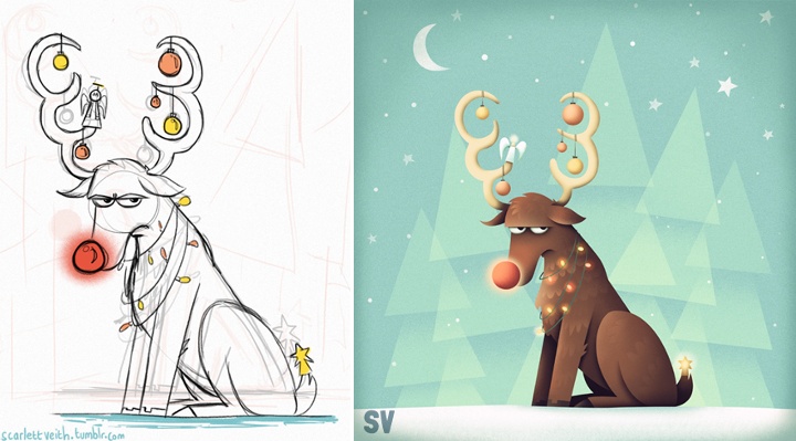
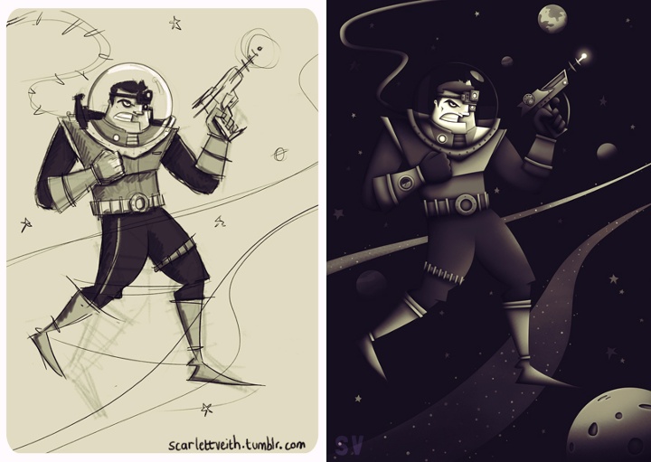
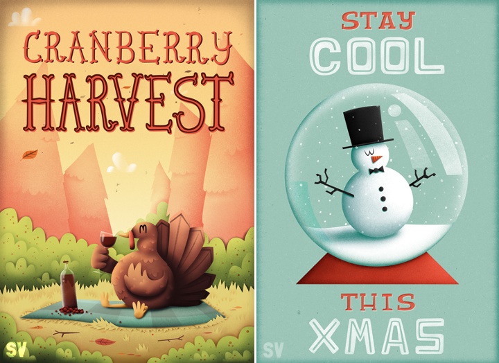
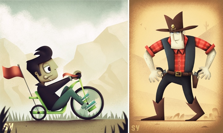
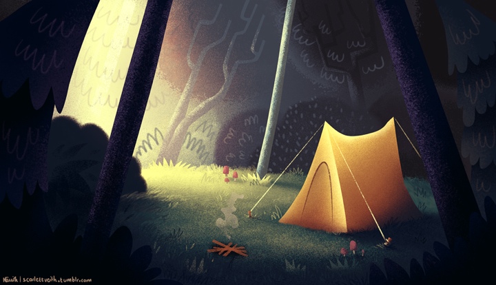
Continuing the ongoing series of interviews with illustrators, today I’m pleased to welcome Natalie Smith on my blog. Natalie’s portfolio is a charming collection with particular emphasis on delightfully quirky character illustration. She also designs T-shirts, and selected illustrations are available for sale over at Society6. Natalie’s Dribbble page, DeviantART gallery and Tumblr stream are full of sketches and work-in-progress snippets that provide a fascinating glimpse into her creative flow.
 Kirill: Tell us a little bit about yourself and how you got started in the field.
Natalie: I am a self-taught, freelance illustrator born and based in Yorkshire, England. Although I’ve always enjoyed drawing, I kind of fell into illustration a few years ago after winning a couple of t-shirt design competitions and through people taking notice of my personal work on Web sites such as DeviantART and Dribbble.
Kirill: Is it important to evolve your stylistic choices? Is there ever a thought of exploring radically different directions? Is there a concern of falling into a certain rigidity of style?
Natalie: I’m not sure if it’s about evolving my stylistic choices per se, but I do think it’s important to experiment and try out new ways of approaching an illustration in order to progress. In fact, it’s more a case of “what can I do to make my work better”? For me it doesn’t even have to be anything too drastic either; it could be something as simple as using a different brush in Photoshop, for example.
As for style, I think it’s ultimately just an amalgamation of what interests you at a given time. As you go through life these interests naturally change and evolve and with it so does your style.
Kirill: From pencil sketches, to the initial transfer to the digital mode, to circling on finer details – what’s your favorite phase?
Natalie: It really depends on the project but generally speaking sketching is my favourite, as that’s the most creative phase of the process and the part where you still have the freedom to do anything. Then it would probably be adding the finer details.
The most tedious part of my process, due to how I work and produce my illustrations, would be laying out the paths and the base colours for my piece.
Kirill: When you transfer your pencil sketches to the digital world, do you try to preserve some amount of hand-drawn imperfection? Is this important to you?
Natalie: I actually do a lot of sketching straight in to Photoshop these days, but when I do use my sketchbook it’s nearly always to put down and explore ideas, crank out thumbnails and try out different compositions and layouts. So my pencil sketches are really just a foundation to build upon rather than a piece of the finished illustration. Sometimes I will do individual bits of the illustration and then piece them together once I’m on my computer.
That being said, I have been trying to incorporate more of a “roughness” to my work, which I think adds a little more character. For this reason I also tend to create a lot of textures, which I use in my work, from traditional sources such as different types of paper and scanning in brush marks.
Above all though, it really depends on what is needed and what will best help communicate the message of the illustration.
Kirill: What do you like about character design and why?
Natalie: I’m not sure exactly what it is, but the first thing I really remember properly sitting down and drawing lots of were the characters from The Simpsons – so I think it’s just something I’ve always been interested in.
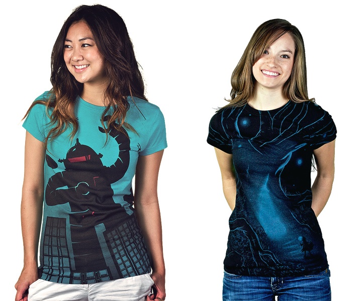
Kirill: What’s different about designing t-shirts? Which parts translate well to the wearable medium, and which do not?
Natalie: The biggest thing you have to remember is that a design someone may hang on their wall isn’t necessarily what they would want to wear! But the way I approach designing a t-shirt is largely similar to how I would tackle other illustrative work; composition, colour etc are just as important.
However, there are certain things I do take into consideration when specifically creating a design for t-shirts. For example, where the design is placed on the t-shirt is important – either to give the design more impact or to avoid it from being unflattering. From my own experience, I also tend to find that simpler designs tend to do better (though this may not be the case for others).
Kirill: Do you think that advances in software tools and global connectivity are making it simpler to start in your field, and at the same time creating more competition and diversity for the clients to choose from? Does it make harder to stand out?
Natalie: Not so much advances in software, as I believe it will only take you so far, but definitely having access to sites like Dribbble, which broadcast your work on a global scale, has made it easier for me to get started in the field. At the same time I do think it creates more competition, but I believe that if you have the passion to progress and the talent then you will always, in the end, stand out.
As a side note on this subject, because I’m self-taught the ease at which you can now have access to other artist’s work and be able to communicate with them and learn from them has been a huge boon for me.
Kirill: How valuable is self-initiated work for you?
Natalie: Extremely! First of all, it’s a time when you can really play around and experiment with your illustrations. It also creates a consistent output and allows you to refine your process and become more efficient at what you do.
Kirill: What’s the best thing about being an illustrator?
Natalie: The variety of the work and having a great excuse to watch cartoons (it’s for research purposes, obviously).
And here I’d like to thank Natalie Smith for answering a few questions I had about her art and craft. You can find Natalie online at her portfolio and buy selected prints in her shop. She can also be found at Dribbble, DeviantART, Tumblr and Twitter.
