Reading on the web
My most-used browser extension is, undoubtedly, Clearly by Evernote (available for both Chrome and Firefox). It takes something that looks like this:
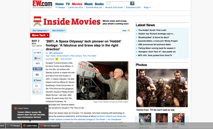
and turns it into this:
![]()
Gone is all the crap that the site wants you to see, and left is the actual content that you have arrived to read. Clearly has a few presents for font choices, sizes and color schemes, and it also allows one to create a completely custom scheme. After staying with the default Clearly theme for a few months I have become quite aware of how comfortable my web reading has become. With a single click of a button I am left with only the article itself. But it went well beyond it, and it took me some time to understand the reason.
As I started the gradual redesign of my own blog a few months ago, I kept coming back to one single question. Imagining myself as the reader of my blog, what would it take me to not click the Clearly button? And so, little by little, I started to take away the visual cruft. Gone is the harsh glare of pure white background and high contrast of pure black text. Instead, I use a quasi-random light-gray texture tile that provides relief while still emphasizing the horizontal direction of the text. Gone is most of the heavy “About me” blurb in the right side bar, and around half of the other sidebar content. Instead, a smaller blurb ends with the “more” link, and the entire sidebar content uses a smaller font size and lighter shade of black. Finally, gone is the entire comment section, as its visual weight has stopped carrying enough value to justify its continued presence. But there was still one more piece left.
Much can be (and has been) said about the choice between serif and sans fonts. There are studies that compare reading speed and legibility, and there are polarized opinions behind every choice. Some sites even go as far as providing a switcher between different fonts, absolving themselves of the hard option of making an actual decision. I wanted to make a decision, and that decision was guided by the same question – why do I enjoy using Clearly so much, and what would it take me to not click that button on my own blog? Which has finally brought me to realize what made my reading so enjoying and comfortable – the default choice of a large variant of PT Serif font.
From there I’ve spent some time going over some of my favorite sites and blogs, looking at their typography and gathering more data to make the choice for my own blog. There was one thing that I was quite clear about – I wanted to have an enjoyable lean-back reading experience, and that ruled out small font sizes from the very beginning. And the more I looked at sans fonts at larger sizes (18 points and above), the more I saw that I was going to use a serif font. Which left two questions – which font and which font size.
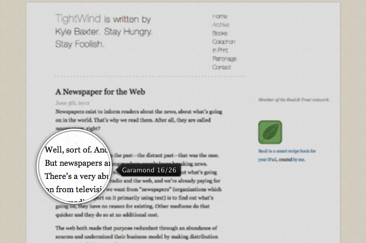
Here are few of the sites that I looked at in my quest (linking to individual entries and detailing the font size / line height). First, Kyle Baxter‘s tightwind.net that uses Adobe Garamond:
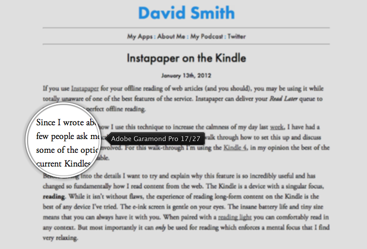
Next, David Smith‘s david-smith.org that uses Adobe Garamond Pro:
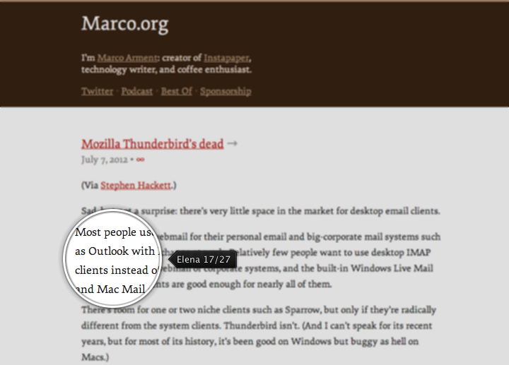
Next up Marco Arment‘s marco.org that uses Elena:
Next, Matt Gemmell‘s mattgemmell.com that uses the aforementioned PT Serif:

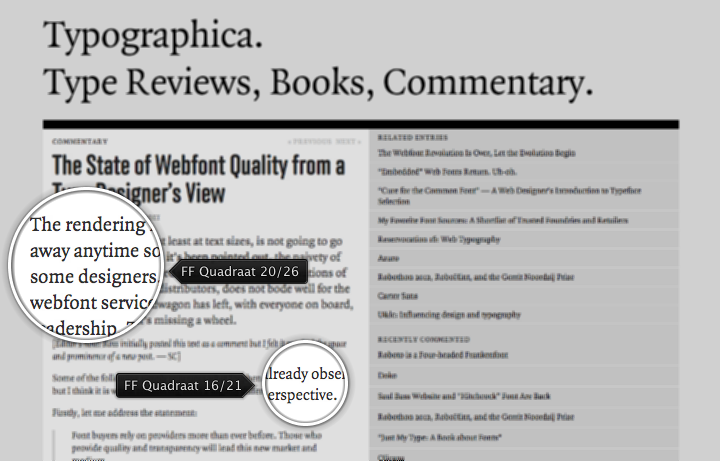
Next one is typographica.org that uses FF Quadraat in two sizes – a bigger one for the opening paragraph, and a smaller one for the rest:
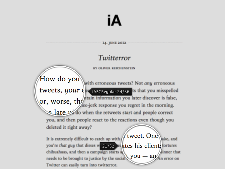
And finally, Oliver Reichenstein‘s informationarchitects.net that uses his own custom iABC font in two sizes – a bigger one for the opening paragraph, and a smaller one for the rest:
As a small detour, I’ve also looked at two of the applications I use occasionally on my mobile devices for more comfortable reading – Flipboard and Pocket:
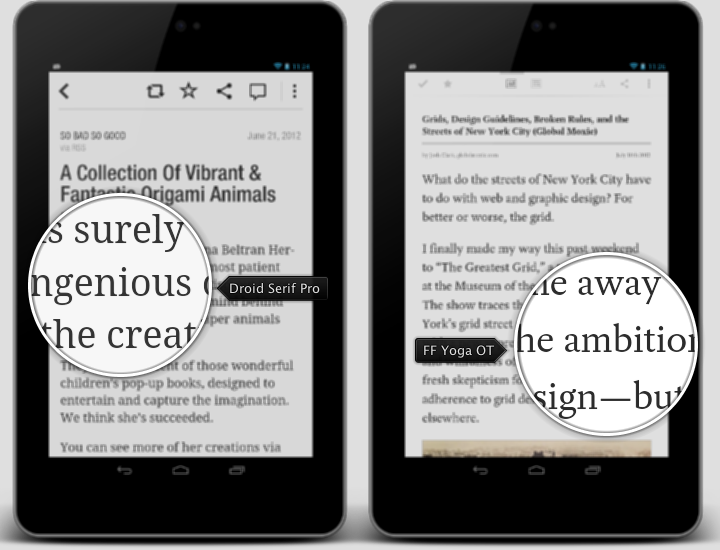
Pocket allows choosing between two bundled fonts – the sans Proxima Nova and the serif FF Yoga OT. Flipboard bundles the sans Neue Helvetica for the main browsing tiles, and uses web views to render the actual articles. The article rendering is not very consistent, using Droid Serif Pro for most of the articles, and a variety of sans and serif fonts for others. This is combined with the lack of user choice to enforce usage of a single consistent font, taking away one of the “selling” points of such an app – consistent, uncluttered and enjoyable reading experience.
The six examples of different web sites shown above are ordered based on the font size – from smallest (16 points) to largest (24 points). The “large” setting of Evernote’s Clearly is 20 points with line height of 30 points, and this was the minimal font size that I was comfortable with. Finally, I did not want to explicitly highlight the first paragraph as done in the last two examples. I do understand the perceived importance of the opening paragraph for those that do quick skimming, but that is not my actual target case.
PT Serif is a free and decent looking serif font. This is what I’ve been using on this blog over the last couple of months. However, it has certain problems with kerning. Here is a very small comparison to Elena, my eventual font choice:
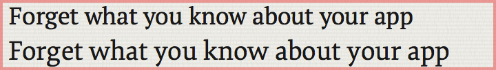
The top line (PT Serif) is quite irregular in the very first word. It starts with quite spacious gaps between the first three letters, and then “rushes in” to complete the next three ones. Compare it to the bottom line (Elena) that has a better consistency, even though some of the gaps still feel a tad too wide.
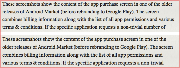
And this screenshot compares how PT Serif (top) and Elena (bottom) handle the body text under my eventual selection of 21 points for font size and 32 points for line height. You can see the better kerning in the words “before” (2nd line), “billing” (3rd line) and “trivial” (4th line), just to point out a few.
Elena is a great and very affordable web font. If you happen to read this article outside of its original form, you’re more than welcome to click through to the original format to judge for yourself. It is rather unfortunate that I only use it on the Mac machines. Much has been said about the difference between rendering engines on Windows and Mac. I would only say that I have not seen a single serif web font that looks good on a Windows browser – including all the sites mentioned here. For now I’m staying with Georgia as the default font for non-Mac platforms.
This would not be complete without adding a few links to sites that provide my daily dose of typography inspiration. In no particular, although alphabetical order, they are:
- Balla Dora Typo-Grafika »
- Beautiful Type »
- Calligraphica »
- Chromeography »
- FontShop Blog »
- Friends of Type »
- I love typography »
- Jessica Hische’s Doodle Blog »
- Letterology »
- Manystuff »
- Paul Shaw Letter Design »
- The FontShop FontFeed »
- Typblography »
- Typedeck »
- Typetoken »
- Typeverything »
- Typographica »
- Typotheque »
- We love typography »
