Going responsive
I’ve been talking about responsive mobile design for quite some time now, but was kind of neglecting my own blog and how it looks like on smaller devices. My main focus is on readability, and this was severely impaired on smaller screens. I was using the WPtouch plugin on the blog, and while it was doing a somewhat decent job at scaling down the content, it was not very good.
And so I spent the last few evenings doing semi-random things in my CSS and poking around the developer tools in Chrome. It’s not finished, of course. I still need to figure out how to bring back the search. But otherwise I’m quite happy with how things look now when you browse this site on smaller screens.
Mobile web is a commonly used name for browsing web on mobile devices. It is a rather useful, but very misleading way to talk about how web pages look on a variety of smaller screens. Screens which are, at least at the present moment, associated with devices that are more mobile than traditional screens found on your desk. The ill-fated push for netbooks and the recent wave of hybrid tablets that have desktop docks with full-size physical keyboards are blurring this traditional line between mobile and desktop screens, but I digress.
As Jeremy Keith points out in his “There Is No Mobile Web” presentation, and as I have mentioned a number of times on my blog, one of the more important facets of responsive design is adapting the presentation of the content to the current context:
Now the important thing is, each time I switch the layout there, going from two to three to six, those break-points, those changes, were not dictated by the size of devices; they were dictated by the content. When did it make sense for the content to switch from two to three to six? Because again, I don’t think it scales to just choose your break points based on whatever’s currently popular. So at the moment we’ve got 320, 480, 640, whatever, but there’s so many different devices out there with so many different sizes and dimensions that it makes much more sense to let your content decide when is it time to expand; when is it time to allow some breathing room.
One of the greatest strength of Web as a platform is the ubiquity of access. A device, no matter how small or big, that ships without a built-in web browser is quickly becoming a thing of the past, a curiosity, a gadget at a severe disadvantage in the fiercely competitive landscape. This landscape is seeing a lot of experimentation in the physical screen size, aspect ratio and pixel density. Designing your structure around a few “well-known” pixel widths of a small subset of popular devices is a losing proposition. Instead, the logical hierarchy of your content – the blocks, their logical importance and the spatial relationships between them – must be the primary factor in the decision to switch between different representations of it.
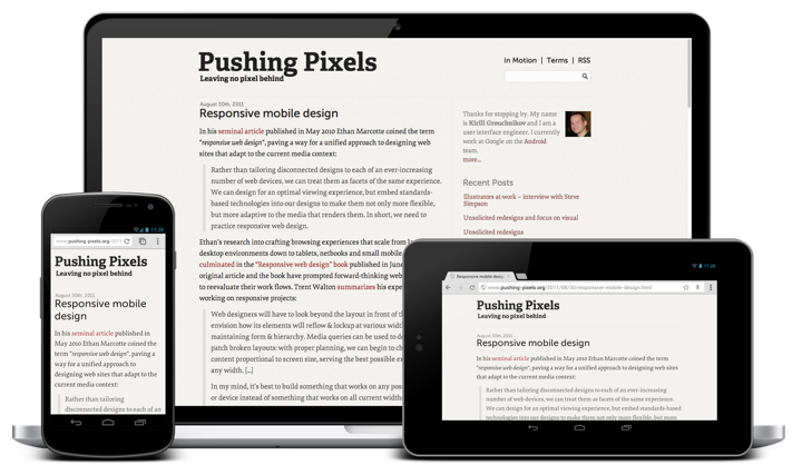
This blog has four blocks: header, content, sidebar and footer. The word “content” is rather overloaded here, and by “content block” I mean the left column that contains the article(s) that you’re reading. As part of the recent redesign the content column switched from 600px width to 720px width to accommodate larger font sizes (with a nice side-effect of being able to use larger images for interviews and other articles). As I started thinking about the different ways to scale down the presentation of the blog to smaller screens, my main goal was to reserve as much horizontal space as possible for the main content block, and to preserve its width (720px) for as long as possible.
At its widest, the current representation is 1120px wide, with 720px going to the content and 365px to the sidebar. Using auto as left and right margins centers the entire content in the browser window. This worked nicely when you viewed the site on a large screen – or rather when your browser window was sufficiently wide to fully fit the entire 1120px span under the current zoom level. However, if you started to make the browser window smaller, horizontal scrolling kicked in and the entire experience was not very user-friendly.
In the new implementation, after a rather short intermediate step where the content column remains at 720px and the sidebar shrinks to 245px, the entire layout switches to one vertical stack – header, content, sidebar, footer. In fact, the transition from displaying this secondary content (“about” blurb, links to recent entries and links to social media profiles) at the right side of the main content to displaying it below the main content reveals a rather unfortunate naming convention for it. It goes along the same vein as the distinction between the semantic <em> (for emphasis) and the presentational <i> (for italics).
At width of 1000px – encoded with @media (max-width: 1000px) – I switch to width=auto, margin=auto and max-width=720px. Here’s a screenshot to illustrate what this does:
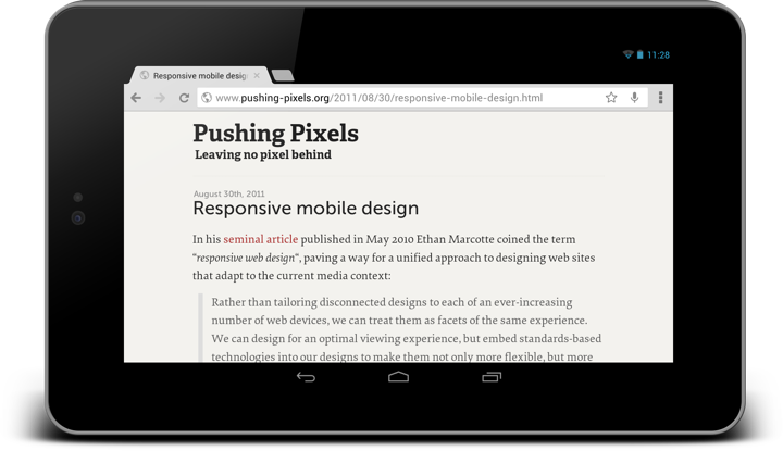
As the sidebar is no longer displayed to the right side of the main content, there’s a certain range of screen sizes where I can display the main content in an area which is wider than 720px. My decision here is to limit the content to its “original” width with max-width=720px and center it horizontally in the parent with margin=auto.
As you go along the axis of progressively smaller screen sizes, at some point you need to decide what to do when you just don’t have enough room to display even a single block of content at its “ideal” width. This is where width=auto kicks in, making sure that your content wraps within the available horizontal space.
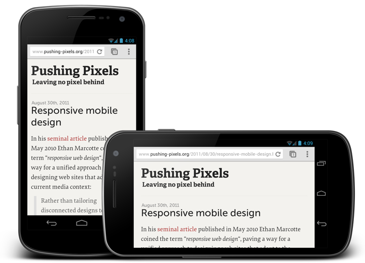
Once you have a decent presentation figured out, there’s a lot of things that you can refine and polish. Depending on the the logical structure of your content you can have multiple breakpoints (or switching points) where content shifts between a number of possible presentation structures. You can play with font sizes (as I did for the main title and subtitle in the header). You can play with content paddings to give it more breathing room on slightly larger devices. For example, in the next screenshot you can see that in portrait I use 12px padding, while in landscape I use 24px. The difference here, of course, is not the specific pixel size or orientation of the specific device, but rather the available width. Currently I encode the switch from 12px to 24px by @media (max-width: 480px). Some sites use percentage based paddings and margins, at the expense of not following a well-defined grid rhythm.
At slightly over 100 lines of CSS and one extra meta directive in the <head> section, with no changes to the overall content structure, this has been much less painful than what I feared it to be.
The full explanation of the viewport meta tag is somewhat over my head, and I don’t quite understand why this needs to be specified explicitly for optimizing the content viewport and default font size on smaller screens, but suffice it to say that without the magic of adding <meta name="viewport" content="width=device-width; initial-scale=1.0; maximum-scale=1.0; user-scalable=yes;" /> to the <head> section the site looked quite badly on a variety of devices and browsers.
I’m not a web developer, nor do I pretend to be creating a complete guide for turning any blog into a fully responsive one. This is just documenting a first and very important step towards making Pushing Pixels look good on a much more diverse variety of screens.
