In my previous lifetime I was a Swing developer. And I liked shiny things. As a proof, here’s the pinnacle (or so I thought, at least) of my explorations in making shiny glossy glitzy buttons. That was around April 2006.
Different UI toolkits provide different capabilities that allow you controlling visual and behavioral aspects. Putting the technical details of styling aside though, UI control styling usually works at the level of an individual control.
And so as I was working on my own look-and-feel library, I heard more and more tidbits about Vista. It was released in January 2007, but it had a long [really really long] history. People kept talking about the three “pillars”, and I was mainly interested in the Presentation one. I don’t have a link, and I can’t even tell if it was a feature that was eventually shelved or just a rumor. But when I heard it, it made a long-lasting impression on me.
The gist of it was that entire UI is a 3D model. You know how they say that buttons should look like something that can be pressed. So you have some kind of z-axis separation. Drop shadows, bevels, some kind of a gradient that hints at the convex surface. And don’t forget to throw in the global lighting model. And so that bit of pixel feature rumor said that the entire UI – from the window level down to an individual control – would be an actual 3D model, with each object living in its own z plane.
So instead of styling each control to create an illusion of z separation (with whatever 2D images are backing each individual control), you would have a spatial model. Each control has its own 3D geometry. Now all you need to do is place the controls in the 3D space, create a few global lights, create a bunch of textures to use on the controls and voila – ship it over to the GPU to compute the final pixels. Want to restyle the UI? Supply a different texture pack and a different lighting model. All the rest is taken care of by the system. Have your own custom control library? Define the 3D meshes for them. All the rest is taken care of by the system.
Now imagine what you can do. If you place two buttons side by side, with just the right tweaking of the meshes and just the right amount of reflection on the textures you can have a button reflecting parts of other buttons around it. And the other way around. You know, all those shiny reflection balls from the early ray tracing demos.
Or, if you model the mouse cursor as an object moving above the window, you can have the back of it reflecting in those controls that it’s passing over. If your control mesh has some kind of a curved contour, the cursor shape would get distorted accordingly as it glides off of the edges.
Or, as you press the button, the press distorts the button mesh as the exact spot of the press, and the entire geometry of the scene reflects that.
I had serious thoughts of doing that. In Swing. That never happened though. Here’s why.
In my mind, there were three big parts to actually doing something like that.
The first one was relatively simple. It would involve transitioning from the point of view of looking at a single control at any point in time towards creating a global view scene that had the entire view hierarchy. There were enough hooks in the API surface to track all the relevant changes to the UI, and even without that you can always say that applications must opt into this mode and have to call some kind of an API that you provide that there are “ready” for you to build that graph.
The second one was also relatively simple. I would need to generate the meshes for all controls. Some are simple (buttons, progress bars), some might be trickier (check marks, sliders). But nothing too challenging. Mostly busy work.
But the last one was the effective non-start. How to actually create the final render of the entire window with acceptable performance? Doing my own 3D engine was kind of out of question. I knew just enough of what is involved to not even begin down that path. So that left me with OpenGL.
JOGL was around at the time, and had a nice momentum behind it. They were gearing towards providing bindings for OpenGL 2.0. There was a lot of activity on the mailing lists. Java3D was another alternative that was under similarly active development. There was even a talk of merging the two. And so I started looking into a simple proof of concept of making a simple JOGL demo on my trusty Windows box.
Around that time (early 2007) Ben Galbraith announced the first (and, posthumously, the only) Desktop Matters conference in downtown San Jose. I left a comment on that announcement. He asked me whether I wanted to make a short presentation on one of my projects. I was quite happy to do so. That was my first public presentation [thanks for the encouragement, by the way!]
It was a nice gathering. Around 100 people, I’d say. And they had quite a few people from the desktop client team at Sun available for informal Q&A. Chris Campbell was my hero at the time (no offense, Chet). The dude was slinging code left and right, showing a lot of great things that could be done with Java2D. He was also working on hardware acceleration of a lot of those APIs. If I remember correctly, he was talking a lot about doing various acceleration on top of OpenGL and Direct3D. Who would be better to validate the overall approach of doing this thing that I wanted to do than him.
I managed to grab him for a few moments. I outlined my thinking. He was polite. He said that it sounded about right. That was just enough encouragement for me.
So after the conference was over I got to actual work. My first private demo was to render a colored sphere. And it looked horrible. It had jagged edges all around it. And it also had visible seams running all over the sphere. I could see the tessellation model before my eyes. It was quite bad.
So I fired off an email to the mailing list. Not about my grand vision. But rather about this specific thing. How to make a sphere look like a sphere. With no jaggies and no tessellation. And they told me to get a “real” graphics card, because whatever integrated graphics card I had on the motherboard is no good for any kind of OpenGL work. And that’s where I stopped.
What’s the point of even thinking going down that road if you must have an expensive graphics card? It might be OK for a demo. It might be OK if I’m satisfying my own itch and showing off my skills with some kind of a thing that runs well on my machine [TM]. But if it can’t be used on “everyday” computers that don’t have those fancy hardware components, it’s a no-go for me.
You might say that I chickened out. I had this grand vision, and folded at the first sign of trouble. But that was – and still remains – my main issue with anything that ends with “GL”. Its never “quite there” promise of commodity hardware availability that is “just around the corner” – and in the meantime, you need this very particular combination of hardware components, drivers and other related software to run. And oh, even if you do have a beefy graphics card, unfortunately it has this driver bug that crashes the entire thing, so you might want to either bug the vendor to fix it, or just disable the whole thing altogether.
Things might have been different. I had really a lot of spare time back then. I might have went down the road of biting the bullet and buying that graphics card (although, as mentioned above, it was not about my own cost, but rather about the reach of the final library). I might have had this thing done in some form or another. Can you imagine buttons reflecting other buttons reflecting the mouse cursor passing above them and rippling as you press them? With the ripple reflected all around that button, and being reflected back in it?
So that never happened. And now it’s all about flat. Flat this. Flat that. Flat *ALL* the things!
Chris Harris at 24:40 into episode 47 of Iterate podcast:
I call it undiscovered country. You can imagine it like a bunch of ships arriving on the shore of this new land, and there’s a town there. And that town was iOS when it was first created. You land and you claim this area around it. You’re out there, and you always land to explore. And we’re very much in the infancy of touch-based design. The interesting thing is that we’ve just landed on the shore, and some people are spending all their time designing, effectively, in the town they’ve landed at.
All these ships are arriving, and more people are arriving on the shore and turning up in this town every day. And some of us are saying “Oh my God, you can go over there and claim a mountain and stick a flag on top of it”, and that’s the thing you can do. Loren Brichter was out there and he planted one. There’s a hill right outside the town, a little way down the road but off the beaten track. And he went right out there to stick his flag and claim pull-to-refresh.
That’s the way I look at it. We’ve got this amazing opportunity to go out there and claim mountains for ourselves. It will never come again. We’ve got this opportunity right now to go and claim these mountains right close to the shore. Afterwards, in the distance, people will have to travel further. You’re going to get across mountain ranges in order to find something new, in order to get something new to explore. I want to go to the top of those closest mountains and claim those myself.
That mountain – once you get to the top of it and standing there and saying “Oh my God, that really worked, that was amazing”, and you see all these people and boats clustering down there, and you’re going “Guys, guys, over here”. And down the other side of this mountain, in the valley down hill, there are all these other things that we can do, and that’s the most amazing thing. When you’re at the top of one of those mountains, you get to see things that other people can’t, and that’s where I feel I am right now. Some of us are at the top of mountains looking down the other side into grassy valleys.
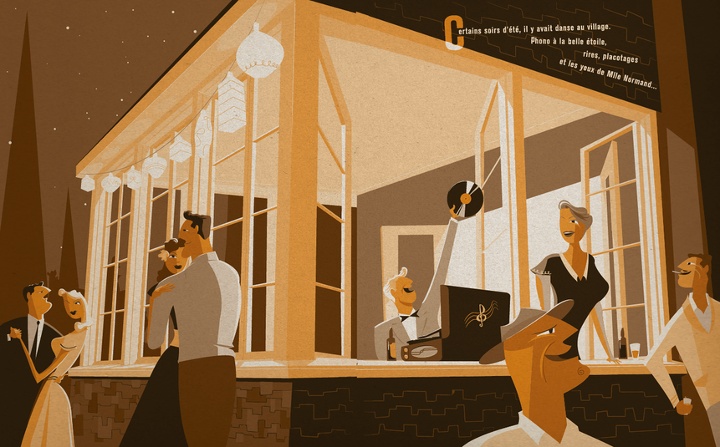
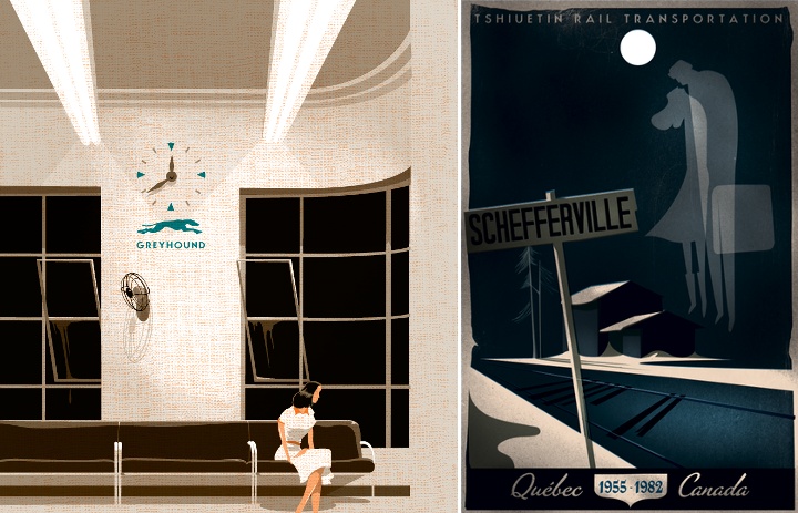
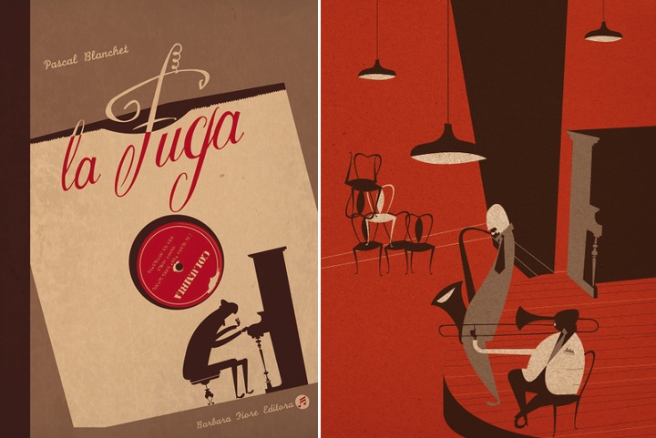
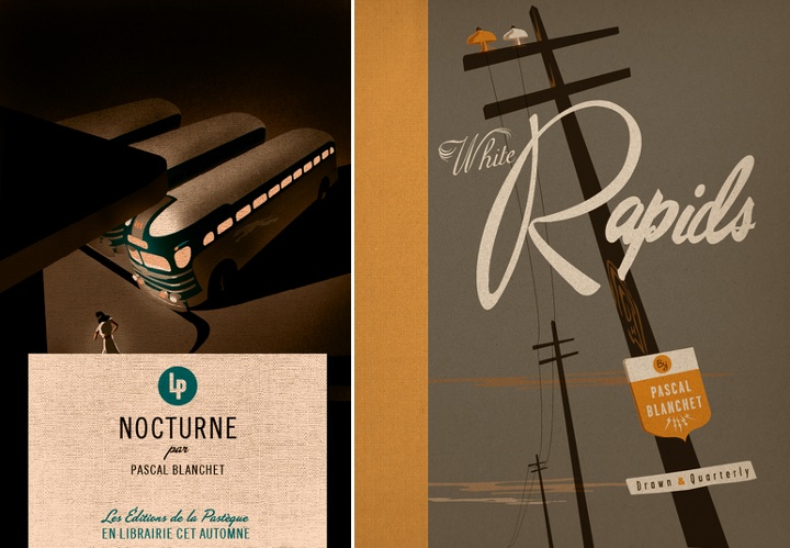
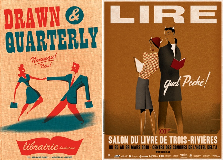
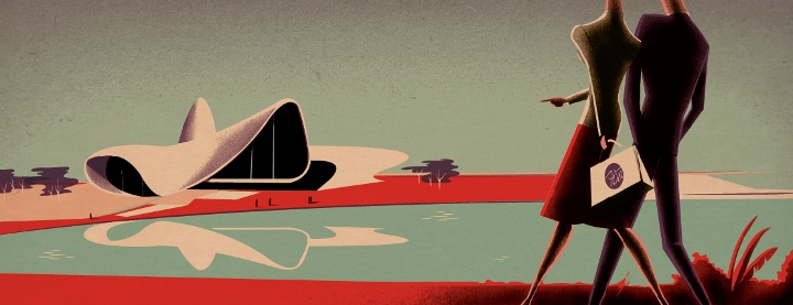
Light and shadows. Rough angles and streamlined curves. Misleadingly simple color palettes and explosively dynamic body language. Browsing the portfolio of Pascal Blanchet takes you decades back into the roaring era of Art Deco and does not let you go. I am absolutely thrilled to have the privilege to Pascal and ask him a few questions about his art and craft.
 Kirill: Tell us about yourself and how you started in the field.
Pascal: I’m a self-taught illustrator. I’m 33, living in Trois-Rivières, a charming old small town right between Montréal and Québec city.
When in my early 20s I moved to Montréal to try finding jobs as an illustrator and I failed. It was a really rough time. I finally tried to send my portfolio to some NYC illustration reps and signed with Jacqueline Dedell agency. The first jobs came really quickly from the San Francisco magazine and Penguin Books. It was a big surprise for me!
Kirill: What drove you to be a freelancer?
Pascal: I always had a serious problem with authority. School and student jobs were a nightmare (for both the bosses and I)
so I guess it was only natural for me to end up as a freelancer.
Kirill: What informs and shapes your taste and style?
Pascal: My first contact with illustration was when I was a kid with the old 78rpm records sleeves at my grandparents house. It makes a huge impression on me.
I learned many many years later that they were made by guys like Jim Flora and Alex Steinwess and many others… I also remember having a huge crush for handlettered windowshop ads. It seems I loved art deco posters and streamline style illustrations long before knowing what those styles were. I’m still trying to find and explanation about my love for the 30s and 40s. All I know is that even when I was around 5 or 6 years old it was there.
Kirill: How has your style evolved over the years? Are you comfortable with it, are you pushing it in new directions, and do you want people to recognize your new work as uniquely yours?
Pascal: I like to think it changed a lot over the years. Looking at my first graphic novel and my last one makes me think that I’m (I hope) not too squeezed in my own “style”. It’s also really important to me to look for something else, something new (to me). I never tried to make something I could call MY style, I guess it just comes out that way. I am mostly afraid to repeat the same thing again and again.
Kirill: You cite music as your main inspiration, and some of your graphic novels incorporate artists and music instruments. How do you convey this dynamic experience in a static medium?
Pascal: I think music has shapes, colors, shadows just like a drawing. To me when I’m working on a graphic novel it’s pretty hard to know where music stops and drawing starts. Most of the time music comes first and often even gives me the subject of the story or the characters.
To me there’s no difference between music and visual arts. A jazz musician has to take a standard and recreate it in his own personal way – just the same as an illustrator. Usually the themes aren’t new at all but we have to make it our own.
Kirill: What drives you to publish graphic novels? How does it feel to hold a printed book of your own?
Pascal: I think it was the thrill to tell the story behind a single image in a more complete way. Most of the time in illustration you have to tell something in a single image and sometimes it’s a bit frustrating.
When you finally hold your book in your hands, it’s months after you finished it, so you kind of look at it with stranger eyes. The feeling you had when you were doing it is already gone and nothing much left but: This page is not good, that face looks ugly, bad shadows here…
Kirill: How do you preserve color fidelity when the final product is targeting print media, such as magazines or books?
Pascal: Pantone colors number. But I’m not that much a freak, since all the colors will change but the balance between them will stay the same. So it’s ok even if they are not exactly what I had in mind.
Kirill: As you start working on a new project, is it pen and paper first, or all-digital?
Pascal: It really depends, I do not have any kind of work routine except for music. Sometimes i make a digital sketch and the final on paper, sometimes it’s the other way.
Kirill: What’s the weirdest client feedback you ever received, if you don’t mind sharing it?
Pascal: “Can you make it more à la Pascal Blanchet”
Kirill: How do you work with type? Do you design your own fonts, or adopt and adapt existing ones?
Pascal: Most of the time I make my type. To me it seems impossible to make a poster and have a graphic designer put fonts on it. It needs to be an integral part of the illustration.
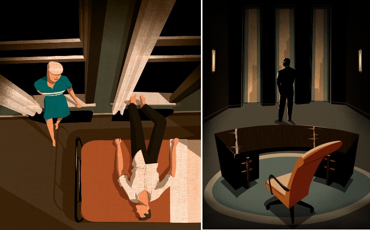
Kirill: Some of your illustrations employ high angles, claustrophobic environments, long shadows and stark silhouettes. Do I detect a fellow film noir fan?
Pascal: Totally! But the origins of the high angles and dramatic views came from my passion for architecture. I discovered film noir long after I started doing exaggerated perspectives. My father was working as a technical draftsman and I learned it at a really young age. Also, I am really fascinated with the relation between human being and architecture – how can the latter magnify or oppress the former. I guess my love for art deco also adds to the dramatic side.
Kirill: What do you think when you look at your own work from a few years ago?
Pascal: Bad work, lousy illustration, need to draw something better NOW.
Kirill: How important is it to invest time in personal projects?
Pascal: I think it’s absolutely necessary to keep myself “creative” and incorporate new techniques and make experimentations. Graphic novels are also the best portfolios you can make, my personal projects gave me most of the jobs I’ve had.
Kirill: What do you do when you run out of ideas and get stuck?
Pascal: When i have enough time in front of me I just sit and think. Drawing just makes me sink even more in the bad concepts way. When in a hurry (most of the time). I like to discuss it with the art director. Sometimes it gives a sudden new turn to the job and helps a lot.
Kirill: What’s the best thing about being an illustrator?
Pascal: Drawing and challenges.
And here I’d like to thank Pascal Blanchet for this great interview. You can find him online at his portfolio and blog.
A few years ago, in a company whose name doesn’t really matter there sat a programmer working on fixing a few bugs and adding a few features. And as he was sitting there, an idea struck him. An idea for a feature which was kind of related to what he was doing. And he leaned over to his cube mate and outlined the idea. And the cube mate told him that it’s a nice one. And that he should see if the idea can be turned into a patent. Not because that idea would actually be turned into a feature. But because everybody else tries to patent ideas, no matter how small or big they are. Or no matter what actual connection they have to what you’re doing in the office. Play the game. Send an email. Let the process begin. Sit in a couple of meetings. And then a few years later, if it turns out to be an actual patent, get some extra money. Just for having had that idea.
And the programmer sent that email. And got a conference talk scheduled for the next week. A talk with a patent attorney. And with every day that passed, the programmer’s excitement has declined. And declined. And declined.
It started with patting self on the back and kind of marveling at self for coming up with the idea. And hey, extra money doesn’t hurt. Not that it’s a lot of money. But not loose change either. But with every day, the realization of how ridiculous and pathetic it is to think that an idea for a pure software-side flow is patentable started to sink in. Growing claws. Clawing at the inside, reducing the self-built pedestal to a heap of quick sand.
And then the time came to sit with the attorney. And the programmer was so dejected at that point that he just wanted to make it all go away. And the attorney sat there and said that he was going to just read this paragraph. And he started reading from the piece of paper. And, sentence by sentence, in six or eight short sentences it described the exact flow that the programmer had in mind. And then he asked whether it was in any way similar to what the programmer had in mind. And the programmer said that it was exactly the same. And the time to sit with the attorney was over.
And ever since then, the programmer has hoped to never be in such a situation again. To never bear the burden of self-inflicted aggrandizement of self. To never think that a mere idea in the realm of pure software is worth the notion of being patentable. To remain humble. To stand on the shoulders of others. To push himself to hone his craft and become better at it every single day. To hope that one day some of his ideas and code will be useful to others. And to never presume to claim that they were original in any shape or form.
As long as I have you here, a personal note. The system is rewarding predatory behavior, and there’s little chance to turn it around from the bottom up. But if you can, consider not attaching your name to any patent application. Something as simple as a one-liner email “Please remove my name from this patent application” should work.
