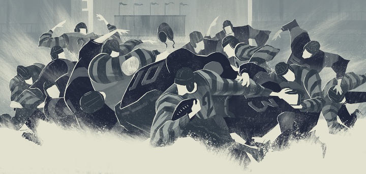
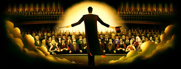
Andrew Lyons is a prolific illustrator with an impressive portfolio that includes client work for GQ, Inc magazine, Penguine Books, BBC, Google and Mercedes-Benz. In this interview Andrew talks about his influences, bringing a human touch to the world of predominantly digital media, the importance of personal work and his recent packaging branding for “Strong” line of nutrient supplements.
 Kirill: Tell us about yourself and how you started in the field.
Andrew: Art was the only thing I was really good at in school, so I knew when I was younger that I wanted to be an artist of some kind. I choose to study painting at university in Cardiff, but when I came out of university I had really now idea what to do with myself, there was no career guidance at all, so I spent the next ten years in odd jobs mostly as a temp working in offices. After a move to France in 2005 I had lots of time on my hands while learning French. I took a graphic design course that taught me how to use Adobe creative suite, but designing logos and websites just felt to restrictive although I liked the aesthetics of clean design. This is when I decided I wanted to be an illustrator, to combine my interest in painting and clean graphics. So in 2010 I started to build a portfolio of personal work and had my first magazine commission 6 months later. From there I just learnt on the job.
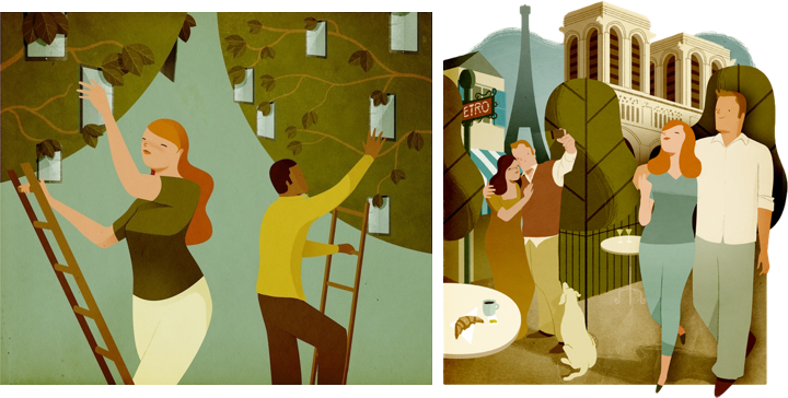
Left – illustration for Inc Magazine, right – illustration for Financial Times Weekend newspaper.
Kirill: What informs and shapes your taste and style?
Andrew: So many different things shape our tastes I think, the more the better. I’ve recently realised that the cartoons I watched when I was very small have been an influence, British children’s programmes from the early 80’s like Mr Ben, and Trumpton. I watch these again with my kids and I can see how the visuals were ingrained in my mind, and see similarities with my work which is weird really!
Another big factor is my love for abstract art, and the kind of paintings I used to do in Art school. I was a little obsessed with squares and geometric shapes in flat colours. I admire artists from the St Ives school; Ben Nicholson, Patrick Heron and Barbara Hepworth.
Lastly comic book artists are a big influence, Hergé’s Tintin, and other artists like Yves Chaland, Ted Benoit, Ever Meulen and Joost Swarte. Abstract art and comic books are my big loves. I like the idea of putting comic book style figures into an abstract and geometric background and seeing how they can interact with that space.
Kirill: Do you want to carve out a consistent and recognizable style, or are you willing to push and explore different directions as time goes by?
Andrew: I don’t really try too hard to be consistent. The way in which I draw certain things seems to evolve naturally with time and I can see differences in the work I did two years ago compared to my current work. I so like to try new things, but I take little steps I guess.
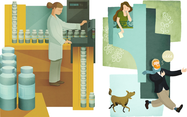
Left – illustration for Spirig AG, right – personal work.
Kirill: Your illustrations are alive with strong human figures, and yet the facial features are reduced to bare minimum. Are you more interested in the shape than in smaller details that might distract from the overall composition?
Andrew: Yes I think that’s probably true, I think it might distract a little, I like simplifying things where I can. But what I like most about having simple features is that it makes the faces more iconic, and possibly easier for people to identify with. Also I like the ambiguity of simple features as it makes emotions difficult pin down exactly, which can be useful when dealing with difficult subjects.
Kirill: As you move from pencil-and-paper sketches to digital outlines and colorizing on computer, do you aim to preserve the imperfection of a human touch? Or is that brought back by textures and lighting?
Andrew: Yes that’s right, I like to conserve some element of the hand drawn in the final art. I’ll either throw in some hand drawn line, or the textures will help to do that a little. More recently I have started to use pencil saying on my characters to rough up their shadows a little, whilst keeping their contours super clean. I like the duality of that. It’s like a push and pull between the right and left side of my brain. There’s a part of me that wants to be Mondrian with super clean lines and colours, and another part of me that just wants to make a mess and throw paint around like Pollock. I try to contain both impulses when I’m working.
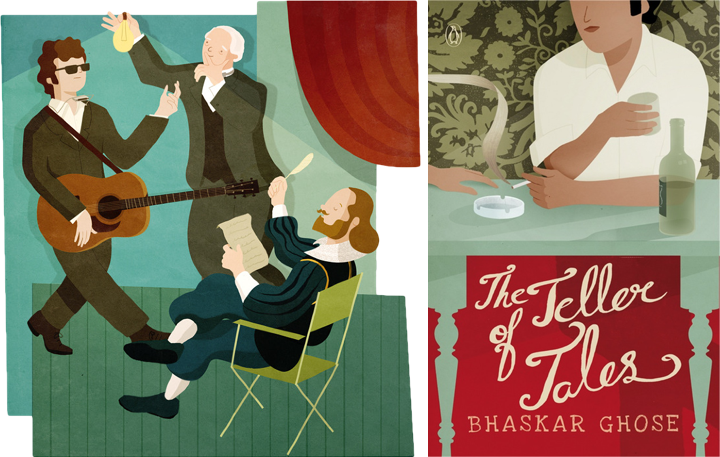
Left – illustration for Google’s Think Quarterly, right – cover illustration for “The Teller of Tales” book.
Kirill: How do you preserve colour fidelity when the final product is targeting print media, such as magazines, book covers or packaging labels?
Andrew: I think that it’s difficult to know exactly how the illustrations colours will look once printed as different paper stocks give different results. I work in photoshop in RGB and then covert to CMYK at the end because there are some layer effects that just don’t work in a CMYK file. So when I’m working I’ll click the little ‘proof colours’ option in photoshop to get a rough idea for how it’ll look once printed in CMYK, but apart from that there’s not much else to do.
Kirill: On a related note, you’ve done a lot of editorial illustrations for magazines. Do you see any changes that affect your work as that industry is exploring digital editions and a variety of smaller screens and different form factors?
Andrew: I’ll often supply a layered photoshop document to an editorial client so that it can be animated for the iPad, but I don’t do any animating myself. I know of some illustrators that do the animating themselves so perhaps it’s a useful skill for illustrators to learn these days. But apart from that I’m not sure how things have changed as I’ve not been illustrating long.
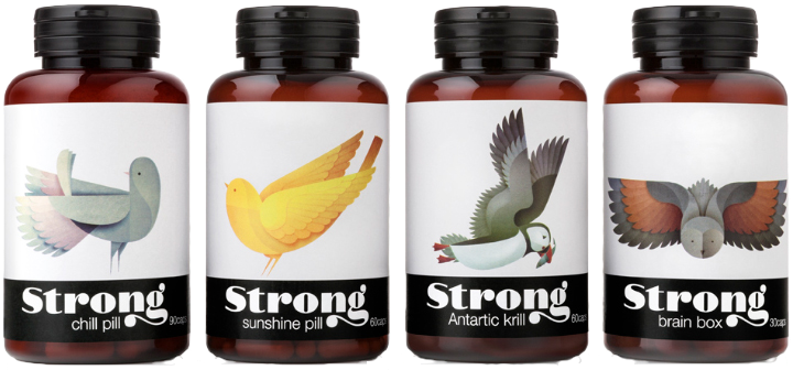
Packaging branding for “Strong” line of nutrient supplements.
Kirill: Walk us through the process of creating the packaging branding for “Strong”. How do you capture the essence of an individual product in a single animal, and yet maintain consistency and continuity for the entire line?
Andrew: Thanks, I’m pleased that you think I’ve captured some of the essence of the subject. I start by looking at dozens of photographs and video of the bird in question, and sketching a lot, just drawing the bird as it is to get a feel for it’s shape. Then I sketch again, but this time directly into photoshop where it’s easier to clean up the drawings, and edit them, flip them etc… It’s at this stage that I try to imagine the birds build from clean curves and geometric shapes. I send my drawings to the client for feedback. My Art Director for Strong very honest with her feedback. If something isn’t working she tells me frankly what needs to change, so I go back and redraw, sometimes from scratch until it’s looking right. Working in this way brings out my best work I think as. it doesn’t always look right at the first attempt.
As to consistency, it’s always at the back of my mind when I’m drawing so this comes through in the final work. I use the same textures in almost all the bird illustrations too which helps.
Left – personal illustration, right – personal illustration.
Kirill: What’s the weirdest client feedback that you’ve received so far, if you don’t mind sharing?
Andrew: That’s a difficult question as I’ve never really had any weird client feedback to be honest! The feedback I’ve had from clients is always quite useful. Sometimes the honesty of the feedback can be quite funny, but it’s usually spot on.
Kirill: How important is it to invest time in personal projects?
Andrew: It’s important for me, and my personal illustrations have brought me new work quite often. I sometimes think that personal work has a quality that some client work is missing, there’s a drive and passion behind a lot of personal work, and I can see it myself when looking in other illustrator’s portfolios. The only difficulty with personal work is getting feedback, and being your own critic. I have other illustrators I can speak to to ask their opinions because when you’ve your head in a piece of work, it can be hard to see things that aren’t working. So a fresh pair of eyes really helps.
Personal work is important too for moving my portfolio and style forward.

Illustration for Bspirit magazine.
Kirill: What do you do when you run out of ideas and get stuck?
Andrew: When I get stuck I’ll try and work through it for a time and I’ll keep at it until I just can’t get any further. Then I’ll do something totally different. I’ll take a walk or read a book. And it’s when my mind is elsewhere that the ideas often come. I’ll often use spider diagrams and write down words related to the subject first rather than drawing anything. Then when I’ve filled a page I try connecting words on opposite sides the page to find something unique, a new idea. Then with an idea in mind of what I want to draw, I try to figure out how I’m going to draw it.
If I’m working hard on finding a visual solution before bed, I sometimes wake up with a picture in my head in the morning, so I quickly sketch it down before I forget it. But it’s rarely that easy.
Kirill: What’s the best thing about being an illustrator?
Andrew: Well, my two favourite things about being an illustrator are being able to work from home and spend more time with my wife and kids. And learning about something new with each project, from Iron ore mining in Africa to William Morris.
Illustration for educational textbook.
And here I’d like to thank Andrew Lyons for his wonderful work, and for taking the time to answer a few questions I had about his art and craft. You can find his work online at his main portfolio site and his personal Tumblr stream. Select illustrations are available for sale at the Society6 shop. He’s also active on Behance, Dribbble and Twitter.
Continuing the ongoing series of interview with illustrators, it’s my pleasure to welcome Brian Edward Miller on my blog. Brian is the creative mind behind the Orlin Culture Shop (OCS) based in Erie, Colorado. His evocatively stylistic landscapes and vibrantly energetic human figures are brought to life with bold strokes and strong color palettes. In this interview Brian talks about his roots, his creative process and designing for various media.

Photograph by Brad Edwards.
Kirill: Tell us about yourself and how you started in the field.
Brian: My name is Brian Edward Miller and I’m the owner and illustrator behind Orlin Culture Shop (OCS for short). I got my start as a creative professional in the field of graphic design and worked for a number of different agencies and studios.
Around 2005-2006 I realized that my favorite part about design was illustration, something I leveraged heavily in all of my projects. I made a decision to pursue drawing more seriously in my spare time and was able to shift the course of my career in a way that afforded me more opportunities to draw. I started by showing up to work an hour early so I could draw and stayed up 2 hours later every evening to create. Next, I took jobs which were less taxing creatively and demanded less of my time so I’d have the energy to pour into drawing. Every drawing I did I saw as an opportunity to grow and it helped me to maximize my study and drawing times.
I ended up working at a few gaming studios as a graphic designer with a handful of opportunities to try my hand as a concept artist. It was here I had my first taste of a career involving drawing and I couldn’t get enough of it. I tried a number of times to make the transition from graphic design to concept art, though none of the opportunities worked out because I could make more money as a Senior Graphic Designer or Art Director than I could a Concept Artist – which is a big deal for me as I have a wife and 2 kids!
Eventually, the decision was taken out of my hands as the first game studio I worked for was dismantled and sold, while the other closed down less than a year later. After the studio closures, I decided to put my abilities to the test by venturing out on my own and starting my own business.

Spot illustration of a broken down vehicle.
Kirill: What drove you to start your own studio, and what is behind the “Orlin Culture Shop” name?
Brian: I started my own studio out of an even mix of necessity and opportunity. As I mentioned above, the gaming studio I was working for had gone under just as I was on the cusp of pushing into concept illustration. I was torn as a creative professional because I had more confidence in my skills as a graphic designer, but I was much more passionate about illustration.
After a handful of interviews at other gaming studios out of state, my wife and I decided we didn’t want to leave Colorado. As there were no local gaming studios which fit our search criteria, we decided to create our own studio which would allow me the freedom to work in the industries of my choosing. Thus, Orlin Culture Shop was born!
Behind the Orlin Culture Shop name is the continuation of an artistic legacy which began when I was very young. My grandfather (whose middle name is Orlin), used to have a workshop in his basement where he’d work on a number of different crafts such as leather working, cross stitching, wood working, etc. – all hallmarks of the vintage Americana generation he grew up in. I spent countless hours in that shop dreaming and building (as well as hammering thousands of nails into boards).
When it came time to name my shop, the name Orlin popped into my head and stuck. Its my hope that I’ll be able to contribute artistic works which will have a positive impact on culture, whether its through editorial illustrations or picture books.
Mowrey Manor, illustration for an educational iPad app.
Kirill: What informs and shapes your taste and style?
Brian: My taste and style was shaped by an amalgamation of influences ranging from Vintage Disney, 1980’s cartoons, Manga, Comic Books, 1940-1960’s advertising illustration, and countless picture books. I tend to fixate on mood and atmosphere in the art I love the most which means I appreciate a broad spectrum of styles and approaches, so long as the mood is right.
Kirill: Are you experimenting with illustration elements outside your comfort zone? Is this a constant process of defining and refining your own style?
Brian: There is always a process of defining and refining my own style. I am constantly on the hunt for refinement within my process and there’s still a TON to learn.
One of the greatest things about running my own business is I have the freedom to experiment as much as I want (so long as I’m bringing in paying work of course). I’m no longer tied to a single job title and description which means I’ve been able to work in a number of different industries.
I also find that every project and client has unique requirements which challenge me in ways I’d never willingly challenge myself. There’s lots of growth that happens because of this, and very healthy boundaries set with deadlines to ensure I don’t get too lost exploring.
Kirill: As you start working on a new project, is it pen and paper first, or all-digital?
Brian: When I start working on a new project, its usually a mix of pen and paper first, followed by all digital. I tend to think better on paper where I can quickly write notes and throw down rough lines to get all my ideas out first. From there I’ll head to the digital platform where I do my ‘official’ sketches and final production.
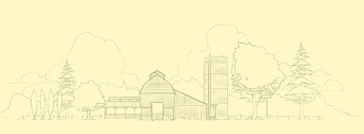
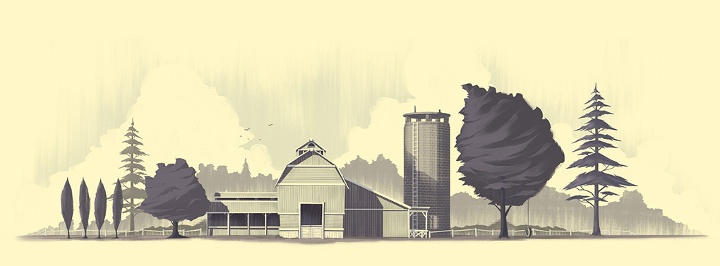
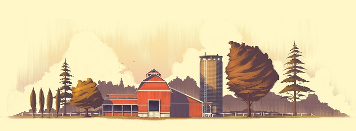
A farm illustration – from the initial sketch to the final look.
Kirill: How do you preserve color fidelity when the final product is targeting print media, such as flyers, posters or magazines?
Brian: Unfortunately, I have very little control over that as most of the clients I’m working with live out of state or out of country. I don’t have opportunities to go on press checks or do anything about quality control so I’m left to the mercy of the client and their chosen printer.
Ideally I’d be able to make the two match but that would require I’m present at every stage of the process. The disparity between print and digital platforms has been something I’ve learned to accept simply because both are so different. I always love pouring over the details of a printed piece, but I also love the dramatic backlighting of a piece viewed on a screen or tablet. I’m comfortable keeping the two distinct which helps keep me appreciate the way a piece shines within different media (as well as keeping me sane).
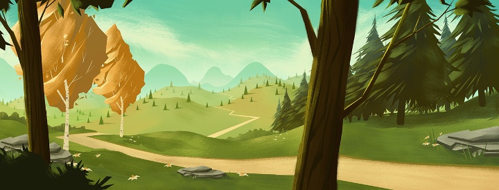
Peaceful valley scene.
Kirill: How much different is the final illustration from the initial concepts that you’re imagining in your head?
Brian: Most often, the final piece is extremely close to what I had imagined in my head (or at least some evolution of what I was envisioning). I tend to focus my imagination on a mood or a feeling so there’s a lot of latitude and room to explore as I move from initial concept to final illustration while staying true to the original vision. That latitude and room for exploration is important to me because drawing can be very tedious work. If I’m simply retracing steps over and over, I get bored.
What are your thoughts on illustrations for web sites, and how does it scale with responsive design and smaller mobile screens?
I’m so used to seeing my illustrations digitally and on websites (usually my own) that I tend to think of the web as the true home for my work. When I do a piece for a client, I see it on screen for months before finally seeing it in print. This makes the print version “the stranger” who looks vaguely like the person I remember sending off…
As for scaling, I believe strong color palettes, diverse tones, and bold shapes help an illustration to scale well, though there’s always some level of detail that is lost as the image size decreases.
Editorial illustration for 1940’s era Snow Bowl.
Kirill: Do you have a particular inclination towards illustrations of nature?
Brian: I definitely have an inclination towards illustrations of nature. Growing up in Colorado, nature was a part of my childhood as I spent the majority of my time playing outside, enjoying the seasons and outdoors. I was also fascinated with Bob Ross as a kid. I remember watching his show with my dad almost every day (I even tried my hand painting using the kit they sold at Hobby Lobby!)
The funny thing is looking through my sketchbooks from the past, you won’t find any drawing of nature. Its all human figure studies, comic book and cartoon characters, etc. Its only when I started my own business and began to figure out who I was as an artist that the inclination towards illustrations of nature took on a powerful presence in my work.
Kirill: How important is it to invest time in personal projects?
Brian: Personal projects are vital to my ongoing development as an artist. It was only with personal projects that I was able to focus my efforts as an aspiring illustrator. My projects included writing and drawing comics / graphic novels, designing characters for animation pitches, and dreaming up story ideas for picture books. It helped me to learn creative writing, illustration, and forced me to face my weaknesses. It also empowered me to transition an idea from my imagination to the digital canvas.

Illustrations for Tarsus Group’s “Label Expo 2013”.
Kirill: What do you do when you run out of ideas and get stuck?
Brian: There is nothing magic about my approach when I’ve run out of ideas or get stuck. I’m very dependent on deadlines to help drive through insecurities and pride (the two culprits I most often discover when I’m trying to understand why I’m stuck). Deadlines force me to sit down and draw despite the fear or uncertainty I’m experiencing. Its only after I’ve thrown down a few ideas (usually the most generic ideas I can think of, the ones which occur to me first) that I begin to get comfortable with the project, my abilities, and my objectives. I have to move forward no matter how much those first few steps hurt, otherwise I’ll sit and stare at a blank page forever.
Kirill: What’s the best thing about being an illustrator?
Brian: The best thing about being an illustrator is being able to provide for my family in a way that allows me to work from home by creating work I love. I also get to see some of the best parts of being an illustrator through the eyes of my kids. When they get excited about the picture books and illustrations I’m creating, that is always cause for me to be thankful. Its there I realize the headaches that accompany being a small time business owner are worth it simply because I’m living a dream I’ve had since childhood

Villainous robots from the “Totes Adorebots” series.
And here I’d like to thank Brian Edward Miller for answering a few questions I had about his art and craft. You can find Brian online at his portfolio and blog, as well as on Behance and Twitter.
It’s been a little under two years since I’ve first written about responsive mobile design. A lot has changed since, but one things has remained consistent – we are surrounded by an ever-increasing variety of screen sizes, aspect ratios and form factors, and our users demand a consistent user experience that adapts and responds to the device they are currently using.
As we were getting our first bearings in the world of responsive mobile design, we’ve started with details pages of individual items to flesh out the higher-level design approaches, as well as lower-level implementation details (see here, here and here for more information). In parallel, around last summer it has become painfully clear that our main pages – streams or collections of items – were built on a very rigid and inflexible foundation that had very little ability to scale to the ever-increasing demands from both design and merchandising teams. And so it was that a few people took a long break in an undisclosed location, to emerge a few months later with a new design. A design that is now taking its first baby steps across all Play apps.
Two of our designers – Marco and Owen – were guests at the last week’s “Android Design in Action” show to talk about the various aspects of this design. If you haven’t watched that video, I highly recommend that you do. They have covered a lot of high-level ground, and in this article I’m going to delve a little bit deeper and talk about the pervasive presence of responsiveness across the entire level stack of the new design.
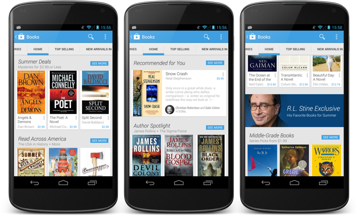
This is the main landing page for the books section in the Play store. Here you can see item collections (such as Summer Deals) represented by a single row of three cards, a personalized collection (Recommended for You) with a single card and an edge-to-edge banner that links to an editorial collection. The Summer Deals cluster is the first example of micro-level responsiveness. When the book title can fit on a single line, the book author is displayed on the second line, while the price always stays in the bottom-right corner. As the author moves to its own separate line, it can span the entire width of the card (3rd book), whereas if it’s on the same line as the price, it gets cut off to prevent content overlap (2nd book).
A second, and much more fundamental example of responsiveness is the Recommended for You cluster that has only a single card. Here our backend indicates that it’s not a collection of books created by our content people. It is a collection of books where each book has a reason (or two) to be included. Specifically, “Snow Crash” has +1’s from two people in my circles. This signal elevates the importance of the item in the stream, and we switch to a more prominent visual representation of the content. Not only we show the title, author, cover and price, but we also show the reason itself, as well as a few lines of the book description in the rest of the space.
Not all signals are created equal. A recommendation based on the +1’s from my social circles is not the same as a recommendation from top / popular lists. One is not necessarily better than the other – as you interact with the stream itself, dismissing recommendations or buying items, that information can be fed into the backend algorithms to tweak the content to each individual user, elevating content based on the signals that are most appropriate for this user. On the client side, this elevation is reflected by displaying more information about the specific item.
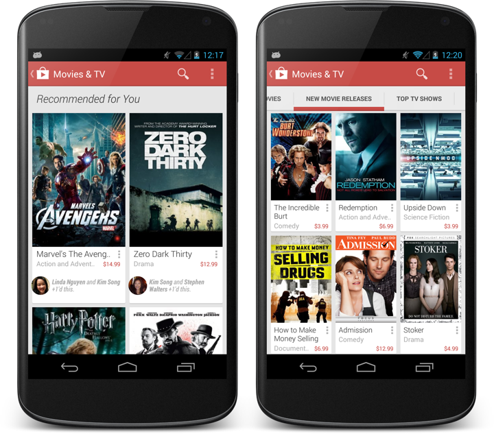
Switching between different card layouts is not confined to individual sections – it can also be applied to the full stream as shown above. On right, New movie releases are shown in a three-column layout of mini cards. On left, the full Recommended for You stream uses a two-column layout that allows displaying individual reasons for each item.

The stream is flexible enough to mix three-column and two-column card clusters, based on the content within each section.
Now let’s take a step back and look at what can we do at a slightly higher level – showing the same content on devices of different screen sizes and how the card clusters adapt – or respond, if you will – to such transitions.
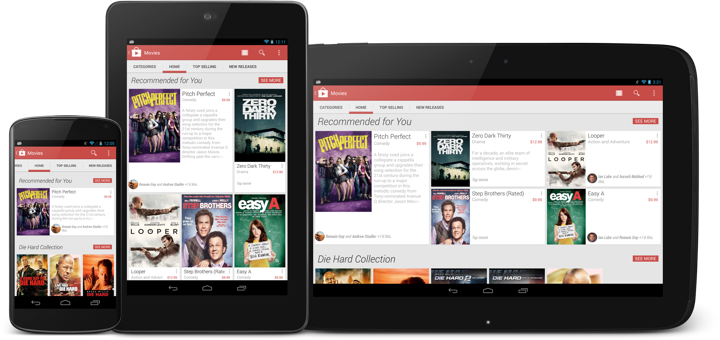
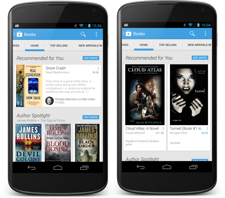
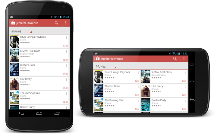
This is the same Recommended for You collection on three devices – portrait Nexus 4, portrait Nexus 7 and landscape Nexus 10. As the screen size grows, so does the number of columns and the number of cards shown in the cluster. The data is the same, but the visual representation of it is different. We go from a single item on Nexus 4 to 5 items on Nexus 7 and Nexus 10 (arranged in different templates for the last two). Note how the cluster arrangement visually promotes the very first item in the collection (with larger cover and more space available for the description).
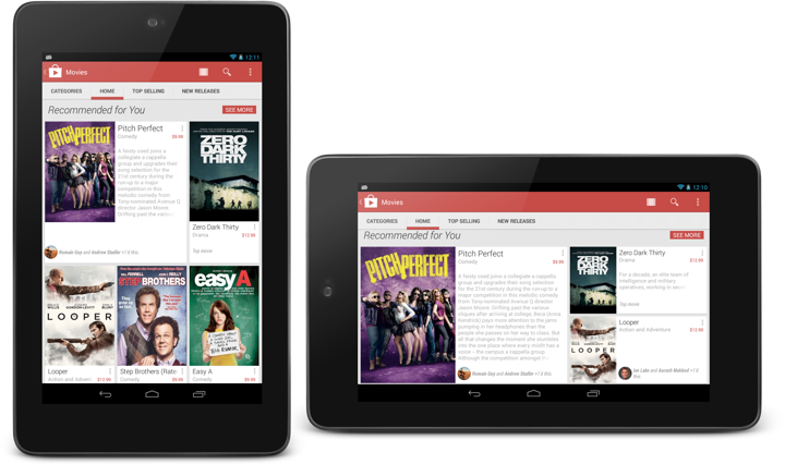
Now the same collection on the same device – Nexus 7 – in portrait and landscape orientation. We switch from three columns and five items to five columns and only three items. The main reason here is that we aim to limit each cluster to the confines of a single screen-sized area. As such, we switch from two card rows in portrait to only one card tow in landscape.
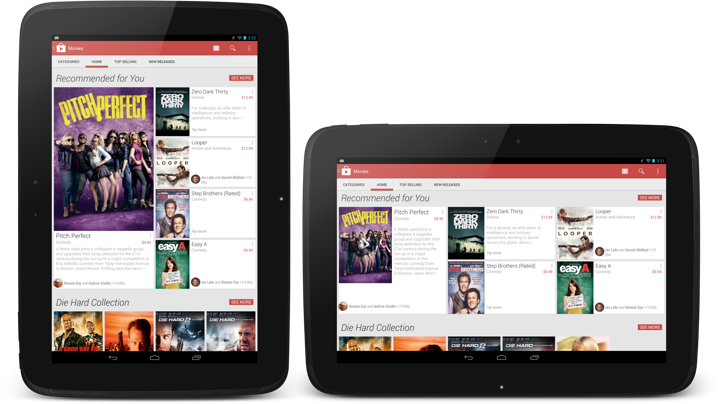
And this is the same collection on Nexus 10 – in portrait and landscape. And yet again the representation of the content responds to the current device configuration – going from a 4-column cluster with one very large card and four smaller ones to a 6-column cluster with one medium-sized card and the same four smaller ones.
An important point to repeat here is that the cluster template (layout of the cards within the specific section) is chosen not only based on the device width, but also on the device height. And so, while portrait Nexus 7 and landscape Nexus 4 use the same number of columns (three), the templates are quite different, as we can fit more content vertically on a portrait Nexus 7. Then, as the template is chosen, we go back into adapting the item presentation based on the specific card – how big the cover is, how big the font for the title is, how many lines of title to show, where to display the reasons (if present), whether to display the item description, etc.
The design is full of these decisions – what to respond to, and how to respond to it. Are we responding to the screen size, are we responding to the specific bits of data, what do we do when we don’t have enough screen estate to show all pieces of data?
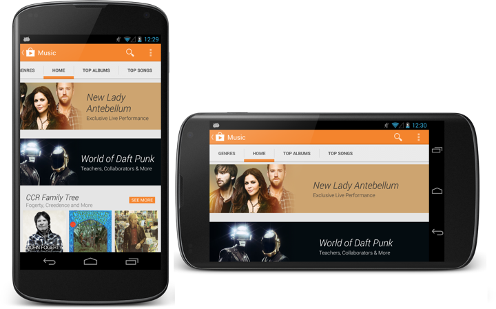
This is another example of such responsiveness. The two banners (Lady Antebellum and Daft Punk) are not static images as they were in the previous Play store design. Instead, they are defined by the main image, background fill color, collection title and collection subtitle. At runtime these elements are combined together into a single unit, and the layout of that unit depends on (or responds to) the device size and orientation. If the title needs to go to two lines, it will go to two lines. If the title needs to go to three lines, the entire banner will grow vertically. Then, the title and subtitle are treated as a single unit (that has its inner content left-aligned) which is center-aligned in the space to the right of the image (take a look at the horizontal alignment in the right screen). Finally, the main image itself is displayed in a way that does not take too much width on portrait phones. Compare how much of the Lady Antebellum image is visible in portrait vs. landscape – and how the main interest point of that image is anchored to the same relative point in the overall banner structure.
The store app (and all Play apps in general) are full of these decisions that permeate every level of logical and visual hierarchy – such as switching to two-column layout on search results when we have enough space to do so.
Responsiveness is not something that you add as an afterthought. It needs time and patience to understand and distill. It needs time and patience to introduce to all levels of your design. And, when done properly, it shows respect to your user. Respect to her choice of device and respect to her choice of how to interact with it.
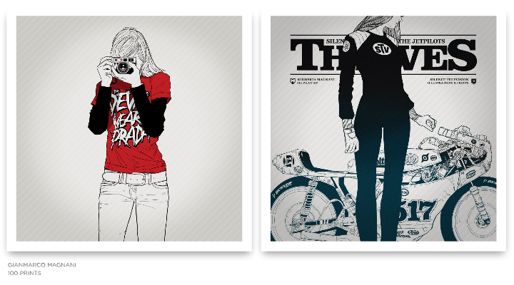
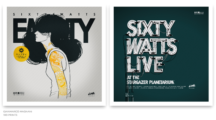
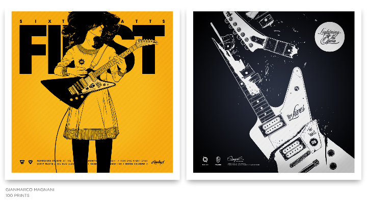
Strikingly beautiful compositions of simple lines and complex structures highlighted by limited color palettes and bold typography. Welcome to the world of Gianmarco Magnani (or M for short). In this interview he talks about his early influences, finding his own style and working on two large-scale projects, “100 Prints” and “Sixty Watts”.
 Kirill: Tell us about yourself and how you started in the field.
M: I studied graphic design but I focused my attention as an illustrator. I love books but I’m not one of people who read a lot. I love everything about design and I love to be involved in projects and art direction. I have always been drawing since I was a child, so I think that in some way I’ve always been in the field.
Kirill: Why did you decide to move from animation and video to illustration?
M: When I was in college I was completely focused on animation and everything related to the screen. Then I started working as an animator for different clients, as well as on some personal projects. At the very beginning everything looks great but then I started to see that developing a great product took a lot of my time, and required to have a team to work with. Then you add up all those things about screen resolution, plugins, or any other technical issue that changes under you every six months. So I decided to think about something more simple technically, something that it won’t change so quickly and also something something that I really would want to do.
I always loved everything about drawing, so I made some explorations being an illustrator and the things went really great.
Kirill: What informs and shapes your taste and style?
M: It was the 80’s. I was around eight years old, and we didn’t have Internet, computers, phones or even 150 channels on the TV. Communication was very limited, but I had an opportunity to be involved with things that came from Japan. It was really hard to come by things like that in those days, and for me they were the first design references. A good friend of mine who traveled from time to time to Japan gave me some VHS tapes with TV shows from Tokyo, a lot of Japanese magazines and some action figures as well. I couldn’t understand anything of what I was seeing, but all those images, icons, packagings, booklets and texts were very attractive to my eye.
I’m really sure I’m going to keep those references always in my work and in my mind. I’m also very influenced and very interested in books about graphic design and identity. And there is a recurrent interest about designs made in Germany in every field, and also some interest on the Scandinavian style.
Kirill: The human figures in your illustrations have deceptively simple yet skillfully accurate outlines. How do you distill the multiple facets of the body language into a single silhouette?
M: I realize that my work is composed with just lines with no shades or depths, so I tried to keep working in that style.
At the beginning I tried to do my work in different styles using shades or grayscale palette, but it didn’t look natural, so I came up with my own simple line style and tried to learn a lot of things. For example, I looked at the composition of vintage comics and manga, how they were composed just with black ink and how they didn’t need anything else besides that. I understood that I have to use just the things the work needs and nothing else. Right now I always try to have that in mind when I start every single project.
Kirill: It is often said that the eyes are the window to the soul, and yet you go to great lengths to hide them or crop them altogether. Why?
M: One of the things I always keep in mind is the hint / insinuation in my work. When I studied photography I learned about the difference between showing a complete scene and just a part of it. I understood that if I have just a part of an idea, the viewer begins to imagine and complete the idea in his mind. On the other hand, if I show a complete idea and totally describe it, the imagination of the viewer simply disappears. So in my work I prefer to have at least one window closed.

Kirill: Your latest works has moved away from using multiple colors, employing pure black with one or two accent colors. Is this a self-imposed constraint to push yourself into exploring and refining your style?
M: When I started my first project called “100 Prints” I decided to start all over again. So I worked for a year trying to have a good balance between my style and all my interests.
I chose the same square format for all my pieces, defined the line style, worked on the technique and kept the color scheme very simple.
I think that in my work the black ink always defines the main structure of the composition. On the other hand, color, in some cases, just says where do you have to see, and in other cases it provides a good balance.
I also think that greatest designs have always been composed just by the simplicity, so I would like to work – or try – to make the things that way.
Kirill: And then, on the other hand, you have these intricately layered complexity of musical instruments and motor vehicles. Is the goal to provide a counter-balance to that perceived simplicity?
M: Yes, maybe is a good contrast and balance between both elements.
Kirill: How do you work with type? Do you design your own fonts, or adopt and adapt existing ones?
M: I love to work with type. Right now I can’t imagine my work without headers or texts around other elements.
Sometimes I create my own, or adapt existing ones. For example, when I have to create a logotype or something next to an icon, almost every Print I use existing typefaces. I also keep in mind that in my work words do not necessary need to be read. For me words also need to be seen. For example, the header on the Print Nº019 doesn’t mean anything, it just looks good.
Kirill: On average, how much time do you spend on a single illustration, and where does that time go?
M: When I make an illustration it depends on the complexity or how much detail it has. It just takes time.
Things change a lot when I have to make a Print because it’s an entire composition between headers, icons, logotypes, color schemes, texts and all the those things around the main character.
In general it can take around a week or two working all day, but in some cases it can take more than a month. There are a lot of unreleased Prints and also an entire Series that I have worked on for months, and for some reason they are still incomplete, and from time to time I try to look at them and identify what they need.
Kirill: How much different the final illustration is from the initial concepts that you’re imagining in your head?
M: They change a lot, but I think it’s a positive feedback because it surprises me and sometimes gives me new ideas.
The problem is (and it happens a lot) when you have a great idea in your mind and you think about all the details for a while and then, when it’s on paper, it loses all that magic that is still in your head and you don’t know what happened. I’m pretty sure I’m not going to have anyone of my Prints complete at the first try, and if I think differently, I’m sure I wouldn’t have any of them.

Kirill: How do you preserve color fidelity for the printed media?
M: I try to use them in the simplest way. I try work using just one or two flat colors with no textures, complex gradients or any other effects.
Kirill: How does it feel to hold a physical print of one of your illustrations?
M: When I have the first copy of a Print, I always spend time to look at it and hang it on the wall. That moment really feels great, but after a few minutes of looking at it I start to think: let’s move this, and this, and this, and also this … but that part of the work and the process is also fantastic.
Kirill: You number all your prints, starting from Nº001. What’s the final goal?
M: I have always been interested in working on huge and long projects.
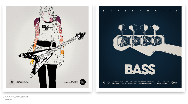
This project is about creating 100 Prints, divided in 25 Series composed of 4 Prints each. They are all created in the same square format with the same style and are numbered from Nº001 to Nº100, and at the end of the project I would like to publish a book.
I started with this project in 2010, and since then I don’t think about the upcoming Prints or Series. I’m sure that’s one of the reasons this project always keep my mind busy and every new Series is a surprise for me. I think I’m going to finish the last Print around 2016, but sometimes I think that it would be better to call it “200 Prints”.

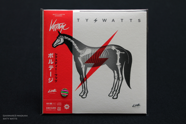
Kirill: “Sixty Watts” has a prominent place in this series, and a few months ago you’ve launched the companion site. And yet, there is no actual band. What is this experiment about?
M: “100 Prints” is divided into 25 Series. When I started the project I decided to create a theme for each Series. When I thought about creating a Series about music, I started thinking about a rock band, but I didn’t want to make designs for any existing band. So I created a band called “Sixty Watts”. At that moment it was just a Series composed of 4 Prints and nothing more. I needed a band and I needed a name, so I came up with something that had a good phonetic sound and also had a very symmetric number of letters for each word.
I published that Series called “Sixty Watts” and a few weeks later I read a post on some French blog about my work and that specific Print. The post said something like: “it’s a Series about a rock band called Sixty Watts, but don’t try to search for the music because it doesn’t exist”.
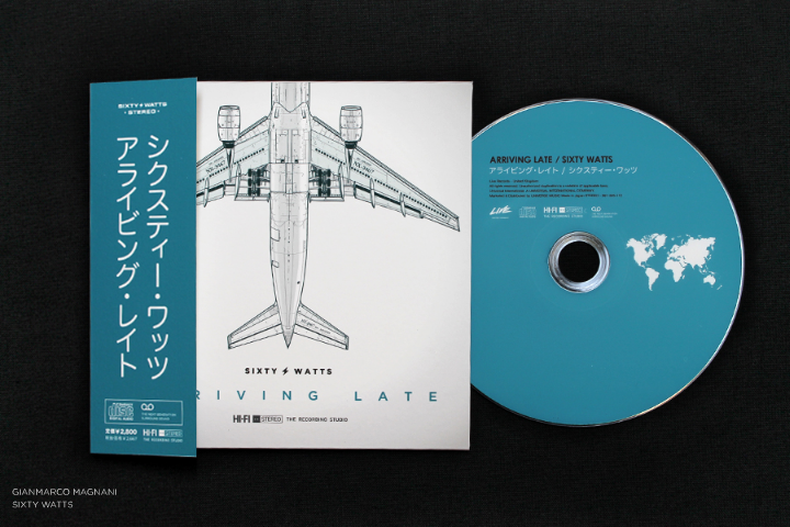

So at that moment it made sense for that Series to start a new project. It sounded like an interesting idea, with a great opportunity to design everything about a rock band – the discography, the posters, the album covers, the instruments and all those kinds of things.
I started researching some great rock bands. I also bought a lot of things just to know how to design the packaging, how to compose the tour posters, all the logotypes or icons included in each piece, how to create an album, a single, the Japanese versions, an LP and things like that. It was very exciting and I had a lot of ideas in my head.
I always wanted to be in charge of art direction for a rock band campaign, album or tour, and I never thought that if the opportunity never comes I can invent it. So I decided to create my own rock band.
When I started the process I thought several times how ridiculous such an idea might sound like, but then I started thinking about it as being “different”. That’s why I continued with the project and published it, and I am still working on new illustrations and also on an upcoming new album.
This project makes a lot of sense for me when I think about the moment when someone looks at an album cover for the very first, and without listening to the music what kinds of ideas come to your mind. Your imagination start creating a complete story, and if you want it, it can be endless.
Kirill: What do you do when you run out of ideas and get stuck?
M: I talk to my wife.
Kirill: What’s the best thing about being an illustrator?
M: That I love what I do.

And here I’d like to thank Gianmarco Magnani for this interview. You can find more of his work at his main portfolio, as well as the companion “Sixty Watts” site. All the Prints are available for sale, and you can follow him on Facebook and Twitter.
