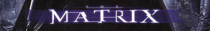
Back in the olden days of 1999 it was pretty much the only movie that I watched in the theaters. In pre-digital days it took a few months for a movie to complete its theatrical rollout across the globe, and once it got into theaters, it stayed for much longer than it does these days. Such was the story of “The Matrix” for me. It stayed in local theaters for at least six months, and I was a single guy with not much to do in the evening after work. So every week, at least twice a week, I would go to watch it again. And again. And again. It’s quite unlikely, in fact, that there’s ever going to be a movie that I’ll watch more times than I’ve watched “The Matrix”.
Back in those olden days, people didn’t wake up to write a new Javascript library. People woke up to write a Matrix rain screensaver. Those would be the mirrored half-width kanas, as well as Latin characters and arabic numerals.
A few years later, “Matrix: Reloaded” came out, taking the binary rain into the third dimension as the glyphs were sliding down multiple virtual sheets of glass. And I finally decided to dip my toes into the world of making my own Matrix rain screensaver, complete with many of the visual effects that were seen in that movie. There’s a bunch of old code that I’ve uploaded as an historical artifact right here. Fair warning – this was 13 years ago, and as many do when they first start out, I reimplemented a bunch of stuff that was already there in the JDK. If you dive into the code, you’ll see a home grown implementation of a linked list, as well as a rather gnarly monstrosity that exposed something that resembled a canvas / graphics API. Don’t judge me. Anyhoo, on to the topic of this post.
One of the things I’ve wanted to do in that screensaver was to take a string as input and render it in the style of Matrix titles:
In here, every glyph undergoes one or more transformations (cropping, displacement, segment duplication). In addition, there are connectors that link glyphs together. It is these connectors that I’m going to talk about. Or, more precisely, how can you come up with the “best” way to connect the glyphs of any input string, and what makes a particular connector chain the “best” chain for that string?

This image captures the “essence” of quantifying the quality of a connector. In the title sequence of the original movie, as well as the sequels, the connectors are only placed at three vertical positions – top, middle and bottom. That is the starting point of this diagram. In addition, there are the following factors at the level of an individual glyph:
- On the scale from 1 to 5, how far the connector would have to go “into” the glyph to connect to the closest pixel? So, the bottom part of A gets 5’s on both sides, and the top part gets 2’s on both sides. The middle part of J gets 0 on the left (as the connector would have to “travel” across the entire glyph) and 4 on the right (as the connector would need to go past the rightmost point of the top serif).
- Defining a “natural” connection point to be (in the diagram above green marks such a point while red signifies that the point is not natural):
- Anything on top and bottom – this is an escape valve that would make sure that any input string has at least one connector chain
- Serifs in the middle – such as the right side of G
- Crossbars in the middle, extending to both sides of the glyph – such as A, B or R.
Then, a valid connector chain would be defined as:
- No two consecutive connectors can be placed at the same vertical position. In the example of the original title, the connector chain is top-bottom-middle-bottom-top.
- A connector must have positive (non-zero) value on both sides. For example, you can’t connect A and J in the middle because the left side of J places value 0 on the middle position.
- A connector must have at least one natural connection point. For example, N and O can’t be connected in the middle, while N and P can (as P’s left side defines the middle position as a natural connection point)
Finally, the overall “quality” of the entire connector chain is computed as:
- The sum of connection point values along both sides of each connector
- Weighed by the chi-square value of the connector vertical positions along the entire chain
- Weighed by the mean probability of the connector vertical positions along the entire chain
The last two factors aim to “favor” chains that look “random”. For example, there is not much randomness in a top-bottom-top-bottom-top-bottom chain. You want to have a bit of variety and “noise” in a chain so that it doesn’t look explicitly constructed, so to speak. As can be seen in the diagram above, the middle vertical position is not a natural connection point for a lot of glyphs, and both of these factors aim to bring a well-distributed usage of all vertical position into the mix.
It is true that the basic underlying rules of defining how a glyph connector chain is constructed are based on the visuals of the Matrix movie titles. You might think of this as the basic rules of physics that apply to the particular universe. However, the evaluation of a specific constructed chain is a softer framework, so to speak. There is nothing explicit in these rules that would force the quality score of the particular connector chain that you see in the final graphics for these particular six letters to be the highest of all valid chains.
When I first ran the finished implementation, it was one of those rare moments of pure, unadulterated geek joy:

These are all possible valid connector chains for the word “MATRIX”, ordered by the quality score that is based on values of individual connector points, as well as statistical variation that accounts for predictability and randomization within a specific sequence. Yes, the top score goes to the sequence that was used in the movie title!
Let’s look at “RELOADED” next:
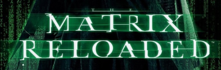
And these are the top 39 valid connector chains for that word:

While my algorithm found the perfect match for “MATRIX” connector chain, the connector chain that was used in the movie for “RELOADED” is scored at place #37. You can see where it falls flat – in the top connector between L and O. The score value for top connector on the right side of L is 1 out of 5, and while the score value for top connector on the left side of O is 5 out of 5, that drastically lowers the overall score. In addition, the last four connectors are bottom-middle-bottom-middle which lowers the median probability factor applied to the entire quality score of this chain.
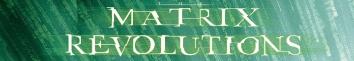
The connector chain selected by the third movie for the word “REVOLUTIONS” is not considered a valid one based on the rules that I chose after “Reloaded” was out. Specifically, the middle connector between U and T is not valid, as there is neither a serif not a crossbar in these two glyphs. And the same applies to the middle connector between I and O.

Finally, the “ANIMATRIX” title deviates slightly in the “MATRIX” part, using middle connector placement between M and A. How did my algorithm fair on scoring this chain?

This was a close one. The connector chain used in the movie title scores at the second place, with the only difference being in the very first connector (top instead of middle).
It’s hard to quantify artistic choices, and I don’t presume to claim that the top-scored connector chain for “RELOADED” based on the rules of my algorithm is clearly superior to what ended up in the actual movie titles. Would it be worth to tweak the scoring system? I don’t think so. There are a couple of noticeable “weak” connectors in the connector chain in the movie title, and relaxing the scoring rules would only introduce more randomness into the process without necessarily bumping up that chain up the ranks.
Perhaps the artistic choice of choosing a long top L to O connector was based on introducing a bit of variance and randomness into the mix. Or perhaps I should check to see who was in charge of the title graphics and ask them :)
Today is the day a bunch of my long-running Swing projects get officially back to life. If you’ve missed the previous post from late last year, those of you who are still in business of writing Swing applications might be interested to take a look at the latest releases of Substance, Flamingo and Trident.
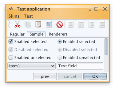
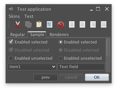
Substance is a versatile, extensible and fast look-and-feel that brings a wide variety of lovingly tailored skins, as well as quite a few behavior augmentations to Swing applications. The major themes of release 7.0 (code-named Uruguay) are support for high DPI monitors, reduction of visual noise and improved visual consistency across all core skins.
Substance 7.0 also has three new skins. The first one is Cerulean skin which was part of the Insubstantial fork that was maintained by Danno Ferrin:
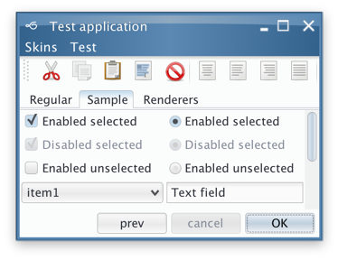
The other two were added to the Graphite family. The first one is Graphite Gold that uses gold highlights on active elements:

The second is Graphite Chalk that has increased contrast on all UI elements:
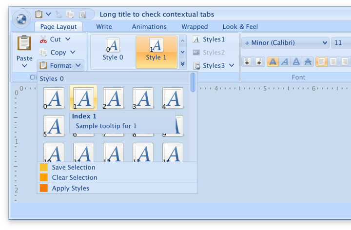
Flamingo is a component suite that provides a Swing implementation of the Office 2007 ribbon container and related components. All Flamingo components have been streamlined to look well under Substance skins, including full high DPI support. Flamingo’s latest release is 5.1 code-named Jileen:
Finally, Trident is the animation library that powers all the animation in both Substance and Flamingo. As this library does not have any user-facing features that directly touch pixels, there is no new functionality in this release. Much has changed since the last time I’ve worked on Trident, and the time has come to remove built-in support for both SWT and Android. With release 1.4 (code-named Enchanted) Swing is the only UI toolkit supported out of the box.
What is next for these libraries?
As the title of this post suggests, I am planning to do two releases a year. What is on that roadmap? I’m not going to make any strong commitments, but these are the rough areas for the next few releases:
- There once was time where I’ve hoped that other look-and-feels would adopt some of the pieces of Substance. That time is long gone, and splitting the functionality across multiple pieces is just overhead. The relevant functionality from both laf-plugin and laf-widget projects is going to be folded back into the Substance code base.
- It is highly likely that I’m going to move Substance away from “seamless” discovery of plugins based on classloader magic. For example, if you’re using Flamingo in your application, you will need to declare an explicit plugin initialization along with setting Substance as your look-and-feel.
- Speaking of Flamingo, I’m going to focus exclusively on how those components look and behave under Substance. Third party look-and-feels are not what they used to be. It’s just not worth my time any more.
- Having said that, there’s much work to be done in Flamingo to provide full support for high DPI monitors. This is the place to follow that work.
So, if you still find yourself writing Swing applications, I’d love for you to give the latest release wave a try. You can find the downloads in the /drop folder of the matching Github repositories. All of them require Java 8 to build and run.
See the recent follow-up on the changes to the font family name on Catalina and changes needed at the JRE level to support proper kerning.
Starting from OS X El Capitan (10.11), there’s a new default system font in town – San Francisco. And it came with a very big underlying change, as detailed by Craig Hockenberry:
Apple has started abstracting the idea of a system font: it doesn’t have a publicly exposed name. They’ve also stated that any private names are subject to change. These private names all begin with a period: the Ultralight face for San Francisco is named “.SFNSDisplay-Ultralight”. To determine this name, you need to dig around in the font instances returned by NSFont or UIFont; it’s not easy by design.
The motivation for this abstraction is so the operating system can make better choices on which face to use at a given weight. Apple is also working on font features, such as selectable “6” and “9” glyphs or non-monospaced numbers. It’s my guess that they’d like to bring these features to the web, as well.
Even though the underlying .otf files are still in /System/Library/Fonts, San Francisco is no longer exposed via the regular APIs that web and desktop developers have grown used to. Specifically for Swing developers (of which there may not be many, so at some point it will kind of take care of itself), passing “San Francisco” to the Font constructor ends up using the previous default – Lucida Grande.
JavaFX is already doing the right thing, using San Francisco as the default UI font on El Capitan and Sierra. Swing’s legacy is to have each look-and-feel decide which font to use, and I was expecting the “System” look-and-feel which maps to Aqua to be using the right font family on the latest OS releases. That is not the case as I’m writing this entry, and Swing apps on both El Capitan and Sierra are still using Lucida Grande on both 8u112 and 9-ea.
Last week Phil Race pointed me to this issue that tracked syncing up the internal implementation details of glyph mapping between JavaFX and AWT. That issue has been fixed in early access builds of JDK 9, and is slated to be available in JDK 8 u152 scheduled for October 2017. At the present moment there is no public API to get either a name or a font instance itself that will be mapped to Lucida Grande on 10.10 and earlier, and to San Francisco on 10.11 and 10.12. The only available solution is quite brittle as it depends on the internal naming conventions exposed by the underlying OS:
- .Helvetica Neue DeskInterface on El Capitan (10.11)
- .SF NS Text on Sierra (10.12)
Note that you need a leading dot in both cases, and that this only works on early access builds of JDK 9 at the moment:
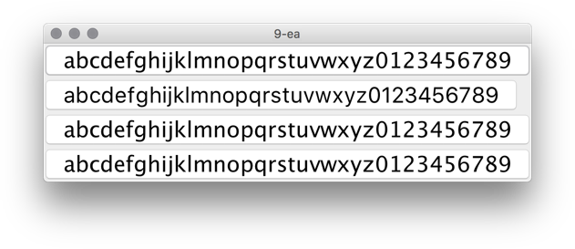
In this screenshot the second button is using new Font(“.SF NS Text”, Font.PLAIN, 24) while the rest are rendered with Lucida Grande. The most noticeable differences are in the curvy strokes of “e”, “g”, “5” and “9”, as well as the straight leg of “a”.
Ideally, there’d be an officially supported way to use the right font on OS X / macOS, either in a form on some kind of a static Font API or a synthetic font family that maps to the underlying system font on all supported platforms. Phil has filed a bug to track the progress on that front.
Sometimes, as my laptop’s fans kick in during a particularly long build, I find myself gazing away from the screen, letting my eyes roam around my desk, losing their focus and slipping into daydreaming.
I find myself thinking about how, just twenty short years ago, one of the obviously expected cables sneaking their way into one of the oversized ports was the bulky Ethernet monstrosity. I think about how seamless and pervasive WiFi has become in my daily life, and how unremarkably smooth that transition has been. Unlike, say, a variety of clunkily unreliable wireless keyboards and mice that I’ve tried over the years. Every laptop that I’ve had in the last decade, at work and at home, always had a wonderfully ungainly cable snaking around, connected to my trusty companion, a two-button mouse. As unremarkable and as ever-present as its eponymous rodent friend.
Despite the soothingly persistent promises of all-day battery life, if I don’t plug my laptop into a nearby power outlet, it can barely plow through playing a two hour 1080p movie. Or doing about an hour of edit-compile-deploy-debug cycles. Or pretty much anything that is not browsing Craigslist. And sometimes, you have to use the right power adapter because some of them do not give you enough juice to even keep up with those long build breaks that happen every now and then. I don’t know if I should laugh or cry. Or maybe both at the same time. So there’s another, slightly less ungainly cable, snaking around. They say color white elevates any hardware design. So I guess it has to be not as ungainly.
I once lost about half a day trying to configure a wireless printer to actually behave as it so boldly promised on its box. To be wireless. It’s there now, in my basement. Snaking around yet another ungainly cable into my laptop. Actually strike that. There are not even enough ports in my laptop for that. So now there’s a box that sits right next to my laptop, with Tron-esque blue LED lights for each plugged cable that indicate that yes, everything that is connected is indeed that. Connected.
If Bluetooth were running in 2016 presidential elections in US, it might prove a very formidable post-truth opponent to our president elect. This time is for real, the working group promises me every time they release a new major version of their spec. This time is for real, whispers the little ghost that calls itself the desktop variant of Linux. Wait, is this for real, whispers Leonardo Di Caprio hearing his name at 2016 Oscars. So there goes another cable sneaking into my laptop, pumping the soothing melodies of Americana folk into my ears.
I watch yet another futuristic video from yet another company that decided to spend some money on exploring the wild. Every surface is screen. Every surface is input. People are congregating around tables, playing some kind of air hockey with rectangles of data. It looks like they are having fun. At work. How rude.
And I find myself daydreaming. That I come to work and I don’t need to wave my badge to tell the system that it’s me. Because when I come back home, my kids know that it’s me. Without me typing in my 20-character long password with at least three special characters in the middle and then telling them some random piece of secret information. So random that you would probably be able to find it in five minutes or so if you knew where to look on one of the social networks.
I daydream that anything I place on my desk gets charged without me having to put it in just the right spot and then do mental gymnastics on what’s the next piece of hardware that gets to be charged to make it through the day. I daydream that I don’t have a single cable on my desk. Around my desk. Or under my desk. I daydream that if the mythical they were able to do that to the network and make it almost as reliable as the slowly dying landline phone network, they can surely do that to the rest of the things that make a computer what it is today. This time is for real, whisper the shadow apparitions from the just-concluded CES.
I daydream of watching a sci-fi movie with an iPod, a phone and an Internet communicator that doesn’t show any signal strength indicator or any battery indicator. Because those are always on and at full value. Because it gets boring after a while to see that your signal is at five bars and your battery is at 100%. Wouldn’t that be something? When something becomes so ubiquitous that you tell these stories to your kids and they roll their eyes and say, sure pops, you stood in a line for two hours just to buy ten rolls of toilet paper. But wait, I tell them, that was actually a thing. Sometimes you joined a line and waited without knowing what was on the other side. Because that’s what you do. Sure pops, they say.
And then the silence settles in. The fans are not spinning anymore. The build is done. I should probably get back to work. I gaze at the cables. They have been my people for a long time now. I have boxes of them in my basement office. I never throw away a cable. You never know when you might need one. You never know.
