Release candidates 2018.H1
Going with the new biannual release cycle of my Swing projects, it’s time to do the release candidates for the latest iterations.
The first major pillar for Substance 8.0 (code-named Wyoming) is Project Cerebrum – unified API surface. The API surface for controlling the visual appearance and behavior of various parts of Substance has grown organically over the years. Part of this growth process has been experimenting with various ways to express this control, from client properties to VM flags to APIs on a number of classes.
Starting with 8.0, the only officially supported entry point into configuring the behavior of Substance-powered UIs and for querying the state of such UIs is via the org.pushingpixels.substance.api.SubstanceCortex class. The API surface of this class is broken into a number of scopes, with every scope applying at the specific granularity level of control
The second major pillar is Project Visor – configurable and custom title pane content. It provides a number of APIs to configure the layout in and around the title pane area of application windows. SubstanceCortex.GlobalScope.configureTitleContentGravity is the API to globally configure the gravity (edge alignment) of title pane content – title text, control buttons (minimize, maximize, close) and app icon.
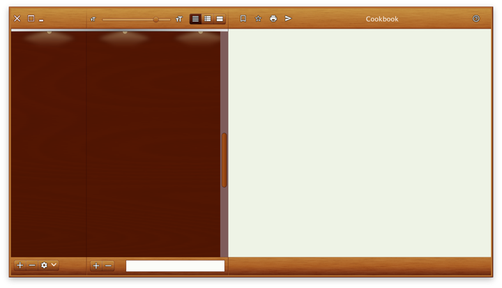
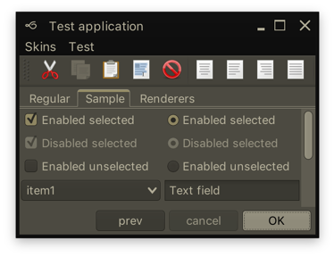
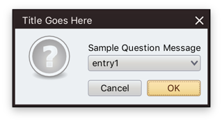
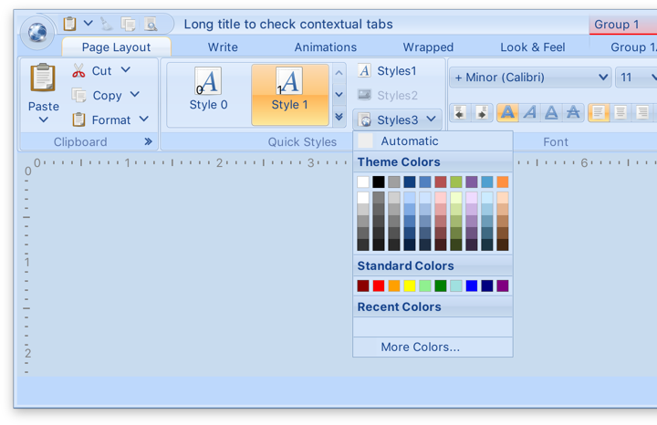
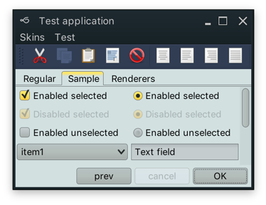
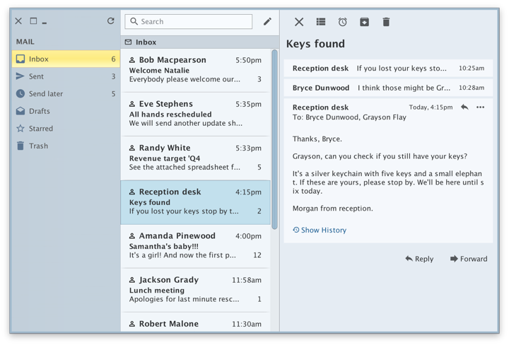
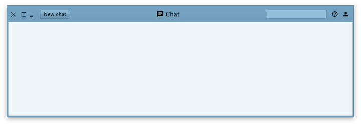
The following APIs on the SubstanceCortex.WindowScope scope allow apps to extend the main content view into the title pane area – as can be seen in all the screenshots in this post:
extendContentIntoTitlePane(Window, SubstanceSlices.HorizontalGravity, SubstanceSlices.VerticalGravity)to marks the specified window to have its content extend vertically into the title pane area.getTitlePaneControlInsets(Window)to query the insets that should be reserved for the main control buttons – close / maximize / minimize.setPreferredTitlePaneHeight(Window, int)to increase the preferred height of the title pane area in case the content you extend into that area is taller than the main control buttons.createTitlePaneControlButton(Window)to get a button that has consistent visual appearance and preferred size with the main control buttons.
Calling JFrame.setDefaultLookAndFeelDecorated(true) on the specific window is the mandatory pre-requisite to be extend the window content into the title pane area with SubstanceCortex.WindowScope.extendContentIntoTitlePane API. See the skeleton demo apps for sample code on how to use these APIs.
The third major pillar is Project Corpora. Up until version 8.0, Substance used to depend on laf-plugin and laf-widget. Those two projects were envisioned when the landscape of third party look-and-feels in particular, and Swing in general, was more vibrant. The goal was:
- For
laf-pluginto provide a common mechanism for specifying look-and-feel plugins for components libraries - For
laf-widgetto provide a collection of widgets that enhance the visual appearance and behavior of specific Swing components
The functionality of these two projects has now been folded into the main Substance codebase. The APIs for configuring animations and widgets are now part of the SubstanceCortex class
In addition, Substance 8.0 comes with:
- Consistent package names for public APIs
- Removed automatic discovery of Substance plugins (that could be used for injecting unintended behaviors into Swing apps powered by Substance)
- Switch to Material icons for built-in components
- Support for icon packs
- Better support for fractional desktop scaling factors
Full release notes for Substance 8.0 are available here.
The biggest change in Flamingo 5.3 (code-named Liadan) is separating the non-core functionality into two new projects:
- Ibis has the code for using vector-based icons in Swing apps. It supports offline transcoding of SVG content into Java2D-powered classes, as well as dynamic display of SVG content at runtime (powered by the latest version of Apache Batik)
- Spoonbill has the code for browsing SVN repositories with the
JBreadcrumbBarcomponent from the core Flamingo project. Future plans include extending this functionality to GitHub repositories as well.
If you’re in the business of writing Swing desktop applications, I’d love for you to take the latest release candidates of Substance and Flamingo for a spin. You can find the downloads in the /drop folders of the matching Github repositories. All of them require Java 8 to build and run. The final releases are scheduled to happen in two weeks’ time, on the week of March 11th.