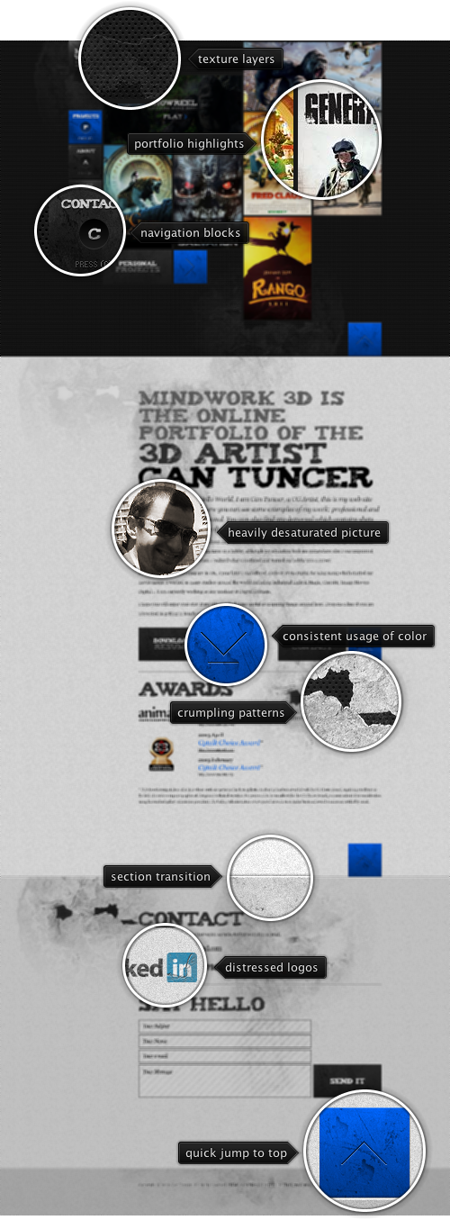
Today’s post highlights the design of MindWork3D.com by The Core Units and Goksel Eryigit for Can Tuncer. The portfolio section above the fold sets the visual tone for the rest of this single-page site. Breaking away from a traditional grid, the portfolio thumbnails are arranged across cells with different weights and sizes, while still using the same underlying “cell square unit”. The navigation controls along the left edge of this section, as well as the bright blue arrow button further anchor this underlying unit and lay out the visual foundation for the following sections. Each portfolio thumbnail has an attractive rollover effect, and once activated, opens an overlay lightbox with slideshows of the specific work.
Scrolling down the page reveals that the navigation controls are anchored to the browser viewport. The buttons highlight as you scroll to the matching section (with a rather jarring “skip” over the “Blog” button that leads to an external site). Each button has its unique distressed texture, while still reusing similar underlying brushes; note the helpful shortcuts embedded in each button that provide quick info on navigating the sections with the keyboard. An extra amount of attention went into vertically aligning the buttons when the content is scrolled all the way up; however, the perceived bottom edge of the last button does not perfectly align with the matching edge of the portfolio row due to extra drop shadows.
Each subsequent section has its own combination of the main underlying elements – distressed textures, monochrome grayscale palette with sky blue highlights, large uneven serifs for section headers. Carefully aligned large square buttons in the bottom right corner of every section help balancing out the large swaths of textures; my favorite texture element here is the hexadot pattern of the portfolio section trying to “break in”, peeling away the crumbling whitewash texture. Overall, the design is a great match to the visual style of Can’s CG work.
P.J Onori on the difference between native and browser apps in his excellent “The Materials of Digital Products“:
There is a reason why we do not see highly refined and precise parts made out of most plastics. This does not negate the usefulness of such a material, but it has its specific uses. Similarly, certain technologies are more suited to precision crafting but often times have greater costs associated with them. A perfect example is developing for the mobile platform. A native iOS app will allow for much greater refinement in performance, motion and visual treatment, but there will likely be greater build costs compared to an HTML5 mobile app. Conversely, HTML5 will allow much greater flexibility in deployment and distribution. Both technologies have their place in mobile, we just need to know when plastic is more appropriate than stainless steel.
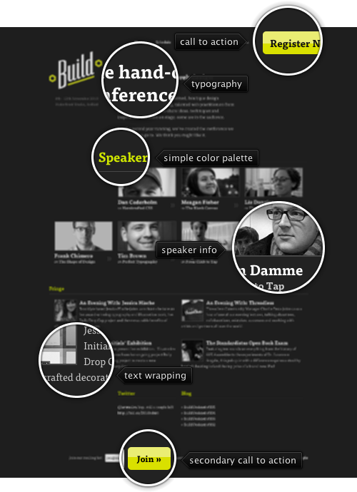
 Today’s build highlights the design of 2010.BuildConf.com by Andy McMillan (@goodonpaper). After reviewing the sites for HDLive 2010 and dConstruct 2010, it’s time for another designer conference site. This design combines a simple color palette and nicely balanced grid to highlight the conference speakers and extra material.
Spare appearance of lime green for section headers and hyperlink rollovers allows using it to draw attention to two action buttons – one if the header and another in the footer. The content is laid out in a four-column grid, with different sections switching to different column spans. Note how the first row of the speaker thumbnails is “missing” the first cell – to balance out the heavy logo just above it; this creates a “content diagonal” that goes from the top left to bottom right. A counter diagonal that connects the action buttons in the header and footer sections brings the balance back to center. The last two sections feel a little off in this regard – with awkward content in the twitter / blog section, an extra wide separator below the “Blog” caption, and off-grid positioning of the footer content. The entry headers in the “Fringe” sections lead to the full content, but are missing the muted double arrow icon found below the speaker thumbnails in the section above; it feels that the UX consistency would be worth a little bit of extra visual noise here.
Be sure to visit the “Workshops” and “Fringe” pages to see consistent application of the same principles throughout the rest of the site. This is quite commendable given how some designers spend a lot of time on the landing page at the expense of the rest of the site.

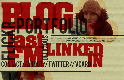
Today’s post highlights the design of OliverKavanagh.com. An instantly memorable landing page that uses overlapping – and sometimes rotated – slabs of extra large texts as navigation links. Note the secondary level of overlapping in the chunky red texts that use a font with a hint of serifs; combined with translucent dark gray color used for the other navigation entries results in an intricate typographical maze that frames the content in the top-right corner.
The texture and color treatment of Oliver’s headshot is my favorite part – note how the three overlapping circles bring out the coarse background texture, with burnt mahogany color deriving from paper yellow, cardboard orange and deep red of the surrounding elements. Moving the mouse over different parts of the page shows simple rollover effects that help understanding which part is active – this is especially helpful given large swaths of overlapping elements.
Finally, a small note on how well the design adapts to different browser window sizes. Just as in case of DesignWise, the actual implementation uses “pre-baked” images – one for each navigation element. While this ensures high-fidelity look, and the pixel-based CSS definitions maintain the exact overlap ratios, the design does not scale well when the browser window is resized – and overflows the right edge on even medium window sizes. It’s hard to say what can realistically be done to accommodate all possible window sizes, or even how far the current state of web typography and the latest CSS support can take designs that rely so heavily on precise typography and positioning.