 Today’s post highlights the design of BrentHarmann.com. The design is anchored by three main elements – an attractive vintage color palette, strong angular geometric lines and embedded Andes font that combines precise square angles, skewed cross strokes and frilly loops. Desaturated brown, magenta and blue are carefully balanced throughout the different sections, with colors switching between foreground, background and separator elements. Note the gradient and strike through effects on the main logo and the call-to-action “ribbon” buttons and attractive whitewash noise textures that bring a welcome relief to wide swaths of content in the main section that uses light brown for the background color. My favorite element here would be the contour effects on the “Portfolio” and “Learn More” ribbons – follow the interplay between inner and outer contours and the drop shadows. The usage of small size Andes on the blog posts dates is the only thing that i would question – there’s too much visual noise at this font size that destroys the beauty of this all-caps font; Myriad is perhaps a better match for the task at hand. On a more positive note, make sure to visit the “Contact” page and study the intricate “Send mail” graphic.
 Today’s post highlights the design of LisaLeonardoOnline.com by apRoberts Arts. The site has a nice soft feel that meshes well with the hand-crafted jewelry available for sale. Paper yellow, beige and feather blue are used for most of the elements, with heavy red highlighting three “action” items. Here, it’s rather disconcerting to discover the quite small clickable area in the big red ribbon – i’d expect the entire element to respond to the mouse click in order to maximize the desired effect.
On a more positive note, i like the mix of thin serif typewriter font, hand sketched lines, desaturated portrait thumbnails and patches of grainy background textures. The overall effect is reminiscent of vintage scrapbooks with the warm, unique and inviting appearance.
 Today’s post highlights the design of KyleMKramer.com by @MrKyleKramer. The landing page has a nice vertical symmetry that mirrors the beige and slate gray sections around the large orange strip that highlights the designer’s portfolio. Note the visual rhythm that switches between intricate textures and flat beige fills, great typography that mixes embedded fonts with image-based oversizes text sections, and the consistent usage of double separator lines with variable stroke width.
And this is what i particularly like about this site – picking a very few elements and employing them consistently everywhere. You can see this in the three-color palette and the way it is used for styling the social icons and switching between light and dark text colors in the header and footer sections. You can see this in the grainy texture used in the portfolio section and the two round orange badges. You can see this in the edge patterns of the portfolio section and the badges – with the same thick slightly depressed outer edge and the lighter dashed seam running along the inner edge. You can see it in the layout and font styles employed in the three poster-style text blurbs in the beige sections – with exactly the same color treatment, text effects and the styling of the separators. And finally, you can see it in the visual treatment of social icons and the “hobby” icons in the two bottom sections – outer shape, icon styling and rollover effects. And while i’m talking about the last icon strip – this is definitely a unique flavor to the “about me” section, with single line snippets on Kyle’s hobbies, all nicely packaged and neatly tucked away, with simple and yet very effective jquery-based toggle effects.
A couple of weeks ago i posted a few screenshots of Gowalla 3 app for the Android platform, and today i want to take a closer look at the great work done by Drew Yeaton (designer, @xeeton) and Philip McAllister (developer, @mcalliph).
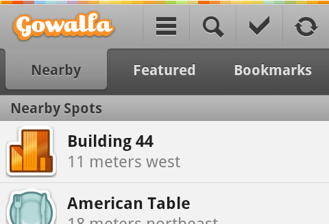
This screenshot illustrates the omnipresent header section. It starts with the thin rainbow strip that reinforces the web branding, transitioning into a combination of action bar and tab strip. Note how the single-pixel light gray separator just below the rainbow strip helps the transition from a full-color area into the predominantly monochrome section. Thin vertical icon lines fade away at the ends, providing just enough separation without too much visual noise. The icons themselves have a light halo offset one pixel to the bottom – this effect is mirrored on the text of selected tab. Together with the thin separator line mentioned above this establishes a consistent lighting model.
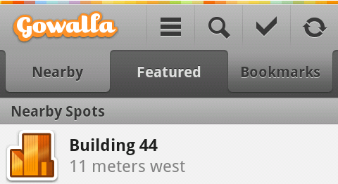
The selected tab has a nice subdued gradient that smoothly fades its fill into the action bar, with gradually darkening colors as it nears its bottom edge. Here, the design follows the same approach as taken by Safari 4.0 and Firefox 4.0 – both blend the currently selected tab into the address bar: Firefox downward and Safari upward. This is the right decision to make – while the header remains anchored to the top edge of the screen, the content is scrolled vertically below the tab strip; blending the selected tab into the content would have broken the visual continuity on both ends.
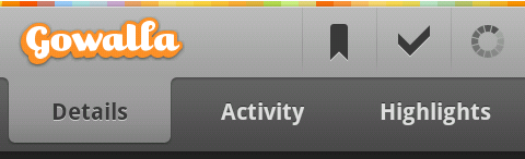
This screenshot shows the styling of pressed tabs. A pressed tab (bookmarks in this case) uses the same curvy contour as the selected one, with much darker gradient and the same color “flip” of the tab text.
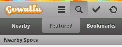
And here you can see the styling of a pressed action bar button. Note how the gradient fill extends to the vertical separators on both sides (with some fuzziness along the right edge), with a much darker line along the top edge and a fade away towards the bottom. On a related note, the current version of the app does not show any visual indication of focus traversal making it rather hard to navigate the app with a nav ball, d-pad or any other navigation method.
As the information is loaded, the rightmost icon shows a spinning progress indicator. This follows the convention set by modern browsers that combine the opposite-state buttons to save valuable space while still providing visual indication of a running task.

Some pages show a button bar anchored to the bottom edge of the screen. Here, the main call-to-action button uses a strong orange fill, while still maintaining the global lighting model. Note how the button text has a darker shadow offset one pixel to the top. It also looks like the much darker gray color of the button bar background makes the outer dark orange line look fuzzy – this can be addressed, perhaps, by tweaking the colors used for the outer and inner contour along the bottom few pixels.

The button bar does not scroll away with the content. It looks like the designers were aware of the precious vertical space taken by this container, and decided to make its background partially translucent. While this may slightly help in “discovering” the scrollability of the main content, i’m looking forward to see the landscape-optimized layout of screens that currently show three static bars.
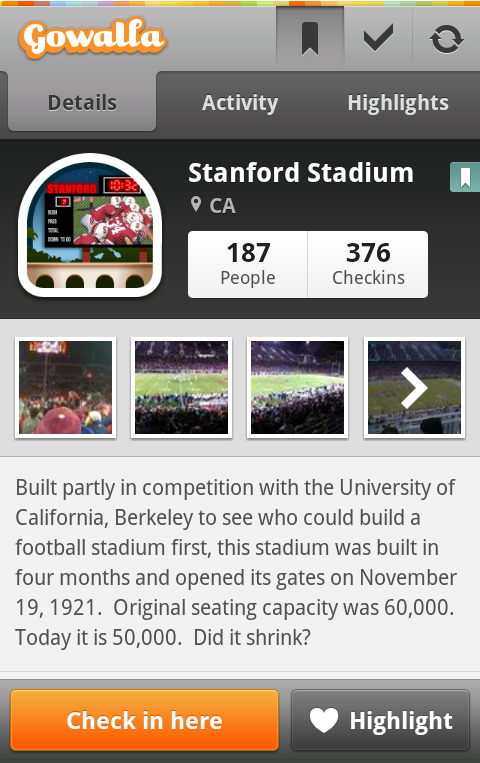
And finally here is a full-size screenshot that shows all the elements together – from the selected action bar button mirrored in a small seaglass overlay next to the location name to the drop shadows around the thumbnails, from the styling of “people” / “checkins” buttons to make them appear as part of the same button strip to the precise content alignment in the location summary section – to all the static navigation elements mentioned above.
