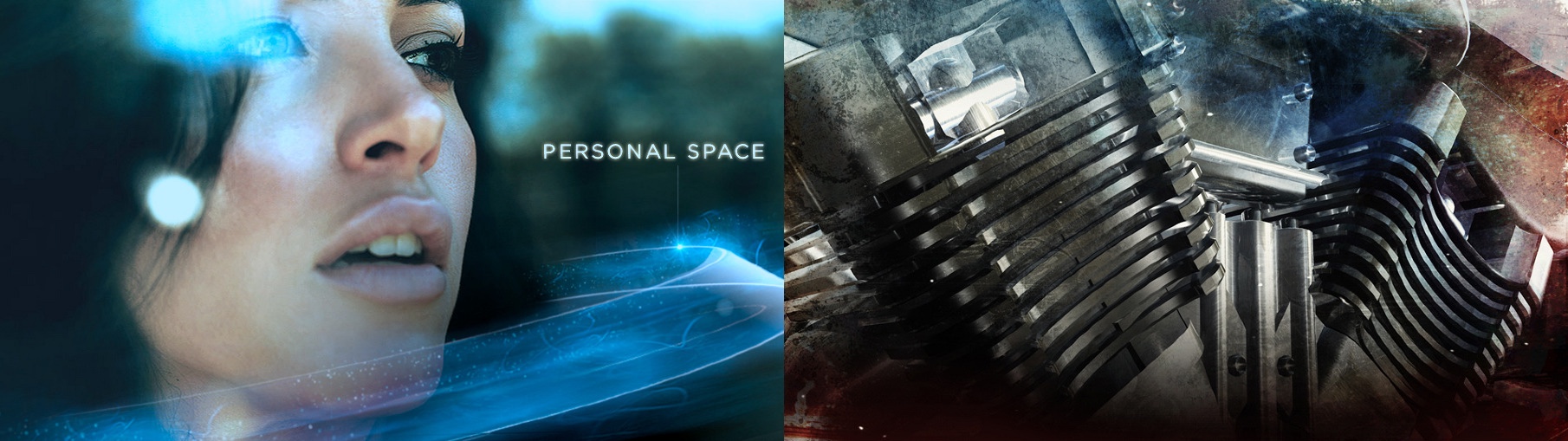
Continuing the series of interviews with designers and artists that bring user interfaces and graphics to the big screens, it’s an honor to welcome David Sheldon-Hicks of Territory Studio. Prior to founding the studio in 2010 David has worked on “Casino Royale” and “Dark Knight”. Since then, Territory’s work can be seen in movies as diverse as “Zero Dark Thirty”, “Jack Ryan: Shadow Recruit”, “Prometheus”, “Guardians of the Galaxy” and the upcoming “Jupiter Ascending”. In this interview he talks about collaborating with the director, the art department and the VFX department throughout the different stages of a production, staying true to the look of the specific production such as aerial tracking in Zero Dark Thirty or high-tech science of Prometheus, the approach he’s taking to design futuristic interfaces, the physicality of technology around us and how it projects into his latest work on Guardians of the Galaxy, and the diverse gamut of projects Territory is working on and how they feed into each other.
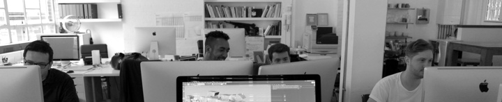
From left to right: Peter Eszenyi, Nick Hill, Marti Romances and Ryan Rafferty-Phelan of Territory Studio at work on Guardians of the Galaxy.
Kirill: Please tell us about yourself and what you do.
David: I set up Territory in 2010 together with Lee Fasciani and Nick Glover. Having met while on a project, we wanted to work together and Territory seemed like a good name to describe our ambitions to carve our own path in the competitive creative sector here in London.
 I’m Creative Director of Motion, with a background in graphic design, moving image and motion graphics – cutting my teeth in music videos before moving onto films, computer games and TV commercials.
The studio combines a number of disciplines under one roof – motion graphics, animation and live action production, branding and UI across print and digital (web, mobile, tablet) and with the recent addition of Luke Miles as Director of Brand Experience, we are able to help brands engage audiences more affectively through physical and non-physical (service) design.
While that sounds like a strange mix, what ties it all together is our shared creative focus on human interaction, and future and near future challenges.
Film and gaming is really my heartland. Our first computer game project was for EA on “Medal of Honor”, which was one of the newer titles in 2010. They were going for a more “Modern Warfare” type of a game, and wanted an opening cinematic to tell the background story of why you [the player] were going to war.
Our first feature film project was “Prometheus” – a historic moment for Territory. Out of the blue we got a phone call from someone who wouldn’t tell us what the project was but it sounded interesting enough so we signed a couple of NDA’s. Then we were told that we’d be working on computer screen graphics for a new Ridley Scott film that was going to be a prequel to the Alien universe – at which point we freaked out. I’m a personal fan of Ridley Scott, and Ron Cobb’s universal language and iconography for the original Alien movie is held in very high regard in the design community. So to have the opportunity to explore that at an early stage was really exciting. The project itself has defined Territory’s approach to on-set screen graphics.
Kirill: And before Prometheus you worked on a couple more movie productions.
David: Yes, as a freelancer I worked on “Casino Royale” and “Dark Knight”. Both those projects were amazing and I loved the challenge and excitement of communicating complex concepts in a brief moment of pure user interface design that is also an intrinsic part of a sound stage environment that the actors engage with!
As Territory has grown, our user interface work for films has grown and developed as well, and we approach it as a discipline in its own right. We get different unique briefs and each one is a creative challenge. The beauty is in the idea of considering user experiences and interactions without the constraints of how you might build it. Sometimes it’s high tech, sci-fi future-thinking user interface, narrative thinking in computer games, or exploring future applications for tech giants such as Sony, Samsung or Microsoft.
We now find that the conceptual approach that we bring to film work appeals to other clients.
Tracking overlays for Jack Ryan: Shadow Recruit. Courtesy of Territory Studio.
Tracking overlays for Jack Ryan: Shadow Recruit. Courtesy of Territory Studio.
Kirill: What about Zero Dark Thirty and Jack Ryan? Was it just you, or was it done by the Studio?
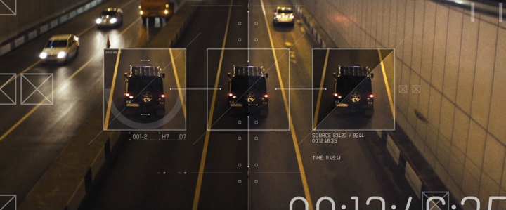
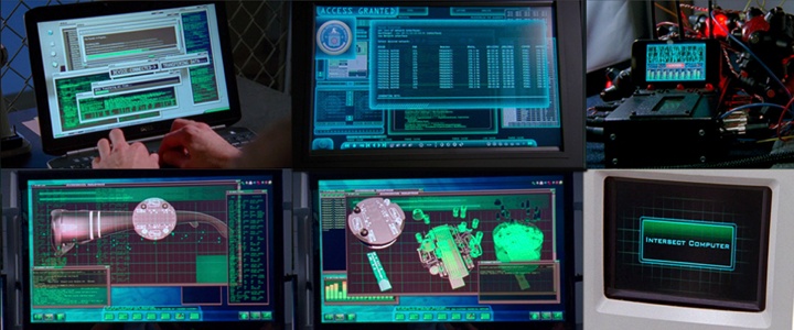
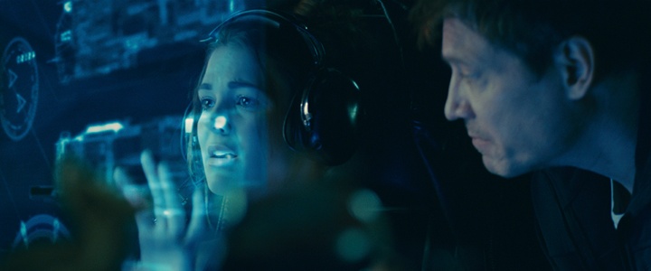
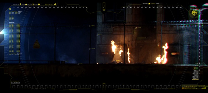
David: That was completed by Territory, rather than by me as an individual. We did “Zero Dark Thirty” after Prometheus, and it was at the opposite extreme in terms of sci-fi versus real-world narrative. It had to be very real and very authentic. There were a couple of visual effect shots but most of the computer screen graphics were on-set playbacks. The large screens where they’re looking at the Predator drone footage and reviewing aerial photography were all CGI plates that we had built and rendered in Cinema 4D, referencing data from Google Maps and then projecting on-set live for the actors to perform against.
We worked on two aspects of “Jack Ryan”; we created a lot of on-set graphics, and we also created what is called an ‘original content’ trailer. We took footage from the theatrical release trailer and did something unique with it – using hard overlays and surveillance technologies to suggest a narrative and suggesting background for some of the characters. In effect, we were using our UI graphical language both to set-dress the film and to advertise it.
Kirill: And for this type of movie your main constraint is that it’s very much rooted in the current technological world.
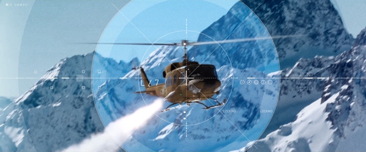
David: Definitely. Case in point, on Zero Dark Thirty I believe we had CIA signing-off on how realistic our work was, and what we could say to be true. For instance, we looked on Google Maps to see what the compound where Osama Bin Laden was hiding in looked like, and they asked us to change it to a degree so that it wasn’t exactly the same. There was online photography of the helicopter that crashed, and we approximated it as a 3D model and, again, changed it a bit for fictional purposes. It was an interesting, if delicate, balance to strike. And of course we had a typical sign-off from the art department – normal sources other than the CIA!

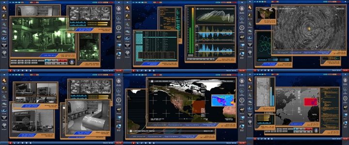
Control center from Zero Dark Thirty. Courtesy of Territory Studio.
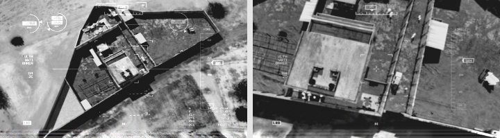
Aerial footage from Zero Dark Thirty. Courtesy of Territory Studio.
Continue reading »
Continuing the series of interviews with designers and artists that bring user interfaces and graphics to the big screens, today’s I’m excited to welcome Chris Kieffer. His work spans multiple films and TV shows, from Chuck and The Mentalist on the small screen to Man of Steel, Pacific Rim, The Cabin in the Woods, Green Lantern, In Time, Inception and Surrogates on the big screen – just to really name a few. His latest production, Transcendence, is playing in theaters now, with widely anticipated Interstellar out in theaters in November 2014. In this interview he talks about the initial exploration and research phases upon joining a new production, the frenetic pace of both TV world and feature film world, designing for mixed form factors – from phones and tablet handhelds to a set that spanned 200 screens, striking the balance between the technical nature of real-world computers and designing interfaces that flash gigantic red warnings across the entire screen, differences between TV and feature productions, and his work on the just-released Transcendence.
 Kirill: Tell us a little bit about yourself and your path to work on screen graphics for movie and TV productions
Chris: I had been a designer for a while before I got into the film/television industry. I was doing a wide array of things – print work, ads, packaging design, t-shirts, etc. I was also doing a lot of motion graphics work, commercials, animations, etc. I really preferred motion graphics over print graphics. I liked being able to bring my designs to life with animation. Something about that really made it fun and challenging. So I pushed to do more and more motion graphics work instead of print. I had an opportunity to do some motion graphics for a film, and during that they needed some help with interface design. I told them I could do it, and the rest is history. I have always been interested in interfaces, GUI’s, FUI’s in movies and television shows, but never thought I would actually be designing them.
Kirill: Where does your involvement with a particular production usually start, and who do you work with?
Chris: Every film/TV show is different. If I’m lucky, I get involved early in production. I usually meet the production designer, art director, and the director to breakdown the script and talk about the overall designs of the film. Sometimes, I work with prop master when designing interactive graphics for a physical prop/device. Other times I get thrown in at the last moment. Literally I could get a call for a whole control room that shoots in a few days and they need 20 or more screens with content. Then I get into the post-production side of things. I do a lot of screen replacement and VFX work too. So I deal with VFX supervisors, VFX editors, directors too.
The set of “Live Free or Die Hard“. Courtesy of Chris Kieffer.
Kirill: Do you prefer having a full artistic freedom for a project, or a more well-defined direction?
Chris: Both. I like when they have an clear idea of what they want, but are open to me coming up with my own concepts based on their ideas.
Kirill: What are your thoughts on the term “Fantasy UIs”? How well does it capture the essence of what you do?
Chris: I like the term. When designing an interface, you have to fantasize what this would look like and how it would work in the world of that film.
Kirill: And on a related note, how do you stay a step ahead of all the advancements in consumer-grade devices and sensor-based gadgets these days?
Chris: I can’t stay ahead, I just keep in touch as much as I can. As soon as you learn or read about some new technology that’s coming out, there’s already a newer one in the works. But I try and find new things as much as possible. Sometimes it’s about understanding the technology we have now, and how do we make it better.
Kirill: In “Live Free or Die Hard” and “Cabin in the Woods” you worked on interfaces that are not supposed to be futuristic. Is there less challenge involved in that?
Chris: It’s not really easier making all the content, but as for designing the interfaces it can be. In Live Free or Die Hard the FBI Headquarters was a standard interface, which made it easier to design and animate. The challenge was the massive amounts of screens and content that had to be made while shooting.
The set of “Live Free or Die Hard“. Courtesy of Chris Kieffer.
In Cabin in the Woods, they didn’t want it to be a standard interface. They wanted it to be a mix of old and new. If it isn’t broke, don’t fix it. That was the idea of that control room. They had old computers mixed within new, as if they added new things when they were needed but left the old stuff because it worked.
The screens of “Chuck“. Courtesy of Chris Kieffer.
Kirill: Do you enjoy designing for mixed form factors, like handhelds for “Chuck” or analogue monitors in “Cabin in the Woods”?
Chris: Both. Each one has its own set of challenges. The device sizes and screens are always changing, along with the operating systems. One device could be an Android system, the other an iOS device or Microsoft tablet. So you have to be able to build for so many different devices. But they can look like really cool gadgets when your finished. On the other hand when you get big screens, you get to do really nice looking interfaces. Then you get to watch actors interacting with them on set, is pretty cool.
Kirill: How much time do you spend researching a particular environment (say, power plant or air traffic control rooms)?
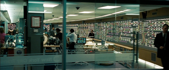
Chris: A LOT! LOL. I really like making it look as real as possible, unless it’s supposed to look different. Even then, I still research a lot. I like knowing how they really work and how they are controlled. It helps when designing the interface, and determining how the actors will interact with it. When I did The Taking of Pelham 123, we actually got to go see the operations in action. Watching how they control and monitor all the subway trains in New York, it helped so much watching how it’s really done. Then I still went and did research. I had to learn how the trains work, where the tracks are, train schedules, etc.
Before / after stills from “White Space“. Courtesy of Chris Kieffer. Property of White Space, LLC.
Kirill: Do you first outline your sketches on paper, or go straight to modeling software?
Chris: I almost always start on paper, but abandon it quickly. I have to figure out if the idea/sketch I have will even work, so I jump into software. I do design a lot in Illustrator and Photoshop, while I’m problem solving.
Kirill: Is there a need to become increasingly more meticulous with advances in shooting and projecting / playback equipment?
Chris: Like I said earlier it’s always changing. So I try to learn and evolve constantly. You have to be ready to adapt to anything.
Kirill: Between on-set shoots that are tied to presence of actors and post-production that is tied to release schedules, what’s more hectic?
Chris: On-set is more hectic to me. Don’t get me wrong, there are some rough times during post production. On-set is unpredictable to a point. Something could go wrong with a piece of equipment during a shot. You may only get one chance to shoot something on-set vs. getting to do a couple of revisions in post. Making it happen exactly when it’s supposed to every time, even when actors or directors change it on the fly. You have to make changes and get it ready in-between takes. I guess it’s a lot more pressure dealing with on-set graphics.
Before / after stills from “White Space“. Courtesy of Chris Kieffer. Property of White Space, LLC.
Kirill: How do you strike the right balance between staying true to the technical nature of computer interfaces and making appealing visuals for the aesthetic purposes of the overall production?
Chris: It’s tricky. Sometimes I will make it as real as it gets, other times you have to change it to be what they want. For example, if you put in an incorrect password in your email it might say something along the line of… Incorrect Password, Try again, Invalid Password. But the director might want it to be a huge animated popup window that says “ACCESS DENIED” in red. Now we know that never happens, but they may be trying to get a story point across in a fraction of a second, so you have to compromise. Then there are times when they want the interfaces to be really dense and full of information, but mean absolutely nothing. So in that instance you can design something that looks great but doesn’t really mean anything. Then there’s the time part of that. You may not have weeks to make a realistic interface the way it should be. You may only get a couple of hours or days to make something.
Kirill: How would you compare working on episodic TV to feature films, in terms of budget, scope, technology at your disposal on-set and in post-production, and your overall place in the production?
Chris: Well that’s a big one, I’ll have to break it apart.
In terms of budget. Films usually have a much bigger budget than the TV shows. But TV can be just as demanding as a film in the scope of work. Sometimes a pilot may have a much larger budget than a normal episode because we have to create everything from scratch. After that there is usually an average that they want to spend every episode. I have worked on some films that have had lower budgets than a TV show, which is challenging. I usually have to figure out new or different ways of making it happen.
Technology on-set can vary. On a show like “Chuck” we always had new gadgets and toys to play with.
The screens of “Chuck“. Courtesy of Chris Kieffer.
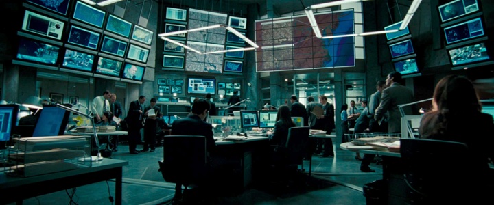
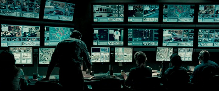
On a show like “Shameless” it’s just what the average person would use, like a laptop or phone. In films there can be a lot of technology at my disposal. It really depends on the need. If they want something a specific way, then I get to work with some pretty cool stuff. Sometimes I’m designing graphics that will be rear projected across six HD screens over a hundred feet and they have to be running in sync, and triggerable by us or the actor.
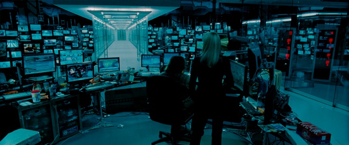
The screens of “Taking of Pelham 1 2 3“. Courtesy of Chris Keiffer.
Then there are times I have to make a simple interactive website on a laptop, so in can vary greatly. On “Surrogates” we had one set that had over a hundred computers feeding two hundred screens and around thirty different feeds at the controllers desk. It had to all be in camera, it would have been too expensive to replace them all in post. They made some changes in post and I ended up changing a bunch anyway. LOL.

The screens of “Surrogates“. Courtesy of Chris Kieffer.
Technology in Post Production, really that comes down to my workstation. I am employed at Warner Bros in the Production Sound & Video Department, and I will admit they do spoil me. My workstation there is a BEAST, which is what I need to get these jobs done in the timeframes given. The only problem is when I go home to work on my computer, I’m thinking of my computer at work…
My overall place in production is different on each project. On some films I do everything from supervising all the video playback graphics to just building content that goes to set. Sometimes it’s nice just designing and animating, because I can focus all my attention on that and really get into it. When I’m supervising, I have to do that and also know the schedule, go to all the meetings, be on set, make changes, delegate who’s doing what and so on. It really makes it hard on the designing and animating process. Luckily I have a few amazing artists who I usually work with, that really makes a difference. We have done enough projects together to know what our strong points are, and how to get things done quickly and efficiently as a whole. I also think as an artist you can grow so much when you collaborate with other artists.
Kirill: What are your thoughts on the increasing number of stereo sci-fi productions, and how is that affecting the type of projects that you’ll be working on in the next few years?
Chris: It doesn’t really affect me during production, in post it can. Like in G.I. Joe: Retaliation they wanted me to fork on some shots that had overlays. High tech HUDs and make them for 3D. It changes the workflow and design when building it for 3D. Besides that I don’t mind.
The interface overlays of G.I. Joe: Retaliation. Courtesy of Chris Kieffer.
Kirill: Going back to the real software that you’re working with on the daily basis, what are the main pain points you’re seeing there?
Chris: I use pretty much what most people use – Aftereffects, Cinema 4D, Illustrator, Photoshop and others. If I run into a problem using one software there is always another that I can use to solve the problem. I really like that part of it, trying to do something that hasn’t been done before.
Kirill: And on a related note, where do you see the field of human-computer interaction going in the next 10-15 years?
Chris: I couldn’t tell you. It is exciting watching all the new advancements and things that are coming out. I think it comes back to information, and the ease of getting it. I love information, whether it’s about family, news, the world, the future, just fun and being able to get that anywhere and anytime in any format is exciting. How we view/interpret/interact with the information is what is going to change as we go. If that makes any sense. LOL
Still from “White Space“. Courtesy of Chris Kieffer. Property of White Space, LLC.
Kirill: What can you tell us about your latest work?
Chris: Not as much as I want to. I recently finished working on Christopher Nolan’s Interstellar. I can’t say much, but I really enjoyed what we did on that film. After its release I will do a breakdown of everything we did on that. I can’t wait!!!
I also worked on Transcendence before that. We had a mix of everything on that film. Modern computers, old computers with CRTs, projections, holograms and so on. We talked about research, and this is a great example of that. In the beginning of production I sat with the Director Wally Pfister and production designer Chris Seagers to discuss what they wanted to do. They were open to ideas as well. So I came up with some concepts and went from there. I sat it many long meetings talking with professors of electrical engineering, computer science and neuroscience from Berkeley to really understand the technology behind the film. Understanding concepts and ways of how to actually map out human thoughts and memories to a computer. I had to learn about nerve impulses, neurotransmitters, and how they can be mapped into a system that can use and store that data. Then try an communicate that on the screens to the audience.
The screens of “Transcendence”. Courtesy of Chris Kieffer.
There were the hi-tech labs too. I had to learn a lot about nanotechnology and robotics for that. Also the technology for that lab was supposed to be almost 30 yrs ahead of what we have now. So I designed the interfaces while doing research on what I needed while on location in New Mexico. Luckily we had a coordinator on this film – Charlie Erlanger – who was able to keep track of all the elements and scenes we needed. He would also help make some of the animations when it was crunch time. There was a small team of designers working on this with me. Vince Parker was the programmer/designer on location with me, he would program all the files for set and to be interactive while I would design and animate them. Coplin LeBleu was back in LA designing elements for the shots coming up in the schedule that we couldn’t get to while on set.
The sets of “Transcendence”. Courtesy of Chris Kieffer.
And here I’d like to thank Chris Kieffer for taking the time out of his prolifically busy schedule and answering a few question I had about his craft, and for sharing the illustration materials for the interview. His latest production, Transcendence, is playing in theaters now, and widely anticipated Interstellar will be out in theaters in November 2014.
Continuing the series of interviews with designers and artists that bring user interfaces and graphics to the big screens, today’s I’m honored to welcome Jorge Almeida. You have seen Jorge’s work on the seminal “Minority Report”, “Iron Man 2”, “Eagle Eye”, “The Dark Knight Rises”, “Mission Impossible: Ghost Protocol” and “Star Trek Into Darkness”. His latest production, “Tomorrowland”, is scheduled for release in May 2015. In this interview he talks about the evolution of digital tools in the last decade, designing interfaces that fit the story, striking the balance between visuals that compel the viewer and yet do not attract attention to themselves, the relentless pace of working on motion pictures, the lasting impact that “Minority Report” has had on the tech industry, his thoughts on screens in future offices and homes, and his recent transition away from the world of film UI.
Eye scan interface from “Minority Report“. Courtesy of Jorge Almeida.
Kirill: Please tell us about yourself and your path so far.
Jorge: My name is Jorge Almeida, and I’ve worked as a user interfaces designer for the film industry for over 10 years. I’ve designed and/or animated UI for a number of feature films including “Minority Report,” “Iron Man 2,” and “Star Trek Into Darkness.” I recently finished work on the upcoming “Tomorrowland” and have since taken a UI Design position with Microsoft.
I originally started in Florida working in print. I spent years doing page layout and design for advertising, newspapers, and catalogues. I was also a computer colorist for a comic book company and wrote and illustrated my own comic book “Captain Cosmo and Phil, the bionic dwarf.” I later moved to Los Angeles and took a job with Black Box Digital, a small design and VFX house that used to operate in Santa Monica. Black Box worked on a variety of projects, but their bread and butter was film UI. They worked on films like “Armageddon” and “Enemy of the State.” They originally hired me to work on an online comic book project, but over time I started taking on more of the UI work. I loved movies, so I was happy to be involved in the industry.
I ended up spending 5 years with Black Box. I’ve since done UI work on other films including “Eagle Eye” (at Pacific Title), and “Iron Man 2” (at Prologue), before taking a lead designer position at OOOii. There, I served as lead UI designer and animator on “Mission Impossible: Ghost Protocol,” “The Dark Knight Rises,” and “Star Trek Into Darkness.” I’ve also gotten a few illustration jobs, one of which was doing the drawings for the end title sequence of “Sherlock Holmes.”
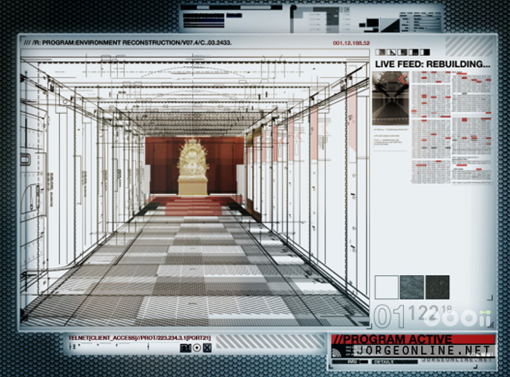
Kremlin hallway scan from “Mission Impossible: Ghost Protocol“. Courtesy of Jorge Almeida.
Kirill: As you transitioned from print design to doing movie interfaces, did it help that both operate on a single fixed canvas where you don’t need to worry how elements reflow and adapt to different screen sizes?
Jorge: I’d never really thought about that, but yes. You’re also pretty spoiled because it’s make-believe. We aren’t as restricted by specific style and font size requirements because our ultimate goal is to help tell the story. Unless required, I try not to get too caught up in minute details of accuracy and functionality. My goal is to make an interface that feels right. If the viewer understands what the UI is trying to communicate, without being distracted by the design, then I did my job.
To me, film UI is more about illustration. There’s a lot of design involved and a lot of thinking about how the UI works, but ultimately it’s about illustrating a story point and trying to do it in a way that the audience finds interesting. Also, I find that many of my design ideas are born out of an abstract concept that I am trying to illustrate.
For instance, one of our tasks with “Minority Report” was to digitally represent the raw stream of data that was pouring directly from the precogs’ minds. I focused on trying to make the date stream appear almost organic and alive. The data itself was essentially frame sequences and snapshots from the various precog visions, often repeated and overlapping, that are spread out horizontally along a timeline. However, with enough of these elements treated a certain way, the data did start to give the impression of something slightly fluid- especially when animated. This seemed especially fitting considering that the data was representing a murder. Numbers and bar graphs and digital readouts seemed too impersonal for such an event. For this reason, when designing the giant Precog screen, I thought of it as a sort of futuristic autopsy table.
Another example would be “Eagle Eye,” there are a few shots where I was trying to make the UI feel sort of like Frankenstein’s monster- with elements looking like they were ripped from other interfaces and cobbled together. For “Mission Impossible: Ghost Protocol” I was trying to give the UI an element of intimacy, like a doctor looking at X-rays. For the starship Vengeance in “Star Trek Into Darkness” I was trying to make it feel like the inside of a submarine. I’m often going for a feel, a sort of visual metaphor that fits the spirit of the movie. I didn’t get to think that way when I was working in print. Not that all print is like that, just that the type of work I was doing was more structured. I use my page layout experience more when I work on real-world films.
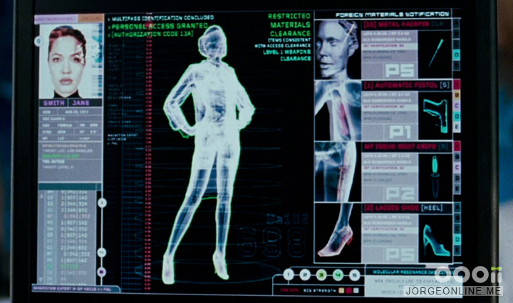
Body scan user interface, “Mr and Mrs Smith”. Courtesy of Jorge Almeida.
Continue reading »
Continuing the series of interviews with designers and artists that bring user interfaces and graphics to the big screens, it’s my pleasure to host John Koltai. You have seen John’s work on “Iron Man 2”, “Iron Man 3” and “The Avengers”, and there’s more coming up to the theaters this year. In this interview he talks about graphic and motion design work for commercials and broadcast reels, the ever-evolving world of screen graphics in sci-fi motion pictures, designing in 3D space for stereo productions, the importance of storytelling, his involvement with the just-released “Robocop”, the tension between immersive holographic interfaces seen on the big screen and the everyday real-world tasks facilitated by computers, and finding time for smaller side projects.
 Kirill: Tell us about yourself and how you started in the field.
John: Well originally I went to school to study computer science, and decided after about two semesters that it wasn’t for me. I was a guitar player, so I started exploring some options within the music department in school, but didn’t really find what I was looking for there. I was also taking some film classes, and through that I became really interested in shooting and storytelling. Towards the end of school I took a motion graphics class that a friend of mine suggested.
I didn’t know anything about that world, and it was taught by a guy who did news graphics in Buffalo (where I’m from originally). His name is Kurt Murphy and he was probably the most important person I could’ve met at that point. He really opened my eyes to the world of motion graphics. He was so passionate about the world of design and motion graphics, and as soon as I took that class I knew exactly where I wanted to focus my career.
After that I moved to New York and went to Parsons [school for design], focusing completely on the world of motion graphics, trying to get into broadcast design. Once I graduated, I did a lot of broadcast work, work for advertising and show packages, and it wasn’t until a few years working in the industry that I started doing UI design for films. That happened at a studio called Perception with Iron Man 2.

Left – pitch spot for Dairy Queen, right – broadcast reel for TWC. Courtesy of John Koltai.
Kirill: Before we get to the film side of your career, let’s talk about your work on commercials. How big your team usually is, who you work with and what’s the timeframe?
John: A lot of it varies by the studio. At some of the smaller shops that I’ve worked with – depending on their level of trust with you – you might be the only one coming up with the entire concept and literally doing all the animation and compositing work, working maybe with the creative director at the studio and the agencies that are hiring you. And then you have bigger places with much bigger budgets. At a studio like that you have access to giant CG teams and huge budgets, where you are just a piece of the puzzle, creating more elaborate sequences. It all depends on the project, I would say.
Kirill: So this would be a blend of computer-generated graphics and real-world photography. Do you come in mostly during the post-production phase, pulling these different pieces and combining them together?
John: Again it varies on the job. In some cases I would be a part of the conceptual phase with art directors on both the studio and the agency sides, trying to come up with the concept of the commercial or the promo. And other times they will have a very clear-cut vision – say, sparkles flying out of a piece of a gum [laughs] – and at that point you’re just a piece of the puzzle, and you do what you’re told. Obviously it’s a lot less creative and fulfilling, as you don’t get to build concepts and ideas.
Left – commercial for Icebreakers, right – broadcast promo for Sons Of Anarchy. Courtesy of John Koltai.
Kirill: Is there any consistency in the software tools used to create motion graphics across different studios and freelancers?
John: I would say so, mostly the Adobe stack. You have After Effects for animation and sometimes design, primarily Photoshop and Illustrator for design, and Cinema 4D for 3D elements.
Kirill: How did these tools evolve over the last few years? The requirements from people you work with – directors, production designers, art directors – are getting more complicated each year, I’d assume. Is the software keeping track?
John: I would say that things are progressing from the production standpoint just because computers are getting faster, software is getting more sophisticated, and you can do a lot more. If I look at my work, or just work in general, from five or 10 years ago, as a whole I think that things have progressed tremendously.
Kirill: Going back to your first feature film work on Iron Man 2, how did that happen for you?
John: I’ve always wanted to be a part of a bigger storytelling project. I never really set out and said that I want to make movies, but I always wanted to do stuff that had a bigger audience, that meant a little more. I happened to be at the right place at the right time working at Perception. We had done a lot of title sequences for Marvels animated feature films. Through that we had built a pretty strong relationship with people at Marvel. What ended up happening was that they came to us to help them with one single element – this giant graphic looping behind Robert Downey Jr. during the Stark Expo sequences. We turned that around rather quickly, and on one of the calls they had mentioned that they wanted a timeline sequence for the film.
They invited us to do a pitch on that, and we ended up doing a lot of designs. I believe that the timeline sequence ended up being scrapped or dialed down. But while we were on the second call with them, they mentioned that they liked one of the designs I mocked up for the look of Tony’s cellphone. It was almost mentioned in passing, and we kind of stopped them on the call, and they started elaborating on it, and that’s when we were asked to pitch on that. We developed a bunch of style frames and a motion test for that, and they were very receptive to one of the designs that I did for the cell phone, and that ended up turning into the coffee table as well as the graphics package for the Monaco race, a vintage-style expo logo, and a bunch of monitors throughout the entire film. It was this one element that turned into over 100 shots that we worked on. For that to be my first foray into the movie graphic business, it was really exciting for everyone at the studio and myself.
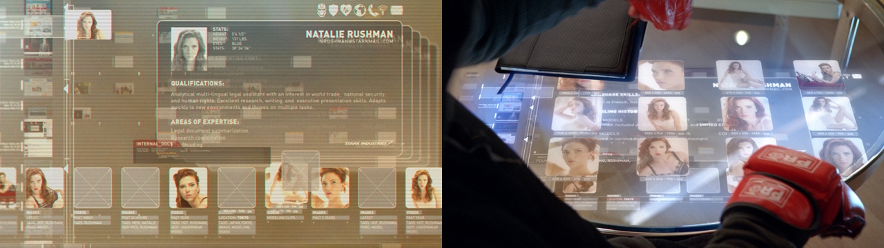
Touch screen glass coffee table for Iron Man 2. Courtesy of John Koltai.
Continue reading »
