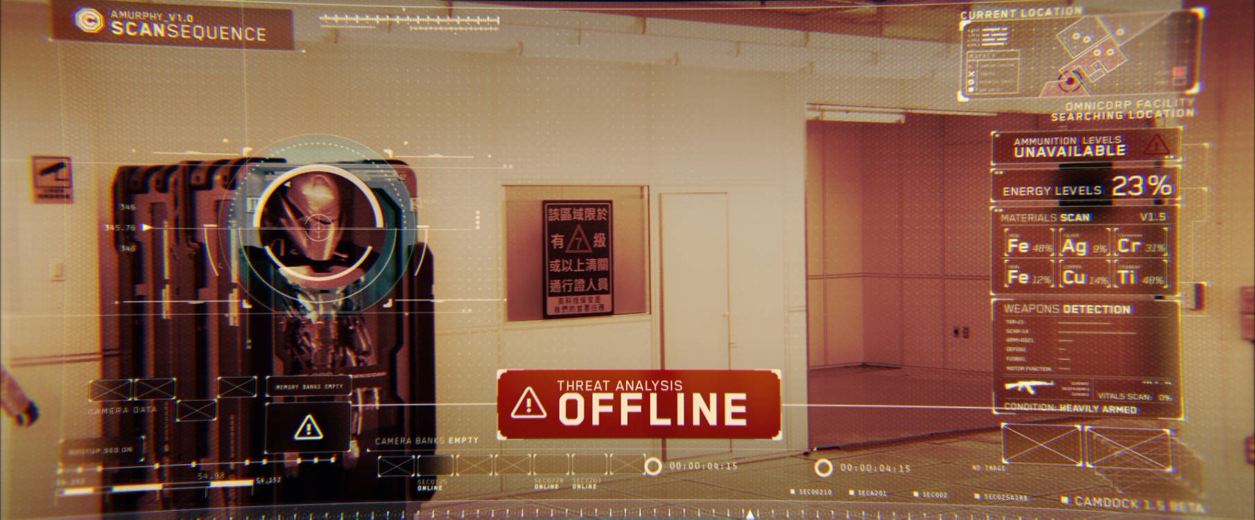
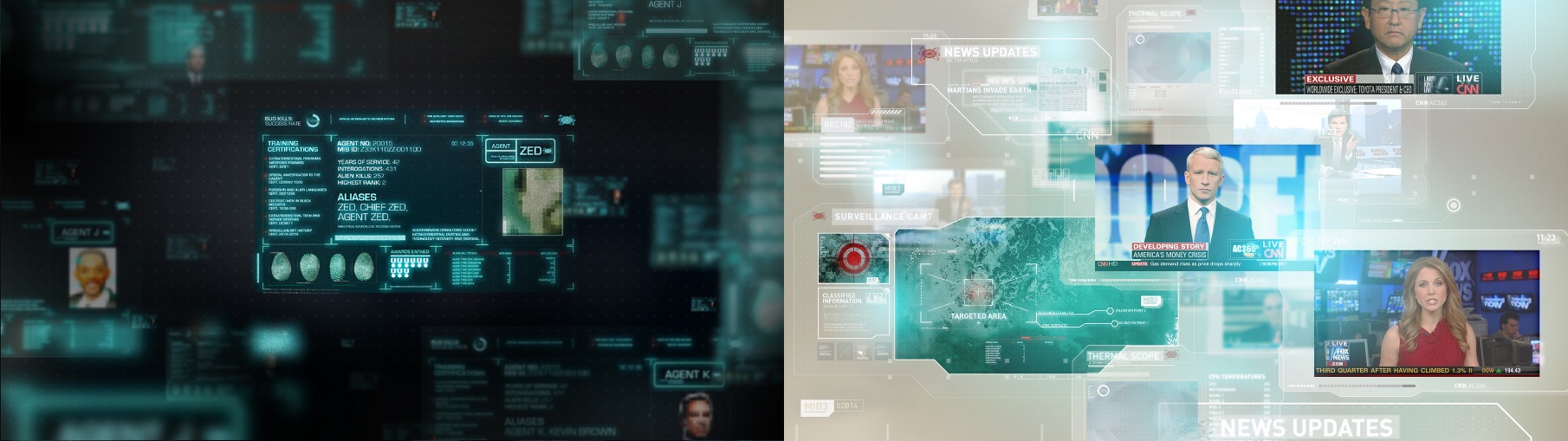
 Point-of-view HUD design for Robocop. Courtesy of John Koltai.
The craft of screen graphics and movie user interfaces – interview with John Koltai
Continuing the series of interviews with designers and artists that bring user interfaces and graphics to the big screens, it’s my pleasure to host John Koltai. You have seen John’s work on “Iron Man 2”, “Iron Man 3” and “The Avengers”, and there’s more coming up to the theaters this year. In this interview he talks about graphic and motion design work for commercials and broadcast reels, the ever-evolving world of screen graphics in sci-fi motion pictures, designing in 3D space for stereo productions, the importance of storytelling, his involvement with the just-released “Robocop”, the tension between immersive holographic interfaces seen on the big screen and the everyday real-world tasks facilitated by computers, and finding time for smaller side projects.
 Kirill: Tell us about yourself and how you started in the field.
John: Well originally I went to school to study computer science, and decided after about two semesters that it wasn’t for me. I was a guitar player, so I started exploring some options within the music department in school, but didn’t really find what I was looking for there. I was also taking some film classes, and through that I became really interested in shooting and storytelling. Towards the end of school I took a motion graphics class that a friend of mine suggested.
I didn’t know anything about that world, and it was taught by a guy who did news graphics in Buffalo (where I’m from originally). His name is Kurt Murphy and he was probably the most important person I could’ve met at that point. He really opened my eyes to the world of motion graphics. He was so passionate about the world of design and motion graphics, and as soon as I took that class I knew exactly where I wanted to focus my career.
After that I moved to New York and went to Parsons [school for design], focusing completely on the world of motion graphics, trying to get into broadcast design. Once I graduated, I did a lot of broadcast work, work for advertising and show packages, and it wasn’t until a few years working in the industry that I started doing UI design for films. That happened at a studio called Perception with Iron Man 2.

Left – pitch spot for Dairy Queen, right – broadcast reel for TWC. Courtesy of John Koltai.
Kirill: Before we get to the film side of your career, let’s talk about your work on commercials. How big your team usually is, who you work with and what’s the timeframe?
John: A lot of it varies by the studio. At some of the smaller shops that I’ve worked with – depending on their level of trust with you – you might be the only one coming up with the entire concept and literally doing all the animation and compositing work, working maybe with the creative director at the studio and the agencies that are hiring you. And then you have bigger places with much bigger budgets. At a studio like that you have access to giant CG teams and huge budgets, where you are just a piece of the puzzle, creating more elaborate sequences. It all depends on the project, I would say.
Kirill: So this would be a blend of computer-generated graphics and real-world photography. Do you come in mostly during the post-production phase, pulling these different pieces and combining them together?
John: Again it varies on the job. In some cases I would be a part of the conceptual phase with art directors on both the studio and the agency sides, trying to come up with the concept of the commercial or the promo. And other times they will have a very clear-cut vision – say, sparkles flying out of a piece of a gum [laughs] – and at that point you’re just a piece of the puzzle, and you do what you’re told. Obviously it’s a lot less creative and fulfilling, as you don’t get to build concepts and ideas.
Left – commercial for Icebreakers, right – broadcast promo for Sons Of Anarchy. Courtesy of John Koltai.
Kirill: Is there any consistency in the software tools used to create motion graphics across different studios and freelancers?
John: I would say so, mostly the Adobe stack. You have After Effects for animation and sometimes design, primarily Photoshop and Illustrator for design, and Cinema 4D for 3D elements.
Kirill: How did these tools evolve over the last few years? The requirements from people you work with – directors, production designers, art directors – are getting more complicated each year, I’d assume. Is the software keeping track?
John: I would say that things are progressing from the production standpoint just because computers are getting faster, software is getting more sophisticated, and you can do a lot more. If I look at my work, or just work in general, from five or 10 years ago, as a whole I think that things have progressed tremendously.
Kirill: Going back to your first feature film work on Iron Man 2, how did that happen for you?
John: I’ve always wanted to be a part of a bigger storytelling project. I never really set out and said that I want to make movies, but I always wanted to do stuff that had a bigger audience, that meant a little more. I happened to be at the right place at the right time working at Perception. We had done a lot of title sequences for Marvels animated feature films. Through that we had built a pretty strong relationship with people at Marvel. What ended up happening was that they came to us to help them with one single element – this giant graphic looping behind Robert Downey Jr. during the Stark Expo sequences. We turned that around rather quickly, and on one of the calls they had mentioned that they wanted a timeline sequence for the film.
They invited us to do a pitch on that, and we ended up doing a lot of designs. I believe that the timeline sequence ended up being scrapped or dialed down. But while we were on the second call with them, they mentioned that they liked one of the designs I mocked up for the look of Tony’s cellphone. It was almost mentioned in passing, and we kind of stopped them on the call, and they started elaborating on it, and that’s when we were asked to pitch on that. We developed a bunch of style frames and a motion test for that, and they were very receptive to one of the designs that I did for the cell phone, and that ended up turning into the coffee table as well as the graphics package for the Monaco race, a vintage-style expo logo, and a bunch of monitors throughout the entire film. It was this one element that turned into over 100 shots that we worked on. For that to be my first foray into the movie graphic business, it was really exciting for everyone at the studio and myself.
Touch screen glass coffee table for Iron Man 2. Courtesy of John Koltai.
Kirill: If I look at movies such as Avatar or Prometheus, even though they happen in the near future, it is distant enough to allow showing technologies that don’t quite exist yet. And then you have the world of Marvel superheroes that is set in the present time with, perhaps, more resources available for the main characters to “acquire” slightly more sophisticated hardware and software. How does this affect the exploration on your side?
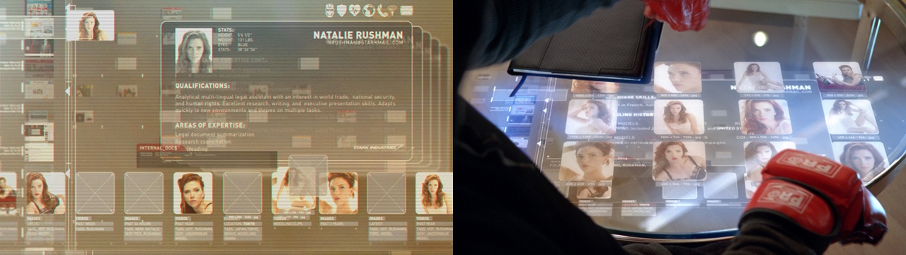
John: I think it’s always important to balance the sophistication of the interface so that it feels futuristic but with elements that also feel familiar. This is especially true for films that are, essentially, in present day. I always try to look at these things as a storytelling device more than anything. For example, when Tony is doing the background check of Scarlett Johansson’s character as she’s being seen for the first time, you want to have a nice way of introducing her character to the audience, as well as give an outlet to Tony’s personality. For me personally it’s about telling the story – more than anything.
Kirill: Specifically for Iron Man 2, how did these things look on set? Just pieces of glass, with post-production adding the actual UI elements?
John: Yes, that was an interesting challenge that we had to deal with. That was all shot on glass, essentially – both the coffee table and the cell phone. Both of those scenes were shot with random hand gestures that Robert Downey Jr was making, and that informed the way we had to design the interface. It was limiting, but also fun to deal with the backwards way of thinking about it.
Kirill: Was Avengers right after that?
John: Avengers came a few years later. My role was a lot less than it was on Iron Man 2 though. I actually created a cell phone interface for that movie as well, almost borrowing from Tony’s cell phone and making it a consumer-grade version.
In addition to that I designed a holographic, almost smart display that is seen at a car dealership as Captain America walks by. Also some designs on the Quinjet, showing some tracking displays. Those were very different from what I’ve done before. It was this very minimal militaristic look.

Holographic display in The Avengers. Courtesy of John Koltai.
Kirill: You did Iron Man, Avengers and are working on a new Marvel film, which all happen in the same place, space and time. Do you need to maintain certain consistency or continuity?
John: Well You look at the Quinjet with its military utilitarian style. And that’s very different from what Stark Technologies does. And that’s different from what you have in the S.H.I.E.L.D. universe and shots of Nick Fury. And we go through the timeline of Marvel movies and grow with the characters. You see guys like Jayse Hansen that has done such an amazing job to create a software identity for S.H.I.E.L.D. You have to be aware of what the software looks like, and how it functions, because a lot of these movies happen only a year into the future from the previous one. But you also want to keep it original, so there’s always this balancing act of drawing from things and making them feel like they’re part of that world, but also giving it your own spin.
Kirill: As you start working on a movie, do you get access to the assets (images, scripts, code) from the previous movies in the same franchise, or do you start from scratch on the technical side of things?
John: In most cases we’ll start from scratch and keep things within the same realm. I try not to reuse elements. However, if you look at my designs for the phone in Iron Man 2 vs. Pepper Potts’s phone, I tried to keep some of the elements the same. I wanted to create a relationship there so if you look at the bottom, you’ll see some of the same icons.

Smart phone design for Iron Man 2 (left) and The Avengers (right). Note the bottom button row icons. Courtesy of John Koltai.
Kirill: What happens with all the assets that you create for the specific movie?
John: Most of what we create ends up becoming property of the film. We deliver all of our source elements, all of our After Effects files – that all goes to the studio.
Kirill: Switching gears to designing for 3D productions, is there anything special you need to do to design for stereo?
John: Well you’re dealing with two cameras instead of one to create the 3D. Every revision you have to make, and even just the way an interface looks and acts in 3D vs 2D has to be considered. From the conceptual standpoint you definitely have to consider that additional dimension. And from the technical perspective you’re doubling your workload and render times by having that second camera.
Kirill: How does that work when you want to test how it looks? Do you have a small system for playing back your latest revisions?
John: I’ve worked on projects where I’ll render quicktimes and play them back on a 3D television. Other times I’ll put on the old school anaglyph glasses with the red and blue lenses, and watch pre-renders right in After Effects.
When I was pitching on Men in Black 3, we created an entire motion test with the idea that the sunglasses in the film could be used as a HUD, almost like a Google Glass type interface. We created that motion test completely in 3D. We didn’t have a brief or even a plot synopsis, and we were creating a world seen through the eye of Will Smith’s character.
If you were to watch that motion test in 2D, it looks very cluttered, and my normal design sensibility I would never lay something out like that. But working in 3D, once you put on the glasses and you actually start seeing the objects in space, everything starts to feel a little more fluid, a little more harmonious, and actually works together quite nicely.
Men In Black 3 pitch. Courtesy of John Koltai.
Kirill: How does something like this map back to 2D when people watch it on a DVD or BluRay at home?
John: For this test it might’ve been designed a little bit differently knowing if it was going to be in the movie. This was purely something to push the bounds of 3D with. But that’s always a balancing act. I’ve worked on other projects where you do have to take that into consideration, to show a lot more restraint, I would say.
Kirill: Is it, in a certain sense, disappointing that your part of the movie gets pushed to the background.
John: It can be. But at the same time you’re creating a world, an environment, a feeling.
Sometimes it’s a little disappointing when you’re in the theater, and at the end of the movie people are walking out during a beautiful end title sequence. That I find a bit more disappointing. You know, most of the time our job isn’t to create a distraction for viewers. If we’re supposed to create a wall of monitors and people aren’t noticing them, or people aren’t distracted by them – in a way that’s our job.

Title sequence for Thor: Tales of Asgard. Courtesy of John Koltai.
Kirill: You mentioned that you have more computing power available to you, but on the other hand you are requested to do ever more on every new production.
John: You’ll get briefs that want to push it and see something that has never been done before, to constantly outdo whatever the last benchmark that was set. And others are much more concerned with the storytelling of movies, and aren’t so interested in creating these elaborate types of interfaces.
I was lucky enough to do a lot of previs on the new Robocop film. I worked directly with the director and the editor of that movie, and that was a great experience. They were so focused on the storytelling, and I really had to put the ideas of aesthetic, big and elaborate HUD sequences to the side and really focus on storytelling and what was going to drive the plot forward. So many times you see HUDs – and if you watch Iron Man movies, these HUDs are beautiful – but, for the average viewer, are not pushing the story along. You’ll be able to press pause and everything would have purpose, and everything would make sense, but you’re not getting a narrative device from those individual elements. In Robocop there are so many scenes where the main character is realizing something and you’re getting that through the HUD. In something like that the immersive environment takes a complete back seat to showing the viewer exactly what’s happening and telling the story.
Kirill: What was the scope of your involvement on Robocop?
John: I pitched on it with Perception around February 2013 with HUD designs for the film, as well as a virtual studio that’s in the film. Jeff Baghai and I did some motion tests that they loved, and because of the narrative aspects of the way the HUD worked, they flew me up to Toronto to work directly with the director, the editor, and the VFX supervisor. We really hashed out all the story points, and how the HUD would work in certain instances when Robocop is trying to find the identity or the location of someone to solve a crime – and a lot of that is done through the HUD.
I spent about three or four weeks up there just working with the entire team, and came back to New York to do a lot of design exploration for how the final version of the HUD would look. Eventually a design that I came up with was chosen, and we ended up creating dozens of HUD shots for the film. It was super-beneficial to hash out the visual language, the way it operated, how certain search functionalities would work up in Toronto. For example, battle mode vs. scanning through ton of images trying to find someone’s profile – all these different aspects of how it would work and how the software would perform during the tasks that Robocop had to do.

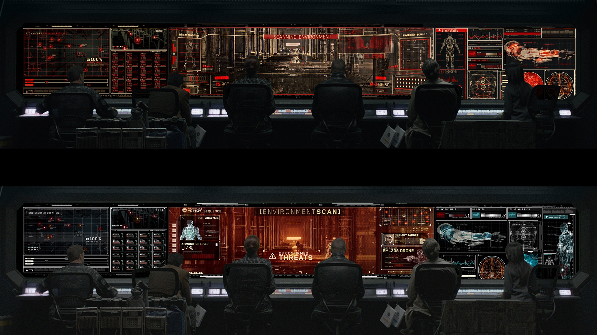
Point-of-view HUD design for Robocop. Courtesy of John Koltai.
In the end I worked on it for four or five months, and based on a lot of things out of my control, the project ended up getting killed. At what was at one point probably the most exciting point of my career – working on this film, being a lead – moved to what was maybe the worst point of my career. I was blindsided by it in a way. As a designer you’re not involved in budgets and things that are more on the production side, but unfortunately there were some issues on that side and we ended up losing the project. They had gone to another company.
Its also pretty strange, because all that work that you do is property of the film. We had to package it all up and send it to the new studio thats creating all those graphics now. I’m very curious to see it. It’s hard to say that you’re not jaded after an experience like that, but at the same time you hope that the work that you did in pre-production to figure out the visual language ends up finding its way into the film and maybe helping the next round of designers to create something great.
All in all it’s work that I’m really proud of, and I hope that I can work on a film like that to such a degree, although hopefully with a kinder outcome.
Point-of-view HUD design for Robocop. Courtesy of John Koltai.
Kirill: Sounds like product planning phase for a real-world hardware / software hybrid.
John: Certainly. It was almost like we were developing our own software package and figuring out how it would work for the user, except that the user in this case was Robocop. At one point (John Lepore (creative director of perception) and Jeff Baghai) all of us were up in Toronto working on the conceptualization of the software. After we returned to New York, we started working on every individual shot, applying the different functionality and how the software would work depending on the specific task that was happening, as well as creating the specific look for the HUD. It went through a variety of iterations.
Kirill: It seems that you keep on returning to the ad world and smaller projects in between the bigger film productions.
John: I haven’t been able to commit quite yet. I like doing projects that reach a wide audience and have some legs, have a little bit more substance than other things. Working on features is a great way to satisfy this, but I’m not solely just interested in Interface Design.
For the past two years I did all the branding for the Gathering of the Vibes music festival. A friend of mine had a fundraiser for Hurricane Sandy, so I did posters and t-shirts for that. I also design posters for The Capitol Theatre here in NYC. I think it’s important to change things up. It’s what keeps you young and fresh and inspired. To always be doing different things, to always be challenging yourself, to always be looking for something that makes you think about things differently. I’ve found in my career and in my life that there are times where you get so comfortable doing something that you sort of lose the magic of it. And once that happens, creativity suffers as well. For me, and probably for everyone, the best way to keep fresh and young is to constantly be doing something different.

T-shirt design for the Gathering of the Vibes festival (left) and Pop Up Yoga Hurricane Sandy fundraiser (right). Courtesy of John Koltai.
Kirill: How would that relate to the ever changing landscape of software and hardware tools at your disposal? Would you define yourself as part of the digital generation?
John: Certainly. Unfortunately, I’m a terrible illustrator [laughs]. Sometimes the best way for me to get an idea out is not with a pencil and paper. Sometimes it is – typically for the interface stuff. But for other things I’ll take out a camera or do a really crude mockup in Photoshop, or throw together frames directly on the computer. No matter what, it’s just about getting the idea out there.
Kirill: Looking at these software tools, is there anything that particularly annoys you, anything that stands between your ideas and seeing them come to life?
John: It would be nice to get to an age where we don’t need to stare at the spinning beach ball ever again. While software has progressed and interfaces have become better, allowing us to do more things within creating content, I feel that there always seems to be a battle between the hardware and how fast it can keep up with you, keep up with the demands of the software. That’s the biggest challenge. And you have software crashing, that relationship between the software and the hardware that we can certainly improve on. It seems it’s never fast enough.
Kirill: What about something more dramatic, if you will? Something like what Tony Starks “has” at his disposal, a holographic 3D projection that you operate on with your fingers?
John: I think that there’s something really interesting, exciting and cool in thinking about working that way, having an immersive 3D environment. On the flip side, the root and purpose of interface design should always be about how intuitive and useful it is, about its ability to complete the task at hand. A lot of times, especially in the last few years, designers get almost carried away with how immersive and visually fantastic their interfaces are, losing sight of the functionality and usability. The whole reason behind interface design is to create something that is intuitive and simple to use.
I love the idea of some day having a software package from Adobe where it is this holographic immersive environment. At the same time I wonder if that will actually be a more productive type of a thing.
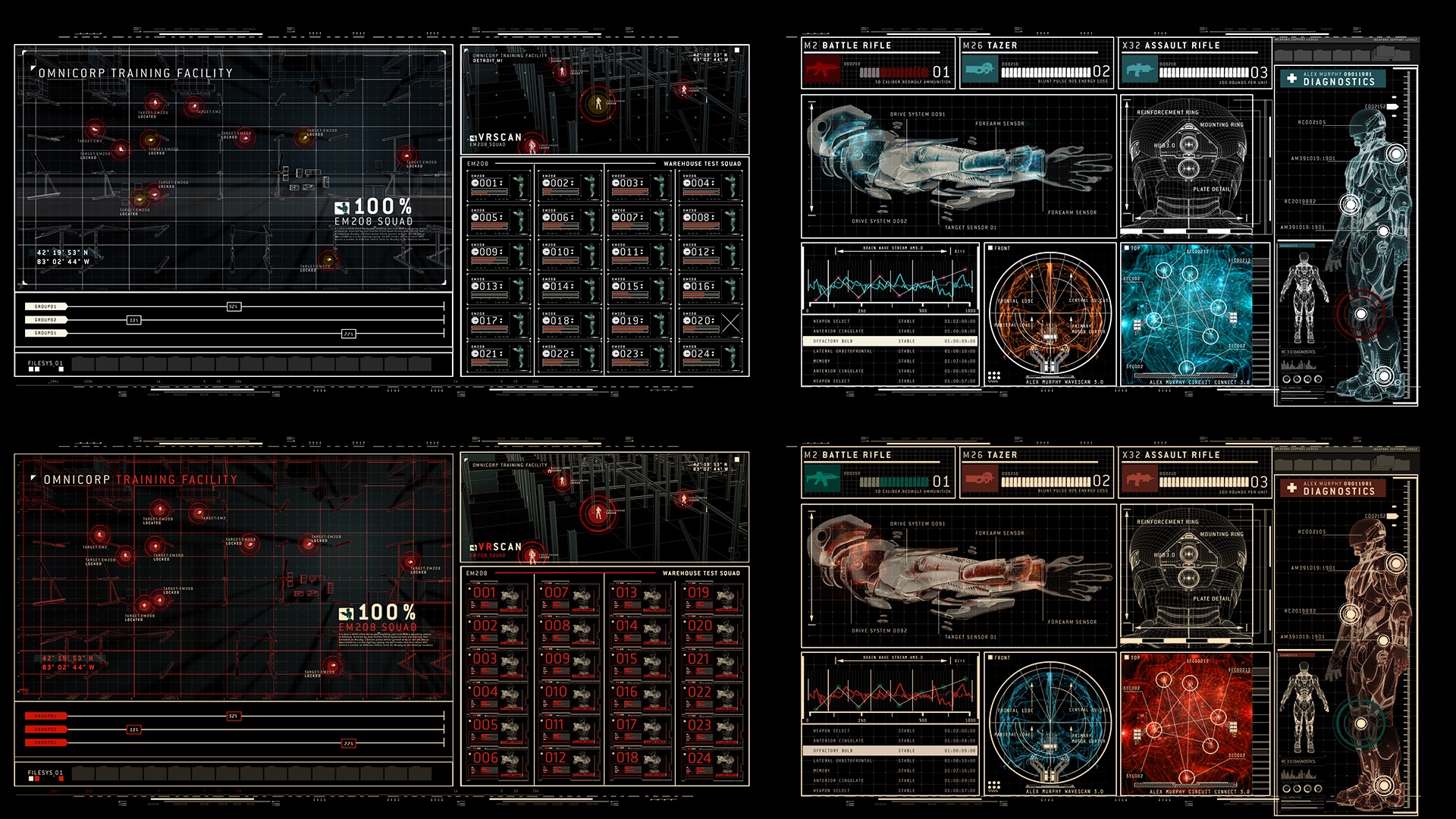
Tracker interface elements for Robocop. Courtesy of John Koltai.
Kirill: Do you know how Adobe evolves the capabilities of tools such as After Effect and Cinema 4D? Is there a feedback loop between them and the studios that use these tools?
John: I don’t know from firsthand experience with Adobe, but the developers behind Cinema 4D, for example, pay visits to studios and talk to the artists. They ask what they want, what they like and use that to progress things.
Kirill: On a more personal level, what types of movies and TV shows do you watch?
John: One of the things about the sci-fi movie genre is that unfortunately sometimes the story takes a back seat to these fantastic worlds. Usually I’m paying so much attention to the set details of the film that sometimes it’s hard to lose myself in the story. I think District 9 was the last sci-fi film I really liked on a deeper level. I actually prefer seeing movies more driven by characters and narrative, it’s easier for me to lose myself in the story when there’s something I can relate to. I just saw The Wolf of Wall Street and thought that was a great film. Breaking Bad and Sons of Anarchy are probably my two favorite shows on TV at the moment.
Kirill: Looking back, was it a good decision to abandon the world of computer science?
John: I certainly think so. I’ve always been much more interested in storytelling, music, and designing. Computer science was always far too dry for me. I didn’t find the satisfaction that I find in doing everything that is involved in this career. There have been real-world devices that I worked on, The Mill touch. That was a lot of fun to work on. That was in line with sort of what I’m doing in films. I was able to design an interface and UX, but the good thing about it was that I didn’t need to code any of it!
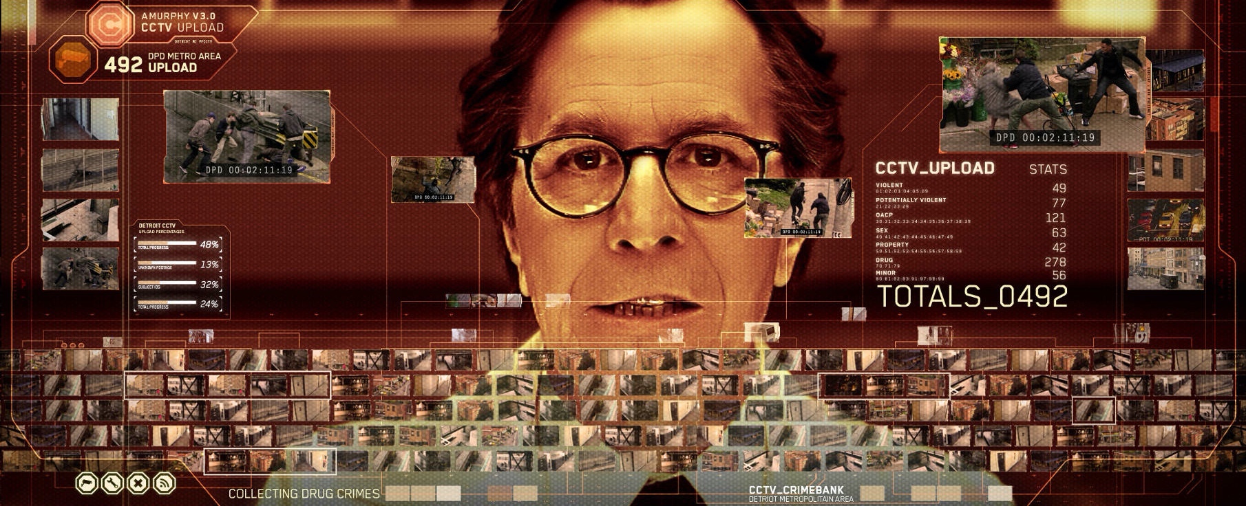
Tracker screens for Robocop. Courtesy of John Koltai.
And here I’d like to thank John Koltai for taking the time out of his busy schedule to do the interview. You can find more of John’s work at his portfolio.
