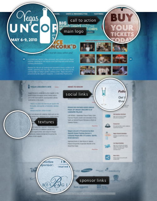
Today’s post highlights the design of VegasUncorked.com. Set in bright azure and metallic blue color scheme, it uses multiple overlaying translucent textures to offset the vivid colors of the large header section. The typographical layout of the header section is done with images to ensure the design fidelity across browsers and screen resolutions. The footer section features sponsor logos; monochrome effect creates a consistent and attractive area that is not overloaded with competing colors. The guider lines in the main section enforce the three-column layout, and the text snippets have plenty of white space around them.
The social links column can use a little more polish. Italicized sub-headers and pinkish glow effect feel disconnected from the rest of typography. The icons look disjointed and not normalized to have the same weight and color scheme. The rollover effects use gigantic rectangles of washed pink color, and the entire section should have received the same amount of attention and restraint as the footer section.

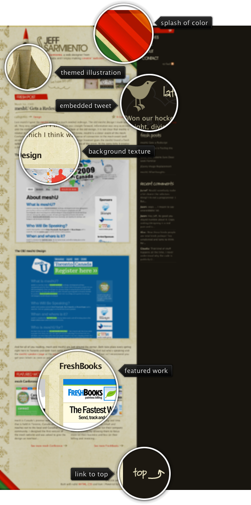
Today’s post highlights the design of JeffSarmiento.com. Set in earthen brown colors, it uses splashes of strong reds, greens and oranges in header / footer diagonal stripes to add a vibrant touch. This approach can also be seen in the illustration of the rocket ship that uses saturated orange colors atop the otherwise themed hull. The design is rife with hand drawn illustrations. These include the header titles, post title underline, stars / arrows next to some of the links, background illustrations for the tweet section and the rocket ship, as well as background texture for the main column.
The navigation menu deserves special attention. While most of the sites place it along the top or the left edge, this site places the navigation menu along the right edge. To alleviate the proximity to the string saturated stripes of color right next to it, the menu items use large font with custom kerning. To further reinforce the importance of the elements, each navigation item uses one of the adjacent colors for its background – red, orange, yellow, green and brown. Move the mouse over the navigation menu to see additional hand-drawn illustrations.

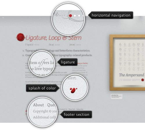
Today’s post highlights the design of LigatureLoopAndStem.com. With finely-grained background texture, plenty of white space, excellent typography and splash of red color to offset the monochrome color scheme it is a perfect example of minimalistic web design. The main page provides a few visual clues to use horizontal navigation. The clues include the explanation text on the navigation bar, cut-off screenshot of the first poster and the small arrow icons in the top-left and top-right corners.

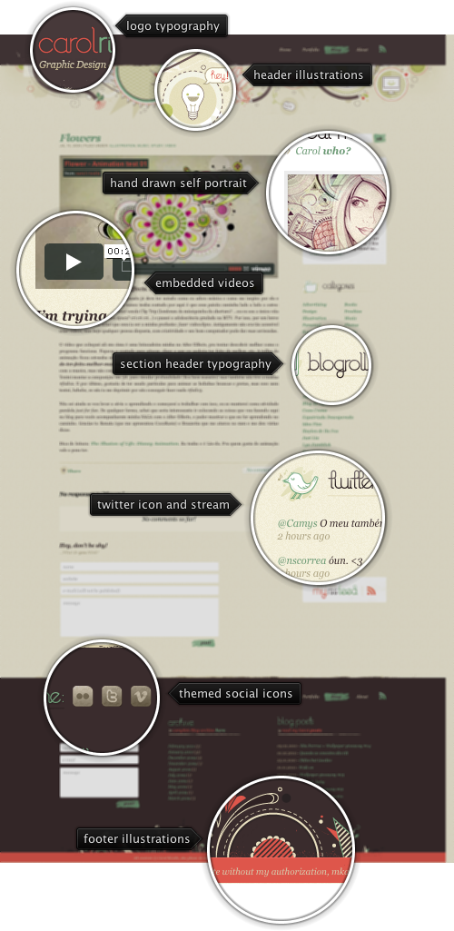
Today’s post highlights the design of CarolRivello.com. The site features intricate hand-drawn illustrations in the header and footer sections, using the primary dark brown, dark orange and desaturated bottle green colors. Hand-drawn illustrations are pervasive throughout the site – used as leading artwork for all blog entries, self-portrait in the “about me” section, section header icons and felt-tip backgrounds for the buttons. The same desaturated bottle green is used for all the links, with the exception of footer section headers which are not clickable. Dark orange is used when the mouse is hovering over the links, and for the footer section sub-headers. The hand-drawn theme is further reinforced by custom typography and unusual ligatures in the main site logo and all section headers. When you visit the site, move the mouse over the navigation menu (both header and footer) for nice animated rollover effects.