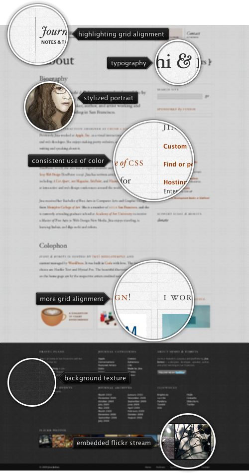
Today’s post highlights the design of SushiAndRobots.com by Jina Bolton. A perfect example of strong grid layout is highlighted by the vertical and horizontal guider lines that help tracing the placement of all visual elements. Note how different elements fit into one or more columns of the six column layout, with extra insets for text sections. All text elements (including the navigation menu, section headers and sidebar links) have their baseline aligned perfectly with the horizontal grid guider lines.
A faded tapestry background texture helps alleviating the string geometrical pattern imposed by the guider lines, and improves readability of the light-on-dark footer section. The main section uses a popular light gray / dark gray / dark orange color scheme with consistent coloring of links and attractive typography for the section headers and rollover effects for the navigation menu elements.

Today’s post highlights the design of ASimpleMeasure.com by Daniel Cork. The site is about measurements, and it is reflected in the design elements. Hand-drawn elements such as separators, image borders and RSS / Twitter icons, the ruler grid along the top edge, stippled site logo, washed out measuring arrows with millimeter dimensions all contribute to a consistent visual message. The sandpaper background texture and a few helper explanation tips complete the visual theme. Reload the site to see a sequence of sliding animations that features the slideshow controls and the “sign up” call to action.

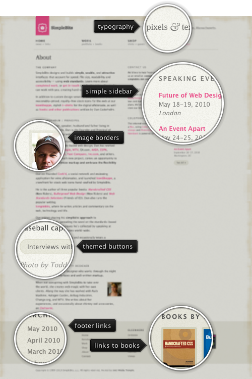
Today’s post highlights the design of SimpleBits.com, a design studio by Dan Cederholm. True to its name, the design is very clean and minimalistic. A spartan beige color scheme with beautiful geometric patterns running along the top, left and bottom edge is offset by increasingly popular shaded desaturated pink color for the logo and links. A simple three column grid provides a lot of whitespace around carefully chosen blocks of text. The navigation menu in the header is perfectly aligned with the main layout columns, and the links in the footer are themed with the darker beige color, blending perfectly with the rest of the site.

Image by Here’s Kate
Every month this series is tracking the latest design trends and collecting the best examples of modern web designs. Here is the list for April 2010 with almost 1700 links from 47 aggregator posts:
