Today’s post highlights the design of BasilGloo.com. About a week ago the site was switched to a summertime bamboo theme, but i prefer the more colorful and polished appearance of the old design. It’s a simple and clean one page design that uses a strong and colorful palette of ribbons. Blurring the ribbons towards the bottom edge creates an illusion of a 3D space (something that is missing from the new design, where both foreground and background elements are in focus). This added dimension serves as a perfect backdrop for the full height image of the designer and bright “Personal” / “Business” headers that use reflection to clearly position them between the “back wall” and the designer figure.
A clean and balanced grid of social icons highlights the personal activities and serves as a portal to follow Basil’s activity on the web. The business side of the ribbons is a perfectly aligned mini-grid with bio blurb and professional snippets. A folded top-left link to the blog adds the final touch to the outstanding design.

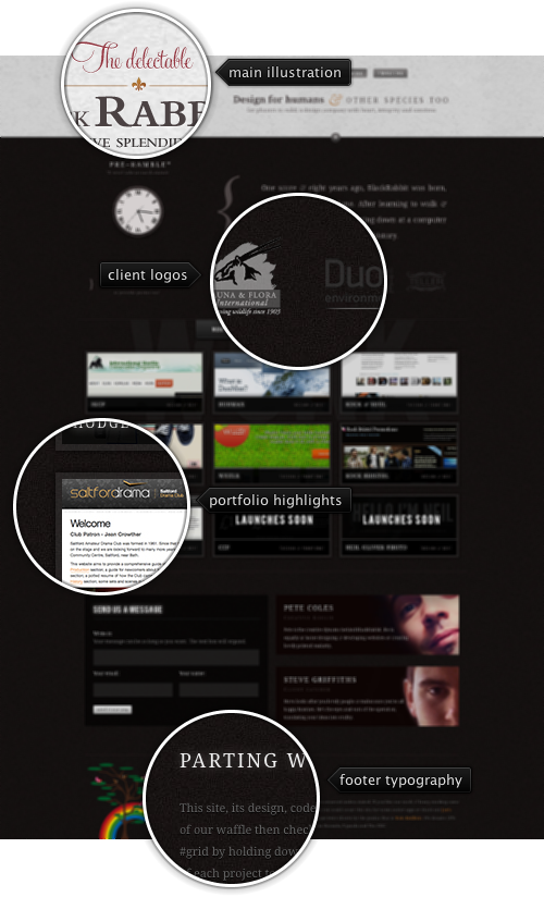
Today’s post highlights the design of BlackRabb.it. A single page design with a strong grid places the main focus on highlighting the portfolio with embedded thumbnails. The overall dark colors are balanced with background noise texture, glowing text effects on section headers, and rollover highlight effects. Move the mouse over the themed client logos to see translucent glowing popups, and click the “+” button between the header and main sections for a colorful illustration. Press Alt+G or Cmd+G to view the grid lines that govern the placement of all the elements in the main section. If you open the site in a WebKit browser (such as Safari), the rollover effects use fading / moving animations, and the expanded illustration has a few moving elements as well.

Today’s post highlights the design of BlueSkyResumes.com. With an attractive choice of soothing sky blue background, the design features an intricate array of overlaying translucent shaped layers (seen throughout the rest of the site such as the “About us” page). Clean typography, subtle text effects, white space for improved scanning and readability and a clever illustration for the “cookie cutter” message are just a few indicators of how much attention was spent on the design. Move the mouse over the left-hand buttons and the top-right blog link to see rollover effects.

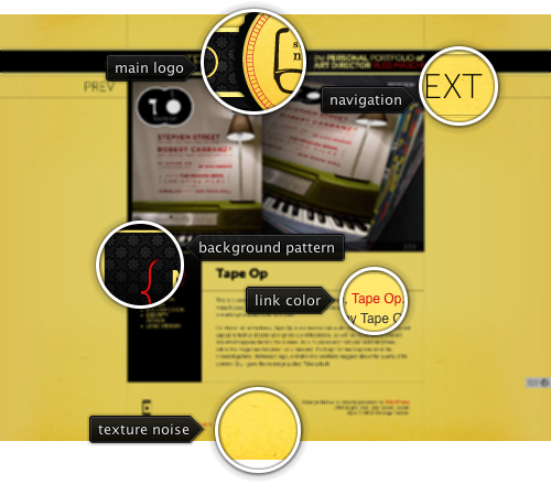
Today’s post highlights the design of StrangeNative.com by Russ Maschmeyer. The saturated yellow color used as the background fill is offset by subtle gradient transitions using darker yellow towards the edges; an extra background layer of texture noise and random smudges adds a welcome relief as well. Strong red reinforces the vibrant choice of colors – it is used as the link foreground color and throughout the various visual elements in the site header, logo and sidebar. The portfolio slideshow embedded in the main page features an attractive layout that highlights the design itself, as well as Russ’s role in the project.