The user details screen of TweetDeck beta presents a succinct and helpful overview of the specific account. A nice human touch to the follow / followed status can be seen when neither side follows the other one (“You are mutually oblivious”).
This screen has one more feature that i find very useful – showing the average number of tweets per day instead of the usual overall count of tweets. The overall count is only relevant if you know how long the person has been on Twitter, and showing the daily frequency is a much better estimate of how much extra traffic you can expect in your timeline. This is, of course, not the perfect metric, since it depends on how many of those tweets are retweets, replies to people you follow and replies to people that you don’t follow.
The only thing that i would change would be to ditch the fractional part. There’s little sense to show 4.9 where you can use a more human ~5. Likewise, infrequent twitters should show <1 instead of completely useless 0.08 (or the like).

TweetDeck for Android is now available for beta testing, and it sports a very polished and responsive user interface. While i didn’t have a chance to spend a lot of time, i’ve noticed a few very interesting explorations in the UX space that aim to address the limited form factor of mobile devices.
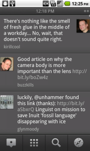 As usual, your timeline is presented as an infinitely scrolling list of tweets, with thumbnails next to the texts. However, TweetDeck opts to omit information that can only clutter the screen, omitting information usually displayed by other mobile clients: the time stamp and the client name. The time stamp is displayed in the title bar and is changed as your scrolling your timeline. The client name is not displayed at all – a good decision, in my view, given that it is of little value beyond the fleeting “who uses what” curiosity.
Next up – scrolling. The stock user experience for scrolling is to fade a thing scroll thumb along the right edge of the scroll view. This shows the current position in the list, and at the same time does not add UI clutter when the view is not moving. TweetDeck features an interesting exploration in this area – the right edge displays a permanent gutter overlay that shows your current position. As long as you’re close to the top, it does not add too much visual noise; as you’re scrolling down to earlier tweets, it shows important visual information how far along you are.
Finally, switching between your timeline, replies and direct messages combines two existing UX paradigms found elsewhere on the platform. Swiping left or right switches to the adjacent column with no extra two clicks required in the official Twitter client. To indicate that the screen is “swipeable” in this fashion, the title bar shows small bevel circular icons that look much like the home screen indicators from the stock Android UI.
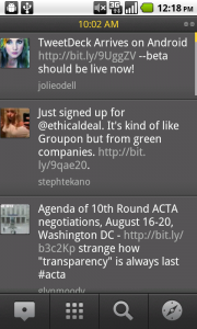 The next screenshot illustrates how TweetDeck does notifications. When one of your columns gets new tweets, the UI is updated with the main highlight color (saturated yellow). The highlights are displayed in the right gutter – giving indication how many new tweets were loaded, and how far higher they are relative to your current position in the list. The title text (timestamp or the generic title) turn yellow as well. In addition, if the new tweets are not in the currently displayed column (say, you’re in your main timeline, and just got a new direct message), the circular icon that corresponds to that column is painted using the yellow color as well. Once you’ve swiped to the relevant column and scrolled to reveal the unread tweets, the highlighting is gone.
Using a strong saturated color in the otherwise grayscale UI works great for drawing your attention to the new updates. In my view this works better than a more intrusive “you have X new tweets” messages displayed in header / footer bars of other clients. But this is not the only nice thing about TweetDeck notifications. As long as the updates arrive while it is the fronted app, TweetDeck is not going to push any system-wide notifications to the status bar. This is a great UX decision that decreases the overall visual noise and keeps me “immersed” in the application.
I’ve only used TweetDeck for a couple of hours today, and it’s too early to say if these UX decisions will pass the test of time. However, i’m very impressed with the amount of attention that went into designing and implementing this client.
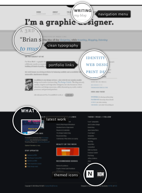
Today’s post highlights the design of BrianHoff.net. An austere palette of grayscales and desaturated blue for the links is the perfect backdrop for clean typography and elegant arrangement of text segments (with extra white space for improved readability). An oversize footer inverts the colors, borrowing a tinge of bluish green for the dark background color, and adding a few small full-color image thumbnails.
For a fixed-width column grid i find it strange to see quite a few places where the columns in different sections do not line up. You can see this in off-center alignment of the navigation menu and the main headline (shifted to the left), and in the jarring misalignment of the right-hand columns in the main and footer sections. Baskerville ampersand glyph can use some weight tweaking to improve its appearance on the darker background of the footer section, especially when used in bold all-caps section headers.
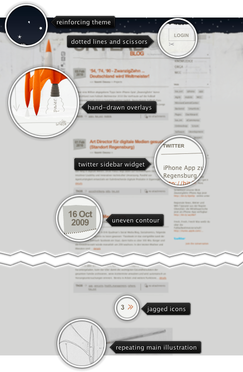
Today’s post highlights the design of Blog.Kupferwerk.net. The design combines hand-drawn elements and space-related illustrations that revolve around the “Skylab” codename. A vibrant orange rocket pointing to the starry sky header is decorated with hand-drawn arrows, trajectory computations and cut-out scissor marks. The same hand-drawn style is used on the social icons that are arranged in a vertical column alongside the rocket. The main illustration is visually balanced by a text-heavy sidebar with the list of categories, tags and an embedded twitter widget.
Uneven separator lines, pencil-drawn contour of the rocket base in the footer, slightly misshapen arrow icons and fading stained texture in the top part of the site reinforce the hand-drawn theme. Also note how the dark orange color used for entry headers and some of the links is derived directly from brick-orange palette of the rocket.
![]()