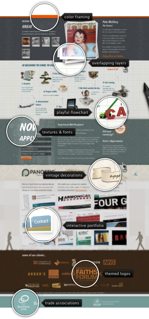
Today’s post highlights the design of Panoetic.com. When first loaded, the site has two main sections – a three-row interactive portfolio and a selection of client logos. The portfolio features a number of attractive transitions – from rollover and (delayed) rollaway effects to the overlay slideshow of the specific project on clicking a thumbnail. Note how each successive row features more thumbnails (three to four to six) while maintaining the same overall vertical grid. The client logo section is placed on the background of earthen brown, with each logo colorized in the desaturated pink-to-yellow browns, creating the effect of the portfolio thumbnails “growing” from the client seeds planted in the ground.
The header section continues the vintage theme set by the background color palette of desaturated blues, browns and off white by interleaving a few intricate illustrations with the floral background patterns. Each illustration (two ribbons and the upward-pointing hand) is an action area that reveals hidden content above the header section. If you position the mouse over the charcoal-painted hand and click three times, the entire content will reveal three sections that provide further information on the agency itself and the people behind it. The vintage decoration elements are present throughout these extra sections, with additional usage of strong orange color to highlight the main action items (expanders, twitter links and the submit button of the contact form).
Finally, note the usage of embedded Felt Tip Roman and Salsbury for various headers and subheaders – both hand-written fonts that further reinforce the vintage theme of the site design.

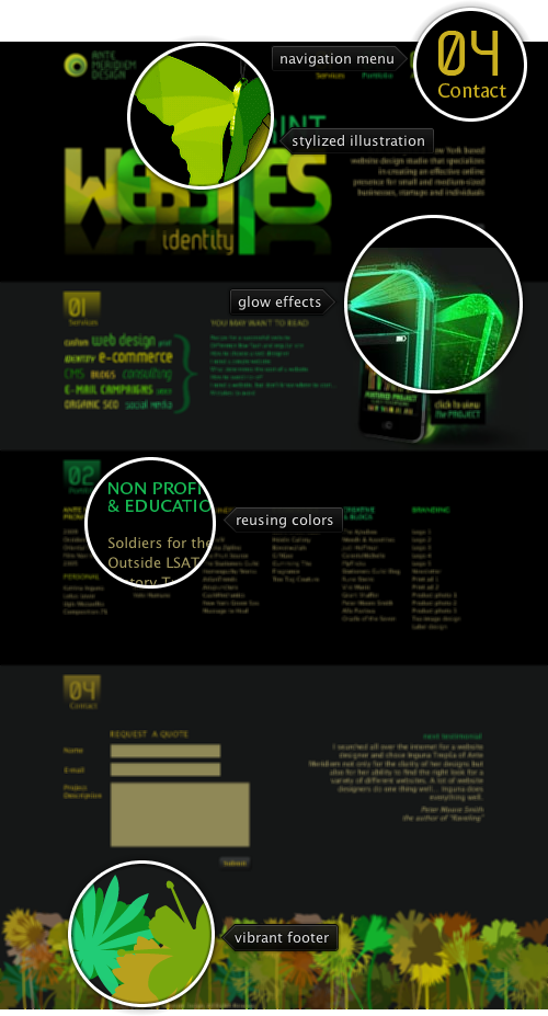
Today’s post highlights the design of AnteMeridiemDesign.com by Inguna Trepsa. It combines solid dark gray / black backgrounds with oversaturated neon yellow-green palette to produce Tron-like visuals, especially in the three phones in the second section. The neon palette lends its colors to the oversized logo illustration, and is further reused (with some desaturation) in the headers, text sections, links and the static navigation menu.
Note how the last section starts using the brown hue to prepare the eye towards the transition to the stylized palm forest footer that mixes the yellow greens with browns, oranges and sand pinks.
On a less positive side, the main header illustration can use fade to transparency in the reflection effect, and the contact form should extend the top two text fields to be right-aligned with the larger text area and the “Submit” button. In addition, the rollover animations on the navigation menu feel very sluggish and should be improved by using much less initial delay.

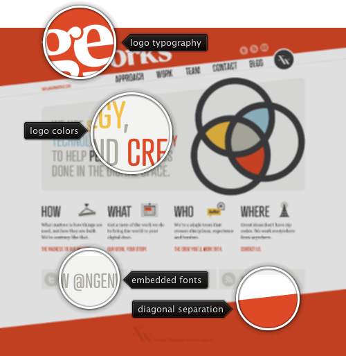
Today’s post highlights the design of nGenWorks.com. This is a refreshing design that explores a combination of diagonal elements, embedded fonts and an invitingly cool palette to create a memorable impression. Two large diagonal stripes frame the main content, with the header section containing an attractive typographic logo and properly rotated social icons. The navigation menu follows the rotation angle of the separator lines and uses images instead of CSS3 selectors that do not work in older browsers.
The main section features an oversized logo that uses three main palette colors – ochre yellow, brick orange and sky blue. Note how these colors are then reused in the main tagline to the left of it, highlighting the agency tools, and using the black color used for the logo outlines to highlight the main goal – the end user. Smaller text blurbs below use styled icons (note the color usage in the two middle icons that further reinforces the color palette while preserving the horizontal balance) – each blurb mirroring and expanding on one of the navigation menu links. Finally, the design transitions to slanted brick orange footer with three faded networking links.
The design uses clean typography by using embedded sans-serif Trump Gothic East Medium font that works well on section headers and large texts, and a readable serif FF Tisa Web Pro for the three-line explanation sections in the lower part of the main page. The later font is used elsewhere on the site (such as the company blog).

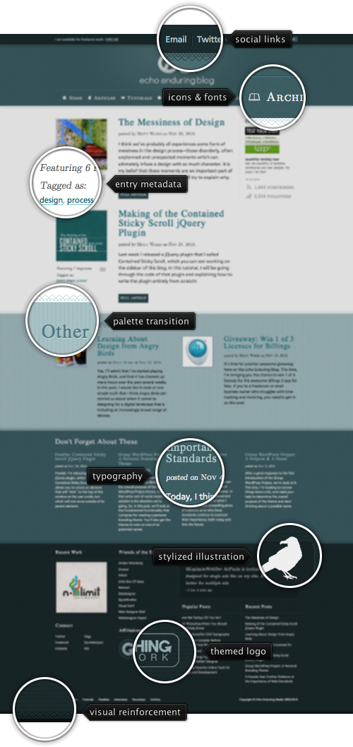
Today’s post highlights the design of Blog.EchoEnduring.com by Matt Ward. Separated in six vertical sections, the design uses the full brightness spectrum of the teal color to frame the blog entry snippets. The darkest shade of teal is reserved for the thin contact / social / search strip at the top and the oversized footer at the bottom. The navigation section is placed in a lighter shade of teal, with a typography-based logo featuring a stylized stipple drop shadow; note the slight radial highlight “emanating” from the logo that sits atop an almost imperceptible noise texture.
The next section uses the lightest background and highlights the last two entries. Each entry gets a full row, with oversized thumbnails, generous font size for the titles and extra detail level of the metadata. Slightly older entries get smaller thumbnails, smaller fonts and less metadata. Finally, the third section of blog entries features text-only snippets laid out in four columns on a slightly darker teal background that transitions the eye toward the dark footer. Note how each section uses different shades of the main teal color for titles, snippets, metadata and links – maintaining the same hue but varying the brightness and saturation. Also note the consistent double-diamond pattern used to separate between each two consecutive sections.
To add a little bit more visual variety, each section uses a slightly different background pattern – from flat to noise, from horizontal stripes to vertical stripes. The design also strives to adhere to a four-column layout, but the second section of the entry snippets is a rather unfortunate deviation from the vertical grid lines, especially given the large vertical white space left behind the sliding ad snippet in the right column of the main entry section. The footer is an attractively styled collection of links, embedded Twitter widget and a smaller navigation menu.
Visit individual blog entries (note the styling of the comments section and contact info), category listings and archives to see how the visual theme is maintained throughout the site. Also pay attention to the usage of embedded fonts, particularly large-serif Latin Modern Roman for the main navigation menu / some of the entries metadata. The usage of CargoGothic Std for the rest of the body text is rather questionable, though, as it leaves much room for improvement in kerning, legibility and curve thickness for most of the font sizes.