Today’s post highlights the design of MrcThms.com. The design is based on a number of visual elements consistently applied throughout all the sections. Among the elements you can find multi-layered stippled noise background textures, fading multi-line separators, decorative elements with a stylized kite shape and attractively spaced wide font used in the navigation menu and subsection headers.
The oversized fringed “blob” icon is repeated twice in a smaller monochrome version, framing the big purple footer; in addition to creating a welcome visual repetition this also anchors the context balance along the horizontal center of the browser window. Slightly desaturated pink completes the color scheme as the foreground color for section headers and links. Finally, the main content section introduces the designer himself and adds a nice human touch by using down-to-earth language and a self-deprecating caricature figure.

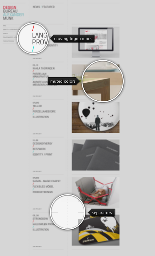
Today’s post highlights the design of AlexanderMunk.com. An austere three column layout reserves the left column for a static vertical navigation menu, and highlights five selected projects with clean typography and toned down thumbnails. Note how the fonts and colors of the project descriptions match those of the main logo – when the designer opts to use images instead of embedded fonts for extra design fidelity.
Clicking on a project description navigates to the project details, where each page maintains the same austere monochrome palette with toned down splashes of the main project color. LTC / Identity is a perfect example of using a desaturated raspberry to create a connection between all project images. The page footer is my favorite element – it lists the fonts and Pantone colors used for the specific design. This can be found in other identity project pages, such as Designsynergy, as well.
The profile page is an additional example of heavy influence of print design, with a large image used for precise layout of the text sections. This would not necessarily undermine the designer credentials as Alexander specializes in identity and interior / product design – and not in web design.

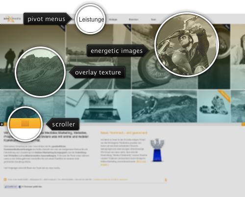
Today’s post highlights the design of AccXMedia.com. A two-row portfolio strip is the main interactive element on this single-page site. A Flash-free multi-faceted immersive experience starts with full-size photographs that capture the human size of the specific projects and maintain consistency across the entire portfolio strip. The images load and fade in on demand as you scroll to the right, and the vertical gray-blue overlay prevents a visual overload of full-color vibrant pictures.
Moving the mouse over the specific image initiates a transition sequence that cross fades the full color image and slides in a translucent information overlay with a short description of the project. Move the mouse between different images in the same row and in two different rows to see attractive and well-executed slide transition sequences of the project descriptions.
A “case study” yellow ribbon in the top-right corner marks a project that has further visual information about the specific project. Clicking such a thumbnail overlays a rich mix of screenshots, pictures, blueprints and text sections that take a deeper look at the specific project – invoking a strong connection to traditional fold out print brochures or booklets.
The slide-down menu serves as a “pivot” to apply a filter to the portfolio strip. Selecting the specific entry leaves only those entries relevant to the specific “subsection” of the company portfolio – web design, online marketing, different market verticals etc. And a rather inconspicuous icon in the bottom left corner of the portfolio strip (to the left of the yellow horizontal scrollbar) slides in a translucent listing of all entries under the current (filtered) view, enabling quicker navigation in case you’re searching for a specific project.
As an added bonus, the portfolio strip is also used to display an attractive introduction to the people behind the company. Click the “Team” menu entry to see an impressive gallery of portraits that bleed into the white space that surrounds the bio blurbs and social links. All the entries are consistently styled with the main black-yellow palette, use clean typography and inject a little bit of layout variation to keep the entire layer friendly and humane.
On a slightly less positive side, it feels that much less visual attention was spent on the bottom half of the main page, with a rather awkward horizontal layout of two large text sections, a somewhat gaudy award icon and an out-of-place Facebook connector footer. I would rather see this content folded into the main portfolio strip in much the same way as the team and contact info overlays, making it perhaps even slightly taller.
