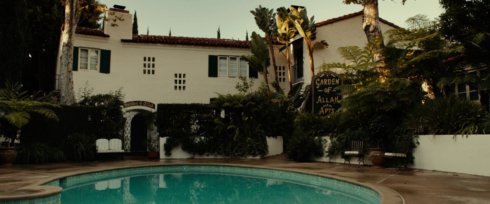
The art and craft of production design – interview with Maher Ahmad
As part of the ongoing series of interviews with creative artists working to bring us some of the most visually compelling movie productions, it is my absolute pleasure to host Maher Ahmad. As he talks about his work as the production designer on the recently released “Gangster Squad”, he goes back to his theater roots drawing similarities and differences in designing for theater and movies, talks about the changes that art departments are undergoing in the age of digital workflow, the shifting balance of responsibilities in the age of ever-increasing reach of digital post-production tools, and his bold vision for the future of 3D in movies.
 Kirill: Please tell us a little bit about yourself and your path so far.
Maher: I came to working in the movie business through working in the theater. I had an interest in the theater and acting when I was in high school, and when I was in ninth grade my mother suggested that I and my older brother go try out for a production at the local community theater. It was a musical called “Gypsy” and they needed kids in it. We tried out and got cast in it, and I was immediately taken with theater business. However I found myself drawn not only to acting but also to the technical end of it. I worked on building the sets there and working on the backstage and lighting crews, and spent four years practically living at the theater. I designed my first set while I was still in high school for that theatre.
I went to Northwestern University to major in theater, and in my first two years I was more interested in acting than I was in design, but I found that I really enjoyed the design side and I had a facility for it. I went to graduate school to pursue it and got Master of Fine Arts in Set and Lighting Design. I designed my first professional theater production in Chicago before I graduated from school, and I taught theater set and lighting design for two years after I got out of college which was great training for me.
In my second year of teaching a friend I had gone to graduate school contacted me and said he was starting a small subscription theater in Chicago, and I agreed to be the resident set and lighting designer. This was the era of what has been termed the first Chicago Theatrical Renaissance. I worked there for five seasons. In 1980 a television series came to town and the production designer was looking for a local assistant. I interviewed with him and after looking at my portfolio, he hired me on the spot. The designer was a wonderful old Hollywood art director by the name of Jack Chilberg; he was trained as an architect and he took me under his wing, showing me all about designing for film. After that I got one job after another in Chicago, mostly on feature films.
I wanted to move up to work as a production designer, but, prejudicially, being a local in Chicago made it difficult to get hired as one. So I moved to New York City and worked from there for a number of years, and then moved to California where I’ve been for the last fifteen years.
Kirill: Was it a difficult transition going from theater to movies?
Maher: Designing for the movies and the theater share an awful lot in common. What I found was that my background in the theater served me really, really well. I find that when I work with people that come out of the theater, they tend to be very well trained and have a lot of craft as well as artistry to
bring to the job. It is very much the case that people who work as designers and in technical areas behind the camera, as well as actors, bring a craft that they have from the their theater training that is well suited to working well and successfully in the movie business. For example, when I was a theater designer, I needed to design the play, provide the construction drawings, paint the rendering for the set, build and paint the scenery, design and execute the lighting, shop for the props, frequently stage-manage it – a very broad background in terms of all of the things that go into putting a set on a stage. That has served me very well in my work in the movie business. I know now how to speak to painters, I know about construction – I have a very broad and solid foundation of craft.
It works the same for actors. An actor that works in the theater has to be able to learn his lines and sustain a performance for two hours, so arriving on a movie set and knowing your lines for a scene that might last four or five minutes is not something that’s difficult for them.
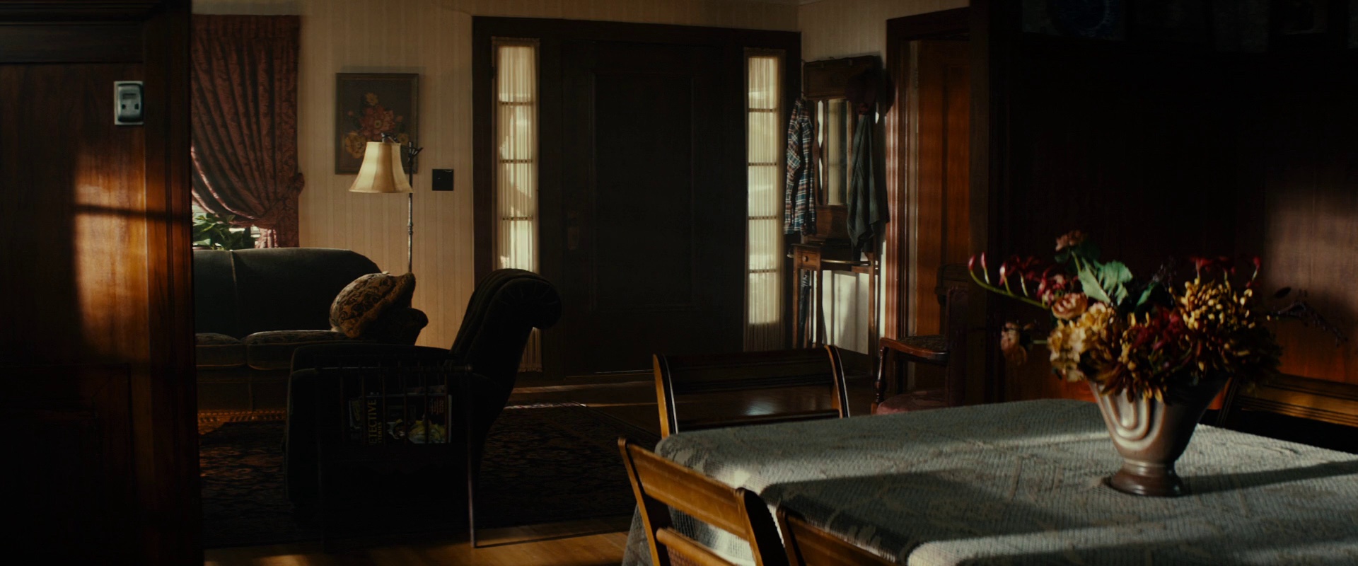
There is one profound difference between designing for the theater and designing for movies, and it’s the same difference that exists in performing for the two different media. For the designer you are putting the work of art, (and in the case of the actor he is giving the performance) for a live audience, and the interaction between the two is profoundly different from that which occurs in a movie theater. I discovered this on the very first movie that I did as a production designer. It was a period film set in Chicago. I took two blocks of a street on the North Side of the city and put it back to 1917. When the crew and the cast arrived at the set, it was pretty amazing for them to walk the street, being in the presence of and being transported backwards in time over three quarters of a century. But when you view the movie, the set looks good, but you don’t have the same kind of amazement that you had when you were there in the physical presence of the set.
That’s the difference between having an audience experience a set as a live three-dimensional piece of sculpture that they share the same space with, as opposed to an image that’s projected on film. It’s the same, somewhat widely recognized performance phenomenon that exists for an actor. There’s something profoundly different when the actor inhabits the same space as the audience. The performance becomes a mutually reinforcing live interaction between him and the audience. It may be hard to imagine, but the same phenomenon exists with an inanimate object like a stage setting. There’s a dialog that exists between the audience and the set that doesn’t exist the same way between the audience and the projected image of the set in a movie theater. It’s the difference between being in the room with Michaelangelo’s sculpture of David, and seeing a photograph of it.
Kirill: Does it make your part of the production less difficult in a sense, being on a big screen but on a flat plane?
Maher: It’s less difficult in certain ways, and infinitely more difficult in others. The camera by and large has a single point of view, so you can compose the set directly to that point of view. That is an advantage, because you only have one direction, one compositional problem to contend with. When you’re working in a theater, to a certain extent even on a proscenium stage, but particularly if you’re on a thrust or an in-the-round stage, you have to be able to compose the set from multiple directions. That exists a little bit in the movie business if you’re using multiple cameras facing different directions on a single shot – you compose the set and director of photography has to compose the lighting to accommodate different directions, which is more difficult. But by and large in film you’re looking in one direction. That makes designing and lighting a little simpler for film than for the theater.
However, the movie business is an infinitely more complicated job because its scope is much, much larger than that of designing an individual play. Even if the play has multiple sets in it, it’s nothing as complicated as designing a movie that can have 60 or 70 different sets, taking place on stages and on locations all over the place, sometimes in multiple cities or countries. It is just geometrically and exponentially a more difficult undertaking than designing a stage play.
Kirill: And on interior shots you also design the space for the camera to move around
Maher: Yes, you have to accommodate the camera, and you have to learn how the camera sees. In the theater you have to know how an audience sees with its naked eye, and what the advantages and the limitations of that are, and you have to accommodate people who are sitting close to the set, sitting far from the set, sitting at and viewing the set from different directions. In designing a film you have to understand how the camera sees objects and responds to light, which is profoundly different from the way the human eye processes light, and how composition works looking through a lens that is constantly moving as opposed to the theater goers eyeline that is fixed throughout the performance of a play.
Kirill: Has it become simpler for you now that digital cameras are much lighter and don’t take as much physical space as film cameras?
Maher: There are some advantages that accrue to the designer from the reduced size of the camera, but from the point of view of the job that I do, I still have an operator and a crew that have to be accommodated. Frequently the size of the camera is the least of it, it’s accommodating the crew behind the camera that is the issue.
Kirill: Do you prefer working on exterior sets because of that?
Maher: Actually shooting an exterior set can be as difficult as an interior set. However, when you build a set on a stage, that oftentimes is the best solution for shooting an interior. Building a stage set in its very nature accommodates the crew and the camera: you can have fly-out walls, and you build it for the specific action that it needs to accommodate. It is true however, when you’re shooting on a location, let’s say in somebody’s living room in a real house, it just becomes a more difficult endeavor. The ability to modify space to accommodate the shooting tends to be much more limited.
Kirill: What are your thoughts on digital tools that allow you to extend or augment your external sets in post-production?
Maher: They’re fantastic. The digital tools allow you to do things that were either very difficult or very expensive – or even impossible before. But one of the problems with digital tools is the notion of authorship that production designers, and particularly directors of photography, need to deal with. Once upon a time all of the objects involved in the production, the sets, the dressings and so on, were under direct purview of the production designer, and all of the photography and the lighting was under the control of the director of photography. But now in the digital world you have a third entity that contributes – the visual effects department – and the coordination becomes tripartite rather than dual. It means that a third entity makes a substantial contribution to what the picture actually looks like, and the way that interaction functions is still being worked out.
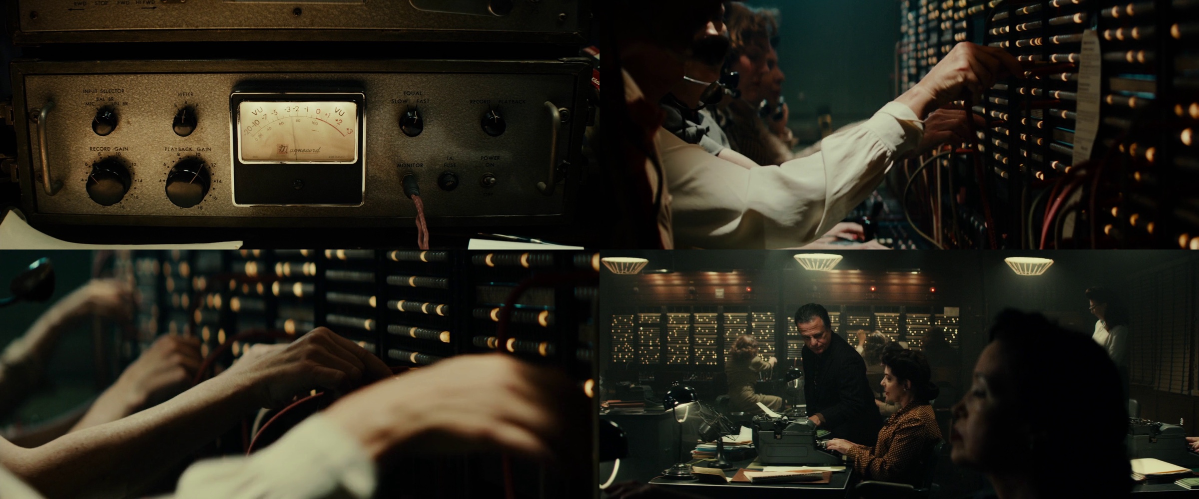
For example on “Gangster Squad” a very important part of the way the movie looks was the digital work that was done with set extensions. I contributed a great deal to what that was going to be through the concept sketches, the working drawings, and the research that I provided to the visual effects department. But it is only rarely that the studios will keep a production designer on after photography has finished, so the design kind of gets handed over to the visual effects department, and after production there is only a limited amount of input from myself. That hand-off is something that’s being worked out, is still a work in progress.
The set objects themselves; the photography and the lighting; and the visual effects – they’re all of a piece. Objects and light are inseparable, you can’t see something unless light reflects off of it, and light doesn’t exist unless it’s reflected off of an object. That job was split in two, and now that job is split into three with the VFX department. In a sense all three should be handled by one controlling artistic entity, but that’s just not possible, it’s too big a job for one person to do, and the mechanics of how it has to happen just don’t allow for that.
Kirill: Is it a power struggle, or a shift in the balance of responsibilities between more people?
Maher: I wouldn’t exactly describe it as a power struggle, although the relationship can be sometime fraught, but no more fraught than any other relationship can be when you work in collaborative art. In other words, there can be a power struggle between a director and an actor if they’re not working collaboratively – but that’s not the way it’s supposed to work. And that’s the way it is with design, photography, and visual effects. If there is a struggle, it doesn’t speak very well of the people who are doing the struggling – they should be collaborating rather than struggling.
Kirill: If it’s becoming easier to build sets that are extended and augmented with VFX in post-production, is that affecting the actors?
Maher: You have to bear in mind that from the very, very beginnings of filmmaking, even before movies could talk, there were photographic tricks that were done that amounted to visual effects. It’s not anything new at all. It’s just that now, using computers, it has become cheaper and easier to do than it ever was before, and its use has increased exponentially. But before computers there were all kinds of visual effects techniques and photographic tricks. It is my observation (I am not an actor), that there are situations where it’s become much more difficult for actors than it ever was. In certain productions they tend to do a lot of green screen work, and interact with entities that are not other actors on the set, and even the set is not there: they are in a green box.
Kirill: Switching gears to Gangster Squad, how did it start for you?
Maher: I had worked twice before with the same director, Ruben Fleischer. I’ve designed all three feature films that he’s done. I interviewed with him for Zombieland and I guess he was impressed enough with my work and my interview that he hired me to do the picture. It was very good working collaboration, and when he did his second picture, 30 Minutes or Less, he hired me to do that. And then he started talking about Gangster Squad, and I joined him. He’s a great director to work with.
Kirill: When did your involvement start on this movie?
Maher: Because the production designer is one of the very first department heads to be hired on a movie when it’s green lit, there are two situations that we find ourselves in. Sometimes you get a call on Monday for an interview, you go to the interview on Wednesday, you get offered the job on Thursday and they want you to start next Monday, and it happens very fast. Or alternatively, there’s a project that is not yet green lit, the director wants to hire you, the thinking is that the show will get a green light any week now, but then you wait week after week for quite a while until the production is given the go ahead and you’re put on the payroll – that latter situation was what happened with Gangster Squad.
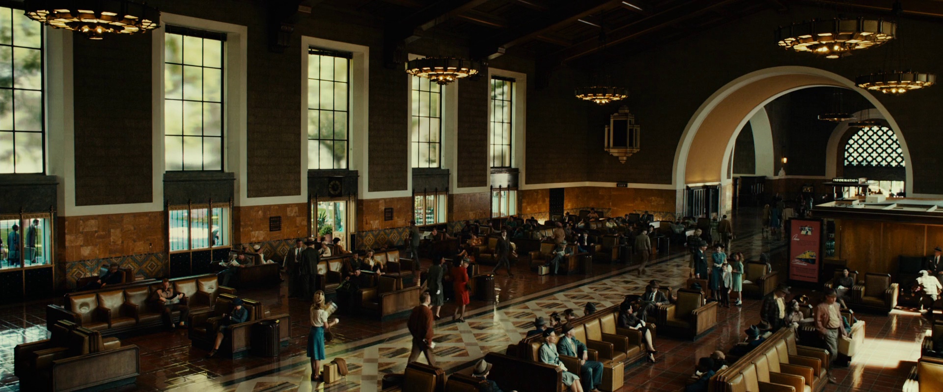
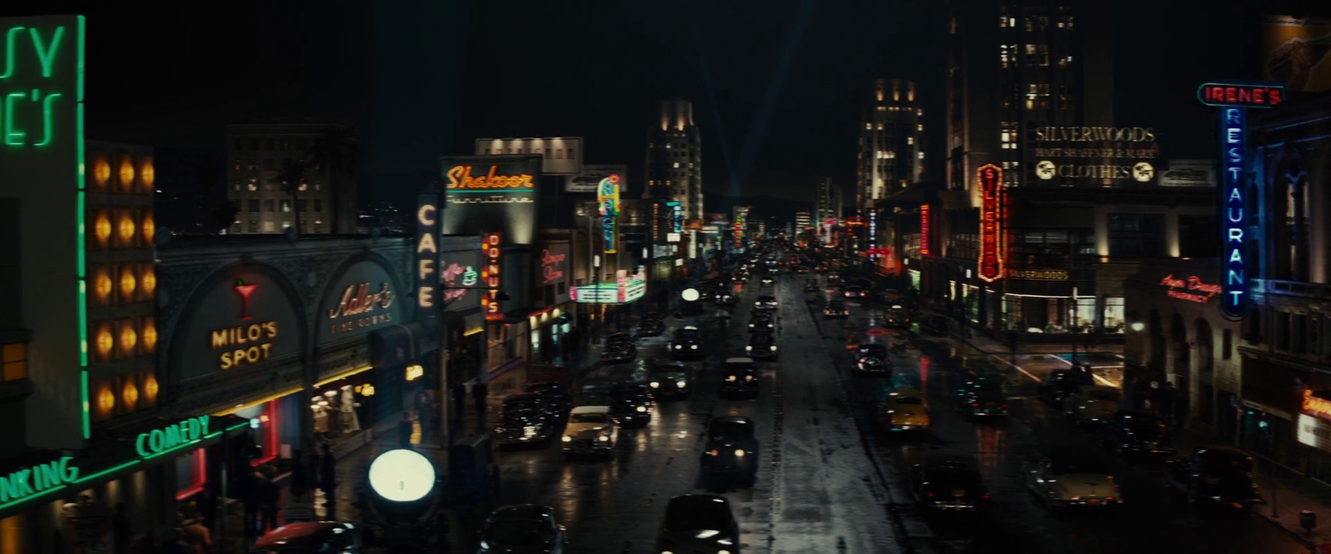
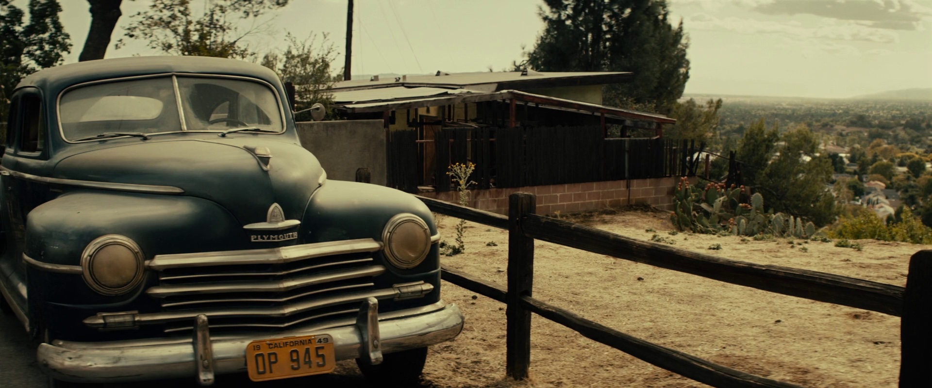
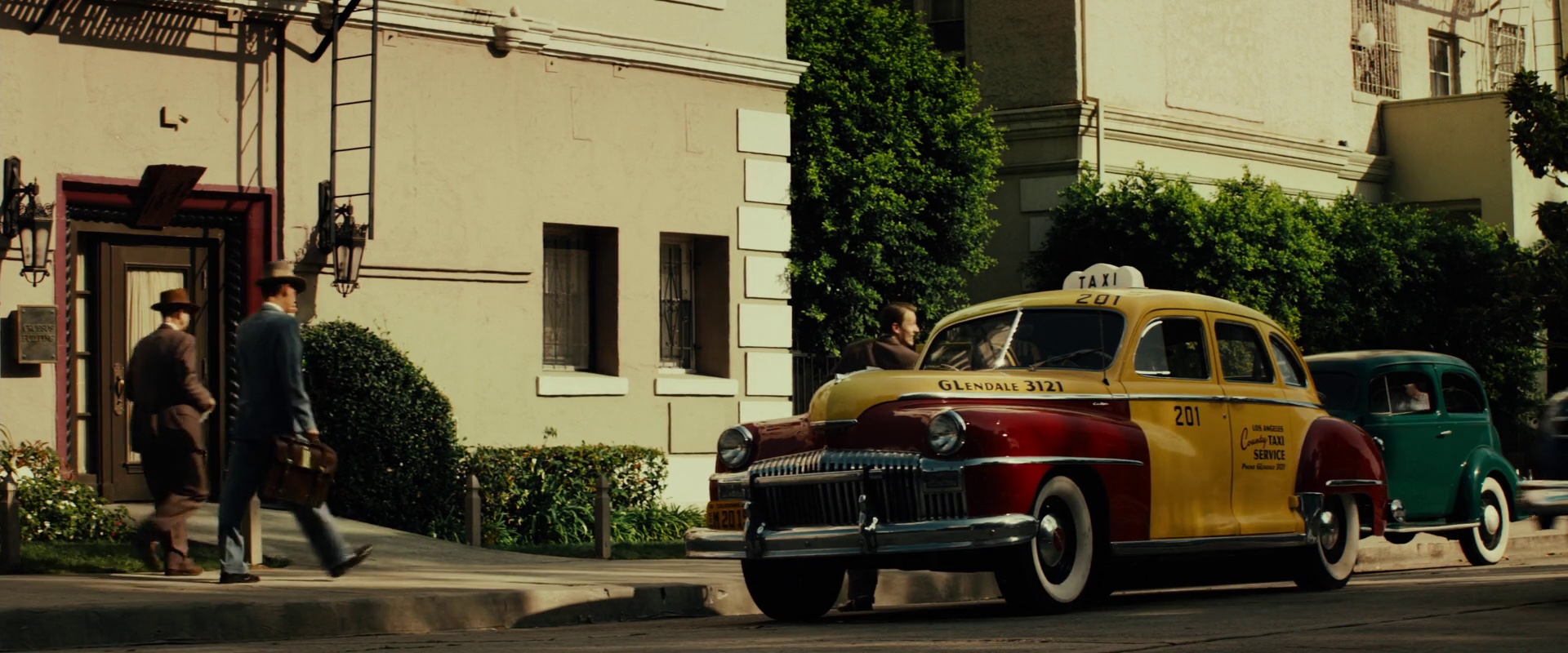
I actually worked on it for almost three months basically for free until it was ready to start production. There was a disadvantage in that I wasn’t earning a salary, and I was turning down other work, but the advantage was that I had a lot of time to do research, and a lot of original location scouting both by myself and with the director. It gave me a lot of time to prepare for the picture. Doing a period picture is a very complicated affair because it requires a lot of research into whatever the period you’re doing, and it allowed me to do a great deal of original research on my own. By the time we were done I had something like 20,000 separate images of Los Angeles in 1940s to pull from to design the picture, and that was an advantage. But it took a while until the picture was actually green lit, and once we were given the go ahead, for as large a picture as it was – about 65 different period locations – it wasn’t really long prep period. We only had twelve weeks of pre-production, it was very fast.
Kirill: Did you have the entire location list by the time the movie was green lit and you knew the budget?
Maher: Not even close [laughs]. The budget always influences what you can do in terms of renting locations. First of all, there wasn’t an enormous amount of location scouting that I did beforehand. We had a handful of locations that we were settled on, but there was still a lot to do once pre-production began. We had a very large location department because we had to kind of scour the entire city of Los Angeles to find the best places to shoot a period movie. It’s much more complicated than when you’re doing a movie that is set in present day.
Kirill: Was it the intent from the very beginning, to shoot on locations?
Maher: We intended from the start to both shoot locations and build sets. We did both.
Kirill: Was that collaboration between you, the director, and the cinematographer?
Maher: A cinematographer doesn’t usually come on to a picture until we are pretty deep into the production. Dion Beebe was the director of photography – a wonderful and very talented man. I’m guessing he came on about six weeks before we started, and I was on twelve weeks before we started, in addition to the three months I did before we were green lit. The location department starts immediately as soon as we got green light.
Kirill: Even though it’s not set too far in the past, how do you make sure that nothing modern sneaks into the frame when you’re shooting outside?
Maher: By and large once you have the list of what the sets are going to be, you begin looking for the best places to shoot at, places that give you as much as you need – and then you try to figure out what physical changes you need to make to those places and what can be done with visual effects to pull the whole thing together. You also need to divide the script into what you think are going to be locations and what are going to be stage sets. It’s an ongoing process, something that you think about when you first start, and then you go back-and-forth a lot between what you’re finding in terms of locations and how you’re going to alter the locations to make them work for the period, and what you think needs to be built onstage for those locations to work.
It didn’t make it into the movie, but we knew we wanted to shoot the Chinese theater, and the Chinese theater itself was practically perfect. It needed minor modifications, but Hollywood Boulevard had a lot of problems. So you’re making a decision that we’re going to shoot the real Chinese theater, and we’re going to have to do a big green screen across the street, and we’re going to have to make all these individual physical changes to the location to make it function correctly. The building where Mickey Cohen kept the girls enslaved was a building that we’ve found on Cherokee Street in Hollywood, and the building itself was pretty good for period, however the exterior and the street still needed a lot of modifications. And the entire lobby needed to be redone for period, the but it was basically a pretty intact period location, and we didn’t need any visual effects done. It was all physical work on the ground. Then we had to build the hallway and the rooms where the girls were kept as a stage set, because the hallway and the rooms at the location could not accommodate the action that needed to take place, and we also had to do a huge explosion and a fire. We also built the elevator because of the fight and the fire that needed to happen in it.
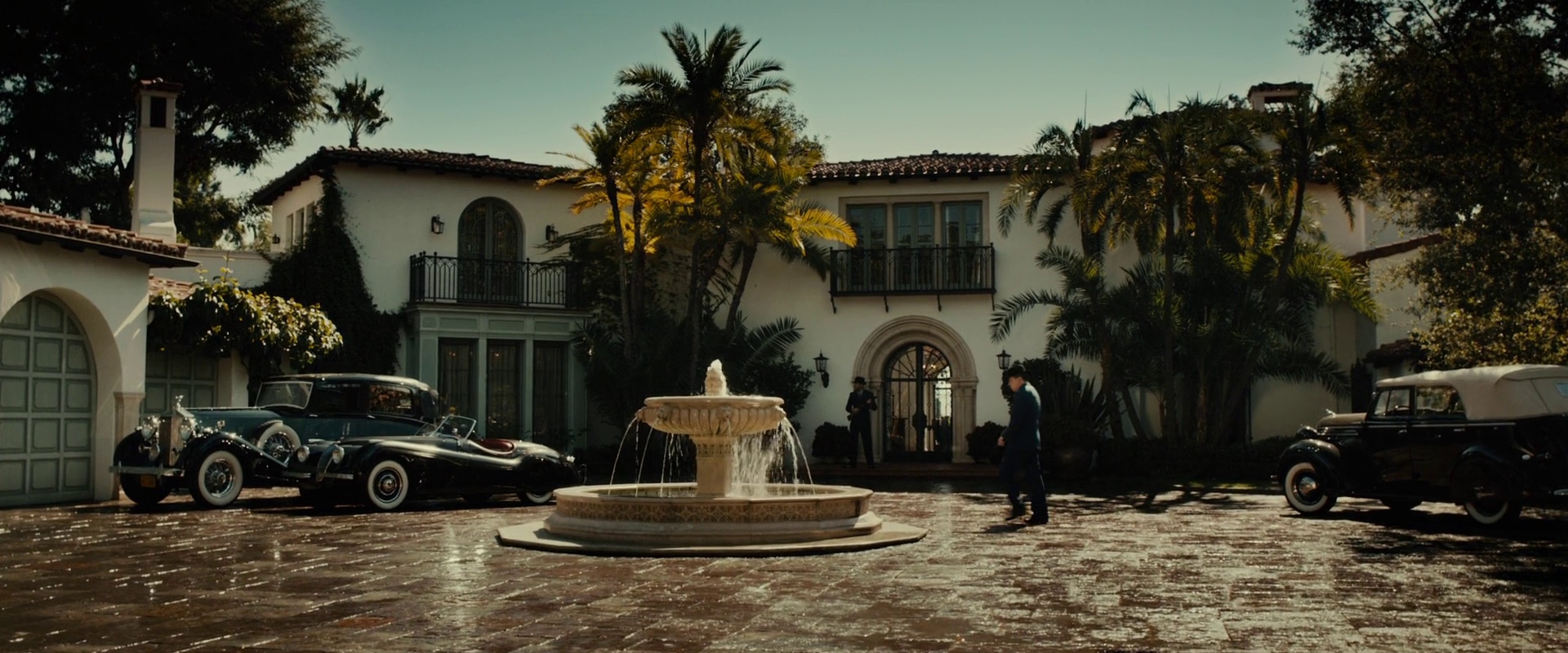
O’Mara’s house needed a lot of work on the interior, but the exterior was fairly good. There were a couple of houses on the street that were problematic and we managed to make physical changes in those and hide things to make it work. We picked our angles. You go out and see what there is for a location, and judge how it needs to be modified either physically of with VFX to allow you to get the kind of shots that you want to get. Ruben from the start said he wanted the picture to have a lot of scope, and that necessitates a lot of both physical work and visual effects work.
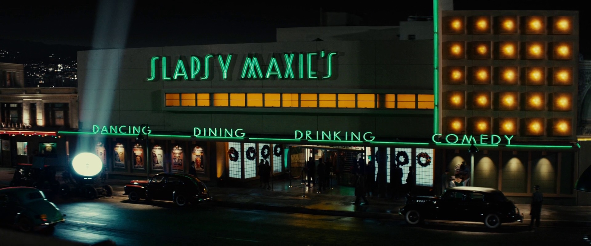
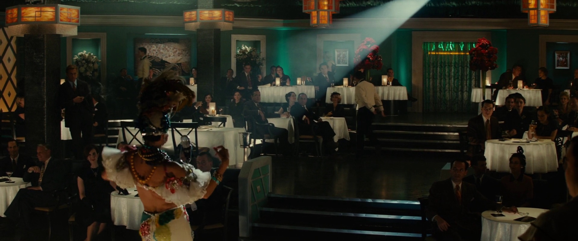
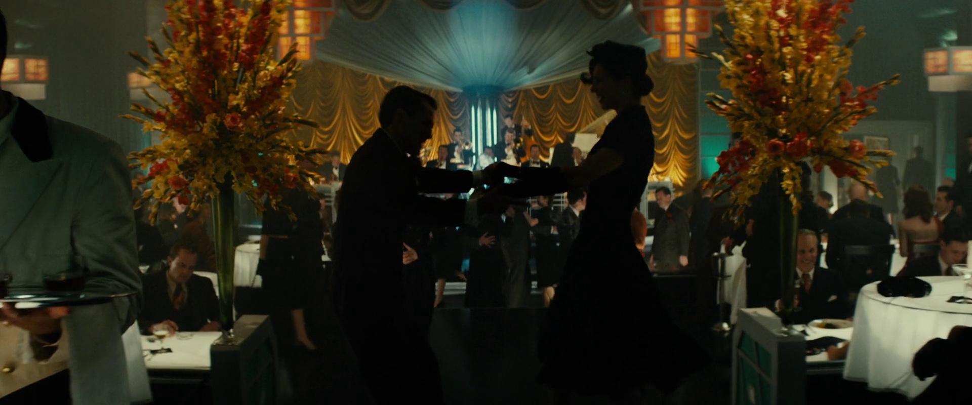
The location for the Slapsy Maxie’s set was a very good block in Bellflower that was originally constructed right in our period. However all of the storefronts (about 20 of them as I recall) needed to be redone physically. We did the signage and redressed all of the show windows. And of course the full façade of the exterior of Slapsy Maxie’s itself was redone physically. The view down Wilshire Boulevard was done as set extension in VFX. The interior of Maxie’s was an old supermarket that was empty, and I built the night club inside there, with the lobby in front and the back stage area behind it, and the bookie operation upstairs in that same place. That location was a very good find, which I found when we were driving by looking for other things in the neighborhood. It was great because we had a very good street facade to start with, and a large empty space to build a stage set inside of. That allowed us to do what we called the Goodfellas shot where Ryan Gosling walks on the street, and then into the lobby and into the main night club all in one long take.
Kirill: And then at some point you start hiring people in the art department to build those things.
Maher: The art department is quite a large department and it spends a lot of money. The production designer supervises five different departments. There’s the art department itself that consists of myself and my principal assistant whose title is the art director; illustrators; the draftsmen who do the actual construction drawings for the sets and the alterations on the locations; and researchers, the art department coordinator, and production assistants. I also hire and supervise the set decorator who is a critical component of the team. The set decorator deals with the furnishings and all of the interior dressings and exterior dressings for the sets. I hire and supervise the construction coordinator – he supervises construction crews that build the sets and do all the construction work on the locations. The head painter is also my hire and I supervise him and his crews. Frequently the production designer will hire the location manager, but in any case he and I have a very close collaboration, as there is between the production designer and prop master, and obviously there’s a lot of collaboration between the production designer and the costume designer. I don’t hire the costume designer, and I usually advise on the hiring of the property master; the other department heads I directly hire myself.
Kirill: Do you at some point become more of a coordinating manager?
Maher: No I wouldn’t call it that. It’s more akin to the relationship between the director and the actors. In other words, you wouldn’t call the director a coordinator. What he does is direct other people, and what I do is direct other artists to bring my artistic vision to fruition. The director does that with all of the department heads. He’s an artist and he coordinates the artistic vision with the other artists he’s working with, and it’s very much the same for me. Some of the people I supervise are more technicians than artists, but some of them are indeed artists. The set decorator is an artist in his own right, he’s not a technician. The construction coordinator is more a technician rather than an artist, but there’s certainly some artistry that goes into doing what he does.
Kirill: Once the shooting starts, are you primarily on the set, or off to the next one?
Maher: Both. I will always open the set, which means I’m there before the start of the day to make sure that everything is prepared for photography. And then I will stick around to make sure that everything is going all right, and if there isn’t a particular need for me to be on the set, then I’ll go off and do other things, checking other sets and planning for the what is to come. There are some designers that spend a great deal of time on the sets, and there are some that spend less; it depends on how an individual designer works, what the director expects of the designer, and what the designer’s strengths are.
Kirill: When you’re shooting digital, you can look at the video monitor and see what the camera sees directly, without waiting for the next morning’s dailies. Is this important for you?
Maher: It is easier to know what’s going on, but what I need to be concerned about – what is directly under my purview – is something that is probably as readily perceptible on a good monitor that is the video tap on film as it is in terms of looking at the monitor of a digital camera. It is much more crucial for the director of photography to see exactly what he is capturing than it is for me, because he’s the one that really needs to see exactly how it’s lit, how the color is being rendered, what the exposure is on the camera. What I need to know is more about the composition than anything else when I look at the monitor, and more about making sure that physical objects on the set are the right physical objects and are composed in appropriate manner. It is less of a critical item for the production designer than it is for the director of photography.
Having said that, the digital image is a much higher quality image than a regular video tap, so it is just a lot better.
Kirill: Does this mean that your craft is not being affected by this transition to shooting digitally?
Maher: It is being profoundly affected by it. In terms of what I see on the monitor, it’s not that much of a difference, but the difference between digital photography and film photography is very much there for what the production designer does. Moving from film work to digital work is as critical for what the production designer does as it is for the director of photography, for the make-up artist, for the costume designer, for the hair person, for everybody. The image is captured in a different way and you have to accommodate the way it is captured. Having said that, I think that as digital photography becomes more sophisticated, the ultimate output is going to more resemble film work. But one has to take into account the fact that you’re shooting digitally rather than you’re shooting on film.
Kirill: Won’t it go away on its own once digital cameras match the dynamic range of film and will be able to match the feel of the grain as one of the settings?
Maher: One thing that I have found in my own experience is that practical fixtures on a setting are becoming more and more important to capturing the image – to give the director of photography the light that he needs to capture an image. As digital cameras become more light-sensitive, the practical fixtures on the set become more important, and there’s more collaboration that needs to happen and more thought needs to be given to what are the practical fixtures on the set and how they are going to aid in allowing the exposure that captures the image. That’s not to say that practicals were ever just incidental. But I think they’re becoming much more critical than they used to be, because the camera requires a lot less light. So the practical fixtures can become not only just motivational lighting, but actually the exposure lighting.
Kirill: Is digital the way of the future?
Maher: I have no doubt at all whatsoever, and have not had any doubt for probably longer than a lot of directors and directors of photography that everything is going to be digital. I don’t think anyone’s going argue that that’s not where it’s going now. One day movies will be shot on film only in the way that movies are shot black-and-white now – just when you want it for a particular artistic effect or result. I remember years ago speaking to an editor that said that digital editing will never become wide-spread because one has to feel the film in your hand, and cut the actual 35mm film. I was quite young, and I was not about to argue with a highly experienced editor about this, but I thought to myself that it didn’t make any sense, that one day all movies are going to be edited digitally. And that is, in fact, what has happened. I don’t think anything is edited non-digitally anymore, even if it is shot on film. In the future I think that a movie will be shot on film for an artistic effect or as a specialty item only, much in the way that doing a silent picture or a black-and-white picture is done for a particular effect.
And I will also say this. People that think that 3D is going away are the people who in the 1920s would have said that sound is a gimmick, and there’s no point in having sound in movies, and why are we bothering with it. And they’re probably the same people that would’ve said in the 30’s that color is a gimmick, and that movies should always be in black-and-white. Three-D is here to stay and it’s my opinion that there’s no picture that can’t be improved by shooting it in 3D, and that one of these days all pictures will be shot in 3D, unless the artistic decision is made to deliberately shoot it in 2D, in the same way one might make an artistic decision to shoot a movie in black-and-white.
Kirill: But for now it hasn’t crossed from sci-fi into the “mainstream”. Maybe “The Great Gatsby” will be the first step there?
Maher: The fact of the matter is that it was exactly the same situation both with sound and with color. The lack of instant acceptance was due as much to the additional cost, and the newness and the refinement of the technology as anything else. Once the technology and the costs came down, the notion that you would want to shoot anything but a sound film, or anything but a color film – unless you had a specific artistic reason to do it – became preposterous. Why would you not want to shoot in color? Why would you not want to shoot with sound? And some day people are going to say why would you not want to shoot in 3D? It brings the experience much more directly to the viewer, and it does what color did. Color gives the viewer much more information than black-and-white does. There are three components to color – the value, the intensity and the hue. In black-and-white you lose the hue and you lose the intensity, and you only have the value.
When you supply to a viewer the hue and intensity that comes with shooting color, you’re capable of giving him much more visual information than you have otherwise. And when you shoot 3D, you’re capable of giving the audience much more information visually. There may, in some cases, be a specific reason to deny the audience that additional information, and that is an artistic decision to be made, but I believe that eventually there will be no good reason for not shooting something in 3D. It will cross over – even though right now it’s difficult and expensive – and I’m as convinced about the future of 3D as I was about digital editing.
Kirill: What about the viewing capabilities? There are more and more theater conversions to the new projecting equipment, but home TV sets haven’t see a lot of 3D set sales. Also, people are increasingly going to online streaming services and consuming movies on smaller handheld screens. Is that a barrier?
Maher: It’s a barrier now simply because the state of the art; the technology isn’t completely there yet. But I have no doubt that “easy 3D” is a technological goal that will be reached. Right now people complain about the darkness of the image, and of having to wear the glasses (which is quite frankly not that big a deal). But they’re working on 3D where you don’t have to put glasses on, and eventually I’m sure that they’ll have 3D that you can view on Netflix. It’s true there is very little content for 3d TV right now, but the same existed with color TV back in the sixties. The fact is that the technology is there, and that it’s going to advance. Some day we’ll be able to stream movies in high definition on a large screen in 3D, when broadband becomes wide enough and when the technology is discovered.
Kirill: Looking back to what you do, does shooting in stereo affect the way you choose and decorate the sets?
Maher: I have never designed a 3D production, although I have been a fan of 3D since I was very young. The creation of a 3D effect from a two dimensional image was actually invented before photography was. I’ve collected the old 3D stereopticon slides and other 3D still formats my whole life. The steropticons are these big cards with two images pasted on them, pretty much always in black-and-white. You put them in a viewer that you hold in your hand. They’re a Victorian invention, and they kind of went out of style right before World War II. The images pop out at you in an incredible fashion. I have been deeply
involved and loving 3D ever since I was quite young.
The fact of the matter is that film has always striven to give an audience the information that’s involved in three dimensions, even when it was shot in 2D. The kind of sets, the compositional devices that are most visually effective in 2D are those that are even more effective visually in 3D. In other words, if you want to set up a really interesting shot, to give the audience a notion that they are actually participating in a live manner in viewing something, you want to set up a foreground, a middle ground, and background, and you want the camera to move so all the objects in the frame move against one another – that’s what gives you the impression of three dimensions. When you’re capturing an image in two dimensions, it is much more effective to dolly a camera towards the set than to zoom on it. When you’re zooming on it, the objects within the frame don’t change in terms of the relationship that they have to each other, but when you dolly on it, they do. So a dolly is preferred over a zoom because it gives you three-dimensional information. And to design a set effectively, whether you’re working in two dimensions or three dimensions, you want to compose it so that it inherently has a composition and object distribution within the frame that is as effective as possible to telegraph the fact that you’re in a three-dimensional world. So if it’s good for 3D, it’s good for 2D. If it’s good for 2D, it’s even better for 3D.
If you photograph a flat wall painted a flat color, whether you photograph it in 2D or 3D, and you zoom in, it’s nothing but a flat wall painted with a flat color, and you get nothing but flat. If you zoom in on a living room where you have a chair in the foreground, a lamp in the middle ground, and a window in the background through which you see trees and a landscape – even in 2D it will still give you a feeling of three-dimensionality because the objects all overlap one another – and when you dolly on it, the movement of the objects against one another give you a really good feeling of three-dimensionality. The chair is going to move relative to the lamp, and the lamp is going to move relative to the wall, and the stuff outside the window is going to move relative to the window. And if you shoot a still of that in three dimensions, you have a really strong 3D effect, and if you move on it in three dimensions in 3D motion photography, you have a tremendous feeling of depth.
Kirill: Does that go back to what you said about theater sets, with a stronger presence of an environment, a stronger sense of a different world?
Maher: It’s not that it’s a different world. It’s that the dialog that exists between the audience and the work of art is a different dialog. My whole life I had seen photographs of Michelangelo’s David, the sculpture. I quite possibly have seen it in a 3D stereo slide which may have looked much more alive and real. But being in the same room with that work of art had a dialog that existed between me and the work of art, and the work of art and myself, that can’t possibly exist in a photographic image, whether the image is two-dimensional or three-dimensional. In the same way, the actor’s performance from a projected screen to an audience sitting in a movie theater does not have the same kind of interactive dialog that a performance of a live actor in front of a live audience has no matter how it may be photographed. It is a different way of experiencing a work of art.
I was amazed when I first realized that an inanimate object can have a dialog with an audience. A live actor in front of a live audience is profoundly, at its core, different from a projected image in front of a live audience. What amazed me was that an inanimate object, a stage setting, also has its own dialog between itself and a live audience, which is different between its projected image and a live audience. In the same way my experience with Michelangelo’s David was profoundly different when I was in the room with the piece of sculpture than when I was looking at photographs of the same piece of sculpture.
Kirill: Can this gap be closed by moving to 3D projection?
Maher: Not closed, but it brings you closer to it. That’s a very astute observation. The goal with film has always to immerse the audience into the world of the film. That is the goal of any work of art – painting, ballet, symphony, theatrical performance, or a piece of cinema. You want to bring the viewer into the world of art that you’re creating, and I think that 3D helps do that. Again, there may be times when for a particular artistic effect you don’t want to do that, in the same way that at certain times for particular artistic effect you would rather shoot in black-and-white than color. But by and large color is going to draw an audience into that world more directly than black-andwhite will, and by and large, in my opinion, 3D will draw an audience member into that world of artistry you’re creating more effectively than 2D.
Time will tell, and it’s not like there haven’t been things that were dead ends technologically. There was this thing called Smell-O-Vision that would blast scents at an audience, meant to enhance the experience and that certainly died a deserved death. There was also Sensurround where an earthquake movie would vibrate the seats, and that was supposed to bring you more intimately into the experience, and that went nowhere. I may be proven wrong, but time will tell. I’m willing to bet anything that most movies are going to be shot in 3D.
Kirill: Going back to Gangster Squad, was there any particular set that was your favorite?
Maher: My sets are like my children, and I don’t have favorites. Some of them turn out better than others, some cost me more money than others, some cost me more trouble than others, but I love them all equally. But I will say this – one of my favorite sets on Gangster Squad didn’t make it into the movie. The sequence was cut because it didn’t fit in with the way the story was being told and with the length of the movie. That set was a recreation of Chavez Ravine which was a Mexican neighborhood that used to exist where the Dodger Stadium is right now. The neighborhood was dismantled when the stadium was built. I found a park and we recreated a part of Chavez Ravine in it – several houses and a big garage. I just had enormous fun designing the set and it turned out really beautifully. Unfortunately, it didn’t make it in the movie. But I did have a particular affection for that one.
I like them all, even the small ones. Actually some of the small ones that I have done that require the least money and the least effort have a really elegant solution to a design problem. I have a great fondness for this bus stop I did for Miss Congeniality 2. It was a very simple set, but it was an elegant solution to the problem of having to have a scene play on the particular street corner in Pasadena that had no bus stop on it. It cost next to nothing either in time or the effort to put it together, but it was such an elegant solution. It’s a set I’m particularly proud of, although it’s never going to make pages of any magazine.
Kirill: Is it difficult seeing those sets dismantled after it’s all done, especially since you compared them so eloquently to children?
Maher: That’s a question I get all the time. When I first started out in the theater, it was a bit of a disappointment. What I did throughout the years I was designing theatrical scenery was to make sure to take a lot of still photographs. In the theater nothing is left at all once the set is torn down, unless you have still photographs of it. In the movie business you always have the completed film; insofar that they were photographed (because large parts of all sets by necessity end up not being photographed), my sets will continue to exist, they exist on film. I’m careful now to photograph as many of my sets as I can so I have still photographs to document them. As to having seen them torn down? It’s just part of what I do, and I kind of got over that a long time ago.
I will say this though. There are situations where sets that should not be torn down – because they could provide a resource for other productions – are destroyed. It annoys me greatly when those sets are torn down. As a matter of fact, there was one on Hangover 3 that I just finished designing. It was what I call set on location. The location was the Con Edison plant in Eagle Rock, a big power plant. Basically it was a giant room and I build a three-tiered prison cell block inside of it. It was something that was very expensive to build, and turned out to be a very good looking set. Los Angeles doesn’t have a multi tiered cell block where you can go shoot. There’s Lincoln Heights Jail which is a very good looking jail, but it doesn’t have one of these big threestory cell blocks filled with jail cells.
I tried to pitch to Con Edison and to Warner Bros that we might leave this as a standing set for other productions to use, but we got nowhere with it for a number of different reasons – safety, liability, lawyers, and determination of what is in the best interests of the studio and the location owner. The bottom line is that what could have been an enormous shooting resource for Los Angeles got demolished. The same thing almost happened to the 3/4 million gallon wave tank that I built in Louisiana for “The Guardian.” It was very close to being destroyed but at the last minute it got a reprieve and has been very useful for a number of productions since we made the movie.
Kirill: Is it weird to see the completed movie for the first time, trying to watch it as a whole without thinking about what went into each set?
Maher: That’s a very interesting question. Generally on first viewing that’s about all I can see. It’s hard for me to get involved in it as a movie. Even though I looked at the dailies, I’m looking now at how the movie is edited together, and how the sets were used, and what takes were used in the movie. Frequently during my first viewing of the movie I’m not in a position to just look at it as a movie. I’m looking at my own particular work in it. But then on multiple viewings I can let myself go and just enjoy the movie, see it as the whole movie. That’s one reason why when my movies come out, I frequently will go see them four or five times projected in the theater. On my first viewing I tend to concentrate on my own individual responsibility rather than seeing the movie as a whole.
Kirill: Even though some significant time has passed since you’ve finished working on that production? It can take a few months or a year depending on when the studio decides to release it.
Maher: That brings up another difference between working in the theater and working in film. In the theater the culmination of all of your efforts is immediate and comes right at the very end of the period that you’re working on it. Opening night in the theater – everyone is there, and whether it’s a hit or a flop, everyone is there to experience the fruition of your work. In the film business the fruition of the work for those people who work on the actual production process, as opposed to post-production process, happens months after you’ve completed your involvement with the project. For example, Hangover 3 is going to be opening at the end of this month, and I won’t be able to attend the premiere because I’m here in Atlanta, and I can’t go back just for the premiere. Consequently I can’t participate in what is the culmination of that effort – seeing the performance in front of an audience.
That’s something that you get to do when you’re working on a theatrical performance. In terms of my interaction with the film after it’s opened and I’ve moved on – it’s safe in the background. It becomes a done thing in the same way that the theater design would become a done thing. It’s pretty much over. However, frequently years after I’ve finished a movie, when I’m out scouting on another movie, I might run into a location, and I will look at it and think that it would’ve been a really great night club location for Gangster Squad, you know. I find myself scouting locations forever, even on projects that have been completed a long time ago.
Kirill: Is it easy for you to view work of your peers, to see a movie that you haven’t worked on? Do you immerse yourself in the story, or do you look at the particular aspects of the production design?
Maher: Both, and generally if it’s a really good piece of filmmaking and I’m really caught up in it, then I’m less analytical about how it was shot and about how it was designed. But if I find that the movie isn’t particularly good, I can always look at the way it was shot or designed.
Kirill: Are there any specific productions recently that you’ve found particularly interesting or challenging from the professional artistic and craftsmanship perspective?
Maher: Here is an insight that I have developed over the years: You will rarely see a mainstream Hollywood picture that is badly designed or badly photographed. The level of quality in production design and cinematography generally in Hollywood films is almost always really good. Some designs are better than others. Some photography is much better than others. But rarely do you see a mainstream film and say that it was really badly designed or really badly photographed. This stands in contrast to the writing, direction, and performances. There’s a lot of movies that you go to and say that it was a terrible piece of writing. I think that is not the product of the fact that designers and cinematographers as a whole are more skilled than writers and directors. I think that it’s a result of the fact that what designers and photographers do is in a profound sense easier than what writers and directors have to do. Particularly writers. The job of writing a good script is much more difficult than designing a really good-looking movie, or photographing a really good-looking movie. Other people may not think that that is a valid insight, but generally I believe that it’s a much easier endeavor to come up with a well-designed or a well-photographed movie than it is to come up with a really well-written one.
And here I’d like to thank Maher Ahmad for graciously agreeing to the interview and for taking the time out of his busy schedule to answer my questions.