Continuing the ongoing series of interviews with creative artists working on various aspects of movie and TV productions, it is my pleasure to welcome Howard Cummings. In this interview he talks about his work on “Side Effects”, a mystery thriller directed by Steven Soderbergh featuring Rooney Mara, Jude Law and Catherine Zeta-Jones. In addition, we discuss his other two productions, “Behind the Candelabra” and “Contagion”.
Kirill: Please tell us about yourself and how you started in the field.
Howard: I went to the graduate school at NYU to study scenic design for the theater. Right after graduation I was asked for help to find somebody to work on this movie, and I said that I’ll do it myself. I had a theater job at the time, but when I did it, I knew right away that film was what I wanted to do.
I was the assistant designer on Nine the musical which was turned into a movie a couple of years ago. I’m not that skilled a draftsman, and I wasn’t a very good as an assistant art director. But I was good at organizing everything else, so I kept getting jobs from this one guy, because I would do everything.
When I did my first film project, I didn’t realize that there were prop people and decorators; in the theater you have to do everything, so I did it all. The producers were so shocked, and they decided to hire me for their next project. It was a very hands-on experience.
Kirill: You have so many people with so many different responsibilities in all these departments. What were your first impressions getting into that world?
Howard: It just seemed to fit. I was better as the designer as I found out. It seemed very lucky in the beginning to be working on the “American Playhouse” TV series. It was a literary-based historical drama, and my first experience as a kid fresh out of school was designing these historical pieces. The first was set in 1583 and we had to make everything. Then I did three movies in the 1900s, the Eudora Welty story in 1930s, Lanford Wilson’s play in 1950s – I got a real broad spectrum of design challenges. I didn’t really do the New York Lower East Side street movie until later. I did have that experience, but not until after I did a good amount of research.
My next project is turn of the century for Steven Soderbergh. He was supposed to have retired, but he suddenly decided not to. He’s more interested now in doing long format TV. We’re about to start a pilot and 10 episodes, and it’s about a drug-addled progressive surgeon in New York at the turn of the century. I’m kind of going back to where I’ve started. I have a reputation for gritty reality, but lately I’ve been able to do other projects and I’m really excited about this particular thing. It’s where my roots were.
Kirill: Your career started before the pervasive availability of digital tools that allow augmenting and enhancing physical sets in post production. Looking at the list of your movies, I see “Percy Jackson” as the only production that used these techniques on a large scale. Are you staying away from such productions on purpose?
Howard: No, I didn’t. I sort of didn’t get a reputation for that. I’ve been doing art films, and I got this interview to take over a job. At the time it was the biggest movie ever made in Canada, “The Long Kiss Goodnight” that was budgeted at around $140M back in 1996. We had a fair amount of digital effects in that movie. So that was my first experience coming across the birth of digital enhancing and set extension. There was this guy working out of Venice who taught me a lot about those tools. Back then you did have to build bigger pieces, and rotoscoping was so time-consuming and expensive.
I never got to do sci-fi movies. People tend to want to hire you for the type of jobs you’ve done in the past. You can get pigeonholed. I’ve done a lot of thrillers, but I’m not sure how that happened.

Continue reading »
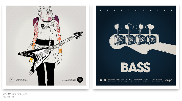
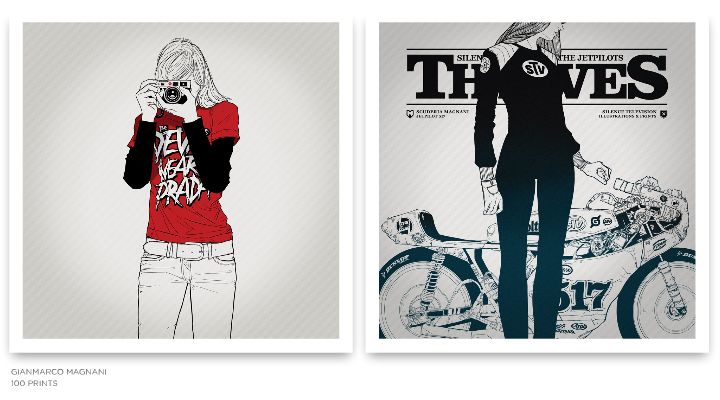
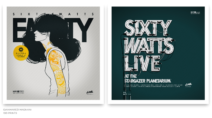
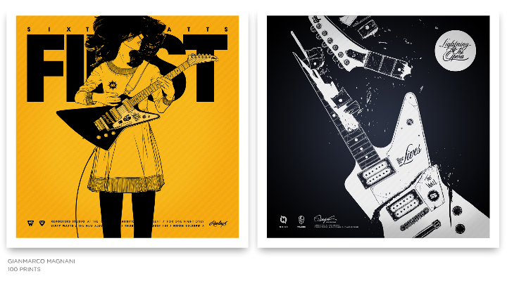
Strikingly beautiful compositions of simple lines and complex structures highlighted by limited color palettes and bold typography. Welcome to the world of Gianmarco Magnani (or M for short). In this interview he talks about his early influences, finding his own style and working on two large-scale projects, “100 Prints” and “Sixty Watts”.
 Kirill: Tell us about yourself and how you started in the field.
M: I studied graphic design but I focused my attention as an illustrator. I love books but I’m not one of people who read a lot. I love everything about design and I love to be involved in projects and art direction. I have always been drawing since I was a child, so I think that in some way I’ve always been in the field.
Kirill: Why did you decide to move from animation and video to illustration?
M: When I was in college I was completely focused on animation and everything related to the screen. Then I started working as an animator for different clients, as well as on some personal projects. At the very beginning everything looks great but then I started to see that developing a great product took a lot of my time, and required to have a team to work with. Then you add up all those things about screen resolution, plugins, or any other technical issue that changes under you every six months. So I decided to think about something more simple technically, something that it won’t change so quickly and also something something that I really would want to do.
I always loved everything about drawing, so I made some explorations being an illustrator and the things went really great.
Kirill: What informs and shapes your taste and style?
M: It was the 80’s. I was around eight years old, and we didn’t have Internet, computers, phones or even 150 channels on the TV. Communication was very limited, but I had an opportunity to be involved with things that came from Japan. It was really hard to come by things like that in those days, and for me they were the first design references. A good friend of mine who traveled from time to time to Japan gave me some VHS tapes with TV shows from Tokyo, a lot of Japanese magazines and some action figures as well. I couldn’t understand anything of what I was seeing, but all those images, icons, packagings, booklets and texts were very attractive to my eye.
I’m really sure I’m going to keep those references always in my work and in my mind. I’m also very influenced and very interested in books about graphic design and identity. And there is a recurrent interest about designs made in Germany in every field, and also some interest on the Scandinavian style.
Kirill: The human figures in your illustrations have deceptively simple yet skillfully accurate outlines. How do you distill the multiple facets of the body language into a single silhouette?
M: I realize that my work is composed with just lines with no shades or depths, so I tried to keep working in that style.
At the beginning I tried to do my work in different styles using shades or grayscale palette, but it didn’t look natural, so I came up with my own simple line style and tried to learn a lot of things. For example, I looked at the composition of vintage comics and manga, how they were composed just with black ink and how they didn’t need anything else besides that. I understood that I have to use just the things the work needs and nothing else. Right now I always try to have that in mind when I start every single project.
Kirill: It is often said that the eyes are the window to the soul, and yet you go to great lengths to hide them or crop them altogether. Why?
M: One of the things I always keep in mind is the hint / insinuation in my work. When I studied photography I learned about the difference between showing a complete scene and just a part of it. I understood that if I have just a part of an idea, the viewer begins to imagine and complete the idea in his mind. On the other hand, if I show a complete idea and totally describe it, the imagination of the viewer simply disappears. So in my work I prefer to have at least one window closed.

Kirill: Your latest works has moved away from using multiple colors, employing pure black with one or two accent colors. Is this a self-imposed constraint to push yourself into exploring and refining your style?
M: When I started my first project called “100 Prints” I decided to start all over again. So I worked for a year trying to have a good balance between my style and all my interests.
I chose the same square format for all my pieces, defined the line style, worked on the technique and kept the color scheme very simple.
I think that in my work the black ink always defines the main structure of the composition. On the other hand, color, in some cases, just says where do you have to see, and in other cases it provides a good balance.
I also think that greatest designs have always been composed just by the simplicity, so I would like to work – or try – to make the things that way.
Kirill: And then, on the other hand, you have these intricately layered complexity of musical instruments and motor vehicles. Is the goal to provide a counter-balance to that perceived simplicity?
M: Yes, maybe is a good contrast and balance between both elements.
Kirill: How do you work with type? Do you design your own fonts, or adopt and adapt existing ones?
M: I love to work with type. Right now I can’t imagine my work without headers or texts around other elements.
Sometimes I create my own, or adapt existing ones. For example, when I have to create a logotype or something next to an icon, almost every Print I use existing typefaces. I also keep in mind that in my work words do not necessary need to be read. For me words also need to be seen. For example, the header on the Print Nº019 doesn’t mean anything, it just looks good.
Kirill: On average, how much time do you spend on a single illustration, and where does that time go?
M: When I make an illustration it depends on the complexity or how much detail it has. It just takes time.
Things change a lot when I have to make a Print because it’s an entire composition between headers, icons, logotypes, color schemes, texts and all the those things around the main character.
In general it can take around a week or two working all day, but in some cases it can take more than a month. There are a lot of unreleased Prints and also an entire Series that I have worked on for months, and for some reason they are still incomplete, and from time to time I try to look at them and identify what they need.
Kirill: How much different the final illustration is from the initial concepts that you’re imagining in your head?
M: They change a lot, but I think it’s a positive feedback because it surprises me and sometimes gives me new ideas.
The problem is (and it happens a lot) when you have a great idea in your mind and you think about all the details for a while and then, when it’s on paper, it loses all that magic that is still in your head and you don’t know what happened. I’m pretty sure I’m not going to have anyone of my Prints complete at the first try, and if I think differently, I’m sure I wouldn’t have any of them.

Kirill: How do you preserve color fidelity for the printed media?
M: I try to use them in the simplest way. I try work using just one or two flat colors with no textures, complex gradients or any other effects.
Kirill: How does it feel to hold a physical print of one of your illustrations?
M: When I have the first copy of a Print, I always spend time to look at it and hang it on the wall. That moment really feels great, but after a few minutes of looking at it I start to think: let’s move this, and this, and this, and also this … but that part of the work and the process is also fantastic.
Kirill: You number all your prints, starting from Nº001. What’s the final goal?
M: I have always been interested in working on huge and long projects.
This project is about creating 100 Prints, divided in 25 Series composed of 4 Prints each. They are all created in the same square format with the same style and are numbered from Nº001 to Nº100, and at the end of the project I would like to publish a book.
I started with this project in 2010, and since then I don’t think about the upcoming Prints or Series. I’m sure that’s one of the reasons this project always keep my mind busy and every new Series is a surprise for me. I think I’m going to finish the last Print around 2016, but sometimes I think that it would be better to call it “200 Prints”.

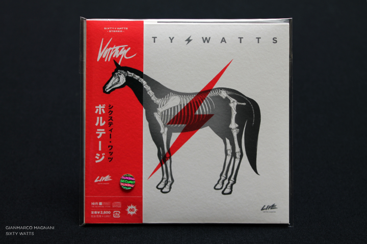
Kirill: “Sixty Watts” has a prominent place in this series, and a few months ago you’ve launched the companion site. And yet, there is no actual band. What is this experiment about?
M: “100 Prints” is divided into 25 Series. When I started the project I decided to create a theme for each Series. When I thought about creating a Series about music, I started thinking about a rock band, but I didn’t want to make designs for any existing band. So I created a band called “Sixty Watts”. At that moment it was just a Series composed of 4 Prints and nothing more. I needed a band and I needed a name, so I came up with something that had a good phonetic sound and also had a very symmetric number of letters for each word.
I published that Series called “Sixty Watts” and a few weeks later I read a post on some French blog about my work and that specific Print. The post said something like: “it’s a Series about a rock band called Sixty Watts, but don’t try to search for the music because it doesn’t exist”.
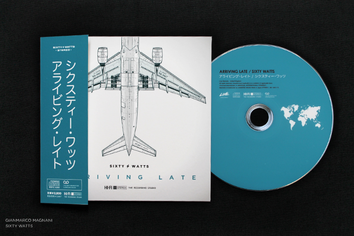

So at that moment it made sense for that Series to start a new project. It sounded like an interesting idea, with a great opportunity to design everything about a rock band – the discography, the posters, the album covers, the instruments and all those kinds of things.
I started researching some great rock bands. I also bought a lot of things just to know how to design the packaging, how to compose the tour posters, all the logotypes or icons included in each piece, how to create an album, a single, the Japanese versions, an LP and things like that. It was very exciting and I had a lot of ideas in my head.
I always wanted to be in charge of art direction for a rock band campaign, album or tour, and I never thought that if the opportunity never comes I can invent it. So I decided to create my own rock band.
When I started the process I thought several times how ridiculous such an idea might sound like, but then I started thinking about it as being “different”. That’s why I continued with the project and published it, and I am still working on new illustrations and also on an upcoming new album.
This project makes a lot of sense for me when I think about the moment when someone looks at an album cover for the very first, and without listening to the music what kinds of ideas come to your mind. Your imagination start creating a complete story, and if you want it, it can be endless.
Kirill: What do you do when you run out of ideas and get stuck?
M: I talk to my wife.
Kirill: What’s the best thing about being an illustrator?
M: That I love what I do.

And here I’d like to thank Gianmarco Magnani for this interview. You can find more of his work at his main portfolio, as well as the companion “Sixty Watts” site. All the Prints are available for sale, and you can follow him on Facebook and Twitter.
In my previous lifetime I was a Swing developer. And I liked shiny things. As a proof, here’s the pinnacle (or so I thought, at least) of my explorations in making shiny glossy glitzy buttons. That was around April 2006.
Different UI toolkits provide different capabilities that allow you controlling visual and behavioral aspects. Putting the technical details of styling aside though, UI control styling usually works at the level of an individual control.
And so as I was working on my own look-and-feel library, I heard more and more tidbits about Vista. It was released in January 2007, but it had a long [really really long] history. People kept talking about the three “pillars”, and I was mainly interested in the Presentation one. I don’t have a link, and I can’t even tell if it was a feature that was eventually shelved or just a rumor. But when I heard it, it made a long-lasting impression on me.
The gist of it was that entire UI is a 3D model. You know how they say that buttons should look like something that can be pressed. So you have some kind of z-axis separation. Drop shadows, bevels, some kind of a gradient that hints at the convex surface. And don’t forget to throw in the global lighting model. And so that bit of pixel feature rumor said that the entire UI – from the window level down to an individual control – would be an actual 3D model, with each object living in its own z plane.
So instead of styling each control to create an illusion of z separation (with whatever 2D images are backing each individual control), you would have a spatial model. Each control has its own 3D geometry. Now all you need to do is place the controls in the 3D space, create a few global lights, create a bunch of textures to use on the controls and voila – ship it over to the GPU to compute the final pixels. Want to restyle the UI? Supply a different texture pack and a different lighting model. All the rest is taken care of by the system. Have your own custom control library? Define the 3D meshes for them. All the rest is taken care of by the system.
Now imagine what you can do. If you place two buttons side by side, with just the right tweaking of the meshes and just the right amount of reflection on the textures you can have a button reflecting parts of other buttons around it. And the other way around. You know, all those shiny reflection balls from the early ray tracing demos.
Or, if you model the mouse cursor as an object moving above the window, you can have the back of it reflecting in those controls that it’s passing over. If your control mesh has some kind of a curved contour, the cursor shape would get distorted accordingly as it glides off of the edges.
Or, as you press the button, the press distorts the button mesh as the exact spot of the press, and the entire geometry of the scene reflects that.
I had serious thoughts of doing that. In Swing. That never happened though. Here’s why.
In my mind, there were three big parts to actually doing something like that.
The first one was relatively simple. It would involve transitioning from the point of view of looking at a single control at any point in time towards creating a global view scene that had the entire view hierarchy. There were enough hooks in the API surface to track all the relevant changes to the UI, and even without that you can always say that applications must opt into this mode and have to call some kind of an API that you provide that there are “ready” for you to build that graph.
The second one was also relatively simple. I would need to generate the meshes for all controls. Some are simple (buttons, progress bars), some might be trickier (check marks, sliders). But nothing too challenging. Mostly busy work.
But the last one was the effective non-start. How to actually create the final render of the entire window with acceptable performance? Doing my own 3D engine was kind of out of question. I knew just enough of what is involved to not even begin down that path. So that left me with OpenGL.
JOGL was around at the time, and had a nice momentum behind it. They were gearing towards providing bindings for OpenGL 2.0. There was a lot of activity on the mailing lists. Java3D was another alternative that was under similarly active development. There was even a talk of merging the two. And so I started looking into a simple proof of concept of making a simple JOGL demo on my trusty Windows box.
Around that time (early 2007) Ben Galbraith announced the first (and, posthumously, the only) Desktop Matters conference in downtown San Jose. I left a comment on that announcement. He asked me whether I wanted to make a short presentation on one of my projects. I was quite happy to do so. That was my first public presentation [thanks for the encouragement, by the way!]
It was a nice gathering. Around 100 people, I’d say. And they had quite a few people from the desktop client team at Sun available for informal Q&A. Chris Campbell was my hero at the time (no offense, Chet). The dude was slinging code left and right, showing a lot of great things that could be done with Java2D. He was also working on hardware acceleration of a lot of those APIs. If I remember correctly, he was talking a lot about doing various acceleration on top of OpenGL and Direct3D. Who would be better to validate the overall approach of doing this thing that I wanted to do than him.
I managed to grab him for a few moments. I outlined my thinking. He was polite. He said that it sounded about right. That was just enough encouragement for me.
So after the conference was over I got to actual work. My first private demo was to render a colored sphere. And it looked horrible. It had jagged edges all around it. And it also had visible seams running all over the sphere. I could see the tessellation model before my eyes. It was quite bad.
So I fired off an email to the mailing list. Not about my grand vision. But rather about this specific thing. How to make a sphere look like a sphere. With no jaggies and no tessellation. And they told me to get a “real” graphics card, because whatever integrated graphics card I had on the motherboard is no good for any kind of OpenGL work. And that’s where I stopped.
What’s the point of even thinking going down that road if you must have an expensive graphics card? It might be OK for a demo. It might be OK if I’m satisfying my own itch and showing off my skills with some kind of a thing that runs well on my machine [TM]. But if it can’t be used on “everyday” computers that don’t have those fancy hardware components, it’s a no-go for me.
You might say that I chickened out. I had this grand vision, and folded at the first sign of trouble. But that was – and still remains – my main issue with anything that ends with “GL”. Its never “quite there” promise of commodity hardware availability that is “just around the corner” – and in the meantime, you need this very particular combination of hardware components, drivers and other related software to run. And oh, even if you do have a beefy graphics card, unfortunately it has this driver bug that crashes the entire thing, so you might want to either bug the vendor to fix it, or just disable the whole thing altogether.
Things might have been different. I had really a lot of spare time back then. I might have went down the road of biting the bullet and buying that graphics card (although, as mentioned above, it was not about my own cost, but rather about the reach of the final library). I might have had this thing done in some form or another. Can you imagine buttons reflecting other buttons reflecting the mouse cursor passing above them and rippling as you press them? With the ripple reflected all around that button, and being reflected back in it?
So that never happened. And now it’s all about flat. Flat this. Flat that. Flat *ALL* the things!
