Random musings as NFL gets into the last week of the regular season and both Saints and Cardinals are at 10-5, with only one of them going to the playoffs. Since they’re not playing each other, we may see an 11-5 team not going to the playoffs this year. And only three years ago Seahawks won their division and went to playoffs at 7-9.
There’s some math laid out in here [PDF] that looks at the schedule balance of an NFL season, and while on average it appears that in most cases we do see the best teams from each conference going to the playoffs, I always wondered what is the worst case scenario.
There are two extremes here. The first one is how bad can you be and still get to the playoffs. The second one is how good can you be and still watch the post season on the TV.
The first one is simple. Each conference has four divisions, and every division is guaranteed a spot in the playoffs (aka Seahawks ’10). If you’re not familiar with how the regular season schedule is determined, here’s how it works. For the purposes of this first extreme, it’s enough to know that each team plays the three teams in its division twice (home / road), and then 10 games elsewhere in the league. What’s the absolute worst? Well, you can get into the playoffs with zero wins. That’s right, zero. How? Imagine a division with four really bad teams, and every game in that division ending at 0:0 (or any tie). And then every team in that division loses the rest of their 10 non-division games. In that case you’d eventually get to a very awkward coin-toss to determine which one of these four teams gets the “first place” in the division. Unlikely? Extremely. Possible? Of course.
Now to the other extreme. How many games can you win and still miss the playoffs? The answer is 14 (out of 16 games you’re playing) – if my math is correct of course. Let’s look at the scheduling rules more closely.
When the league expanded to 32 teams, it brought a very nice balance to the divisions themselves and to the schedule. Two conferences, four divisions each, four teams each. All hail the powers of 2! By the way, there’s additional symmetry that you get to play / host / visit each other team every 3/4/6/8 years (depending on the division association).
Back to who gets to the playoffs. Every division sends its first place, with two more spots (wildcards) left to the two best teams in the conference after division leaders are “removed” from the equation. This means you can be a really good team and still not get into those six. The conditions are quite simple really (as one of Saints / Cardinals will see this Sunday). The first one is that you have an even better team in your division that takes first place. The second one is that you have two better teams elsewhere in the conference (such as 49ers that already secured the first wildcard spot for NFC).
Let’s look at the numbers now. How can we get to the 14-2 record and still miss the playoffs?
In the following scenario we have NFC East as NE, NFC West as NW, NFC North as NN, NFC South as NS, and their counterparts in AFC as AE, AW, AS and AN. Let’s choose three random divisions in NFC, say NE, NN and NS.
A team in NE is playing 6 games in NE, 4 in NN, 4 in AW and 2 in NS/NW. A team in NN is playing 6 games in NN, 4 in NE, 4 in AN and 2 in NS/NW. A team in NS is playing 6 games in NS, 4 games in NW, 4 games in AE and 2 games in NN/NE.
In general you meet all teams in your division twice, all teams in another division in your conference once, all teams in a division in the other conference once, and then two teams from the other two divisions in your conference that finished at the same place as you last year.
What we’re trying to do is to get as many wins as possible for the #2 team in each one of our divisions (NE, NN and NS). There are only two wildcards available in each conference, and we don’t care what happens in NW or the entire AFC.
For each pair of teams in NE, NN and NS we want to maximize the number of wins while still keeping in mind that they play each other. This year each team from NE plays each team in NN twice. And each team in NS plays one team in NN and one team in NE – based on its position in the division last year.
Let’s look at NS first. Team #1 and #2 get four wins each playing #3 and #4 in their division. Then they split the wins in their two games, getting at 5-1 record for each. They then win all 4 games against NW, getting at 9-1, and all 4 games against AE, getting at 13-1. Finally, assuming that our two teams finished last year at positions that get them scheduled against NE / NN teams that will not be finishing at #1 / #2 teams this year, both teams get at 15-1 – all without taking a single win away from the four teams in NE / NN that we’ll be looking at shortly.
Now to NE / NN. We’ll look at NE, while the same logic applies to NN. Once again, teams #1 / #2 win all four games against #3 / #4 and split their own two matches, getting at 5-1 both. Now they play four games against NN. They win both games against #3 / #4 teams, getting at 7-1 each, and split the wins against #1 / #2. We need to split the wins in order not to take away “too many” wins from those two teams in NN. So we end up with 8-2. Now they win all four games against AW, getting at 12-2. Then they get one win against NW getting to 13-2. Finally, they have one game to play against NS. Applying the same selection logic, the best scenario for us is to get them scheduled against a team that is not at #1 / #2 this year (but at the same position they were last year), which gets both teams to 14-2.
And now the same goes to the first two teams in NN, getting them to 14-2 both. Which is why we need to split the NE/NN games between #1/#2 teams.
Now we have #2 team in NS at 15-1 and #2 teams in both NE and NN at 14-2 each. One of them will have to stay out of playoffs. Unlikely? Extremely. Possible? Of course.
Waving hands in the air, it feels that the first scenario is much less likely to happen due to how few ties we usually see in the league. Even though it can happen in any one of the eight divisions, and the second scenario involves three divisions in the same conference, it’s still much less likely to happen. What if we remove the ties from the equation?
A 4-team division has every team playing every other team twice. All in all you have 12 inner-division games in every division. If no game ends in a tie, the most extreme case is that all teams end up winning and losing 3 games in their division, and losing all other 10 games, with 3-13 record for each. One of them will go to the playoffs. That would also answer the question of how many games can you lose and still go to the playoffs. In the previous scenario (no wins), you have every team in the division at 0-10-6 record, so it’s “only” 10 losses. With this scenario you have a 13-loss team going to the playoffs.
It would appear that this new extreme is more likely to happen, as it only involves teams in a single division, and the other one (14-2 not going to playoffs) involves teams in three divisions.
Now two questions remain. Can we get to a 15-1 record and stay out of playoffs? And, more importantly, is there a fatal flaw in the logic outlined above?
One of my recent resolutions (not for 2014, but for mobile software in general in the last few months) was to evaluate designs of new apps and redesigns of existing apps from the position of trust. Trust in the designers and developers of those apps that they have good reasons to do what they do, even if it’s only one or two steps on the longer road towards their intended interaction model. But Twitter’s recent redesign of their main stream keeps on baffling me.Putting apart the (somewhat business-driven from what I gather) decision of “hiding” the mentions and DMs behind the action bar icons and adding the rather useless discover / activity tabs, I’m looking at the interaction model in the main (home) stream.
Twitter never got to the point of syncing the stream position across multiple devices signed into the same account. There is at least one third-party solution to do that, which requires third-party apps to use their SDK and users to use those apps. The developer of that third-party solution has repeatedly stated that in his opinion Twitter is not interested in discouraging casual users that check their streams every so often. If you start following random (mostly PR-maintained) celebrity streams, it’s easy to get lost in the Twitter sea, and when you check in every once in a while and see hundreds – if not thousands – of unread tweets, you might start feeling that you’re not keeping up.
As I’ve reached the aforementioned decision a few months ago, I’ve uninstalled all third-party Twitter apps I had on my phone, and switched to the official app. It does a rather decent job of remembering the stream position, as long as – from what I could see – I check the stream at least once every 24 hours. When I skip a day, the stream jumps to the top. It also seems to do that if the app refreshes the stream after I rotate the device, so some of this skipping can be attributed to bugs. But in general if I’m checking in twice a day and am careful not to rotate the device, the app remembers the last position as it loads the tweets above it.
In the last release Twitter repositioned the chrome around the main stream, adding discover / activity tabs above it and the “what’s happening” box below. While they encourage you to explore things beyond your main stream, it also looks like they’re aware that these two elements take valuable vertical space during the scrolling. And the current solution is to hide these two bars when you scroll down the stream.
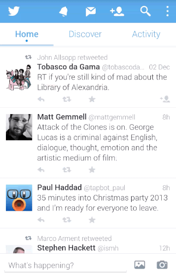
And here’s what baffles me the most. On one hand, the app remembers the stream position, which means that I need to move the content down to get to the newer tweets (as an aside, with “natural” scrolling I’m not even sure if this is scrolling up or scrolling down”). On the other hand, the app hides the top tabs / bottom row when I move the content up.
Is the main interaction mode with this stream is getting to the last unread tweet and then going up the stream to skim the unread tweets, as hinted by remembering the stream position? Or is it getting bumped to the top of the stream and scrolling a few tweets down just to sample the latest few entries in it, as hinted by hiding the two chrome rows and providing more space during the scrolling?
I don’t want to say what the app should or shouldn’t do in the stream (as pointed out by M.Saleh Esmaeili). It’s just that I can’t get what the designers intend the experience to be.
A few days ago The Verge has posted an article around metric-driven design in Twitter mobile apps, an for me personally the saddest part of this article is how much they focus on engagement metrics and how little the guy talks about informed design. Trying to squeeze every possible iota of “interaction” out of every single element on the screen – on its own – without talking about the bigger picture of what Twitter wants to be as a designed system. Experiments are fine, of course. But jacking up random numbers on your “engagement” spreadsheets and having those dictate your roadmap (if one can even exist in such a world) is kind of sad.
When every interaction is judged by how much it maximizes whatever particular internal metric your team is tracking, you may find yourself dead-set on locating the local maximum of an increasingly fractured experience, with no coherent high-level design, and no clear path that you’re taking to arrive to the next level. Or, as Billie Kent’s character in Boardwalk Empire says, “always on the move, going nowhere fast.”
Make a list of your top favorite tentpole productions in the past 15 years, and you can count on having François Audouy be part of at least one of them. He started his career as an illustrator and concept artist on movies such as Men In Black, Pearl Harbor, Spider-Man, Minority Report and Avatar, shifted to the art director position on Transformers, Watchmen and Charlie and the Chocolate Factory, and then moved to be the production designer or Abraham Lincoln: Vampire Hunter and the recently released The Wolverine. In this interview François talks about his work on The Wolverine that brought him back to his days of reading comics books growing up, researching the history, art and architecture of Japan, designing and building the main sets for the movie, and collaborating with visual effects departments on big-budget sci-fi productions.
 François Audouy
Kirill: Please tell us about what you’ve been doing lately.
François: I was the production designer on Wolverine, which was an incredibly exciting and rewarding project. It took seventeen months to complete from start to finish. And I just finished another movie, Dracula Untold, and I’m very excited about Wolverine coming out on DVD.
Kirill: How far did you get into the X-Men universe preparing for the movie? Did you treat this movie as a standalone production not necessarily connected to the rest of the franchise?
François: When I first heard about the project, the only thing I knew about it was that it was set in Japan. And to be honest, that was the thing I was the most excited about. It was a dream of mine to design a movie set in Japan. Every movie is an opportunity for a designer to become an expert in something. So I really thought it was exciting to learn more about Japanese culture and architecture. You’re always looking for an opportunity to learn something.
Having said that, I was also really aware of Wolverine because I was born in 1970s, and I’m pretty much the same age as Wolverine. I remember the comic books from the late 1980s, which, looking back, is probably the golden age of Wolverine. My feeling was that the movies featuring Wolverine hadn’t really tapped into a lot of what I loved about those comics, and a lot of detail with the Logan character who’s so interesting. And I read the script, I thought that it was a great story where we really get a chance to get to know Wolverine a little bit better, and we get to focus on him for an entire movie without the distractions of all the tertiary characters. That was very exciting.

Yashida cottage. Concept illustration over location photography. Courtesy of François Audouy.
Kirill: The Japanese culture is rather closed to the outsiders. How did you approach your research phase?
François: It was kind of terrifying in the beginning, honestly. It’s so different, and so deep. There’s so much to learn.
First thing I did was to hire a researcher in Los Angeles to pull images and references. And Jim [Mangold, director] early on decided that he wasn’t interested in making a movie with cliches, like little temples or bamboo forests. I went hunting for settings and places that felt unique and different. One thing that I’m really proud of in the film is that we have this intimate story, but it also takes them through places that are understated, grounded in real, and not so Hollywood-phony [laughs]. I was trying to do something that felt real.
What helped tremendously was that I had the art department in Tokyo, and a group of people who were helping me with the locations. I had a great location manager. I scouted many places in Japan, in the mountains, north of Tokyo, Nagasaki, Hiroshima, Kobe, Kyoto, Osaka. I went there six times, and over the course of the travels every time I learned more about the culture, as I was surrounded by my Japanese crew going to all these interesting places.
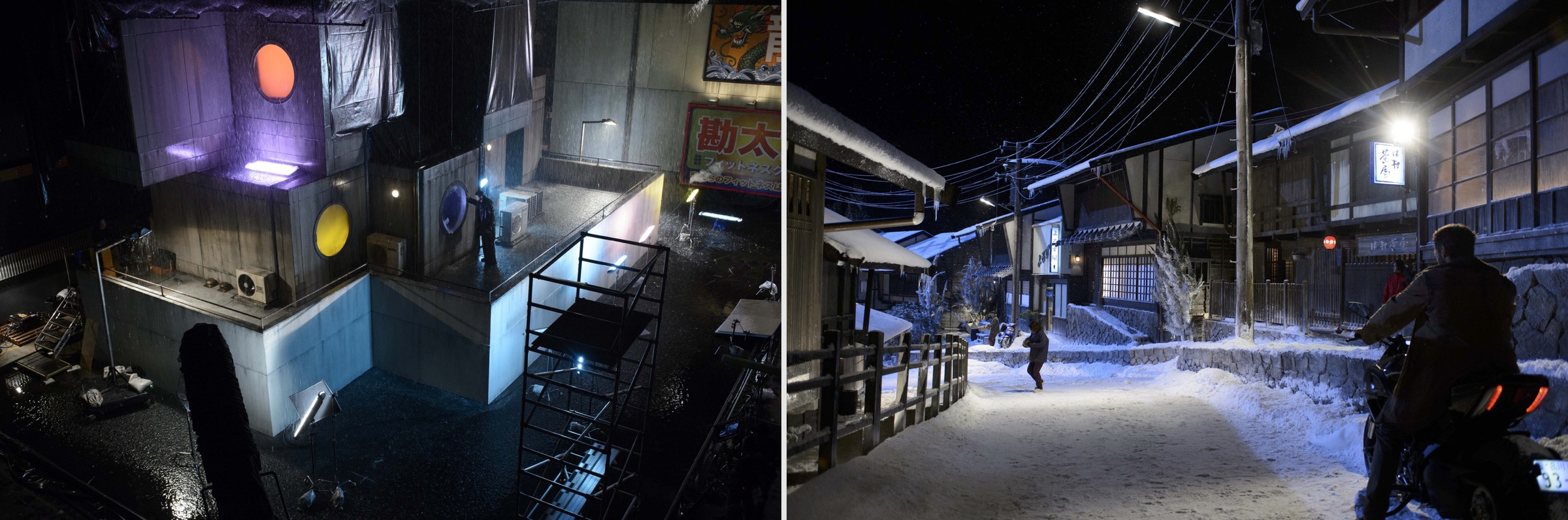
Left – Tokyo love hotel, set built on stage. Right – ice village, set built on location. Courtesy of François Audouy.
Kirill: The family compound is one of the central sets in the movie. How much time did you spend on it?
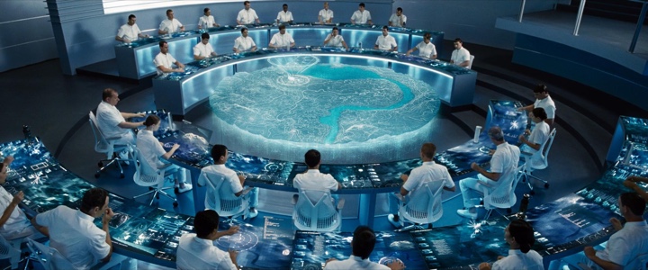
François: That was probably our biggest set, and it was my favorite. It was a very immersive set, a set that you walk into and it feels totally real, even though it was built on a soundstage. Jim was referencing and inspired by “Rear Window” with Jimmy Stewart. It had an apartment looking out into the courtyard, and you can see the world outside and all of the different stories happening. And he wanted the Yashida compound to have the same feel, where you could look and have these views across the central courtyard, and see Mariko’s world, and Yashida’s chambers, and the story dynamic of this complicated family.
I created a set that was pretty much in-camera. We had a big central courtyard with water element, and all of the interiors, and it was very much an in-camera place. And it was a very hyper-modern Japanese aesthetic that was ground and rooted in the ancient flow of Japanese architecture.
And to answer your question, it probably took five or six months to design that.
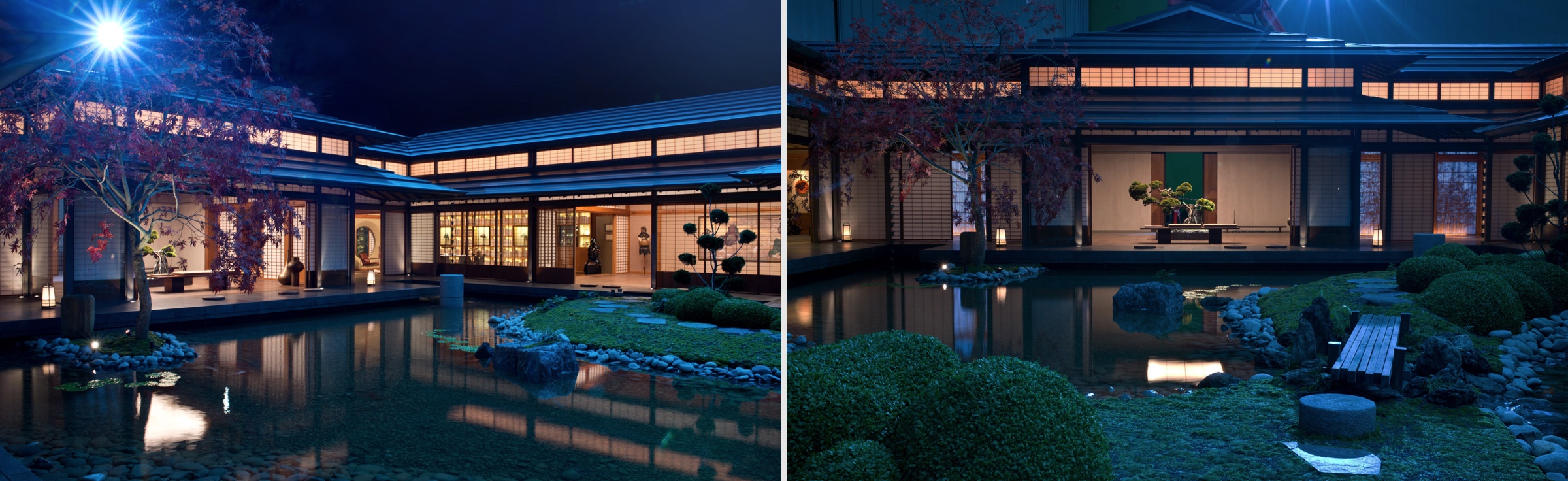
Yashida compound. Set built on stage. Courtesy of François Audouy.
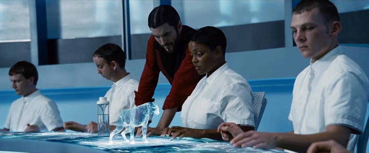
Kirill: And the other big set for the final sequence in the science lab was done with some digital extensions?
François: It was originally scripted as a cave [laughs]. But I wanted to bring it back to a more Japanese setting. The movie has a little bit of everything – an old cottage, a billionaire’s compound, an ancient Buddhist temple in Tokyo – and I thought it would be really cool to have a modern industrial lab.
This set was pretty big, 42 feet tall. We built two floors of the tower that was supposed to be 30-40 stories high. The idea was to create an action sequence that happened vertically. Normally these sequences are very horizontal, and we wanted to go down and up instead of just horizontal. We kept redressing our two floors as different floors going down, and extending those floors with the digital set extensions.
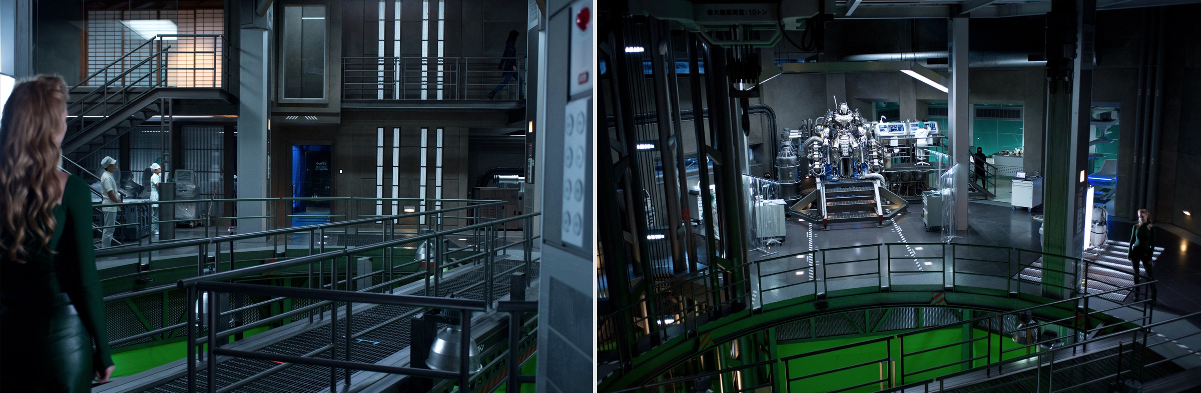
Yashida lab. Set built on stage. Courtesy of François Audouy.
Kirill: You’ve worked on quite a few other VFX-heavy productions. How is the balance of responsibilities between you as the production designer and the visual effects supervisor working for you? Are you losing some of the control over the final look of the digitally augmented scenes?
François: You’re right, as a lot of these films are becoming more synthetic, relying on digital set extensions and digital building out of environments. The studios and the directors realize that too, which is why we bring in the visual effects supervisors quite early in pre-production, so that they can be involved in what we’re doing. I try to keep a very close collaboration with VFX supervisors, and I also try to make sure that I design the digital sets – or sets with digital extensions – in the same way that I’m designing a set I’m building. I don’t really see a distinction whether it’s going to be digital or physical. It doesn’t matter to the audience. They don’t know and they don’t care what’s digital or what’s physical. I really treat that job in the same way.
I work hard to have everything designed and figured out before I leave the production. We hand over all the assets to visual effects for the assembly in the same way that I would hand over designs to a construction crew. They would get a full set of construction drawings, paint references and color ways, with everything figured out before you go and build the set.
Kirill: Although the difference is that for physical construction you’re still on the project, but for digital in post-production you are, for the most part, gone.
François: That’s true, and that’s why it’s important to have a close relationship with the visual effect supervisor which will be overseeing the final construction of the digital assets.
One thing that was great about Wolverine was that Jim had me come by the editing suite at Fox every two weeks over the course of six months. He showed me new things every two weeks, and it was a really great opportunity. He pulled me in, valued my opinion and kept me as a part of the team.
Kirill: And the last question is about 3D productions. How is it working out for you. Is it here to stay, perhaps confined to the tentpole sci-fi productions, or do you see it fading away?
François: I think stereo’s here to stay. I like it, but I don’t like it for all films [laughs]. It can be a great added experience to certain films, and kind of a distraction to others. It’s here to stay, but I don’t think we’ll be doing all films in stereo.
And here I’d like to thank François Audouy for taking the time out of his schedule to answer a few questions I had about his work on The Wolverine and about his craft in general. Special thanks to Mitzye Ramos at Think Jam for putting me in touch with François. The movie is available on DVD, Blu-Ray and in your favorite digital distribution channels.
Continuing a series of interviews with designers and artists that bring user interfaces and graphics to the big screens, it’s my pleasure to host Paul Beaudry. You have seen his work on “Avatar”, “The Hunger Games” and “Ender’s Game”, and in this interview Paul talks about what goes into designing screen graphics, drawing inspiration from the latest explorations in real-world software and hardware, holographic and 3D displays as a possible evolution of human-computer interaction in the next few decades, challenges in using technologies such as Google Glass or Siri in film, the ongoing push to create more detailed and elaborate sequences, and his thoughts on working remotely with the current crop of collaboration tools.
 Kirill: Tell us about how you started in the field of motion graphics.
Paul: I started out wanting to be an AVID editor, editing documentaries and similar productions. As soon as I finished school and got into the industry, I found out that what I liked the most was coming up with graphics for documentaries and shows that I ended up working on. From there I started teaching myself motion graphics, moving into opening title sequences and getting some cool opportunities.
There are really good communities online for learning. At the time for me it was talking with other people at the great mograph.net site, talking about how to get into the industry, the challenges and technical issues. That’s how I got my start. The software itself is not crazy, and a lot of people learn how to use, for example, Photoshop even though they’re not professional graphic designers or photographers. They way I look at After Effects and other 3D tools that we use is that they are more complex than Photoshop, but not so much so that it’s not impossible to learn on your own. It was years going crazy, huddled over my computer, teaching myself in every bit of free time I had during late nights, not having much of an outside life for sure [laughs].
Kirill: That’s on the technical side of things. What about the design side?
Paul: I hope I’m still learning as I go. It was a lot of the same, learning design and technical stuff together hand-in-hand. I think it’s important, actually. A lot of the conversations we had online was about getting critiques of your work, moving forward in design and technical side at the same time.
Kirill: How did you start building out your portfolio?
Paul: A whole bunch of spec pieces. My interest at the start was not really in UI design for film. At the time not that many people even knew that could be a full-time job. I was more on the television side of things, doing commercials, title sequences, more traditional motion graphics. And it was also doing my own stuff, building up reputation to get real projects.
Kirill: What were those first real projects?
Paul: I was working with the company Frantic Films on a half-hour documentary show for the Discovery channel. I don’t think it ran in US; it was a Canadian thing. I got a chance to do the opening title sequence for them, expressing my interest in doing that, and they gave me my first shot. From there I started doing a lot more work for them, and some stuff for HBO and A&E a few years later, and as a freelancer I kind of branched from there.
Kirill: What’s the story of the iOS music app Anthm that you have in the portfolio section on your site?
Paul: Anthm came out in February 2012, and actually the name is now Jukio because we ran into a bit of a legal issue. That’s something I did with my friends in our free time. It’s me, Tyler Johnston who is a graphic designer, and Ben Myers who I worked with on Avatar. We were having drinks at a bar, and we were annoyed at the music they were playing. So we came up with an app for iOS that lets you request and vote on the music playing in your location from your phone, like a jukebox with millions of songs.
Kirill: Perhaps jumping a bit forward, your work for movie UIs is the tip of the iceberg above the surface, with playback loops or basic interactivity that mostly focuses on the presentation layer. And on the other hand, creating a real application that people run on their devices forces you into the full design and implementation cycle, complete with crashes, bug fixes, feature requests etc.
Paul: My first passion is to create fantasy user interfaces for film, but at a certain point you want to make something that’s real, something that a real user can use. Something that doesn’t only look like magic, but hopefully feels magical to use. Not that Jukio is earth-changing or anything, it’s simply a music app, but there are small UX choices there that feel magical to us and that’s not always something you can do in film. It’s definitely something that we’re really interested in – getting real feedback from people, making something real that can be used to solve real-world problems.
I should mention that none films I can talk about right now had real software in them, everything that’s been released was done in post, but the company I’m working with now, G Creative Productions, has the ability to create real software that’s used on set by the actors while they’re filming. It’s all done using live playback so it’s not a post-production thing at all – they create real software that the actors can tap, change on the fly and really interact with while they’re filming.
Continue reading »
