Continuing the series of interviews with designers and artists that bring user interfaces and graphics to the big screens, today’s I’m excited to welcome Corey Bramall. His work spans multiple films and TV shows, from Caprica and Human Target on the small screen to Thor, Captain America: The Winter Soldier, Safe House, the first two G.I. Joe and the last three Transformers movies on the big screen – just to name a few. In this interview Corey talks about the changes his field has undergone in the last 15 years, differences between TV and feature productions, working on multiple movies in the Marvel and the Transformers franchises and striking the balance between the technical nature of real-world computers and making appealing visuals for the aesthetic purposes of the overall production.
 Kirill: Please tell us about yourself and what you do.
Corey: My name is Corey Bramall, I design and animate the graphics that are on computer screens in movies and tv shows known now as FUI (fictional or fantasy user interfaces). I have been doing this kind of work for around 15 years. I try to balance my life between family, work and play. When I’m not working I’m usually hanging out with my family or going to see live music.
Kirill: What drew you into the field of screen graphics, and how has that changed in the last 15 years or so of doing it?
Corey: I always had an interest in graphics, photography and computers so in high school I got on the yearbook design committee and was playing around with Photoshop 3… “now with layers!” and I remember thinking to myself “this is something.. I’m not sure what, but it’s something”. After high school I was working odd jobs and trying to figure out what I was going to do with my life but I could never shake how fun and creative this program called Photoshop was so eventually I found a two year multimedia program here in Vancouver that offered a variety of classes like ‘Interactive Authoring’, ‘Video Production’, ‘3D Animation’ and… ‘Photoshop’. After graduating the two year program in 1999 I was trained to make CD-Rom titles which of course had gone completely obsolete. I had no industry but I had this odd array of skills that made me sort of a ‘jack of all trades’.
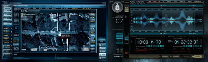
I had found a job at a company that produced terrible course ware for educational training and was about to call it a career at 21 when I got a call from a studio asking if I was available immediately to come and work with them to make graphics for a tv show. I took the job and the rest is sort of history. I worked at that studio for a few years and eventually started Decca Digital. One of the biggest changes in the last 15 years I would say is what’s capable technically. When I started everything was 640×480 pixels and I could backup an entire months work on a single CD. Today most of the stuff I design is full HD (1920×1080 pixels) and can be almost 2GB for just one screen. The other biggest change is just the sheer number of people designing FUI screens.
Kirill: Who do you work for during the various stages of a production, from the initial explorations during the pre-productions all the way to the post-production?
Corey: A lot of my work happens during production where I’ll create graphics to be shot in a scene so they actually have to function in a rudimentary way. I’ll build them so the onset operators can turn widows on and off, move the widows around, change backgrounds and so on. This is an interesting process because as you’re designing you have to think about how the screen will function as well. It can provide some interesting design limitations that I have to overcome and sometimes re-think. Because replacing what’s on a screen in post-production has become much easier, quicker and cheaper, a lot of times directors want graphics on the screen that they know will be replaced later just so the actor has something to interact with instead of a giant green square. I’ve work on projects were I’ve just done the production graphics, just done post-production graphics for burn-in and I’ve done both.
Kirill: Do you prefer having a full artistic freedom for a project, or a more well-defined direction?
Corey: I don’t think I’ve ever had full artistic freedom on any project, that would be amazing to have that freedom one day. Given a choice, I’d obviously prefer full artistic freedom but a lot of my work in the last few years has been for sequels or for films that take place in a universe that was created prior to me being involved so my challenge has been to stay true to that while perhaps adding some of my own style. I tend to work with a lot of the same people who have a style that they’re accustomed to so I’m often bound to that aesthetic but I’ll always find somewhere to add some personal flare.
Kirill: What are your thoughts on the term “Fantasy UIs”? How well does it capture the essence of what you do?
Corey: I think it’s a good term for this type of work. Before Mark Coleran coined the term FUI we called it all sorts of things: computer playback, screen graphics, screen design and so on. But is it Fictional User Interfaces, Fantasy User Interfaces, Faux User Interfaces? Let’s just say it’s Fantasy, once and for all ok?
Continue reading »
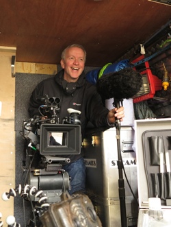
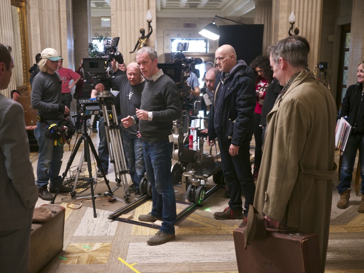
Continuing the ongoing series of interviews with creative artists working on various aspects of movie and TV productions, today I’m honored to welcome the cinematographer Benoît Debie. In this interview Benoît talks about the evolving craft of cinematography as the technology is shifting the productions towards the purely digital end of the spectrum, what happens on a movie during pre-production, shooting and post-production phases, his work on the recently released “Spring Breakers” and how he approached the explosive neon colors that permeate the story, and the experience of shooting in 3D for his upcoming “Every Thing Will Be Fine”.
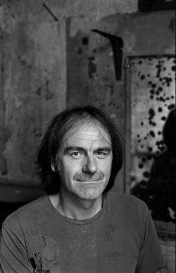
Benoît Debie.
Photography by Kris Dewitte.
Kirill: Please tell us about yourself and your path so far.
Benoît: I started when I was quite young, around 23 years old. I went to a film school in Belgium, and after graduating I did two movies as AC (assistant camera), but it wasn’t really my cup of tea. I wanted to be a DP (director of photography) for feature film, but it’s quite difficult to get there when you’re just starting. I went to the TV world for around eight years, learning a lot about TV shows, and then little by little I went back to the film industry. I did a few short movies and commercials, and my first feature was “Irreversible” from Gaspar Noé. From that moment I’ve been doing only feature films.
Kirill: How do you get approached to work on a production? Is it through the connections on your previous films, or a more formal auditioning process?
Benoît: It depends. Some directors would ask me to join them for my style or my approach. In that case they would come to me for something very specific. And sometimes I have auditions, but they are not as frequent these days. More often than not I would get called to discuss a project, or I’d get a script and then we’d discuss how to start approaching it.
Kirill: What happens during the pre-production?
Benoît: It depends on the movie and the director. I did two movies with Gaspar Noé, and with him I only join the production the day before we start shooting. That’s the way he likes it – for me to be a little bit unprepared. With other directors it may take 6-8 weeks to prep the movie, to see the locations, to do the storyboards and the shooting lists. It also depends on the complexity of the movie.
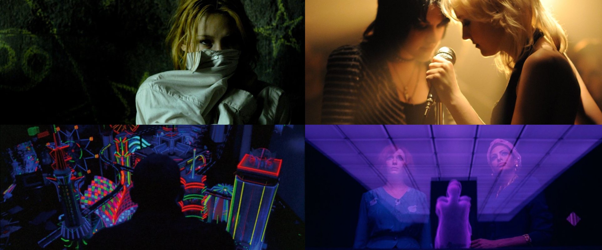
Top left – Passage, top right – The Runaways, bottom left – Enter The Void, bottom right – Lost River. Courtesy of Benoît Debie.
Kirill: As the shooting starts, do you also operate the camera? Is there a distinction between you as the director of photography and another person as the camera operator?
Benoît: You can certainly be a DP and not operate the camera. I always do both because I like to operate. It’s really important to me, especially when we shoot on film. I can see the exact frame through the eyepiece – the reflection, the darkness, the contrast. It’s important for me to see that, and I also like to operate the camera. It’s part of the look of the movie. I was the camera operator on all my movies, except for some union restrictions on movies that we shoot in the United States and some cases where we need a second camera.
Kirill: What are your thoughts on the transition from shooting film to shooting digital? It used to be that only you would see the image through the camera, and it would take a few hours or maybe even a couple of days to process the dailies. And now if you connect a monitor to your digital camera, everybody who wants to see the take can see it immediately. Do you feel that you’re losing some of the magic of capturing the scene on film?
Benoît: This is a big change and a big difference between film and digital. As much as I can I keep on shooting film. It’s not only the quality that is much better. It’s also the difference between the way you shoot in film and the way you shoot in digital. For me, when we shoot in film, everybody’s focused on the action, on what have we to do – the actors, the director, the DP and everybody else. When we shoot in digital, it’s completely different. Everybody’s shooting for what seems like forever, with no cuts.
I think we’re losing things not only in terms of image, but also in terms of intensity on the set. And it’s a shame, because that’s a completely different approach to filming.
Continue reading »
“Penny Dreadful” is one of the darker dramas that have graced our TV screens this year. Bringing together fictional characters from the Victorian and Edwardian literature, it weaves their origin stories set back in the haunting atmosphere of late 1800’s London. Owen McPolin is the cinematographer who shot four of the eight episodes in the first season of the show. In this interview he talks about the overall structure of shooting episodic television, creating a unified visual experience throughout the show’s arc while still allowing for individual artistic freedom of expression, the ambitious scope of quality of modern episodic TV productions, advances in digital equipment and how he sees the craft of cinematography evolving in the world of computer-generated media such as video games and animated movies and the increasing collaboration of cinematographers and visual effects supervisors. The second half of the interview delves deep into the details of “Penny Dreadful”, talking about researching the era and picking correct lighting, choosing techniques to convey suspense and fear and various aspects of this globe-spanning collaboration that encompasses facilities in Canada, US and Ireland.
 Kirill: Please tell us about yourself and how you got into the business.
Owen: My name is Owen McPolin. I’m from the West of Ireland, and I’ve been working professionally in the industry since 1996. I was educated in Ireland, but I did most of my third-level education in film in the UK after which I returned to Ireland where I’ve been working mostly in TV Drama, shorts and smaller budget pictures.
Kirill: How does it usually work for you on episodic TV since you don’t get to shoot all the episodes for the whole season?
Owen: The structure of the industry here tends to dictate that. You would have a lot of dramas where certain DOPs [directors of photography] would shoot certain blocks. Sometimes you have leapfrogging DOPs who shoot the first pair of episodes, then the third one and then the final pair. Or you may have a situation where you do the second and the fourth blocks. Or there have been occasions where you do only two episodes of a 10-episode season. It depends on your availability and on what you’ve committed to before.
People tend to like to pair a DOP and a director in the UK, particularly on block structured series. So if the director leapfrogs, so does the director of photography. That way they can prep alongside, and then shoot together, and then go together into another prep or editing, as the other pair come into their block. That way there’s no discontinuity in production.
Kirill: How does this approach work on productions that tell a longer story throughout the whole season, or even across multiple seasons? You can’t really watch each episode as its own thing on such shows.
Owen: That comes down to the tone of the piece as it’s set at the beginning of the production. There would be a basis by which you approach the piece. If there’s a certain location set up, or a certain story arc or a certain character, you would tend to follow the grammar that you would’ve applied at the beginning for that location, the character or any given scene.
It’s episodic in nature, and you normally return to certain hero locations, hero situations, hero characters. Even though you have individual creativity as the DOP which would change and inform your approach, the overall feel of the project is already set up and you would tend to follow that, to use that as the jumping point for your own approach. There’s always going to be nuances and changes to the approach, but nothing ever too radical that would get you out of the world.
Kirill: And besides the first pair of director / DOP, there’s a lot of decisions done by the show creators.
Owen: Indeed. The creators and the producers, along with the production designer and the costume designer would start to create the idea of the world that you’re trying to capture. All the base elements are there – the sets, the colours, the tones, the costumes, the approach about how to move the camera or not. Those decisions are made earlier on.
When that structure exists, you enter that world and you capture it by your interpretation. The variables are set to a certain degree, but how you interpret a certain screenplay photographically with the same set of ingredients is up to you.
Producers and creators generally engender encouragement to the DOP to find a different way. They might say that they like what came before, but they want you to prove it, to change it a bit, to say something else, to offer them something in that scenario.
Continue reading »
One of the more useful things that was “graduated” from the internal package in the latest drop of support libraries is ListPopupWindow.
No more need to try and emulate the look and feel of a popup window with a custom styled and positioned dialog for older platform releases.
Use R.layout.abc_popup_menu_item_layout for platform-consistent appearance (text style, margins, regular / ripple highlights) in your list adapter. Then set it with ListPopupWindow.setAdapter, optionally register a dismiss listener (note how the overflow dots for the “active” popup are darker), set anchor view for properly positioning the popup, compute the content width based on the content of your list, optionally mark it as modal so that it can be dismissed by tapping outside and don’t forget to call show().
