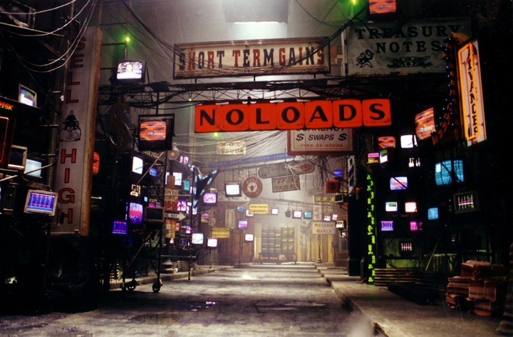
Continuing the series of interviews with designers and artists that bring user interfaces and graphics to the big screens, it’s an honor to welcome David Sheldon-Hicks of Territory Studio. Prior to founding the studio in 2010 David has worked on “Casino Royale” and “Dark Knight”. Since then, Territory’s work can be seen in movies as diverse as “Zero Dark Thirty”, “Jack Ryan: Shadow Recruit”, “Prometheus”, “Guardians of the Galaxy” and the upcoming “Jupiter Ascending”. In this interview he talks about collaborating with the director, the art department and the VFX department throughout the different stages of a production, staying true to the look of the specific production such as aerial tracking in Zero Dark Thirty or high-tech science of Prometheus, the approach he’s taking to design futuristic interfaces, the physicality of technology around us and how it projects into his latest work on Guardians of the Galaxy, and the diverse gamut of projects Territory is working on and how they feed into each other.
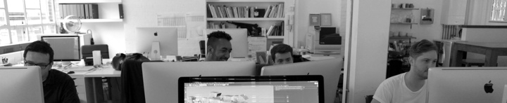
From left to right: Peter Eszenyi, Nick Hill, Marti Romances and Ryan Rafferty-Phelan of Territory Studio at work on Guardians of the Galaxy.
Kirill: Please tell us about yourself and what you do.
David: I set up Territory in 2010 together with Lee Fasciani and Nick Glover. Having met while on a project, we wanted to work together and Territory seemed like a good name to describe our ambitions to carve our own path in the competitive creative sector here in London.
 I’m Creative Director of Motion, with a background in graphic design, moving image and motion graphics – cutting my teeth in music videos before moving onto films, computer games and TV commercials.
The studio combines a number of disciplines under one roof – motion graphics, animation and live action production, branding and UI across print and digital (web, mobile, tablet) and with the recent addition of Luke Miles as Director of Brand Experience, we are able to help brands engage audiences more affectively through physical and non-physical (service) design.
While that sounds like a strange mix, what ties it all together is our shared creative focus on human interaction, and future and near future challenges.
Film and gaming is really my heartland. Our first computer game project was for EA on “Medal of Honor”, which was one of the newer titles in 2010. They were going for a more “Modern Warfare” type of a game, and wanted an opening cinematic to tell the background story of why you [the player] were going to war.
Our first feature film project was “Prometheus” – a historic moment for Territory. Out of the blue we got a phone call from someone who wouldn’t tell us what the project was but it sounded interesting enough so we signed a couple of NDA’s. Then we were told that we’d be working on computer screen graphics for a new Ridley Scott film that was going to be a prequel to the Alien universe – at which point we freaked out. I’m a personal fan of Ridley Scott, and Ron Cobb’s universal language and iconography for the original Alien movie is held in very high regard in the design community. So to have the opportunity to explore that at an early stage was really exciting. The project itself has defined Territory’s approach to on-set screen graphics.
Kirill: And before Prometheus you worked on a couple more movie productions.
David: Yes, as a freelancer I worked on “Casino Royale” and “Dark Knight”. Both those projects were amazing and I loved the challenge and excitement of communicating complex concepts in a brief moment of pure user interface design that is also an intrinsic part of a sound stage environment that the actors engage with!
As Territory has grown, our user interface work for films has grown and developed as well, and we approach it as a discipline in its own right. We get different unique briefs and each one is a creative challenge. The beauty is in the idea of considering user experiences and interactions without the constraints of how you might build it. Sometimes it’s high tech, sci-fi future-thinking user interface, narrative thinking in computer games, or exploring future applications for tech giants such as Sony, Samsung or Microsoft.
We now find that the conceptual approach that we bring to film work appeals to other clients.
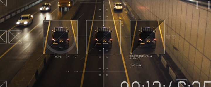
Tracking overlays for Jack Ryan: Shadow Recruit. Courtesy of Territory Studio.
Tracking overlays for Jack Ryan: Shadow Recruit. Courtesy of Territory Studio.
Kirill: What about Zero Dark Thirty and Jack Ryan? Was it just you, or was it done by the Studio?
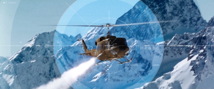
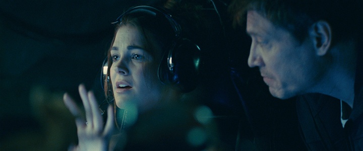
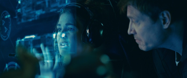
David: That was completed by Territory, rather than by me as an individual. We did “Zero Dark Thirty” after Prometheus, and it was at the opposite extreme in terms of sci-fi versus real-world narrative. It had to be very real and very authentic. There were a couple of visual effect shots but most of the computer screen graphics were on-set playbacks. The large screens where they’re looking at the Predator drone footage and reviewing aerial photography were all CGI plates that we had built and rendered in Cinema 4D, referencing data from Google Maps and then projecting on-set live for the actors to perform against.
We worked on two aspects of “Jack Ryan”; we created a lot of on-set graphics, and we also created what is called an ‘original content’ trailer. We took footage from the theatrical release trailer and did something unique with it – using hard overlays and surveillance technologies to suggest a narrative and suggesting background for some of the characters. In effect, we were using our UI graphical language both to set-dress the film and to advertise it.
Kirill: And for this type of movie your main constraint is that it’s very much rooted in the current technological world.
David: Definitely. Case in point, on Zero Dark Thirty I believe we had CIA signing-off on how realistic our work was, and what we could say to be true. For instance, we looked on Google Maps to see what the compound where Osama Bin Laden was hiding in looked like, and they asked us to change it to a degree so that it wasn’t exactly the same. There was online photography of the helicopter that crashed, and we approximated it as a 3D model and, again, changed it a bit for fictional purposes. It was an interesting, if delicate, balance to strike. And of course we had a typical sign-off from the art department – normal sources other than the CIA!

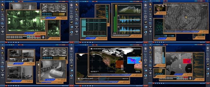
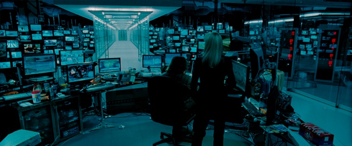
Control center from Zero Dark Thirty. Courtesy of Territory Studio.
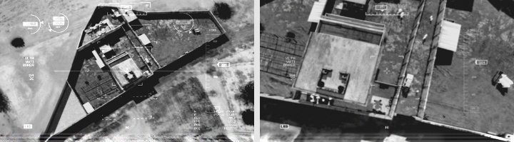
Aerial footage from Zero Dark Thirty. Courtesy of Territory Studio.
Continue reading »
When I first spoke with the cinematographer Jonathan Freeman ASC in late 2011, it was primarily about his work on feature films. Since then he has worked on a number of HBO television productions, including “Game of Thrones” and “Boardwalk Empire”. In this interview Jonathan talks about the disappearing world of mid-budget adult feature drama and the migration of creative talent into the television world, defining and evolving the visual look of a series in collaboration with multiple director / cinematographer crews, an almost-continuous seasonal cycle of high-quality adult drama series, his close collaboration as a director of photography with VFX department on the effects-heavy “Game of Thrones” and working on tighter-scripted story arcs that span entire seasons.
Kirill: As a viewer I’m seeing a lot of quality adult drama productions writing, as well as high-profile cast & crew, moving from the feature world into the TV world in the last few years – including “Game of Thrones” and “Boardwalk Empire” that you’ve been working on. Is that what you are seeing as well from within the industry?
Jonathan: Generally speaking I prefer the shorter format of movies. Telling a concise story, within a couple of hours, more or less, is something that I always aspire to. However I’m always drawn firstly to the content of the script. The difference of quality between features and television scripts that I’ve been exposed to lately, is quite surprising. There’s been such a great improvement in television writing to the point where one could argue that the best writing is currently in TV. You’re starting to see now how the success and popularity of TV shows overshadow some of the major film releases. If the old water cooler is any gage, people seem to talk about popular TV shows on Monday mornings more often than the latest blockbusters.
You’re also seeing a migration of highly sought-after filmmakers desiring to make a leap into television. Part of that is probably financial, but I think there are two aspects on the creative side. The first is the opportunity to tell a longer story, which is something unique. And the other is that the material presented to them is quite exceptional. As for myself, I continue to choose my projects based on the quality of material rather than the medium itself.
Kirill: And there’s not much mid-budget drama being done in feature world.
Jonathan: That’s very true. There seems to be a void between ultra low budget films and tentpoles. The middle-sized budgets – from $15M to $40M – are rarely being made currently. You’ll occasionally come across a couple here and there that were built up through some unique financing. But it seems like mid-range films, for the moment at least, are not profitable investments for the studios.
Hopefully these are cycles that may come back. There was a period a few years back where films recognized by the Academy awards were independent ones in that $15M-$40 range, gaining interest from the Oscars as well as at the box office. That seemed to go away when tentpoles and the ultra-low budget horror movies became very financially successful.
Continue reading »
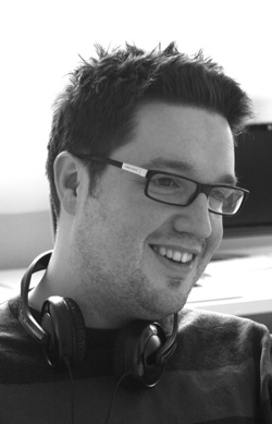
Continuing the ongoing series of interviews with creative artists working on various aspects of movie and TV productions, today I’m honored to welcome Michael Goldman. After starting his career in the commercials department at Industrial Light & Magic, Michael’s work has spanned a variety of TV and feature productions which, in the recent years, included Iron Man, The Amazing Spider-Man and Star Trek: Into Darkness. In this interview he talks about the shifting balance between physical and digital aspects of movie-making, from balancing budgets to building sets to shooting and augmenting individual scenes, as well as his thoughts on how the craft of art direction and production design should evolve and adapt in the world that shifts increasingly more work into the post-production stage.
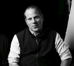 Michael Goldman.
Photography by Mark Redmond.Kirill: Please tell us about yourself and your path so far.
Michael: My name is Michael Goldman, and I work as a production designer and art director. I came to the industry in a roundabout way. I completed my master’s degree in architecture, and started working in architecture firms in New York and then Seattle, but it wasn’t the best fit for me so I tried the art world next, working for artists that did large scale public art projects. That’s where I got my art director skills, working on drawings and making presentations and then helping to build the final pieces. I drafted plans, worked in metal, wood and concrete bringing artist’s ideas to life. After about 5 years of that, I found my way into the film industry.
I was working in Seattle for the artist Buster Simpson, and “Sleepless in Seattle” was being shot there at that time. They were building a huge set for the top of the Empire State Building scene, and the production was hiring every carpenter they could find in Seattle to build it’s huge raised deck in a short period of time. I was looking for work, because Buster didn’t have any projects at the time, so I jumped at the opportunity. At the time, it was just a way to pay my bills until the next art project came along.
While working on that show, I visited the art department and started looking at the drawings of the sets that we were going to build, and I thought to myself, I can do this and this is what I was did during my architectural work. So I started exploring the possibility of drawing for films and began talking to people in the industry and trying to make some contacts.
After I had 3 or 4 names and numbers, I went to LA, sent out a lot of resumes, made follow up calls phone calls and slowly made my way into it. In the film industry if you are reliable and work hard, like any job, you will get rehired and work continuously. You can work your way up pretty fast. I was lucky that I met some helpful people and had some good opportunities. Suddenly it’s almost twenty years later and I don’t know where the time has gone.
Final light set for First Union Bank commercial (done at Industrial Light & Magic). Courtesy of Michael Goldman.
Kirill: If there’s such a thing as a typical production, when does your involvement usually begin?
Michael: On a big feature production, on the scale of Iron Man or Star Trek, we start early. As an Art Director I will work on the project for between seven months to a year, and I usually start around five months before the principal photography begins. We set up the art department, start doing the illustrations and conceptual drawings and models, and all the while the script is changing. The first couple months of prep we deal with outlines and early scripts and towards the end we’re doing a lot of drafting up working drawings and set construction. Art directors mange all these steps.
Kirill: How much of this is overlapping with the main shooting phase?
Michael: We’re designing, building and striking sets throughout the whole production. A big production usually rents a bunch of stages at a studio, and we keep rotating through them, building on several stages weeks or months ahead of the shooting time and then we strike them after they finish shooting and build the next one. When possible, we bring the director and other key players in ahead of time to comment on the progress of the sets and make adjustments as we build. On the first day we shoot a new set we are always there to “open the set” and make sure the director, producers and have what they want. Then we head out and keep working on what’s coming up the following weeks. It’s kind of leap frogging between stages. Depending on the size of the movie we might end up filling every stage at a studio two or three times.
Star Wars 1 – video game commercial (done at Industrial Light & Magic). Courtesy of Michael Goldman.
Continue reading »
Continuing the series of interviews with designers and artists that bring user interfaces and graphics to the big screens, today’s I’m excited to welcome Chris Kieffer. His work spans multiple films and TV shows, from Chuck and The Mentalist on the small screen to Man of Steel, Pacific Rim, The Cabin in the Woods, Green Lantern, In Time, Inception and Surrogates on the big screen – just to really name a few. His latest production, Transcendence, is playing in theaters now, with widely anticipated Interstellar out in theaters in November 2014. In this interview he talks about the initial exploration and research phases upon joining a new production, the frenetic pace of both TV world and feature film world, designing for mixed form factors – from phones and tablet handhelds to a set that spanned 200 screens, striking the balance between the technical nature of real-world computers and designing interfaces that flash gigantic red warnings across the entire screen, differences between TV and feature productions, and his work on the just-released Transcendence.
 Kirill: Tell us a little bit about yourself and your path to work on screen graphics for movie and TV productions
Chris: I had been a designer for a while before I got into the film/television industry. I was doing a wide array of things – print work, ads, packaging design, t-shirts, etc. I was also doing a lot of motion graphics work, commercials, animations, etc. I really preferred motion graphics over print graphics. I liked being able to bring my designs to life with animation. Something about that really made it fun and challenging. So I pushed to do more and more motion graphics work instead of print. I had an opportunity to do some motion graphics for a film, and during that they needed some help with interface design. I told them I could do it, and the rest is history. I have always been interested in interfaces, GUI’s, FUI’s in movies and television shows, but never thought I would actually be designing them.
Kirill: Where does your involvement with a particular production usually start, and who do you work with?
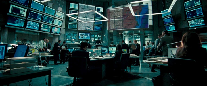
Chris: Every film/TV show is different. If I’m lucky, I get involved early in production. I usually meet the production designer, art director, and the director to breakdown the script and talk about the overall designs of the film. Sometimes, I work with prop master when designing interactive graphics for a physical prop/device. Other times I get thrown in at the last moment. Literally I could get a call for a whole control room that shoots in a few days and they need 20 or more screens with content. Then I get into the post-production side of things. I do a lot of screen replacement and VFX work too. So I deal with VFX supervisors, VFX editors, directors too.
The set of “Live Free or Die Hard“. Courtesy of Chris Kieffer.
Kirill: Do you prefer having a full artistic freedom for a project, or a more well-defined direction?
Chris: Both. I like when they have an clear idea of what they want, but are open to me coming up with my own concepts based on their ideas.
Kirill: What are your thoughts on the term “Fantasy UIs”? How well does it capture the essence of what you do?
Chris: I like the term. When designing an interface, you have to fantasize what this would look like and how it would work in the world of that film.
Kirill: And on a related note, how do you stay a step ahead of all the advancements in consumer-grade devices and sensor-based gadgets these days?
Chris: I can’t stay ahead, I just keep in touch as much as I can. As soon as you learn or read about some new technology that’s coming out, there’s already a newer one in the works. But I try and find new things as much as possible. Sometimes it’s about understanding the technology we have now, and how do we make it better.
Kirill: In “Live Free or Die Hard” and “Cabin in the Woods” you worked on interfaces that are not supposed to be futuristic. Is there less challenge involved in that?
Chris: It’s not really easier making all the content, but as for designing the interfaces it can be. In Live Free or Die Hard the FBI Headquarters was a standard interface, which made it easier to design and animate. The challenge was the massive amounts of screens and content that had to be made while shooting.
The set of “Live Free or Die Hard“. Courtesy of Chris Kieffer.
In Cabin in the Woods, they didn’t want it to be a standard interface. They wanted it to be a mix of old and new. If it isn’t broke, don’t fix it. That was the idea of that control room. They had old computers mixed within new, as if they added new things when they were needed but left the old stuff because it worked.
The screens of “Chuck“. Courtesy of Chris Kieffer.
Kirill: Do you enjoy designing for mixed form factors, like handhelds for “Chuck” or analogue monitors in “Cabin in the Woods”?
Chris: Both. Each one has its own set of challenges. The device sizes and screens are always changing, along with the operating systems. One device could be an Android system, the other an iOS device or Microsoft tablet. So you have to be able to build for so many different devices. But they can look like really cool gadgets when your finished. On the other hand when you get big screens, you get to do really nice looking interfaces. Then you get to watch actors interacting with them on set, is pretty cool.
Kirill: How much time do you spend researching a particular environment (say, power plant or air traffic control rooms)?
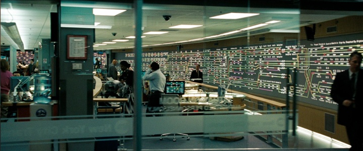
Chris: A LOT! LOL. I really like making it look as real as possible, unless it’s supposed to look different. Even then, I still research a lot. I like knowing how they really work and how they are controlled. It helps when designing the interface, and determining how the actors will interact with it. When I did The Taking of Pelham 123, we actually got to go see the operations in action. Watching how they control and monitor all the subway trains in New York, it helped so much watching how it’s really done. Then I still went and did research. I had to learn how the trains work, where the tracks are, train schedules, etc.
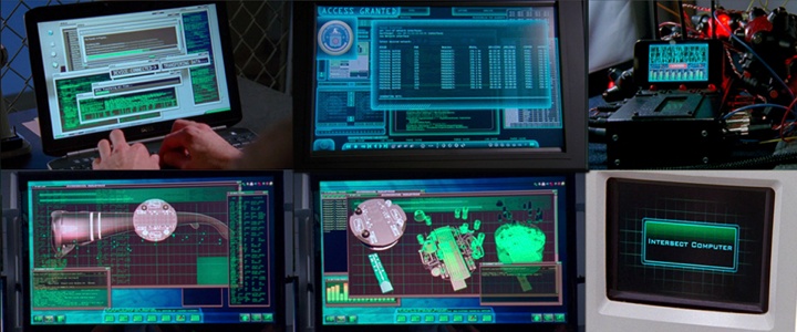
Before / after stills from “White Space“. Courtesy of Chris Kieffer. Property of White Space, LLC.
Kirill: Do you first outline your sketches on paper, or go straight to modeling software?
Chris: I almost always start on paper, but abandon it quickly. I have to figure out if the idea/sketch I have will even work, so I jump into software. I do design a lot in Illustrator and Photoshop, while I’m problem solving.
Kirill: Is there a need to become increasingly more meticulous with advances in shooting and projecting / playback equipment?
Chris: Like I said earlier it’s always changing. So I try to learn and evolve constantly. You have to be ready to adapt to anything.
Kirill: Between on-set shoots that are tied to presence of actors and post-production that is tied to release schedules, what’s more hectic?
Chris: On-set is more hectic to me. Don’t get me wrong, there are some rough times during post production. On-set is unpredictable to a point. Something could go wrong with a piece of equipment during a shot. You may only get one chance to shoot something on-set vs. getting to do a couple of revisions in post. Making it happen exactly when it’s supposed to every time, even when actors or directors change it on the fly. You have to make changes and get it ready in-between takes. I guess it’s a lot more pressure dealing with on-set graphics.
Before / after stills from “White Space“. Courtesy of Chris Kieffer. Property of White Space, LLC.
Kirill: How do you strike the right balance between staying true to the technical nature of computer interfaces and making appealing visuals for the aesthetic purposes of the overall production?
Chris: It’s tricky. Sometimes I will make it as real as it gets, other times you have to change it to be what they want. For example, if you put in an incorrect password in your email it might say something along the line of… Incorrect Password, Try again, Invalid Password. But the director might want it to be a huge animated popup window that says “ACCESS DENIED” in red. Now we know that never happens, but they may be trying to get a story point across in a fraction of a second, so you have to compromise. Then there are times when they want the interfaces to be really dense and full of information, but mean absolutely nothing. So in that instance you can design something that looks great but doesn’t really mean anything. Then there’s the time part of that. You may not have weeks to make a realistic interface the way it should be. You may only get a couple of hours or days to make something.
Kirill: How would you compare working on episodic TV to feature films, in terms of budget, scope, technology at your disposal on-set and in post-production, and your overall place in the production?
Chris: Well that’s a big one, I’ll have to break it apart.
In terms of budget. Films usually have a much bigger budget than the TV shows. But TV can be just as demanding as a film in the scope of work. Sometimes a pilot may have a much larger budget than a normal episode because we have to create everything from scratch. After that there is usually an average that they want to spend every episode. I have worked on some films that have had lower budgets than a TV show, which is challenging. I usually have to figure out new or different ways of making it happen.
Technology on-set can vary. On a show like “Chuck” we always had new gadgets and toys to play with.
The screens of “Chuck“. Courtesy of Chris Kieffer.
On a show like “Shameless” it’s just what the average person would use, like a laptop or phone. In films there can be a lot of technology at my disposal. It really depends on the need. If they want something a specific way, then I get to work with some pretty cool stuff. Sometimes I’m designing graphics that will be rear projected across six HD screens over a hundred feet and they have to be running in sync, and triggerable by us or the actor.
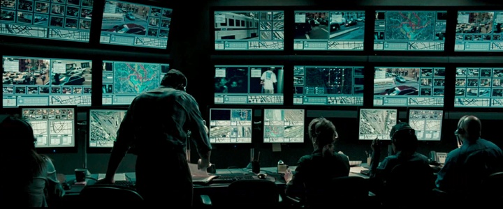
The screens of “Taking of Pelham 1 2 3“. Courtesy of Chris Keiffer.
Then there are times I have to make a simple interactive website on a laptop, so in can vary greatly. On “Surrogates” we had one set that had over a hundred computers feeding two hundred screens and around thirty different feeds at the controllers desk. It had to all be in camera, it would have been too expensive to replace them all in post. They made some changes in post and I ended up changing a bunch anyway. LOL.

The screens of “Surrogates“. Courtesy of Chris Kieffer.
Technology in Post Production, really that comes down to my workstation. I am employed at Warner Bros in the Production Sound & Video Department, and I will admit they do spoil me. My workstation there is a BEAST, which is what I need to get these jobs done in the timeframes given. The only problem is when I go home to work on my computer, I’m thinking of my computer at work…
My overall place in production is different on each project. On some films I do everything from supervising all the video playback graphics to just building content that goes to set. Sometimes it’s nice just designing and animating, because I can focus all my attention on that and really get into it. When I’m supervising, I have to do that and also know the schedule, go to all the meetings, be on set, make changes, delegate who’s doing what and so on. It really makes it hard on the designing and animating process. Luckily I have a few amazing artists who I usually work with, that really makes a difference. We have done enough projects together to know what our strong points are, and how to get things done quickly and efficiently as a whole. I also think as an artist you can grow so much when you collaborate with other artists.
Kirill: What are your thoughts on the increasing number of stereo sci-fi productions, and how is that affecting the type of projects that you’ll be working on in the next few years?
Chris: It doesn’t really affect me during production, in post it can. Like in G.I. Joe: Retaliation they wanted me to fork on some shots that had overlays. High tech HUDs and make them for 3D. It changes the workflow and design when building it for 3D. Besides that I don’t mind.
The interface overlays of G.I. Joe: Retaliation. Courtesy of Chris Kieffer.
Kirill: Going back to the real software that you’re working with on the daily basis, what are the main pain points you’re seeing there?
Chris: I use pretty much what most people use – Aftereffects, Cinema 4D, Illustrator, Photoshop and others. If I run into a problem using one software there is always another that I can use to solve the problem. I really like that part of it, trying to do something that hasn’t been done before.
Kirill: And on a related note, where do you see the field of human-computer interaction going in the next 10-15 years?
Chris: I couldn’t tell you. It is exciting watching all the new advancements and things that are coming out. I think it comes back to information, and the ease of getting it. I love information, whether it’s about family, news, the world, the future, just fun and being able to get that anywhere and anytime in any format is exciting. How we view/interpret/interact with the information is what is going to change as we go. If that makes any sense. LOL
Still from “White Space“. Courtesy of Chris Kieffer. Property of White Space, LLC.
Kirill: What can you tell us about your latest work?
Chris: Not as much as I want to. I recently finished working on Christopher Nolan’s Interstellar. I can’t say much, but I really enjoyed what we did on that film. After its release I will do a breakdown of everything we did on that. I can’t wait!!!
I also worked on Transcendence before that. We had a mix of everything on that film. Modern computers, old computers with CRTs, projections, holograms and so on. We talked about research, and this is a great example of that. In the beginning of production I sat with the Director Wally Pfister and production designer Chris Seagers to discuss what they wanted to do. They were open to ideas as well. So I came up with some concepts and went from there. I sat it many long meetings talking with professors of electrical engineering, computer science and neuroscience from Berkeley to really understand the technology behind the film. Understanding concepts and ways of how to actually map out human thoughts and memories to a computer. I had to learn about nerve impulses, neurotransmitters, and how they can be mapped into a system that can use and store that data. Then try an communicate that on the screens to the audience.
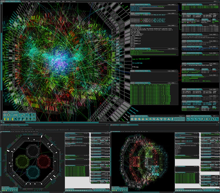
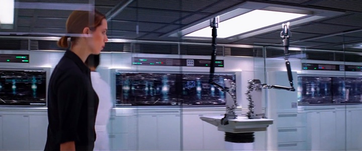
The screens of “Transcendence”. Courtesy of Chris Kieffer.
There were the hi-tech labs too. I had to learn a lot about nanotechnology and robotics for that. Also the technology for that lab was supposed to be almost 30 yrs ahead of what we have now. So I designed the interfaces while doing research on what I needed while on location in New Mexico. Luckily we had a coordinator on this film – Charlie Erlanger – who was able to keep track of all the elements and scenes we needed. He would also help make some of the animations when it was crunch time. There was a small team of designers working on this with me. Vince Parker was the programmer/designer on location with me, he would program all the files for set and to be interactive while I would design and animate them. Coplin LeBleu was back in LA designing elements for the shots coming up in the schedule that we couldn’t get to while on set.
The sets of “Transcendence”. Courtesy of Chris Kieffer.
And here I’d like to thank Chris Kieffer for taking the time out of his prolifically busy schedule and answering a few question I had about his craft, and for sharing the illustration materials for the interview. His latest production, Transcendence, is playing in theaters now, and widely anticipated Interstellar will be out in theaters in November 2014.
