Continuing the ongoing series of interviews with creative artists working on various aspects of movie and TV productions, it gives me great pleasure to welcome Steve Saklad. After doing art direction for films such as “The Game”, “Red Dragon” and “Spider-Man 2” for the first part of his career in Hollywood, in the last decade he did production design on a variety of productions including “Juno”, “Up In The Air”, “The Muppets”, “Labor Day” and, most recently, the pilot episode for the TV show “Empire”. In this interview Steve talks about his theatrical background, the changes that the art department is undergoing in the last decades, his involvement in pre-production and production phases of his films and his work on 250 (and counting) commerials. In addition, he takes a deep dive into the production details of the “Empire” pilot, “Up In The Air” and the beautiful atmosphere of “Labor Day”.
 Kirill: Please tell us about yourself and your path so far.
Steve: I’m a theater person deep down. Raised on musical theater since boyhood, I spent all my time in the theater department at my undergraduate college (Brandeis University) and trained in Set Design along with Costumes and Lighting at Yale School of Drama for my graduate degree. I arrived in New York with my sketch and drafting portfolio in the summer of 1981, ready to design my first Broadway show. I designed a few off and off-off Broadway shows during the decade, but primarily was first assistant to the top Broadway set designers on some of the great shows of the 80’s. Little by little, drafting for Broadway seguee’d into drafting for movies. By the 90’s I was a feature Art Director, now living in Los Angeles, and designing commercials on the side. After all that prep time, I was good and ready when my first Production Design opportunities in indie films came along in 2004.
Kirill: What drew you into the world of the art department, and what – if anything – has changed for you since you’ve started working on your productions?
Steve: Like the set design department in theater, the work of the Art department is all about creating a world that didn’t exist before you started. It could be operatic, super-natural or documentarian, it could be the fantasy world of “The Muppets“, or the banal real-world environment of “Up In The Air“. You’re setting the parameters and saying this is what’s important visually to tell the story you want to tell. That’s thrilling.
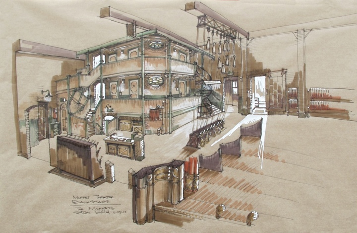
Sketch drawing for the backstage set of “The Muppets”. Courtesy of Steve Saklad.
Changes since I began in the art department— how much time do you have? When I began, we drafted in pencil on velum paper which was then sent through a diazo machine to make a blue-line print. We carried pagers, sent approvals by fax, and kept quarters in our pockets to make emergency phone calls from pay phones on the corner. The computer revolution has changed the outer tools, but not the process. We still assemble moodboards by hand, still page through books for inspiration, still match fabric swatches with paint chips to arrive at a color pallet. Set models are now often digital versions on a computer screen, although I still prefer the old-fashioned 1/4″ paper models. I still find my way to a design by sketching in ink on buff yellow onion-skin paper and adding markers and whiteout to give it life. But I’m admittedly a relic of another time compared to most designers I know.
Kirill: You’ve spent the first half of your career so far as an art director. What have you carried with you as you transitioned into the role of the production designer, and how does that affect your working collaboration with your art directors?
Steve: It’s a great question. I know the nuts and bolts of running an art department as well as construction, paint and greens departments, I know how budgets are structured and what designs generally cost because I did that job for almost 15 years. I hope that means I’m more compassionate to my art directors, knowing what they’re going through to make our designs come to life. I’ve also been blessed with getting to work with some amazing Art Directors under me, who have taught me far more than I could ever teach them. It’s definitely a two-way street.
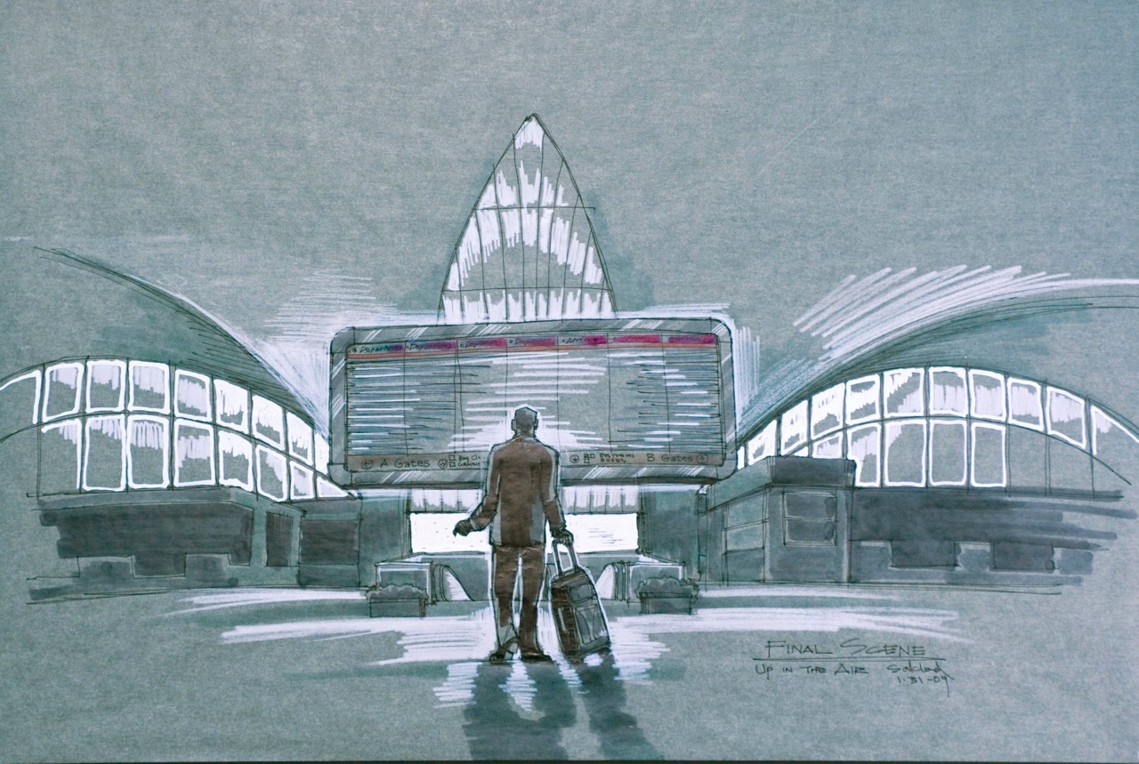
Sketch drawing for the final scene in “Up In The Air”. Courtesy of Steve Saklad.
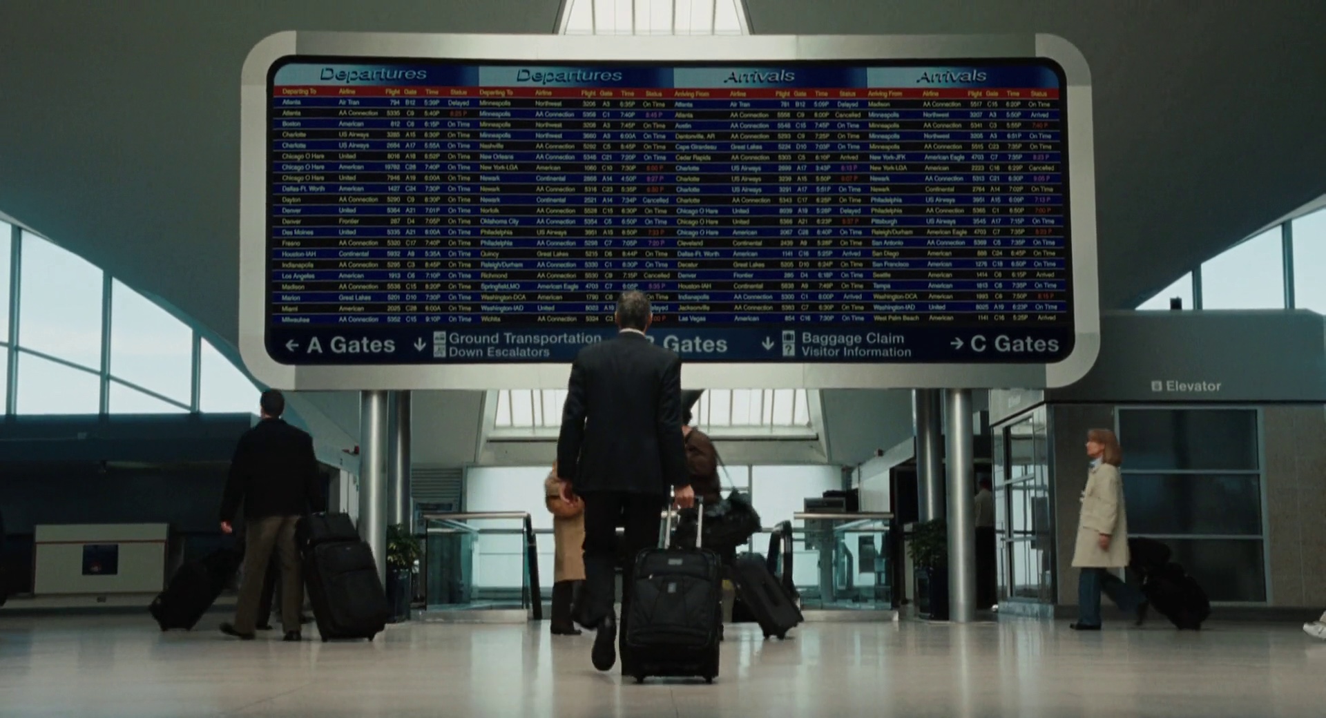
The final still from the movie.
Continue reading »
At the intersection of art and technology, the ever-increasing importance of screen graphics in feature film reflects the expanding arc of human-computer interaction in our everyday lives and the pervasive presence of glass screens around us. It gives me great pleasure to welcome Andrew Booth of BLIND LTD to the ongoing series of interviews with designers and artists that bring user interfaces and graphics to the big screens. In the last few years you’ve seen their work on the “The Dark Knight” trilogy, “Hellboy”, “Skyfall”, “Jack Ryan” and the recently released “Kingsman: The Secret Service”, as well as in the cinematic trailers for the CRYSIS game franchise. In this interview Andrew talks about what drew him into the industry, the overall collaboration process within the feature production environment, approaching the technology world of Bond and Batman franchises to define the look and feel of the interfaces, constructing the visual language of the two competing factions in “Kingsman”, the primary goal of supporting the story and the effect it has on all aspects of the craft of screen graphics, and the two-way flow of ideas between the worlds of “fantasy” and “real” screens.
Kirill: Please tell us about yourself and how you got into the field of screen graphics for film.
Andrew: I love film and I love design, and it seemed a natural fit. I come from art and design background, and I like making things. It was good expressive way of doing something that was innovative and thought provoking.
Kirill: It would be a rather boring movie if all the technology it showed you would already be present in your life.
Andrew: I figure with screen graphics you want to see something that has a bit of escapism, excitement and drama about it.
Kirill: Does that get pushed by the director, the production designer and by yourself?
Andrew: Generally it’s all about the story, and within that you will have the graphical element that’s written on the page. Part of your work is reading the script, getting some ideas and then developing them.
As far as who we collaborate with? Generally speaking I deal directly with the director. We also work in conjunction and in collaboration with the art department and the visual effects supervisor.
One of the things that we do at BLIND, which is quite different from other agencies, is that we deal with graphics on set and in post.
The first film I ever worked on was “Die Another Day”. I wanted to get into films and ended up almost breaking into Pinewood Studios to visit the VFX supervisor at the time. I showed the work that I produced including a number of film specific test shots. I think the VFX supervisor was surprised that I got through the gates. Two weeks later I got a phone call and told that they had some post graphics work for me to do. That was my “in” to the industry.
Post is a very different animal compared to on set. You’re working to a specific cut length, and you might only have 12 frames to tell your story graphically.
My second job was for Guillermo Del Toro’s “Hellboy” where everything was live and on set. We had to be very diligent in the way we told the story.
Back to your question, at BLIND we collaborate with the production designer, the VFX supervisor and the director.
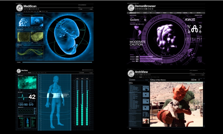
UI Screen graphics from Hellboy / http://www.blindltd.com/hellboy / Courtesy of BLIND LTD
Kirill: And that’s where the decision between doing things on set or in post production is made? Some directors would want to see more stuff directly in camera.
Andrew: It is cyclical.
On “Hellboy” “Sahara” “Batman Begins” “Doom” “Casino Royale” “The Dark Knight” our work had predominantly been on set. Then there was a step change where everyone moved away from doing it practically. I wondered if this part of the industry was dying away. Obviously it is easy to green everything up and then think about it afterwards, however with “The Dark Knight Rises” and “Skyfall” there was a return to the practicality of doing as much as you possibly can on set.
As we speak we’re doing an on set project with the VFX supervisor who got us involved in the post-production screen graphics for “Jack Ryan: Shadow Recruit”. We both know that we’re going to do things in post, but we’re trying to achieve as much as possible live.
It’s an interesting hybrid in terms of where we sit.
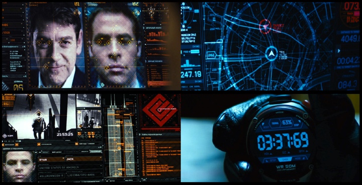
UI Screen graphics from Jack Ryan: Shadow Recruit / http://www.blindltd.com/jack-ryan / Courtesy of BLIND LTD
Continue reading »
Continuing the ongoing series of interviews with creative artists working on various aspects of movie and TV productions, today I’m honored to welcome Caity Birmingham. Over the last few years she held the roles of production designer, art director and set decorator on multiple feature film and TV productions, mixing it with working on sketch comedy for web and television. In this interview she talks about what drew her away from directing into the world of the art department, the frantic world of web comedy productions, the ever-increasing diversity of platforms for creating and consuming content in the digital world that surrounds us, and her work as the art director on the recently released “White Bird in a Blizzard.”
 Kirill: Please tell us about yourself and your path so far
Caity: I went to school for directing but discovered I much prefer directing inanimate objects to directing actors. I enjoy working in the art department because it still allows me to participate in character development, backstory, tone, mood and setting in a very hands-on way. I got to Los Angeles about five years ago, and worked on anything I could in any aspect of the art department just to meet people and learn things. During the first few years I learned that “internship” can be a dirty word, and you never know which jobs are going to lead to big breaks or long-lasting collaborative relationships; often it’s the ones you least expect. I’ve happily tried every art dept. job from set dresser to production designer. Around the time I was meeting great art people in Los Angeles and getting to work as set dresser on movies like “Like Crazy”, I production designed my first feature “The Wise Kids“, directed by Stephen Cone. I met him through some mutual Chicago friends and filmmakers, and have since designed three features for him. I really value those kinds of ongoing collaborations. I was also lucky enough to meet some great production designers who invited me onto their teams in various roles, including Todd Fjelsted, who production designed “White Bird in a Blizzard”, and hired me as his art director.
My experience so far has been in small independent films (“White Bird” is actually one of the largest films I’ve worked on) and sketch comedy. My friend Katie Byron, another production designer I was lucky enough to meet and work with, who production designed “Like Crazy” and a bunch of other wonderful films, connected me with “Funny or Die” soon after I got to Los Angeles, and I worked on probably 40-50 of their web comedy sketches in between working on movies and other projects. I also interned at Abso Lutely Productions back in 2010 (one of my better internship experiences) and in a very roundabout way ended up back at that company this past year, taking over for Katie as production designer on “Comedy Bang! Bang!”, which is a little sketch comedy/talk show on IFC.
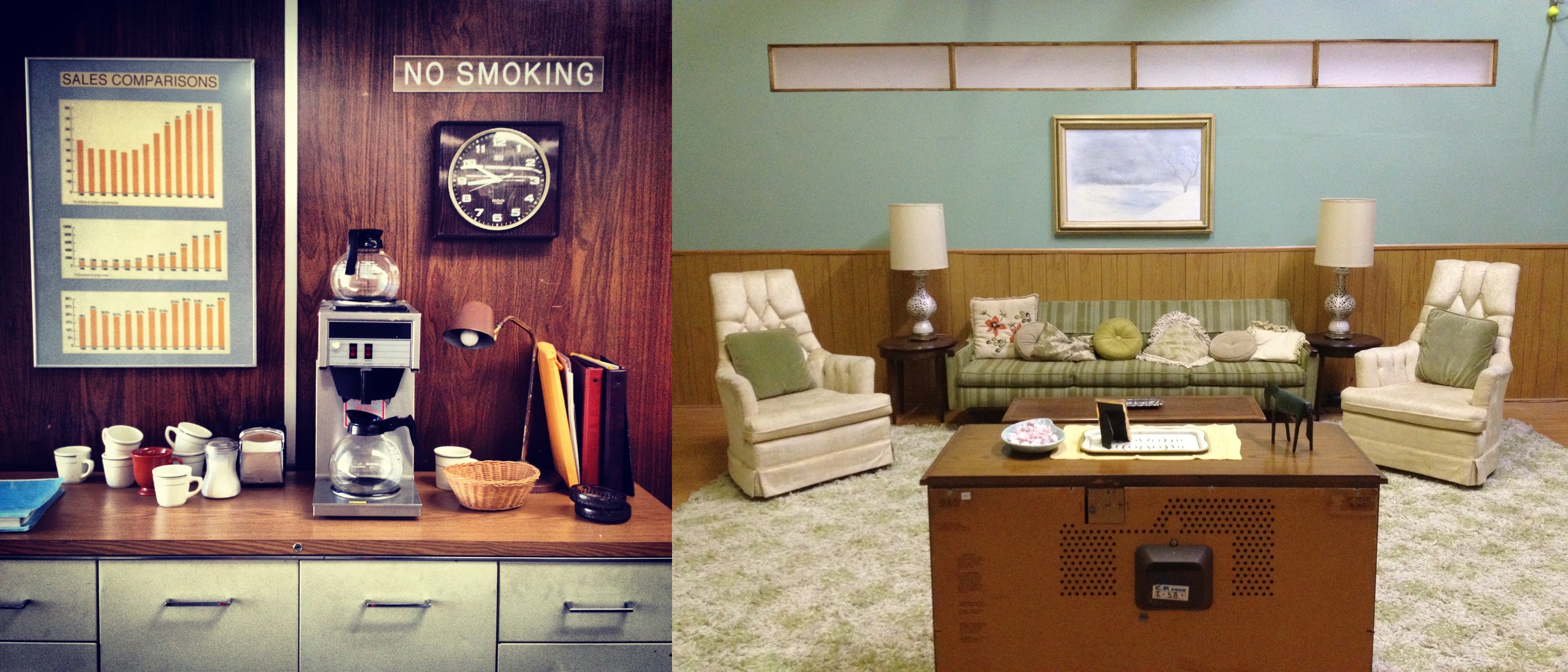
On the sets. Courtesy of Caity Birmingham.
Kirill: What drew you into the business, and how has that changed during the years that you’ve been working on different sets?
Caity: As an undergraduate, I was studying art at a small liberal arts school and at the same time watching tons of movies (this was before Netflix, so I was basically going row by row at the video store), and slowly realizing I wanted to work in film, but not really knowing what that meant. So I assumed I wanted to be a director and went to graduate school to figure it out. I feel really lucky to have stumbled into the art department. Like, how is there this job that combines so many of the things that interest me and that I happen to be good at? Since trying to work professionally in Los Angeles, that feeling has definitely evolved into something a little less purely optimistic. I’ve been paid next to nothing to put my hard work and creativity into projects I found fairly worthless, but for every soulless project there is another great little project with an amazing script and a delightful crew.
Kirill: You’ve been taking diverse roles in the art department – set decorator, art director, production designer. Does that explore different creative parts of your brain? Do you want to avoid repetitiveness in what you do?
Caity: One great thing about the art department is that each job is entirely different, requires different skills and presents different challenges, so repetitiveness is never a problem. I have learned that the best skills you can have are adapting quickly, communicating clearly, and solving problems creatively, and those skills apply to all projects and all art department roles, just in different ways. When I started working in Los Angeles, I was just hungry for any art department job I could get, and the experience was equally valuable whether I was working for and learning from other production designers, or figuring out how to be the production designer myself. Working in a variety of roles has definitely given me a greater appreciation for what everyone else in my department is dealing with. For example, I will never underestimate the work of the on-set dresser. It is a difficult job, and when done well, it adds a tremendous amount to the success of the art dept. and the film/show as a whole.
Kirill: How and when did you join “White Bird in a Blizzard”, and what was your part in the movie?
Caity: Todd Fjelsted is a production designer I’ve been lucky enough to work with on a few projects. He had designed Gregg Araki’s previous film “Kaboom”, as well as a number of other interesting, successful indies. I was already a big fan of the director, Gregg Araki, and when Todd mentioned the project, I told him I’d love to work on it in any capacity. I just got lucky that he needed an art director and trusted me to do it.
Continue reading »
Continuing the ongoing series of interviews with creative artists working on various aspects of movie and TV productions, today I’m honored to welcome the set decorator Kris Boxell. You’ve seen her work in the two sequels of “The Matrix” trilogy, “Fruitvale Station” and, most recently, “Blue Jasmine.” In this interview she talks about her first production – “The Right Stuff”, drafting and creating the right look for the specific production, working with on-set green screen environments, the day-to-day activities on the set in her role as the set decorator, her collaboration with production designer Santo Loquasto on Woody Allen’s “Blue Jasmine”, and a deep dive into the impact – or lack thereof – of digital revolution on her craft.
Kirill: Please tell us about yourself and your path in the movie business.
Kris: I came out of the television generation – from mid-fifties into the sixties. And at some point, probably in early sixties, they had a movie on every afternoon. I’d come from home to school, and there’d be a movie on. I was watching them and it was rather exciting.
Later I would go to movies, but I wouldn’t stop everything for it. Living in Los Angeles in the seventies, I couldn’t afford first-run films, so I would see revival presentations, usually two at a time, as well as foreign. My local theater would play two movies every night, and it was mostly film noir for months. When I was 18 to 21, it was this amazing exposure to such classic film noir movies, and it’s part of my soul now.
I was in college studying sociology, and then went to graduate school at UCLA, but not majoring in film. There wasn’t a very big film department; I would’ve done media studies, but it didn’t exist. I was a sociologist and a demographer doing research. Then I met my husband at San Diego Comic-Con which you probably have heard of [laughs].
Kirill: Back then it was a rather small convention.
Kris: It was tiny. You had all these artists, and I had really good friends in Westwood who had a comic-book company, and I spend all my time reading vintage comics. Then Ron Turner, a publisher from Last Gasp Publishing who did the early underground comics, introduced me to Tim Boxell, and then we were married. I moved to San Francisco and dropped out of the PhD program at UCLA, and a year later, not even intentionally, found a back door into the film industry.
My husband was doing storyboards on “The Right Stuff”. Philip Kaufman the director likes to communicate via storyboards. They started with the effects sequences, and my very first job in the movie business was taping up storyboards. Then I got hired as an art assistant in visual effects. That was waaaay before computer graphics. We threw model airplanes out of the windows [laughs]. We lit things on fire in parking lots.
I look at behind-the-scenes and voiceovers on older movies with Ray Harryhausen and other animatronics artists talking about how they did it. They were asked to do something, and then they started figuring out how to do it and seeing what works.
We did a lot of motion control on “The Right Stuff”. We had a gigantic motion control machine, and it would repeat the action of the camera. It was really thrilling to be able to do those things, and a lot of processing was in-camera, with multiple passes and a lot of mattes, background plates and glass paintings. I had a real appreciation for matte painters, and they still have an organization, and there’s a lot of history there.
Continue reading »
