Illustrators at work – interview with Niall McCormack
I have first came upon the online presence of Niall McCormack a couple of years ago through his blog dedicated to vintage Irish book covers. Unlike many of the aggregator blogs that simply repackage and post image galleries, every entry on this blog is a breath of fresh air, providing a wealth of background information on the specific authors, genres and publishing houses, along with Niall’s own impressions of the works. And a few months ago I was particularly delighted to find Niall’s portfolio, a thriving and captivating collection of his illustration work with particular emphasis on music packaging and book covers. It gives me a great pleasure to welcome Niall to the ongoing series of interviews with illustrators, and to ask him a few questions about his art and craft.
 Kirill: Tell us about yourself and how you started in the field.
Niall: I’m a designer and illustrator from Dublin, Ireland. I specialise in designing music packaging and book covers. I studied Industrial Design at college in the early nineties but I spent my free time designing posters and playing music while I was there. After college I played with my brothers in a band called Jubilee Allstars. I designed all of our record releases – a few LPs and a bunch of singles and EPs. That gave me a good handle on the technical side of packaging design and I got more jobs on the back of that work.
Since 2007 I’ve been designing CD covers for Ace Records in the UK and I get to work on great music from the fifties and sixties – rhythm & blues, soul, rock ‘n’ roll, girl groups, rockabilly, garage etc.
In the last couple of years I’ve been exploring illustration much more and enjoying the freedom it brings to the design process. Originating the entire visuals for a project is very satisfying and allows a higher degree of control over the process. It also means that you can add you’re own voice to projects and use it as a selling point to new clients.

Left: Giselle, for Birmingham Royal Ballet exhibition organised by Point Blank. Right: Vatican Voodoo Brand for The Art of Superstition exhibition organised by Illustrators Ireland.
Kirill: What informs and shapes your taste and style?
Niall: Collecting records from a young age had a major impact on my visual taste. I’ve always loved the sleeve designs as much as the music and in many ways it was my first exposure to the visual arts. I love design that is simple and direct, I like it to be rough around the edges. I always associate slick design with corporate blandness. I like vernacular design and popular commercial design.
I’m also very interested in the mechanics of printing and how different processes affect the look of the finished piece. I’m fascinated by how ephemera from different eras has a look that is unique to that time, how trends in design as well as advances in print technologies affect the style of that time.
Kirill: Do you want to carve out a consistent and recognizable style? Is there a danger of being influenced too much and not finding your own unique voice?
Niall: My aesthetic preferences and tastes do give my work some semblance of a recognisable style. It is something that I’m conscious of, but I find it hard to actively aim for a consistent style without it becoming a creative strait jacket. I’m not too concerned about having a unique voice, I like my work to retain the feel of the material that I take inspiration from. Some of my work requires me to explore styles from the past in a believable way so there is less room to create a unique voice.

Book covers for Chartered Accountants Ireland.
Kirill: How do you approach designing a book cover? Is it about capturing the story in a single image, or a somewhat looser interpretation that gives you more freedom?
Niall: Most of the book covers I design are non-fiction and the Irish market is quite conservative in terms of cover design. Irish publishers are struggling to embrace the move towards illustration which has occurred in larger markets over the last few years.
With fiction, if you’re lucky, you’ll get to read the full book although sometimes it might only be a chapter or two. I think it’s important to capture the tone or mood of the book rather than a literal representation of a particular scene, character or object. Period style may also need to be evoked and that can be a good starting point.
Non-fiction covers can be a real challenge but it is very satisfying when it goes right. I design a lot of accountancy book covers with impenetrable titles and abstraction tends to work a lot better than stock clichés.

Downtown Soulville CD covers for WFMU Radio.
Kirill: What is your process of designing a record cover? Does it work better if you like the particular album?
Niall: Yes, it definitely helps to like the music and it’s essential that you have a good understanding of the cultural context the music was made in and the market it is aimed at. Luckily I have a fairly broad taste and I’m a fan of the labels I work with. I’m not interested in packaging music that I don’t like and so far it hasn’t been an issue.
The design process is different depending on whether I’m working on a reissue or on contemporary material. For reissues there are usually some photographs or other ephemera which will be used as the starting point. I always relish having a blank canvas to start with which happens more often with contemporary releases. I like to push illustrative solutions but sometimes an artist will feel safer with a photographic cover.
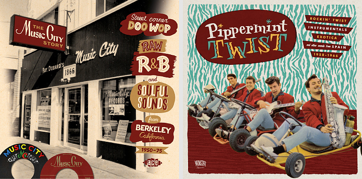
Left: The Music City Story, CD cover for Ace Records. Right: Pippermint Twist, LP & CD cover for Munster Records.
Kirill: Most of your record covers are for compilations of material from a few decades ago. Employing the mix of old photographs and vintage illustration elements, is your intent to stay faithful to the original style of that era?
Niall: The majority of my work is for labels who reissue music from the ‘fifties and ‘sixties and it’s an era I’m drawn to both musically and visually. I do try to stay faithful to the original style of the era and can be a bit obsessive about it. I try to use fonts which are true to the period and employ hand-lettering when necessary. I enjoy exploring the nuances of popular visual style. There’s a big difference between the graphic look of the early-sixties, mid-sixties and late-sixties but some of the differences are quite subtle. I collect books of LP cover art and I’m particularly fond of 45 label artwork, it’s always good to refer to examples from the period, rather than later reinterpretations which can be quite wide of the mark. With some projects I’m less fussy about period style and can employ a more general retro feel.
Kirill: Speaking more broadly about cover design, what are your thoughts on increasing prevalence of digital stores – for both music and books? Do you keep in mind that people are browsing and making impulse purchases on a variety of smaller screens?
Niall: To be honest I’m still focused on the physical product and don’t tailor the design to the digital marketplace unless that is a requirement from the outset. The buyers of reissues tend to be older and still want physical product, particularly releases with extensive sleeve notes and archival images. Most of the packages I work on have at least a 20 page booklet so a digital version would be lacking in comparison.
I’ve designed some digital only music and book releases but haven’t enjoyed the experience. It is essentially a thumbnail icon that you are producing and it is very different from what I’m used to. I’m not sure about the fate of CDs but I believe books aren’t in the imminent danger that some commentators would have us believe.
Kirill: What’s the technical process? Pen-and-paper first, and then transition to digital tools?
Niall: I mainly use brush or dip-pen and ink to create the original elements and then bring them into the computer to add colour, texture and assemble. I avoid clean vector lines if at all possible. With some pieces I’ll mimic the printing process and create separations for each colour, add texture to them individually and then recombine them as a single piece. I go into the process of creating Tomorrow Never Knows for Illustrators Ireland’s Illustrated Beatles exhibition here.

Left: Charlie Parr, gig poster for U:mack Productions. Right: Thee Oh Sees, gig poster for U:mack Productions.
Kirill: Once the cover is part of the final product, do you ever wish to go back and tweak that illustration? Has it ever happened that you had what seemed to be an even better idea after the process has been completed?
Niall: You can have very strong feeling about a piece when you are working on it but feel differently when you view it after some time has passed. This can go both ways, sometimes a job gets compromised and the client wants to use what you feel is a weaker idea. It can be quite dispiriting at the time but oddly, I’ve found that I’m often very happy with the finished cover after the dust has settled. At other times, you can be very happy with a piece as you work on it, but when you review it later on you might not be as enthusiastic. It’s hard to be objective in the middle of a job so you have to trust your instinct, it won’t always be right but it will be most of the time.
Kirill: How do you preserve color fidelity when the final product is targeting print media, such as album or book covers?
Niall: I have a well-calibrated colour printer which gives a good idea of colour in the CMYK range. Colour fidelity is less problematic now than it has been in the past, partly because the technology has improved but also because I’ve a better sense of what is possible within the limitations of commercial printing.

Left: Konono No 1, gig poster for U:mack Productions. Right: Flash Gordon, re-imagined film poster for Hollywood Babylon Dublin.
Kirill: What’s the weirdest client feedback that you’ve received so far, if you don’t mind sharing?
Niall: A client described some of my cover drafts as “old fashioned” and “out of date”. I didn’t have the heart to explain the whole retro phenomenon.
Kirill: They say that the Internet has a place for everybody, no matter how narrow their interest is. What’s the story behind the Vintage Irish book covers blog? How did it start?
Niall: I wanted to start a design blog that focused on an area of design which was generally overlooked. Originally I hoped to post examples of Irish ephemera from the 20th century but I found it very hard to find enough good material. While I was on the look out I noticed that there were lots of very interesting Irish book covers waiting to be discovered. The history of Irish graphic design and illustration has yet to be documented properly and many very talented Irish designers from the past are completely unknown even in their home country. The blog has a very narrow focus but I think that has been a strength rather than a weakness. Most of the covers I post aren’t on the internet already and I think people appreciate the unique content and my efforts to piece together some of the designer’s stories.
Kirill: How much time do you spend on preparing a typical entry on that blog, and how do you get the actual high-resolution images of the covers?
Niall: The blog entries take about 3-4 hours to put together. The majority of covers are from my own collection of books.
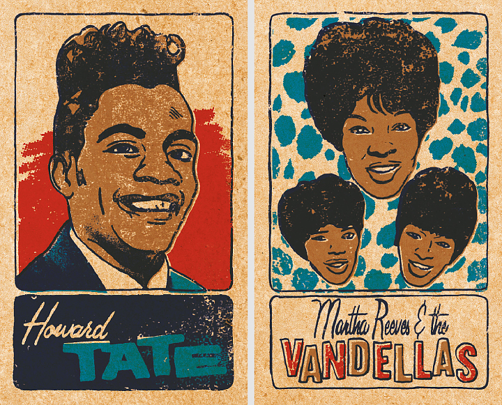
Two cards from a set of 48 Soul & Funk Trading Cards, personal work.
Kirill: How important is it to invest time in personal projects?
Niall: Personal projects are vital and I always enjoy working on them. There is more space to experiment and try new processes and the results usually make for good self promotion pieces.
Kirill: What do you do when you run out of ideas and get stuck?
Niall: Try not to stress out. It’s good to get away from work and get a clear head.
Kirill: What’s the best thing about being an illustrator?
Niall: Having started out as a designer, the best thing for me is the added freedom and control that illustration gives.

Left: WFMU interprets the music of Sun Ra, CD cover for WFMU Radio. Right: Tomorrow Never Knows for Illustrated Beatles exhibition organised by Illustrators Ireland.
And here I’d like to thank Niall McCormack for graciously agreeing to answer a few questions I had about his work, and to share his materials for the interview. You can find more of Niall’s work in his portfolio, and follow his blog dedicated to vintage Irish book covers.
