Going with the new biannual release cycle of my Swing projects, this week is seeing the latest official releases of Substance and Flamingo.
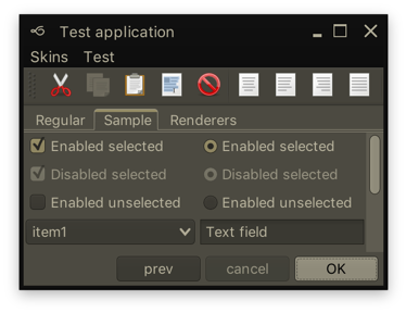
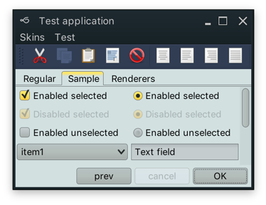
Along with a few visual polishes and tweaks, Substance 7.1 (code-named Vermont) brings support for using correct default system font on macOS 10.10+ when you’re running your app under the recently-released Java 9. In addition, your JOptionPanes will see a tweaked order and alignment of the buttons. By default, the order and alignment follows the interface guidelines for the specific platform. On a macOS machine, for example, the buttons will be aligned to the trailing edge of the dialog (right on LTR and left on RTL), with the default button placed as the trailing button:
Use the APIs on the SubstanceLookAndFeel class for app-specific control over the order and alignment of the JOptionPane buttons if you want to deviate from the platform guidelines.
The previous release of Substance brought full support for high DPI screens, and the latest release for Flamingo 5.2 (code-named Kennocha) aligns both libraries to be first class citizens on modern screen hardware. The unofficial release notes are:
- Full high DPI support for all components, including
- Command button icons and arrows
- Color selector popup menu
- Ribbon galleries
- Ribbon bands in collapsed state
- Support for vertical scrolling of secondary level content in ribbon application menu
- Better mouse wheel handling in command menu popups
- Addressed clipping issues on some transcoded SVG content
If you’re in the business of writing Swing desktop applications, I’d love for you to take the latest releases of Substance and Flamingo for a spin. You can find the downloads in the /drop folders of the matching Github repositories. All of them require Java 8 to build and run. Happy Swing coding!
Going with the new biannual release cycle of my Swing projects, it’s time to do the release candidates for the latest iterations of Substance and Flamingo.
Along with a few visual polishes and tweaks, Substance 7.1 (code-named Vermont) brings support for using correct default system font on macOS 10.10+ when you’re running your app under the recently-released Java 9.
The previous release of Substance brought full support for high DPI screens, and the latest release candidate for Flamingo 5.2 (code-named Kennocha) aligns both libraries to be first class citizens on modern screen hardware. The unofficial release notes are:
- Full high DPI support for all components, including
- Command button icons and arrows
- Color selector popup menu
- Ribbon galleries
- Ribbon bands in collapsed state
- Support for vertical scrolling of secondary level content in ribbon application menu
- Better mouse wheel handling in command menu popups
- Addressed clipping issues on some transcoded SVG content
If you’re in the business of writing Swing desktop applications, I’d love for you to take the latest release candidates of Substance and Flamingo for a spin. You can find the downloads in the /drop folders of the matching Github repositories. All of them require Java 8 to build and run. The final releases are scheduled to happen in two weeks’ time, on the week of October 16th.
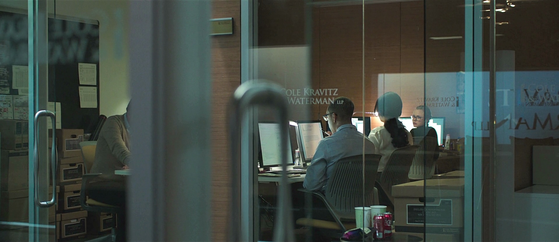
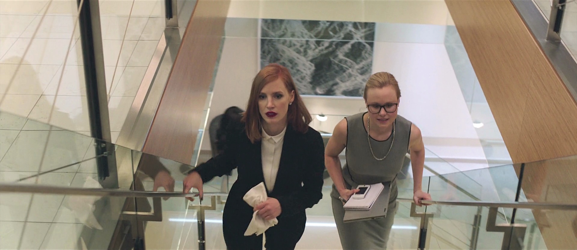
Continuing the ongoing series of interviews with creative artists working on various aspects of movie and TV productions, it is my pleasure to welcome Mark Steel. In this interview he talks about his path into the art department, the ever-changing landscape of episodic television that balances the cinematic scale with shrinking timelines, the day-to-day responsibilities of an art director on set, the present and potential future of combining visual effects with physical world building, and the place of virtual reality tools in simulated set environments. The second half of the interview is about Mark’s work on recently released “Miss Sloane”, a story that follows a formidable D.C. power-broker played by Jessica Chastain and her fight against the powerful gun lobby.
Kirill: Please tell us about yourself, and your path into the art department.
Mark: I was born in Vancouver and grew up in Ottawa. I watched a lot of TV when I was a kid. I was into animation and horror which lead to a fascination with make up and special effects. I began reading Fangora magazine and other such publications, which really introduced me to the whole behind-the-scenes world of film. In my last year of high school I was offered a co-op program at a local community cable TV station. There I got to direct all sorts of studio shows, local remote and mobile shoots.
 I then went to post secondary school at Ryerson in Toronto for Radio and Television Arts. I actually wanted to be a TV director when I graduated. I found myself at the CBC as a stagehand, and began working in set decoration and props. The CBC at the time was in decline, but a lot of the old system of designers, art directors, builders, costumes, FX and all the other trades were still under one roof. It was really a wonderful and sadly broken creative place. I learned a tremendous amount about all the crafts and talents that went into production.
I worked on the last two seasons of a popular comedy series called “Kids in the Hall”. It was a highly creative show. We did hundreds of sets a season to be shot as 16mm short films, three camera studio bits, with live audience segments. It was really a master class in pushing the boundaries in television at the time.
When I left the CBC, I found that my experience as a set decorator was most in demand. Toronto production was growing, and we had three unions in the city. I did a lot of Canadian TV series and movies of the week for US networks. I found myself working with local and US production designers, and eventually I was asked by a local PD to step in as an art director on a TV series for a Disney cable channel sci-fi series. I have been working primarily as an Art Director for US projects in Toronto although I have been all over Canada and some of the Caribbean.
Kirill: What drew you into the film / TV industry, and how has that changed after a few productions?
Mark: It’s the best part-time job anyone ever has to start. While I was still in school, I had a friend who was working on film sets as a production assistant. I had an occasion to visit and found that environment to be very appealing. My early years at the CBC was a sort of institutionalized experience that was in the process of dying, as government funding was being stripped away and I really had no future there. I knew there was this “outside” industry in Toronto, and with a few connections I realized that I could make a living in the art department as a Set Decorator.
As a young person, I was very into the circus of it all. Rolling onto locations, completely taking over a space, transforming it and disappearing again without a trace. What I also began to realize very early was that I really didn’t have the patience to work on set with the shooting crew. I found the pace and the hierarchal nature of a film set to be tedious. I much preferred to take part in the research, sourcing, prep and installation of sets. I excelled as a Leadman and Set Decorator and began to build my brand off-set in the Art Department.
Kirill: As you have done a variety of both feature and episodic productions, how would you compare the pace of the two worlds?
Mark: They are really not that fundamentally different, especially these days. I developed my skills primarily in TV series where mastering scheduling was key. My training and the goals of my early mentors was to create “feature” quality look in spite of budget and schedule constraints. Progressively, the quality and demand of television series increased through the late 2000’s. At the same time many productions also demanded more for less.
I can’t say when it was exactly over that period of time that I honed the ability to deliver on shorter and shorter timelines. 8 weeks of prep became 6 weeks that became 4 and so on, but the principal tool constantly employed is communication. It is all about prioritizing the creative needs and getting to consensus as efficiently and respectfully as possible. In TV that is almost always the Producer’s call. In features it is the Director’s.
On a TV series most of the time the Director is a guest. Usually he or she has the experience with the format and understands how to efficiently get what is needed out of a shooting day. My contact with the Director is typically about problem solving around scheduling constraints and to guide them through the possibilities on standing sets. Although schedule remains a reality in the feature world as well, the priorities are driven by the Director’s vision. Depending on his / her status and the budget, greater degrees of deference must be payed. Expectations are infinitely scalable, but in the end every project has many of the same steps.
Continue reading »
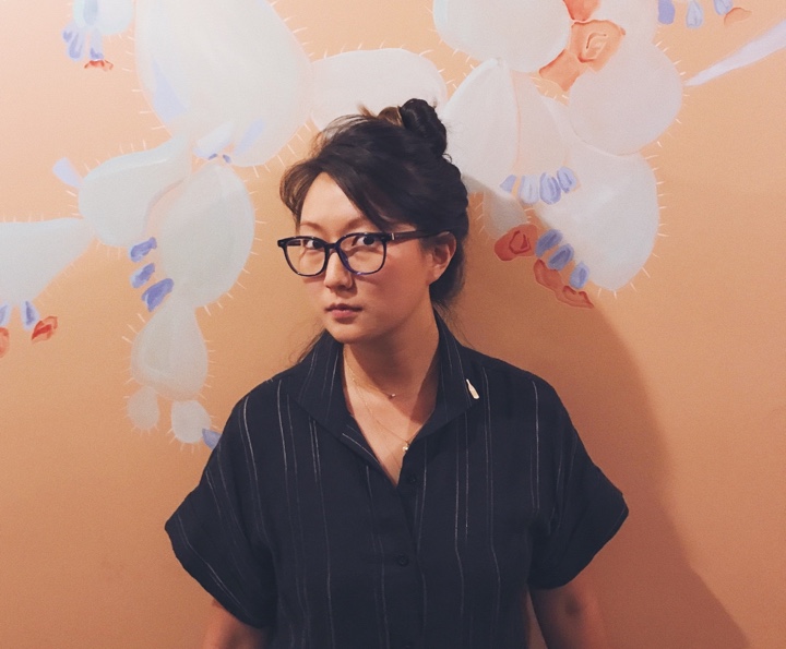
Continuing the ongoing series of interviews on fantasy user interfaces, it gives me great pleasure to welcome Karen Sori. As the graphic designer on the recently released “The Circle”, her work brought together the physical and the digital worlds of the story. In this interview we talk what graphic design for film is, how it can be both pervasive and invisible, working on productions of different scopes and being constantly challenged to find solutions to new problems.
As we transition to talk about “The Circle”, we start with designing the physical spaces of that world, and creating a design system that defines the company’s identity. Diving deeper into the digital part of it, and screen graphics in particular, Karen talks about choosing the red color for the logo and the main interfaces to convey the sinister undercurrents of that company’s technology both internally and externally, the visual aesthetics of the interfaces and the decisions made to reduce the traditionally negative connotations associated with the red color, and taking interface elements out of the rectangular confines of the screen and into the physical space around the main character.
Kirill: Please tell us about yourself and your path so far.
Karen: My name is Karen Sori, and I’m a graphic designer for film and TV.
I grew up with the love of movies very much present in my household. My father enjoyed them immensely and always made it a point to share everything he had watched growing up. So many of his memories of watching movies are tied to when he and my mother were traveling in South America as immigrants. It is a remarkable thing that movies can inspire joy and transcend any age, gender, culture, and circumstance of their audience.
After moving to the States from Sao Paulo in grade school, I remember one of my first outings with my newly acquainted cousins was a trip to Disneyland. I didn’t yet understand or speak English at the time so observing the visual feast before me was incredibly surreal. I was old enough to know that it wasn’t real but observing the buildings, the playfulness of scale, the whimsy of the characters– the delight of fantasy really stuck with me.
All through school, I was fortunate that my parents put great value in pursuing a career and life in something one loved. Never was there a moment when they made me feel I had to compromise the pursuit and expression of creativity for something traditional for the sake of convention. So I set my sights on becoming an Imagineer for Disney and the vehicle in which to get there would be an education in architecture.
Through my time in school, I made it a point to experience working at various architecture firms to help inform and better shape an understanding of what professionally practicing meant. And as much as I loved my education and found so much appreciation for a whole new aspect of the world around me, by my thesis year I knew I wanted to shift gears upon graduation and find a career that captured the spirit of world-building like Imagineering and the technicality of spatial design.
I’ve always been a planner so breaking from my own set road seemed terrifying. Ironically enough my father was the one to encourage me to not be bound by expectations (even my own) and to pursue something meaningful and lasting. So I took a chance and made a deal with my parents. For one year I would try and get my foot in the door in the film industry. And if it didn’t pan out into anything real, I would happily return to architecture knowing I had at least tried.
But where to begin? I didn’t know anyone or anything about the industry. I needed to research and get educated on what this world was really like. What is it that art departments do exactly? So I sat down and made a list of every movie I ever enjoyed and thought was visually compelling. I signed up for a month free trial of IMDb Pro (college graduates, especially middle of a recession, aren’t rolling in money unfortunately) and started digging. I looked for production designers, art directors, set designers – anybody that I could contact and would be willing to have an open dialogue with. I had an Excel sheet with all the names, when I’d emailed them, when they called back, so on and so forth. I did my best to not be a huge bother, but persistent enough to express my commitment and curiosity. It was surprising that a number of people actually responded with such sincerity and earnestness.
It was around eight months in when Beth Mickle who designed “Drive” was prepping to do Ryan Gosling’s first directorial movie “Lost River” that my first opportunity to be on a real art department came. I jumped at the chance. I packed my bags and bought a one-way ticket to Detroit.
Looking back, it was the perfect project to get me acquainted with film-making. It felt like summer camp. It was a small crew with a really small budget but wonderfully kind people that wanted to make Ryan’s vision happen. I started out as an art PA (production assistant) like anyone else and worked my way from project to project. Through the ups and downs of the business, I learned and absorbed as much as possible from every job and every person I met.
If there’s one thing I realized in all of this is that opportunities come from anywhere, and from people you may have met for the briefest of moments. There is no reason or rhyme as to when and how things unfold in this industry. So be kind, commit hard work and dedication to your craft, and be grateful you get to do what you love everyday. I am only here because of all those who came before me, opened doors and gave me a chance.
Kirill: When you said that your first experience with doing movies was magical, what about the daily pressure and grind on the set?
Karen: The crazy long hours and the all-nighters didn’t really bother me to be honest because I came from architecture where the hours and expectations were even more insane. I guess my view on “normal working hours” was already distorted to begin with.
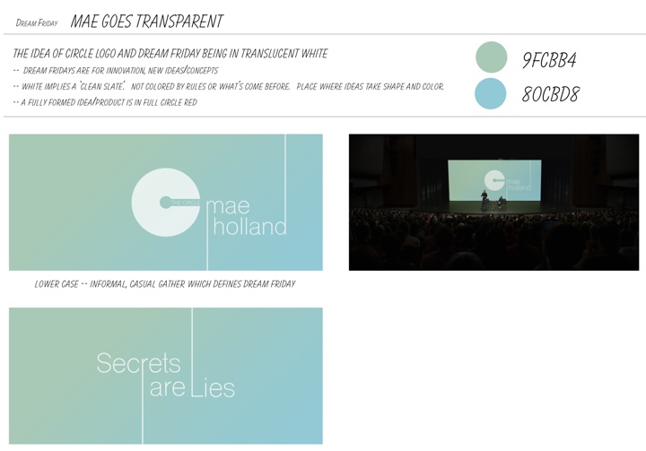
Graphic design for going “transparent” segment. Courtesy of Karen Sori and STX Entertainment.
Kirill: What is graphic design for film? What do you say when people ask what you do for living?
Karen: I get asked that all the time. First thing people think of is that I design movie posters.
I usually preface everything by saying that any time you watch a movie, never does a crew just roll into a space, be it a mansion, a park or a museum, and shoot what is there as is. Everything that you see is considered, curated, designed, created, and carefully placed with reason and intent. Graphic design is in support of that very process.
I can design something as small as a book cover or as large as a 300-foot long mural on a municipal wall along the train tracks in Chicago. It’s making something real out of nothing. That’s the best way I explain it to people. I don’t know if it necessarily sticks [laughs], but that’s how I see it.
Kirill: If we’re talking about productions that take place in the modern time, we all are used to seeing so many different spaces in our everyday lives. Do you think people underestimate how much thinking goes into creating those spaces for film?
Karen: Absolutely. Let’s say you’re watching a drama, and you’re in a cafe. People don’t ever think about the fact that all the menus, the signs on the menus, the logo on the barista’s shirt, are all things that are created specifically for that show.
There’s also this entirely unseen side to all of this – legal clearances. Anything I make has to go through a legal department to clear names, phrases, designs etc. It’s a whole process that is not ever evident when you’re watching a movie. People are always shocked when I tell them that that rather small, almost insignificant logo in the background took a great deal of time to create and be approved for legal use.
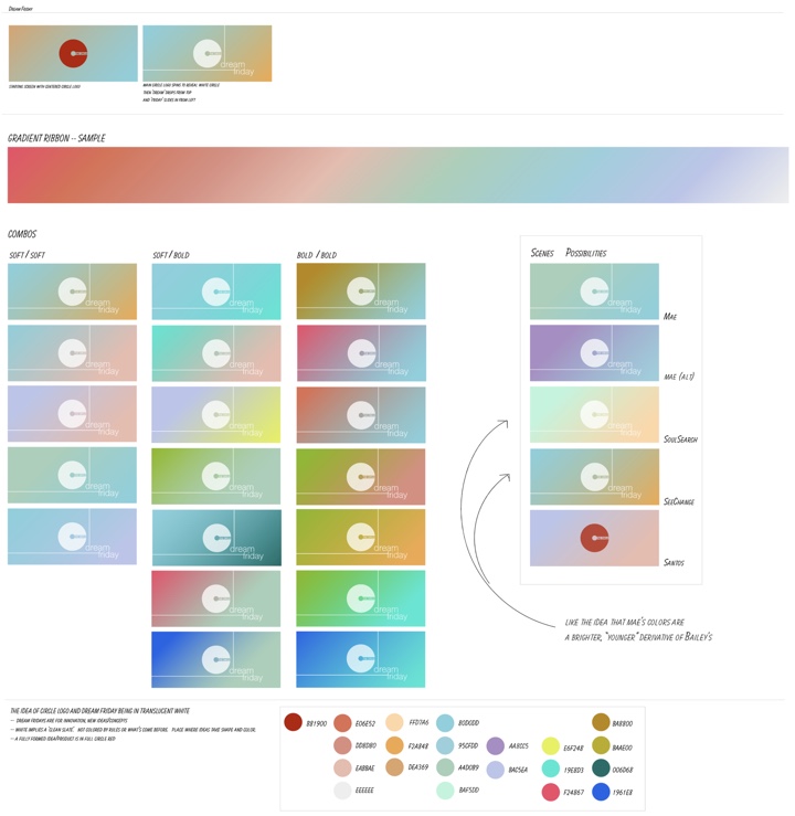
Design process for the graphics of Dream Fridays. Courtesy of Karen Sori and STX Entertainment.
Continue reading »
