Continuing the ongoing series of interviews on fantasy user interfaces, it gives me great pleasure to welcome Carly Cerquone. In this interview we talk about how much (or little) time screen graphics get in feature films, designing elements to be seen by camera, fantasy user interfaces as a storytelling device, and how she approaches the task of creating interfaces that target specific characters. As we discuss all this and more, we dive deeper into Carly’s work on the recently released “The Fate of the Furious” and “Spider-Man: Homecoming”.

Kirill: Please tell us about yourself and your path so far.
Carly: Growing up, I don’t think I could have ever considered myself “bored”. I spent most of my free time playing sports, watching movies, drawing, painting, and participating in a variety of extracurricular activities. While I enjoyed the fine-arts very much, I was also attracted to science, math, and technology. In middle and high school I enrolled in as many art and AP classes as my schedule would allow, and by my junior year I made the decision to pursue a career as an artist in the film industry.
After a lengthy search and application process, I was accepted into the Motion Picture Science program at the Rochester Institute of Technology. In addition to my coursework, I held jobs as a motion graphics designer, and a live graphics operator for Sportszone Live, our broadcast channel.
The summer of my sophomore year I was offered an internship at Cantina Creative. That year, I spent the two months in Los Angeles and earned my first feature film credit on Need for Speed. I returned the following summer for a second internship, and accepted a full-time position with Cantina immediately after graduation.
I’d be remiss if I didn’t credit my parents. I’m not sure where I’d be if it weren’t for their unwavering guidance and support. They’ve encouraged me in every aspect of my life and I consider myself extremely lucky to have them in my corner.
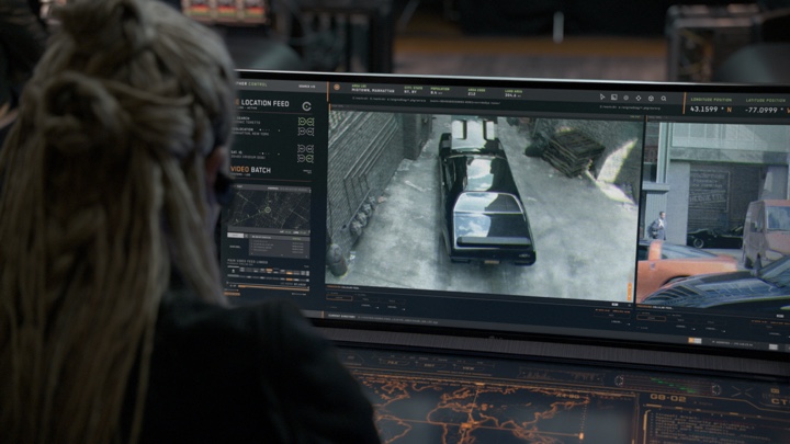
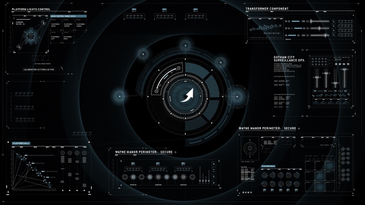
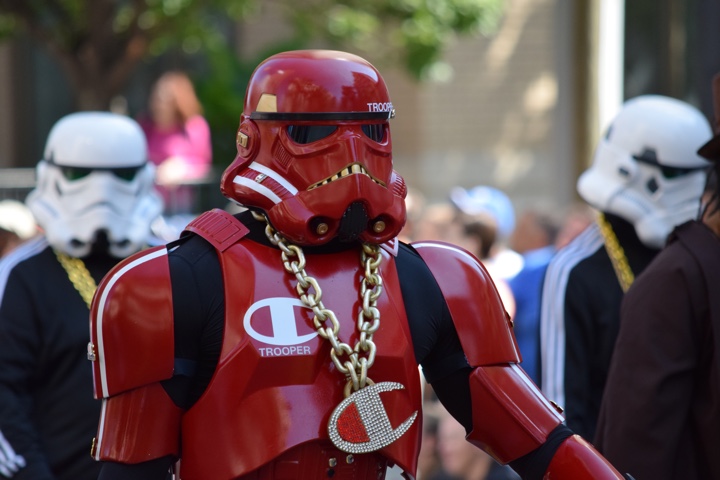
Screen graphics for “The Fate of the Furious”. Courtesy of Carly Cerquone.
Kirill: You’ve graduated the Motion Picture Science program at RIT. What is special about that program, and what are the challenges that the education system needs to meet in the world that is undergoing such dramatic changes in consumer technology?
Carly: Motion Picture Science (MPS) is a truly unique program. It provides a science and engineering based education in the fundamental imaging technologies used for the motion picture industry. It straddles two colleges – the College of Imaging Arts and Sciences, and the College of Science, and joins a core curriculum in practical filmmaking and imaging science. When I enrolled, MPS had just entered its 5th year of existence, and is still the only program of its kind in the country.
I don’t think it’s realistic to expect the education system to keep up with technology by way of lesson plans or curriculum updates. It’s definitely important for students to be knowledgeable of current industry standards and practices, but that alone won’t be enough to carry them through their careers. I’ve met artists that have graduated from rigorous design programs, others that are completely self-taught, and others still that are educated in an entirely different field! The one thing that each of these individuals have had in common is a drive to learn and continue learning at every opportunity. If an institution can provide their students with the tools and motivation to learn outside of the classroom, they will have created an education to last a lifetime. Students who are fortunate enough to graduate with their appetite for knowledge intact, and the ability to gain it on their own will be able to adapt no matter how frequently the technology changes.
Kirill: There are so many screens in our lives, and so much software that we interact with every day. When you talk with people about what you do for a living, do you think they are surprised to hear that everything has to be explicitly designed?
Carly: Absolutely! Most people know that holograms and other obviously-futuristic elements are created in a studio. They’re often surprised to find out that even the most basic phone screen and computer monitors have been designed, animated, and replaced by an artist.
Kirill: What are your thoughts on the amount of time screen graphics get in feature films? How does it feel to see your work appear and then be gone in almost the blink of an eye?
Carly: Hahaha, well when it’s worded like that it doesn’t feel great! But in all honesty, I don’t mind. Screen graphics exist to support the story. Sometimes their only function is to add to the tone of the film. Other times, they are needed to deliver important information to the audience. As long as my work is visible long enough to perform its intended function, I am happy. I can indulge in the intricacies of the design and animation in the showreels.
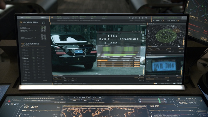
Screen graphics for “The Fate of the Furious”. Courtesy of Carly Cerquone.
Continue reading »
Continuing the ongoing series of interviews on fantasy user interfaces, it gives me great pleasure to welcome Khairul “Keko” Ahmed whose work spanned, so far, the worlds of video games, feature film and automotive interfaces. In this interview we talk about what goes into creating video game cinematic sequences, how it compares to working on hero and background screens in the feature world, designing with purpose and supporting the main story, creating design systems that span dozens of screens, and the challenges of car dashboard interfaces, from longer development times to making them informative and immersive. Khairul’s work in feature film was part of “Captain America: Civil War” and “Avengers: Age of Ultron”, and as we got through the topics, we dive deeper into his work on “Batman v Superman: Dawn of Justice”.
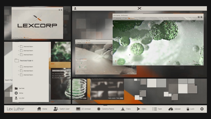
LexOS screen graphics on “Batman v Superman: Dawn of Justice”. Courtesy of Khairul Ahmed.
Kirill: Please tell us about yourself and your path so far.
Khairul (Keko): I am a designer, art director and photographer, gravitationally driven by the need to explore the unknown. I guess that’s what drove me to where I am today!
Believe it or not I was actually on the path of the sciences which I failed completely. Till this day I reflect on that as the best thing that could have happened to me, as this ignited my passion for the things I love doing now.
Within this moment I discovered “Data Flow”, a graphic design book on visualizing informational data, and fascinated by its contents I was lead onto studying traditional Graphic Design at the University of the Arts London. It’s known for its exceptional Graphic Design degree course, and I felt I was at the heart of pursuing my dreams.
 On the path of discovering my passion, it was actually the periodic table sequence from the film Iron Man 2 which hit the mark completely. In a full state of visual brainfreeze I was ultimately taken away by the whole FUI experience. This was the first time I fully felt immersed by the use of visual graphics on that level. I think for me this became the pinnacle of understanding FUI, as my obsession for the graphics itself and the need to know the process led me down the rabbit hole.
I kid you not – I spent uncountable hours revising the footage, tracing elements trying to imitate the designs and even looking up the artists involved to find some way to reach out to them. Pretty psycho right? Though I’d like to think I was simply super passionate! Funny enough, this hunger led me onto emailing Prologue, the studio behind it all.
Simon Clowes one of the Creative Directors at Prologue at the time was kind enough to reply to my fanboy email which resulted in a dream come true moment! a phone call that changed everything. Completely speechless I was asked if I’d be interested in joining the team as a design intern.
Within my first week of being at Prologue I broke all the rules of being an intern. I was on a mission by the end of the day, to learn everything I dreamt of knowing when revising those Iron Man 2 sequence and to ask all the questions I could possibly ask! Frankly, I wasn’t discreet about it either.
Straight off the bat I introduced myself to the creatives involved with the Iron Man 2 sequence, literally telling them I loved what they do. This sudden exchange allowed me to connect to the artists beyond the level of just looking at their work. I must say it was a great pleasure and privilege to have been able to connect to such amazing creatives such as Simon Clowes, Alasdair Wilson, Ilya Abulhanov, Taka Sato, Paul Mitchell, Manija Emran and Danny Yount. Having spoken to them directly, not only was I able to get a deeper insight into their thoughts, processes and ideas, I was actually being taught by some of the best in the industry.
Besides learning from the best in the industry of FUI, it was actually a car ride with Simon Clowes which rooted me as a core designer today! He asked me right then and there “what do you love doing and what would you want?” Till this day I am so grateful for that question, as what happened after made me pursue the next stages of my life very differently.
It’s moments like this that I feel are so important in life, as it takes you a step back and makes you think about how far you’ve come and where you see yourself going, as you can remind yourself of your goals.
So Mr Simon Clowes if you’re reading this – Thank you!
Prologue pretty much grounded my career! I adopted and developed my aesthetic into a distinctive style that combines my love of title designs / typography and cinematography. Using all the knowledge I had gained, I graduated from University of the Arts London with an Honours in Graphic and Media Design. Shortly after joined the design team at Spov via the recommendation of Alasdair Wilson.
I was immediately immersed into the world of creating high level, advanced screen graphics for featured games such as the Call of Duty series. Designing at such an advanced level with a sharp eye for intricate detail, I am proud to say I’ve crashed a few Ae files in my time. Within this time frame I was inspired by the works of GMUNK, Yugen Blake, Ash Thorp and Jayse Hansen. Seeing their exceptional level of work displayed in the film realm reminded me of my passion for working within films. This was a turning point at which I decided it was time I focused on working on a feature film.
With my goal in sight, I literally was on a mission and nothing could stop me. Without any hesitation (crazy to say) I booked a flight out to New York in the search of reaching my goals.
Honestly, I can’t thank the guys at Perception enough for taking that interview. I met with the infamous John Lepore and Danny Gonzalez, who both instantaneously inspired me about the work I wanted to do and was dreaming of once again!
To give a little background, Perception was doing everything I wanted in terms of FUI for films, whilst also applying their knowledge into creating real world UI. This was a very unique and new direction for me, as I was yet to experience that realm. Landing an opportunity with Perception was literally a life changing experience as this was my breaking point.
Having the talents of John Lepore, Russ Gautier and Doug Appleton mentoring me really changed my perspective in the UI world. They basically taught me one of the most important factors behind Ui design which was “ask yourself why each elements needs to be in frame”. As you know this is very important as a lot of UI tends to get dismissed as beautiful background blur. Perception really focused on giving elements importances to their roles. Story first!
Honestly I could tell you endless amounts of stories about how John Lepore would come behind my screen and fire a million questions with regards to the roles and my choices of UI elements. Moments like that have shaped me into clarifying my design choices, plus adding hierarchy in accordance to the level of importance to the narrative. Johnny was teaching me the rules of graphic design once again, re-rooting me back to my backbone. I feel we all need that from time to time to understand why we are making things in the first place.
Screen graphics on “Call of Duty”. Courtesy of Khairul Ahmed.
Kirill: Back at Spov when you worked on video games, did you do in-game graphics or the cinematic sequences between stages?
Khairul (Keko): It was a mixture of both, depending on the particular project. For instance, on the Call of Duty series nine times out of ten it would mostly likely be cinematic sequences. They are all carefully scripted with a narrative possibly following a chain of events, needing some level of graphic UI to suggest what lies ahead.
Thus my role would be designing elements for mission briefings, highlighting key objectives, schematics of buildings etc. At times I also took part in the early stages of enhancing the multiplayer experience for the Call of Duty series. This role required me to challenge the realm of current gaming experiences and push the boundaries of elements such as simple HUDs, weapon loadouts, maps and so forth.
It would even go down to creating a style guide that could be implemented into the game itself. This was actually the case for Batman: Arkham Knight. The original piece that is on my site is actually part of a pitch, which then allowed Spov to continue their work on the actual game. What we submitted was in fact a teaser suggesting Bruce Wayne booting up the batcave. Rocksteady Studios fell in love with the visual language and aesthetics so much that they felt each element was tailored to the look and feel of Batman. Thus they went full steam ahead to implementing the same stylistic approach in the game.
Screen graphics on “Batman Arkham Knight”. Courtesy of Khairul Ahmed.
Continue reading »
As usual, DragonCon comes to Atlanta over the Labor Day weekend. These are my personal highlights from the opening parade this year.


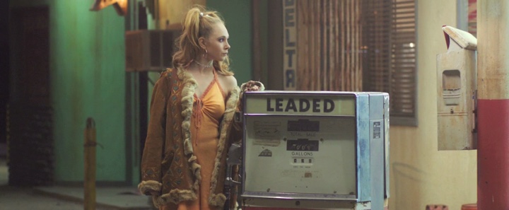
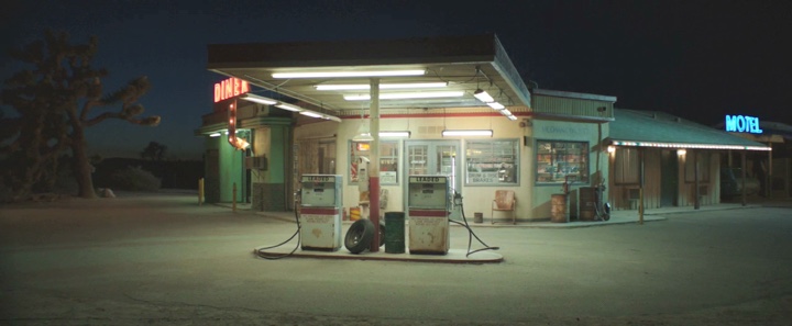
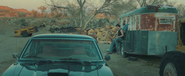
Continuing the ongoing series of interviews with creative artists working on various aspects of movie and TV productions, it is my pleasure to welcome Tom Lisowski. In this interview he talks about what production design is, when it needs to stay invisible and the misconceptions viewers have about the field, how the transition from film to digital affected what happens on set, balancing artistic and financial aspects of a production, shifts in the world of story telling between features, episodic TV and streaming services, as well as his work on music videos and commercials. The second half of the interview is about Tom’s work on the recently released “Safelight”, a journey of two troubled teenagers that takes them from a highway truck stop to a road trip down the California coast to photograph lighthouses.
Kirill: Please tell us about yourself and your path so far.
Tom: I went to art school where I studied painting, and after that I started doing art for video games. My forte was environments – basically the same thing that I do for movies now. Because I was doing games I was hired to do a mural for a city cafe set on a TV show. The mural had some videogame-style characters in it. The production designer of the show asked me if I could also draw pictures of the sets. I ended up becoming her art director for a few different projects, TV and features. I discovered production design through her. I did go to art school, but at the time I wasn’t aware the field of production design existed. I love how through your interviews you’re bringing awareness to a field that most people are unaware of.
People know that there’s a director, a cinematographer, and actors, but they don’t know there’s a production designer. A lot of times that’s a good sign. They are in an environment and they don’t know that it was created by someone. If you do a good job, they believe it’s a real place.
Kirill: When people ask you what you do for a living, is it hard to make people understand, especially when we’re talking about productions set in the modern day? After all, we all are surrounded by these environments every single day.
Tom: There’s definitely a misconception about movies set in the modern day. Everything is recognizable, and you’re not in a cave or a castle. The misconception is that someone just showed up with the camera and shot everything. But it’s the same as when you’re writing a novel and choosing what part of an experience to describe. In a movie you’re very careful to choose what the audience sees.
Also, certain things generally look bad on camera, for example white walls. And there are certain elements and props that you use to tell your story. If a character is cold, you want your set dressing to communicate that. You tell the story through the environments, and everything in that whole movie is supporting that story. Everything you do is based on telling the story, whereas in real life everything is totally random [laughs].
Kirill: I like that you mentioned that if you do your job well, it is unseen in a certain sense. As a viewer, I want to follow the story and not look at that wall. You want to send that subliminal message, but not be explicit about it.
Tom: Exactly. We always talk about whether the production design should be invisible or visible. It depends. If you’re going to an alien planet, you’re showing an environment that nobody has ever seen before. A big part of the experience is seeing something amazing, and the audience is definitely noticing it. You’re looking at that environment, and it becomes a huge part of the experience. Some people say that the set becomes a character.
But at the same time, you don’t want the audience to be thinking about it. If somebody is designing the costumes for the characters, you want the viewer to believe that they just woke up that morning and put those clothes on. If you start thinking about what goes on behind the scenes, it takes you out of the story. But there are movies where our work is center stage.
Kirill: Does it help to have the digital pipeline on the set, where you together with the director and the cinematographer can see on the monitor how the sets are captured by the camera?
Tom: That’s especially important for the on-set dresser. They are making sure that everything that needs to be in the frame is in there. I try to be on the set as much as possible. I’m always there when we open the set and start shooting. As much as I can be I’m there to see the set through to completion.
However, a lot of the time I’m also hard at work on the next set. Often the next location isn’t available until the very last minute, so we have to be building and dressing while we’re shooting something else. So I’ll be there, looking at the monitors to make sure everything looks good, and then I have to be off to the next set. I’ll have my on-set team continue to check the monitor constantly.
Nowadays you can see the edits as you’re working on the movie. Not long after you shoot it you can see a rough cut of the scene you just did, and the director will know if something’s missing. Back in the day you had to wait forever for the film to be developed, and then for somebody to cut it together.
Kirill: Do you remember a sense of things going unnecessary slow back then?
Tom: You had to trust your gut and use your imagination a lot more when you couldn’t see it. And all the amazing film-makers didn’t see any of it back in the day when everything was done on film. They would go with their gut and hope that everything was great. Now you can see it sooner, and that makes you become a better production designer, faster.
Kirill: Bringing you back to the beginning of your career on set, what was the most surprising thing you saw around how movies are made?
Tom: I was always blown away to see the really big sets. The mechanics of it is amazing. You see a big cave, and you think that somebody brought in all these big rocks. But it’s all carved out of foam, and painted amazingly well. Or you’re looking at the walls of this mansion, and they are just a very thin piece of lauan plywood. It was eye-opening to see a lot of that stuff.
When I went from video games to the world of movies, I loved the physical aspect of everything. I loved that you can stand in front of it, look at it and walk around it. Before that I had textured polygons on a computer screen. But seeing everything in real life was a big part of the magic of it.
There are also sets where you use forced perspective, with smaller things in the back and bigger things in the front. That tripped me out early on, and I try to use that in my sets sometimes when we want to make the set seem bigger. We had this graveyard set, and we built it all on a stage. We wanted to make it feel like it went on forever, so the trees in the back are smaller so that they look like they’re further away.
Continue reading »
