Continuing the ongoing series of interviews on fantasy user interfaces, it’s my pleasure to welcome Kristoffer Brady. In this interview he talks about the relationship between tools and ideas, the what’s and the why’s of unsolicited redesigns, working within the constraints of project requirements and creating screen graphics that support the main story on feature film productions. We go back to Kristoffer’s earlier concept work on “Terminator: Genisys” and then dive deep into the screens and interaction surfaces of the recently released dystopian sci-fi “What Happened To Monday”.
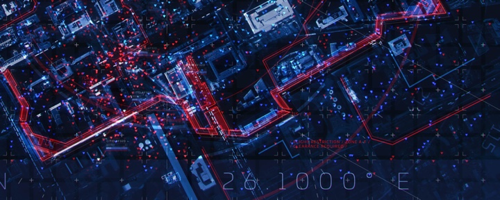
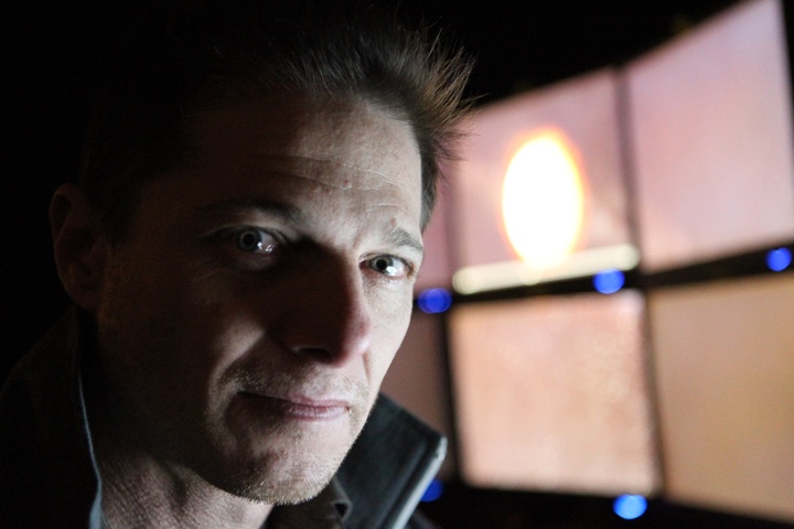
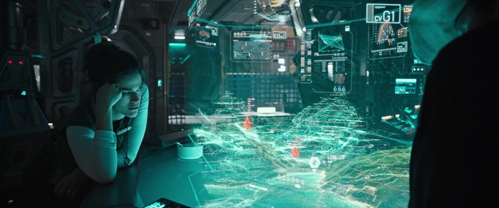
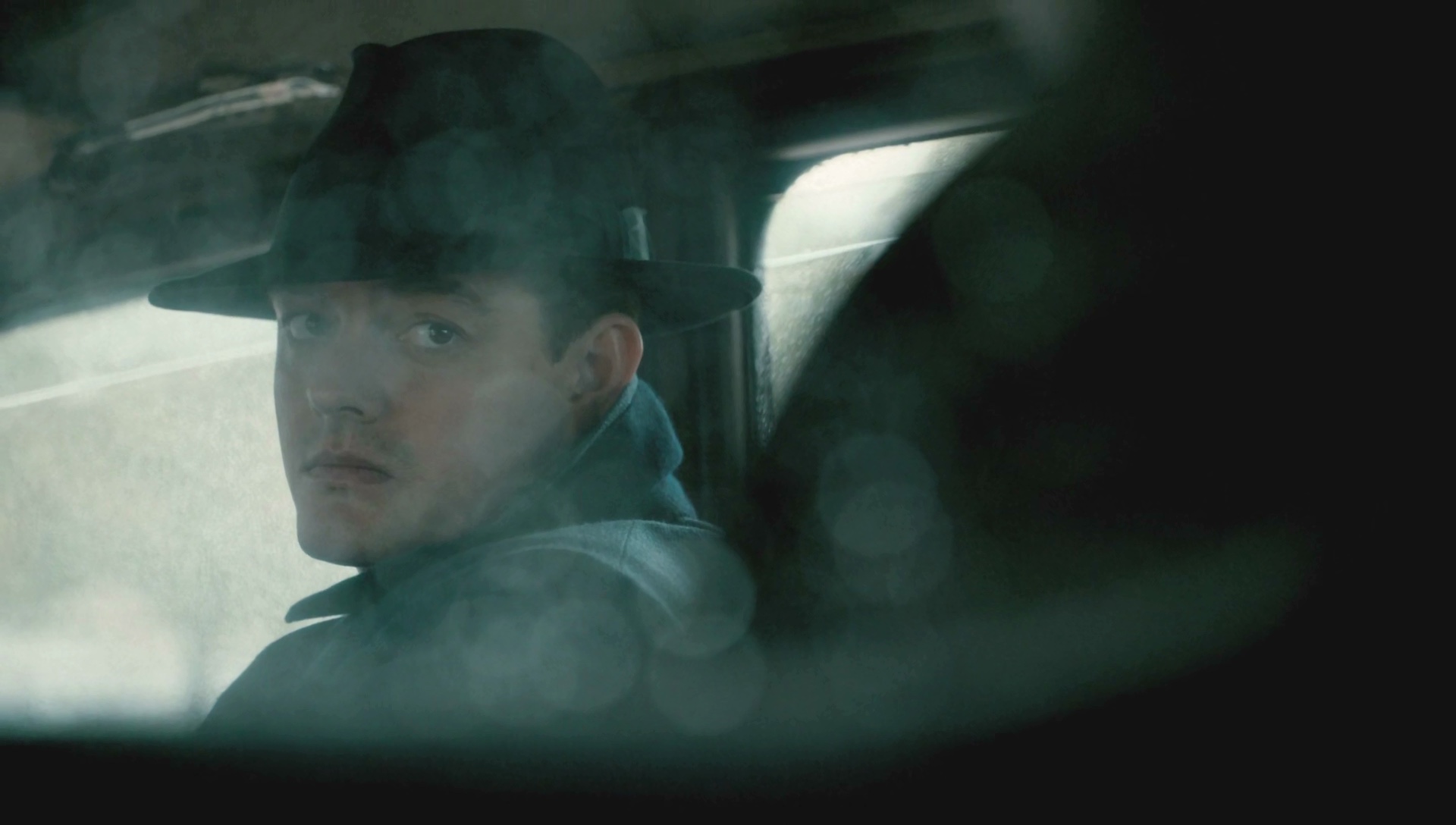
Screens of “What Happened to Monday”, courtesy of Kristoffer Brady.
Kirill: Tell us about yourself and your path so far.
Kristoffer: It’s a path that takes a lot of different turns along the way. I’ve been an incessant doodler since day one, and among other things, originally I wanted to be a comic book artist. I grew up on 80’s and 90’s anime and movies, AD&D and Image comics and admired a lot of concept artists and sci-fi illustrators. All these things in my life affected my want to produce art and hopefully make a living at it.
After school, I sort of fell into the world of web design and Flash, which was really taking off at the time. It was such an interesting story telling medium and felt like an anything goes type of creative platform. At the time I was making fliers for raves and club nights, teaching myself 3D and Photoshop. Eventually, I got my foot in the door at an agency and in the beginning I was doing pretty boring run-of-the-mill websites.
 Once I got legit work doing interactive jobs, and began paying attention to all the shops out there, I knew that this was where I needed to be at the time. There was some really inventive stuff coming out. I remember seeing an interactive site for “Donnie Darko” by a company called Hi-res, that just blew my mind. It was really like moving through a piece of art, but participating in how the story unfolded. It was the first time I had experienced interactive storytelling in that way, and it left a big impression on me. I remember sitting in my room with the lights off and my headphones on, fixated. For me, it was more powerful than watching any movie or playing any game.
I guess I started my official “career” in 2005, and I spent the next ten years working for various interactive digital production agencies in the US and Europe. I wore a lot of hats, pitching and producing, learning along the way and using the tools as they progressed and grew. I really loved interactive work, and at the time, it felt like the perfect cross-section between entertainment and functionality.
Every campaign had to be engaging but also fun and easy to use. When you are making an experience that has to pull the user in, either a boring story or frustrating usability will be the end of it. On one end it exposed me to designing things that people wanted to use, rather than just making a piece of art that someone has an emotional connection to, but on the other it also taught me about storytelling and using narrative to bridge those interactions together.
Between 2011 and 2012 I worked on several large campaigns, for the first “Thor” and the first “Avengers” movie. The premise was that you were a member of SHIELD and logging into their network, and it required a lot of these UI-type bits for the various components. I started doing research and I came across Mark Coleran’s work who, in my mind, pioneered a lot of the things that the UI artists are doing today. He already had videos talking about his process and I learned a lot from all his work. I downloaded everything from his site, trying to reverse engineer, and figure out how he made certain things. It was such a fun experience, and it opened up the possibility of ui being something I could do for a living.
I didn’t know anybody who worked in that industry, and I was enamored by it. Artists like GMUNK and Ian Sargent among others, were doing great things and it made me pay a lot more attention to the motion graphics industry.
In 2012 I was approached by Facebook. I took a break from interactive work to move to San Francisco to work there primarily as a communication designer, and also to do some product work. It was a new and interesting chapter, but I knew that I eventually wanted to pursue ui work and work on films.

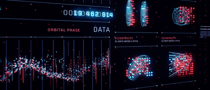
“Simian” – self-initiated design exercise, courtesy of Kristoffer Brady.
It was during this time that I started working a lot on self-initiated projects for myself. I had no ui work in my portfolio so I had to create some work to show what I could do. I put out a 1 minute motion piece, that was part of a larger idea, and it sort of blew up. That piece got me some attention, and I was eventually approached to do some concepts on “Terminator Genisys”.
I did a few frames with them and struck up a friendship with the VFX supervisor who was part of that project, and he’s the one that brought me to work on “What Happened to Monday”.
Beyond that, I wrapped up that movie after a year, spent some time working in VR for Oculus and and a small gaming studio, and then struck out as a freelancer which is where I’m at right now. I’m primarily focusing on UI design for feature films, with a few in the pipeline.
Kirill: On your site you say “Tools have evolved and changed. Industry standards become old news, quickly replaced by something new. I’ve embraced the idea that learning new skills and being versatile is a necessary part of the job.” Do tools matter if you don’t have the artistic sensibility to dream up something to begin with?
Kristoffer: There’s some truth in that, especially in this particular niche field. We’re creating these fantastical interfaces which then inspire people who create real ones, which we in turn reference to make something new and so on. I’ve been on both sides of that coin, where I’ve had to work on real platforms and products, and the constraints that come along with that are different from what you do when it needs to be entertaining and support the story. It has to adhere to a totally different set of rules.
The tools are always secondary to your ideas. I still always start on paper, no matter what. It’s way more freeing. I don’t try to make anything too rendered. It’s very loose, because I want my ideas to be that way. Very rarely do I sit down and start digitally. It doesn’t nearly produce the same results. If I do, I struggle to just to get to that core idea, and I’d rather do that on paper.
Evolving with the tools, as I mention on my site, is a necessary thing. I absolutely believe in that. You should never value your technical skills over your ability to produce great ideas, at least in position as an artist. I try to approach the problem from the standpoint of what it is that I’m trying to solve. If my current toolset does not allow for that thing to be solved, I’ll have to learn it, solve it and move on. I don’t need to become an expert in that particular piece of software. I don’t need to know everything or do every tutorial in order to master it. I just need that program to be my partner for a little bit while I solve this issue so I can get on and create the larger picture.
Having technical skills and being aware of what’s possible is necessary. Whenever I have worked alongside developers, even though I wasn’t coding, I needed to be able to speak that language. I needed to be aware of what was possible, because design and technology rise up together. It’s a relationship between the two because they are both part of the same whole.
“Simian” – self-initiated design exercise, courtesy of Kristoffer Brady.
Kirill: I like what you said about the re-design you did for MPC Software – “I normally avoid un-solicited re-designs. You are too far removed from the decisions that were made, both from a visual aesthetic perspective and from a technical one.” Going back to that self-initiated FUI piece that you did to jump-start that part of your portfolio, do you think such projects are worth the time and the effort?
Kristoffer: A lot of the time you’re dealing with data sets that you don’t have access to otherwise. The MPC project was more of a re-skinning, not so much a re-design. I was using that software at the time, and I was unhappy with how it looked. It was a passion project for me. I even sent it to them, but nothing came out of it.
There’s a lot of unsolicited redesigns of this and that out there, and that’s fine. It’s a valid place to start. But you should approach it with a certain amount of humility. You don’t have the perspective of someone who is there building it. You spend some night in your bedroom on it, but you have no idea how much had to happen for it to get to where it is now. Obviously not everything that we see out there is good, but you can’t be ignorant of the process.
Not everyone has had the experience of being on such projects that are being used by millions of people on the daily basis, but you also need to be aware of the process and not fool yourself. But if you approach it as a way to show your thinking and your strategy to create strong composition and a balanced product, that’s an excellent way to work. Always present it in a correct light – not perhaps as a smarter approach or as a redesign but as your own take on it.
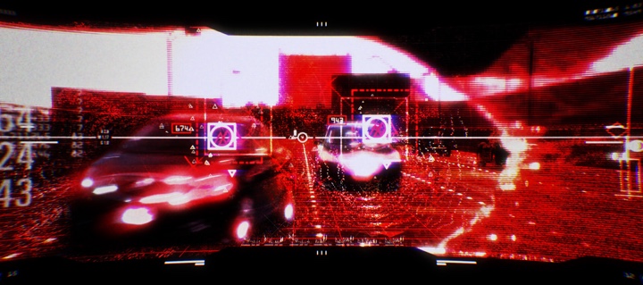
Concept design for first-person machine view of “Terminator: Genisys”, courtesy of Kristoffer Brady.
Continue reading »
Continuing the ongoing series of interviews on fantasy user interfaces, it’s an honour to welcome Todd A. Marks. In the last 25 years Todd has been deeply involved in all aspects of screen graphics for feature film, from design to playback, weathering the wave after wave of changes in the underlying screen and projection technologies. To sample just a part of his work would be to mention movies such as “Solaris”, “Deep Impact”, “Abduction”, “Spectral”, “Date Night”, “Anchorman 2” and “The Internship” (as well as the upcoming “Venom”).
As we talk about the intricate technical details of wrangling older CRT screens and syncing them with pre-digital cameras, setting up efficient and reliable playback systems on set, and finding the right solutions for productions of different shapes and sizes, Todd dives deep into two particular films. The first one is the seminal “The Net” that, almost 25 years later, manages to stay fresh and relevant as our lives become ever more entangled with digital tools, platforms and networks. The second is the recently released “Steve Jobs” for which the team had to go back to find the original hardware and software, and make it appear both authentic to the time and appealing to the more discerning modern audience.
Todd Marks in front of bank of monitors during a McDonald’s commercial shoot. Courtesy of Todd Marks.
Kirill: Please tell us about yourself and the beginning of your career.
Todd: I’m from California. I grew up in Sunnyvale and Cupertino in Silicon Valley. I graduated from Homestead High School (’81) – which is the same high school that both Jobs and Wozniak had graduated from more than a decade earlier. During the summer between middle school and high school I took a computer course with Steve Headley who was the computer teacher at Homestead. It was still the time with IBM punch cards that you ran through the reader.
My dad was a project manager on aerospace projects at Lockheed in the Valley. We were one of the very first families that I knew of that had a computer in our house. It was a Southwest Technical 6800 with about 8k of RAM. We initially used a black-and-white TV as a monitor, a tape cassette player from RadioShack to load Basic, and a World War II teletype as our printer. My dad built a variety of Heathkit electronic projects during my childhood. He built both mine and my brother’s 25″ color TVs from kits. We each had those in our rooms, which was pretty cool back then.
When I was younger, I thought I wanted to be an actor. I was into drama and television / film production. Between my junior and senior years of high school I took a film class at De Anza College in Cupertino, and I really enjoyed it. They liked what I was able to do, and they asked me to work there which I did part time while I was a senior in high school. After I graduated from Homestead, I went to De Anza College full time, and continued working in the film department as well as their community access TV studio. I worked several film and video projects during that time. I received a Film/TV Production degree from De Anza, and later went to Foothill College and got a Business degree.
Sidenote: The De Anza college film department was in back of Flint Center, up four flights of stairs. It just so happens that Flint Center is the place where most of the first act of “Steve Jobs” movie takes place. During production, we were filming in some of the same rooms that I had learned film making 30 years before!
After working for a while on industrial and music videos, I moved to Los Angeles in 1988 to get a Marketing degree at CSUN, Cal State University, Northridge. My thinking was, that the film industry is in LA, and this is where you had to go if you were really serious about getting into the film business.
While at CSUN, I started a Mac hardware, software, sales and consulting business. That was back when we had the Mac SE 30 and similar models. I also joined a couple of professional Film and TV organizations as a student member, allowing me to meet people who were working professionally. One of those people, helped get me my first job when I graduated. I worked as a Production Assistant (PA) on Carol Burnet’s TV series “Carol and Company”. It was a very cool first post-college job.
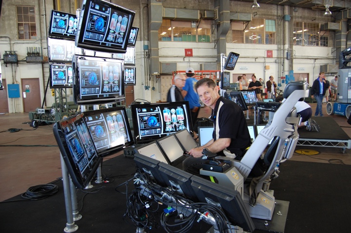
Todd Marks setting up monitors for the additional photography work on “Day The Earth Stood Still” [2008]. Courtesy of Todd Marks.
That job ended up having no direct bearing with what I’m doing now. My career-path happened in part, by being at the right place at the right time. I was at a book store with my then girlfriend, and now wife, I was hanging out in the computer-books area, and some guy asks a Mac question. Together we both chimed in to answer him. Afterwards, I started talking with that other guy, and it turns out he’s this big-time first assistant director for feature films. I got his contact info, and told my then girlfriend (now wife), “this guy could really change my life.” So I made sure I stayed in touch with him, and then became friends with him, (David Sosna).
At that time, around 1992, I was looking to get into film producing. But something got in the way of that goal…
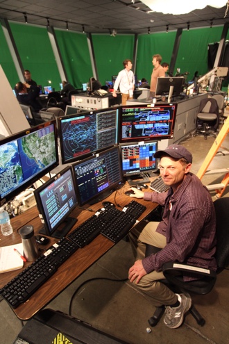
Todd Marks running the LAX Control
Tower graphics during the pilot for
the “Scorpion” TV show [2014].
Courtesy of Todd Marks.
David introduced me to the director John Badham, (David and John had worked on War Games together). John was a Macintosh power user and fan of Apple like I was. I ended up doing computer consulting work for John and his assistants in their office. It was a good way to get on the Warner Bros Studio lot back then! Around that time, John and David were preparing to start production on “Point of No Return” with Bridget Fonda. Since there was a some major scenes with computers in them, David asked me if I wanted to help them, by assisting with computer stuff that was going to be part of the movie. I of course jumped at the opportunity. That was my first big feature film, and I learned about this job that I never knew existed – the person in charge of making the computer screens for the movies.
The production had already arranged to have a computer and video playback engineer on set with his special computer and video gear. The custom gear synchs the camera and, computers, and monitors to each other so that you can get rid of the “roll bar” and film clean images of the screens.
My job was to make sure that we had the right graphics and computers at the right time on the set, and I thought that it was a really cool job. It was a combination of many of my skills and things I liked to do – computer stuff, design with a technical aspect to it, working on set, and doing something that directly has an impact in the movie.
Sidenote: Luckily, I didn’t have to start as somebody’s assistant and then spend years and years working my way up. I was able to leapfrog that by doing this kind of work.
About a year later I got a call from John Badham’s office to come in and talk to them about their new movie, “Drop Zone”. They sent me a script with all this cool computer stuff in it. I did a breakdown, and created storyboards with an artist friend of mine. We sketched out all the computer scenes to give them and idea of how things would look. I went to the meeting with three copies of the storyboards, as I figured that I was going to meet with John and his assistant to discuss the details. When I arrive, I’m brought in to John’s office and greeted by what seems like a wall of people. It turns out that I was meeting with John AND all the department head! – I think it was about ten people. I was introduced to everyone, and then said. “Oh, we are going to need more copies of these storyboards.” [laughs].
I made the presentation, answering questions about how we’d do specific computer sequences, and deal with other technical aspects of the story. That meeting went really well, and I was confident, even though I knew they had another playback coordinator to interview. A few days later, I went off to MacWorld which was our annual pilgrimage to San Francisco. While I was there, I got paged to John’s office (we had pager’s back then!), I found a pay phone at Moscone Center, I called them and they offered me the job.
It was very exciting. That was my first big job as the head of a department, as the computer and video playback supervisor (the title we now call it), and it was my first feature film on location. We filmed in Florida, and in Los Angeles. It was a both fun and challenging, and a great learning experience. It was the launch of my career.
After that I worked on “Species”, and then someone recommended me to director Irwin Winkler who was prepping to work on “The Net”.
I went in to meet with them, discussed a variety of idea and concepts. I got hired, and “The Net” became my next big project.
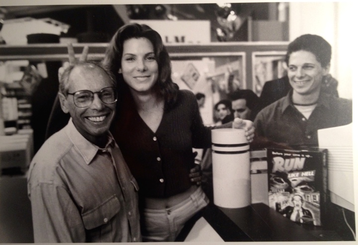
Director Irwin Winkler, along with Sandra Bullock, and Todd Marks on floor of MacWorld in SF, one of the filming locations for “The Net” [1995]. Courtesy of Todd Marks.
Continue reading »
Continuing the ongoing series of interviews on fantasy user interfaces, it’s my pleasure to welcome Toby Grime. In this interview he talks about the experimenting with writing musical composition interfaces inspired by analogue synthesizers, the evolution of software tools at his disposal in the last twenty years, the overabundance of screen graphics in contemporary movies, balancing the realism of our everyday interactions with technology with demands for novelty and screen time scarcity, and the prime directive of supporting the main story line.
As we discuss these and more, Toby dives deeper into the details of his screen graphics work for feature films, from the surgically stark black-on-white lines of the virtual control room in “The Matrix Reloaded”, to lo-fi 8-bit video game aesthetic of screens in “The Lego Batman”, to his most recent work on the holographic table interfaces in “Alien: Covenant”. At the end, we come back to the world of technology in our daily lives, taking a look at the screens all around us and talking about teaching the kids to understand the concept of consumption and producing.
Screen graphics of “Alien: Covenant” (2017)
Kirill: Please tell us about yourself and what brought you into this field.
Toby: My name is Toby Grime and I’m an art director and designer at Animal Logic which is a film animation studio in Sydney, Australia.
Screen graphics, amongst other undertakings is one component of what I do at Animal Logic. I also get stuck into short form directing, visual effects and feature development there. Outside of work I love tinkering with experimental sound design, keeping my interests broad.
My interest in interface design possibly started subconsciously whilst engaging with analogue synthesizers in early ’90s. I shared a sound studio with a close friend Brendan Palmer which was kitted out with Korg modular synthesizers, Roland drum machines and many other fun pieces of hardware for creating electronic music. They are littered with dials, sliders, switches and graphic markings. Each synthesizer has its own uniquely designed interface and hardware ergonomics used to interface with the machine.

Photo by Nick Wishart
Some of the interfaces were better engineered than others. Some were more fun to use. Some just looked cool but were an ergonomic nightmare and so forth. I believe that’s what triggered my interest in interfaces and how humans work with machines. It’s the idea of interfacing with machines that was of interest to me.
I was interested in that through my years at art school where I got my bachelor’s degree in photography and sound, but it wasn’t until eight years later that I started to work in UI and UX. That was the start of the ‘.com’ web boom when websites became more popular and the world was going online. I didn’t have a formal design education, but I wanted to explore this field more, so I launched myself into very early set top box TV UI design and online web design and UX.
At the same time, around 1999, I started creating experimental musical composition interfaces. I drew on my experiences with hardware analog synthesizers, and started creating my own musical software. I didn’t like the commercial software I was using, and wanted to create my own. I used Macromedia Director to create visually based sound art applications that would be used with the interface projected as I use it. I liked making very minimalist, stripped down UI that was graphically based and used that as an interface to change sounds. It was the opposite to the complexity I was finding using commercial software.
That was the pathway of how I got into the field of UI, and it’s been a component of my career working in VFX and film since.
The actual sound remixer that I did for my master’s university project was pivotal. It had a clean minimalist design. I’d thought hard how different visual language would create different outcomes in the way the sounds were mixed. The interface is the gateway between humans and machines to produce an outcome – that’s the heart of UI whether it’s real or imagined in the world of movie making where we bend the rules!

’70s & ’80s analogue audio hardware from Toby’s studio
Kirill: If you look back twenty years ago, and at the software and hardware at your disposal, are things easier now? Or perhaps you still find yourself fighting with your tools to express a certain thing and accomplish a certain task?
Toby: The tools have progressed immensely over the last twenty years. There is more sophistication in software to let you (mostly!) achieve whatever outcome one designs. Even though you can achieve a higher level of sophistication these days, the same rules of time and budget reign king when working on any film project. Technology and tastes change, time and money doesn’t.
I was thinking back to 2003 whilst working with the production designer, Grant Freckelton when I worked on my first film UI for a sequence called ‘Virtual Control Room’ in “The Matrix Reloaded”, and we didn’t have tools like Houdini or Nuke etc.. After designing elements in Illustrator, we did it all as 2D animation in AfterEffects using camera data from the tracking department to align the graphics in 3D space. I believe it was just the early days of people using camera data in After Effects. It was very minimal, just black graphics in a white virtual endless white room – at least we didn’t have to worry about look up tables and colour spaces!
There’s so much 3D integrated into UI design now. Since that first Matrix piece, UI has jumped leaps and bounds in sophistication and detail.
If you look back at the ’70s and ’80s, most UI was very basic, and that in itself has immense charm. When you have limited resources, you have to be on point with the user interface in the context of your storytelling.
I enjoy watching the original “Blade Runner” and “Alien”, and also who could forget “2001: A Space Odyssey”? All the UI graphics were minimalistic and very specific to the story points, and that’s something that is lost in some of today’s UIs I feel. I see lots of complex, beautifully detailed UI that somehow doesn’t feel it supports the story point – ha ha I maybe am guilty of that sometimes too! Us UI designers sometimes love to just over design, cause sometimes it’s fun.
There is more than enough of an expanded and incredible toolset at designers’ disposal today to pretty much do whatever UI that one dreams of. This was not the case 20 years ago.
’70s & ’80s analogue audio hardware from Toby’s studio
At the end of the day, the UI has to support the script, the story and the emotion of what is happening in that sequence. In a way, I feel a good UI is when you’re not paying attention to it in the context of the film. It’s a graphical extension of the set. It’s a part of the production design. It’s a part of the performance of the actors themselves. It’s part of their hand motion, the eye darts, the facial expressions. I see UI as an extension of all of that. If it breaks those connections, it will take you as an audience out of the shot. You don’t want to be the UI designer who lets the audience break their suspension of belief in the middle of a film.
There are examples of contemporary UIs that are minimalistic and streamlined, of course. I liked the way “Blade Runner 2049” handled some of the UI with a slight nod to the ’80s visual language from the first film. This is why I like to look back at the charm of the old films. I love the UIs from the ’70s and the ’80s. It’s simple and it’s always on point for the message and the storytelling.
Continue reading »
Continuing the ongoing series of interviews with creative artists working on various aspects of movie and TV productions, it is my pleasure to welcome Stuart Bentley. In this interview he talks about the evolution of cameras and lights at his disposal, the changing landscape of the art of storytelling, collaborating on set and working on episodic television. The second half of the interview is about Stuart’s work on the recently released “SS-GB”, a five-part BBC drama mini-series set in a 1941 alternative timeline in which Nazi Germany occupies the United Kingdom.
Kirill: Please tell us about yourself and how you started in the industry.
Stuart: I’m Stuart Bentley and I’m a cinematographer. As long as I can remember I was into drawing and painting and generally making pictures. My dad is a really keen photographer so we always had cameras around when I was a kid
When I was around twelve or thirteen I got massively into skateboarding. After a few years, me and my friends started taking photos and filming each other, and it became something that we did every day. That was all happening while at school I was becoming more interested in art and photography. We had a small dark room in our school where I was doing my stills.
Then I went to art college, I did a fine art degree where I did a lot of painting, filming, and all kinds of other disciplines. All through that time I was still very much into skateboarding, and as some of my friends were becoming really good at it, I started to film a bit more seriously. We would travel all over the place, getting paid here and there and making our own skate videos. So I did that when I was younger, day to day, we would be out there all day every day, rain or shine.
 At the same time I was studying art and photography. I was shooting, editing and directing short films with my friends, and the more I did that, the more I realized that I liked filmmaking. It wasn’t necessarily just about skateboarding filmmaking, but rather the whole process of it. That’s when I started to veer off the skateboarding path, and got into doing music videos and commercials.
Eventually I moved to London and went to the National Film School. I was excited about the whole process of lighting and learning about it. I never had an opportunity to work on a film set, and I didn’t really know anybody who worked in film or television. I didn’t really have any understanding of how film sets worked, and it felt like such a hard world to find your feet in. That was in late ’90s, before you could go onto the Internet or Youtube and get some info about it, or get contact information. I remember going to the BBC in Manchester with a VHS showreel, and literally asking at reception “who I do I need to speak with to be a cameraman?!!”[laughs] It felt like a very closed and difficult world to get into.
That is part of the reason why I moved to London and went to the film school. A lot of my skateboarding friends did the same, and they became runners or production assistants or production secretaries or whatever. Right after the film school I started shooting music videos, and online commercials – we all were helping each other. It was such a quick process of shooting one music video after another, and it led onto short films, dramas, and feature films. And that was my way of negotiating it in there [laughs].
Kirill: If you look back over all those years that have passed, how would you describe what happened in the world of technology around cameras?
Stuart: When I started filming back when I was 13, we were shooting on massive VHS cameras, Hi8 or Digital8. My friends dad had a Digital8 camera, and our minds were blown! It was the most amazing thing. Then Sony VX1000 camera came out, and it became the staple of the skateboarding industry for the next 10-15 years. That was it, and that was all anybody knew.
Kirill: Are you talking about the lights themselves, and how the most recent camera models capture the nuance of the light?
Stuart: You can go back ten years or so when the RED camera came out, and that was a real game-changer for me. I was shooting a lot of music videos and online / low budget commercials at the time and, if you could afford it, you could shoot on 16mm or 35mm film, but other than that you were using dodgy adapters to stick a prime lens on something like a video camera. When RED came out, it was a very accessible and cheap way of getting the “35mm look” for a very low budget.
The most exciting thing for me recently is advances in LED lighting. I was recently shooting a film and we had hundreds of sky panels in a studio all rigged up to an iPad. We could do chase sequences, switching between night and day in a push of the button. We could program it all right on that iPad, shooting a car sequence in a studio with LED panels. I find it incredible, and it gives the DP (director of photography) such a huge range of subtle and sophisticated tools to achieve the most fantastic images.
Kirill: As you mentioned that things have plateaued a bit in the camera technology, as an outsider looking in, my impression is that the current advances seem to be focusing on adding even more Ks to the camera resolution – talking about 6K and 8K nowadays. Do you think that there’s a certain limit beyond which your eye doesn’t get anything new that is useful?
Stuart: I’ve never been the kind of person that obsesses over the technicalities of pixel counting. I think that you can see an image that was shot on video with its own texture, quality and beauty. Just become something has a high resolution, to me it doesn’t correlate in any way to the quality or enjoyment of the image.
There are certainly benefits to it though, if you’re doing something heavy in post-production that needs any kind of image manipulation, better resolution can help to qualify what you would call a “good image”.
My approach to looking at cameras, be it 16mm or RED or Alexa, is to see them as tools for the job. Each job is unique. Each job has its own challenges and solutions. You have to pick the best tool for the job, and it’s as simple as that. They all have their own beauty and aesthetic, which you can embrace and manipulate. I don’t think I can say that one of them is better than the others, for me it just doesn’t work like that.
Kirill: As you went through the path of doing music videos and commercials, to working on TV shows and feature films, do you remember anything that was particularly surprising on the bigger productions?
Stuart: I’ve done a lot of short films, and that’s a good way to prepare for what a feature presents to you in terms of the pace and the challenges. It felt like a very natural progression to me. And the same goes for the music videos as well that generally have a very quick pace. When you get to a TV drama, you’re already used to that kind of pace and intensity.
The first TV show that I did was period drama, and that was quite an interesting challenge. I’d not done shot period work before so it was a great opportunity to learn about shooting period drama and trying to deal with all the challenges that entails.
Continue reading »
