5,736 pedestrians were killed in traffic crashes in USA in 2015. That is 15 people killed every day walking the roads.
37,461 people were killed in traffic crashes overall in USA in 2016. That is 102 people killed every day being on the roads. Additional (staggering) 2M+ were injured or permanently disabled.
There is nothing in the constitution, the bill of rights or the other amendments that guarantees an inalienable right for citizens, residents and other individuals to possess and operate a steel box at speeds that simply do not match our abilities to react in time to whatever may happen on the road at any given moment.
And yet, there is no public uproar. There are no petitions. There are no mass walkouts. There are no social media hashtags. There are no somber politicians sending thoughts and prayers. There is no government agency combing the aftermath of every single crash that resulted in a fatality to make sure that something like that won’t ever happen again.
Nobody gets in the car weighing their chances and deciding that yes, that trip to see their favorite team playing some other team is certainly worth the chance to die today.
Imagine getting on the plane knowing that there’s a decent chance that you’re not going to make it to your destination. Imagine a passenger plane crash happening every four days. Taking 400 lives. Twice a week or so. Because that is what is happening on the roads in this country. And every other country. More than 1.25 million people die every year world wide as a result of road traffic crashes.
And yet, there is no anger towards some kind of an organization that promotes the interests of big car manufacturers. Nobody is thinking to ostracize their friends for buying that shiny new car that can accelerate from 0 to 100 faster than ever before. There are no voices calling to raise the minimum driving age for bigger SUVs to, let’s say 21.
And here is where it gets really difficult. If self-driving / majorly-assisted technology could bring those numbers down, but not quite to zero, what would be deemed acceptable? Setting aside the juicy lawsuit targets and the initial wave of breathless headlines and rhetoric of the last few days, how little is still too much?
What happens when it’s no longer the weak excuse of “it’s fine because it was this frail human who lost their concentration for a second”? What happens when we are talking about machines of unimaginable complexity hurtling ever faster down our roads, as they take human lives on the monthly, weekly, daily or even hourly basis?
The advocates of fully self-driving future seem to never quite talk about this, pretending that somehow everything is going to be peachy and there are not going to be any human lives lost from some point going forward into eternity. This week is a rude wake-up call to regroup and start thinking about this ugly side of mass ground transportation.
The universe of “Black Mirror” continues to expand with each new episode, adding more layers and nuance to how technology of today can evolve in the near future. From the very beginning, the show was focusing much less on the technology itself, but rather on how it can change the fabric of our everyday interactions from the micro level of a single individual to the macro level of the society at large. And yet, the presence of technology in the universe of “Black Mirror” can not be denied, even through the most fleeting glimpses at the outer manifestation of that technology – glass surfaces, or screens.
Continuing the ongoing series of interviews on fantasy user interfaces, it’s my pleasure to welcome Simon Russell. In this interview he talks about his work on audio geometry experimentation and music visualization for concert stages, the symbiotic relationship between tools and imagination, the difficulty of creating something truly new and the drive to best serve the storyline with screen graphics. In between and around, we talk about Simon’s work on the screens of “Black Mirror”, from the corporate technology of “Hated in the Nation” to the futuristic graphics in “USS Callister” to the soft round shape of the coaching device in “Hang the DJ”.
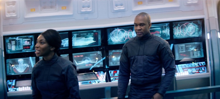
Screens of “USS Callister” episode of “Black Mirror”, season 4.
Kirill: Please tell us about yourself and your path so far.
Simon: I did a degree in visual communication and moving image design at Ravensbourne, and then started working in the motion graphics industry. My first job was at the Cartoon Network, doing lots of kids stuff. Then I did lots of shiny R&B adverts for a company that was in the music business and then for a startup that basically stopped quite quickly, I’ve been doing freelancing in the last eight years or so.
My direction changed somewhat when I started 3D. I found it stimulating and challenging in a way I hadn’t found 2D work. Then I began to bring particles particles and simulations into the work and something really clicked. And that’s where I’m sitting at the moment – somewhere in between VFX and motion graphics.
Recently I’ve been doing music visualizations for concerts and projection mapping, and that brings me back to my college days. I did projects on Kandinsky when I was 15, and I loved the idea of visualizing music even then. And now many years later I’m coming back to it. It’s oddly circular.
 Kirill: It’s quite interesting to see the hardware advances in that area and how much they are enabling in the last decade or so. You go to a concert or watch award shows, and it’s amazing to see all those screens in different shapes and sizes everywhere. And it didn’t even feel a gradual process. All of a sudden, these gigantic screens were everywhere.
Simon: I’ve been interested in music visualization for so long. I’ve went away from it and now I’m getting paid to do it on such a big scale. I did visuals for the Shawn Mendes world tour visuals, and the screens were insane. It’s the hardware and the playback that make it possible. It’s really exciting.
My motivation is to see it as pure experimental design. Everyone puts their own spin on it, and people see it on these futuristic screens. Aside from “Black Mirror” and live event work, I’ve been doing audio geometry experiments on my site. I’m getting some work from that, and it’s driving the jobs I’m doing. It’s nice and surprising that it’s working out like that [laughs]. It’s not often that things fall nicely into place like that. Maybe I’ve been doing it for so long that eventually it just clicks.
Kirill: We’re talking about number of screens, each with its own shape and size which is usually quite huge so that it can be seen from the back of that space. When you sit down to first think about it, what’s your approach to visualizing it? Do you do it on paper, or in some kind of a digital environment?
Simon: You start thinking about the idea, about what it is you’re trying to get across. For that, it doesn’t matter what is the shape of the box and how you are trying to draw it. It’s the same process. You get your concepts, you sketch, you make little experiments to prototype it in 3D. A screen is just a 2D surface, and it doesn’t take a huge leap of imagination to do it.
But the project I’m working on at the moment is this tunnel with 42 projectors super bright projectors. It’s going to be really long and really bright. And we’re using the whole tunnel, roof and all. The playout system we’re using can preview the setup in VR so you can really get a sense of the space and what you’ll be seeing. It’s amazing to see these particles waves flowing in time to the music, flowing down the tunnel. If it’s even close to that in real life it’ll be very powerful.

Visuals for Shawn Mendes Illuminate live tour, courtesy of Simon Russell.
I also worked with another client on a project where we visualise the space in Unreal engine to really get a sense of it. It can be used as a communication tool to show such spaces to clients, like film directors. Designers that work on more technical things know how it’s going to look and feel, but sometimes you need to lead people. So if you can put them into that world, it’s a very practical use of VR. Everyone is scrambling around VR at the moment, but nobody knows what it is going to end up being. I believe that this particular approach is going to be genuinely useful.
Kirill: Do tools matter as much as your imagination? The tools at your disposal continue evolving, but what good are those tools if, as a designer, you don’t have the right idea to work off of?
Simon: It’s a symbiotic relationship. It’s a fair point that you can have the highest-end computer, but it’s useless if you don’t know how to use it and you don’t have any imagination. On the other hand, you can have crazy ideas and no means to achieve them.
As ever, the truth is somewhere in the middle. This is where Painting Practice are so strong. They stand in the middle of that place. You have post-production houses which are very technical even when they have their design departments. But it’s hard to do simulations of what is physically plausible and still be loose and creative. You need to be in the brain-space to think about it in a purely creative way. It doesn’t always go hand-in-hand with those giant post places. This is where Painting Practice fits in. They lead conceptually, but also know how to follow it through and push those ideas down. It’s about defining those clear, beautiful, emotive ideas, about really creating a powerful concept but being able to lead that through all the hurdles and challenges of a huge technical production and still keep that original essence.
Visuals for Shawn Mendes Illuminate live tour, courtesy of Simon Russell.
Continue reading »
Going with the biannual release cycle of my Swing projects, it’s time to do latest release batch.
Substance 8.0 (code-named Wyoming) is a major release that addresses technical debt accumulated in the API surface over the years and takes a major step towards enabling modern UI customizations for Swing applications. Full release notes and API listings are available, with the highlights being:
- Unified API surface (Project Cerebrum)
- Configurable title pane content (Project Visor)
- Folded laf-plugin / laf-widget (Project Corpora)
- Explicit instantiation of component and skin plugins
- Switch to Material icons + icon pack support
- Better support for fractional scaling factors
Flamingo 5.3 (code-named Liadan) has extracted the non-core functionality into two new projects:
- Ibis has the code for using vector-based icons in Swing apps. It supports offline transcoding of SVG content into Java2D-powered classes, as well as dynamic display of SVG content at runtime (powered by the latest version of Apache Batik)
- Spoonbill has the code for browsing SVN repositories with the
JBreadcrumbBar component from the core Flamingo project. Future plans include extending this functionality to GitHub repositories as well.
If you’re in the business of writing Swing desktop applications, I’d love for you to take the latest releases of Substance and Flamingo for a spin. You can find the downloads in the /drop folders of the matching Github repositories. All of them require Java 8 to build and run.
Going with the new biannual release cycle of my Swing projects, it’s time to do the release candidates for the latest iterations.
The first major pillar for Substance 8.0 (code-named Wyoming) is Project Cerebrum – unified API surface. The API surface for controlling the visual appearance and behavior of various parts of Substance has grown organically over the years. Part of this growth process has been experimenting with various ways to express this control, from client properties to VM flags to APIs on a number of classes.
Starting with 8.0, the only officially supported entry point into configuring the behavior of Substance-powered UIs and for querying the state of such UIs is via the org.pushingpixels.substance.api.SubstanceCortex class. The API surface of this class is broken into a number of scopes, with every scope applying at the specific granularity level of control
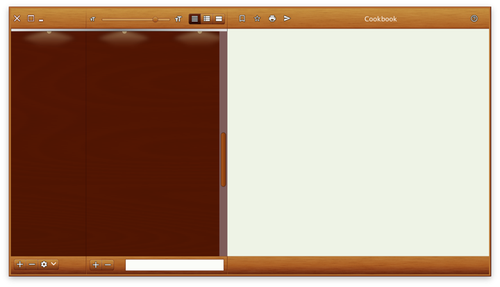
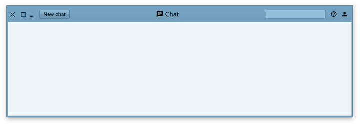
The second major pillar is Project Visor – configurable and custom title pane content. It provides a number of APIs to configure the layout in and around the title pane area of application windows. SubstanceCortex.GlobalScope.configureTitleContentGravity is the API to globally configure the gravity (edge alignment) of title pane content – title text, control buttons (minimize, maximize, close) and app icon.
The following APIs on the SubstanceCortex.WindowScope scope allow apps to extend the main content view into the title pane area – as can be seen in all the screenshots in this post:
extendContentIntoTitlePane(Window, SubstanceSlices.HorizontalGravity, SubstanceSlices.VerticalGravity) to marks the specified window to have its content extend vertically into the title pane area.getTitlePaneControlInsets(Window) to query the insets that should be reserved for the main control buttons – close / maximize / minimize.setPreferredTitlePaneHeight(Window, int) to increase the preferred height of the title pane area in case the content you extend into that area is taller than the main control buttons.createTitlePaneControlButton(Window) to get a button that has consistent visual appearance and preferred size with the main control buttons.
Calling JFrame.setDefaultLookAndFeelDecorated(true) on the specific window is the mandatory pre-requisite to be extend the window content into the title pane area with SubstanceCortex.WindowScope.extendContentIntoTitlePane API. See the skeleton demo apps for sample code on how to use these APIs.
The third major pillar is Project Corpora. Up until version 8.0, Substance used to depend on laf-plugin and laf-widget. Those two projects were envisioned when the landscape of third party look-and-feels in particular, and Swing in general, was more vibrant. The goal was:
- For
laf-plugin to provide a common mechanism for specifying look-and-feel plugins for components libraries
- For
laf-widget to provide a collection of widgets that enhance the visual appearance and behavior of specific Swing components
The functionality of these two projects has now been folded into the main Substance codebase. The APIs for configuring animations and widgets are now part of the SubstanceCortex class
In addition, Substance 8.0 comes with:
- Consistent package names for public APIs
- Removed automatic discovery of Substance plugins (that could be used for injecting unintended behaviors into Swing apps powered by Substance)
- Switch to Material icons for built-in components
- Support for icon packs
- Better support for fractional desktop scaling factors
Full release notes for Substance 8.0 are available here.
The biggest change in Flamingo 5.3 (code-named Liadan) is separating the non-core functionality into two new projects:
- Ibis has the code for using vector-based icons in Swing apps. It supports offline transcoding of SVG content into Java2D-powered classes, as well as dynamic display of SVG content at runtime (powered by the latest version of Apache Batik)
- Spoonbill has the code for browsing SVN repositories with the
JBreadcrumbBar component from the core Flamingo project. Future plans include extending this functionality to GitHub repositories as well.
If you’re in the business of writing Swing desktop applications, I’d love for you to take the latest release candidates of Substance and Flamingo for a spin. You can find the downloads in the /drop folders of the matching Github repositories. All of them require Java 8 to build and run. The final releases are scheduled to happen in two weeks’ time, on the week of March 11th.
