What happens with the raw footage captured by the camera lens after the last “Cut!” sounds off on the last day of shoot? It passes through a lot of hands and eyes until we get to see the final version on our screens. Post-production includes cutting and editing the shots, sound editing, dialogue replacement, foley effects, sound effects and soundtrack, just to name a few. Color grading is an integral part of the post-production process, and is mainly composed of two parts – color correction and artistic color effects.
This is where the shots of the same outside scene taken under different natural lighting conditions (sunny / cloudy) are made to look visually consistent as if they were shot as one flowing sequence. This is where the existing footage gets its colors shifted to change how the viewers will subconsciously interpret the mood of that scene. This is where the magic of visual story telling gets shaped to the final intent of the director.
Continuing the ongoing series of interviews with creative artists working on various aspects of movie and TV productions, it is my pleasure to welcome Norman Nisbet. In the last couple of decades he has worked on a wide variety of productions in film, television, documentaries, commercials and music videos. Do colors carry universal meaning across different cultures in our increasingly more connected world? How do you tackle the limitations of much smaller color spaces on screens? How much have the software tools have advanced in the last decade or so? What went into color grading the wonderful world of “The Neon Demon”? And much more importantly, will we ever agree on the right spelling of the word “colour”?
Kirill: How did you get into the field?
Norman: I stumbled onto it, really. At that time I didn’t even know colour grading existed as a field. I knew about editing but never thought of the colour grading part. I always thought that was for stills photography.
I was working for Multivisio Holdings – an audio-visual company in Jhb, South Africa, doing video productions for the car industry (helicopter shoots etc), as well as staging and engineering shows and car launches. It’s much like the show business and everything that comes with it. At some point the company bought the first component digital editing suite in the southern hemisphere and an URSA GOLD with a Pandora Pogle to go with. The American operators were great guys and they were eager to teach me.
I was in luck! I was editor’s assistant for 6 months then a Telecine assistant for 6 months. Then I had to choose as they were hiring, and I chose the film/colour grading world. I was always painting and drawing, spending school holidays at that company to mount slides from car shoots for multiple projector slide shows. I was always drawn not to photography specifically but image making, if I may call it that.
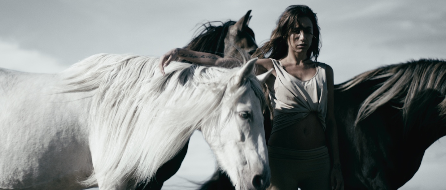
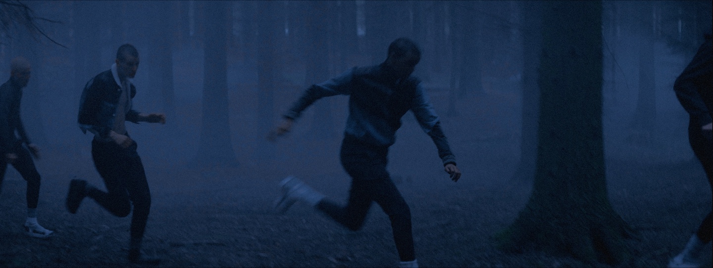
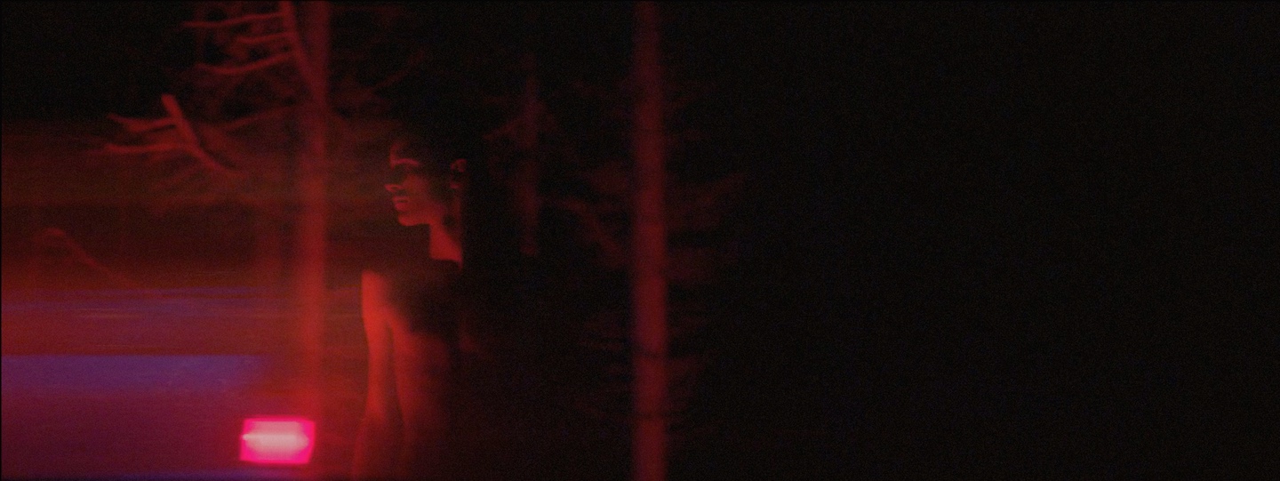
Norman Nisbet’s work on Mena Maria’s “F*#$ You”.
Kirill: What is color grading? What it is that a colorist does on a feature film or a TV show?
Norman: Colour grading is enhancing the raw image that was shot on film or digital media to present to an audience on different formats. It is the bridge between the camera and the screen. There is a technical translation aspect to it, as well as allowing for a creative side of the process. The cinematographer has a chance here to enhance the image for the audience to enjoy the intended vision of the film or program. Colour grading has replaced the ‘colour timing’ process that was previously done in a film laboratory.
The role of the colourist is to help enhance that image and to be the cinematographer’s ‘hands’ by understanding his vision and making sure the audience will see the program or film in the way the cinematographer intended it be viewed. The colourist has a responsibility to convey the cinematographer’s intent. Obviously we (colourists) give creative input and have the technical know-how to carry out this process.
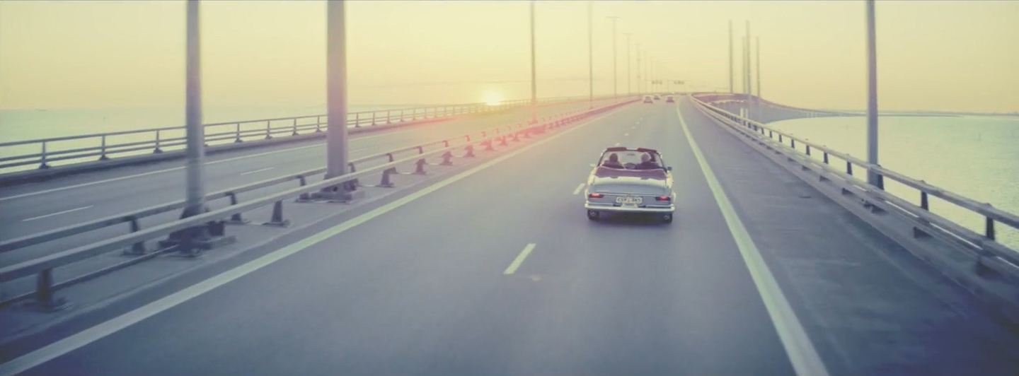
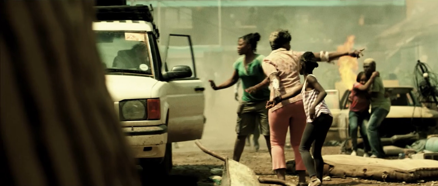
Norman Nisbet’s work on Medina’s “We Survive”.
Kirill: How do you describe what you do to people outside of the industry?
Norman: I describe it as photoshopping a moving image. Or nowadays as a ‘filter’ applied in Instagram. I enhance images to portray a mood to help the story. I create warmth or cold. Animosity or sincerity. A menacing darkness or a pastel universe. I carry the viewer through the scenery in a subliminal manner. I invoke feelings as the viewer watches the images. There is always the technical side too: matching scenes and shots as they are shot at different times or different lighting. Even making day time look like night time.

Norman Nisbet’s work on Medina’s “We Survive”.
Kirill: Is there such a thing as a universal “dictionary” of meanings to color choices to convey mood and emotion?
Norman: There are, of course, studies which show how a human body reacts to certain colours. Red raises the heartbeat, blue is calming. Mental triggers such as green symbolises growth but green is also jealousy and envy. So these colours can be challenges or to use as tools. Are nights blue?
Kirill: What are your thoughts on a much smaller color space on screens compared to real life?
Norman: Human eyes and the messages relayed to the brain are amazing! The amount of colour balancing that goes on in a split second! Looking at a smaller screen limits this spectrum. You cannot perceive the range of blacks so the picture is always more contrasty. In real life there is no true black or white, there are too many reflections bouncing around. You can almost touch colour if you look properly.
Any screen cannot truly show real life and the smaller the screen, the more distant the viewer – so a more contrasty picture will engage the viewer’s interest. Image compositions are clearer too. I feel it’s a pity that cinemas are losing popularity to home viewing or even on-the-go streaming for commuters, even though it is very convenient. There is still something to be said for the ‘cinematic experience’ as in ‘in a cinema!’
Norman Nisbet’s work on Doctors Without Borders.
Kirill: What would you say are the essential characteristics of a colorist?
Norman: There’s a saying: A colourist will fix the problems you never knew you had in ways that you will not perceive.
So a colourist should know his client, bond with and read the intentions of his client. And then translate the message onto a hard format in visual form. A colourist should not only have a keen eye but also a keen ear.
There are also many fields in the colour grading world. For example, there are those who remaster and archive films where knowledge and purity of image is of essence. And those who work in fiction use different senses compared to those who work in documentaries.
Norman Nisbet’s work on HAN X Teva.
Norman Nisbet’s work on HAN X Teva.
Kirill: Talking about “The Neon Demon”, when did you join the production and what was involved in the initial discussions around your involvement with that project?
Norman: I had been introduced to the producer Lene Børglum a while before by a cinematographer for whom I graded a commercial. I think it’s fair to say that Lene and I built up a relationship based on mutual respect even though we did not have many dealings with each other at that stage.
Kirill: On that feature, who did you work with throughout the various stages, and how long would you say you’ve spent on it?
Norman: I was invited to a screening of the film with the editor Matthew Newman and the director Nicolas Winding Refn, and we discussed different aspects of the film afterwards. It was my first time working with Nicolas and I was amazed at how interested he was in my opinions regarding the story, the characters etc besides the visual aspects of the film. I felt he gave me trust as a professional and that deepened my sense of involvement in the film.
After that I took up contact with Natasha Braier, the cinematographer. We introduced ourselves and discussed the look of the film over a Skype talk. Finally we viewed the film together when Natasha came to Copenhagen for the grading, giving us a day before to discuss the film and also to get a find out more about each other, as we would be working closely to for the next couple of weeks. The next day we started the process with Nicolas, the director and soon Matt, the editor joined too.
I was accompanied in the grading suite by an assistant from the facility as I was working there as a freelancer on this project, even though I already had a working relation with the facility. Altogether I spent 30 days grading on the film.
 Kirill: What was the most challenging scene for you on “The Neon Demon” and why?
Norman: Every scene was challenging in the first day or two, because Natasha and I were establishing our relationship and trust. I wanted to engage in how she envisions the film in a cinematic way. Natasha was used to shooting and finishing on film and not digital, and wanted to keep the ‘film feel’ in the visuals. My job was to take the digital process to feel like the films I used to work on back in the days of digital intermediates. But we found our feet and I got to enjoy many aspects of her cinematography.
One scene does come to mind, though. The casting scene where the models are in a barren room, clad only in underwear and feeling exposed and vulnerable under the open lights. It was interesting for me because ‘beige’ was everywhere. It was a challenge to separate the skin tones to give the picture its three-dimensionality. I graded and graded the scene repeatedly over the weeks, each time searching and finding and coming closer to a place where we felt excited. Harder/softer contrast, colour temperatures etc made the continuity difficult. Eventually we found a soft, creamy universe but kept the stark feeling.
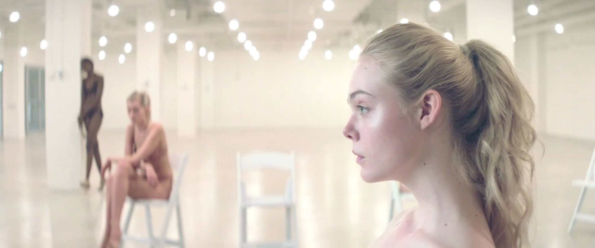
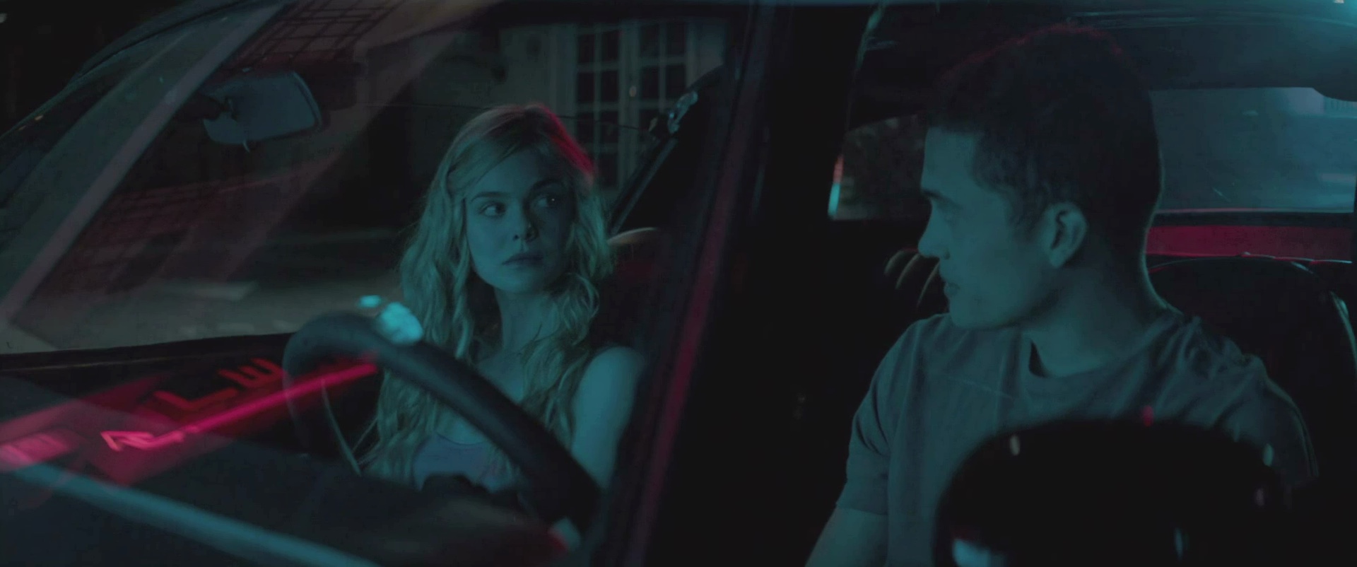
Norman Nisbet’s work on “The Neon Demon”.
There were many scenes too which were challenging but also more fun in their challenges. For example when ‘Jesse’ is taken in by the light during the fashion show. The turning point. The intense and graphic images. Blues & cyan on a black background. Red on black background. Having only red as a source light. It was amazing and fun to work in these extremes, I was challenged but loving it!
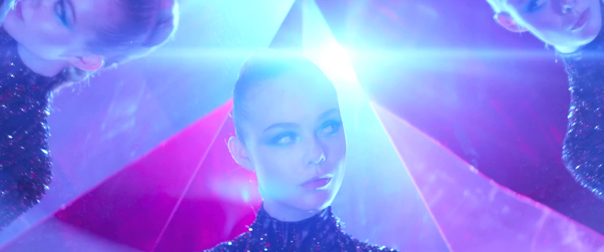
Norman Nisbet’s work on “The Neon Demon”.
Kirill: If you look at the material you’re working with, how much of it can you change with the tools at your disposal? Can anything be done these days in post?
Norman: I would say a hell of a lot can be done in post, yes. But it depends on where your pinnacle of purity lays. And your imagination. At a certain point the images may look too manipulated. But we certainly can take it far from reality. I can make the same material look sunny and warm or cold or even like a moonlit night. We use alpha channels and mattes and tracking masks and layers of material to build up one image, giving the illusion of a space in time.
Look at the films we see these days. How far have you been taken from reality? I’d say just about anything can be done in post.
Kirill: On a related topic, how much have things changed for you in the last 15 years with software advances? Is there something that you can do now that was impossible to do back when you’ve started?
Norman: If we talk about back when I first started then it’s more than 15 years ago. But it’s 15 years ago that the colour grading process went non-linear and the software technological advances have been phenomenal. For one, we are working from a digital format which means there is no inherent grain in the material. This means that we can manipulate the images without having to watch out for grain inconsistency.
Working off a hard disk means that we have automatic tracker systems as opposed to manually having to program masks. I can remove or manipulate unwanted objects in the frame without having to send it to VFX. I can give beautiful skin treatments. I can create alpha channels for harder gradings on isolated parts of the image. I can even rebuild a picture using layers of images. It’s incredible what can be done nowadays.
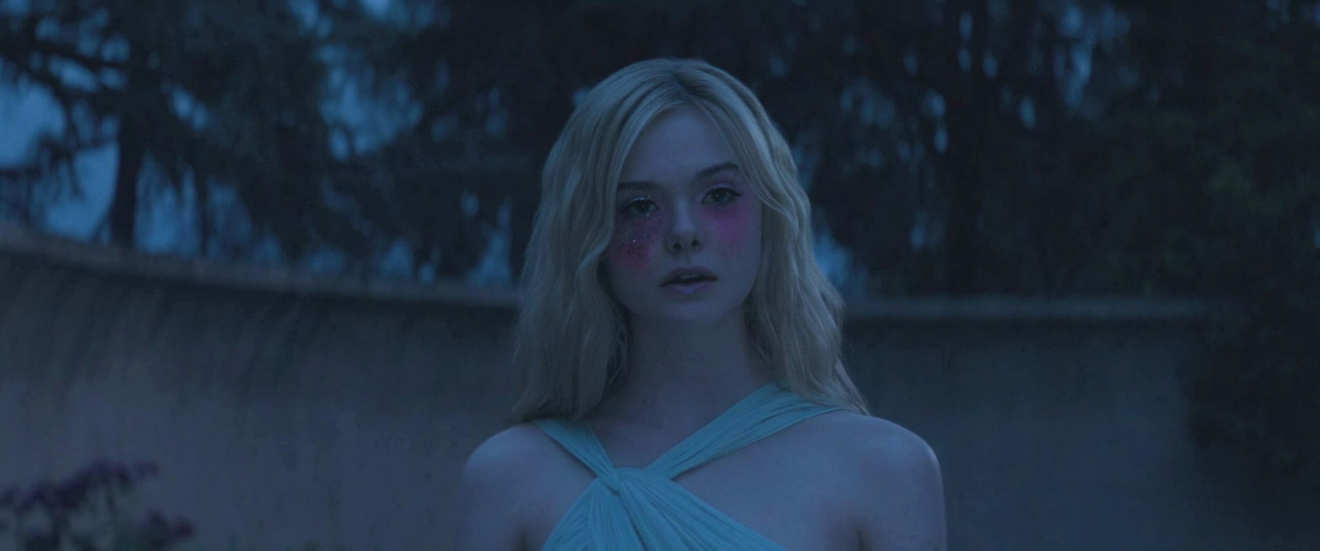
Norman Nisbet’s work on “The Neon Demon”.
There’s the dark scene in Neon Demon where Jessie goes to Ruby’s house very early in the morning after she hears the landlord attacking her neighbour. We drastically reframed a shot of the interior of the dark house for more emphasis but as the camera moves I realize that in the darkness we had actually run out of picture – we had reframed too much. So I was able to ‘double up’ the bottom half of the picture using an alpha channel and a duplicate image in a layer behind.
Kirill: “The Neon Demon” was shot on digital, and my understanding is that since there is no physical medium of film involved, you can get much more material to work with. How was it on that particular production?
Norman: Digital medium has been long time in development to match the latitude that film has, and only recently has it surpassed the range that film has. And that is without the ‘personality’ of film. Natasha’s (cinematographer) experience coming from film brought such a full range to the digital format, and that was what I worked from.
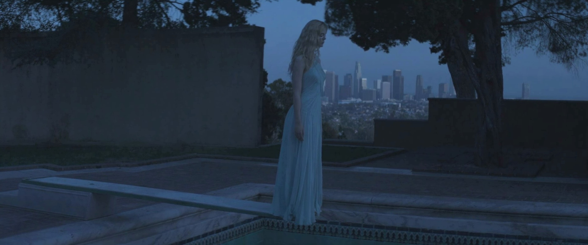
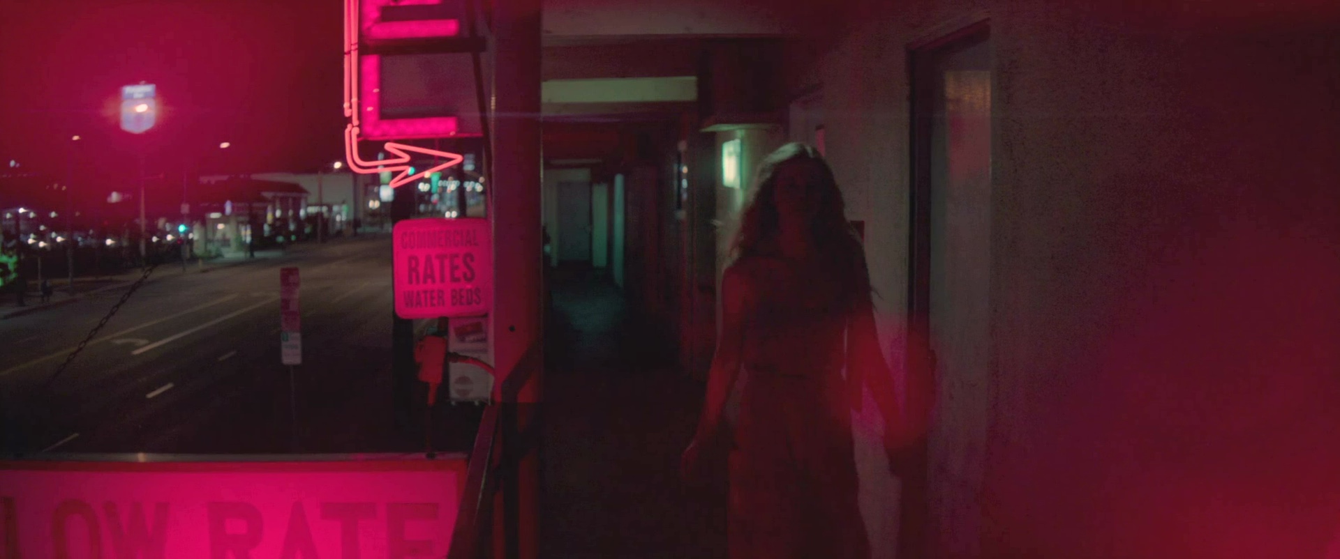
There’s a scene where Jessie goes for an interview (Elle Fanning interviewed by Christina Hendricks) in an office overlooking L.A. We have wonderful range in the sky outside the windows yet a soft and full contrast curve inside the office. The same goes for the dark night scenes in and around the motel. Nice soft and full range blacks that carry enough detail when needed.
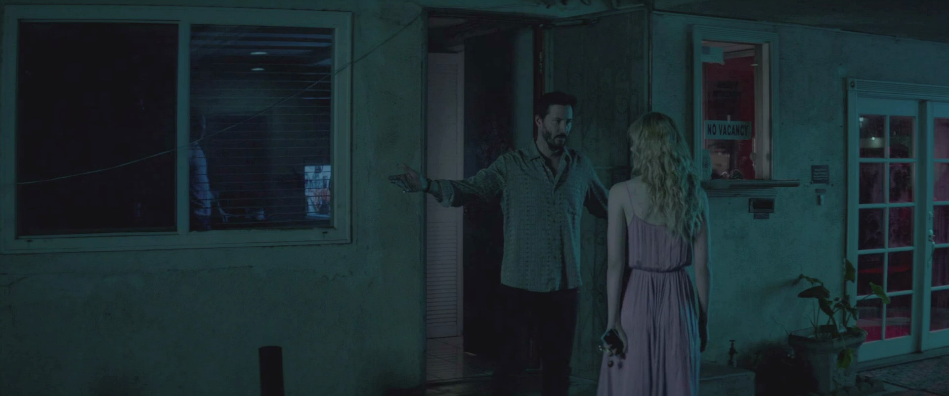
Norman Nisbet’s work on “The Neon Demon”.
I am altogether very happy with the range that digital formats have to offer these days. It was a ‘dark time’ in filmmaking when digital was first trying to compete with film – not enough range and ugly solarized colours too. Nowadays the bit depth and low compressions are so much better.
Yet, we still try to mimic the personality of film in our soft contrast curve of the final product. I think it says a lot about film.
Kirill: You’ve worked on quite a few local (Danish) TV shows. How would you compare the pace of work on feature films and episodic television?
Norman: Well, that always depends on budget, doesn’t it? I work mostly in fiction, drama genre and there has been a kind of an equation that has stood the test of time: 1 viewing minute of a film is almost 1 hour of colour grading work. For example, a 90 minute film gets graded in about 80 hours.
It kind of applies for episodic television too, but I think the ratio is pushed a bit further. When I graded the TV series ‘Borgen,’ we graded a 55 minute episode in 5 days. The pace is faster, but not far from the original equation. Some television work gets graded in a day for a 40 minute episode. It can be tough and the colourist has to stay disciplined when grading on episodic television series.
Norman Nisbet’s work on “The Neon Demon”.
Kirill: Bringing you back again to how different cultures perceive certain colors, is there anything different for you when you work on local productions and your work for US / Hollywood features?
Norman: There are different styles and trends across the globe. Popular colourists could have a certain style so films are seen globally with a repetitive look too. Hollywood plays a major role with huge budgets. But we as colourists recognize looks from certain parts of the world which seem to be classics – ‘Nordic Noir’ for example. I feel all the players are watching each other’s work for inspiration.
Kirill: What’s the best part of your work day?
Norman: Invoicing! Nah, just kidding. The conversation and ambience in the grading suite is great. Setting a really cool look for a commercial or music video still gives me a rush. Nailing one or two difficult shots does as well. Compliments usually work too ☺
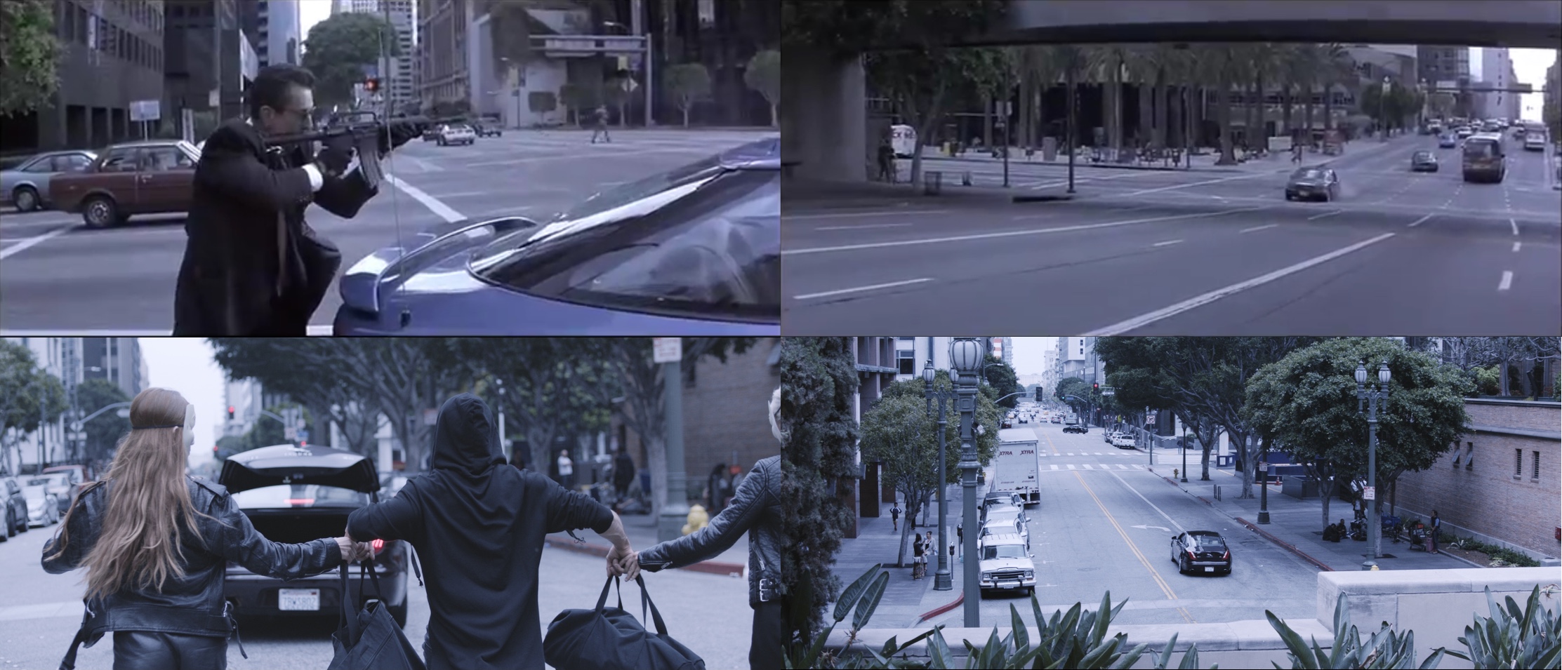
Norman Nisbet’s work on a music video. Top row – stills from the movie “Heat” as visual look guidance, bottom row – stills from the graded video.
Kirill: If you look back at “The Neon Demon” or “Melancholia”, what stays with you after your involvement is done?
Norman: The chemistry in the grading suite stays with me. We spend long days and weeks in a dark room with each other for company and we kinda get to know each other through work detail, as well as casual conversation. It’s getting to know a bit more about the people whom I work with.
Kirill: As you sit down to watch the final cut of one of the shows or features you’ve worked on, can you enjoy the story or do you look at the particular pieces that you’ve worked on?
Norman: Often I am overwhelmed by the new soundtrack, as I am usually grading with ‘guide’ audio. I do still look for all the specific grading elements in a final viewing to be sure that everything is in order. But it is at this stage that I can actually enjoy the film too, because we are at the point of finalization.
Norman Nisbet’s work on “The Neon Demon”.
And here I’d like to thank Norman Nisbet for graciously agreeing to answer a few questions I had on the craft of color grading, and on what went into creating the worlds of “The Neon Demon”, as well as for sharing the wealth of the supporting imagery.
“The Neon Demon” is out now on BluRay and other physical and digital formats. Finally, if you want to know more about how films and TV shows are made, click here for additional in-depth interviews in this series. Stay tuned for more interviews in the near future!
