To wrap up the series on the Chroma color system introduced in the latest Radiance release, I wanted to look beyond the world of user interfaces, and to the world of physical products around us.
For quite some time now, Radiance supported the concept of decoration area types – recognizing that application menu bars, toolbars and status bars are common examples of special containers found in most user interfaces. These containers create functional grouping of application controls and bring order to complex screens. From the title pane at the very top, to the menu bar and the toolbar under it, to the control pane on the left, all the way down to the footer at the bottom – the visual grouping and separation of application content into distinct decoration areas follows the logical grouping of application content.
And with Chroma, a button component does not need to “know” about the decoration area it is displayed in – it asks the current Radiance skin to give it color tokens that correspond to wherever it happens to be in the application hierarchy, and then draws itself with surface, outline and content tokens.
Tokens are design decisions that combine together to make up the whole design system. A design system can be in the digital world of user interfaces, or in the physical world of retail and wholesale goods. This is the Borealis backpack from The North Face:
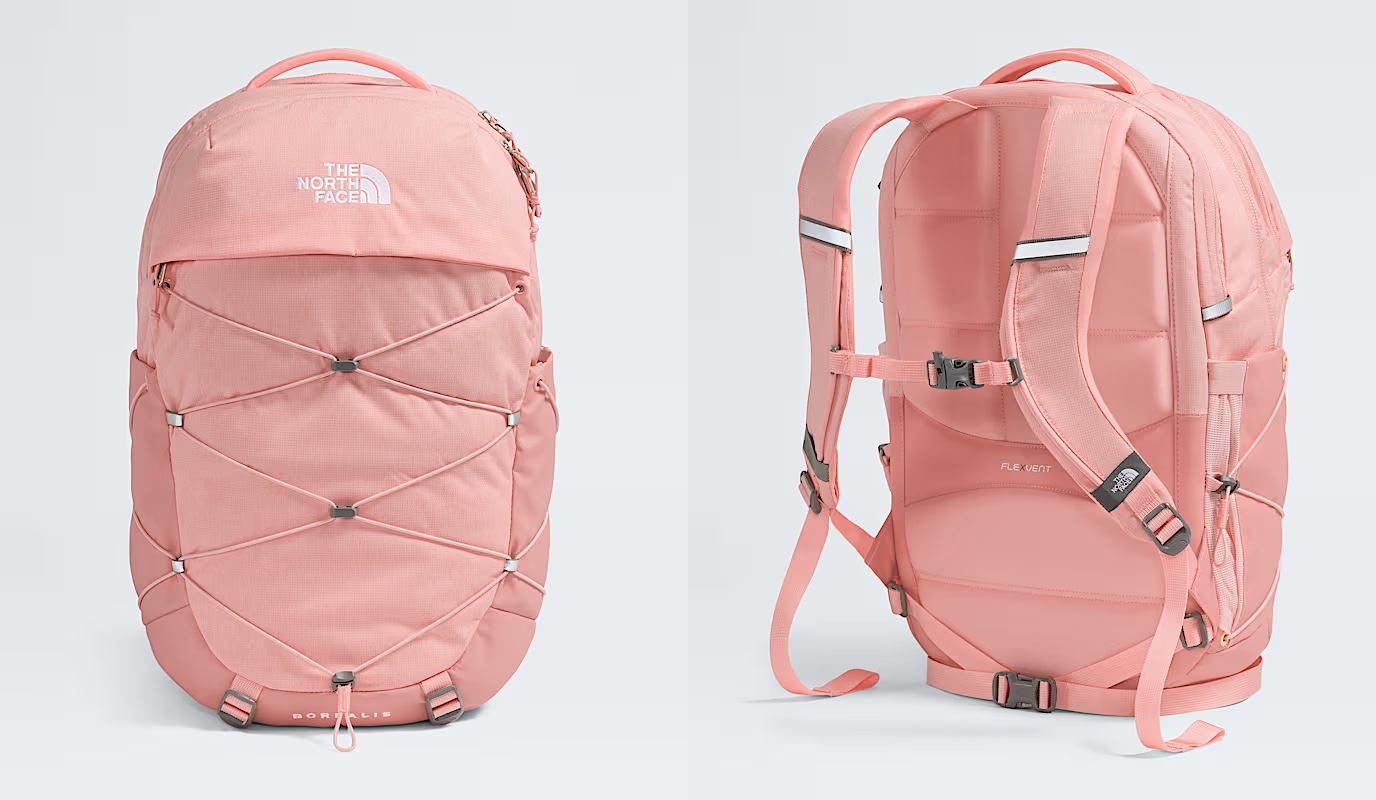
Here, we have:
- A consistent color palette of terracotta heather.
- Applied in two tones – a lighter one for the bulk of the body, and a slightly darker one for the bottom, the sides, and the back cross.
- Company and product names as “content” on top of these “surfaces” in a consistent, much lighter tone from the same palette.
- And finally, consistent application of a darker grey accent on the buckles and additional elements
The overall design “system” is applied throughout the whole line of Borealis backpacks, that you can see by clicking the color selectors on that page.
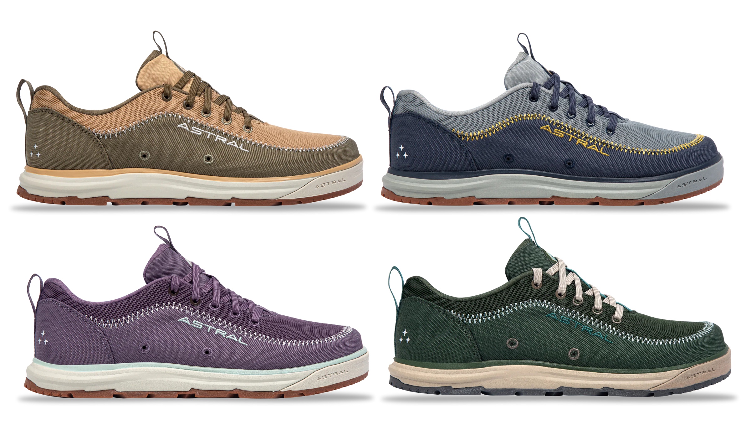
The same approach, extended to multiple “decoration areas”, can be seen in the line of Brewer 3.0 shoes from Astral – delineating design elements across the product, changing the color palette and color token mappings to create a coherent thematic connection across all variants:
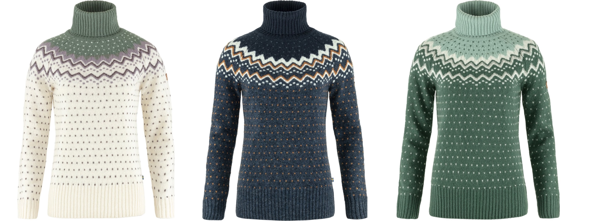
This is the Ovik knit roller neck collection from Fjallraven, again with a single strong underlying design, but multiple color variations:
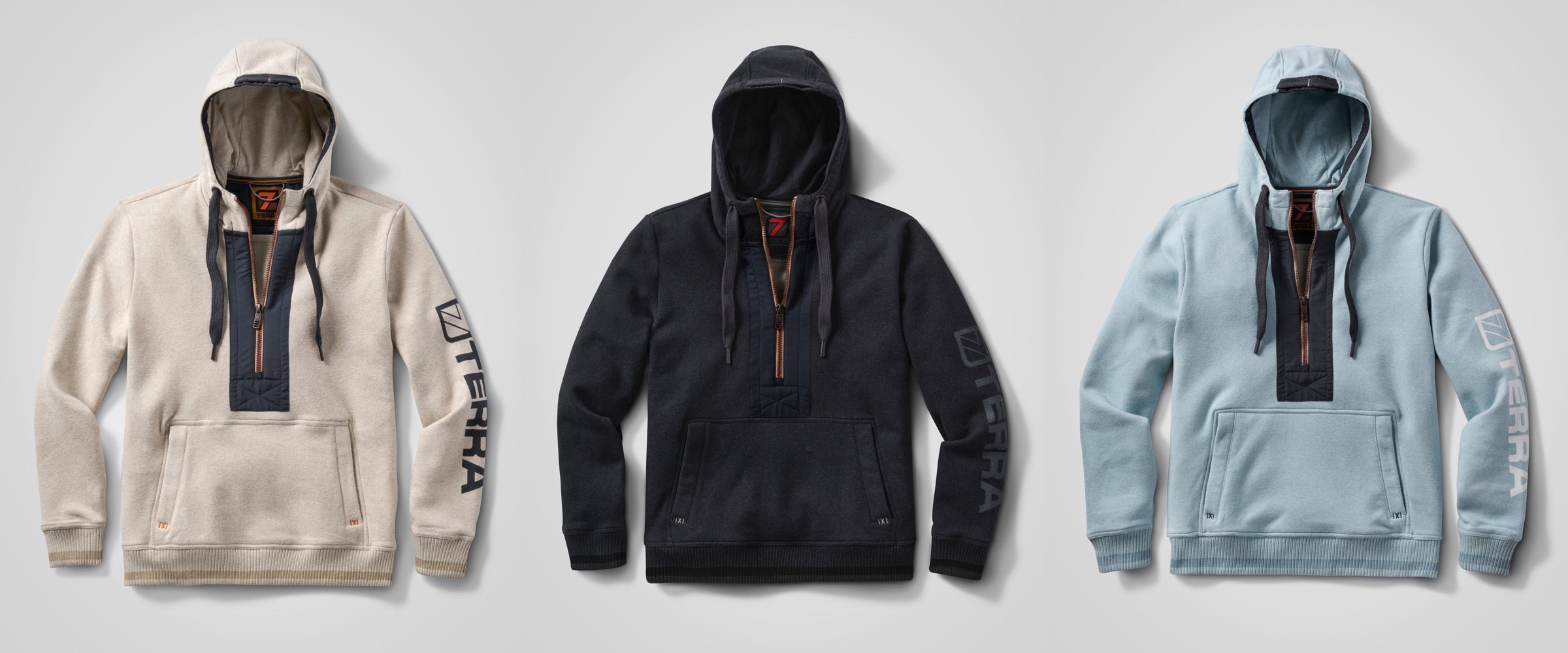
This is the Stokk hybrid hoodies line from 7Terra:
And this is Escapade backpack collection from Zorali:

The overall approach is similar:
- Create a “blueprint” for the product line, identifying key functional areas of the product that will be consistent across the entire line
- For each functional area, group the pieces into tiers – canvas (surface), logo (content), connectors (outline / line)
- For each tier, define which color tokens will be used on the physical material – plastic, metal, cloth, etc
- Define multiple color skins / combinations to be used across the product line, deriving palettes for each functional area, leading to the color tokens being mapped to the actual RGB colors
With a few tweaks, this approach works for wearable consumer products highlighted here – shoes, sweaters, and backpacks – and can extend into tupperware, cars, architecture and many more. Keep your eyes open for the design of the physical world around you as you go about your day, and see how it can be applied to the world of digital user interfaces.
Continuing the ongoing series of interviews with creative artists working on various aspects of movie and TV productions, it is my pleasure to welcome back Beth Mickle. In this interview, she talks about the changes in the industry since we spoke back in 2012, how she sees generative AI, what advice she’d give to her younger self, and the importance of physical and mental well-being. Between all these and more, Beth dives deep into her work on “Superman”.
This interview is the second part of a special initiative – a collaboration with the Production Designers Collective that was founded about 10 years ago. This collective brings together over 1,500 members from all around the world, sharing ideas, experiences and advice across the industry. We talk about its goals and initiatives, and the upcoming second International Production Design Week scheduled in mid-October this year.
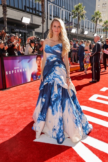
Beth at the LA Premiere Of “Superman”
Kirill: Welcome back, Beth. We first spoke back in 2012 about your work on “Drive”. What has been happening in your professional life since then?
Beth: “Drive” was an amazing opportunity to work with Nicolas Winding Refn and Ryan Gosling. A couple years after that I worked on Ryan’s directorial debut “Lost River”, as well as a few other smaller studio movies. Then, quite excitingly, I got swept into the James Gunn filmmaking arena in 2017, and I’ve worked almost exclusively with him for the last eight years. At the height of pre-vaccine Covid I did “Dear Evan Hansen” with Stephen Chbosky, and I’m working with my brother right now on a live action film for the Japanese franchise Gundam. It’s been a wonderful adventure for all of us.
Kirill: Outside of your work on “Deuce”, would you say that you are one of the rarer artists that stays in the feature world, and not crossing over too much, if you will, into episodic productions?
Beth: Not by choice, necessarily. It happened to be the projects that have come my way. There have definitely been many wonderful series that I really admire and would love to have been a part of if the stars had aligned. I’m hopeful that in the future I’ll be able to dive into world building in the TV side of things.
My brother is a writer / director, and he did the series “Sweet Tooth” with Netflix, which my husband designed. I always admired their work on that, and always thought that it would have been fun if I could have been free to be a part of that. I was on “Guardians of the Galaxy” at the time, so it didn’t happen.
Kirill: What bigger changes have you seen over the last decade or so since we spoke? Maybe some technical advances, or new materials or techniques that are directly applicable in your field?
Beth: There have definitely been advances when it comes to the visual effects [VFX]. Every year it feels that the VFX worlds get progressively more sophisticated with the finishes and the realism that they can achieve. Compared to 10 years ago, we are able to lean on them more and more as needed for resurfacing and for set extensions.
For physical builds, we did a lot of material testing on “Superman” to nail down how we were going to do the Fortress of Solitude. It’s a rare thing to have that much time and resources to be able to explore and experiment with so many materials. We definitely wouldn’t have had that luxury in the smaller filmmaking arena. It’s one of the joys of getting to work on some of these larger movies – you have time to develop techniques and fabrication to achieve what you want.
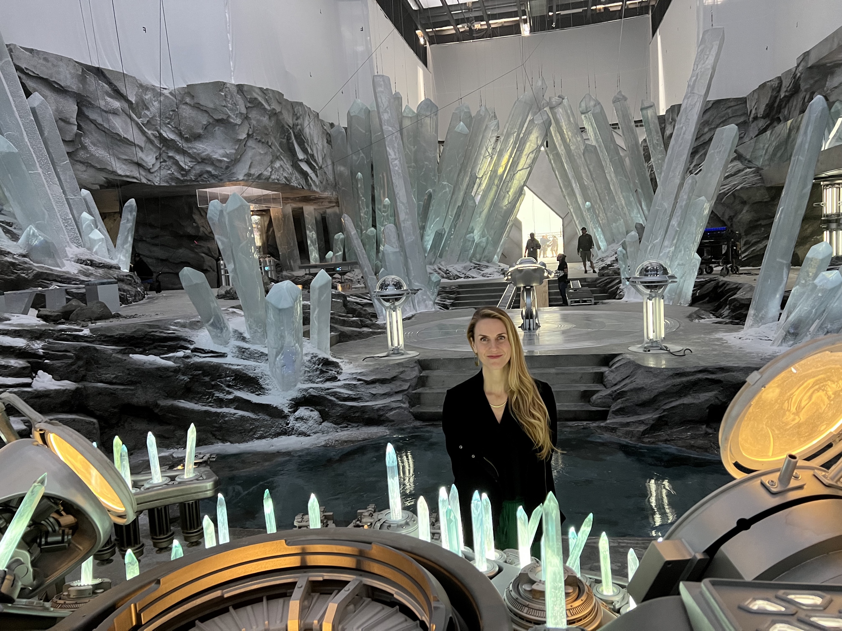
Beth on the Fortress of Solitude set of “Superman”. Courtesy of Warner Bros.
Kirill: When “Avatar” came out in 2019, there was a period of a few years where a lot of productions did 3D – and then it slowly faded away. Do you feel that the audiences prefer “flat” images?
Beth: I remember being really excited about the 3D world. I felt that it was going to have great reception and great longevity. I don’t understand why it’s not been used more frequently. My husband did a number of 3D films, and in our discussions we thought that this new technology was going to sweep the industry – but surprisingly for me, it hasn’t. I keep reading about some of the 4D experiences where they’re bringing in motion in the seats and all kinds of effects within the theaters. It’d be interesting to see what that might end up doing.
And that brings me back to your previous question about technology – I should mention the volume [virtual production stage]. It’s a great new tool that is being introduced. It still has a little ways to go with being fully accessible for all the movies that might want to use it. But I think when used correctly, it’s a fantastic resource. As people get a handle on that technology, it will start to become more and more ubiquitous on films.
Kirill: Continuing to the Production Designers Collective, what is it and what is it for you?
Beth: I am thrilled that the Production Designers Collective has come into existence. Inbal Weinberg is one of my dearest friends in the film world. She and I worked together when we were first starting out in the indies in New York twenty years ago. I remember she said to me how she strongly believed a community could be created of all the production designers out there, so that we could share resources and advice, and build a supportive community for each other. And I’m sitting there and thinking what a beautiful idea that would be, but what a Herculean effort it would be to actually bring that together.
So now here we are, ten years after she actually started this collective with Kalina Ivanov, and they’ve connected hundreds and hundreds of production designers around the world. You have all of these people that I have always admired from afar, and whose work I had always respected from afar, and whom I always wished I could be in connection with – and now we can talk about crew, about ideas, about approaches to work. You can ask what it’s like to work in the middle of Ireland or the middle of New Zealand.
I never had easy direct access to these wonderful designers, and with the Production Designers Collective, it’s so easy to get in touch with one another. It’s taken down these imaginary walls that may have been there before. There’s only one of us production designers on a movie, and that means that we’re quite isolated from other production designers in the industry – unless you really make an effort for outreach. You’re not always sure if designers across the world are all going to want to be in communication in that same way.
That is what this Collective has done – open all those doors, open all those lines of communication. Now we can be stronger as a community because we’re all connected.
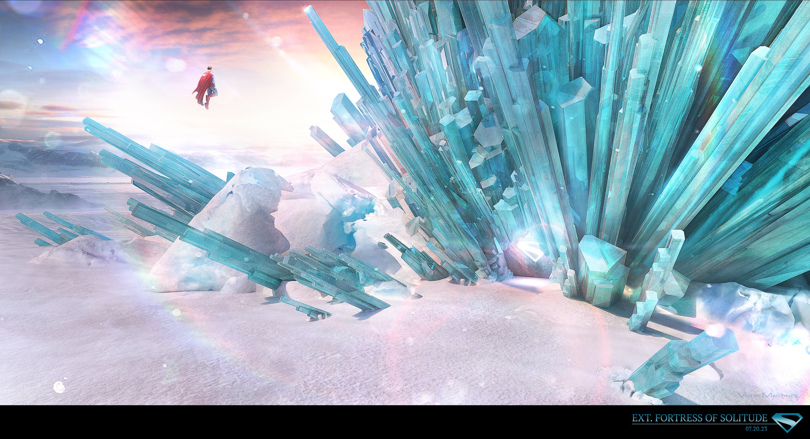
Render of the exterior of the Fortress of Solitude for “Superman”. Courtesy of Warner Bros.
Continue reading »