Continuing the ongoing series of interviews with creative artists working on various aspects of movie and TV productions, it is my pleasure to welcome Kalina Ivanov. In this interview, she talks about what production design is, our need to tell stories, the meteoric rise of episodic productions over the last decade, how she sees generative AI, and what keeps her going. Between all these and more, Kalina dives deep into her work on “The Penguin”.
This interview is the first part of a special initiative – a collaboration with the Production Designers Collective that Kalina founded about 10 years ago together with Inbal Weinberg. This collective brings together over 1,500 members from all around the world, sharing ideas, experiences and advice across the industry. We talk about how it came to be, its goals, and the upcoming second International Production Design Week scheduled in mid-October this year.
 Kirill: Please tell us about yourself and the path that took you to where you are today.
Kalina: I am originally from Bulgaria. I came to the United States when I was 18, and I wanted to study theater design. I studied and practiced to become a theater designer, and I couldn’t find a job in theater in America. It was completely different than in Europe, and it was a quick switch to storyboarding movies for me. Once I was in, I was hooked.
Kirill: Looking back at the time when you started in early ’90s, what would you say are the biggest changes for you in this field since then?
Kalina: It’s clearing moving more and more towards special and visual effects, and now we have AI is coming for us. We all have to be prepared for it. That’s coming, and I find it challenging, but also great. And at the same time, I’m hoping that young filmmakers will find their way to tell a good story with this new format. I keep up with new technologies, like drawing on computers, but I still draw a lot of it by hand.
Kirill: Do you feel that it doesn’t matter if it’s a physical tool or a digital tool, and that the art is more important than the tools?
Kalina: Absolutely. Every production designer brings a unique point of view. No two people are the same, even identical twins. There were two production designers who were identical twin brothers – Richard and Paul Sylbert, and they were not the same [laughs]. We bring a unique point of view to the field, and no technology can take that away from us.
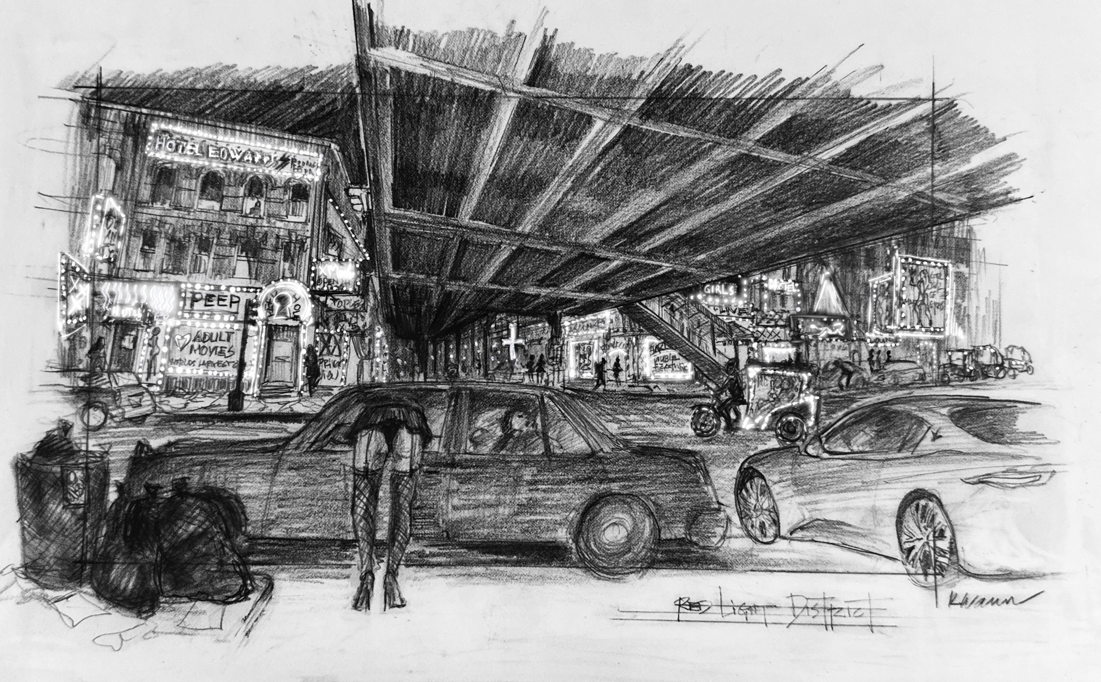
Sketch of the Red Light District for “The Penguin”, courtesy of Kalina Ivanov.
Kirill: Can anybody be an artist? Can art be taught?
Kalina: It depends on what kind of artist you want to be. I don’t consider myself a phenomenal artist in terms of drawing, but people find my sketches evocative. I look at them as working drawings. I don’t look at them as a piece of art at all. It all depends on your point of view. An artist has the sensibility, and that can be expressed in many different ways.
Kirill: How would you define what production design is? What kind of an art form is it?
Kalina: It’s about creating the environment. Every project is different. Every journey in every project is different. For me it starts with a script. As long as I can get under the skin of the character, as long as I can become that character, I’m good. If I can’t become that character, there’s trouble brewing on the horizon [laughs]. My process is quite intuitive. I read the script carefully, I think about the characters, and then I draw. Then, through these drawings, the atmosphere starts showing in.
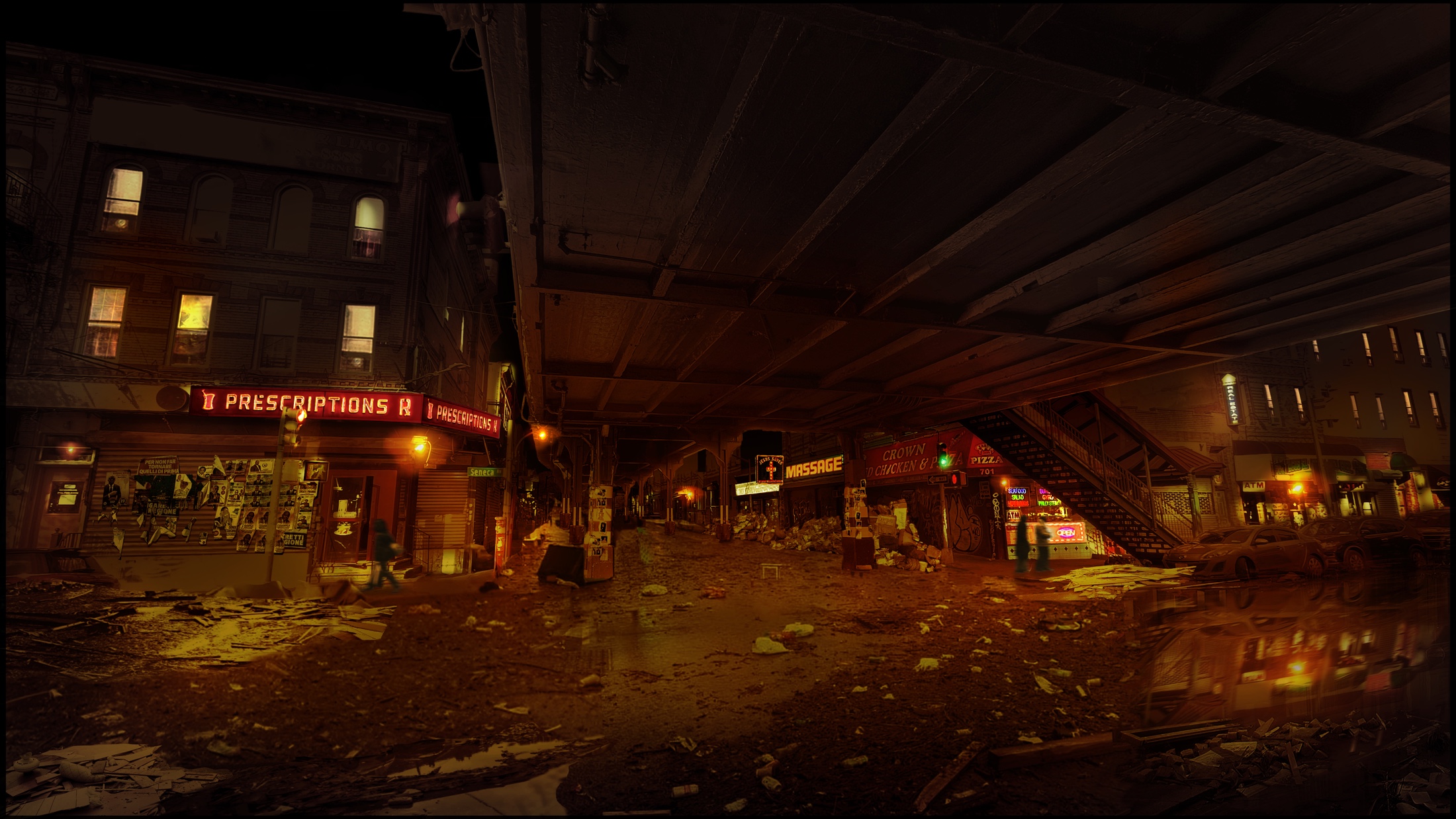
Render of the Red Light District for “The Penguin”, courtesy of Kalina Ivanov.
Kirill: Sounds like you are in the camp of a picture is worth a thousand words.
Kalina: Absolutely. I’m not eloquent, so I prefer the drawings to talk.
Kirill: What is the biggest misconception that people have around what production designer is or what do they do?
Kalina: Most people consider us set decorators. They don’t see production design for what it is, especially in contemporary movies. Sometimes I also feel that the cinematographer gets credited with production design, believe it or not. All sorts of people get credited, but production design is a unique art. It requires the mental capability of thinking of all the colors, and all the textures, and all the shapes and forms that come in into the world.
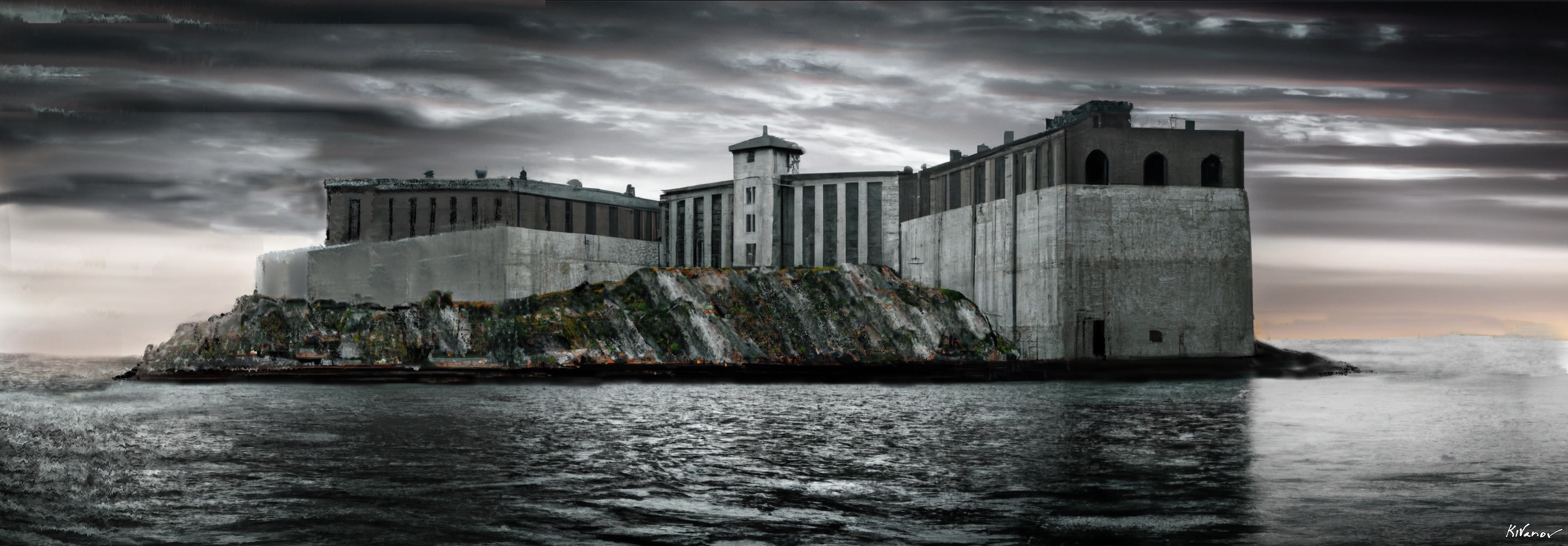
Sketch of the Blackgate Eye Prison for “The Penguin”, courtesy of Kalina Ivanov.
Continue reading »
Continuing the ongoing series of interviews with creative artists working on various aspects of movie and TV productions, it is my pleasure to welcome Toni Barton. In this interview, she talks about what she sees as the biggest change in this industry in the last 25 years, her approach to creating the worlds for her stories, building layered sets that reflect the history of the place and the characters, how she sees generative AI, and what keeps her going. Between all these and more, Toni dives deep into her work on “Fight Night: The Million Dollar Heist”.
 Kirill: Please tell us about yourself and the path that took you to where you are today.
Toni: From a very young age I had a fascination with architecture – and was very excited when my cousin introduced me to her youngest brother in law, Julius Haley, who was the first architect I would meet. A few years later while on summer break, my mother directed a children’s theater production of the musical “The Boy Friend”. She enlisted my sister and I to paint all the sets. I did not know what I was doing, but this experience planted a seed. That seed grew in high school, where I took many drafting classes and eventually interned at an architecture firm.
With the sole purpose of becoming an architect I attended the University of Southern California, but that singular focus broadened quickly. Songfest was an annual fundraiser held by students at the Shrine Auditorium. While practicing with the Black Student Union, someone asked if I could design our backdrop. So, in the middle of the night I was painting a large backdrop on top of the parking structure. Once again, I didn’t know what I was doing, but I was having fun. Over those years I learned more about architecture, designed more plays and musicals, worked in the scene shop, and designed several short films. After graduation, I moved to New York and studied scenery for stage and film at NYU. For a few years I assisted several Broadway set designers and worked at a couple of industrial set design firms – and once I was accepted into the union, I started working in film.
I was an assistant art director for many years, drafting, learning while crying and trying to figure it out [laughs]. I worked with some amazing people, including art director Patricia Woodbridge. She brought me on “Mona Lisa Smile”, “Hitch”, “Freedomland”, “Sherlock Holmes” and “The Bounty Hunter”. She taught me what to do as an assistant art director and put me in places to learn. Patricia was my film mom, and I will forever be grateful for her. Later, I started art directing on a lot of different TV shows, and eventually collaborated with the production designer Loren Weeks. He was hired to design the first seasons of the Marvel Netflix series “Daredevil”, “Jessica Jones”, “Luke Cage”, “Iron Fist”, and “The Defenders”. After that, as a good boss does, he pushed me out of the nest, saying “Now go fly and design”, which was scary, but wonderful. All of this thankfully lead to production designing “Fight Night: The Million Dollar Heist”.
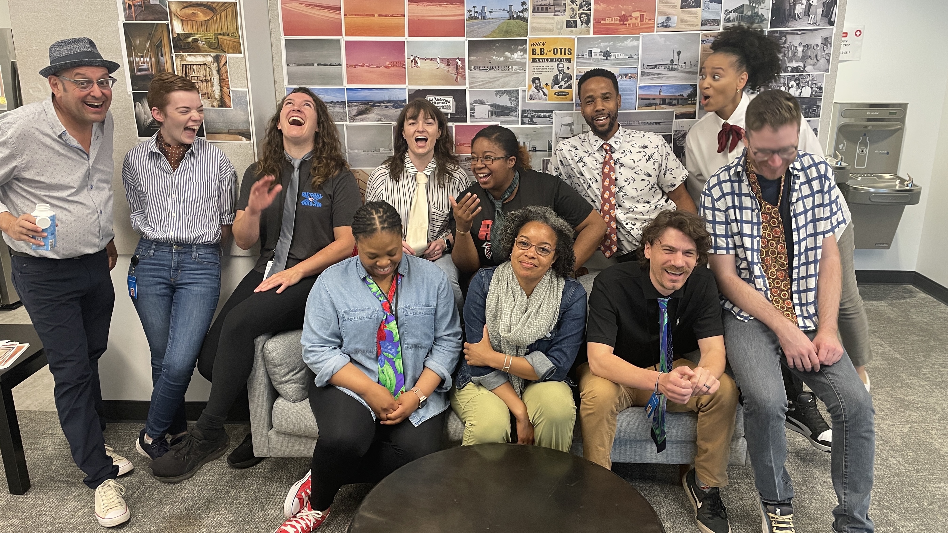
Toni Barton and the art department of “Fight Night”. Courtesy of Toni Barton.
Kirill: Looking back at the first 25 years of your career, what do you see as the biggest changes in this field?
Toni: The biggest change for me is how we consume media. When I was growing up, the entire family would sit down and watch a show, whatever was on. There were 4 or 5 channels, and everybody would want to have that water cooler moment the next day. You didn’t want to come in the next morning without seeing what happened on your show the night before, because everybody would want to talk about it together.
Now, everybody is in their private space – watching it live or for the fiftieth time on their phones or three seconds after it’s left the movie theater and is streaming.
My preference for episodic shows is to drop weekly – giving the audience a chance to breath with the story and to anticipate what’s going to happen the next week. I like that much more than digesting content all at once.
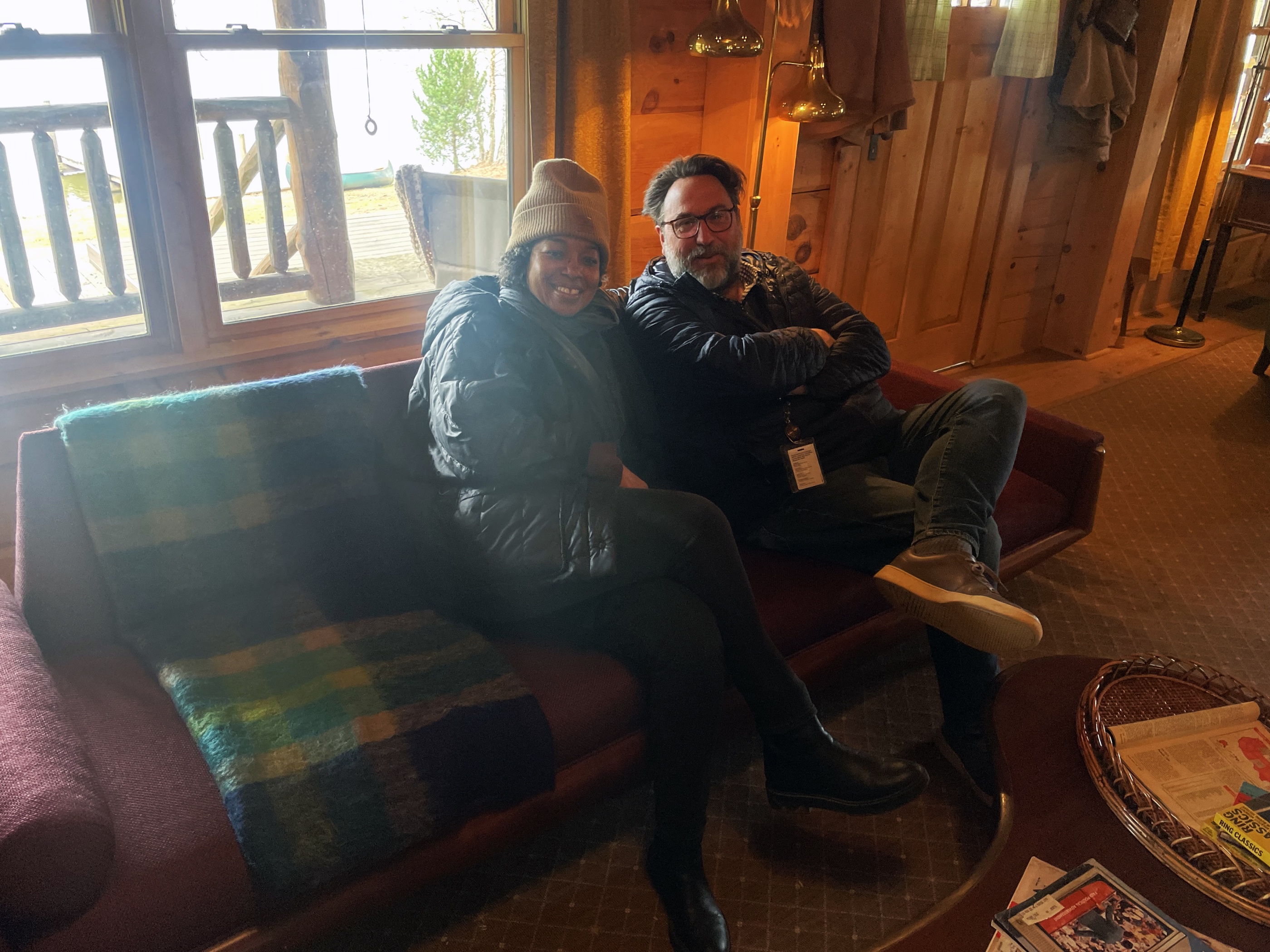
Toni Barton and Lance Totten, the set decorator of “Fight Night”, on the set. Courtesy of Toni Barton.
Kirill: From design perspective, did you start designing on paper, or was it already in the world of digital devices and tools?
Toni: When I was in architecture school I mainly drew by hand, not learning much on the computer until later when my studio professor told us “I don’t want anybody to think of AutoCAD as the designer. It is merely a tool. It is no different than using a pencil on vellum or ink on mylar”. Realistically, when I was an assistant art director drafting sets, I drafted only on the computer. But as a designer, I think with my hand. When I’m designing a set, a lot of times I’m on my drafting table. I’m figuring it out with a pencil, trace paper and a scale ruler. I’m constantly moving the pencil, sketching through ideas, or tearing off a piece of trace and taping it on top of another to develop my ideas from concept to reality.
At a certain point, I may hand off a sketch to my set designer. And sometimes they give it back digitally so I can modify my ideas in AutoCAD, thinking through the details. Designers use all sorts of tools today for 2D and 3D modeling. These tools might be on a computer or iPad. It might be the set designer or the illustrator making a 3D model or fly-through animation. It’s just the tools that we utilize to tell the story, but they’re not designing it. They are simply how we communicate our ideas.
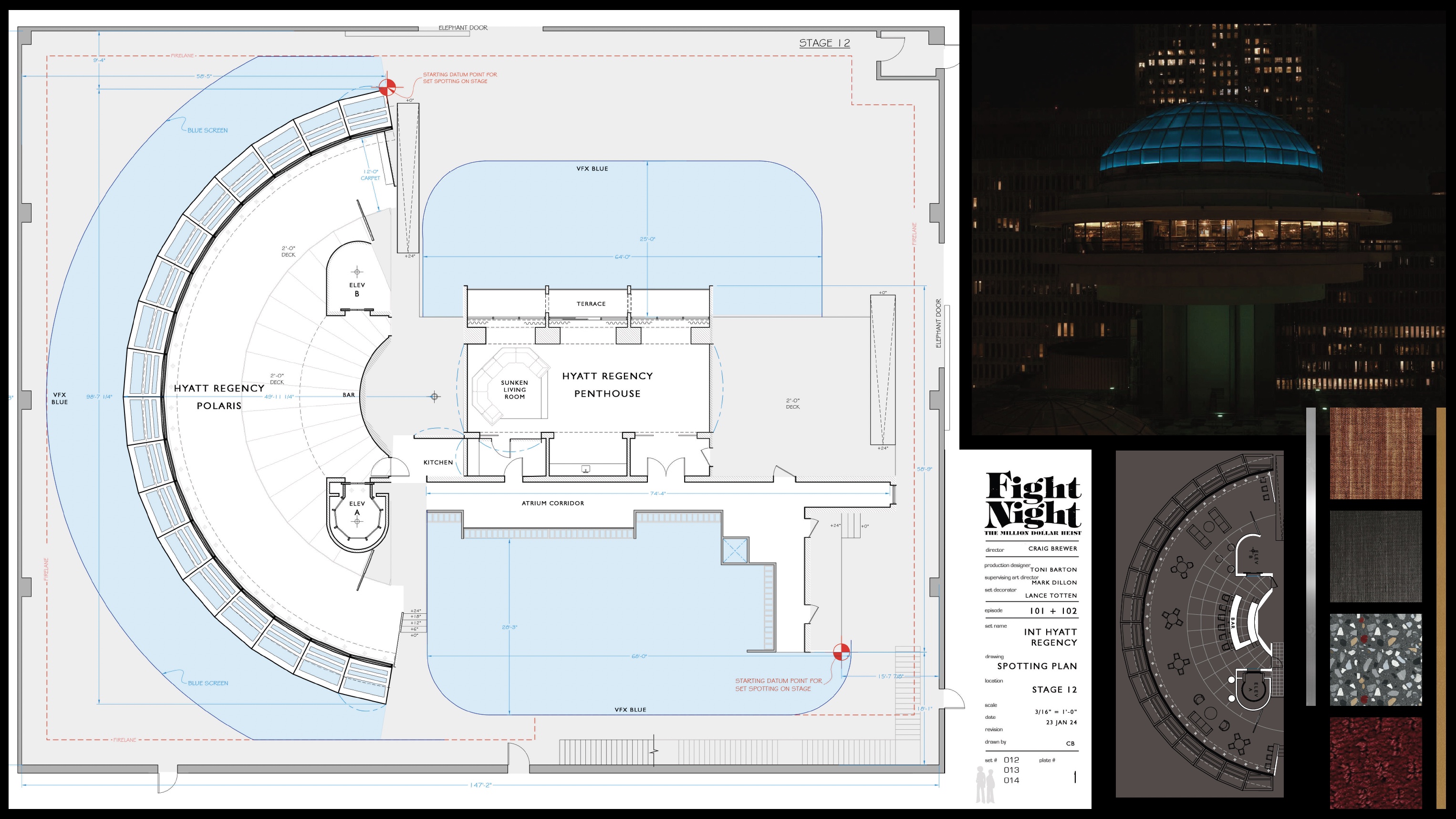
Floor plan and materials for the Hyatt Regency set of “Fight Night”. Courtesy of Toni Barton.
Continue reading »
After looking at how Radiance draws Swing components using container color tokens, we’re going back to the surface color tokens available for each container type (active, muted and neutral):
containerSurfaceLowestcontainerSurfaceLowcontainerSurfacecontainerSurfaceHighcontainerSurfaceHighestcontainerSurfaceDimcontainerSurfaceBright
Why do we need multiple surface color tokens? Why not provide a single containerSurface and be done with it?
For quite some time now, Radiance supported the concept of decoration area types – recognizing that application menu bars, toolbars and status bars are common examples of special containers found in most user interfaces. These containers create functional grouping of application controls and bring order to complex screens.
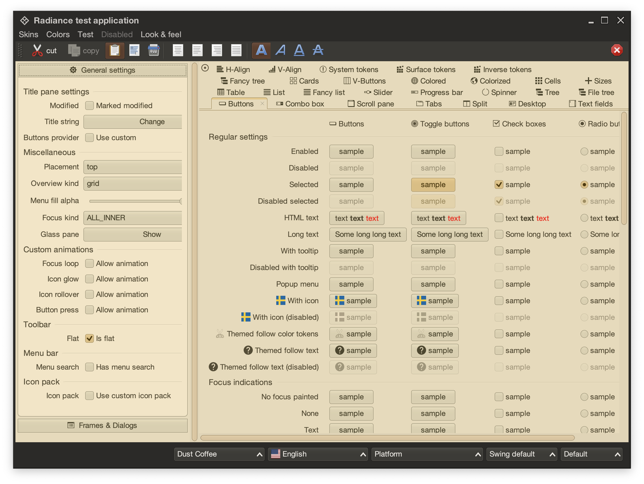
This is the main Radiance demo app under the Dust Coffee skin. At the top, we have the window title pane and menubar, rendered in a darker shade of grey. Under that we have the toolbar, rendered in a slightly lighter shade of dark grey. At the bottom we have the status bar, in the same darker shade of grey. The main application content is divided into two panes – control pane on the left and main / general pane on the right.
The visual grouping and separation of application content into distinct decoration areas follows the logical grouping of application content. The so-called “chrome” parts of the UI – title pane, menu bar, toolbars – are grouped to be visually distinct from the main app content. The same applies to the bottom status bar.
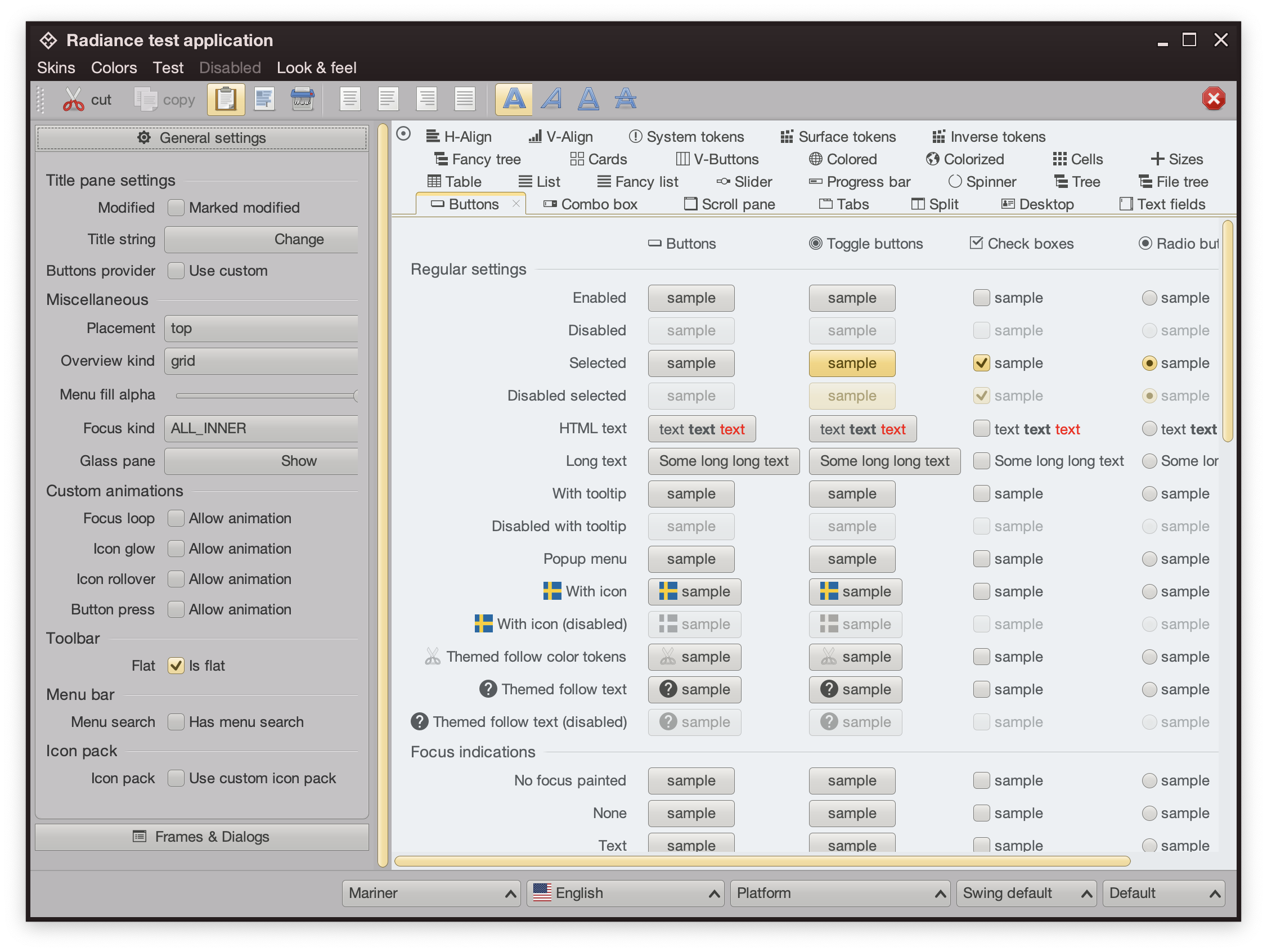
This is the same demo app under the Mariner skin. Here, a different design decision has been made. The title pane and the menubar are rendered with dark brown. The rest of the “chrome” – toolbars, control pane on the left, and the status bar are rendered in medium shade of grey. The main content is rendered with a noticeably lighter shade of grey.
Here we have the latest iteration of JetBrains’ IntelliJ, the so-called One Island style. The visual styling of various areas follows the logical grouping of relevant functionality – the title pane at the top, the tool window bars on the left and the right, the left sidebar with project and structure views, the right sidebar with the Gradle view, the bottom tool window with the Run view, and finally the main editor pane in the middle. This new styling uses different shades of grey to convey the logical hierarchy of the different tools and panes, from darker shades along the edges, to medium shades for tool windows, to the lightest shade for the editor.
The same visual grouping and separation is applied in the One Island dark variant, starting with slightly lighter shades of dark grey along the edges, to the darkest shade of dark grey for the editor.
The Claude Desktop app is another example of staying with the same desaturated yellow tones, using slighly darker one for the side bar, medium one for the main panel, and the lightest one for the user reply panel in the bottom right.
This is a concept mock of a sidebar by Jackie Brown on X, visually separating the product bar on the left from the inbox / selected product bar to its right. Using a slightly darker shade of grey for the product bar provides a clean separation between the two, without being too distracting.
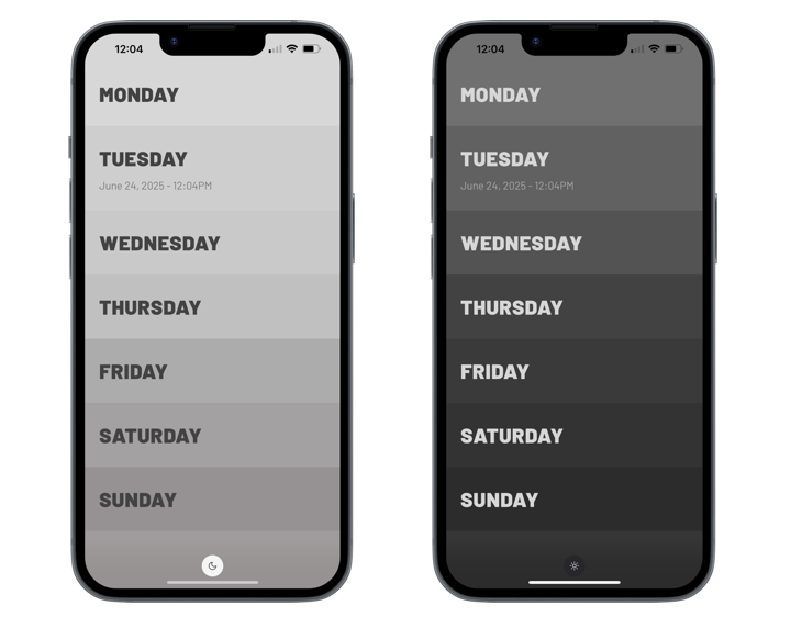
And finally, the minimalist note taking Weekstack iOS app uses a gradation of shades of grey to separate the days of the week, both in light and in dark mode.
The common thread between all these examples is that this visual grouping and separation is achieved by using a variation of shades (or tones, in the language of Material and Radiance Chroma) of the same main color. Let’s take a look at how the different surface roles look like in Radiance:
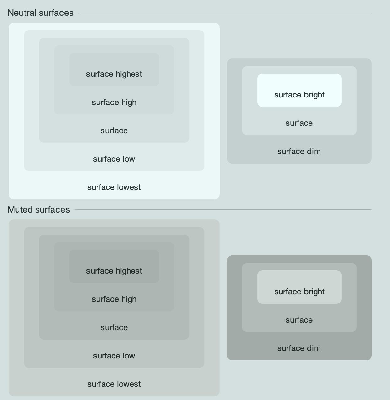
These are the surface roles under the Mariner skin, for neutral and muted containers. On the left is the hierarchy of surface roles from lowest to highest, and on the right is the hierarchy from dim to bright.
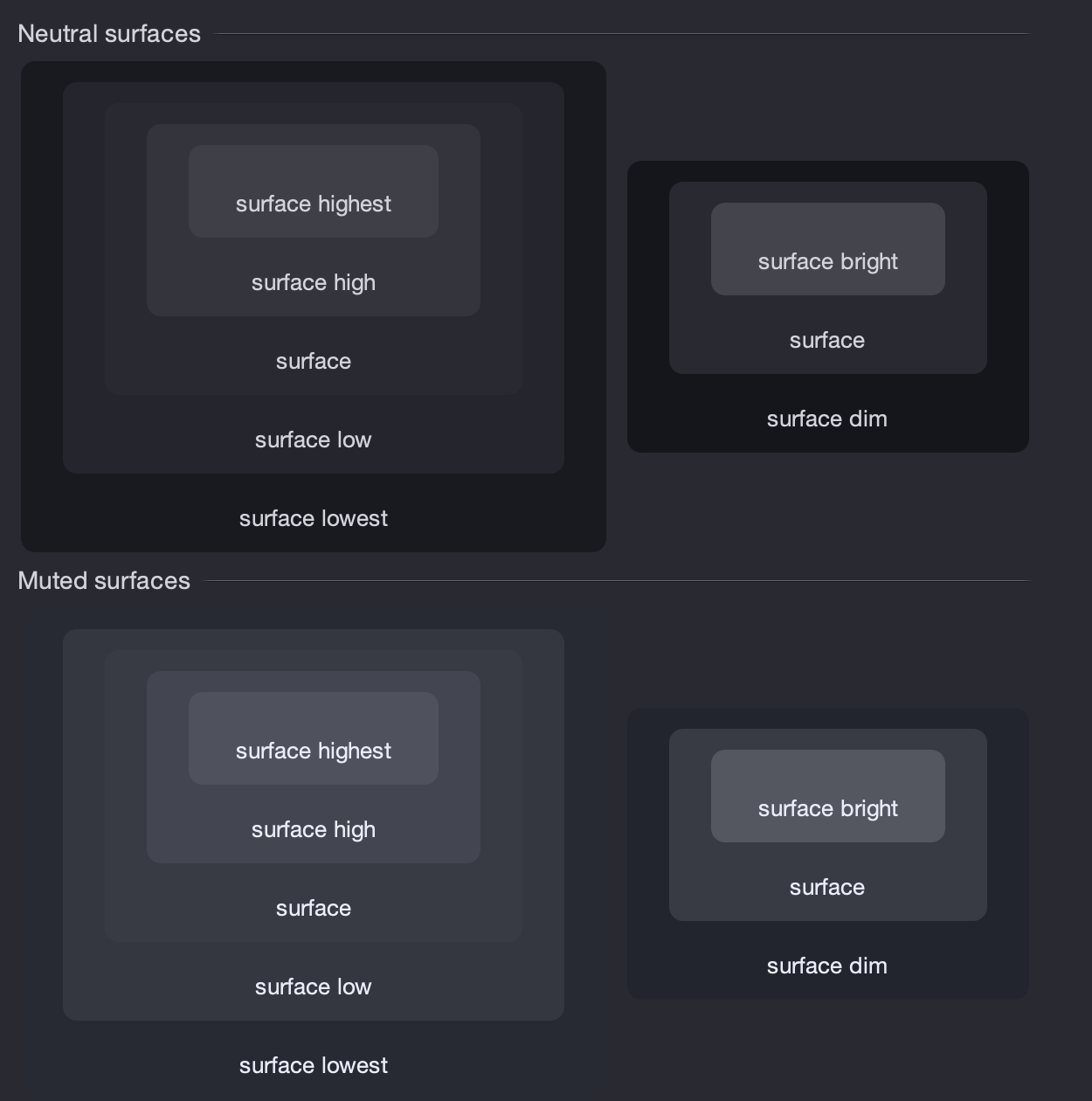
And here are the same surface roles under the Night Shade skin.
Comparing the Radiance surface color tokens across light and dark containers, it is important to note:
- The hierarchy of dim to bright will always have the bright token at a lighter tone
- The hierarchy of lowest to highest will have the lowest token closer to its “side” of the tonal spectrum, and the highest token going “towards” the opposite side of the tonal spectrum. For light containers, it means that the lowest token is the lightest, and the highest token is the darkest. For dark containers, it flips – the lowest token is the darkest, and the highest token is the lightest.
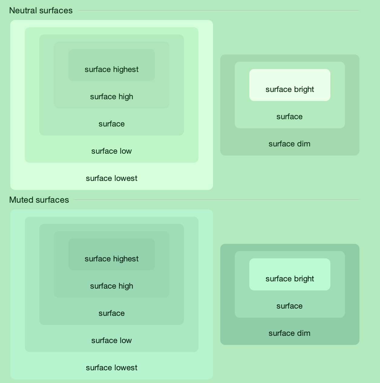
This also works for more “colorful” skins such as Green Magic – all surface color tokens are taken from the same tonal palette, preserving a strong visual connection between them.
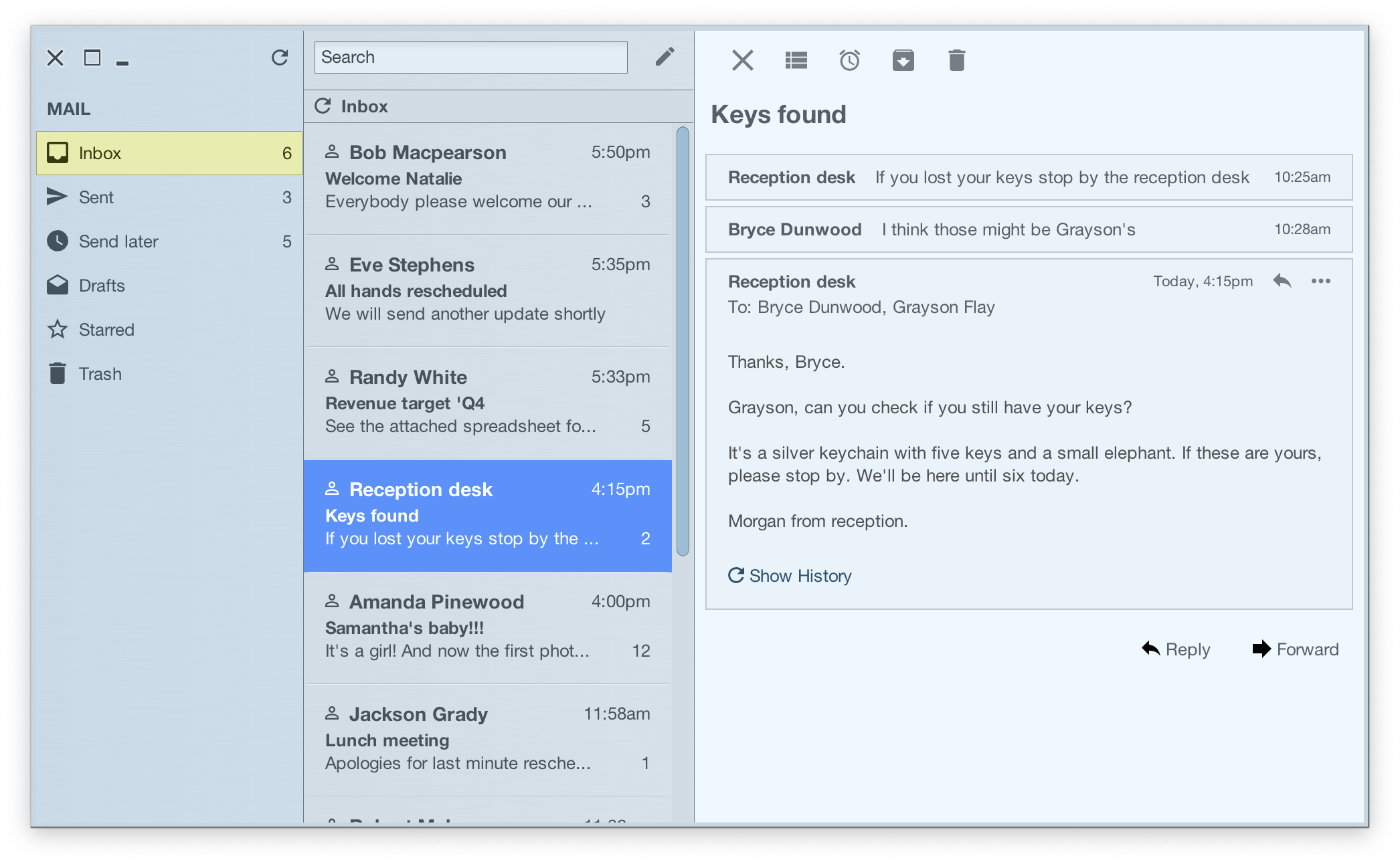
This demo app bundled with the Radiance shows the related concepts of decoration areas and surface containment working together. This app has three decoration areas – the light blue destinations on the left, the medium grey thread list in the middle, and the light grey thread on the right. And then, inside the thread panel on the right, this demo is using surface containment – containerSurface role for the overall panel, and containerSurfaceHighest for each one of the smaller nested boxes.
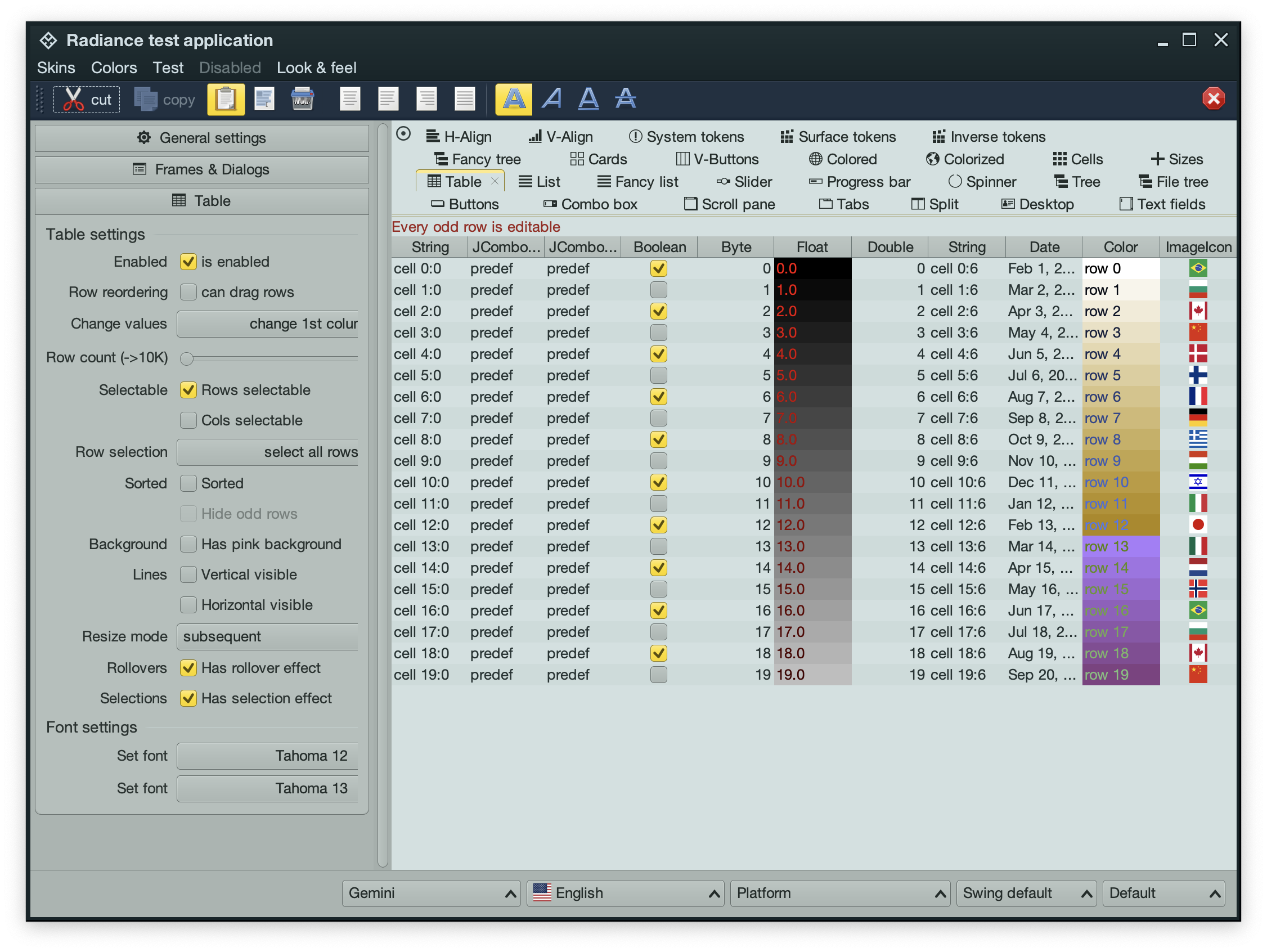
Going back to the main Radiance demo app, it is using the containerSurfaceLow color token for the nested configuration panels in the left-side control pane. This creates a visual separation for everything related to configuring the demo table, without being too distracting (since it’s using the same tonal palette that is used on the overall control pane) – and without the need to define a separate decoration area type for it.
In the next post we’ll take a look at the world outside of user interfaces to see it through the lens of color tokens, containers, and surface containment.
Picking up where the second part ended, let’s take another look at the same application UI rendered by Radiance and its new Chroma color system, in light mode and in dark mode:
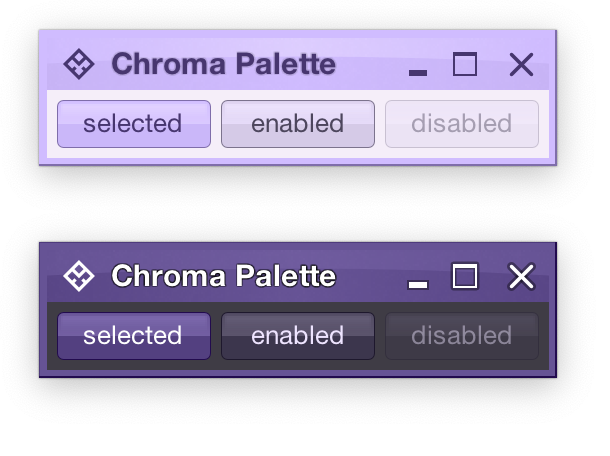
Recapping, Radiance has three types of containers – active, muted, and neutral. In this particular UI, the selected toggle button is drawn as an active container. The enabled button is drawn as a muted container. And the panel that contains the buttons is drawn as a neutral container.
Each container has three parts – surface, outline, and content. Radiance provides multiple color tokens to draw these parts, giving the apps the flexibility to choose a flat look, a gradient look, or any other custom look. In the particular example above, the surface part of each button (inner fill) is drawn with a vertical gradient that emulates the appearance of shiny plastic.
Let’s see how this approach extends to other Swing components rendered by Radiance
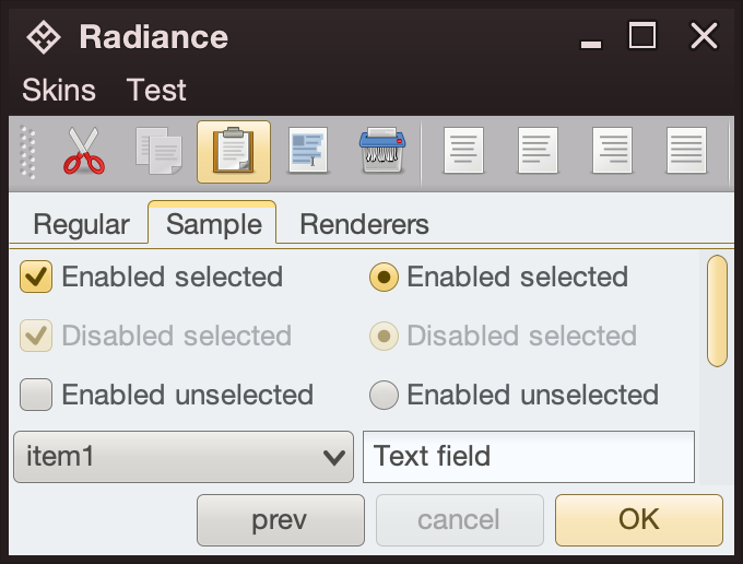
- The title pane and the menu bar are drawn as neutral containers, using dark brown as the seed color for the surface tokens
- The toolbar is also drawn as a neutral container, using medium gray as the seed color for its surface tokens
- The active tab is drawn with a combination of surface color tokens for the active container (the top yellow strip) and outline color tokens for its outline
- Selected checkboxes and radio buttons are drawn as active containers, same as the default “OK” button
- The scrollbar is also drawn as an active container
- The combobox is drawn as a muted container
- The text field is drawn as a neutral container, using a different / lighter surface color token for its inner fill

The same approach extends to renderer-based containers, such as the tree on the left and the list on the right
- The striped background is drawn with surface color tokens of a neutral container, alternating between
containerSurface and containerSurfaceHigh
- The highlights are drawn with surface and outline color tokens of an active container
The usage of containers and color tokens is not skin-specific. The UI delegate for a specific Swing component, let’s say a button, does this:
- Get the surface painter and the outline painter from the current skin
- Determine the decoration area type of this component (menu bar, toolbar, control pane, footer, etc)
- Ask the skin for the container color tokens that match the decoration area type and designated container type. For example:
- The button UI delegate will ask for neutral container tokens for enabled buttons, or for active container tokens for buttons in active states (selected, rollover, pressed, etc)
- The checkbox UI delegate will ask for neutral container tokens for an unselected checkbox, or for active container tokens for active checkbox (selected, rollover, pressed, etc)
- The scrollbar UI delegate will always ask for active container tokens – as a design choice in Radiance
- Ask the surface painter to draw the inner part of the component using the obtained color tokens
- Ask the outline painter to draw the outline of the component using the obtained color tokens
What is achieved by this separation?
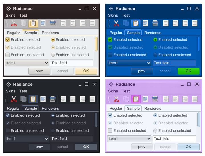
- Each skin defines its own colors for the different decoration area types, such as the purples for the title pane, the menu bar and the toolbar in the bottom right screenshot under the Nebula Amethyst skin.
- Each skin also defines the overall visuals of surfaces and outlines across all components, enforcing consistent application of visuals across buttons, comboboxes, scroll bars, checkboxes, etc.
- And at the same time, each component and its Radiance UI delegate is responsible for deciding how it combines the colors defined by the skin (for each decoration area type) and the visuals defined by the skin’s painters to draw its own distinct appearance.
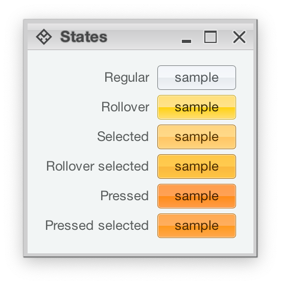
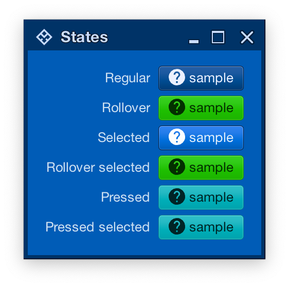
Radiance also provides support for using different color seeds for different active states. Seen above is the Office Silver 2007 skin and the visuals for the same button under rollover, selected, rollover + selected, pressed, and pressed + selected states. The application of the inner gradient fill is consistent, provided by the skin’s surface painter. The application of the outline visuals, including the slightly lighter inner outline, is consistent as well – since the skin’s outline painter uses the same color tokens – but from different color seeds provided by the skin.
And the same skin can mix light and dark visuals for different active states in the same decoration area type. Here, under the Magellan skin, components in rollover, rollover + selected, pressed, and pressed + selected states use light fill and dark content (text and icon), while the same component in the selected state uses dark fill and light content.
In the next post we’ll take a look at the flexibility provided by multiple surface color tokens, and how they can be used to build up a visual hierarchy of content in your applications.
