Continuing the ongoing series of interviews with creative artists working on various aspects of movie and TV productions, it is my pleasure to welcome Gonzalo Amat. In this interview he talks about technology changes in the field of cinematography, set dynamics and collaboration through communication, finding the balance between technical and artistic aspects of storytelling, and the world of episodic productions . Around these topics and more, Gonzalo dives deep into his work on “The Man in the High Castle”, alternate history of post-World War II where the Axis powers have divided the United States and assimilated the citizens into different cultures.
Kirill: Please tell us about yourself and the path that took you to where you are today.
Gonzalo: I watched a lot of films since I was little, but I didn’t really ever think about working on film as I didn’t know you could have that as a career. But I did have a still camera throughout my school years, and I would take photos everywhere. As I was getting closer to college age, I started getting interested in literature and storytelling in general.
When I was in college, I started out studying communications, and didn’t get to film until later. It slowly came together, as you take novels as narrative, and add visuals through photography to make a film. I started working in productions as a production assistant, and when I was sure that it was what I wanted, I went to the London film school. After that I moved back to Los Angeles where I studied in the American Film Institute, and I’ve been shooting since – everything from documentaries to art films, from short movies to TV and streaming.
Kirill: Looking back at your early days in the industry, was there anything particularly surprising or unexpected for you?
Gonzalo: A set is always such a weird place to be on. I’ve been there for half my life already, but I still think it’s a very strange place. Everyone is always running around, and then suddenly everyone stops and it’s complete silence, and then everyone runs again. It’s this kind of mix of energy that’s interesting and focused. There’s really nothing like it.
It’s so special to see all these people, each one doing their own job, and everyone comes together. Then, when you roll camera, everyone quiets down and you have all this energy concentrated into one small space that goes through the camera. The energy on the set still surprises me to this day.
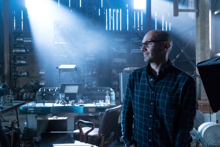
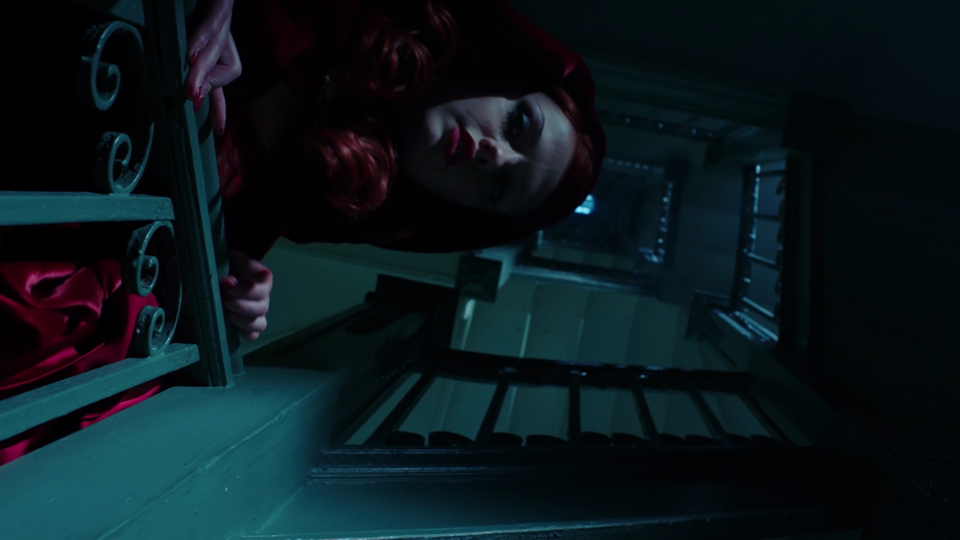
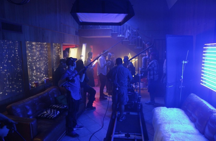
Behind the scenes on the sets of “The Man in the High Castle”. Courtesy of Gonzalo Amat and Amazon Studios.
Kirill: Now that you’re working in the industry, how does that affect you as a viewer? Do you catch yourself analyzing how they made a particular shot, or do you get to enjoy the story itself?
Gonzalo: In a way, yes. When I’m in the middle of a project and I’m watching something, all I can see is how they did it – so I don’t really enjoy it. But if I’m able to disconnect, then I’m able to enjoy the story even more. If you don’t get pulled in, then you see the strings behind it and it’s not that enjoyable. But if it’s well done, if it’s powerful and it just sweeps you away, you admire it more than the average viewer. You know how much effort went into it.
I like watching movies, because I’m looking forward to see if it’s going to sweep me off my feet, or if I’ll end up thinking about how many days it took to shoot the scene.
Kirill: You mentioned “when you roll camera”, but that’s almost obsolete now that digital has taken over. If you look at these first 20 years of your career, how different is it today compared to when you started?
Gonzalo: It’s pretty different. When I started, there was just video assist. You could see what the camera was doing, but there was no way of telling how it would look until it got developed. There was a little bit of a magic element to what we did as cinematographers. Some people complain that it’s lost and that the magic is gone. But I don’t see it like that.
I see it as another way of communicating with someone. You communicate with the director, and you both see something that is quite close to what the final image is going to be. You can discuss if it should be darker or cooler or warmer. You’re still the cinematographer. You are telling the vision of the director and not only your own vision. The more tools you have to communicate, the better it is, especially on subjective things like color or brightness.
Technology has also changed the way we do color correction in post-production, and the way we work with lights on set. You can program lights and change light during a scene. It can be programmed to change color during the scene, and you have other nice storytelling tools like that. Nowadays we can be shooting an exterior scene, and program lights to simulate a cloud passing by. You make the backing light a bit darker for 30 seconds, and then bring the brightness back up. It’s subtle. It gives you a sense of realism, even if the viewer doesn’t notice it on its own.
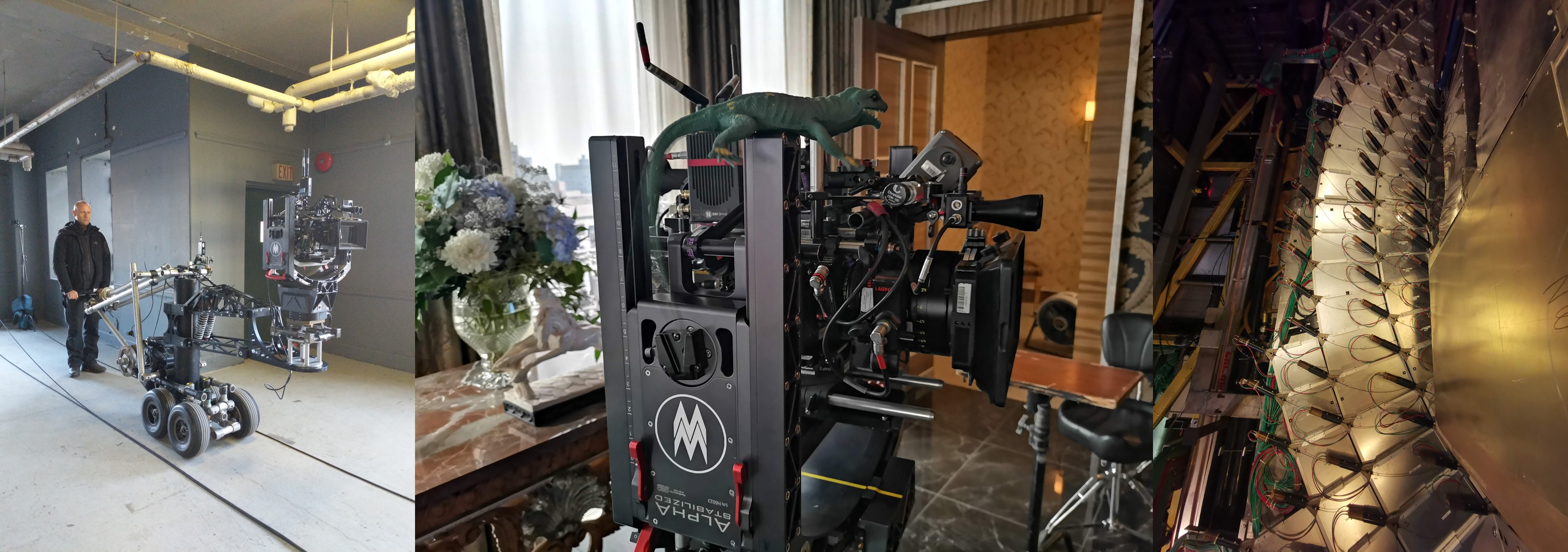
Behind the scenes on the sets of “The Man in the High Castle”. Courtesy of Gonzalo Amat and Amazon Studios.
Kirill: Is it time-consuming to keep track of all these changes in technology?
Gonzalo: Quite so. When you’re shooting, you can’t dedicate the time to anything else. So every time I have a break, I have to brush up on what came out and stay up to date. You have new cameras, new lenses, new lights coming out all the time. It’s hard to keep up. But it’s also part of the job. I like to test new things every once in a while. It’s nice to use new technologies and not get too used to the old ones.
Kirill: Between the technical and the artistically parts of it, is one more important than the other?
Gonzalo: You have to have a good balance between the two, even if sometimes you end up paying more attention to one. When you read the script, you start with the artistic part to get ideas. Then you translate that to the technical side – what lights do we need, what cameras we are going to use, how do we shoot it. And then, when you’re on the set, you go back to the artistic part. It’s kind of a full circle, and you constantly have to go back and forth between the two.
My approach is to keep it more on the artistic side until I get to talk to the director. I take it from Conrad Hall who would discuss the idea with his crew, before executing it. If you know the crew, the technical part of it is known to them. They know what to do. So I prefer to keep it on the artistic side, even though the technical side is important for completing the production.
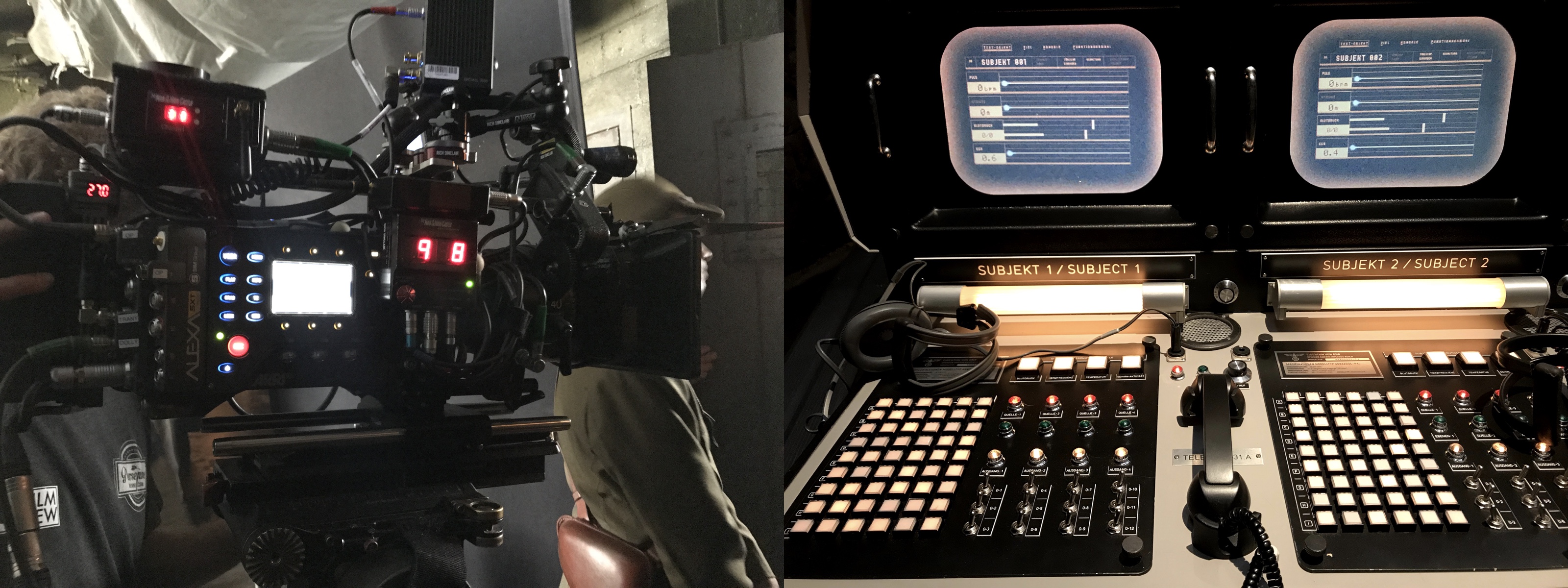
Behind the scenes on the sets of “The Man in the High Castle”. Courtesy of Gonzalo Amat and Amazon Studios.
Continue reading »
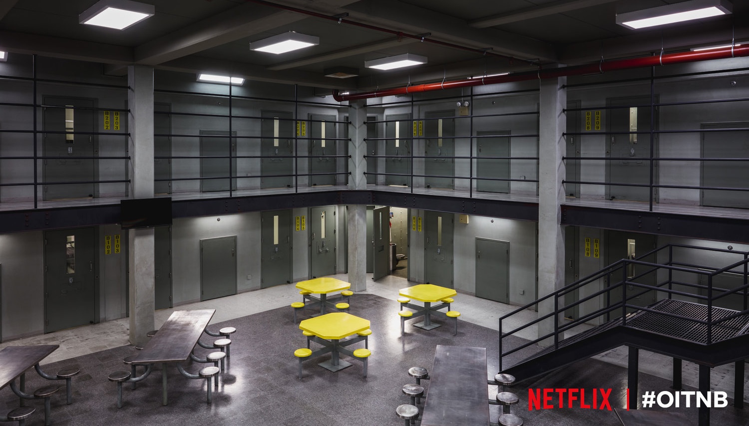
Continuing the ongoing series of interviews with creative artists working on various aspects of movie and TV productions, it is my pleasure to welcome Malchus Janocko. In this interview he talks about changes in the world of episodic TV productions in the last decade, crafting the worlds for contemporary dramas, maintaining visual consistency across a season arc, getting attached to the sets, and what keeps him going in the field. Around these topics and more, Malchus goes back to his work on “Gossip Girl”, and dives deep into the last four seasons of Netflix’s “Orange is the New Black” and various aspects of the production design of the show.

On the sets of “Orange is the New Black”. Left – Lee Malecki, set decorator. Center – Malchus Janocko, production designer. Right – Geoffrey Ehrlich, art director.
Kirill: Please tell us about yourself and the path that took you to where you are today.
Malchus: My father took me to see “Alien” at an ungodly early age, and that’s how I started [laughs]. My father’s a physicist and my mother’s an art teacher. I always thought that I would want to go into art or architecture, and somehow I found myself heading into this, after a whole string of events. I have an undergraduate degree in fine art painting from Rochester Institute of Technology, and after that I applied to Carnegie Mellon as a scenic artist, thinking I could go to school to paint scenery for theater. I had done a lot of theater in high school and some during college.
I applied on a whim and I was accepted, but they accepted me as a designer – and I didn’t know that until I got there. I thought that I had been accepted as a painter [laughs] and I had to make a decision at the time, and decided to stay. I finished that program, moved to New York after graduate school, and I worked for a firm doing corporate theater, exhibitry, events, car shows, corporate meetings etc. We did a series of ice sculpted shows for Opryland hotels and all kinds of things. I worked there for 7 years, then I worked at an events company for a year as their design director, and then I had an opportunity to move into the scripted field.
I’ve worked with Loren Weeks for many years, and he asked me to come on to a straight-to-video Wesley Snipes movie that was shooting in Providence, Rhode Island. And I’ve been in narrative and scripted world ever since, which has been fantastic. I think that all of your experience leads you to where you want to be. I used all of that event experience on “Gossip Girl” during the 5 years that I’ve worked on it as the art director for Loren Weeks. I worked on “I Am Legend” for almost a year as an assistant art director. In between seasons of “Gossip Girl” and “Orange is the New Black”, I was able to work on “The Amazing Spider-man 2” and some of the Marvel “Defenders” for Netflix.
When “Gossip Girl” season 6 happened, my boss moved on and I was able to start production design on it. I’ve done lots of art direction, and I’ve been production designing for the last 6 or so years.
On the sets of “Orange is the New Black”. Courtesy Malchus Janocko. See notes at the end for full credits.
Kirill: If you look back at this span of the last decade in your career, do you feel that the productions demand more these days?
Malchus: Absolutely. I feel like the quality has gone at the same time as the amount of content we have out there. It’s not that the quality is going down as there is more content, at least as far as art direction, scenery and set decoration goes. Everybody wants higher quality work, or people just won’t watch. The quality of writing has also increased greatly. We have so many amazing things to watch now.
Kirill: Is that only on the technical side, as the cameras are getting better, or also on the artistic side to support the depth of the story lines?
Malchus: You can look at soap operas versus HBO, and how quickly they do lighting on soap operas. When we started “Gossip Girl” we had to move so quickly that we didn’t do full ceilings. We would leave the ceilings open and light through the ceilings, and it allowed the shooting crew to move more quickly. That was also good for the ability to light those actresses well, which wasn’t the same as how lighting in a grittier show might be done.
The high-resolution cameras made a big difference. I used to call it the HBO thing where you have these low angles where you see all of the ceilings. If you look back on older TV productions, you wouldn’t see a lot of low angles because there were no ceilings. Then things started to shift. My big shift was on “The Leftovers” – money-wise, budget-wise and look-wise. That was indicative of how everything has gone in that direction. There have always been really beautiful shows, particularly on HBO. I worked as an assistant art director for Bob Shaw on “Mad Men”, and that was a big influence on me.
Kirill: Is it hard nowadays to do a 22-episode season when it’s competing against shows that have between 8 and 13 episodes?
Malchus: I’ll be able to answer that at the end of this season. I’m doing the second season of “FBI”, and the last time I did a full 20+ episode season was on “The Mysteries of Laura”. It’s off to a good start and it feels just as rich, even if our shooting schedule is more abbreviated. On season 7 of “Orange is the New Black” we had 10 shooting days per episode, and on “FBI” we have 8 – even when you’re filling the same amount of time. Does it get the same amount of attention? It’s hard [laughs].
The other thing is whether or not every episode has the same scale. You may have one episode that’s up, and one episode that’s slightly smaller in scale, but the story should remain the same quality.
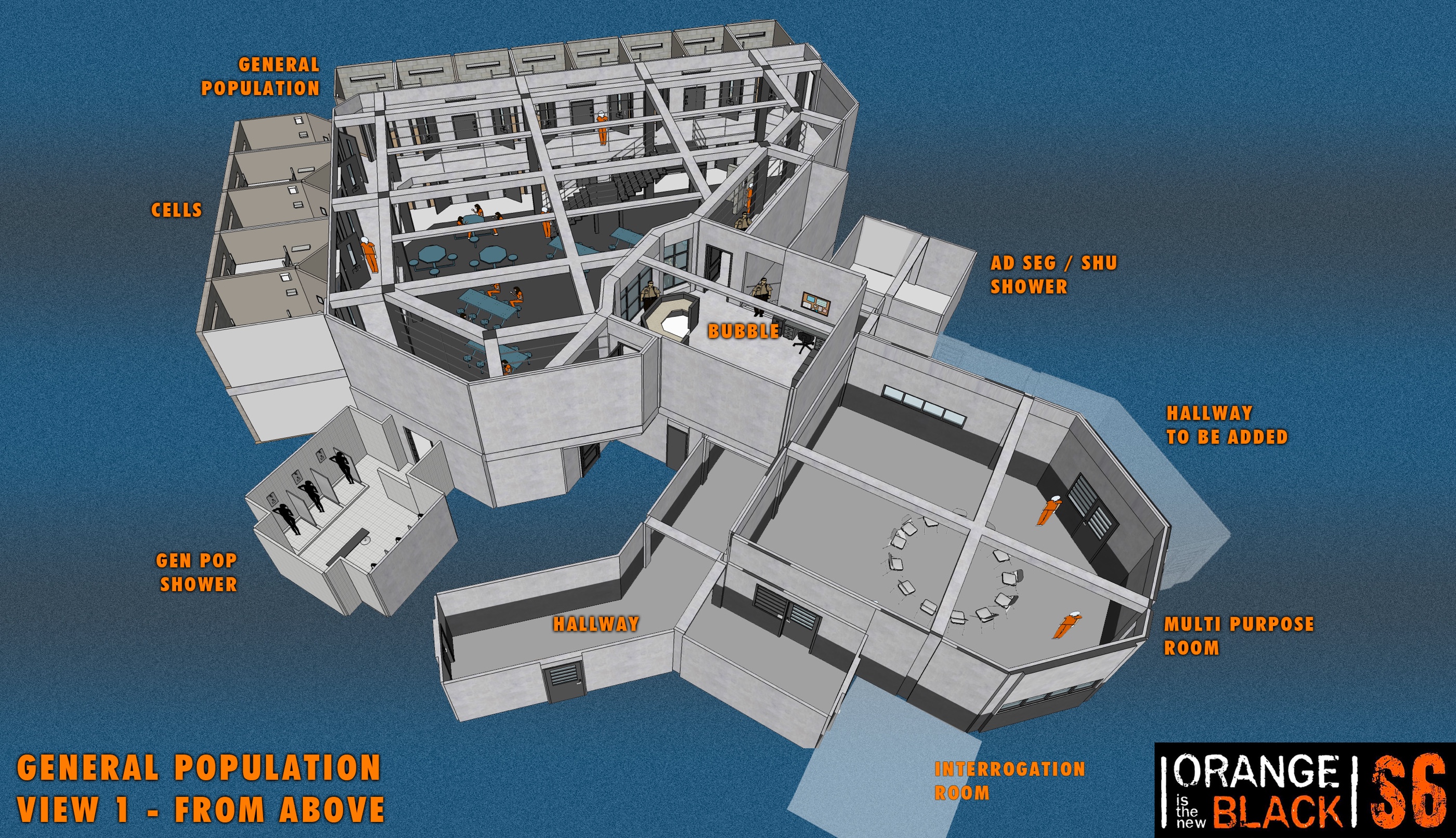
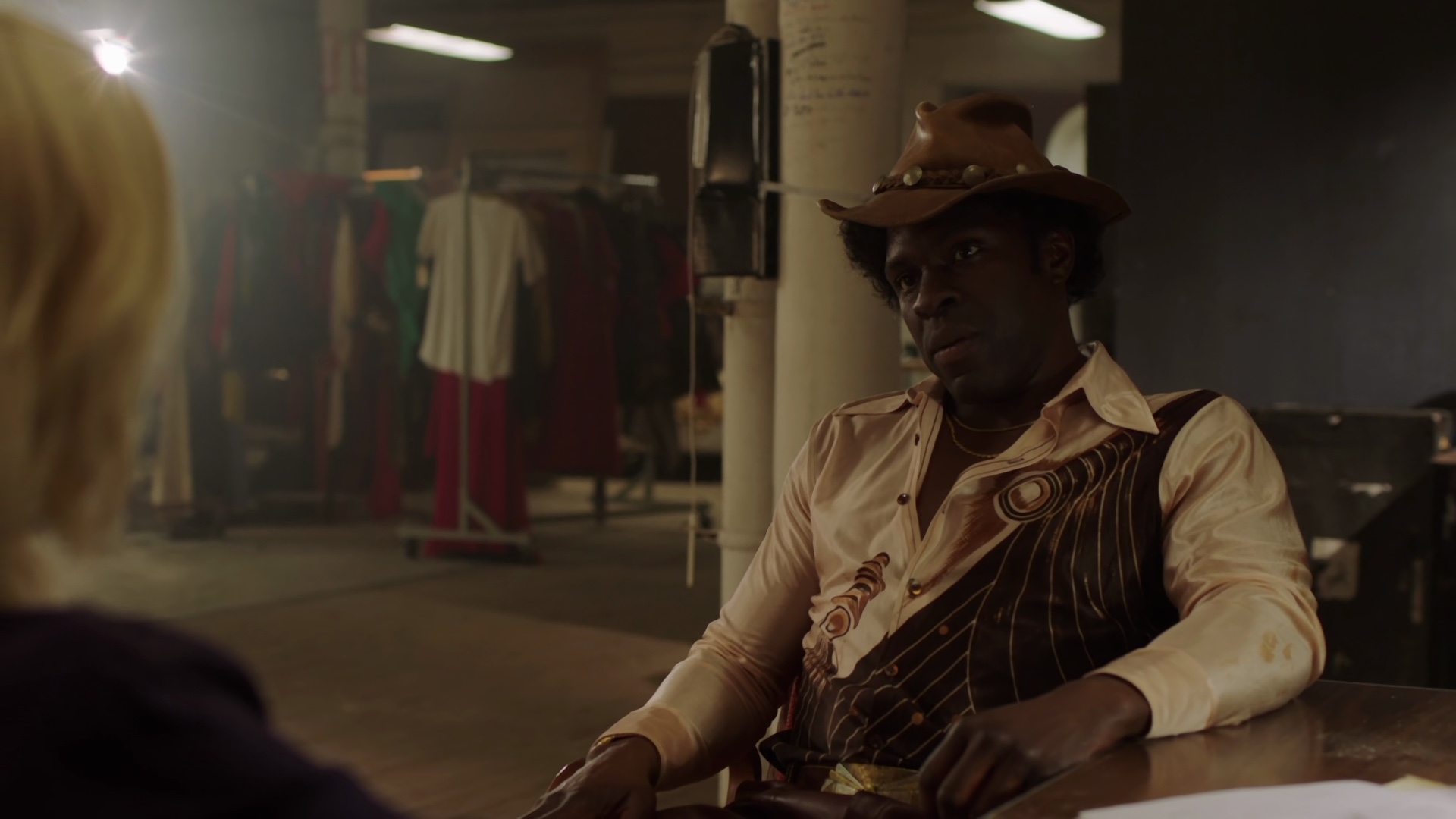
Set renderings for “Orange is the New Black”. Courtesy Malchus Janocko. See notes at the end for full credits.
Continue reading »
Continuing the ongoing series of interviews with creative artists working on various aspects of movie and TV productions, it is my pleasure to welcome Yaron Orbach. In this interview he talks about the beginning of his career and technical changes in the last 15 years as the industry has shifted from film to digital, the various facets of cinematographer’s responsibilities on and off the set, and the balance between bringing fresh perspectives and maintaining consistent visual look across season arcs in episodic TV productions. Around these topics and more, Yaron dives deep into his work on the second season of HBO’s “The Deuce”.
Kirill: Please tell us about yourself, and the path that took you to where you are today.
Yaron: I was born and raised in Israel, and from a very young age I was interested in watching movies, a love my parents introduced me to. I had the opportunity to go to Alon High School of Arts and Sciences in Israel, which had different art programs – from theater to dance to video. I was about 15-16 at the time, and I was doing 2-3 minute short films on Super-VHS, learning basics of screenwriting, directing, editing, photography, film history, etc.
It was a great experience to have at a very young age, and most importantly I was working with a group of like-minded kids. The first thing I fell in love with, was the teamwork. That was the thing that I enjoyed the most during those high school years. You shoot each other’s movies, you act in them, you edit them together, and we were evolving as a group. By the second year of the high school there were people who were more drawn to directing, or screenwriting, or editing.
Everyone kind of found their niche by the second year, and mine was the photography. Some of it must have come from my family background. My father was a publisher with an affinity for graphic design, and so was my grandfather. I wasn’t pushed into it, but it was in the air. Between liking movies and finding that opportunity to be in a program that gives you an insight into how to do it, I was naturally drawn to that side of it. I loved thinking about lighting, composition and everything else on the photographic side of things. I was doing everything in the first year, and I found myself enjoying that part of it more.
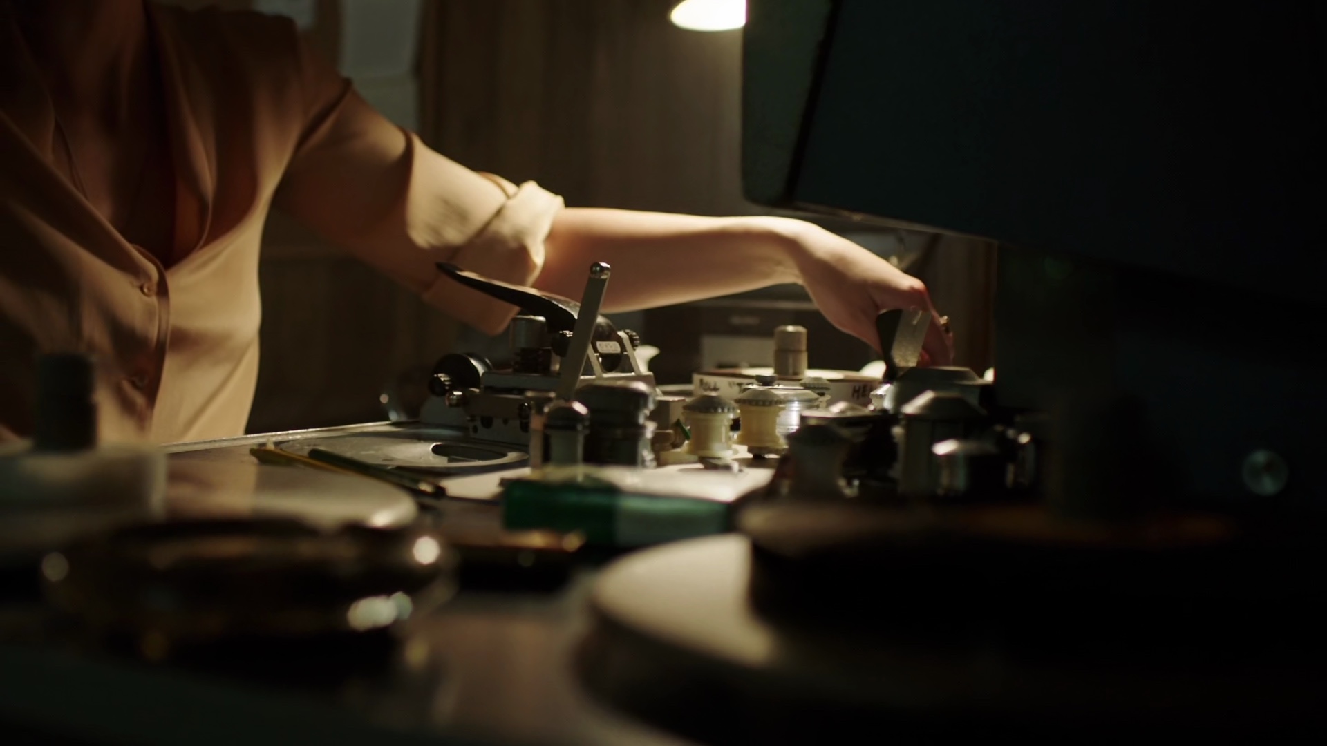
Second season of “The Deuce”, cinematography by Yaron Orbach.
After I finished high school, I went to the Israeli Army for three years, completely detached from anything that has to do with film. I was serving in a combat unit, and by the end of it I already knew that I wanted to continue my film studies in the US. I wanted to broaden my horizons after getting the taste for it in high school. So I found time during my last year in the army to prepare for the SAT exams, to fill applications and send letters for a few schools in the US.
I was 22 when I finished my army service, and 6 months later I found myself in New York, going to the film program at the School of Visual Arts, majoring in cinematography. That was the beginning of my journey in New York, and that’s where I’ve been since August of ’97.
Kirill: Do you feel that it’s easier to get into the industry these days? The equipment is more affordable, and that might be opening doors for a wider variety of indie productions.
Yaron: I graduated from college around May of 2001, and the first few years were difficult. I was doing short films for free, and little by little I got into working on small indies, working for free just to get that experience. It was hard, to be honest, but a good kind of hard. You don’t have the same responsibilities when you’re young and unmarried. That allowed me to live the life of a starving artist for a few years – and enjoy it.
To your point, when I started out, I worked with film and video just started to come out. A few years after I graduated we started getting into shooting on video, as it was getting good enough to experiment with. Probably there is an advantage to it being quite accessible these days. If you want a little practice, you can spontaneously pick up a camera and shoot something. But that is all about the technical side of it.
If you want to do good work, you need a good script behind it. You need a good story, a good director, a good concept and good actors. The technology can only take you so far.
Second season of “The Deuce”, cinematography by Yaron Orbach.
Kirill: If you look back at these last 15 years or so, is it that much different shooting on digital today compared to shooting on film back then?
Yaron: In my particular case, the way I shoot digital is similar to the way I shot film back then. I made that transition about 7-8 years ago. Up until then I worked primarily with film, and these last years have been all digital. The way I like to work is to use available light and practicals that are embedded in the production design of the set. Because of this naturalistic approach, I’m shooting digital the same way I shot film.
I used to push the film a stop or two to get more sensitivity out of it. I used the same natural light, and the same practicals and lamps on set. I haven’t changed my approach much. If anything, the video cameras have made it easier to push the boundaries of making things look naturalistic. These cameras are so sensitive with regards to exposure, whereas film was a bit less. But truthfully, it wasn’t much less. You would take a 500 stock and push it to 1,000, and it saw what my eye saw in many ways.
I would say that the biggest change for me is the ‘magic aspect’ that you had before. No matter how many times you used it, it still managed to surprise you a bit. It might have been a texture that would look a bit different. It might have been the light that would hit something a bit differently. Or maybe it was because it is a chemical process. And now you can see it straight away on set. You can experiment with it a bit more on location, and know that you have it. You sleep a bit better at night, but you do lose a bit of that anticipation of opening that morning email from the lab that everything is OK.
It goes both ways. Sometimes I miss that kind of excitement of seeing it for the first time, because that little surprise was always there. On the other hand, I also enjoy finishing my day of shooting and knowing that I have it. What you see on the monitor on set is what you captured, so it goes both ways.
Second season of “The Deuce”, cinematography by Yaron Orbach.
Continue reading »
It’s loud. Irreverent. Vibrant. Vivid. Uninhibitedly visceral. And it’s not afraid to look at many of the issues that are polarizing our society in the last couple of years – from gender identity to women’s agency, from fascination with social media to mob mentality, and how things might look like when being outraged over the most inconsequential things is taken to its logical extreme.
Continuing the ongoing series of interviews with creative artists working on various aspects of movie and TV productions, it is my pleasure to welcome Michael Grasley. In this interview he talks about this roots in the field of architecture, how art direction can make itself invisible to the audiences, choosing his projects, and his measure of success. Around these topics and more, Michael dives deep into his work on last year’s “Assassination Nation”.
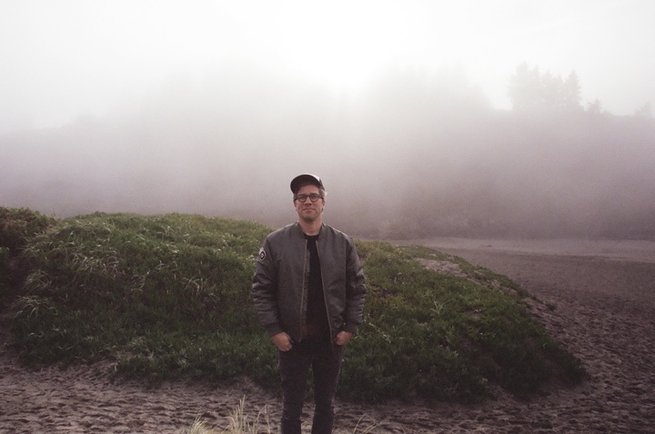
Michael Grasley. Photography by Elissa Knight.
Kirill: Please tell us about yourself and the path that took you to where you are today.
Michael: I didn’t go to film school. My path was a more circuitous route. I was always interested in design and I was always really passionate about film. When I was a teenager, I would watch all the end credits and take note of the cinematographer or the costume designer. I was passionate about film in that way – understanding how the films related to each other, or the director’s previous projects.
I went to art school and studied industrial design and later ended up going to graduate school for architecture. The thing about architecture that I loved as a student was that you work in this studio environment with a dozen people and you work crazy hours and it’s super intense. The culture of that is actually great training for working in film. You get these projects that last for 3-4 weeks, and the focus is on communicating your ideas. You have visiting designers, architects and professors from other academic institutions coming to see the work. You present to them and they critique it.
Architecture school is notorious for being harsh in a way that is not personal. It takes away being overprotective of your ideas. If it’s a strong idea and if you communicate it properly, then you have success. And if it’s not that strong of an idea, and / or if you can’t communicate it, you fail.
After grad school I got involved with design work for theater projects where I was able to work closely with the actors during the rehearsal process. That was really an amazing experience. I was living up in Seattle at the time but I had friends who were working at Ridley Scott’s company, RSA, doing commercials for a couple of big directors. They basically talked me into coming to LA. The lure of those original paychecks and the free-lance lifestyle was pretty seductive compared with what I was doing at that time.
At first I worked on art crews doing mostly commercials and music videos, but I would also do mood books for directors to present to clients. Basically putting images together into some kind of meaningful narrative for a pitch.
At a certain point one of the designers I was working for said to me “There are so many of these little films happening, why don’t you just start designing movies if that’s what you want to do?”
Kirill: Going back to your background in architecture, there you create something physical. You can get close to it, look at it from different angles, reach out your hand and touch it. How would you compare that with what you do for film or television, which might be more temporal or ephemeral?
Michael: That is true until the moment the film is released and then it lives forever. For good or for bad! I subscribe to the Roland Barthes theory that architecture and film are akin to one another. For instance, with a painting you might only glimpse at it and move on. Then compare that to cinema where you have to watch a film from beginning to end in order to understand the narrative. You might choose to walk out early, but you would also forfeit the experience. It is the same with a building. You step inside and in the logic of the architecture there is a narrative path. They both have a captive audience.
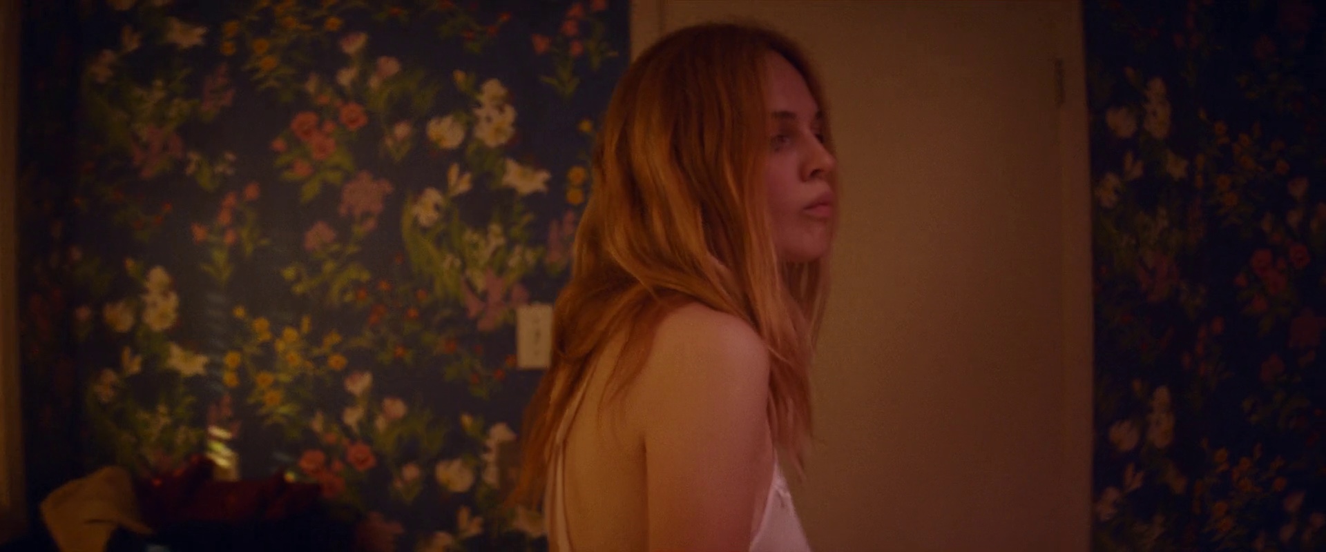
On the set of “Assassination Nation”. Photograph by Monica Lek. Courtesy Michael Grasley.
Continue reading »
