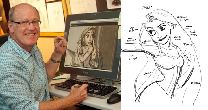
Glen Keane is one of the top Disney character animators, famous for his work on “The Little Mermaid”, “Pocahontas”, “Aladdin”, “Tarzan” and, most recently, for the remarkable Rapunzel in “Tangled”:
My sketch books and the figure drawings are the source for everything I’ve ever animated. It’s all these observations. The little things that make a huge difference. You don’t see it unless you are drawing it, and you have to draw it. In order to draw it, you have to have observed it. You can see it, or you can really see it.
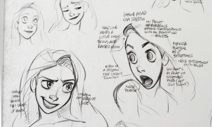
Glen’s spartan sketches show how a trained artist needs just a few strokes to express genuine human emotions. The master sketches provide annotated guidance for character modelers, and animators, highlighting the connections between key anatomical features.
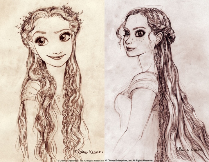
Further character development depends on the artistic vision of the movie directors, pushing the boundaries of computer graphics and material modeling. In this detailed sketch Claire Keane explores the intricacies of Rapunzel’s magic hair.
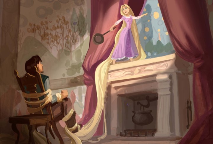
Storyboard artists work with the script to translate it into the key scene frames (which may happen even before the conceptual art exists). The story board is much less about character fidelity or fine facial expressions. It is about positioning the characters, defining camera angles, and high-level body expressions. A storyboard artist Mark Kennedy has posted a veritable treasure trove at his blog (part 1, part 2, part 3):
As a storyboard artist you want to get as many things right as you can: nail down the characters and their relationships and their personalities, of course, as well as all the story events, but also the staging, the layout and the look of everything as best you can. The more you can give the departments that come after you, the less time they have to spend inventing things out of thin air and the more time they can spend adding those great layers to what we’ve given them and turn our initial thoughts into the beautiful and nuanced end product.
The story boards and the conceptual character art are then taken by the visual development artists. The mood, the tension and all the script intricacies of the specific scene come alive with scenery, inanimate objects, textures, colors and ambient lighting.
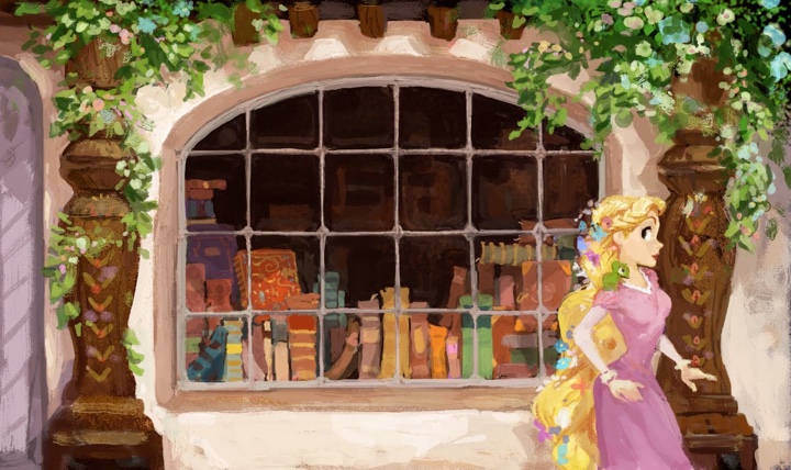
The bookshop scene did not make the final cut, but this artwork by Scott Watanabe is a perfect specimen of translating the festive mood of Rapunzel finally realizing her lifelong dream. Bright sunshine, colorful flowers in her hair and lush verdant vines sprawling down the wooden columns frame the veritable color bonanza of book display in the wide front store window. Aquamarines, oranges, yellows, purples and browns are masterfully arranged to create an inviting, yet not overwhelming backdrop to the “best day ever”.
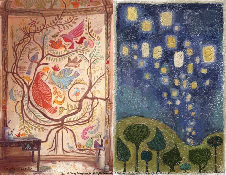
Mural artwork by Claire Keane highlights Rapunzel’s desire to explore the outside world.
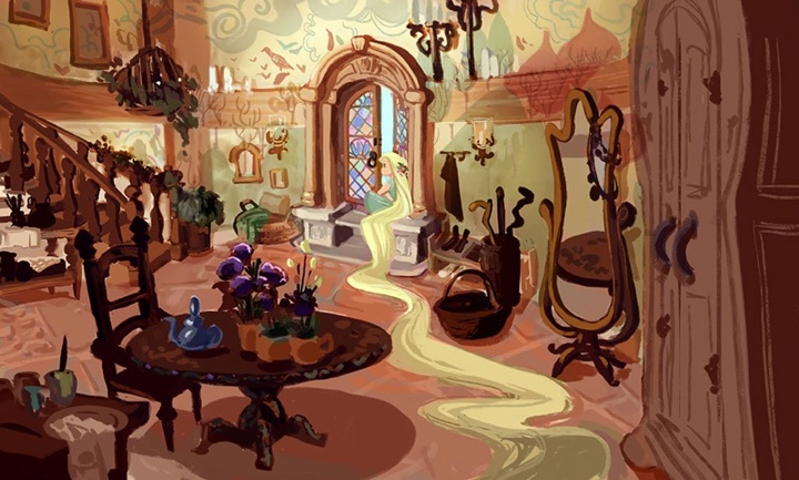
This artwork by Victoria Ying places Rapunzel in a richly decorated chamber filled with exquisite furniture. Note how every single detail supports her wish to go outside – the scene is dominated by the oversized dresser and dark mahogany table, with Rapunzel curling by the open window seemingly oblivious to the beautiful objects surrounding her.
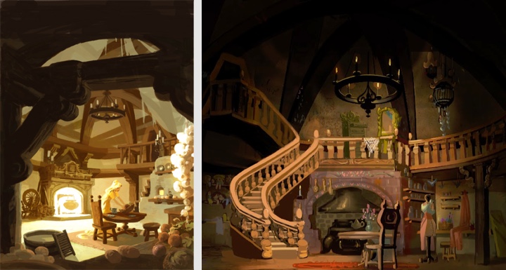
The artwork by Kevin Nelson and Victoria Ying contrasts the gloomy dome of the high-vaulted chamber with the bright blue sky outside.
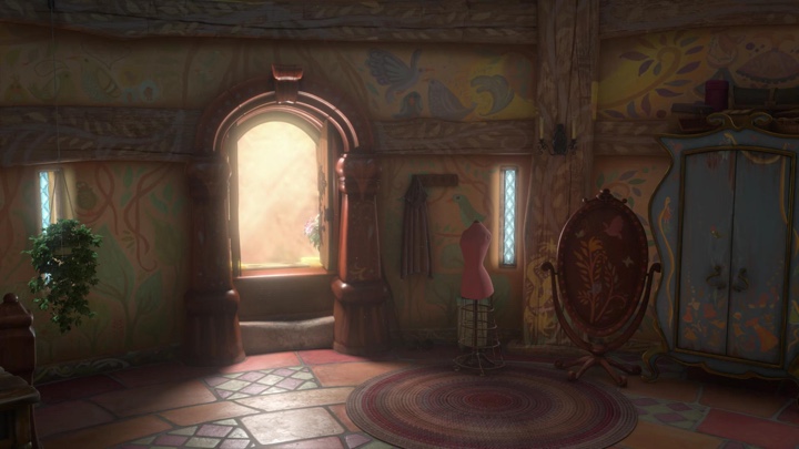
Conceptual art, refined sketches, storyboards, visual art – all of these are fed to the animators to create the final renders. The movie still combines the soothing pastel murals and the sun light streaming through the open window. Note the fine texture details of the wooden arc and the ambient shadows on the floor and the dress mannequin.
The streaming light in this scene highlights Rapunzel’s hair, casting a strong shadow around her. Note how the light diffuses throughout the entire chamber, bringing out the fine details of the armchair and the small table by the staircase base.
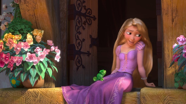
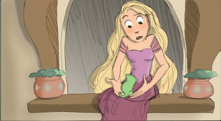
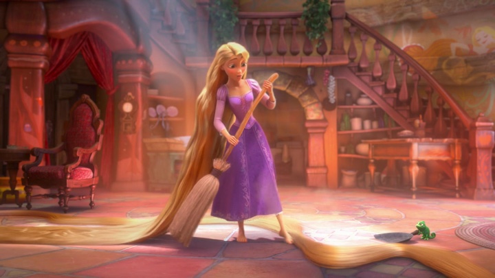
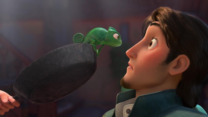
And this is the final render of one of the storyboard sketches seen earlier. The emotions in her face, the relaxed position of the shoulders, the intricate textures of the wooden beams and soft pastel flowers – all the painstaking artist work combined and rendered in a single frame. Mark Kennedy continues:
On “Tangled”, the directors (Nathan Greno and Byron Howard) were always very careful not to tell us board artists what we could and couldn’t do in the CG world. They always said to us, “just board it the best possible way you can, and we’ll figure out a way to make it happen”. And that’s just what we did. The technical people on “Tangled” were amazing and did an awesome job of accomplishing every insane idea we threw at them. I have no idea how they did it but they are spectacular!
And you thought that “Sleeping Beauty” had a lush forest scenery… Rapunzel’s wish finally comes true, and she escapes the tower to visit the city. The entire scene is simply stunning – you can see every grass blade, every fern leaf and every moss lump. The sun light is partially blocked by the overhanging tree tops, and this allows the animators to bring out the full gamut of greens.
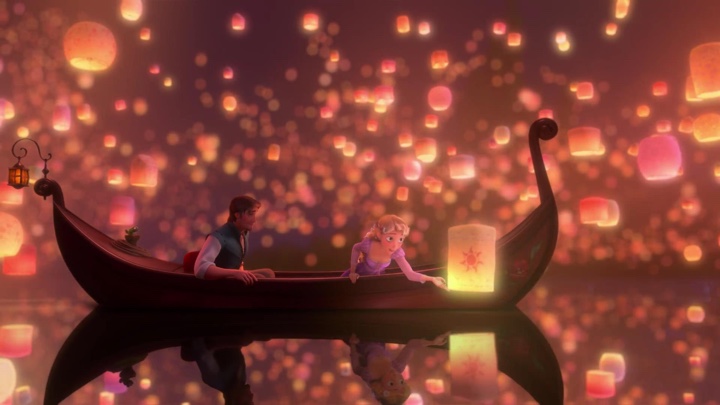
Managing to rival the beauty of the forest scene, the floating lanterns by the lake is by far the most memorable moment of the movie. Soft pinks, yellows and oranges of the lights highlighting the braided hair, dark purple sky highlighting the pastel purple dress, and dark brown wood of the boat serving as a visual anchor throughout the scene – simply amazing.
The art of “Tangled” supports the story – and not the other way around, as witnessed in way too many other animated movies released in the last few years. In the words of Mark Kennedy:
[…] when people ask me why it takes so long for us to get it “right” in story, and why story takes so long when our drawings don’t look like we spend much time on them, it’s because we spend a lot of our time debating these types of things, arguing with each other and working out the best way to tell the story and the best way to develop the characters. And when we do draw, it’s to try out these things and see how they work, and experiment and find the right way to tell the story and how to create the types of characters that people will fall in love with, root for and remember long after they’ve left the theater.
Images and video stills by Walt Disney Pictures.
Sources: apple.com · disney.wikia.com · amazon.com · parkablogs.com · artofdisney.canalblog.com · denofgeek.com · collider.com · blueman.ws · pavementmouse.blogspot.com · sevencamels.blogspot.com · victoriaying.blogspot.com · davidgilson.blogspot.com · theartofglenkeane.com · artofkevinnelson.blogspot.com

Today’s post highlights the design of NomadGraphs.com by Mathias Brouilly. Precise geometrical patterns and shapes drive the visuals. Monochrome icons with simple and strong shapes; thick pinstripes and large dots used on the section headers, main logo and the contact form; typography-driven slideshow across the top part of the page – all of these guide the eye through the various content sections on this single-page site. The color palette of brick orange, light brown, pale olive and ivory is repeated in a thin repeating stripe running across the top edge – a recently popular trend that made a few appearances in this series.
On a less positive note, the pale olive is used for links as well as italicized text, adding uncertainty about what is and is not clickable. In addition, each section seems to have its own column layout. Even with strong vertical lines connecting each section content with the matching header and well-maintained visual balance inside each section, the overall impression is a little messy and disorganized.

Today’s post highlights the design of MumMade.co.nz, an online store for home-made baby products (design by PixelFusion). Soft pink-brown color palette joins the attractive selection of fabric-inspired textures and illustrations to create an inviting browsing experience. Individual product pages use a carefully crafted item selector, while category pages employ attractively spaced and nicely framed product thumbnails.
Muted pink is used for the hyperlinks, and the site uses the thin serif Archer Light for headers / navigation links and handwritten Bowfin for the social icons. The “About” page uses a professional photograph to create a deeper personal connection which is further reinforced on the “Thanks” page.
On a less positive side, the auto-advance slideshows on the home page are just too much. There are three slideshows, each one with its own cycle. The top one has a ticker that allows manual navigation, but the bottom two are not very usable – there’s just too many transitions with very little control provided to the end user.