The colors of “Tron: Legacy”
The title sequence sets the visual tone and defines the dominant colors for the entire movie, forgoing the full-color warm palette of the Disney castle for a metallic aquamarine hue and a predominantly dark environment. Once the main character moves into the computer world, two colors dominate the visuals – very desaturated metallic light blue and heavy orange.
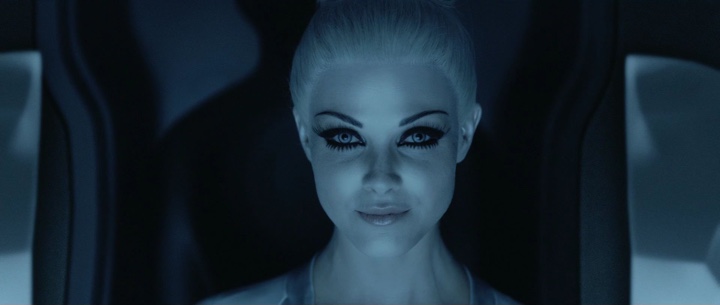
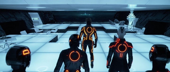
Note how the post-processing has removed almost all the traces of eye and lip color, preserving monochrome light blue surfaces.
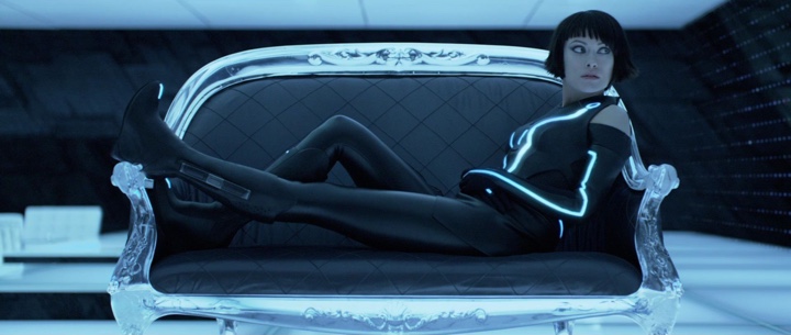
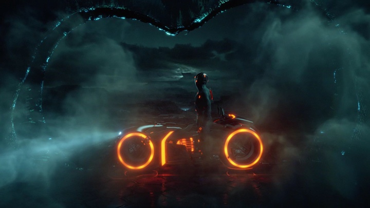
Even a strongly lit floor and glowing costume stripes cast just enough ambient light to accentuate the dark polyester clothes and slanted walls.
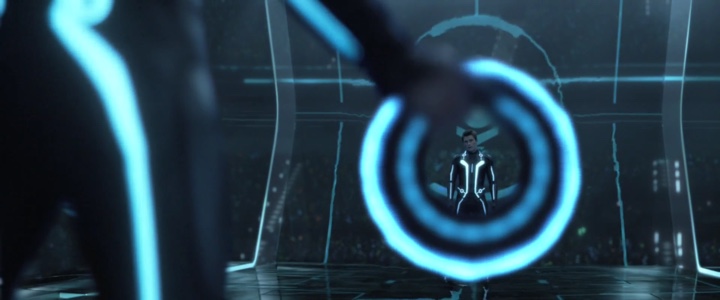
The fighting scenes feature an artful interplay of bright glowing light sources and shiny reflective dark environmental structures.
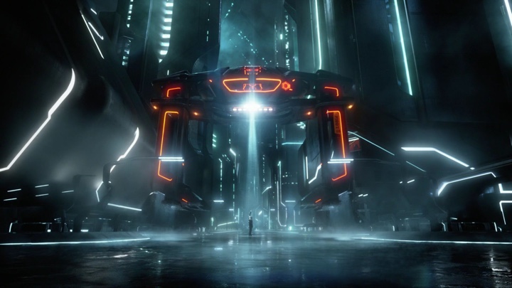
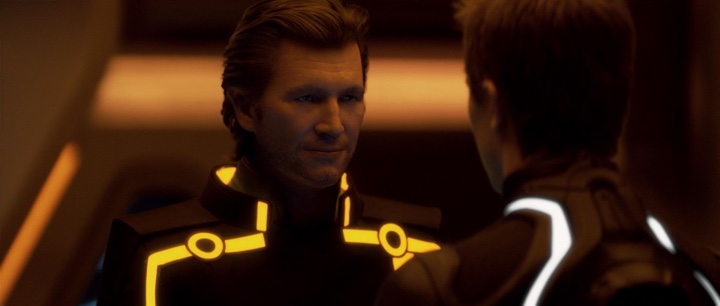
Bright saturated orange serves to create and maintain visual conflict.
As the conflict grows, orange becomes more pervasive, with perceptible reflections on some of the surfaces.
There is no single hue of orange – the light sources span from saturated yellow to a darker reddish hue to create a certain degree of separation between the different characters, while still maintaining an overall connection.
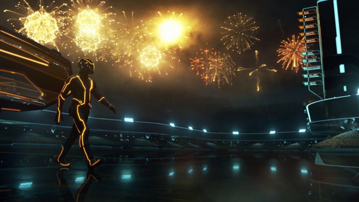
A spectacular array of fireworks is one of the rarer outdoors scenes where the light dominates.
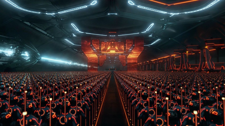
While the army assembly uses more ominous shades of orange to highlight the impending threat.
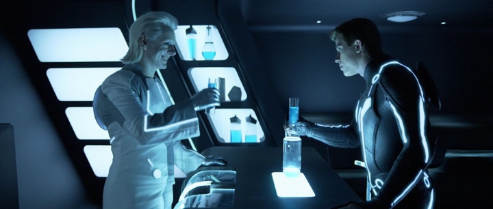
Drinks are one rare source of light, with saturated blue making a rare appearance.
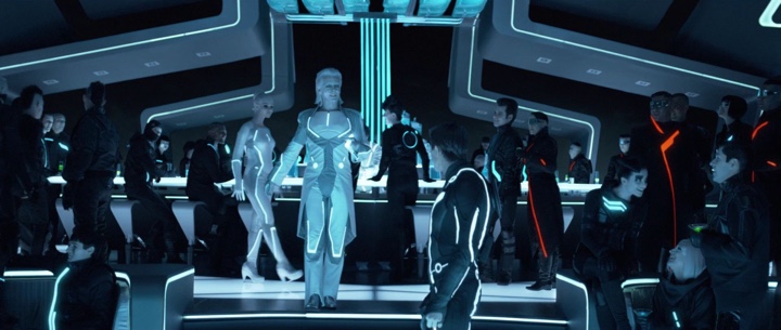
And elsewhere in the club the drinks are acid lime green, adding a small splash of color to the reddish oranges of few of the guests.
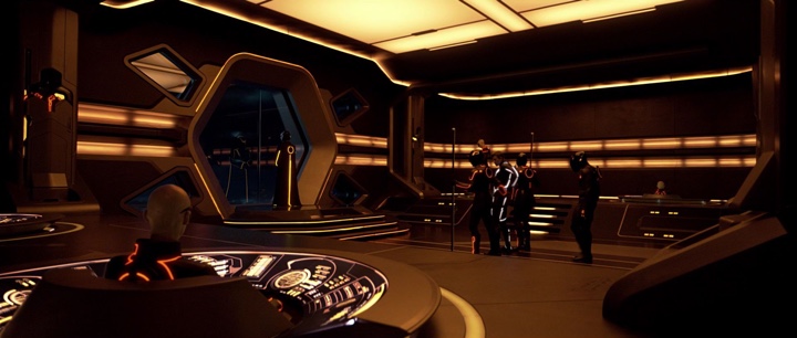
The command center is the only place where the environment is not black. Deep bronze and sepias mesh with desaturated yellow light sources to highlight the importance of this room.
The sepias are extended not only to the costumes, but to the faces and hair.
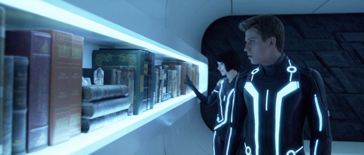
The hideout chambers are a rare multi-color environment. The leather-bound books span purples, greens, blues and browns to highlight the diversity of human-made products.
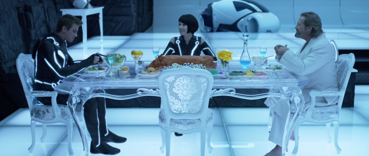
Saturated dark greens make their only appearance in the computer world on the plates of both human characters, along with bright yellow fruit and flowers. Note that this environment is meant to maintain the connection to the human world, and the scene highlights the majority of human characters in a fleeting moment of outward relaxation.
Images and video stills by Walt Disney Pictures. If you’re interested in more details on the design of Tron, take a deeper delve.


