
Today’s post highlights the design of HelloMountee.com by Padraig Kennedy and John Ryan. Playing off of the product name (which combines the action of mounting a drive with the abbreviation of the publishing platform), the design guides the eye towards a large full-color icon that replicates a stylized uniform of the Canadian mounties. This splash of bright orange surrounded by somber steel gray is a great backdrop for the main call-to-action “buy” button located directly below it – note how the button uses a muted shade of orange to maintain a professional look of the product.
Unlike an overloaded product page for Cornerstone featured earlier in this series, this landing page opts to use brevity and puts all the content above the fold. An embedded overview video of the product takes the center stage, with the default freeze frame using the same muted dark steel gray as the surrounding color palette. Note subtle textures, drop shadows and radial highlight around the video; combined with clean typography (embedded Aller font family) and a strong alignment of elements – especially in the right column – placing just the right amount of product information on the landing page, leaving the rest to additional pages readily accessible from the navigation menu.

Today’s post highlights the design of Shop.TheHeadsOfState.com. Placing main emphasis on highlighting the different products, it uses a clean monochromatic palette, simple typography (mixing Helvetica Neue for body text and monospace Courier for most of the header content) and an austere header logo. Note how the logo slightly overlaps the full-width slideshow that highlights promoted products.
Most of the store products have a distinct vintage look, which is further reinforced in the header section. The cart tracker is decorated with a slightly distorted background that combines a desaturated turquoise color and a dot noise pattern. The muted background grunge patterns can be seen further along the sides of the main slideshow. Finally, each one of the slides (note the nice cross-fade transition effect) features a unique retro-style description of the specific product, combining typography, colors and ribbon elements.
This seemingly simplistic design has a great visual balance, strong alignment and, most importantly, great presentation of the featured merchandise.

Today’s post highlights the design of DotVita.com by Dave Onkels (@daveonkels) and Chris Vogel (@imchrisvogel). A deceptively simple landing page has two main parts, both comfortably fitting above the fold. The top part puts a spin on the main tagline, framing a picture of an air stewardess with beautfully styled condensed typography, all laid out on top of an intricate fantasy landmass map that fades towards the left and right edges.
Note the exquisite interplay of the three main colors from the site logo, earthen brown, raspberry red and light orange. The desaturated brown of the map frames the much heavier brown of the woman’s hair and eyes and highlights her fair skin tone, while the red and orange of her uniform fabric and buttons are mirrored in tall double arrows that lead to more content. The bottom half of the landing page uses a more somber monochromatic color scheme, with three simple content boxes, a thick slanted dash separator and a simple footer with contact information.
The “Logbook” page connects the “30,000 feet” tagline to the studio portfolio, with an attractive “altimeter” that simulates physical descent the closer you get to the bottom of the page. The two arrows at the bottom of the altimeter widget allow scrolling the content, but this is not a very usable affordance. While a previous click is being processed and the content still scrolls, subsequent clicks are ignored; in addition, dragging the pointer arrow does not have any effect.
The “Contact” and “About” reuse the layout and the palette of the main landing page, although with no striking illustrations. However, the “Logbook” page mentioned earlier features an illustration of a vintage suitcase that makes me wish that other pages had such great header illustrations as well.
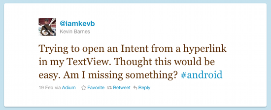
This tweet from Kevin Barnes crossed my stream last Saturday:
He posted the solution overview shortly thereafter, but i thought i’d summarize the different ways to display and handle hyperlinks in Android.
The core TextView component provides a nice range of features that make it a prime candidate for displaying hyperlinks. If your text and hyperlink address are static, the simplest way would be to define a string in your resource file. The string can contain the any number of embedded links, for example:
<string name="help_center">Visit the
<a href=\"http://my.company.com/help\"\>Help
center</a></string>
Now, you can either call setText(R.string.help_center) API or simply point to that string from your layout XML:
<TextView android:text="@string/help_center" ... />
At runtime, the framework will find the matching string (which can be in a localized folder), convert it to a properly formatted representation and register a click listener to launch the browser to view the associated link. There are two more things that you should do. First, use the android:textColorLink attribute to control the color of the link elements. Second, locate your TextView when the activity is created and call setMovementMethod(LinkMovementMethod.getInstance()) on it. This will allow users to navigate your links with a navigation ball, d-pad or any other focus traversal aid.
Let’s take this a step further – what if the link itself or the surrounding text are dynamic? Here, you can use the TextView.setText(CharSequence) API where the parameter is constructed dynamically based on your specific application logic. However, there is an additional step to do before calling that API. Once you have constructed the string – with one or more hyperlink segments in it – call Html.fromHtml(String) method. This will properly delineate the link segments and register the click listeners.
Note that up until now i haven’t addressed the original question posted by Kevin. Opening the hyperlink address in the browser might not be the optimal solution for all cases. You might not want to transfer the user to a full-screen browser, preferring to display the content in a floating dialog. Or perhaps you need to put additional controls around the hyperlink content. Or perhaps you don’t have any hyperlink content per-se, but rather need to run some custom logic on activating that segment (be careful though not to diverge too far away from the well-known pattern of hyperlink handling).
If you want to attach a custom listener to be invoked when the user activates the specific text segment, you will need to do the following:
- Create an instance of SpannableStringBuilder.
- Use the different append and insert methods to create the text content. Note that here you’re not going to create any explicit a href spans.
- For every “hyperlink” span, call the setSpan() API as shown below.
- Call TextView.setText(CharSequence) API, passing your instance of the SpannableStringBuilder to it.
- As before, call TextView.setMovementMethod(LinkMovementMethod.getInstance()) to enable proper focus traversal of your custom spans.
Here is an example of specifying and configuring a custom span:
SpannableStringBuilder stringBuilder = new SpannableStringBuilder();
stringBuilder.append(leading);
stringBuilder.append(middle);
stringBuilder.append(trailing);
stringBuilder.setSpan(
    new ClickableSpan() {
        @Override
        public void onClick(View widget) {
            // handle span activation (show dialog, ...)
        }
    },
    leading.length(), leading.length() + middle.length(),
    Spannable.SPAN_EXCLUSIVE_EXCLUSIVE);
myTextView.setText(stringBuilder);
