The Art of “Tangled” – interview with Claire Keane
If you’re new here, let me introduce myself – I’m a giant fan of “Tangled”. It doesn’t happen a lot, but when it does, it sweeps you off your feet. A visual journey so wonderful that you catch yourself watching it over and over again, discovering yet another subtle layer of colors, textures, strokes and shapes. A splendid feast for your eyes that passes by in a blink of an eye without you noticing how the time has passed. In short, a movie that sets the bar so high that you never expect another movie in the same genre to be quite on the same level.
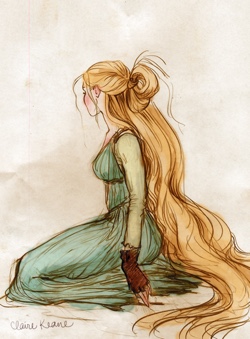
So you can only imagine my excitement when Claire Keane has graciously agreed to answer a few questions i had about her work on “Tangled” and the animation industry in general. Going under the rather dry title of “conceptual artist”, Claire’s work spans the entire movie, from the leading characters to Rapunzel’s surroundings – not to mention the intricate details of her magic hair.
Kirill: Tell us about yourself.
 Claire: I grew up in southern California until the age of 16 when my family decided to move to France for a year. After one year our family loved Paris so much we stayed many years thereafter. After graduating from the American School of Paris I went to Parsons School of Design in Paris for one year thinking I would like to go into fashion design but soon enrolled in the Ecole Superieure D’arts Graphiques realizing that illustrating and drawing was really my passion. In my fifth year at ESAG, I chose to write and illustrate a fairytale book for my thesis project. It wasn’t until then that I realized how much I loved the development phase of a project. When “Tangled” came to the point where they needed to bring people on to develop Rapunzel’s world I was ready to go with my thesis project in hand as my portfolio.
Kirill: How long have you been working on Rapunzel? Has it been an all-consuming adventure or a more structured “work” project?
Claire: I worked on Tangled (Rapunzel) for 6 years with a small break to do some work on Enchanted. Working on Tangled was an all-consuming adventure – I like it best that way.
Kirill: Where do you find your inspiration?
Claire: I usually find inspiration in other artists. A few that I tend to come back to a lot are: Matisse, Rembrandt, Klimt, Marie Laurencin, Ronald Searle.
Kirill: What is your preferred drawing medium and why?
Claire: I love pen and ink for the simplicity of being able to do it anywhere but since I’ve started using photoshop so much I have become completely addicted to the undo button… and I find it very hard getting back into using *real* medium again.
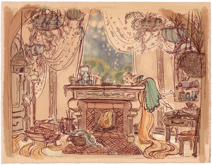
Kirill: How do you recreate the world as seen through the eyes of a girl that has spent all her life locked away in a tower? How much of yourself have you channeled into the fabulous wall paintings?
Claire: For Rapunzel I drew my inspiration from my own life. Early on I realized that the paintings on Rapunzel’s walls were going to be a representation of Rapunzel’s personality and her subconscious thoughts and desires. To be able to accomplish that I felt I really needed to know who she was. I ended up carrying a sketch diary with me on my free time to document what I was doing when I wasn’t doing anything in particular so that I could have a sense of what Rapunzel could be filling her days doing in her tower. So if I was putting my clothes away I would get out my sketchbook and draw Rapunzel hanging up her clothes in her room, and then I’d see that I was drawing while I was supposed to be doing chores which led me to an idea that Rapunzel would be constantly creating: if she had mending to do it would turn into a full-on craft project. Needless to say not much housework got done those few weeks of “research”!
Kirill: Your character and scene sketches are wonderfully expressive and exude a lot of vibrant warmth and energy. What does it feel to hand them to be transformed into precise mathematical models and how much (if any) of the original feel is lost in the process?
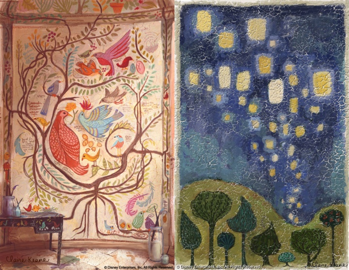
Claire: I’m honored if any of my sketches get handed off to be modeled! It is so rare to have your inspiration be taken all the way through to the finished product. As for the mural paintings, they weren’t really finished until they were mapped onto the CG model and lit. Once we saw them like that it all felt so much more real. It added another layer of believability to the character- as if Rapunzel had really spent all those years in her tower painting them.
Kirill: What do you think about the transition of the industry in general, and full-feature animation movies in particular, to the 3D world?
Claire: I feel really lucky to be apart of this time in animation. It feels like it is full of ripe ideas just ready to present themselves to the public. There are so many amazing things that are possible to do and very little of it has yet made it into a full-length feature film. I think we will start to see hybrids of 2D and CG animation and completely new styles and ways of animating that we have yet to conceive of coming out of the industry soon.
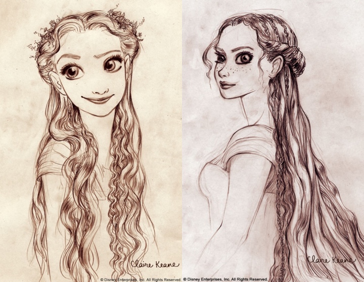
Kirill: “Tangled” has an amazing level of detail everywhere – tree leaves, grass blades, wall stones, pavement blocks, dresses and, of course, the magical hair. That leaves the characters’ faces as the only flat element lacking any level of realism. Is this related to the “uncanny valley” that has plagued movies such as “The Polar Express”, “Beowulf” and, to a much lessed degree, the Clu character in “Tron: Legacy”?
Claire: Yes, there was discussion about how naturalistic they wanted to make the characters. They ended up with a more stylized version for the sake of animation.
 Claire: Cinderella for the colors, composition, and story which are so magical. But I think the movie that has most inspired my visual development work on “Tangled” in particular was Sofia Coppola’s “Lost in Translation”. I loved how she spent time with the main character without having to get to a plot point right away. Everything I was doing in my sketch diary that I spoke of earlier was really inspired by watching Scarlett Johansen’s character just sit in her hotel room- you really start to feel like you could hear her inner thoughts even though nothing was really happening externally and no dialogue was being said. I’ve found I really love exploring a character’s private moments that may not necessarily be scripted in the movie but they make me believe in the character I am spending time working on. And I have seen that it helps me a lot when thinking about anything I would need to design for him/her: be it the character’s bedroom, costumes or even their paintings on the walls.
Kirill: What’s next for Claire Keane? Anything exciting you can share with us?
Claire: I am hoping someday to find the time to work on my own personal project. As for right now though, I’m having a lot of fun working with some wonderful people: Chris Buck (director of Tarzan and Surf’s Up) and Mike Giaimo (art director of Pocahontas) on a really fun and whimsical film. Mike has such a bold personal style and I am so excited to help get that style onto the screen.
And here again i would like to thank Claire Keane, not only for taking her time to answer my questions, but also for bringing us such a wonderful cinematographic experience. If it takes another six years for your next movie, my daughter and I will be waiting.


