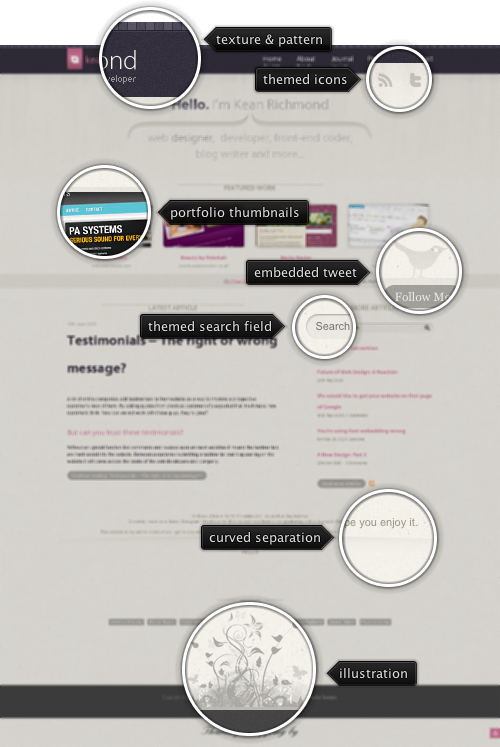
Today’s post highlights the design of KeanRichmond.com. The site header uses a simple noise texture with a pattern of alternating light and dark cells running along the top edge, all set in a desaturated purple color. The header contains the main logo and navigation menu that use white and dirty pink as foreground colors – both in good contrast with the background color. Dirty pink is used for menu rollover effects, and this is continued elsewhere on the page, especially on the buttons.
The main area is separated into portfolio highlights and article sections. Moving the mouse over portfolio thumbnails reveals a rather unusual effect – where the active image is themed with a monochrome palette based on beige tint. A small horizontal strip that contains the latest tweet separates between the portfolio and the articles – note how the twitter bird is extended into the portfolio section, but does not overlap the description of the last entry.
The article section seems to break the strong horizontal symmetry suggested in the header and portfolio sections (set by centering the content, oversized curved brackets and an even number of portfolio thumbnails). However, shifting the article list column to the right balances out the extra visual weight created by the right-aligned navigation menu in the header section.
The footer section continues the retro theme set by the old-paper texture of the main section, and adds an intricate floral illustration and hand-written font used for the “thank you” message. While the main site footer seems to waste a lot of vertical space, see how that space is used in the “About” page.
Last Friday we went on a zeppelin ride from Moffett Field with Airship Ventures. My favorite part was to fly above the evaporation ponds:


And a green one:


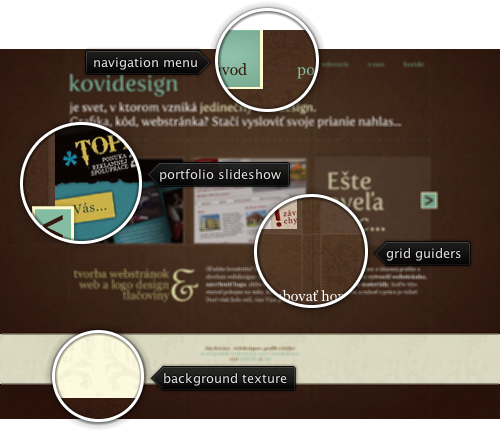
Today’s post highlights the design of KoviDesign.sk by Jan Kovacs. Set on the backdrop of a rich deep brown with a radial highlight and an intricate pattern, the design takes the grid to the extreme by showing the actual grid guider lines on all the pages. The foreground palette of faded ochre, white and desaturated aquamarine is in a perfect harmony with the brown background color, and consistent usage of aquamarine for links / navigation menu rollovers creates a consistent and predictable interaction with the site.
The portfolio slideshow takes the main stage, with a scrollable view that uses consistent colors for the scroller buttons. Click the buttons to see smooth navigation between the portfolio thumbnails. Precise typography used in the header and to the left of the copyright blurb is highlighted by dropshadow effect around the large letters. Browse the rest of the pages to see the consistent usage of these elements throughout the entire site.

Today’s post highlights the design of Kyee.co.uk. A single page design with a clean palette of light gray, sky blue and black places the main emphasis on the portfolio arranged in a precise three-column grid of thumbnails. The section headers use images for high fidelity typography, and all the text sections use a rather unorthodox center alignment. The footer section uses a soothing sky blue noise texture with steel blue foreground elements – texts, separators and icons – with the deep-browns of the coffee cup being the only exception. Note how the global “lit from above” lighting model is preserved in the drop shadows of the designer’s headshot and the inner bevel highlights of the contact form text fields. The legibility of the large text paragraphs in the footer section can be improved by left aligning the text, making the fonts bigger and / or using shorter line length.


