Continuing the ongoing series of interviews with illustrators, today I’m pleased to welcome Owen Davey on my blog. Owen is a prolific illustrator whose work spans editorial print illustration, animation, book cover art, branding and more. And if that is not enough, later this year we’re going to see his third published book, “Laika the Astronaut” (which is already available for pre-order).
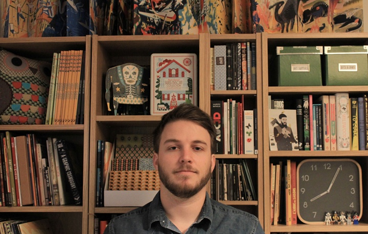
Kirill: Tell us a little bit about yourself and how you got started in the field.
Owen: I’ve been working as a Freelance Illustrator for about 4 years, since graduating from University College Falmouth with a First Class BA(Hons) in Illustration. My first professional commission was for the Guardian Weekend, a week before I graduated. An ex student of Falmouth was an art director for them and liked my work, so thought he’d give me a chance. Since then, it’s just snowballed really. I’ve now worked with a range of clients across the globe including Orange, Microsoft, Persil, New York Times, Templar Publishing, Walker Books, Creative Review, Jamie Oliver & Threadless.
Kirill: Your style is rooted in the mid-century period. What attracts you there, and what are your thoughts on bringing that almost analogue look back to life with the modern digital tools at your disposal?
Owen: I discovered a while ago, that my work thrives under constraints. Limiting colour palettes or applying strict compositions just seems to make my work better. That’s what I love about mid-century design. The creativity and strength of design many illustrators managed to accomplish, within the limitations of technology, just inspires me. It is certainly my golden age for design.
In terms of the analogue and digital, that’s something I struggle with constantly in my work. I love the imperfections of image-making, and the evidence of human touch, and yet I also love clean, slick and precise imagery too. I always start with drawing, work digitally, and end with textures and manufactured imperfections; that way I sort of try and get the best of both worlds. I think I’ll just always be sitting on the fence though really.

Left – illustration for “The Feed” project for Orange. Right – illustration for an article about eReader devices.
Kirill: Do you want people to recognize your work the first time they see your new illustrations? Is there a concern of falling into a certain rigidity of style?
Owen: I’d like illustrators and designers to recognize my work, yeah. I discovered a long time ago, that the general public just doesn’t have the eye for it. Family & friends always tell me when they see something they think is mine, when it looks nothing alike. I don’t mind though; it’s my job to know the difference. I never fear falling into a rigidity of style, because I’m never 100 per cent happy with any of the work I do. I’m constantly evolving my work in an attempt to improve and hone. If you look through my blog for example, there’s quite a distinct change from the beginning to the most recent. I live in a world of illustrative evolution.
Kirill: What do you think about making illustrations for web sites? How does the evolution of responsive web design and scaling the design with device size affects that?
Owen: It doesn’t bother me at all really. It’s lovely to see work in the physical world, but I love computers. They are incredibly enabling objects. I’d have sucked at living in any other era. I just love the internet too much. And the joy of work existing in the digital ether, is that you can be 100 per cent sure how the colours are going to look on your screen. Reproduction can be a nightmare!
Just to clarify though, I’m a great lover of objects of art. My bookshelf is my pride & joy. But what everybody has to understand, is that we are now living in an age, when you should only print something if it’s worth it. You either make beautifully crafted objects, or you just do it digitally. The age of the crappy plastic CD has died out but stunning Gatefold Vinyl lives on. eBooks pick up the trashy novel, while art books are printed with spot colour matt stock perfection.
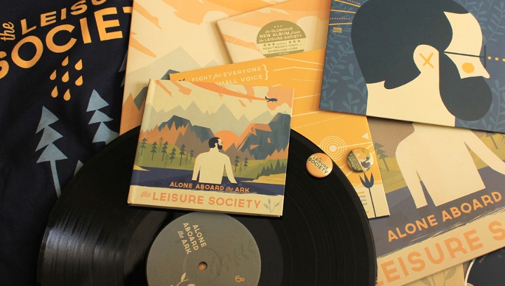
Various branding materials for the Alone Aboard the Ark project.
Kirill: What does it take to create a complete branding for a new music album (“Alone Aboard the Ark”), from album sleeves to booklets to t-shirts to beer labels, all the while maintaining a unified theme across the different physical characteristics? How long did that process take, and what was the most unexpected thing that happened there?
Owen: Well the surprising thing with it, was how long it trailed on for. I completed the cover artwork before Christmas, and I’m still doing little bits and pieces for it here and there. I approached the merchandising etc. in a very self referential way really. I tried to reuse elements as much as I could, simplifying and rearranging, colour picking, dragging and dropping etc etc. It was great fun to do. Each design takes on a slightly new life, and you really get to explore an image and a theme. I hope to do it more.
Kirill: You also did the jacket design for “Wild Boy” novel. How is that field adapting to the world of digital book stores, and what effect are those scaled-down interfaces having on the process of designing book covers?
Owen: Um. I don’t really know. I don’t see much difference in designing for the digital and physical to be honest. They’re both viewed in similar ways. If it’s eye catching online, it should be eye-catching in store.
Kirill: And if we’re talking about books, you are working on your third picture book, “Laika the Astronaut” – due out later this year. How’s the world of physical publishing treating you? Which parts of the long process of publishing a book work well for you, and which parts are still rooted in the pre-digital world?
Owen: Nope. Not working on it. It’s been done for several months. Just takes ages for it to be released. Um.
Well I love picture books. The longer printing side etc. is slightly infuriating, but the creation of them is great fun. I’m used to working to tight deadlines and single images most of the time, so to be able to approach a 32 page picture book over the space of a few months is really refreshing. You get to develop ideas in such exciting ways. You can add extra concepts or fun elements, properly explore pace and flow, hone storytelling, and refine composition. Love it. And Templar are particularly good at letting me choose papers and fonts etc, so that the finished object is one I can be really proud of. I can’t wait to see Laika in the flesh!

One of the illustrations for Laika the Astronaut picture book.
Kirill: Going back to the client work, do you prefer getting a full artistic freedom for a project, or a more defined direction from the client?
Owen: It depends really. The main issues stem from a client not being sure about which they want. If they tell you you have artistic freedom and then essentially steer you to where they originally wanted you, that’s pretty annoying. But in general I’m game for both. I do like to have some input in the conceptual process, even if they give me a strong theme or specific subject matter. I don’t really love being a human paintbrush (but then sometimes that’s where the best money is)
Kirill: Does it ever happen that a client contacts you based on your existing work, but then starts pushing you into a direction you’re not comfortable with?
Owen: Not exactly. I quite like exploring outside my comfort zone, so its fun when they get me to do stuff slightly different. I’ve had clients with just simple bad taste, asking me to add horrific colours or making bad edits to images after I’ve created them etc. That’s annoying, but I dunno. I’m fairly easy going with it all. If I was too precious with my work, I’d have been a Fine Artist, or gallery illustrator. When people commission me, they have to get what they want; otherwise I’m failing at my job.
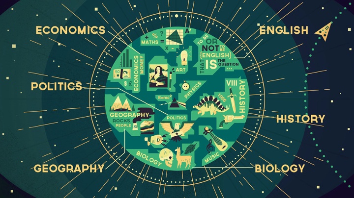
Animation still from the Wisdomap Schools project.
Kirill: How valuable is self-initiated work for you?
Owen: It’s not valuable per se. It’s just fun. There’s a massive back catalogue of work I want to get done, but I often try and slip it into commissioned work, or books. I don’t usually class my picture books as self-initiated, because there’s still a client, but I suppose it fulfills the same purpose for me; it’s a way of cutting loose and exploring my own ideas.
Kirill: And on a related note, do you ever get to take a break as a free-lance illustrator?
Owen: Nope. It’s all I think about most of the time. I do other creative things, and live my life, but it all leads back into illustration in the end. I take time off, but I usually illustrate in it anyway. My last 3 holidays have all had mini commissions happening throughout them, but they paid for the holidays, so yay to me!
Kirill: What’s the best thing about being an illustrator?
Owen: Being paid to do what I love.
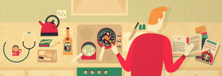
Animation still from the Wisdomap Medicine project.
And here I’d like to thank Owen Davey for taking time to answer my questions. You can find Owen online on his site, his blog and Twitter. Selected prints are available for sale over at Big Cartel.
I can trace the origins of my interest in the world of digital illustration to one artist. And her name is Zara Picken. It was this wonderful combination of shapes, colors and textures that drew me in, and it has been a true delight ever since to see her new work coming out on her blog and her Flickr stream. And today I am quite humbled to welcome Zara on my blog, and ask her a few questions about her art and craft.
 Kirill: Tell us a little bit about yourself and how you got started in the field.
Zara: I’m a UK-based illustrator originally from the Walsall in the West Midlands, currently based in the North East of England. I studied on a foundation course at Stafford College and went on to complete a degree in Illustration at the University of the West of England, Bristol.
I’ve been working as a professional illustrator since graduating in 2008. I work with UK and international clients on a wide range of projects across areas including editorial, advertising and more.
Kirill: How has your own stylistic taste evolved over the years? Is there ever a thought of exploring radically different directions? Is there a concern of falling into a certain rigidity of style?
Zara: I am interested in a wide range of aesthetics, beyond design and illustration – I have always been very interested in art, photography and film, for example. I don’t think I’ve ever had one particular stylistic taste – there is so much out there that I admire. I have a blog called Hovering Cat where I have been sharing my favourite finds since 2007.
Concerns about my own style never figure consciously when I am working – the way I work today has evolved from years of developing my process and will most likely continue to change as I carry on making small alterations based on playing and experimenting.
It’s difficult for me to see my own style, the same way that I don’t hear my own accent when speaking. I never notice it until someone points it out to me. Perhaps that’s what style is – the voice in which you naturally speak, not influencing what you say but how you say it. I use my style to communicate and will sometimes alter my tone or the way I word something but at the core it will always be my pronunciation and delivery.
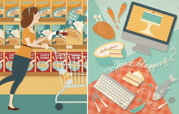
Left – illustration for ShopSmart magazine, right – illustration for Delicious magazine.
Kirill: And on the flip side, do you want people to recognize your work the first time they see your new illustrations?
Zara: People do seem to know it’s my work when they see new pieces but it’s more important to me that the illustrations resonate with people. My work is about communication first and foremost.
My name isn’t the first thing I expect people to think when they see the work, though I think my work is distinct and I aim for it to be eye-catching. There is personality in my work but I don’t want it to be overbearing at the expense of the message I wish to convey.
Kirill: When you transfer your pencil sketches to the digital world, do you try to preserve some amount of hand-drawn imperfection? Is this important to you?
Zara: Sometimes – it depends on the illustration, so I decide on a case-by-case basis. It used to be a bigger concern for me than it is today but I now feel less precious towards my sketches. Imperfection does not equal authenticity – clarity and editing is important, too. Sometimes symmetry and clean lines are required and sometimes a less perfect line or a degree of wonkiness helps.
I aim to be flexible and not so linear in the way I work, both literally and figuratively. My sketching is not hugely influential on the final piece in terms of the finish and manner in which it’s completed. I like to work ideas up a bit more digitally before showing them to clients, to give a better idea of my direction.
Kirill: Do you find yourself spending “too much” time on progressively smaller details? Do you ever wish to go back and tweak a certain illustration after it’s already been published by the client?
Zara: I like to keep illustrations simple and graphic whenever possible. I try not to add smaller details unless they say something or add significantly to the appearance of an illustration. There is always the temptation to dwell on details if work has been completed in advance of a deadline – I’ve found the time is better used by taking a step back and returning with fresh eyes. I try to spend time editing my illustrations, stripping back any extraneous elements.
If a client has published a piece of commissioned work and I later decide to add the image to my portfolio, I might sometimes choose to alter it slightly. It doesn’t mean that I was unhappy with the illustration when published but rather that changing it could help it to fit better alongside other pieces in my portfolio. I guess the fresh eyes also play a part – sometimes time away from an illustration can give a new perspective when revisiting.
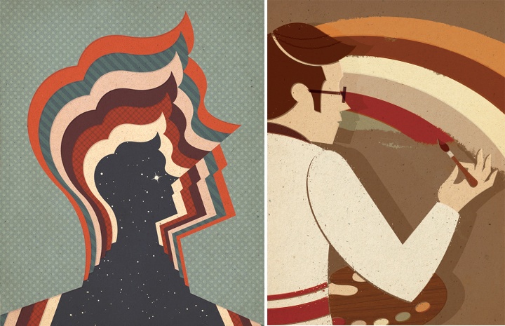
Left – starman, right – retro rainbow.
Kirill: What’s the weirdest client feedback you ever received, if you don’t mind sharing it?
Zara: I was commissioned to create an illustration to accompany an article about wine tasting – upon sending the roughs, I was informed that alcohol could not be depicted within the illustration.
Kirill: Would it be wrong to say that drawing human figures is one of your favorite areas?
Zara: I’ve enjoyed drawing people a lot more since working professionally as an illustrator. At university, I often disliked drawing human figures, due to the way life drawing was taught as a strictly representational exercise. All imagination was eliminated from the process and it certainly was not my favourite area.
I started to enjoy it more when I realised that people could be drawn in a way that matched my graphic design approach and did not have to be so realistic. By simplifying and refining complex areas of human anatomy, worrying less about the “right” and “wrong” ways to do things, people feel more integrated into my compositions and I have more freedom over the way figures can be portrayed.
Kirill: How valuable is self-initiated work for you?
Zara: I would say that it is invaluable. I focus on self-initiated projects whenever I’m not working on commissions. I probably end up doing as much personal work as commissioned – I try to do as much as possible. It’s crucially important to draw images you enjoy and tackle the sort of subject matters you really want to explore. I think this helps me to retain my voice.
Working on self-initiated projects also enables me to try out different ways of working that sometimes inform future commissions. My personal work feeds into my commissioned work, especially when clients cite self-initiated pieces for the direction of a job.
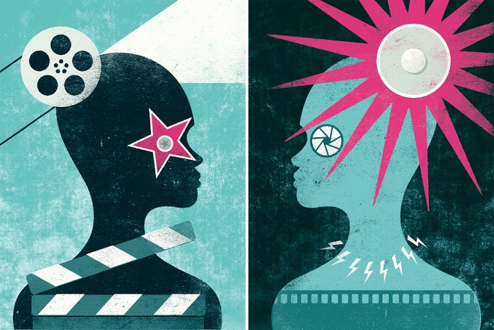
Self initiated “Glare” illustrations (part 1, part 2).
Kirill: And on a related note, do you ever get to take a break as a free-lance illustrator?
Zara: Yes, though I’m still learning to balance my time – I try to make sure that I take the opportunity to have a break when things are quieter, though my immediate impulse is to work on personal illustrations in that time. I think it’s easier when I travel to a different location as the temptation isn’t there to sit behind a desk – the change of scenery can be a pleasant distraction and there is extra motivation to go out and explore.
Kirill: There’s a recent surge of interest in mid-century inspired illustration, photography, fashion and design. Do you see this as a younger “digital” generation trying to recreate the old “analogue” look and capture that spirit?
Zara: I think that this is the reason in some cases. I have a theory that it could be the result of increased access to media from a wider range of times and places. This fits what is happening within wider culture. A comparison could be made to young musicians, who are now able to listen to music from any era thanks to online music services and are therefore influenced or inspired by a broader collection of artists. The sheer volume of material that might never have been seen before is now shared widely with a receptive audience.
Personally, I prefer to embrace the values of mid-century design rather than try to emulate an aesthetic. These principles are appealing in their positivity and playfulness. I want my work to have the same timeless, classic quality inherent in work produced during that era.
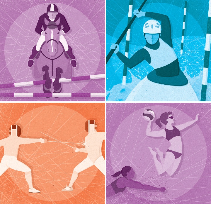
Illustrations for the London 2012 Olympic Games.
Kirill: What do you think when you look at your own work from a few years ago?
Zara: Some pieces stand the test of time better than others but I feel that I have come a long way in the few years I have been working professionally. I sometimes catch sight of illustrations lurking in my archive that I remember being really pleased with at the time and now…not so much.
However, I try not to be too critical of my older work – it has acted as a step towards what I am doing today and one day, the work I am doing today will be considered “old work”. Besides, my favourite piece of work is almost always my most recent.
Kirill: What’s the best thing about being an illustrator?
Zara: I like not knowing what I’ll be doing from one week to the next – it can be a slightly scary way to earn a living but it’s also exciting.
I also like the continuous consumption of coffee.
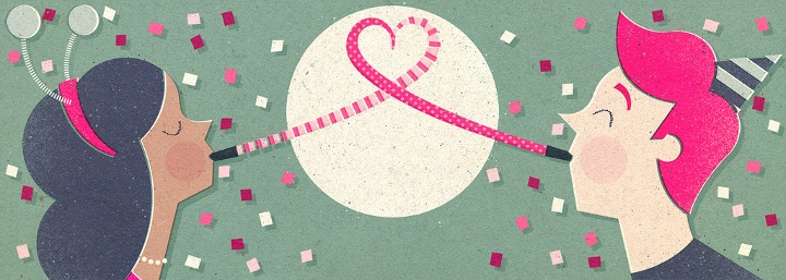
Illustration for an email newsletter.
And here I’d like to thank Zara Picken for taking the time out of her busy schedule to do this interview. You can find Zara’s work on her site, her blog and her Flickr stream. Zara also has active presence on Dribbble and Behance. You can buy selected prints over at Society6.
As I was watching “Prometheus” again after the interview with Shaun Yue, paying closer attention to how human-computer interaction is presented in the various systems, a particular point that he made during the interview stood out:
When you look inside NASA control centers and spacecraft, the graphics do not appear very futuristic. Same if you go inside an air traffic control room and nuclear submarines – all of these very mission-critical settings. The graphics don’t become more sophisticated. If anything, they become simpler and more basic. You’re dealing with such important data that has to be processed.
In one scene, Shaw hobbles over to the medipod to initiate a Caesarian to remove the trilobite from her body. She presses the red “Emergency” label on the screen (it’s not clear if this label is red before she touched it, and the earlier introduction of the equipment does not provide a clear view of the default presentation). In response, the automated voice says “Emergency procedure initiated, please verbally state the nature of your injury.” The first part is reinforcing the acknowledgment of the selection, and the second part guides Shaw to state the next command verbally. As Shaw says “I need Caesarian” the voice replies “Error, this medpod is calibrated for male patients only. It does not offer the procedure you have requested. Please seek medical assistance elsewhere.” She then initiates manual selection mode, making quick taps on the selector wheel and saying “Surgery. Abdominal. Penetrating injuries. Foreign body. Initiate.” which completes the selection phase and opens the pod.
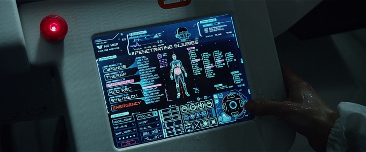
Christopher Noessel over at the “Make It So” blog dissects this sequence:
Aside from the pointless “tension-building” wrong-gender plot point, there are still interface issues with this step. Why does she need to press the emergency button in the first place? The pod has a voice interface. Why can’t she just shout “Emergency!” or even better, “Help me!” Isn’t that more suited to an emergency situation? Why is a menu of procedures the default main screen? Shouldn’t it be a prompt to speak, and have the menu there for mute people or if silence is called for? And shouldn’t it provide a type-ahead control rather than a multi-facet selection list?
…
Why does Shaw need to speak in this stilted speech? In a panicked or medical emergency situation, proper computer syntax should be the last thing on a user’s mind. Let the patient shout the information however they need to, like “I’ve got an alien in my abdomen! I need it to be surgically removed now!”
I disagree. Natural language processing is a daunting task on its own. While false interpretation of voice commands is annoying when you dictate a memo, incorrectly interpreting a medical emergency from the words of a distressed patient can have quick and lethal implications. Particularly in a system clearly designed for a particular person – Peter Weyland.
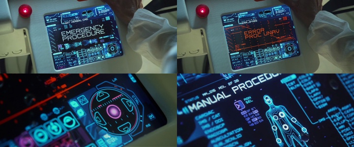
After the first voice-based interaction, as the system correctly recognizes an unsupported precisely-defined medical procedure, it does not presume to offer alternatives, or attempt to parse additional voice descriptions of Shaw’s situation. Instead, the manual selection interface offers an impressively quick way for Shaw to navigate the tree of available options and choose the specific supported procedure. And while the first impression is that Shaw is continuing to issue voice commands to navigate this menu, the second part of the sequence clearly shows her using the on-screen selector wheel – merely commenting her selections for the viewer’s sake.
The remarkable efficiency of this selection requires a certain degree of proficiency interacting with computer systems – which is implicitly expected from all passengers aboard this scientific expedition. The speed of this interaction is even more remarkable after watching the 3D re-release of “Jurassic Park” and its infamous “It’s a UNIX system! I know this!” scene, where it takes Lex 56 seconds to navigate the three-dimensional flyover rendering of the file system to locate the component that locks the laboratory doors.
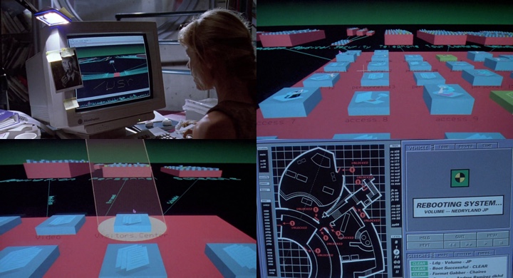
While the sequence highlights the novelty of the interface, it also underscores the poor usability of the system even if you are familiar with it – with unnecessarily long transitions that follow each particular selection, and grotesquely zooming in on a very small part of the overall hierarchy.
It takes a more focused watching of “Prometheus” to see how pervasive computer screens are aboard the ship – on the bridge, in the science lab, in the airlock chamber and around the medipod. And yet the interaction is minimal. Actually, the only explicit interaction seems to be when Charlie turns on the projection cube and proceeds to swipe the hologram projections of cave paintings. The rest is relegated to pure visualization – such as the initial descent path of the ship, the DNA sequence matching or the diagnostic scan of Shaw’s abdomen inside the medipod. It’s as if the software is written to know what needs to be presented at any point in time without lengthy explicit instructions from the crew.
When you don’t have complex interaction patterns, you have fewer points of failure. While a crash in the DNA sequence matcher is a marginal waste of time, a crash in the descent tracker or the medipod is a matter of life and death. Removing interaction complexity or, in fact – removing the need for the explicit interaction once the intent is understood – is a key part in how the human-computer interaction is presented throughout “Prometheus”.
There are two systems worth noting for their uncommonly complex visualization layer. The first is the Holotable on the bridge, and the second is the Engineers’ spacecraft control room – the Orrery. Both are featured prominently throughout the movie, but yet both are displayed as low-risk systems.
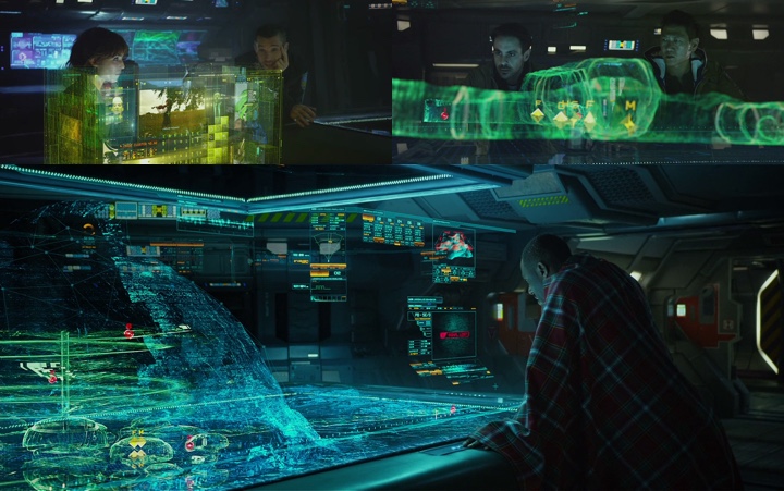
While the Holotable displays the visual structure of the dome as scanned by the laser “pups”, what happens if some part of that system crashes? Not much probably. The crew would miss some part of the scan, or see incorrect position of the probes, or miss the Engineers’ spacecraft. In fact, the sequence where Janek realizes that the underground structure is a spacecraft shows quite clearly that it was visible in the scan the entire time after David has opened its doors – even as he turned off his shoulder camera. If anything, failing to see the spacecraft in the rendering is a human failure.
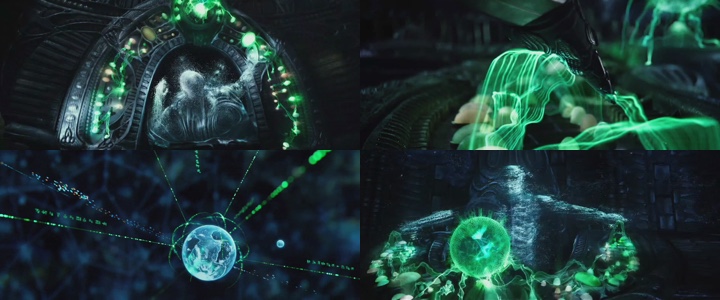
The Orrery itself is an interesting experimentation in visualizing planetary systems. However, it seems to purposefully stay as far away as possible from presenting the “quantum leap” interfaces that might be just within our reach if only we stop focusing on the next incremental improvements to the existing ways we interact with computers. If anything, the overhead shots of the deck Engineer, combined with booting the system by playing a flute portray this interaction as playing a musical instrument. If you’re interested in a deeper analysis of this navigational interface, click over to the “Make It So” blog.
Overall, the visual prominence of holographic stereo projections – mainly highlighted in the Holotable and the Orrery sequences – overshadows an interesting take on portraying human-computer interactions in movies. Computer screens are pervasive aboard the ship, and yet the amount of actual interaction required to accomplish the specific tasks is minimal.
Natural language voice input for a predefined set of tasks, predictive surfacing of relevant information, concise visual representation of salient data and simple touch-based interaction as the fallback for cases where incorrect interpretation of the user intent has life-threatening implications. These are some great ideas that deserve exploration in the real-world software.
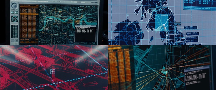
When we are surrounded by glowing screens wherever we go, what does it take to create believable and yet attractive computer interfaces for big-budget movie productions? In this conversation Shaun Yue talks about realism in representing the human-computer interaction in “Skyfall” and “Prometheus”, what does it take to place hundreds of live monitors on the set, his work on game cinematics for “Crysis” and “Call of Duty”, and how we may be interacting with information in the next few decades.
 Kirill: Tell us a little bit about yourself.
Shaun: I’m originally from Melbourne, Australia. I studied Multimedia Design at Swinburne University; it was a mix of web, animation, video and graphic design. During that time I worked as a web designer, and this web agency shared office space with a film production company, Exit Films, who made commercials and music videos. I was really interested in the work they were doing, so during the time I was working at this web company – I helped them do motion graphics, and also worked as a director’s assistant. I tried to get on set and see the whole process of what it takes to make a film.
In hindsight I was so lucky with the filmmakers I worked with – people like Garth Davis, Glendyn Ivin, Greig Fraser, they’ve subsequently gone on to achieve so much. It was an experience where I knew I had so much to learn; and was lucky to be in the right place at the right time.
After that I kept working mainly in animated commercials, and was then employed by the Australian Centre for the Moving Image which is a cultural institution which exhibits moving image in all forms, from film to games and contemporary art. I did all of their motion graphics promotional work. It was an interesting break from commercial clients, and great to explore a wide breadth of the moving image cultures.
In 2006 I was lucky enough to win a grant with the British Council to come to London and meet with some British designers who I admired. Through that I met Toby Glover who designed “Batman Begins” and a whole host of other screen graphics for films. We got along quite well, and worked together on some projects, and a year later he said “The Dark Knight” was going to be made, and asked if I would be interested, and I said “Of course!”
Kirill: Were you always interested in working in movies, or did it come together like that?
Shaun: I always loved watching movies and loved sci-fi. Whenever I saw a computer on film, I always felt strange. It was one of those things where I felt that maybe I could do that better.

Kirill: Jumping a little bit forward as you talk about making things “better”. The “Alien” franchise started in 1979, and you joined it working on “Prometheus”. How do you define “better”? Is it in terms of raw processing power that you have at your fingertips and how intricate you can get? Is it about improving the interaction design, the visual design, or something else?
Shaun: It wasn’t specifically a technical software solution to making it look more sophisticated, for example I think the computers in Alien are great, they have a very functional aesthetic. But so often screen interaction in film appears very naive, unbelievable as a computer user. And now that I’ve worked on a couple of movies, I can understand why it is a little bit fictitious or a little bit over-dramatized. But back then when I was watching movies, I was thinking that that’s not how computers work, and if I did it, I’d do it properly.
Kirill: And by “everyone” you mean people who are actually into computers…
Shaun: Right, the biggest thing about film is that they have a very broad audience. There’s often dramatic storytelling reasons to present something as it finally appears, rather than being authentic to technology. Balancing design authenticity with narrative concerns is probably the greatest challenge of the job.
Kirill: Is it a back-and-forth process on the set, defining how “realistic” the interactions with computers are? Do you ever get feedback that what happens on the computer screens is too boring?
Shaun: It depends on the movie. For example, in “Dark Knight” all the screen designs – which were designed with Toby Glover and Andrew Booth – are all DOS-based, engineering-based, very realistic, often sparse. It was about believability, and in that case the director never said that it’s too boring and let’s jazz it up. On the other side, “Prometheus” and “Skyfall” are very much about how can we show something that is beyond what a normal person is used to. “Prometheus” is set in the future, and it has to be more than what viewers are used to now, similarly with “Skyfall”, an element of a higher level of computers that the public doesn’t usually see. Obviously it’s a little bit of fantasy, but it was an important aspect of how the directors wanted to present computers in those films.
Continue reading »
![]()
![]()
![]()
![]()
![]()
![]()