The craft of screen graphics and movie user interfaces – conversation with Jayse Hansen
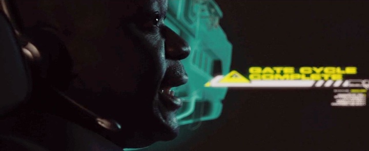
At times futuristic, at times mirroring the outer edge of the latest research, and almost always an integral part of the story. In this conversation Jayse Hansen talks about fictional user interfaces, his approach to the initial research, interaction with the movie director and visual effects supervisor, and how these interfaces shape and are shaped by their real-world counteparts. Jayse has recently completed his work on “The Avengers” and he delves into how shooting in stereo has affected the design of Iron Man’s helmet HUD. He also talks about the future of user interfaces and, in particular, exposing huge sets of data for smart consumption and effective non-linear navigation.
Kirill: Let’s start with your background and how you got to working on user interfaces in movies.
Jayse: I was just a kid that loved film and wanted to get into it, but I had to do it in a roundabout way because I lived far away from the main centers of action, and didn’t really have the means to go to school for it. I started by teaching myself graphic design for print from books and asking designers everything I could. Most told me I’d never be a designer unless I went to school for years and years. What I found was that some of those schooled designers came out very cocky but lacking the skills to actually back it up. So I took the hard road, and bought a library of books on design, asked for critiques from designers I respected, and grew as much as I could.
I then moved into Flash-based web sites, did some UI design in the old Stardock theming community, and finally into motion design. And then a friend of mine, Mark Coleran introduced me to the fact that people actually get to design screens for films. If you’re a good UI-designer and a good motion-designer, then you might be a good fit for FUI’s (Fictional User Interfaces.) I thought that would be about the best job in the world.
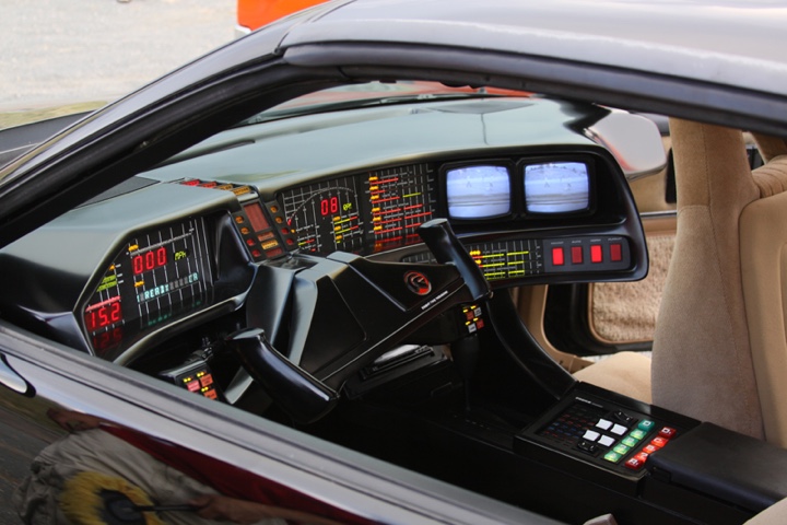
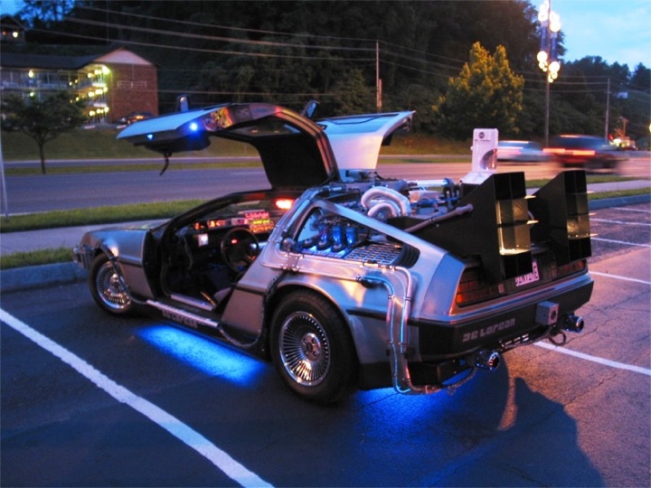
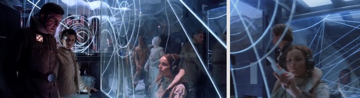
I realized that since I was little I’d always paid attention to the screens in film, for example, the x-wing targeting displays in “Star Wars” or the holographic globe in the “Return of the Jedi”. With shows like ‘Knight Rider’ or the Delorean in ‘Back to the Future’ I’d always wanted to know what all the displays on his dashboard were and how they worked.
I sent Mark some UI work I’d done and luckily he didn’t laugh at it. He thought it was decent enough to start sending my name around. So I got my first gig doing concept work for Dead Pool’s vision and Striker’s command center screens on “X-Men Origins: Wolverine“. And after I got through the first door it just kept on going because there really are only a few people out there that specialize in this type of work. I think the detail involved might kill a few people, but I thrive on it.
Kirill: What is the process of creating screen graphics for these fantasy user interfaces? Who do you usually work with?
Jayse: There are usually two sides to it, although they’re somewhat merging. One side is called “playback design” where you’re designing before they start filming. In this case you may be working with the film’s art director. You may get a part of the story or a part of the script and you’ll be designing screens for them to use on-set while they’re filming so that the actors can actually interact with it. The other side is called “post-replace” and those are designed and composited in post-production after the filming is done. There, you’re usually working with the VFX Supervisor and the director.
Hero screens seem to be becoming more and more post-replace, as the director and editors have a clearer vision at that point of what the screens should contain. “Hero screens” are more about story-telling or clarifying. The director will focus on them to move the plot along or to quickly clarify a certain point. They’re usually in focus and seen closeup, sometimes even full screen as in “2012“.
I’ve been doing hero screens for the most part, and for this type of work I’ll usually get a rough edit and all or part of the script. Reading through it is never wasted time – as I pick out parts of the story that really inform the design and the aesthetic. Then it will be a conversation with the director, vfx supervisor and the leads of the company that I’m working for about how to make it look super sexy and tell the story at the same time.
Kirill: Do you get a rough estimate on how much screen time and screen estate you’re going to get?
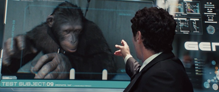
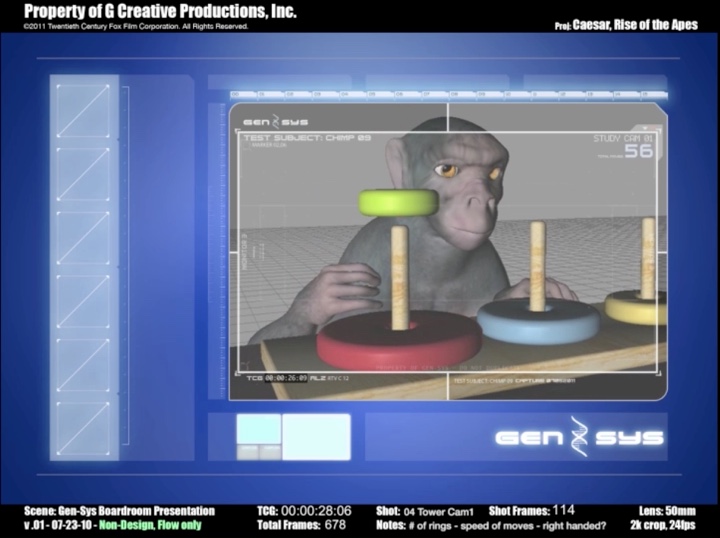
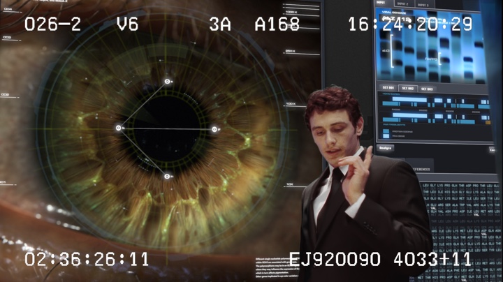
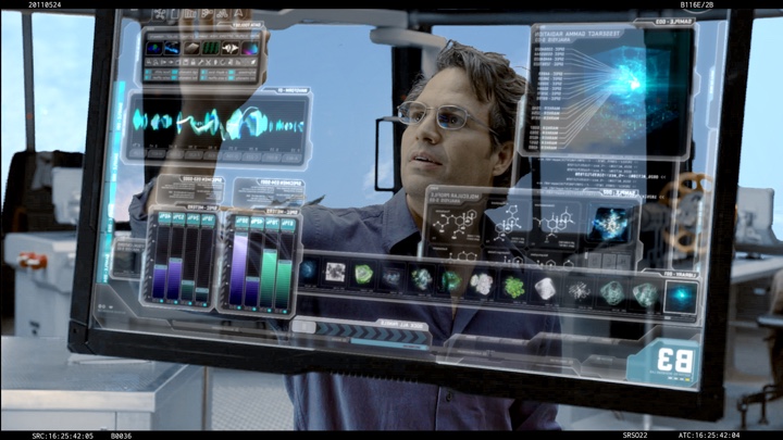
Jayse: Sometimes screen-time has not been determined yet and we’ll have a little of a back and forth discussion. For example, for “The Rise of the Planet of the Apes” they came to me through G-Creative Productions to do the boardroom sequence where James Franco is explaining how a new drug, ALZ-112, is going to help cure brain illnesses and make everyone smarter, including apes! In that sequence, as he’s describing the process, the drugged chimp goes crazy and jumps through the glass presentation screen at the very end. The entire sequence, which ended up at around three or four minutes in the final movie, was originally just text on a page. Although it was really well written, it didn’t have much in the way of descriptions of visuals.
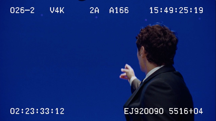
So before filming began, they wanted to flesh it out in terms of what would be on the screen behind James, which on set was simply a large, 11’x17′ blue screen. In addition to visuals, they wanted to know the overall pace of the scene. I started by doing a roughed out animatic sequence. I needed pacing so I recorded my own voice doing all the actors’ parts. Director Rupert Wyatt used that on set to pace it out, and then about four months later, after they filmed it, they came back for me to do the final shots.
Kirill: So essentially you are doing a very dynamic pre-vis sequence, and not just a bunch of static image boards.
Jayse: Yes, it’s basically pre-vis for filming – but it’s also somewhat post-vis for the post-production work. I even had a little terribly-animated Poser-monkey in there just to convey some of the ideas.
Kirill: Do you get a relative freedom for your first explorations, and then refine it based on the feedback from the director or the VFX company?
Jayse: Exactly, yes. There’s a ton of freedom upfront and that’s what I really like about it. They are really relying on me to provide what I think the content should be, and so they’ll usually be very general in the script or description. So beyond that it’s up to me, or the team, to do the initial research and flesh it out.
Kirill: Let’s talk about the research phase. You did a virus proliferation map for “Contagion” and brain cell activity simulation for “The Rise of the Planet of the Apes”. Do you go to the technical literature on the subject to get a roughly plausible visual language?
Jayse: Yes. I really love doing the research. Unfortunately there is always a deadline, so you can’t get a degree in the fields I study – even though some of them are so interesting I’d love to learn more – like learning to fly in order to design the upgraded Iron Man HUD. I will continue to learn that type of thing! But, because the pace is pretty fast, I do try to talk to people who either work in that field or have done that kind of work, and of course there’s a ton of web research.
For example, for “Apes” I made PDF’s of research for each of the 20 or so different story-points that had to be told.
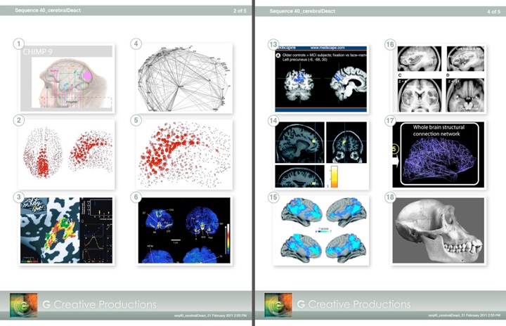
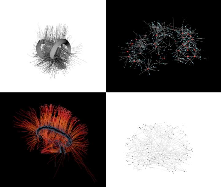
I did some reading about chimp research, and how they display that data in terms of graphs, and a ton of work on how they map the brain. Jorik Blass has done great research in diffusion tensor imaging of the brain and it turns out to be this beautifully complex look which I recreated in Cinema 4D for some of the brain sequences.
Kirill: Do you have any specific directive to take that look a little bit beyond what is available in the real-life systems in that particular area, to make it a little bit more sexy or appealing?
Jayse: I always assume that they want something that feels grounded but is at the same time sexy, or “Hollywood” as they call it. I only had one time where they came back to me and said, “make it more Hollywood” (laughs). I tend to amp stuff anyways, and that’s my goal to make it look more polished, more sophisticated, as well as tied into the general art direction of the film itself.
Kirill: But then on the other hand you’re not supposed to steal too much attention away from the main characters.
Jayse: Exactly, and it’s a big balancing act. A lot of designs I do use the composition rule of thirds or the golden mean to direct the viewer’s attention to the actor. In “The Rise of the Planet of the Apes” the designs were done very intentionally to always make sure he was the focus. Sometimes the main graphic would literally ‘point’ to him.
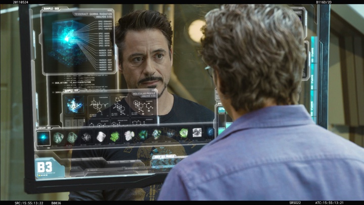
With Avengers, I was directed to design the glass screens with a lot of negative space, or lots of black in other words, to make sure when you’re looking through the screens you can clearly see the actors’ faces and performances.
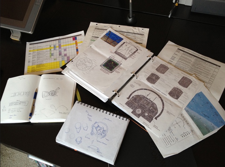
Kirill: Do you start with the physical medium of pen and paper, or do you go straight to the computer?
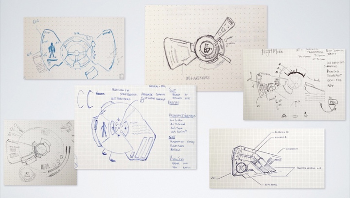
Jayse: I always sketch first. Though I’m also comfy with starting digitally first as well – I just prefer thinking with paper. I give myself permission to ‘draw badly’ and sketch out everything without rulers and without rules. Just let things flow from your brain kind of thing. I went through two notebooks for “The Rise of the Apes”, and three notebooks just for Ironman’s HUD for “The Avengers”. It’s the quickest way to test out ideas, and visually ‘think’. I always try to go away from the computer, away from electrical interference, get out. I have an art-room in my house with a big drafting table and a nice view out the window, and I like to go there to brainstorm.
Kirill: Do you keep a notebook to collect your ideas in between the projects?
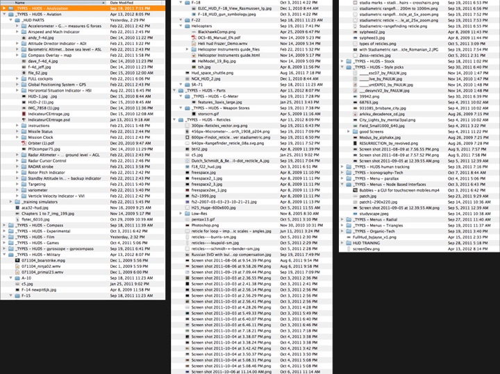
Jayse: Yes, and I have that in both the physical notebook and on my phone. I would snap pictures and put them in Evernote. Mark Coleran has a huge folder of screen references that I was super envious of – so I started making my own. I came up with my own way of categorizing them by screen type – like ‘Facial Recognition’ or ‘Thermal Imaging’ or ‘Access Denied’. Inside each they’re broken down to real-world applications, film, hardware, and ‘unrelated-but-inspiring’. I track the existing movie references so that I’m not repeating them, but also to be inspired. I also have stuff that maybe is not related at all – a painting, maybe – but it has a neat feel or a neat color palette to it, and that is perhaps the best reference to use to make your stuff look unique and new.
Kirill: Getting back to playback designs that are used on the sets and hero screens developed in post production, which one is more interesting for you?
Jayse: I actually like both. I’m yearning to just do some background screens sometimes – pure interface-love. But I guess generally I like the hero screens best. Having a story to tell, or a narrative is one reason I love designing for film. You also have more definition of what is happening in the scene and you also tend to get more time to get it right.
Kirill: In your interview for FxGuide you mentioned that this was your first production done in stereo. This makes it even more important to work in post-production, as opposed to “flat” playback background sequence.
Jayse: Right. Although the screens themselves didn’t have depth, the interaction of the actors with the glass screens was all improvised on the set. They filmed with just glass screens, with no tracker markers. It was interesting to get the footage and see how different actors interact differently with these screens. Nick Fury (Samuel Jackson) was just moving and swiping things – usually in a somewhat angry manner. Banner (Mark Ruffalo) would timidly slide things slowly, purposefully up and down, and then Tony Stark (Robert Downey Jr) would just go crazy turning things, sometimes using his index finger and pinkie to slide. We would always think that he was probably just messing with us, “let’s see what they come up with” type of thing. There was really no direction in terms of what it would be.
Kirill: So you’re designing each type of the interface around this fluidity.
Jayse: Yes, we designed and animated it to work with those movements. Another awesome designer who I worked with, Jonathan Ficcadenti had the fun task of coming up with the graphics behind a thumb-twist and dual finger slide, tap tap. We came up with a lot of ideas over a few beers – but in the end it took a few design variations to actually get that to work.
Kirill: Apart from doing more modeling for the stereo environment, do you see that it affects the way you approach designing the on-screen elements?
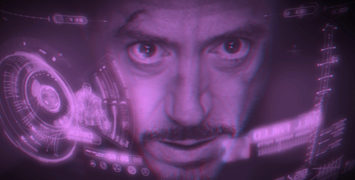
Jayse: This especially affected the HUD. This was the first time that it was done in stereo and I was surprised by how much it changed pretty much everything that we did. A lot of cheats would no longer work – because stereo reveals that they are just cheats. Also – they didn’t want shallow depth of field in these HUDs. In the previous HUDs you could get away with a lot of stuff being out of focus and blurred out to get some sense of depth. And so it was easy to put things in front of his face or move things around more dynamically. But stereo purists like stuff to be mostly in focus because the viewer’s eye is what determines what is in focus. We were worried about it at first, thinking: are we going to deliver two versions, one for the 2D version of the film, and the stereo one for the 3D version? And that would have been just a nightmare, so we had to come up with something that would look good in both 2D and 3D.
The consequence of this is that everything is in focus – so everything is readable. We ended up with a much more detailed look where we can read, for the first time, the small micro text and so we made sure that all the text is related to the scene, and all the graphics had a purpose – which is the way I like to design anyway.
There was another thing that happened in the stereo process. In the previous HUDs you could fake things in terms of where they were in Z space. You could have something that is closer to his face but small, and it would look all right. You’d put it closer to have it move less with the track and look more stable – so it’s a great cheat in 2d. But once you put it in stereo, suddenly it would look like it was inside his face. It was kind of an optical trick that worked in 2D, but doesn’t work in 3D and you realize, wait, that’s actually inside of his cheek – that looks awful! So you had to redo the positioning and scale of graphics to make sure that it felt right in stereo as well as looking right in 2D.
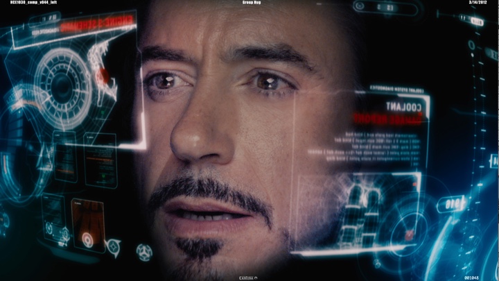
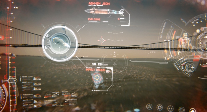
But designing in stereo also gave us the unique opportunity to use depth to differentiate designs. There are two HUDs in the film. The first HUD, Mark VI, designed for Iron Man II, was kept a bit more flat and the intraocular distance less spread, for less stereo depth. The second, new updated Mark VII HUD – the one he jumps into during the final battle sequence – was where we pushed the 3D depth a bit more. Really it was just spreading the two left-right cameras in After Effects a bit farther apart.
Kirill: It would seem that 3D is more affected by the difference in how people perceive it through these special glasses they hand out in the theaters. Did it happen that you got such a feedback that some of the parts would appear inside Tony Stark’s face, but it looked all right to you?
Jayse: We had a lot of going back and forth between different people (laughs). And a lot of tests! The visual effects supervisor, Janek Sirrs and the stereo team had the final say. We relied on their expertise a lot. In terms of pixels, we had worked out where his cheek actually lived. We looked at it in the blue and red format, and you can count the pixel offset between the two versions to estimate whether the specific element was too close or too far out. Stephen Lawes (Cantina’s Creative Director) and I developed a ‘cheat sheet’ for our team of people working on the final stereo run. It listed general z-space coordinates for each major element to keep them consistent from shot to shot. He’d spent a lot of time figuring out the ideal space of the elements so that it didn’t feel too empty or too crowded.
Kirill: Do you see this as the path forward, stereo-first productions for sci-fi movies?
Jayse: Yes. Like it or not, so far it’s proven to be a good money-maker, and if nothing else, that will continue it. I actually really liked working on this in stereo. I think that HUD was one of the things that was meant to be seen in stereo. Once we did our first stereo tests, we all got pretty excited about how it looked with depth. It felt like you were in the HUD with Tony Stark, which was pretty cool.
Kirill: Did you have any specific instructions on what to avoid in your stereo work?
Jayse: Well I learned that there’s a James Cameron approach to 3D – which is to have the most foreground object be at picture plane and everything else to recede back. And that’s a really nice way of doing it. And there’s another way of doing it, the more typical way, where you have your main action at picture plane and you have stuff at front come forward into the audience, and background things go back. But having stuff come forward ‘into the audience’ can tend to produce headaches – especially if you have a lot of action – and camera shake – basically all the things you see in our HUDs. You’d also have a lot of elements cutting the picture-plane. So we were aiming for picture-plane and back since that worked really well on “Avatar”, for instance.
But we had a problem with the HUD. You can put all the graphics that are in front of his face at picture plane, and then have Robert Downey Jr.’s face recede super far into the background – but then the HUD feels cavernous. We had a lot of different tests and we finalized on having the picture plane on his cheeks. Otherwise the HUD ended up feeling like a rather overly-capacious closet (laughs) when he was pushed too far back. But now we had graphics coming up front and we were worried about very fast 3D movements and motion shake as he’s flying. Would it make you dizzy or nauseous? And how would cutting from scenes where your eyes are focused on distant NYC landscapes to super close-up shots work. I have to hand that to Stephen Lawes, Janek Sirrs and the wizards at Stereo D. It ended up working really well.
Kirill: There is a lot of emphasis on interactivity. If you look back at “Star Wars” and “Star Trek”, or even the movies from 1990s, there wasn’t a lot of real interactivity. Perhaps there was not enough technical capacity to do this, but nowadays it’s an almost implied part of your job.
Jayse: Everything is interactive these days. It used to be keyboards and mice, but these days it’s all touch screens or holographic or a direct-neural-interface, such as the HUD which works off of both line-of-sight and the neural-oscillatory-activity of Tony Stark.
Kirill: Do you see this connected to the renewed interest in UX in the real world software, with touch-first hardware from Apple, Microsoft and other companies? Is this affecting what you do?
Jayse: Absolutely. People used to be a little bit mystified by a few things – such as interactivity – but now it’s completely natural for an actor to walk up to a glass screen and do swipe or twist movements to zoom in. That’s where it changed. It’s no longer mysterious; it’s just pretty much everyday life. Same with glass screens – people think those will never happen but they’re already here.
Kirill: And you get to cut corners here and there, as you’re not creating real-world systems for the real-world environment.
Jayse: Yes, we design them to a degree that it works for the story – which is the most important – and reality comes in as a second. Full functionality is lacking, as we don’t need it to be working in eighty different situations like the real software would, and we’re quite thankful for that. We simply don’t have that kind of time. So yes, we gladly cut a lot of corners. It’s also what allows us to think outside the box a bit. I’m not worried about how a programmer is going to have to make this all work.
Kirill: Looking at this the other way around – do you see the fantasy user interfaces leaking from movies into the real-life software, perhaps a few years later?
Jayse: I think it grows consumer demand for that type of thing. For instance I just started working on a ‘top secret’ real-world government UI design project. I guess they were jealous of the way government screens look on film (laughs). They don’t want theirs looking like an Excel spreadsheet when it could look better – and work much more efficiently – by being better designed. People ask me “do you prefer function or form first” and I think that they are inextricably related. A badly designed interface is not going to function very well, and that’s what I really like about user experience. You can’t separate the two. You can’t say it functions well without it being formed well.
Kirill: You work with real-life software tools on a daily basis. What do you see as the main source of pain for you as the user of the current crop of user interfaces? What would you change if you were a king in the world where the software works for you instead of fighting at you?
Jayse: It’s a good question. I think a lot of software could benefit from a nodal approach if done in the right way. That may be because I’m a very visual kind of guy, but the software that is currently done in that way – which is basically a lot of compositing software, like Nuke, Shake, or Flame – and how it works with nodes and links between the items really makes sense to me. Some of the recent real-world interfaces that I was working on reimagined the Excel spreadsheet look as a node-based interface, and I think it will work well that way.
I think one of the biggest challenges of software and data design is the amount of data that it has to make accessible to the end user. I’m extremely interested in ways of mapping complex patterns of information – looking at patterns rather than individual pieces – and I see a lot of work exploring that which is really exciting to me such as Circos.
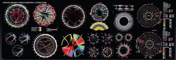
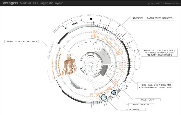
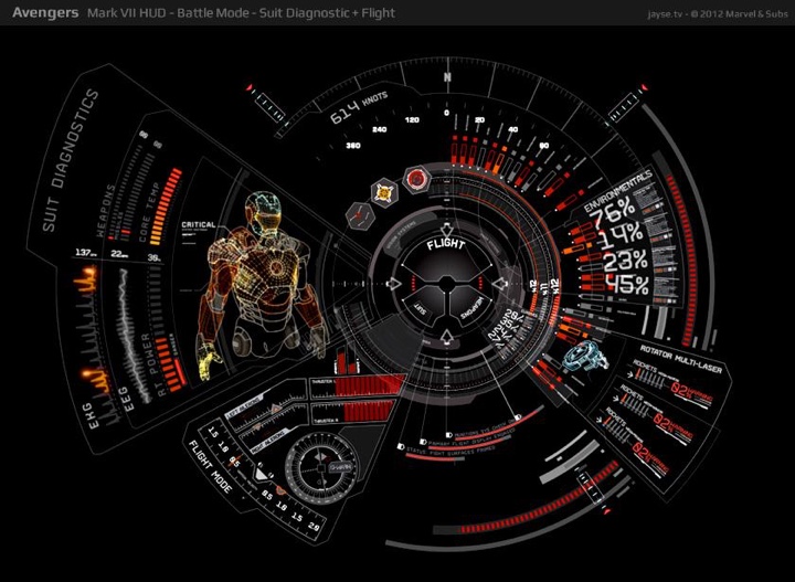
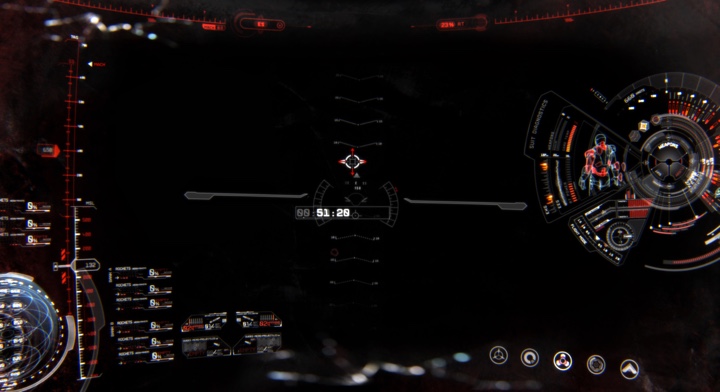
I integrated parts of those ideas in the Mark VII HUD diagnostic. It showed him an immense amount of data on his suit at a glance, but yet you can’t read each individual thing. And you’re not meant to – he’s looking at the patterns of it. He could zoom in if he wanted to see each one, but he knows where each piece of data lives and he can see at a glance whether it’s OK, or whether it’s depleting or malfunctioning. And so he can read the patterns at a glance, rather than just raw information. I really got into it designing the HUD. This guy’s got so much info coming at him from Jarvis, his suit computer. How does he read it? What he’s supposed to look at? How can he read it and fly his suit at the same time? He has to be able to glance at stuff and absorb the data in an instant.
Kirill: Projecting that into the real-life software, you’re talking about investing time to understand how to reduce the visual complexity of the information.
Jayse: Maybe not reduce it. Simplicity is very relative after all. Some people, like Tony Stark, are very comfortable with immense displays of data. The challenge is how to display it in a way that is understandable and useful to the user at a glance. So it can remain complex – yet convey what you need simply and effectively.
Kirill: There’s been a recent explosion in the interest in infographics, how to take these big data sets and distill them down to the underlying traits and tendencies.
Jayse: Exactly. For so long we’ve relied on a linear display of information, such as a family tree. But there’s so much data now that it kind of fell apart in the 1950s and 1960s. For a long time there’s been so much data that we haven’t been able to organize it, the tree stopped working and we ended up with all this scattered data. But recent advances in network visualizations and network complexity mapping have come out and allowed you to organize all that data in a way that makes it useful for you, once you learn how to read it. A radial network map might look futuristic to you now – but it will soon be as familiar to you and your children as a family tree.
Kirill: Bringing it back to your film work, is this where your research comes in, to know what is that information that is supposed to be shown to the main character interacting with your screens?
Jayse: Yes. For “The Rise of the Apes” it was a lot of medical visualization, and for “The Avengers” it was studying the aircraft carriers and how they work.
For the HUD it was studying combat aviation HUDs and what kind of information they display – how they change in different modes etc. I consulted with an A-10 fighter pilot. I would explain the general situation of something like flying low through a city and ask him what kind of stuff would he want on his ultimate HUD. Then I’d add my sense of dramatic alternative UIs and merge it altogether. But that information changed how I designed the new Mark VII HUD.
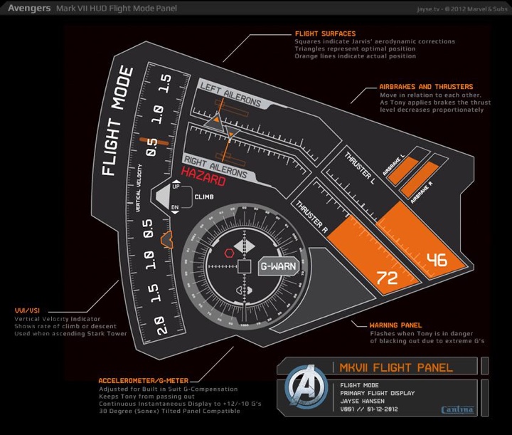
If you just started out to design something ‘cool’ in a HUD – you’d just end up with a bunch of circles and random text and I think it would just feel wrong, even if you couldn’t put your finger on why.
Kirill: Can the work you’ve done to understand and map visual complexities of real-world data in fantasy user interfaces affect the real-world software?
Jayse: It’s possible. I’ve recently had a few new offers to design real-world UIs… so we’ll see. With Iron Man’s HUD it’s always a balance between too much data or not enough. But that’s the balance with real HUDs as well. I asked the fighter pilot, Johnnie Green about information overload and he said that the standard HUDs are always overloaded with information. In fact, he said the first thing he teaches his students is how to focus on the important stuff as you need it, how to zero in on the information that you need and blank out the rest.
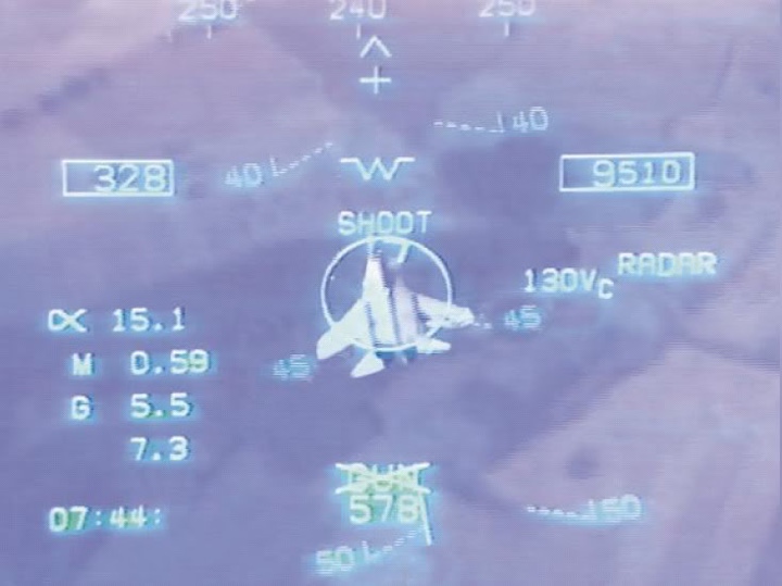
Real F-18 HUD
Mark VII Iron Man HUD
Kirill: You mentioned growing up on the interfaces from “Star Wars” and other older movies. If you look at them now they look quite dated, as they were built within the confines of not only the old hardware, but also within the confines of what the designers could think about. Is this going to happen to your current work in 40-50 years?
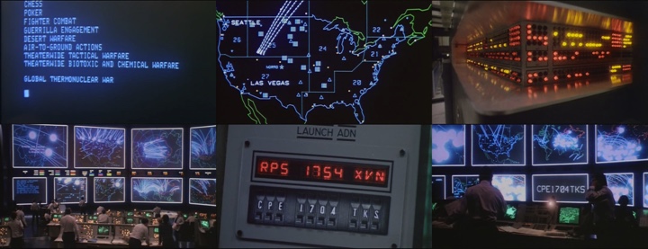
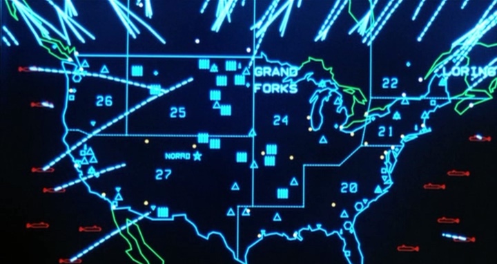
Jayse: I’m sure it will. When I look back at the interfaces in “Star Wars”, I totally appreciate them and I think they were well-designed. They immediately tell the story of what they were trying to tell, and for that I love them. They do look dated because of their simplicity, but we may always go back to simple, so it could come back around. Minimalism and Maximalism are constantly in and out – like an ocean. And I love both – I just don’t love indecisive in-betweenism. I think we’ll probably see less grid-based design and more organic pattern-based data-design – and much more holographic displays which are really exciting to me. In the end though, good design will always be good design, and in a way it may always be timeless. If you look at the screens of “War Games” and the big command center at the end – and I saw a screenshot the other day – that was just gorgeous.
Kirill: Wouldn’t that be affected by your impression as a kid growing up seeing that? You’re not really viewing it objectively from where you are today.
Jayse: It’s always hard to be objective about this stuff when you have your own personal memories integrated into it. But design is a learned discipline, and I look at things very differently now than when I was a kid – and those screens still look pretty sexy in their lo-fi kind of way.
Kirill: There’s a recent trend – in “The Avengers”, “Avatar” and quite a few other productions – to gravitate towards translucent screens with no visible batteries or wires where you fling stuff between the screens and you can look at the 3D models projecting from them. Can you realistically expect this to happen in the next 15-20 years?
Jayse: Absolutely. There are DJs already using glass screens in their sets. You can be in the crowd looking at the DJ and see his face, see him interact with the virtual turntable.
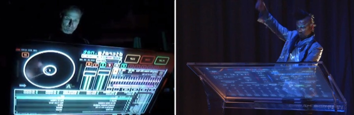
I think they have a few things to work out, but it’s all being done right now. I can’t wait to see paintings being created this way. The Explay Crystal phone was just released with a transparent display. Think of it from an interior design point of view – a sleek office full of transparent screens looks so much more open and nice than one with ugly black LCDs blocking the view. And in Avengers, Joss used them beautifully – even having conversations between them.
Once they figure out how to parametrically blur and ND, or darken down the background they’ll find wider adoption. I can’t wait to get mine.
Part of designing for films is that sometimes people will say that it looks too advanced for this film, but you always want to design a bit more advanced than what’s current because you don’t want the aesthetic-life of the film to only last a year or two.
You want that film to look good five years from now, ten years from now. Nothing dates a film like old cell phones or having an outdated looking interface on it. So for Fury’s screens – they wanted them to be less high-tech and polished than Stark’s interfaces – yet still be very advanced. If they weren’t, in two years it would be like Fury walking up to his monitors and pulling out a Motorola flip phone with a red LED display. It’d immediately date the film and you’d be pulled out of the story for a second or two. So I’m always looking to never have the design be dumbed down or be too current just for his reason. You want it to hold up years from now.
Kirill: But you also you don’t want to go too far beyond what seems to be reasonably futuristic.
Jayse: Yeah you don’t want it to stand out for just being crazy. It will just draw too much attention for being too ‘out there.’ That’s where tying it in to the art-direction and design of the film as a whole is important to me. But keep in mind; sometimes we’re unaware of what is truly ‘current’. Some of the really amazing data design that looks so next-level-futuristic is actually being done currently… right now, in the real world. For me that’s pretty exciting stuff.
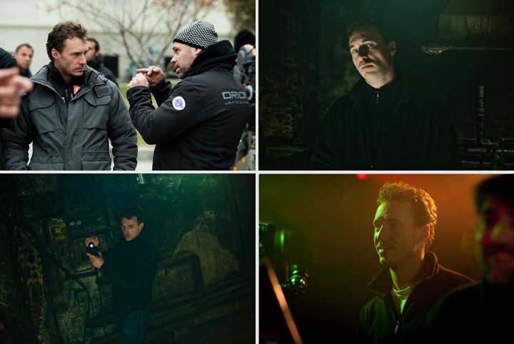
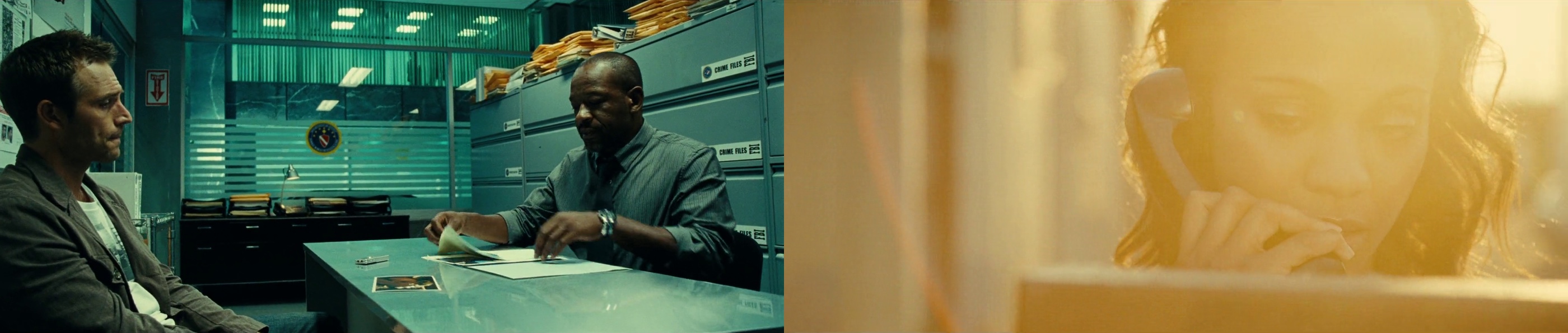
And here I’d like to thank Jayse Hansen for this unique opportunity to graze the surface of what it takes to create screen graphics and user interfaces for movies, and for sharing his process and behind-the-scenes pictures with us.