Continuing the ongoing series of interview with illustrators, it’s my pleasure to welcome Brian Edward Miller on my blog. Brian is the creative mind behind the Orlin Culture Shop (OCS) based in Erie, Colorado. His evocatively stylistic landscapes and vibrantly energetic human figures are brought to life with bold strokes and strong color palettes. In this interview Brian talks about his roots, his creative process and designing for various media.

Photograph by Brad Edwards.
Kirill: Tell us about yourself and how you started in the field.
Brian: My name is Brian Edward Miller and I’m the owner and illustrator behind Orlin Culture Shop (OCS for short). I got my start as a creative professional in the field of graphic design and worked for a number of different agencies and studios.
Around 2005-2006 I realized that my favorite part about design was illustration, something I leveraged heavily in all of my projects. I made a decision to pursue drawing more seriously in my spare time and was able to shift the course of my career in a way that afforded me more opportunities to draw. I started by showing up to work an hour early so I could draw and stayed up 2 hours later every evening to create. Next, I took jobs which were less taxing creatively and demanded less of my time so I’d have the energy to pour into drawing. Every drawing I did I saw as an opportunity to grow and it helped me to maximize my study and drawing times.
I ended up working at a few gaming studios as a graphic designer with a handful of opportunities to try my hand as a concept artist. It was here I had my first taste of a career involving drawing and I couldn’t get enough of it. I tried a number of times to make the transition from graphic design to concept art, though none of the opportunities worked out because I could make more money as a Senior Graphic Designer or Art Director than I could a Concept Artist – which is a big deal for me as I have a wife and 2 kids!
Eventually, the decision was taken out of my hands as the first game studio I worked for was dismantled and sold, while the other closed down less than a year later. After the studio closures, I decided to put my abilities to the test by venturing out on my own and starting my own business.

Spot illustration of a broken down vehicle.
Kirill: What drove you to start your own studio, and what is behind the “Orlin Culture Shop” name?
Brian: I started my own studio out of an even mix of necessity and opportunity. As I mentioned above, the gaming studio I was working for had gone under just as I was on the cusp of pushing into concept illustration. I was torn as a creative professional because I had more confidence in my skills as a graphic designer, but I was much more passionate about illustration.
After a handful of interviews at other gaming studios out of state, my wife and I decided we didn’t want to leave Colorado. As there were no local gaming studios which fit our search criteria, we decided to create our own studio which would allow me the freedom to work in the industries of my choosing. Thus, Orlin Culture Shop was born!
Behind the Orlin Culture Shop name is the continuation of an artistic legacy which began when I was very young. My grandfather (whose middle name is Orlin), used to have a workshop in his basement where he’d work on a number of different crafts such as leather working, cross stitching, wood working, etc. – all hallmarks of the vintage Americana generation he grew up in. I spent countless hours in that shop dreaming and building (as well as hammering thousands of nails into boards).
When it came time to name my shop, the name Orlin popped into my head and stuck. Its my hope that I’ll be able to contribute artistic works which will have a positive impact on culture, whether its through editorial illustrations or picture books.
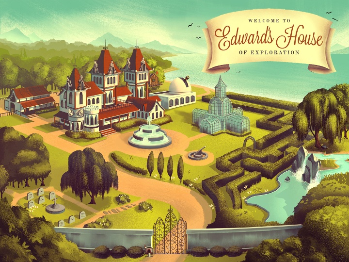
Mowrey Manor, illustration for an educational iPad app.
Kirill: What informs and shapes your taste and style?
Brian: My taste and style was shaped by an amalgamation of influences ranging from Vintage Disney, 1980’s cartoons, Manga, Comic Books, 1940-1960’s advertising illustration, and countless picture books. I tend to fixate on mood and atmosphere in the art I love the most which means I appreciate a broad spectrum of styles and approaches, so long as the mood is right.
Kirill: Are you experimenting with illustration elements outside your comfort zone? Is this a constant process of defining and refining your own style?
Brian: There is always a process of defining and refining my own style. I am constantly on the hunt for refinement within my process and there’s still a TON to learn.
One of the greatest things about running my own business is I have the freedom to experiment as much as I want (so long as I’m bringing in paying work of course). I’m no longer tied to a single job title and description which means I’ve been able to work in a number of different industries.
I also find that every project and client has unique requirements which challenge me in ways I’d never willingly challenge myself. There’s lots of growth that happens because of this, and very healthy boundaries set with deadlines to ensure I don’t get too lost exploring.
Kirill: As you start working on a new project, is it pen and paper first, or all-digital?
Brian: When I start working on a new project, its usually a mix of pen and paper first, followed by all digital. I tend to think better on paper where I can quickly write notes and throw down rough lines to get all my ideas out first. From there I’ll head to the digital platform where I do my ‘official’ sketches and final production.
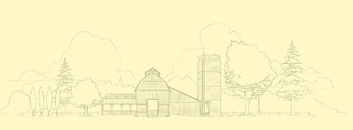
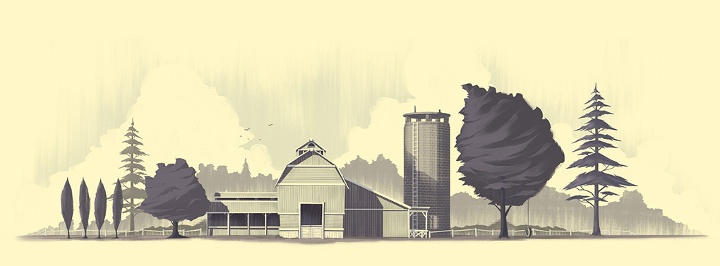
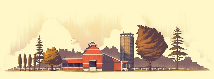
A farm illustration – from the initial sketch to the final look.
Kirill: How do you preserve color fidelity when the final product is targeting print media, such as flyers, posters or magazines?
Brian: Unfortunately, I have very little control over that as most of the clients I’m working with live out of state or out of country. I don’t have opportunities to go on press checks or do anything about quality control so I’m left to the mercy of the client and their chosen printer.
Ideally I’d be able to make the two match but that would require I’m present at every stage of the process. The disparity between print and digital platforms has been something I’ve learned to accept simply because both are so different. I always love pouring over the details of a printed piece, but I also love the dramatic backlighting of a piece viewed on a screen or tablet. I’m comfortable keeping the two distinct which helps keep me appreciate the way a piece shines within different media (as well as keeping me sane).
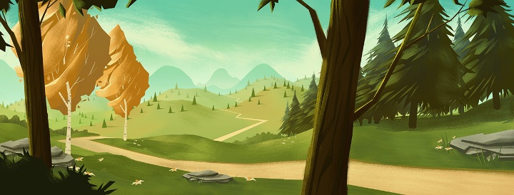
Peaceful valley scene.
Kirill: How much different is the final illustration from the initial concepts that you’re imagining in your head?
Brian: Most often, the final piece is extremely close to what I had imagined in my head (or at least some evolution of what I was envisioning). I tend to focus my imagination on a mood or a feeling so there’s a lot of latitude and room to explore as I move from initial concept to final illustration while staying true to the original vision. That latitude and room for exploration is important to me because drawing can be very tedious work. If I’m simply retracing steps over and over, I get bored.
What are your thoughts on illustrations for web sites, and how does it scale with responsive design and smaller mobile screens?
I’m so used to seeing my illustrations digitally and on websites (usually my own) that I tend to think of the web as the true home for my work. When I do a piece for a client, I see it on screen for months before finally seeing it in print. This makes the print version “the stranger” who looks vaguely like the person I remember sending off…
As for scaling, I believe strong color palettes, diverse tones, and bold shapes help an illustration to scale well, though there’s always some level of detail that is lost as the image size decreases.
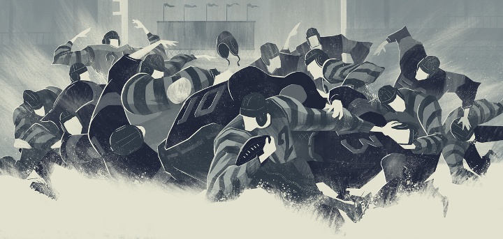
Editorial illustration for 1940’s era Snow Bowl.
Kirill: Do you have a particular inclination towards illustrations of nature?
Brian: I definitely have an inclination towards illustrations of nature. Growing up in Colorado, nature was a part of my childhood as I spent the majority of my time playing outside, enjoying the seasons and outdoors. I was also fascinated with Bob Ross as a kid. I remember watching his show with my dad almost every day (I even tried my hand painting using the kit they sold at Hobby Lobby!)
The funny thing is looking through my sketchbooks from the past, you won’t find any drawing of nature. Its all human figure studies, comic book and cartoon characters, etc. Its only when I started my own business and began to figure out who I was as an artist that the inclination towards illustrations of nature took on a powerful presence in my work.
Kirill: How important is it to invest time in personal projects?
Brian: Personal projects are vital to my ongoing development as an artist. It was only with personal projects that I was able to focus my efforts as an aspiring illustrator. My projects included writing and drawing comics / graphic novels, designing characters for animation pitches, and dreaming up story ideas for picture books. It helped me to learn creative writing, illustration, and forced me to face my weaknesses. It also empowered me to transition an idea from my imagination to the digital canvas.

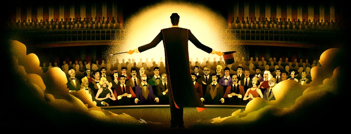
Illustrations for Tarsus Group’s “Label Expo 2013”.
Kirill: What do you do when you run out of ideas and get stuck?
Brian: There is nothing magic about my approach when I’ve run out of ideas or get stuck. I’m very dependent on deadlines to help drive through insecurities and pride (the two culprits I most often discover when I’m trying to understand why I’m stuck). Deadlines force me to sit down and draw despite the fear or uncertainty I’m experiencing. Its only after I’ve thrown down a few ideas (usually the most generic ideas I can think of, the ones which occur to me first) that I begin to get comfortable with the project, my abilities, and my objectives. I have to move forward no matter how much those first few steps hurt, otherwise I’ll sit and stare at a blank page forever.
Kirill: What’s the best thing about being an illustrator?
Brian: The best thing about being an illustrator is being able to provide for my family in a way that allows me to work from home by creating work I love. I also get to see some of the best parts of being an illustrator through the eyes of my kids. When they get excited about the picture books and illustrations I’m creating, that is always cause for me to be thankful. Its there I realize the headaches that accompany being a small time business owner are worth it simply because I’m living a dream I’ve had since childhood

Villainous robots from the “Totes Adorebots” series.
And here I’d like to thank Brian Edward Miller for answering a few questions I had about his art and craft. You can find Brian online at his portfolio and blog, as well as on Behance and Twitter.
In the last two decades Oana Bogdan has worked on dozens of movie and TV productions. On the big screen her career spans “Stargate”, “Godzilla”, “Vanilla Sky”, “I, Robot”, “Underworld”, “Total Recall” and the upcoming “The Prey”. On the silver screen you have seen the her work in “24”, “Without A Trace”, “Cold Case”, “Criminal Minds”, “Justified”, “Dark Blue” and “Hawaii 5-0”. In this interview she talks about how the craft of art direction and production design is changing in the world of increasing capabilities of digital tools, the shifting balance of responsibilities between the various departments, why building real-scale vehicle models was necessary for “Total Recall” and how different the work like is between movies and TV shows.
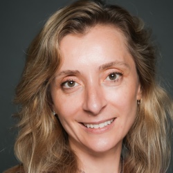 Kirill: Please tell us a little bit about yourself.
Oana: I was born in Romania and moved to the US when I was 8 years old. I got into the film industry in 1993, I had just moved to LA the year before, and my first project was “Stargate”, the one that Roland Emmerich directed with James Spader and Kurt Russell. The film industry has definitely changed a lot over the last 20 years. At the time, “Stargate” was a pretty big show, and surprisingly, it was a non-union project. It was pretty easy to get into the film business, I think, in those days. I ended up working in the creature department even though my initial contact was in the art department. I had a very nice meeting with the art director, Mark Zuelzke, who then thanked me and told me that he was not going to hire me! He told me to call this other person on the project because he was also looking for some help, and that’s how I ended up in the creature department on that film. The designer and fabricator of the creatures was Patrick Tatopoulos, and I ended up working with him for the next eleven years. He went back and forth between production design work and creature effects work, and I got the chance to work in both of these departments along the way.
Kirill: Looking back to those earlier years, how was the process of bringing creatures to life on film? Did it involve more physical craft than it does today?
Oana: Yes, actually, effects were typically made practical at that time and the majority of the effects we created for the film were practical and in camera. Stargate was revolutionary at the time, we developed a new technology for the visual effects with the stargate ring, where the characters would pass through the ring using an optical effect to get to the parallel world. It looked as if they were passing through a vertical plane of water. We also had helmets that we constructed for the creatures, Anubis and Horus, the guards and Ra that needed to retract back from their faces. We had physical helmets created, and through visual effects morphed them digitally to reveal the heads of the actors. That was the beginning of digital effects as we know them now.
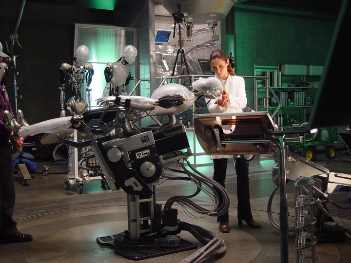
On the set of “I, Robot”
Continue reading »
Continuing a series of interviews with designers and artists that bring user interfaces and graphics to the big screens, today I’m honored to host Joseph Chan. You have seen his work on “Tron: Legacy” and “Oblivion”, as well as one quite a few motion ad campaigns for companies such as Sony, Google, HP, Intel, Blackberry and others.
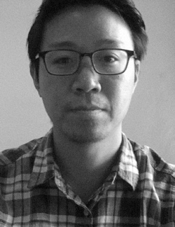 Kirill: Please tell us about yourself and how you started in the field.
Joseph: I’m a motion graphic designer and I’ve been working in the industry since 2007. I graduated from Pasadena Art Center in 2006 with a degree in graphic design, specializing in motion graphics.
Before that I attended UC Irvine, I didn’t have a major and was deciding what I wanted to do as a career, and it was around the year 2000 when the .com boom was in full force. It was a great and inspiring time for me, people were designing amazing abstract graphics from 3D programs that I had never seen before. I learned Photoshop and put together a portfolio with personal projects that I did in my spare time. After I was accepted into Art Center, I transitioned from graphic design into motion design which had started to ramp up midway through my college years.
Kirill: What happened after you graduated?
Joseph: During school I took two internships. One was in an interactive design studio, creating graphics and content for websites. In my latter terms at Art Center, I took a class with Chris Do who owns and operates Blind which does motion graphics, and I interned under him and Tom Koh. From then on I decided to focus entirely on motion graphics.
Kirill: And here you’re not talking about Flash / VRML containers that were very popular at that time in the browser environment.
Joseph: I wasn’t into the technical side of Flash or into creating websites. I was mainly using it as a tool for simple layer and text animations, because that was what people used at the time. But the designers who were using Flash in amazing ways, creating beautiful websites full of motion really caught my eye and pushed me towards my career.
Kirill: So back to what you did after graduating…
Joseph: I graduated in mid December in 2007, took some time off for the holidays, and started freelancing at different motion graphics studios around LA and Santa Monica, and I’ve been doing it ever since. I’ve never been staff at a studio before, at this point in my career I feel freelancing is the way to go as I have a little bit more freedom in terms of studio and project choices.
Kirill: Are you also involved in art direction / concept design?
Joseph: Sometimes I am brought in to a project midway or near the tail-end, so therefore I won’t be as involved with the concept as someone who had been on the project since the beginning. So in that scenario I’d be helping out with animation and finishing. Other times I am brought in from the pitch phase, and that includes art direction, concepting, and designing. I do enjoy all parts of the process, designing and animating, and personally I like to find a balance between the two, trying not to do too much of one thing for long stretches of time.
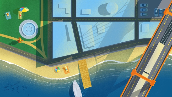
Kirill: You’ve worked on projects with rather different styles. For example, the spot for the first launch of Google Chrome, the recent spot for Google Now and the one for the Gates foundation are semi-vintage illustration style, while Beats Envy and Sony spots have a very modern high-tech industrial feel. Do you like exploring radically different styles?
Joseph: Absolutely. I’m influenced by all kinds of different styles and I try not to limit myself to a particular one per se. I’d like to think that each project has a different and unique solution, so I keep my mind open to what the project asks for.
Kirill: How many people do you usually have collaborating on a single spot?
Joseph: It all depends on the project and what it entails. The spot for Google – compared to other big budget projects that I’ve worked on – was quite simple from the start and we knew that. We did everything from concept to delivery – illustrations, design, compositing and animations – with a team of four people. The spot for Beats Envy also had a small team, but it was a little bit more complicated due to the need for 3D modeling and animation. I worked on the UI designs, compositing of 2D and 3D elements, and the overall grade. The team was four or five people. And then of course we had producers and the creative directors.
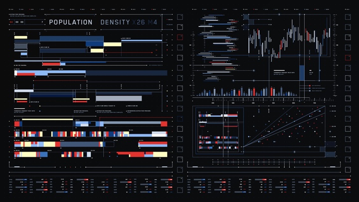
Continue reading »
Continuing the ongoing series of interviews with creative artists working on various aspects of movie and TV productions, it is my pleasure to welcome Howard Cummings. In this interview he talks about his work on “Side Effects”, a mystery thriller directed by Steven Soderbergh featuring Rooney Mara, Jude Law and Catherine Zeta-Jones. In addition, we discuss his other two productions, “Behind the Candelabra” and “Contagion”.
Kirill: Please tell us about yourself and how you started in the field.
Howard: I went to the graduate school at NYU to study scenic design for the theater. Right after graduation I was asked for help to find somebody to work on this movie, and I said that I’ll do it myself. I had a theater job at the time, but when I did it, I knew right away that film was what I wanted to do.
I was the assistant designer on Nine the musical which was turned into a movie a couple of years ago. I’m not that skilled a draftsman, and I wasn’t a very good as an assistant art director. But I was good at organizing everything else, so I kept getting jobs from this one guy, because I would do everything.
When I did my first film project, I didn’t realize that there were prop people and decorators; in the theater you have to do everything, so I did it all. The producers were so shocked, and they decided to hire me for their next project. It was a very hands-on experience.
Kirill: You have so many people with so many different responsibilities in all these departments. What were your first impressions getting into that world?
Howard: It just seemed to fit. I was better as the designer as I found out. It seemed very lucky in the beginning to be working on the “American Playhouse” TV series. It was a literary-based historical drama, and my first experience as a kid fresh out of school was designing these historical pieces. The first was set in 1583 and we had to make everything. Then I did three movies in the 1900s, the Eudora Welty story in 1930s, Lanford Wilson’s play in 1950s – I got a real broad spectrum of design challenges. I didn’t really do the New York Lower East Side street movie until later. I did have that experience, but not until after I did a good amount of research.
My next project is turn of the century for Steven Soderbergh. He was supposed to have retired, but he suddenly decided not to. He’s more interested now in doing long format TV. We’re about to start a pilot and 10 episodes, and it’s about a drug-addled progressive surgeon in New York at the turn of the century. I’m kind of going back to where I’ve started. I have a reputation for gritty reality, but lately I’ve been able to do other projects and I’m really excited about this particular thing. It’s where my roots were.
Kirill: Your career started before the pervasive availability of digital tools that allow augmenting and enhancing physical sets in post production. Looking at the list of your movies, I see “Percy Jackson” as the only production that used these techniques on a large scale. Are you staying away from such productions on purpose?
Howard: No, I didn’t. I sort of didn’t get a reputation for that. I’ve been doing art films, and I got this interview to take over a job. At the time it was the biggest movie ever made in Canada, “The Long Kiss Goodnight” that was budgeted at around $140M back in 1996. We had a fair amount of digital effects in that movie. So that was my first experience coming across the birth of digital enhancing and set extension. There was this guy working out of Venice who taught me a lot about those tools. Back then you did have to build bigger pieces, and rotoscoping was so time-consuming and expensive.
I never got to do sci-fi movies. People tend to want to hire you for the type of jobs you’ve done in the past. You can get pigeonholed. I’ve done a lot of thrillers, but I’m not sure how that happened.

Continue reading »
![]()
![]()
![]()
![]()
![]()
![]()
![]()
![]()
![]()
![]()
![]()