The art and craft of storytelling in feature and episodic productions has been with us for more than a century, and the roots of storytelling in our culture go as far back as humanity has existed. Throughout the interviews I do with creative artists that work on these productions, we talk about the evolution of storytelling from the artistic and technical perspectives, focusing on the today. But what about tomorrow? To help me define and answer that question, it is my delight to welcome Andrew Shulkind.
Andrew is at the forefront of a new generation of storytellers that want to redefine the entire cinematic experience that has been confined, for better or worse, to a hard flat rectangular surface in the movie theater, in our living rooms, and most recently on our mobile devices. Drawing onto his diverse experiences in the realms of augmented and virtual reality, we dive into what the near future holds for both creators and the audiences, tapping into data to understand what works best, the technological challenges on the road ahead, overcoming the inertia of the traditional world, and immersing the viewer in new, exciting and yet-uncharted realms.
Andrew Shulkind comes from a classic background in traditional cinematography and continues to shoot broadcast commercials and films for theatrical exhibition.
Kirill: Please tell us about yourself and your path so far.
Andrew: After film school at NYU, I worked at Panavision, and joined the Cinematographer’s Guild. I moved up the ranks from Camera Assistant and Camera Operator to Remote Head Technician and then Cinematographer. I cut my teeth on a bunch of big studio movies where I moved up quickly as an apprentice under some of the best cinematographers in the business like Janusz Kaminski, Darius Khondji, Emmanuel Lubeszki and Don Burgess.
Looking back I see a much clearer line to the present than it felt at the time. Early on, besides camera assisting, I was helping with color management. Kodak and Panavision had jointly developed a piece of software called the PreVIEW System that allowed cinematographers to virtually emulate nuanced looks to visually communicate to the lab how we wanted the film processed, back when it was all photo-chemical. For 100 years, motion picture film was processed using printer lights, playing with intensity, brightness and density of red, green and blue, and you would influence the look of the daily film processing (called “dailies”) to get the dailies to get you as close as possible what you wanted the final look of the film to be.
This new system allowed us to experiment non-destructively earlier in the process, making the need for a fixed reference for the lab even more important. I became the liaison between the cinematographer and the film laboratory to communicate those choices. As that process moved beyond printer lights to scanning the film for a digital intermediate (DI), it required an even more specific language for delivering the original creative intention through technical means to achieve a digital finish.
All this is to say that we as we’ve moved from photochemical photography to capturing on photosites and finishing digitally to watch a panel of pixels on a screen or mobile device, the business of capture is changing because suddenly we’re photographic more dynamic range than we can display. This reality requires us to decide what information we want to keep, what we’ll throw away, and it becomes as imperative to be able to communicate this abstraction to others how we want this thing to look when it gets delivered.
I’ve always been interested in the intersection of art and technology and each role I’ve had is a different blend of those two fields. In the commercial and music video world, I liked to find efficient ways of working in new emerging technologies and ended up being asked to shoot product tests for new camera, storage, and lighting manufacturers. I do a lot of visual effects heavy stuff and we are always using compositing, and motion control and motion capture, so I spend a lot of time activating emerging technology in the pursuit of dynamic storytelling.
We shot a bunch of early interactive content, including the first piece of content designed for an iPad; we built a tiny stereo 3D camera for shooting live action handheld, I often get to play with LED and plasma lighting and other technologies before they come out because on set we’re always thinking about what we can do to save time and money and tell the story efficiently and differently. And the tools that we have to do that is increasing exponentially by the day.
Then, around four years ago I was doing a commercial that required us to shoot 360° background plates. We needed a professional level of resolution, color gamut, reliability and monitoring. It didn’t exist so I brought together some partners to finance and build it. In so doing, we ended up building a high-res 32K 18-camera 14-bit uncompressed camera that remains the highest quality capture device for shooting 360˚.
We used it on a ton of other projects in this space, but other commercial and film producers and directors and studios that I had worked with in the past started reaching out for 360˚ expertise and so I ended up doing a lot of early 360° VR projects for various companies like Samsung, Google, Nokia, Facebook and others with my camera and others. Then it moved to those folks reaching out to have me consult on how to build or optimize their 360˚ cameras.
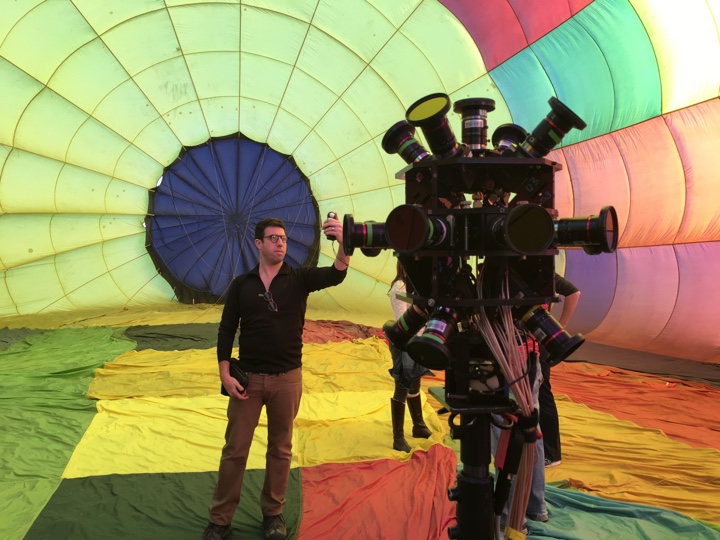
Andrew Shulkind inside of a hot air balloon for an automotive project for Chevrolet.
From there it moved into helping agencies, brands, networks, and studios, strategize how they can best use VR/AR content more efficiently and more strategically. All the while, I was still shooting traditional commercials and movies. So immersive consultation morphed into consulting and speaking about overall content plays to shape the future of entertainment content, bridging how traditional media, advertising, sports, esports, live streaming, immersive, and interactive content, and gaming rely on each other as part of a bigger strategic initative.
About two years ago, I was producing a movie property and that macro level of awareness got me thinking about how inefficiently properties are valued with all the data we have at our disposal. So a group of data scientists and I started developing a toolkit to scrape web data and user behavior to understand audience sentiment. You analyze that and start making assumptions on how a product or a property will perform in a market – whether it’s a product, a personality, a film, or a commercial.
I think a lot about algorithms and how well it works for Spotify, how challenging it is for Netflix, and how studios think this kind of technology undermines their secret sauce. In some ways, when Netflix adds a movie to their library, it seems to make it harder for users to find what they want instead of easier. You have new tools and techniques that allow us to tell stories in different ways, but if improperly curated, it becomes a mess. As a storyteller who has spent a career integrating technology in authentic ways, I feel a responsibility to get involved. So that’s what has driven what I’ve been up to this minute.
Continue reading »
Continuing the ongoing series of interviews with creative artists working on various aspects of movie and TV productions, it is my pleasure to welcome Eric Koretz. In this interview he talks about the evolution of digital hardware and software tools at his disposal, the changing landscape of the art of storytelling, working on commercials, minimizing disruptions on set, and how film compares to other art forms. The second half of the interview is about Eric’s work on the recently released “Frank and Lola”, a noir romance of desire, infidelity and jealousy starring Michael Shannon and Imogen Poots.
Kirill: Please tell us about yourself and your path so far.
Eric: My name is Eric Koretz and I’m a cinematographer.
I graduated from the communications design program at Syracuse University. I had a design company in school doing graphic design and motion graphics. I moved to Los Angeles after graduating and continued doing the design work. After a year of doing that I realized that I hated it, and that I wanted to do film. So I shut everything down and started PA’ing on music videos and commercials. That was back around 2001.
I also did a lot of still photography, but at that time I didn’t know that I wanted to be a cinematographer. I didn’t even know what it really was. I was more interested in directing and writing, and that’s how I started. I applied to the American Film Institute for cinematography, because I naively thought that I would just learn the camera work, while keeping to do directing and writing. My portfolio was pretty strange – photography and those hybrid projects.
When I got in, everybody else had so many years of experience and it was a steep learning curve for me. But as it went along, I realized that cinematography was all I wanted to do. AFI was a great experience. I learned a lot there from the classes but also from the guest DP’s that would come in to teach, and also from the other students.
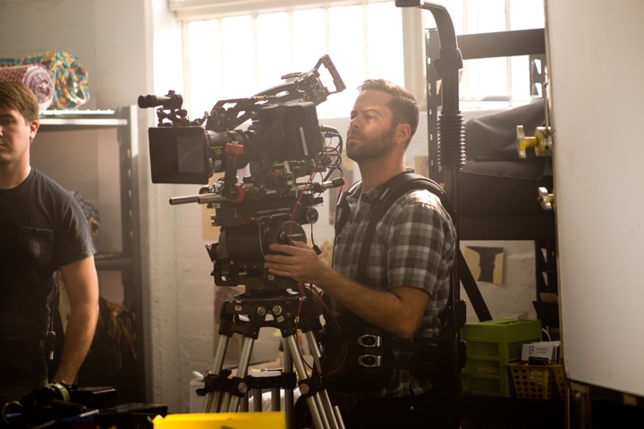
On the sets of “Frank and Lola”. Courtesy of Eric Koretz.
Kirill: Would you say that the industry’s transition to digital opened up the field and democratized it in a sense? It takes not that much money to get a reasonably good equipment these days.
Eric: When I was in college, those 3-chip CCD digital cameras started coming out, and they changed everything. I started using those for my hybrid projects, and they were great. But I still learned film, and I was shooting video and editing on A/B rollers. AfterEffects and Final Cut were just coming out, but that’s what you had before for editing. You would take two video-tape decks, and cut between them by rolling back and forth. That’s what I learned in college before those software packages came out.
I shot film in under-grad, and I also shot film in grad school. That’s when the first big digital cameras started appearing, with the first “Star Wars” prequel using Sony 900. And after graduating AFI that’s when 5D came out. I bought it mostly for stills, and then fell in love with the video aspect of it. And it changed everything, because you could just go out and have this beautiful quality without paying that much money for the more expensive gear. That opened up a whole new world.
I did a lot of 5D cinematography right when it first started off. I was sort of on the forefront of shooting with 5D, and I think it really helped. The normal process when you get out of school is to crew and work your way up, but I was shooting all the time. I did a lot of documentaries and smaller commercial projects, and started to build from there.
Kirill: Do you miss those days, or the physicality of film as medium?
Eric: I was always trying the next new thing in terms of digital. I love the immediacy of digital. I love to be able to manipulate the image and see what you’re doing live on set. I have absolutely no nostalgia for film, and that’s different from a lot of other DPs [directors of photography]. I love what you get with the new digital cameras. I don’t miss film at all.
On the sets of “Frank and Lola”. Courtesy of Eric Koretz.
Kirill: If you look at how the technology is changing in your field, do you think there’s a lot of revolutionary steps ahead of us, or is it more about incremental evolution? Is it close to reach the maximum potential of technology at this particular phase?
Eric: The steps are definitely incrementally smaller. The main camera people are using now is Alexa Mini, which is mostly because of its size and the media that it uses. However it’s an “under-spec’d” camera. The max resolution is 3.4K, but you have to shoot open gate raw to achieve that. People have been using this camera for the last two years, while there are other cameras from RED, Sony and Panasonic that have 4K+ resolution.
It’s really about the color science, and how accurate and natural you get the colors. That’s what I’m mostly interested in seeing improved. Alexa does it beautifully, and all the other companies are improving. That’s why I still use the Alexa. I love the color science.
The push for resolution only matters in terms of how you’re viewing it. Most consumer TVs that are coming out now with decent to best specs are 4K, so it’s only natural for the cameras to progress to be 4K to match that. And the projectors that come out to be used in movie theaters are all 4K. It only makes sense to have the resolution of what your final output is going to be.
Kirill: What about the artistic side of it? Does it mean anything to jump from 4K to 6K, for example?
Eric: Artistically, I don’t think it matters. It’s more about the colors and the color science, to me anyway. I’m not against more resolution. Most DPs don’t like it when you re-frame after the fact, but it gives you the ability to sometimes shoot one size and then crop in or move it around. But it doesn’t really matter to me.
On the sets of “Frank and Lola”. Courtesy of Eric Koretz.
Continue reading »
Continuing the ongoing series of interviews with creative artists working on various aspects of movie and TV productions, it is my delight to welcome Maya Bankovic. In this interview she talks about the world of cinematography and the evolution of digital tools at her disposal, how she chooses her projects and collaborators, and the balance between being emotionally involved with the story and staying aware of her job on the set. The second half of the interview is about Maya’s work on the recently released “Below Her Mouth”, a tale of desire, passion, and sexuality made by an-all female crew of storytellers.
Kirill: Please tell us about yourself and your path so far.
Maya: I took up 35mm photography as a hobby when I was a teenager, and I loved using my Minolta and spending time in the darkroom. But I didn’t want to pursue still photography because it seemed like kind of a lonely life. What I did realize was that I loved working as part of a team, bouncing ideas around and making something as a group, in theatre class for example. Having people around me was very satisfying, and I was thinking about how I could do that as a job [laughs].
I went to a film school and met a lot of new people, and it worked out pretty well, because twelve years later I still work with a lot of them. At that age I was chasing a certain type of life that would give me interesting experiences and access to other realities, while satisfying the technical part I loved about doing photography.
Kirill: As you started to work in the industry, was there anything particularly surprising for you?
Maya: It is such a demanding industry to be working in and the hours are really long, so it’s always surprising to me when people don’t love doing it yet stay. I didn’t want to risk becoming too jaded with all of that so I worked my way up as a cinematographer from tiny projects to bigger ones. I think doing independent films with people I care about has enabled me to maintain the love that I have for filmmaking, because the demands of the industry itself can make for a difficult lifestyle. Now that I’m working on larger projects with people I’m meeting outside of any kind of shared history together, I still go into a new film with that same spirit of community – it helps me ignore the stress of the business apparatus that’s always functioning in the background and concentrate instead on the creativity.
Kirill: What are your thoughts about the evolution of digital cameras in the last decade or so?
Maya: I talk about this all the time – this technological shift is the reason why I have this career. It started around 2005 when I took out a small bank loan to buy a DVX100a, which was the only camcorder at the time that could do 24p at an affordable price. Shooting in 24p was what was creating a distinction in the look and quality level among documentary filmmakers and indie filmmakers at that time, the same way cameras later on offered large sensors and we all made the leap towards that, collectively.
So that camera was the reason I was able to put myself out there as a cinematographer after I left school and lost access to the equipment there. People cared a lot about whether or not you’d shot film, which I had done a lot of at school. But you had to basically be able to afford to shoot a project on film in order to keep doing things at the industry-standard level. And the minimum price for a film project was around $20,000. But people were coming around to the idea of using my little DVX100a so that we could keep busy between those more expensive film projects.
Then the RED camera came out, and everything changed. Access to the RED and others that came out shortly thereafter levelled the field. It was no longer about the film standard, but rather about your eye. It allowed me to experiment. When you’re using digital equipment, it frees you up to play with composition or exposure or white balance without worrying about wasting film. The price of one foot of film comes to around one dollar, once it’s all purchased, processed and transferred. That’s about one dollar per second, which is a lot if you’re experimenting. I think a lot of DPs [directors of photography] felt liberated to play around more with cinematography and open up their imaginations thanks to digital cameras.
Kirill: Is there anything still missing in digital cameras from the artistic perspective?
Maya: I love the texture of film, and there’s a certain discipline that comes with shooting film. It is part of the process that is maybe gone now. It was the texture and certain imperfections that you could get that made me love shooting film. Those imperfections were not always appropriate for every project, but when they were, it was magical.
For me, now, it’s more about the quality of the story that I’m capturing. It doesn’t matter to me that digital has taken over. I love shooting film with its gorgeous texture, and I do adore the process. But in terms of the artistic or the creative approach, that should all be motivated by the story. That’s what dictates the creative direction you follow, not necessarily the thing you use to capture it.
The most important thing to me is the quality of the story that we are putting into the world, and I think that a lot of these projects wouldn’t get made if we were still counting on film, with its prohibitive costs. There would be very little money invested in stories that are more niche or fringe, because no one would want to sink a huge investment into a TV show or a film that is not guaranteed to show a return on investment by appealing to mainstream audiences. Projects that reach beyond mainstream culture’s usual narratives can get made now, and look good, and to me that is an important artistic development, because it’s a cultural one.
Kirill: To me as a viewer that means that I have more productions to choose from. These days I find myself having to decide what not to watch, because there’s only so many free hours in the day.
Maya: It’s definitely true. I think the main problem with that are the really low-budget productions which neither take any creative or conceptual risks nor provide good jobs for people. There’s an oversaturation of those types of productions in every major city in the world. When you only have a shoestring budget, it’s sort of a false dream to think that you’re going to make your mark as a filmmaker when you’re trying to make something with mainstream appeal but you’re up against thousands of similar projects of a similar scope. It’s not sustainable, but ultimately it’s the choice of the people that pursue it. Again, that’s why seeking out stories that exist outside of those story conventions are where I find most of my own feelings of personal urgency and devotion as a cinematographer. Same goes for when I’m choosing which films to watch. Because yes, there are so, so many of them.

Continue reading »
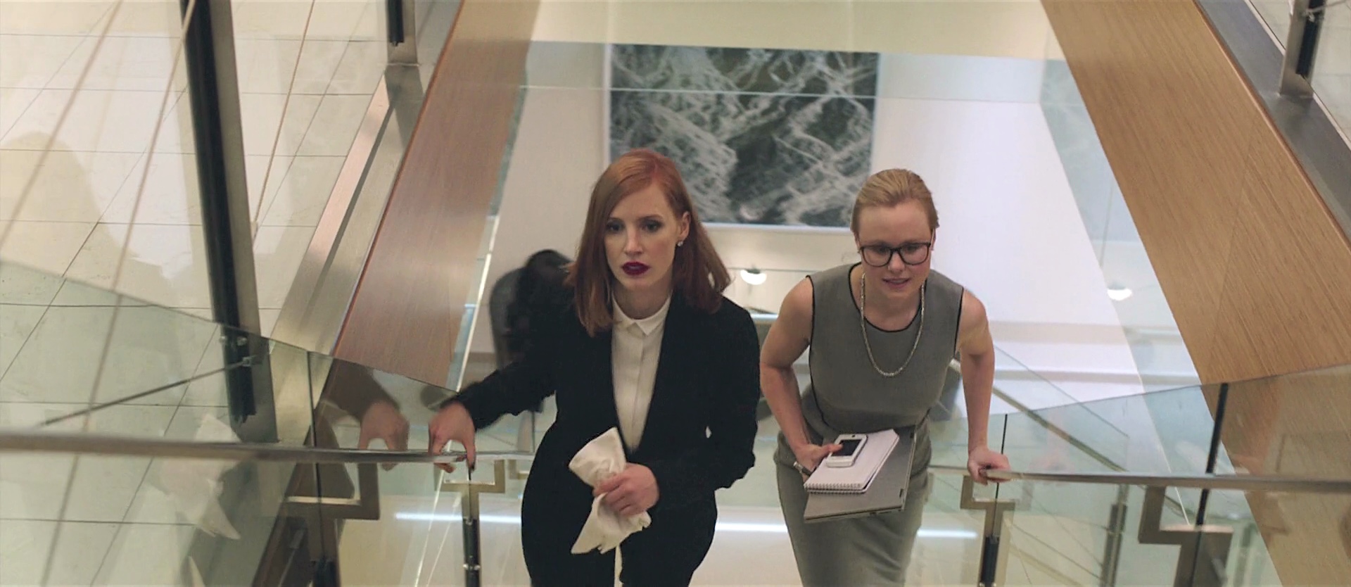
Continuing the ongoing series of interviews with creative artists working on various aspects of movie and TV productions, it is my pleasure to welcome Mark Steel. In this interview he talks about his path into the art department, the ever-changing landscape of episodic television that balances the cinematic scale with shrinking timelines, the day-to-day responsibilities of an art director on set, the present and potential future of combining visual effects with physical world building, and the place of virtual reality tools in simulated set environments. The second half of the interview is about Mark’s work on recently released “Miss Sloane”, a story that follows a formidable D.C. power-broker played by Jessica Chastain and her fight against the powerful gun lobby.
Kirill: Please tell us about yourself, and your path into the art department.
Mark: I was born in Vancouver and grew up in Ottawa. I watched a lot of TV when I was a kid. I was into animation and horror which lead to a fascination with make up and special effects. I began reading Fangora magazine and other such publications, which really introduced me to the whole behind-the-scenes world of film. In my last year of high school I was offered a co-op program at a local community cable TV station. There I got to direct all sorts of studio shows, local remote and mobile shoots.
 I then went to post secondary school at Ryerson in Toronto for Radio and Television Arts. I actually wanted to be a TV director when I graduated. I found myself at the CBC as a stagehand, and began working in set decoration and props. The CBC at the time was in decline, but a lot of the old system of designers, art directors, builders, costumes, FX and all the other trades were still under one roof. It was really a wonderful and sadly broken creative place. I learned a tremendous amount about all the crafts and talents that went into production.
I worked on the last two seasons of a popular comedy series called “Kids in the Hall”. It was a highly creative show. We did hundreds of sets a season to be shot as 16mm short films, three camera studio bits, with live audience segments. It was really a master class in pushing the boundaries in television at the time.
When I left the CBC, I found that my experience as a set decorator was most in demand. Toronto production was growing, and we had three unions in the city. I did a lot of Canadian TV series and movies of the week for US networks. I found myself working with local and US production designers, and eventually I was asked by a local PD to step in as an art director on a TV series for a Disney cable channel sci-fi series. I have been working primarily as an Art Director for US projects in Toronto although I have been all over Canada and some of the Caribbean.
Kirill: What drew you into the film / TV industry, and how has that changed after a few productions?
Mark: It’s the best part-time job anyone ever has to start. While I was still in school, I had a friend who was working on film sets as a production assistant. I had an occasion to visit and found that environment to be very appealing. My early years at the CBC was a sort of institutionalized experience that was in the process of dying, as government funding was being stripped away and I really had no future there. I knew there was this “outside” industry in Toronto, and with a few connections I realized that I could make a living in the art department as a Set Decorator.
As a young person, I was very into the circus of it all. Rolling onto locations, completely taking over a space, transforming it and disappearing again without a trace. What I also began to realize very early was that I really didn’t have the patience to work on set with the shooting crew. I found the pace and the hierarchal nature of a film set to be tedious. I much preferred to take part in the research, sourcing, prep and installation of sets. I excelled as a Leadman and Set Decorator and began to build my brand off-set in the Art Department.
Kirill: As you have done a variety of both feature and episodic productions, how would you compare the pace of the two worlds?
Mark: They are really not that fundamentally different, especially these days. I developed my skills primarily in TV series where mastering scheduling was key. My training and the goals of my early mentors was to create “feature” quality look in spite of budget and schedule constraints. Progressively, the quality and demand of television series increased through the late 2000’s. At the same time many productions also demanded more for less.
I can’t say when it was exactly over that period of time that I honed the ability to deliver on shorter and shorter timelines. 8 weeks of prep became 6 weeks that became 4 and so on, but the principal tool constantly employed is communication. It is all about prioritizing the creative needs and getting to consensus as efficiently and respectfully as possible. In TV that is almost always the Producer’s call. In features it is the Director’s.
On a TV series most of the time the Director is a guest. Usually he or she has the experience with the format and understands how to efficiently get what is needed out of a shooting day. My contact with the Director is typically about problem solving around scheduling constraints and to guide them through the possibilities on standing sets. Although schedule remains a reality in the feature world as well, the priorities are driven by the Director’s vision. Depending on his / her status and the budget, greater degrees of deference must be payed. Expectations are infinitely scalable, but in the end every project has many of the same steps.
Continue reading »
