We are living in a time of unparalleled abundance of deep, thoughtful, provoking and captivating story telling in the medium of moving picture. Just a few short years ago, episodic television was the home for mostly generic, repetitive plot lines that you would occasionally dip into for a few episodes, soon to be forgotten among similar cookie-cutter stories. It was the world marked by long breaks inside each season, structured around “sweeps” rating peaks of November, February and May.
Things have changed dramatically in just the past few years, with tight and focused season arcs, entire seasons released for binge watching, delay-view technology that tipped the balance of when we watch our shows into our favor, and the undeniable tidal change in the entire landscape of how stories are told in the age of streaming. These days, I often find myself trying to fit “just one” more show into the few precious evening hours, answering the maddening question of what am I going to give up on watching this week.
“Black Mirror” is a show like no other. It’s an anthology set in a world just around the corner, a world that is at times soothingly tranquil, and at times achingly terrifying. It’s a world that shows the great promise of technology, and is not afraid to explore the dark corners of how that technology can undo the fabric of our daily social interactions at work, with friends and within family.
As the third season of the show wrapped up, I’ve had the honor of interviewing the production designer Joel Collins and the VFX director Dan May. The year before that I spoke with Gemma Kingsley on the screen graphics of the first two seasons, and last month I’ve had the opportunity to extend that discussion into the screens of the last two seasons so far with Simon Russell. And today it gives me great pleasure to welcome Erica McEwan who worked as the graphic art director on all 19 episodes of the show so far.
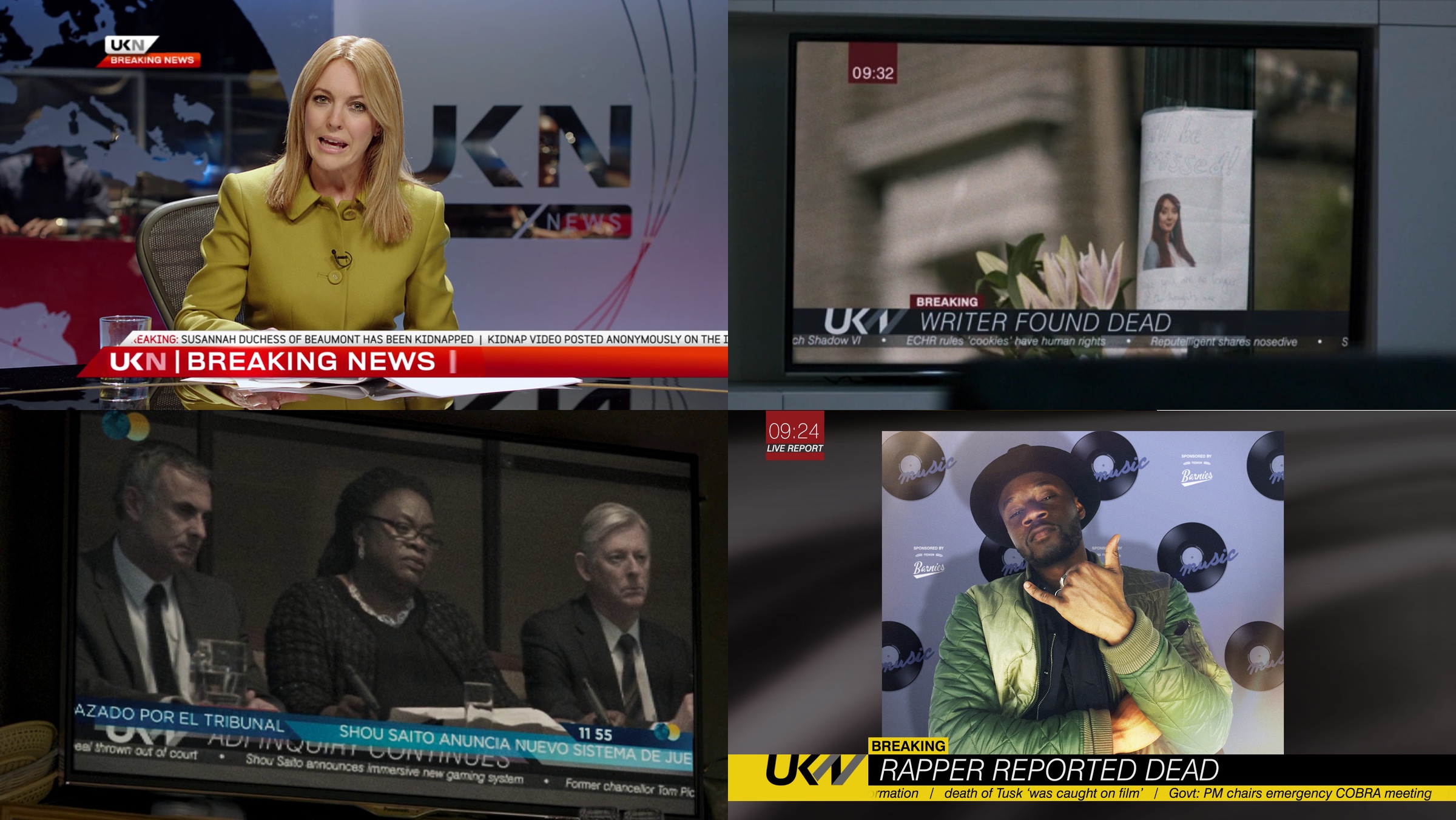
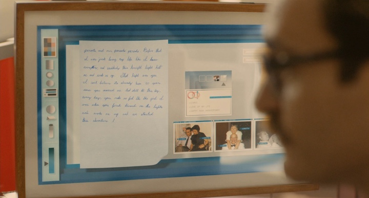
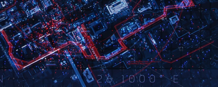
Branding for the UKN news channel that serves to move the plot forward, as well as to create temporal connection between different episodes. In top right, “Hated in the Nation” is connected to cookies introduced in “White Christmas” and Reputelligent company with word play on “Nosedive”. In bottom left, “Hated in the Nation” is connected to Shou Saito from “Playtest”.
Kirill: Please tell us about yourself and your path so far.
Erica: I was born in Canada, but I grew up on the sunny shores of Sydney. As a kid, I was often dragged into my dad’s office on the weekends. I was sitting there in his art department, playing with thousands of Pantone markers and thinking that when I grow up I want to color-in for a living.
I made it my prerogative to get into one of the university courses, to be visual, to do something with art. I did a bachelor of design degree in visual communication, focusing on film, video, typography and production design. I hated the computer. I hated technology. I wanted to do everything with my hands. When I finished my degree, I started working on a medical drama and some short films, starting at the bottom of the art department.
 Soon I felt that I was suffocating in Sydney. I wanted to go where the lights were a bit brighter – to the US or Europe. I talked my way into a TV studio doing motion graphics and broadcast design, as the pay cheques were a little bigger, and within a year I found myself over in London knocking on doors and looking for a job in motion graphics. Ironically, I found myself quite a computer geek, living in AfterEffects.
Through knocking on those doors I met Justin Chatburn who is a visual development artist now at Painting Practice. He gave me my first job in Soho. During the next six years I did a bunch of motion graphics jobs, especially title sequences for TV shows. I was still in the TV world, but it wasn’t quite where I imagined I would be. After those six years I wanted to be a storyteller again. I wanted to be a part of something that would let people escape for an hour and forget about their troubles.
Fortunately, in the meantime Justin had met Joel Collins and Dan May from Painting Practice, and he got me into their company for a few jobs. And before I knew it, I was talking with Joel about wanting to get back into the film world. He told me there was this crazy new show called “Black Mirror” that nobody knows about, but it has a lot of screens and graphics. He invited me to work with them, and the rest is history. Before we knew it, we were up to our eyeballs into season 1. It was complex, exciting and really hard work! The end result was so special and unique that we kept going back for more
Quite strangely, despite my early film and art department beginnings, it was my accidental foray into motion graphics for those years that actually paved my way back into the art department, to the role that I do these days – which is to create and art direct graphics on a physical and digital level, throughout the prep, shoot and post processes.
Once i got there, I fought the graphics thing for quite a while. I wanted to make stuff with my hands, and art direct in the more traditional sense. But when I realised there is such a need for graphics in so many formats, including physical elements that didn’t only exist in the computer – i began to really embrace the job. “Black Mirror” is such a complex job for graphics, so when Joel invited me to come and be part of the team I jumped head-first into that complexity. That’s how I ended up on this show.
Kirill: You mention that you’re working on both physical and digital level, and this is something that I also talked about with Joel and Dan – that Painting Practice chooses the best suited tool for the job, including some of the older techniques like matte paintings.
Erica: There are so many factors that come into why something would be done in-camera or CGI. On “Black Mirror” like on any other show, you ultimately have the constraints of time and money – so you always want to aim for the execution which will best visualise the story within those constraints – be it physical or digital. Some directors or actors prefer to have real, tangible elements there on the day, so we work hard to have that option. Personally, I feel doing as much as you can in-camera, especially up close gets the best results.
But sometimes you can’t find the exact location you need. Or you can’t shoot it wide enough and you have to extend that set. Or you have to realise an idea that is physically impossible to make, so CG is really helpful there. It is the marriage of the two – for the right reasons – that always gets the best results. And Painting Practice does that very well. They are able to cover both sides, physical and digital, and marry them in a way that you don’t know what was made on a computer and what was there in the beginning. It’s such an art.
From the graphics perspective, we might come up with a logo for a bank or need to build a gigantic sign, but the location would not allow safely hanging that sign on the front of the building. So even though we have created the design in the art department, we have no other choice but to comp that in in post. It’s a practical reason. The integrity of the design always remains. But what it comes down to a lot of times – is what you are physically able or allowed to do.
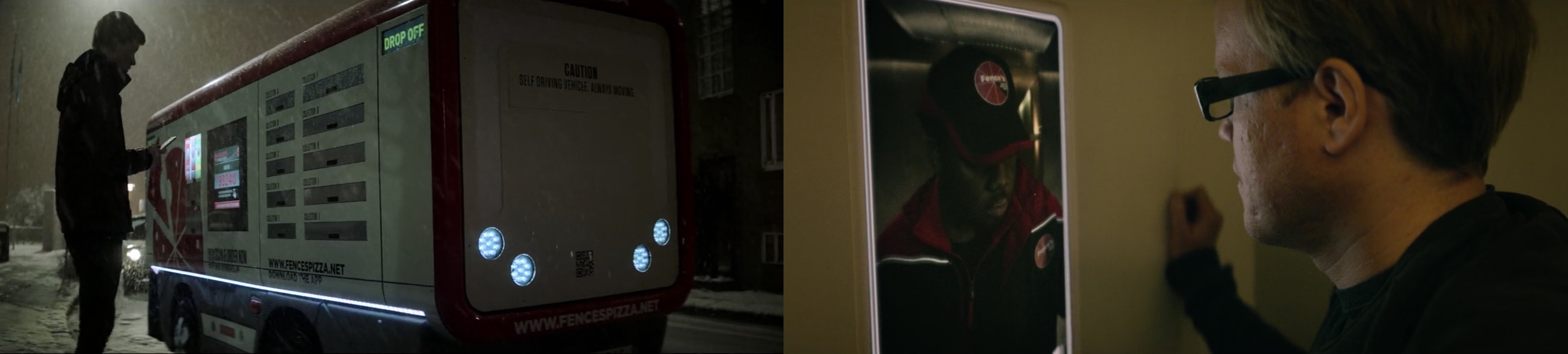
Fences Pizza truck from “Crocodile” and delivery person from “USS Callister”.
Kirill: Would you say that you build your sets for the camera? The set might not necessarily be a complete room when you’re in it physically, but as long as it is seen as a room by the camera, that may be enough. Is there some aspect of an illusion in those sets?
Erica: It depends on the story. If you’re talking about the white room in “White Christmas” or being a cookie inside your spouse’s mind in “Black Museum”, you want those worlds to transcend real or hypothetical spaces. You want those spaces to feel real enough that they are frightening, but illusion plays a part too.
Other times, you absolutely need to bring a sense of realness and reality to it. Take the spaceship in “USS Callister” as an example. It is a fantastical idea of course, but you want that spaceship to feel real. You want to be able to touch those screens and those controls. You want to feel that virtual space. That’s where VR is going these days. It’s so tactile that you feel that if you fall over, you’re going to hit the floor. It’s not an illusion, but rather a fantastical and tangible space to be in.
In terms of graphic design, I feel that you should do everything for the right reason and not just because you “can”. Just because we have great technological processes or the ability to do things that we couldn’t do 10 years ago, doesn’t mean that we should always choose those. We should do things with purpose and reason. To me, that’s good design.
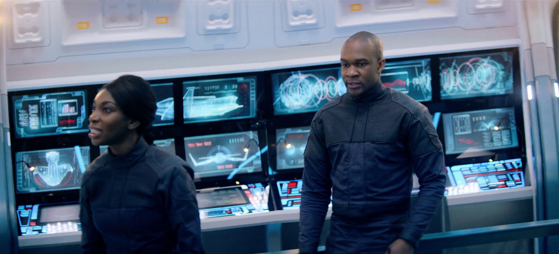
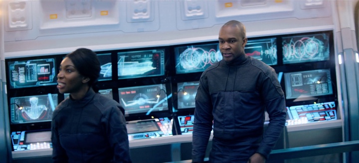
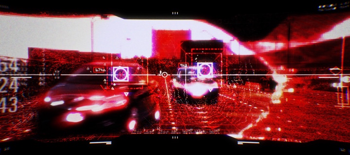
Screen graphics for “USS Callister”.
Continue reading »
One of the most influential movies in my recent memory, “Her” explores the intersection of love, relationships and technology in a world where voice-based interactions and artificial intelligence have evolved to the point where they are virtually indistinguishable from those of humans. Credited as a graphical futurist designer, Geoff McFetridge designed the outer manifestation and the inner workings of that technology, balancing the dichotomy of how pervasive yet inconspicuous it appears to be.
We start the interview by talking about the role of design in our everyday lives, whether there’s such a thing as good and bad design, timelessness and fashion cycles in the world of design. Then Geoff dives deeper into the world of “Her”, from the directive to build a nice near-time future to crafting a narrative that reveals the quiet horror lurking beneath the utopian veneer of the characters’ lives, and working on the almost invisible interfaces of the technology that binds it all together. At it gets closer to the end, we discuss connections between the world that “Her” imagined in 2013 and the screen-filled obsession of our daily lives in 2018.
Kirill: Please tell us about yourself and your path in the world of design so far.
Geoff: I grew up in Calgary, Alberta Canada. I came to design through doing skateboard and snowboard graphics. Then I went to the Alberta College of Art and Design, and the program was very much rooted in what was, at the time, archaic techniques of design. That was around 1990 which was the beginning of desktop publishing, and computers arrived while I was studying there.
My work was street-culture related. I was doing skateboards and flyers, and working for people in California while I was in college. I figured that I wanted more out of design, and I applied to CalArts in California to their grad program. It was a deliberate turn for me, as I wanted to start from zero and really learn design. That was where I got my thinking. That program helped me develop my critical approach to design. It was within me, but I didn’t really know. It was a way of building a narrative into the work, but also being critical of your own work. Even before there were any client expectations, it was about meeting my own personal demands.
I’ve been in Los Angeles ever since. I’ve started my studio nearly right after I graduated in 1995. The plan was to have art shows, do animation and do design. These three things have been my pursuit since in different mediums.
My film work started in titles. I work with directors, and the only time I do that work is when I know the director and we have a working relationship, or I get called in to work on a project directly with the director.
Kirill: It feels like the past decade has placed a lot of emphasis on various parts of design in our lives. Instead of rushing to solve a problem, you have to understand it well enough so that your solution feels natural – which obviously takes a lot of work. Do you see that there’s more appreciation to the field of design in the last few years?
Geoff: Things have changed so dramatically. We live in a more visual culture. No longer is it shocking to be able to make a magazine on your desktop computer. You see both filmmakers and viewers that are so literate of design and culture in a way that I think is untapped. I always operate to design for people who are as literate or more literate in this world than I am. It might be doing a user interface or doing a logo for a fictitious company. People know the difference between a fake logo and a real logo when they see it.
When you see something like “Cyborg Incorporated” on a side of a bus in “Terminator”, it looks fake and people know that. Does that work for you? Does that help build that escape of being in a fantasy world? Or is it a flaw? That’s always been true. People are autonomous makers – in film, website design or other fields. That sophistication was there before, but it was untapped. But now people are also participants, producing so many things of their own.
Kirill: Is there a counter-edge to it? Anybody can be a producer, but also anybody can be a critic. There are so many social platforms and forums where people can easily critique design work without necessarily investing time to understand the limitations, constraints and thinking that surrounded that work.
Geoff: Absolutely. I’m not saying that design has gotten any better. There is more design. There is more of everything. But it’s not like we’ve entered the golden age where there is more beautiful stuff.
I always wonder what it would be like to live through the time of Art Deco. Would you be tired of all of it? Oh look, here comes the next toaster with lines on it. If I was alive back then as a fan of Art Deco, would I think that Adolf Loos is awesome, or would I be tired of it?
Nowadays there is a lot of critique. You can post something, and people link to it and link to other things. There’s a lot of connecting going on, and it is a type of a treadmill that doesn’t necessarily lead somewhere.
What’s the difference between an online forum and a critique in school? When you’re in grad school and you sit down for a critique, it’s powerful. That power is structured. There’s a culture of critique at the school you’re in. There’s someone leading it, and it looks very different from this commentary.

Continue reading »
The universe of “Black Mirror” continues to expand with each new episode, adding more layers and nuance to how technology of today can evolve in the near future. From the very beginning, the show was focusing much less on the technology itself, but rather on how it can change the fabric of our everyday interactions from the micro level of a single individual to the macro level of the society at large. And yet, the presence of technology in the universe of “Black Mirror” can not be denied, even through the most fleeting glimpses at the outer manifestation of that technology – glass surfaces, or screens.
Continuing the ongoing series of interviews on fantasy user interfaces, it’s my pleasure to welcome Simon Russell. In this interview he talks about his work on audio geometry experimentation and music visualization for concert stages, the symbiotic relationship between tools and imagination, the difficulty of creating something truly new and the drive to best serve the storyline with screen graphics. In between and around, we talk about Simon’s work on the screens of “Black Mirror”, from the corporate technology of “Hated in the Nation” to the futuristic graphics in “USS Callister” to the soft round shape of the coaching device in “Hang the DJ”.
Screens of “USS Callister” episode of “Black Mirror”, season 4.
Kirill: Please tell us about yourself and your path so far.
Simon: I did a degree in visual communication and moving image design at Ravensbourne, and then started working in the motion graphics industry. My first job was at the Cartoon Network, doing lots of kids stuff. Then I did lots of shiny R&B adverts for a company that was in the music business and then for a startup that basically stopped quite quickly, I’ve been doing freelancing in the last eight years or so.
My direction changed somewhat when I started 3D. I found it stimulating and challenging in a way I hadn’t found 2D work. Then I began to bring particles particles and simulations into the work and something really clicked. And that’s where I’m sitting at the moment – somewhere in between VFX and motion graphics.
Recently I’ve been doing music visualizations for concerts and projection mapping, and that brings me back to my college days. I did projects on Kandinsky when I was 15, and I loved the idea of visualizing music even then. And now many years later I’m coming back to it. It’s oddly circular.
 Kirill: It’s quite interesting to see the hardware advances in that area and how much they are enabling in the last decade or so. You go to a concert or watch award shows, and it’s amazing to see all those screens in different shapes and sizes everywhere. And it didn’t even feel a gradual process. All of a sudden, these gigantic screens were everywhere.
Simon: I’ve been interested in music visualization for so long. I’ve went away from it and now I’m getting paid to do it on such a big scale. I did visuals for the Shawn Mendes world tour visuals, and the screens were insane. It’s the hardware and the playback that make it possible. It’s really exciting.
My motivation is to see it as pure experimental design. Everyone puts their own spin on it, and people see it on these futuristic screens. Aside from “Black Mirror” and live event work, I’ve been doing audio geometry experiments on my site. I’m getting some work from that, and it’s driving the jobs I’m doing. It’s nice and surprising that it’s working out like that [laughs]. It’s not often that things fall nicely into place like that. Maybe I’ve been doing it for so long that eventually it just clicks.
Kirill: We’re talking about number of screens, each with its own shape and size which is usually quite huge so that it can be seen from the back of that space. When you sit down to first think about it, what’s your approach to visualizing it? Do you do it on paper, or in some kind of a digital environment?
Simon: You start thinking about the idea, about what it is you’re trying to get across. For that, it doesn’t matter what is the shape of the box and how you are trying to draw it. It’s the same process. You get your concepts, you sketch, you make little experiments to prototype it in 3D. A screen is just a 2D surface, and it doesn’t take a huge leap of imagination to do it.
But the project I’m working on at the moment is this tunnel with 42 projectors super bright projectors. It’s going to be really long and really bright. And we’re using the whole tunnel, roof and all. The playout system we’re using can preview the setup in VR so you can really get a sense of the space and what you’ll be seeing. It’s amazing to see these particles waves flowing in time to the music, flowing down the tunnel. If it’s even close to that in real life it’ll be very powerful.

Visuals for Shawn Mendes Illuminate live tour, courtesy of Simon Russell.
I also worked with another client on a project where we visualise the space in Unreal engine to really get a sense of it. It can be used as a communication tool to show such spaces to clients, like film directors. Designers that work on more technical things know how it’s going to look and feel, but sometimes you need to lead people. So if you can put them into that world, it’s a very practical use of VR. Everyone is scrambling around VR at the moment, but nobody knows what it is going to end up being. I believe that this particular approach is going to be genuinely useful.
Kirill: Do tools matter as much as your imagination? The tools at your disposal continue evolving, but what good are those tools if, as a designer, you don’t have the right idea to work off of?
Simon: It’s a symbiotic relationship. It’s a fair point that you can have the highest-end computer, but it’s useless if you don’t know how to use it and you don’t have any imagination. On the other hand, you can have crazy ideas and no means to achieve them.
As ever, the truth is somewhere in the middle. This is where Painting Practice are so strong. They stand in the middle of that place. You have post-production houses which are very technical even when they have their design departments. But it’s hard to do simulations of what is physically plausible and still be loose and creative. You need to be in the brain-space to think about it in a purely creative way. It doesn’t always go hand-in-hand with those giant post places. This is where Painting Practice fits in. They lead conceptually, but also know how to follow it through and push those ideas down. It’s about defining those clear, beautiful, emotive ideas, about really creating a powerful concept but being able to lead that through all the hurdles and challenges of a huge technical production and still keep that original essence.
Visuals for Shawn Mendes Illuminate live tour, courtesy of Simon Russell.
Continue reading »
Continuing the ongoing series of interviews on fantasy user interfaces, it’s my pleasure to welcome Kristoffer Brady. In this interview he talks about the relationship between tools and ideas, the what’s and the why’s of unsolicited redesigns, working within the constraints of project requirements and creating screen graphics that support the main story on feature film productions. We go back to Kristoffer’s earlier concept work on “Terminator: Genisys” and then dive deep into the screens and interaction surfaces of the recently released dystopian sci-fi “What Happened To Monday”.
Screens of “What Happened to Monday”, courtesy of Kristoffer Brady.
Kirill: Tell us about yourself and your path so far.
Kristoffer: It’s a path that takes a lot of different turns along the way. I’ve been an incessant doodler since day one, and among other things, originally I wanted to be a comic book artist. I grew up on 80’s and 90’s anime and movies, AD&D and Image comics and admired a lot of concept artists and sci-fi illustrators. All these things in my life affected my want to produce art and hopefully make a living at it.
After school, I sort of fell into the world of web design and Flash, which was really taking off at the time. It was such an interesting story telling medium and felt like an anything goes type of creative platform. At the time I was making fliers for raves and club nights, teaching myself 3D and Photoshop. Eventually, I got my foot in the door at an agency and in the beginning I was doing pretty boring run-of-the-mill websites.
 Once I got legit work doing interactive jobs, and began paying attention to all the shops out there, I knew that this was where I needed to be at the time. There was some really inventive stuff coming out. I remember seeing an interactive site for “Donnie Darko” by a company called Hi-res, that just blew my mind. It was really like moving through a piece of art, but participating in how the story unfolded. It was the first time I had experienced interactive storytelling in that way, and it left a big impression on me. I remember sitting in my room with the lights off and my headphones on, fixated. For me, it was more powerful than watching any movie or playing any game.
I guess I started my official “career” in 2005, and I spent the next ten years working for various interactive digital production agencies in the US and Europe. I wore a lot of hats, pitching and producing, learning along the way and using the tools as they progressed and grew. I really loved interactive work, and at the time, it felt like the perfect cross-section between entertainment and functionality.
Every campaign had to be engaging but also fun and easy to use. When you are making an experience that has to pull the user in, either a boring story or frustrating usability will be the end of it. On one end it exposed me to designing things that people wanted to use, rather than just making a piece of art that someone has an emotional connection to, but on the other it also taught me about storytelling and using narrative to bridge those interactions together.
Between 2011 and 2012 I worked on several large campaigns, for the first “Thor” and the first “Avengers” movie. The premise was that you were a member of SHIELD and logging into their network, and it required a lot of these UI-type bits for the various components. I started doing research and I came across Mark Coleran’s work who, in my mind, pioneered a lot of the things that the UI artists are doing today. He already had videos talking about his process and I learned a lot from all his work. I downloaded everything from his site, trying to reverse engineer, and figure out how he made certain things. It was such a fun experience, and it opened up the possibility of ui being something I could do for a living.
I didn’t know anybody who worked in that industry, and I was enamored by it. Artists like GMUNK and Ian Sargent among others, were doing great things and it made me pay a lot more attention to the motion graphics industry.
In 2012 I was approached by Facebook. I took a break from interactive work to move to San Francisco to work there primarily as a communication designer, and also to do some product work. It was a new and interesting chapter, but I knew that I eventually wanted to pursue ui work and work on films.

“Simian” – self-initiated design exercise, courtesy of Kristoffer Brady.
It was during this time that I started working a lot on self-initiated projects for myself. I had no ui work in my portfolio so I had to create some work to show what I could do. I put out a 1 minute motion piece, that was part of a larger idea, and it sort of blew up. That piece got me some attention, and I was eventually approached to do some concepts on “Terminator Genisys”.
I did a few frames with them and struck up a friendship with the VFX supervisor who was part of that project, and he’s the one that brought me to work on “What Happened to Monday”.
Beyond that, I wrapped up that movie after a year, spent some time working in VR for Oculus and and a small gaming studio, and then struck out as a freelancer which is where I’m at right now. I’m primarily focusing on UI design for feature films, with a few in the pipeline.
Kirill: On your site you say “Tools have evolved and changed. Industry standards become old news, quickly replaced by something new. I’ve embraced the idea that learning new skills and being versatile is a necessary part of the job.” Do tools matter if you don’t have the artistic sensibility to dream up something to begin with?
Kristoffer: There’s some truth in that, especially in this particular niche field. We’re creating these fantastical interfaces which then inspire people who create real ones, which we in turn reference to make something new and so on. I’ve been on both sides of that coin, where I’ve had to work on real platforms and products, and the constraints that come along with that are different from what you do when it needs to be entertaining and support the story. It has to adhere to a totally different set of rules.
The tools are always secondary to your ideas. I still always start on paper, no matter what. It’s way more freeing. I don’t try to make anything too rendered. It’s very loose, because I want my ideas to be that way. Very rarely do I sit down and start digitally. It doesn’t nearly produce the same results. If I do, I struggle to just to get to that core idea, and I’d rather do that on paper.
Evolving with the tools, as I mention on my site, is a necessary thing. I absolutely believe in that. You should never value your technical skills over your ability to produce great ideas, at least in position as an artist. I try to approach the problem from the standpoint of what it is that I’m trying to solve. If my current toolset does not allow for that thing to be solved, I’ll have to learn it, solve it and move on. I don’t need to become an expert in that particular piece of software. I don’t need to know everything or do every tutorial in order to master it. I just need that program to be my partner for a little bit while I solve this issue so I can get on and create the larger picture.
Having technical skills and being aware of what’s possible is necessary. Whenever I have worked alongside developers, even though I wasn’t coding, I needed to be able to speak that language. I needed to be aware of what was possible, because design and technology rise up together. It’s a relationship between the two because they are both part of the same whole.
“Simian” – self-initiated design exercise, courtesy of Kristoffer Brady.
Kirill: I like what you said about the re-design you did for MPC Software – “I normally avoid un-solicited re-designs. You are too far removed from the decisions that were made, both from a visual aesthetic perspective and from a technical one.” Going back to that self-initiated FUI piece that you did to jump-start that part of your portfolio, do you think such projects are worth the time and the effort?
Kristoffer: A lot of the time you’re dealing with data sets that you don’t have access to otherwise. The MPC project was more of a re-skinning, not so much a re-design. I was using that software at the time, and I was unhappy with how it looked. It was a passion project for me. I even sent it to them, but nothing came out of it.
There’s a lot of unsolicited redesigns of this and that out there, and that’s fine. It’s a valid place to start. But you should approach it with a certain amount of humility. You don’t have the perspective of someone who is there building it. You spend some night in your bedroom on it, but you have no idea how much had to happen for it to get to where it is now. Obviously not everything that we see out there is good, but you can’t be ignorant of the process.
Not everyone has had the experience of being on such projects that are being used by millions of people on the daily basis, but you also need to be aware of the process and not fool yourself. But if you approach it as a way to show your thinking and your strategy to create strong composition and a balanced product, that’s an excellent way to work. Always present it in a correct light – not perhaps as a smarter approach or as a redesign but as your own take on it.
Concept design for first-person machine view of “Terminator: Genisys”, courtesy of Kristoffer Brady.
Continue reading »
