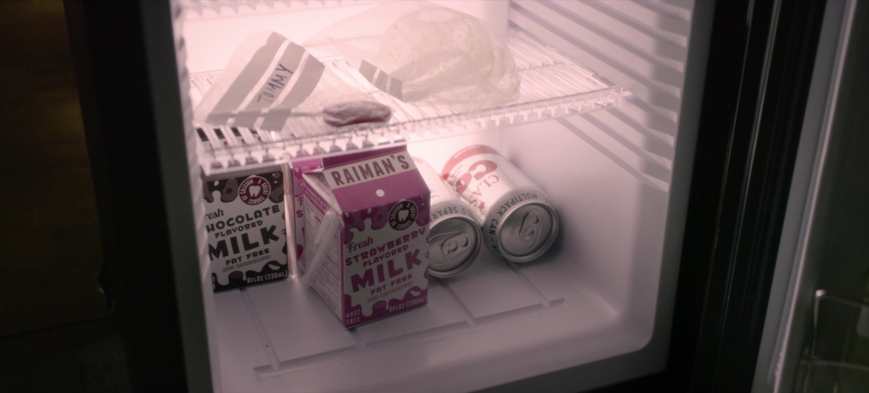
 Graphic and packaging design for Raiman's milk and cola from "USS Callister". Raiman's milk cartons are seen in "Black Museum" flashbacks, and are linked to the Raiman character from "Men Against Fire" that was raised on a farm. The cola can is also seen in "Shut Up and Dance".
Connecting the dots in “Black Mirror” – interview with Erica McEwan
We are living in a time of unparalleled abundance of deep, thoughtful, provoking and captivating story telling in the medium of moving picture. Just a few short years ago, episodic television was the home for mostly generic, repetitive plot lines that you would occasionally dip into for a few episodes, soon to be forgotten among similar cookie-cutter stories. It was the world marked by long breaks inside each season, structured around “sweeps” rating peaks of November, February and May.
Things have changed dramatically in just the past few years, with tight and focused season arcs, entire seasons released for binge watching, delay-view technology that tipped the balance of when we watch our shows into our favor, and the undeniable tidal change in the entire landscape of how stories are told in the age of streaming. These days, I often find myself trying to fit “just one” more show into the few precious evening hours, answering the maddening question of what am I going to give up on watching this week.
“Black Mirror” is a show like no other. It’s an anthology set in a world just around the corner, a world that is at times soothingly tranquil, and at times achingly terrifying. It’s a world that shows the great promise of technology, and is not afraid to explore the dark corners of how that technology can undo the fabric of our daily social interactions at work, with friends and within family.
As the third season of the show wrapped up, I’ve had the honor of interviewing the production designer Joel Collins and the VFX director Dan May. The year before that I spoke with Gemma Kingsley on the screen graphics of the first two seasons, and last month I’ve had the opportunity to extend that discussion into the screens of the last two seasons so far with Simon Russell. And today it gives me great pleasure to welcome Erica McEwan who worked as the graphic art director on all 19 episodes of the show so far.
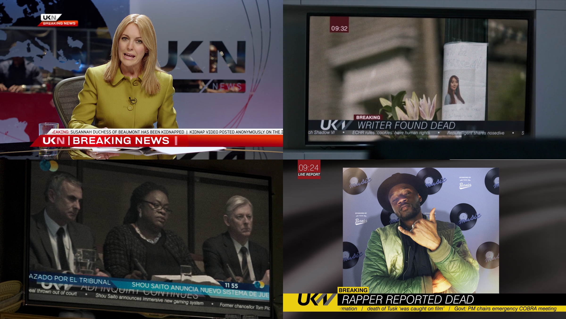
Branding for the UKN news channel that serves to move the plot forward, as well as to create temporal connection between different episodes. In top right, “Hated in the Nation” is connected to cookies introduced in “White Christmas” and Reputelligent company with word play on “Nosedive”. In bottom left, “Hated in the Nation” is connected to Shou Saito from “Playtest”.
Kirill: Please tell us about yourself and your path so far.
Erica: I was born in Canada, but I grew up on the sunny shores of Sydney. As a kid, I was often dragged into my dad’s office on the weekends. I was sitting there in his art department, playing with thousands of Pantone markers and thinking that when I grow up I want to color-in for a living.
I made it my prerogative to get into one of the university courses, to be visual, to do something with art. I did a bachelor of design degree in visual communication, focusing on film, video, typography and production design. I hated the computer. I hated technology. I wanted to do everything with my hands. When I finished my degree, I started working on a medical drama and some short films, starting at the bottom of the art department.
 Soon I felt that I was suffocating in Sydney. I wanted to go where the lights were a bit brighter – to the US or Europe. I talked my way into a TV studio doing motion graphics and broadcast design, as the pay cheques were a little bigger, and within a year I found myself over in London knocking on doors and looking for a job in motion graphics. Ironically, I found myself quite a computer geek, living in AfterEffects.
Through knocking on those doors I met Justin Chatburn who is a visual development artist now at Painting Practice. He gave me my first job in Soho. During the next six years I did a bunch of motion graphics jobs, especially title sequences for TV shows. I was still in the TV world, but it wasn’t quite where I imagined I would be. After those six years I wanted to be a storyteller again. I wanted to be a part of something that would let people escape for an hour and forget about their troubles.
Fortunately, in the meantime Justin had met Joel Collins and Dan May from Painting Practice, and he got me into their company for a few jobs. And before I knew it, I was talking with Joel about wanting to get back into the film world. He told me there was this crazy new show called “Black Mirror” that nobody knows about, but it has a lot of screens and graphics. He invited me to work with them, and the rest is history. Before we knew it, we were up to our eyeballs into season 1. It was complex, exciting and really hard work! The end result was so special and unique that we kept going back for more
Quite strangely, despite my early film and art department beginnings, it was my accidental foray into motion graphics for those years that actually paved my way back into the art department, to the role that I do these days – which is to create and art direct graphics on a physical and digital level, throughout the prep, shoot and post processes.
Once i got there, I fought the graphics thing for quite a while. I wanted to make stuff with my hands, and art direct in the more traditional sense. But when I realised there is such a need for graphics in so many formats, including physical elements that didn’t only exist in the computer – i began to really embrace the job. “Black Mirror” is such a complex job for graphics, so when Joel invited me to come and be part of the team I jumped head-first into that complexity. That’s how I ended up on this show.
Kirill: You mention that you’re working on both physical and digital level, and this is something that I also talked about with Joel and Dan – that Painting Practice chooses the best suited tool for the job, including some of the older techniques like matte paintings.
Erica: There are so many factors that come into why something would be done in-camera or CGI. On “Black Mirror” like on any other show, you ultimately have the constraints of time and money – so you always want to aim for the execution which will best visualise the story within those constraints – be it physical or digital. Some directors or actors prefer to have real, tangible elements there on the day, so we work hard to have that option. Personally, I feel doing as much as you can in-camera, especially up close gets the best results.
But sometimes you can’t find the exact location you need. Or you can’t shoot it wide enough and you have to extend that set. Or you have to realise an idea that is physically impossible to make, so CG is really helpful there. It is the marriage of the two – for the right reasons – that always gets the best results. And Painting Practice does that very well. They are able to cover both sides, physical and digital, and marry them in a way that you don’t know what was made on a computer and what was there in the beginning. It’s such an art.
From the graphics perspective, we might come up with a logo for a bank or need to build a gigantic sign, but the location would not allow safely hanging that sign on the front of the building. So even though we have created the design in the art department, we have no other choice but to comp that in in post. It’s a practical reason. The integrity of the design always remains. But what it comes down to a lot of times – is what you are physically able or allowed to do.
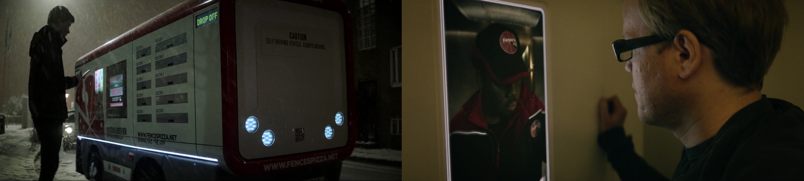
Fences Pizza truck from “Crocodile” and delivery person from “USS Callister”.
Kirill: Would you say that you build your sets for the camera? The set might not necessarily be a complete room when you’re in it physically, but as long as it is seen as a room by the camera, that may be enough. Is there some aspect of an illusion in those sets?
Erica: It depends on the story. If you’re talking about the white room in “White Christmas” or being a cookie inside your spouse’s mind in “Black Museum”, you want those worlds to transcend real or hypothetical spaces. You want those spaces to feel real enough that they are frightening, but illusion plays a part too.
Other times, you absolutely need to bring a sense of realness and reality to it. Take the spaceship in “USS Callister” as an example. It is a fantastical idea of course, but you want that spaceship to feel real. You want to be able to touch those screens and those controls. You want to feel that virtual space. That’s where VR is going these days. It’s so tactile that you feel that if you fall over, you’re going to hit the floor. It’s not an illusion, but rather a fantastical and tangible space to be in.
In terms of graphic design, I feel that you should do everything for the right reason and not just because you “can”. Just because we have great technological processes or the ability to do things that we couldn’t do 10 years ago, doesn’t mean that we should always choose those. We should do things with purpose and reason. To me, that’s good design.
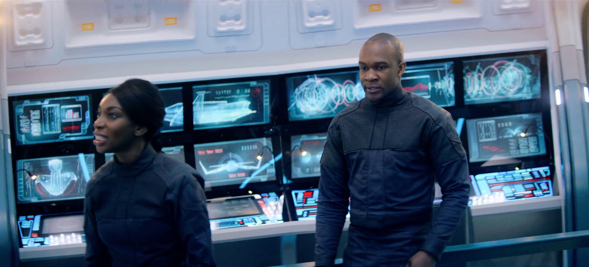
Screen graphics for “USS Callister”.
Kirill: Does it feel that nowadays anything is possible – if not in the physical world, then in the digital counterpart? Do you feel more free during your initial design phase as you explore the world of that storyline?
Erica: Initially, it’s a really good practice to go as far as you can with concepts. You never know what you are going to achieve. Your best ideas start when you remove all budget or time considerations. Obviously, you don’t want to promise that to the director before you have figured out all the details. I talk with Joel about different ideas, materials and approaches. Then, along with Robyn Paiba, our Series Supervising Art Director, we also look at the practicalities of time and money before we plough ahead.
“Black Mirror” looks as great as any feature film, but it’s still TV in terms of time and money constraints. But I believe that you should start with “the-sky-is-the-limit” mindset and then you pull it back if you need to. You want to be as open as you can.
Kirill: When the show just started, it was only seven episodes – six regular and one special – over two years. Then, as Netflix picked it up for twelve more episodes in 2016 / 17, and the just renewed season 5, there are that many more storylines set in what appears to be a single universe, as there are a lot of cross-references and the technology appears to be evolving quite in sync. How much of a challenge is it for you to keep that universe in your head and keep the pieces – such as architecture, transportation, technology, design in general – coherent and consistent?
Erica: The universe itself, definitely in the later episodes, has become more explicit. It’s subtly written into the stories, then visually tied together with the elements you mentioned.
But earlier on it happened quite organically. It was something as simple as the UKN news channel that you see in “Be Right Back” and “White Bear” of season 2 referencing “The National Anthem” from season 1. That thread was born for cross-referencing and everybody agreed we should use our news channel, UKN when news was scripted. You see that thread throughout later episodes. Those Easter Eggs started appearing as graphics or story mentions, and then evolved in the later seasons.
Graphical connection between “White Bear” and “Playtest”.
I’ve done all 19 episodes to date so far, and I do feel that it’s in my system. If I was to cut myself, a little bit of “Black Mirror” would come out [laughs]. It feels intrinsic. Without realizing it, as you are designing something, you are thinking about it holistically. Each of the stories is so wonderfully individual, but the show’s creators have written common themes and threads into all of them. So you start thinking about the universe in a holistic way as you’re coming up with ideas.
We draw upon things that we’ve done before. It’s not done to be repetitive in any way, but if an interface is able to find its way into another episode, there’s a subtle link that helps bring that universe together a bit.
Kirill: There were glimpses of it in “The Entire History of You” and “White Christmas”, but it felt that the last season placed a very heavy emphasis on advances in neuro-technology. How do you approach designing and visualizing something that is happening inside somebody’s head?
Erica: At first, with great difficulty. It is so abstract, and it is a real challenge. Often we spend quite a bit of time playing around with it. How do these memories look? How does consciousness look on a screen? You try to stay within the world of graphics that we’ve created in terms of being minimalistic. We pare things back. We take away anything that you don’t need until you’re left with its purest essence, until it almost stops making sense. Then you’ve boiled it down to its most basic form where you’re telling the story with the simplest possible graphics.
That way it’s also not overtaking the story. You have the music, the characters, and the world they are in. The last thing you want is a graphic that is screaming at you. We’re always trying to keep it subtle, to keep it in the flavor of that particular world or episode. We have a lot of circles. We have a lot of nature. We have a lot of organicness. It’s important to keep things to something that we can relate to.
When you start going down the route of sci-fi tropes, you start to come away from what the show has done so beautifully. It still feels very human. It still feels very within our grasp. And it’s very important to keep that element within the graphics.
It’s easy to get super-techy with neurological technology and run away with it. But even if we start down that road, we pull it back in. We do animation tests that help to see how it looks in motion – as opposed to just having style frames. We get there in the end!
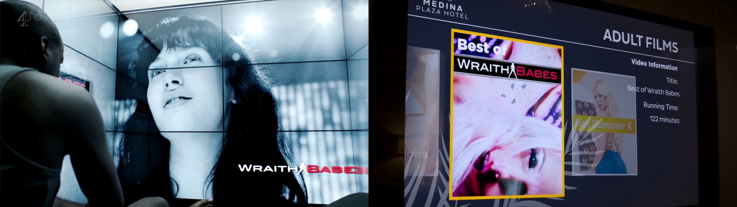
“Wraith Babes” video advertisement from “Fifteen Million Merits” and adult movie from “Crocodile”.
Kirill: From the perspective of the simplicity of graphics, did it feel that “Fifteen Million Merits” was such a big exception? It was all neon graphics, all the time, always in your face.
Erica: They wanted it to look very much like a game, and all the colors and graphics were key to that world. You have to pedal through all those points in order to survive, and it was important for the graphics to be so out there and alive. They were the whole world themselves.
On the opposite end of the spectrum, you have the simplicity of “Be Right Back”. Before that episode we had plexiglass screens and the organic tree-ring interfaces in “The Entire History of You”, but that one was the first time that we had a computer. Martha’s laptop has such an elegant and simple design, and it was the first time we’ve done something like that. It was burned in post because you can’t shoot graphics on plexiglass like that, but we still had to come up with those screen designs quite early in the process.
We’re always designing graphics in tandem with the tech. They feed into one another, and they have to work together. We have the director, the producer, the production designer and the show’s creators Charlie and Annabel, all engaging at the same point in the process, and it’s important for those ideas to be signed off. We went through quite a few approaches with that laptop and how that screen was going to look. In the end, we took everything away and inverted it to be simple white text on black background.
The way it was balanced with the rest of the set design was in perfect harmony. I felt that it was the beginning of looking at simplifying the graphics of some of the devices that we used on and off in different episodes. It works with the look of that technology.

Radial / circular interfaces from “The Entire History of You” (top left, top right), “Arkangel” (middle left, middle right), “Hang the DJ” (bottom left) and “White Christmas” (bottom right).
Kirill: This is what I love about the portrayal of technology in the show. Technology enables the stories to exist, so to speak, but it doesn’t draw attention to itself. It’s never about the gadgets, but rather what good and bad things can happen when those gadgets exist. How does it feel to work on something that is at once so integral to the story and yet almost invisible on its own?
Erica: I learned it back at the university. You shouldn’t notice good design. When you’re using a pen, you don’t want to notice it. You just want to write. But if you’re noticing it, for example if the pen not long enough to hold comfortably, it’s not doing its job well.
When people are talking about the human stories in “Black Mirror” is at the core of it. It’s about our relationships with the people around us, and the ever-growing presence of technology. When our designs enable those stories but you don’t “notice” them, that’s an achievement for me. That’s a sign of something working and being appropriate.
We are having a lot of fun time in the art department world of film and television making these designs, products and interfaces. But we have to put our egos aside. We’re there for the story. We’re there for the overall collaboration and the end result. But it is also nice that people make lovely comments about the beauty of the worlds that we create!
Going back to the pen analogy, it should just inherently work and be ingrained in the world.
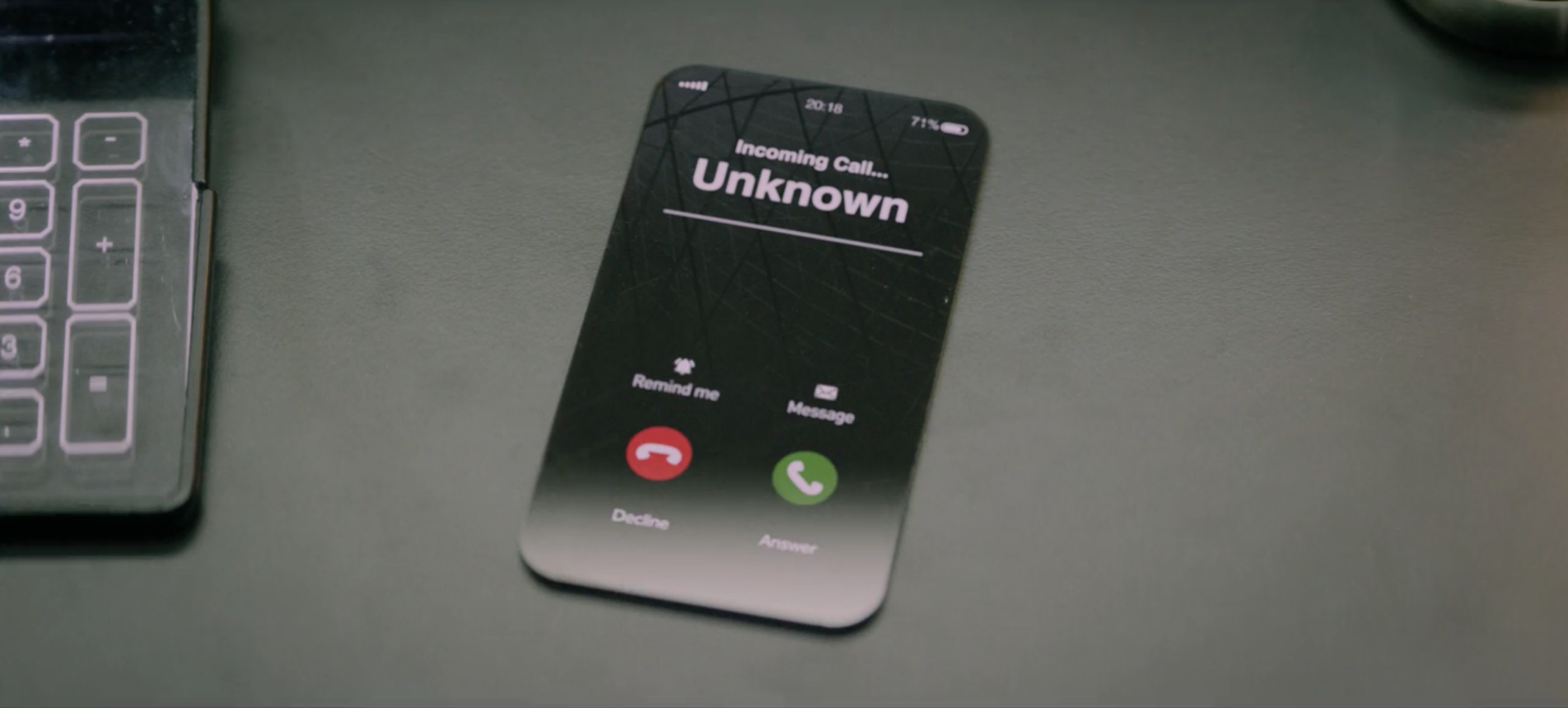
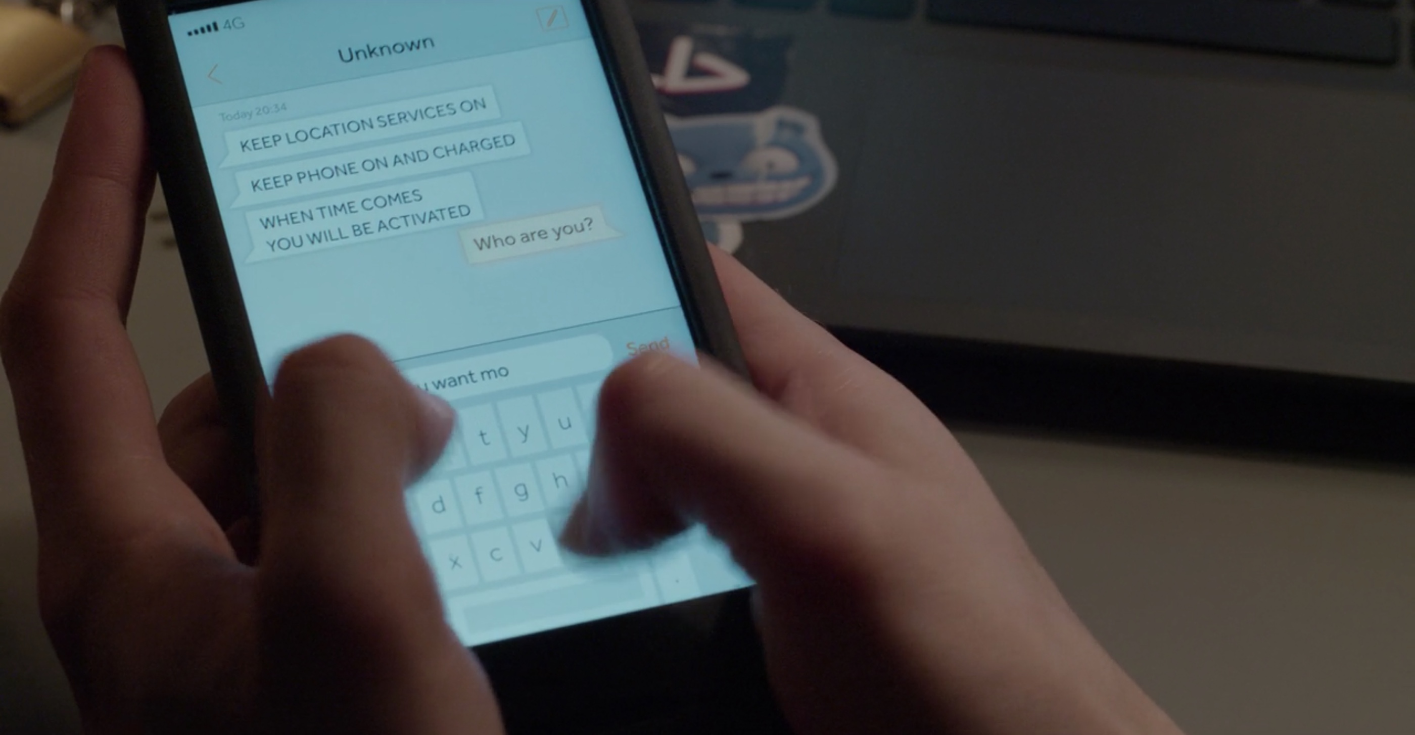
Designing the communication technology for “Black Mirror” – the phone from “USS Callister”.
Kirill: There are so many laptops around us. There are so many pregnancy test sticks in the stores. And yet you spend however many hours, days or weeks on meticulously designing version after version of these seemingly everyday products. When you talk with people outside of your industry about what you do on this show, do you find that people are surprised about how much work goes into it?
Erica: I think they are. They ask “Why didn’t you just use one of those pregnancy test kits from the store?”
Some of the time that may work. For example, in “Shut Up and Dance” you’re in this gritty world that is very ‘now’ and the design challenge here is not to stray too far into the ‘near future’. You want it to be very much what you have right now in your hands. In those instances we may use or adapt existing things to enhance the story of that world. But other times there’s a sensibility in paring something down and making it our own to fit more seamlessly into another particular world.
The pregnancy test you see in “White Christmas” and “Be Right Back” had to have that digital element with the dancing baby. That’s something that takes it into the near future where you say to yourself “Oh, that’s how those tests are going to look like in 5-years time.” You don’t want something off-the-shelf now, but something that could be off-the-shelf next year or the year after. You push the world a bit to suspend belief for that tiny moment, and then you bring it back to something recognizable and attainable.
It’s coming back again to the idea of appropriateness. Visually and also financially, if we have a huge room full of screens, and they were all done in VFX, that’s a lot of burn-ins across a lot of shots. So while it’s economical and visually helpful to use existing objects in that scenario, we always need to make them our own, and make them work in that space and feel appropriate to the story.
We can achieve great things in camera. If we’re using screens that turn on and we have everything we need to make those graphics, we shoot them for real in camera. At the end of the day, sometimes it’s very important to the overall process to be able to do that. It really does depend on the situation.
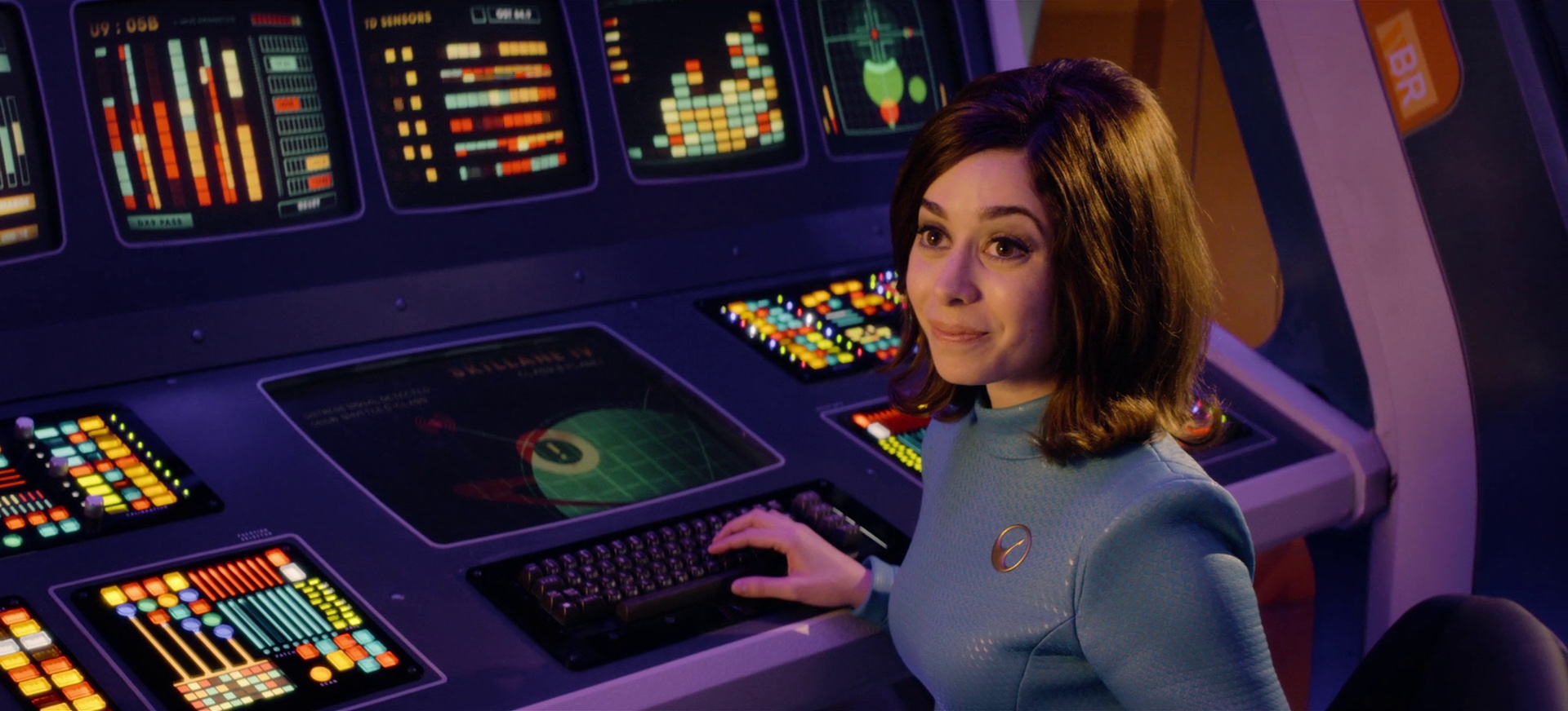
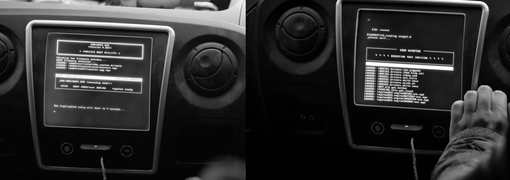
“Space Fleet” bridge graphics for “USS Callister”. Skillane IV planet on the screen above the keyboard is a reference to a character in “White Bear”.
Kirill: How different was “USS Callister” in that regard, since it didn’t have to be bound by the world of existing technology projected into the near future?
Erica: That episode was the most challenging for my area of the art department so far. Joel Collins and Phil Sims were madly designing the spaceship leading into the shoot, and we knew there were going to be a lot of screens in there. It was at least 65 screens, and the director was very keen to shoot it on anamorphic lenses.
As soon as you have a curved space and anamorphic lenses, it becomes near impossible to comp some of those screens in post. They came knocking on my door, saying that they needed to shoot all of the screens in camera all the time. And there were story beats that needed to be reflected in all of the screens at the same time, like the ship powering down or hitting an asteroid. It was an absolute military operation to coordinate what was happening on all these screens at one time
We worked with the art department to find screens and the tablets that would fit into those spaces. When we had the physicality of it, we started working on the screens themselves and the retro look. The screens needed to be programmed to work on cue over all the long days of shooting. I have to give a massive nod to Revolver Av who helped us. They did a lot of work on “Black Mirror” in general, but on “USS Callister” it was next level of programming on their side.
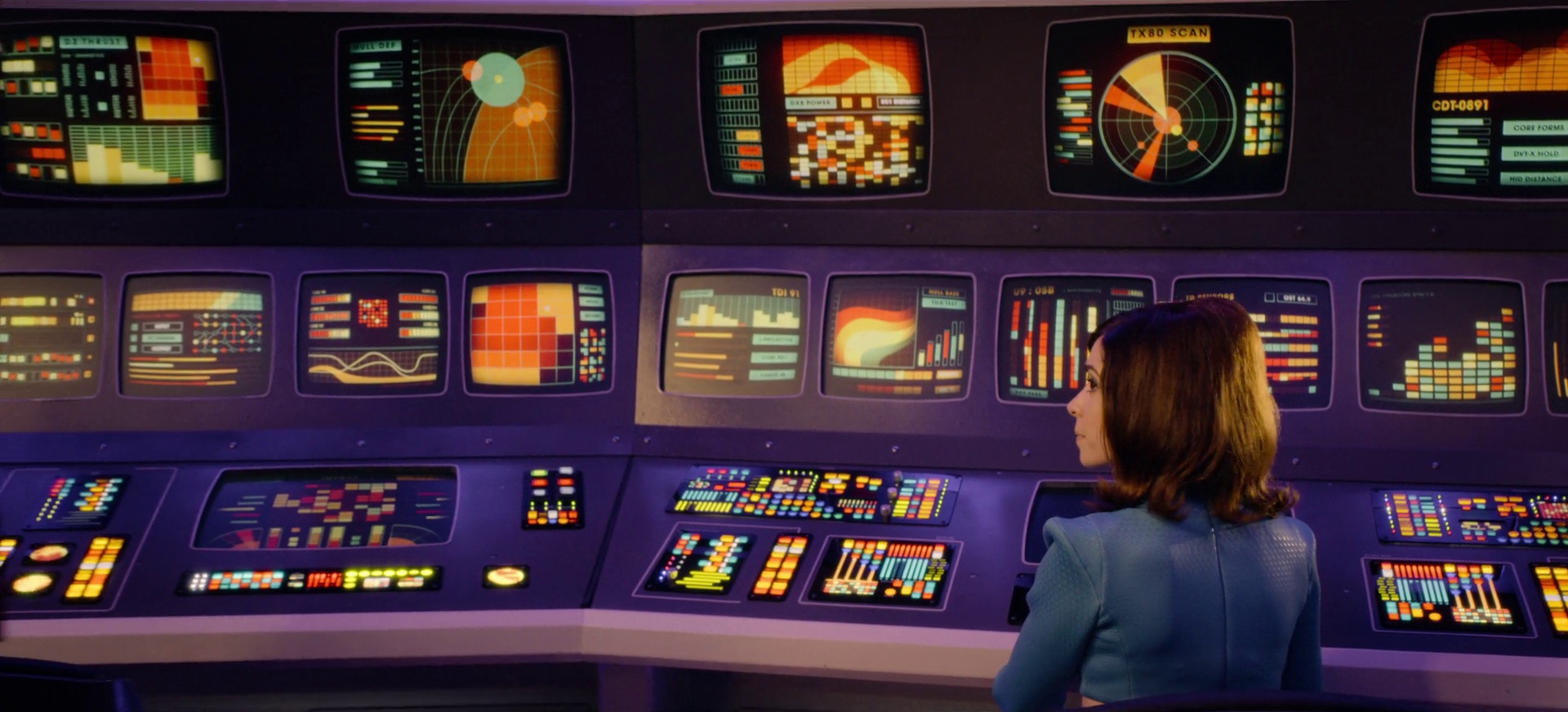
“Space Fleet” bridge graphics for “USS Callister”
No matter how much prep we did, every day would throw a new curve ball, and they had to work their magic. They wrote custom programs to let us control and link everything. It was a massive exercise in design, coordination and execution. It felt like something that you would do on a large-scale film production. But, as I mentioned before, we are working with TV constraints. We don’t have months to plan it, and it was a great sense of achievement to have been able to pull it off. I learned a lot on that episode.
My spreadsheet of everything that needed to happen on screen in that episode was a great example of what it looked like inside my head over those weeks! It was three meters long stuck on the side of the set, with military precision required to have it all working. It was a lot of fun.
And then you have several screens in the Callister office and Daly’s house as well. That episode was extremely screen-heavy, and we did it pretty much all in camera.
Kirill: “Hated in the Nation” was also quite heavy on the screens, as well as on technology in general. I especially liked Blue’s laptop with kind of a glowing keyboard. Do you also look at the characters themselves to see what kind of technology they would choose in that universe?
Erica: Designs very much have to feel in sync with the characters and the world of that particular episode. The world of tech in that episode was, for the lack of a better term, more of a PC / Android feel, whereas in “Be Right Back” you could say was more in the world of Apple. Joel Collins and Morgan Kennedy worked hard on a specific look for the tech of the police station and Blue’s devices, each one with its own specific look.
When it came to the graphics, we had to think about it differently. Blue is part of the police force, and her device operated on more of the their internal computer system, and programs she wrote herself. You ask yourself what is she seeing on her screens as she’s interacting with them, and we were giving Faye Marsay some cues during the shooting process on how to interact with those devices.
Inevitably, designs do develop as we go through post-production. We lock the edit, and we start seeing new design requirements needed to carry on through the post process. It’s evolving and improving to tell the story just right.
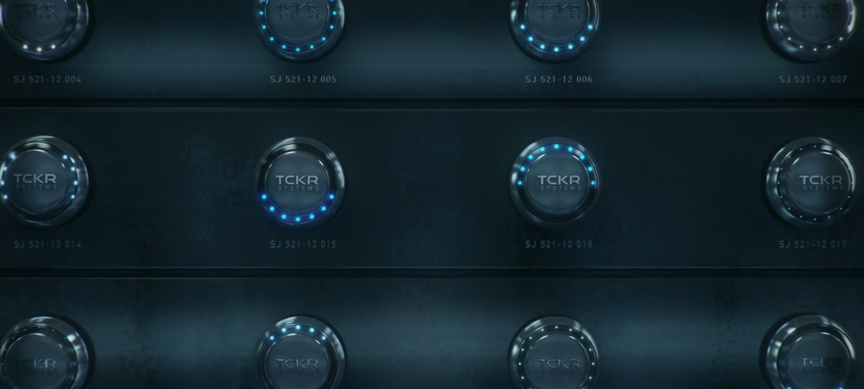
The TCKR facility in “San Junipero”. TCKR is referenced briefly in “Playtest” and explored considerably in “Black Museum”.
Kirill: You’ve worked on all the 19 episodes that we’ve seen so far. “San Junipero” seemed to be the audience’s highlight in season 3, but probably everyone has their own favorite episode. Does it surprise you to hear what resonates with people?
Erica: It’s interesting when you go to a dinner party with friends, and people start talking about “Black Mirror”. Everyone has their favorite, and it’s surprising to me to hear what gets under people’s skin. Everyone connects with them at different levels for different reasons. Some people connect at it at the human level. Some people connect with it because they love the technology.
“San Junipero” had a sadness on some level, but had a very positive ending, especially for “Black Mirror”. Everyone loves the ’80s and those old movies. There was the pop culture, and the colors, and the love story to it. It absolutely resonated with a lot of people, and it does surprise me what certain people connect with.
Kirill: When you do go to one of those parties and meet somebody new, what’s your answer to the question of what you do for a living?
Erica: I say that I make graphics for film and TV. They know that it’s there, but I don’t think that people understand what is involved. I say that I work within the production design realm, making anything from a hand prop to a neon sign to a computer screen to a phone. All of these are graphics. All of these need to be created and placed within that world.
Screen graphics for phones in “Shut Up and Dance”. Note the sticker on the laptop in the background referencing the cartoon character from “The Waldo Moment”.
Kirill: On the spectrum between the happy ending of “San Junipero” and the rather bleak ending of “Arkangel”, where are you as far as how technology has changed our lives in the last decade or so?
Erica: It’s a really big question, and that’s the outlook of all these stories. In the beginning it seems that technology is making our lives easier. We can achieve things faster. We can have busier lifestyles and have things at our fingertips without much of a thought.
Social media completely has got its pros and cons. It can destroy lives, but it also allowed me to keep in touch with people as I moved from Australia to the UK. I usually wear rose-tinted glasses. I see it in a positive light compared to some others. I try to find good in it and embrace technology, even though I hated computers back in college.
But as a new mom now, and after working on the show, I do see another side a lot more. I have that worry about where things are going. If you combine what’s achievable and attainable in terms of technology with what we’re capable of as humans, it opens up some dark doors and potential situations that you don’t want to think about.
“Arkangel” is a really good example of us embracing technology quite innocently in the beginning and wanting to use that device for safety, happiness and wellbeing. But our human condition is that we just don’t know when to stop. We don’t know where those lines are and how not to cross them. And when we do cross them, it’s too late.
I definitely try to take a step back and do tech detox. I try not to use email and social media on the weekends. You need time for yourself and for family. And these days with a baby I don’t even have time for social media [laughs].
In terms of work, technology has absolutely changed the role of the graphic designer within film and television. Software is faster and more readily available. When I started on set 15 years ago, we would go around, take photos on film, stick them on big moodboards for a show-and-tell. That whole process to be able to show something to the director took a whole day. And now you’re expected to send three PDFs with your new ideas before lunch time.
The nature of technology is creating speed, and speed is becoming expectation. There’s no escaping it. We run around, doing everything on our smartphones. I’m at the office, on the set, at the printer’s, at the construction shop looking something being CNC’d out of a massive sheet, and I’m using my smartphone. I’m taking pictures, making documents, sending updates for people to sign off on. It is expected now, and the timescales shrink even as the jobs grow. Technology is enabling us to do that.
In the art department we can now do giant wall partitions or floor coverings or carpets, designing it on a computer and having it all cut out by machines in 24 hours. Ideas are coming fast and hard, and much of it has landed in the lap of graphics designers because they have the skills and the software.
“Hang the DJ” didn’t look like a graphics-heavy episode apart from the oracle device. We didn’t have any restaurant signs, no menus or labels. But in the graphics department we were creating these beautiful geometric wall partitions and coverings. It’s great that we can do that, but it has also increased the scope of work. The Graphics department is growing, having to find more people to work on the longer list of jobs – which is ultimately really exciting. In a way, technology has enriched the role of my particular department, but it has also caused the demand to achieve things faster. It’s a double-edged sword.
Wall partitions in “Hang the DJ”.
I think technology is always a double-edged sword. There’ll always be that debate. It’s about finding the harmony and making correct ethical decisions as we go through life.
Now that I have a child, I started thinking about what is her world is going to be. That’s the question on every parent’s mind these days. When will I let my child have a Facebook account? When will she have her first mobile phone? It’s getting younger and younger, and you ask how do you protect them.
Kirill: And sometimes there’s so much social pressure around them to have that technology. My personal favorite episode is “The Entire History of You”, and in particular the dinner scene where one young woman find herself in a situation where she has to defend her choice to not use that particular grain technology in her life. Sometimes it’s an uphill battle, so to speak, to actively be making that choice.
Erica: Definitely. It’s becoming a choice these days. If you look at the last hundred years, there’s always this rebellion of the next generation. I wonder if the next generation is going to pull back from social media and technology, because they see that stuff lives online forever.
I don’t put many photos of my baby online, because I keep on thinking of what she would say in ten years about having her photos all over the net without having been asked about that! Maybe her generation will step back in a way, and be that girl in “The Entire History of You” that decided that she is happy to be sitting on the outside of it all.
I’d like to think that there’s going to be some sort of a counter-movement to the obsession with Instagram where people feel the need to prove that their life looks a certain way.
Car screen graphics from “Metalhead”. On the left, it references “USS Callister”, “Crocodile” and the very active /r/blackmirror community on Reddit. On the right, it references all seven episodes that aired on Channel4, followed by “why did you bother pausing this you freak”.
Kirill: That was “Nosedive” which was quite scary.
Erica: Going back to your question on how people react to different episodes, a couple of my friends that really love the show said to me that they couldn’t watch that episode. They felt that it was their life and their thoughts. Even though it has these beautiful soft colors and a certain playfulness to the story, the crux of it is utterly terrifying. So they found it one of the scariest episodes, more than “Playtest” which is more explicitly scary. This one was scary on a whole different level for some.
It rang true in particular with the new generation that lives with ratings and apps and portraying yourself online in a certain way to look happy and accepted.
Kirill: It reminds me of an article I was recently reading about so-called influencers on Instagram, and how people get stuck playing the game of creating these fantasy personas on social media. That was the horror of “Nosedive” for me, the persona that Lacie is trying to build for the society to see or perhaps the persona that the society is forcing her to be.
Erica: And she doesn’t even know who she is anymore. It’s ironic that these online profiles are our identity, but actually we’re quite possibly losing our sense of self-identity in a massive way by conforming. Especially young people are so impressionable. If you’re in high school and you’re feeling you need to be a certain way, it’s very hard to figure out who you are as a person. Lacie’s character definitely explains in a horrifying way, especially the scene at the wedding in the end and the uplifting moment in the prison when she’s free from her technology.
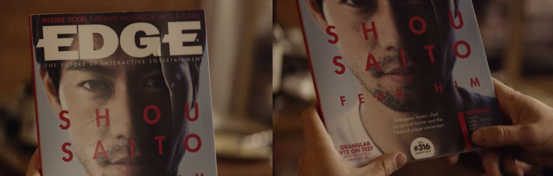
Print design for the Edge magazine in “Playtest”. On the left, the top headline is referencing the TCKR company and “San Junipero”. On the right, the bottom left headline is referencing the Granular company and “Hated in the Nation”.
And here I’d like to thank Erica McEwan for taking the time out of her busy schedule to talk with me about her work on “Black Mirror”, for sharing the supporting images and for pointing me to the few select cross-references embedded in the show’s designs. “Black Mirror” is playing on Netflix as we speak. And if you want to know more about how films and TV shows are made, click here for additional in-depth interviews in this series.
