Continuing the ongoing series of interviews with creative artists working on various aspects of movie and TV productions, it is my pleasure to welcome Howard Cummings. In this interview he talks about his work on “Side Effects”, a mystery thriller directed by Steven Soderbergh featuring Rooney Mara, Jude Law and Catherine Zeta-Jones. In addition, we discuss his other two productions, “Behind the Candelabra” and “Contagion”.
Kirill: Please tell us about yourself and how you started in the field.
Howard: I went to the graduate school at NYU to study scenic design for the theater. Right after graduation I was asked for help to find somebody to work on this movie, and I said that I’ll do it myself. I had a theater job at the time, but when I did it, I knew right away that film was what I wanted to do.
I was the assistant designer on Nine the musical which was turned into a movie a couple of years ago. I’m not that skilled a draftsman, and I wasn’t a very good as an assistant art director. But I was good at organizing everything else, so I kept getting jobs from this one guy, because I would do everything.
When I did my first film project, I didn’t realize that there were prop people and decorators; in the theater you have to do everything, so I did it all. The producers were so shocked, and they decided to hire me for their next project. It was a very hands-on experience.
Kirill: You have so many people with so many different responsibilities in all these departments. What were your first impressions getting into that world?
Howard: It just seemed to fit. I was better as the designer as I found out. It seemed very lucky in the beginning to be working on the “American Playhouse” TV series. It was a literary-based historical drama, and my first experience as a kid fresh out of school was designing these historical pieces. The first was set in 1583 and we had to make everything. Then I did three movies in the 1900s, the Eudora Welty story in 1930s, Lanford Wilson’s play in 1950s – I got a real broad spectrum of design challenges. I didn’t really do the New York Lower East Side street movie until later. I did have that experience, but not until after I did a good amount of research.
My next project is turn of the century for Steven Soderbergh. He was supposed to have retired, but he suddenly decided not to. He’s more interested now in doing long format TV. We’re about to start a pilot and 10 episodes, and it’s about a drug-addled progressive surgeon in New York at the turn of the century. I’m kind of going back to where I’ve started. I have a reputation for gritty reality, but lately I’ve been able to do other projects and I’m really excited about this particular thing. It’s where my roots were.
Kirill: Your career started before the pervasive availability of digital tools that allow augmenting and enhancing physical sets in post production. Looking at the list of your movies, I see “Percy Jackson” as the only production that used these techniques on a large scale. Are you staying away from such productions on purpose?
Howard: No, I didn’t. I sort of didn’t get a reputation for that. I’ve been doing art films, and I got this interview to take over a job. At the time it was the biggest movie ever made in Canada, “The Long Kiss Goodnight” that was budgeted at around $140M back in 1996. We had a fair amount of digital effects in that movie. So that was my first experience coming across the birth of digital enhancing and set extension. There was this guy working out of Venice who taught me a lot about those tools. Back then you did have to build bigger pieces, and rotoscoping was so time-consuming and expensive.
I never got to do sci-fi movies. People tend to want to hire you for the type of jobs you’ve done in the past. You can get pigeonholed. I’ve done a lot of thrillers, but I’m not sure how that happened.

Continue reading »
In this installment of the “In Motion” series I talk with Tim Grimes about his work on the movie “Last Night”, on switching between working on feature films and TV series, on what changes digital productions bring into the world of crafting physical sets and his appreciation of film as a medium.
Kirill: Tell us about yourself and the path that lead you to become a production designer.
Tim: I started off as a production assistant in an office. I was in bands for a while, and then I moved out of New York, and four months later I moved back and my intent was to somehow get into the film business. I had no idea how that would happen, I was 27 at the time and I ended up getting a job as a waiter. I used to work at “Kim’s Video” in New York and I met this guy who came in and asked me if I wanted to be a production assistant on this film that ended up under the name “Return to Paradise”.
I was interested in the film business, but I didn’t really know what I wanted to do. After about a year and a half working as a production assistant on a bunch of TV shows, like “Spin City” and “The Corruptor” with Chow Yun-Fat, I became a property person. I did that for a long time, from 1999 to about 2004, and I was really fortunate to have worked on the second season of “The Sopranos”. I was on a bunch of films and met property master Peter Gelfman who ended up being my boss for a long time. This lead me to work with Kevin Thompson, who is a production designer and a friend of mine. He’s amazing and really talented; he just did “Bourne Legacy” with Tony Gilroy [director].
And through Kevin I met Harris Savides who just passed away. He was my mentor, and almost like my father. We worked together on “Birth” directed by Jonathan Glazer, with Harris shooting, Kevin designing and me doing props under Peter Gelfman. That’s how I met Harris Savides and we became close friends. He worked with David Fincher, Sophia Coppola and Woody Allen, he was very picky about the jobs that he would take. He knew that I had a desire to move on, to do something more challenging, to do the next thing. He was getting ready to do “Last Days” with Gus Van Sant and he asked me during the re-shoots of “Birth” if I was interested in joining the crew. I ended up getting the job as art director, which was basically production designer. I was the head of art department, and it was very stressful and exciting. So he basically gave me my first shot, and that’s how I got into production design.
I then went on to do smaller films, continuing to do props on the side. Then I got an agent and that opened a bunch of doors, and one thing led to another. I tried to use the Harris Savides model to not just take any job, but doing things that interested me, jobs that I thought would stand out or I’d learn a lot from, different things that wouldn’t pigeonhole me into a sort of category. That thing can happen pretty easily. And that’s how I took “Last Night”. I had never done a romantic drama; it’s not something that completely interests me and I wouldn’t do them all the time, but I definitely wanted to do one and I thought that Massy Tadjedin [director/writer] was an interesting writer. I liked her take on this simple European-style romantic drama. That’s what attracted me to the project.
Kirill: As you moved to assume larger responsibilities, do you find yourself going back to do the small things on your sets?
Tim: “Last Night” had the budget of $7M, which is not that big. I was heavily involved in it. We didn’t do a lot of building, it was almost all locations. We build this small set for Paris which ended up with flashback photographs that two of the characters look at at the end of the film. It was work on transforming locations. I’m very hands on, I’m there helping the decorator decide what we’re putting up. I’m very much involved on a project like that.
Continue reading »
“Moonrise Kingdom” is by far the most enchanting and charming movie that I saw in 2012. It is a great pleasure to have the opportunity to host Gerald Sullivan, the art director of this wonderful production, and to ask him a few questions about his craft, and his work on the movie.

Gerald Sullivan
Photography by
Niko Tavernise
Kirill: Tell us a little bit about yourself.
Gerald: I am a graduate of the Southern California Institute of Architecture, SCI-ARC. I began working as a set designer in ’95 without much prior knowledge of film making. Since then I’ve had the good fortune of working on a variety of films, gaining insight from many great production designers and working with some of the industries most highly regarded directors.
Kirill: In your experience, what’s the role of an art director in the overall production, and what skills do you bring to the table?
Gerald: An art director takes on many roles throughout the production. We need to be shape shifters. Initially we need to be able to conceptualize the scenery needed to tell a certain story. Budget and schedule need to be established. The art director has to be able to react, adjust and respond to inevitable changes through out each project. We are in constant contact with the assistant directors, the UPM [unit production manager], construction, set decoration, SPFX [special effects], the Director of Photography, the key gaffer, the key grip, etc. Every art director I know has an appreciation for art, architecture, decoration, and the history of each. The best understand we must be learning more all the time, constantly expanding our knowledge, what we bring to the table.
Kirill: From set decorator to art director to production designer. Is it a natural progression, or just one path to follow?
Gerald: No natural progression, no one path to follow. Doesn’t need be a progression that aims toward, or ends up at, production designer. Whatever your best at, and take pride in doing, that’s where you should be.
Kirill: How did you end up working on “Moonrise Kingdom”?
Gerald: I had worked with Adam Stockhausen on a film the previous summer in Michigan. We got along well. I am a big fan of Wes’s work. Adam had worked with Wes on “Darjeeling Express” and a few commercials as an art director. When Adam let me know he was going to work on “Moonrise” as production designer, I let him know I was interested in art directing.

On the set of Bishop family house. Photography by Niko Tavernise, courtesy of Gerald Sullivan.
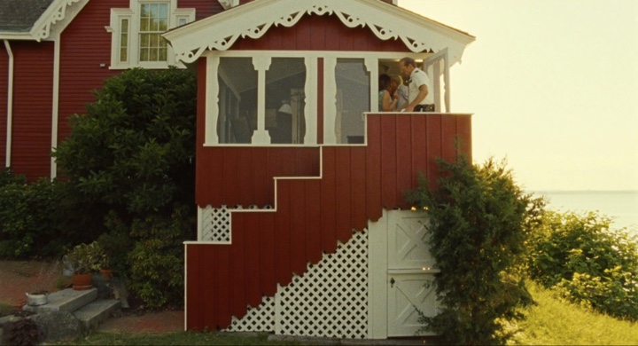
Outside shot of Bishop family house. This extension was built to match the house and provide the director with what he needed for each scene. It also camouflaged a non-period sun room.
Continue reading »
I was hooked from the very first episode. The idea, the script and the cast were phenomenal. And the colors were absolutely gorgeous. Almost too bright and vivid to be true, and yet never flashy or harsh. As I sat down to relive those few precious episodes that saw the light of day (two seasons, twenty two episodes total), I was completely overtaken by how amazingly well this show was put together.
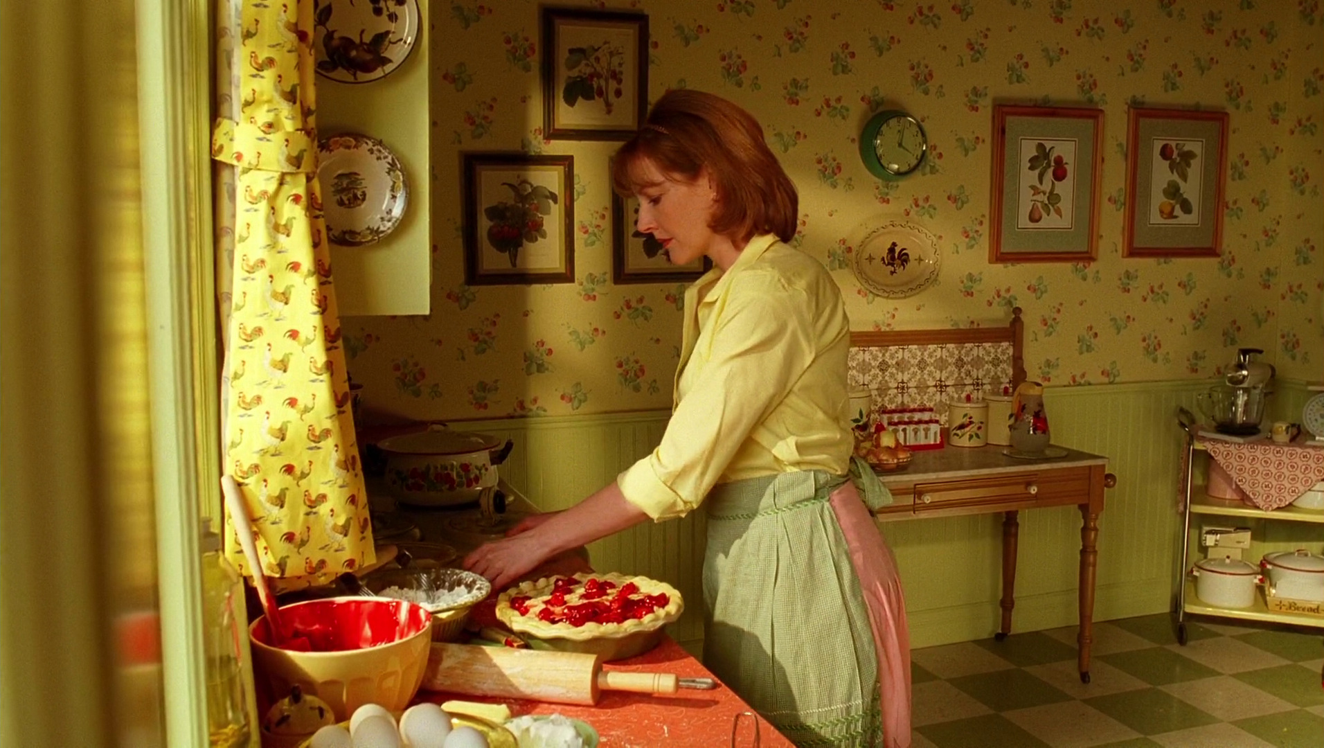
The very first sequence with young Ned running through the impossibly bright field of yellow flowers transitions into the kitchen scene with his mother. Every piece in this set has its place, every fabric and wallpaper lovingly textured with nature-based patterns, and the pop of bright red is a perfect compliment to the earthly yellows, olives and browns.
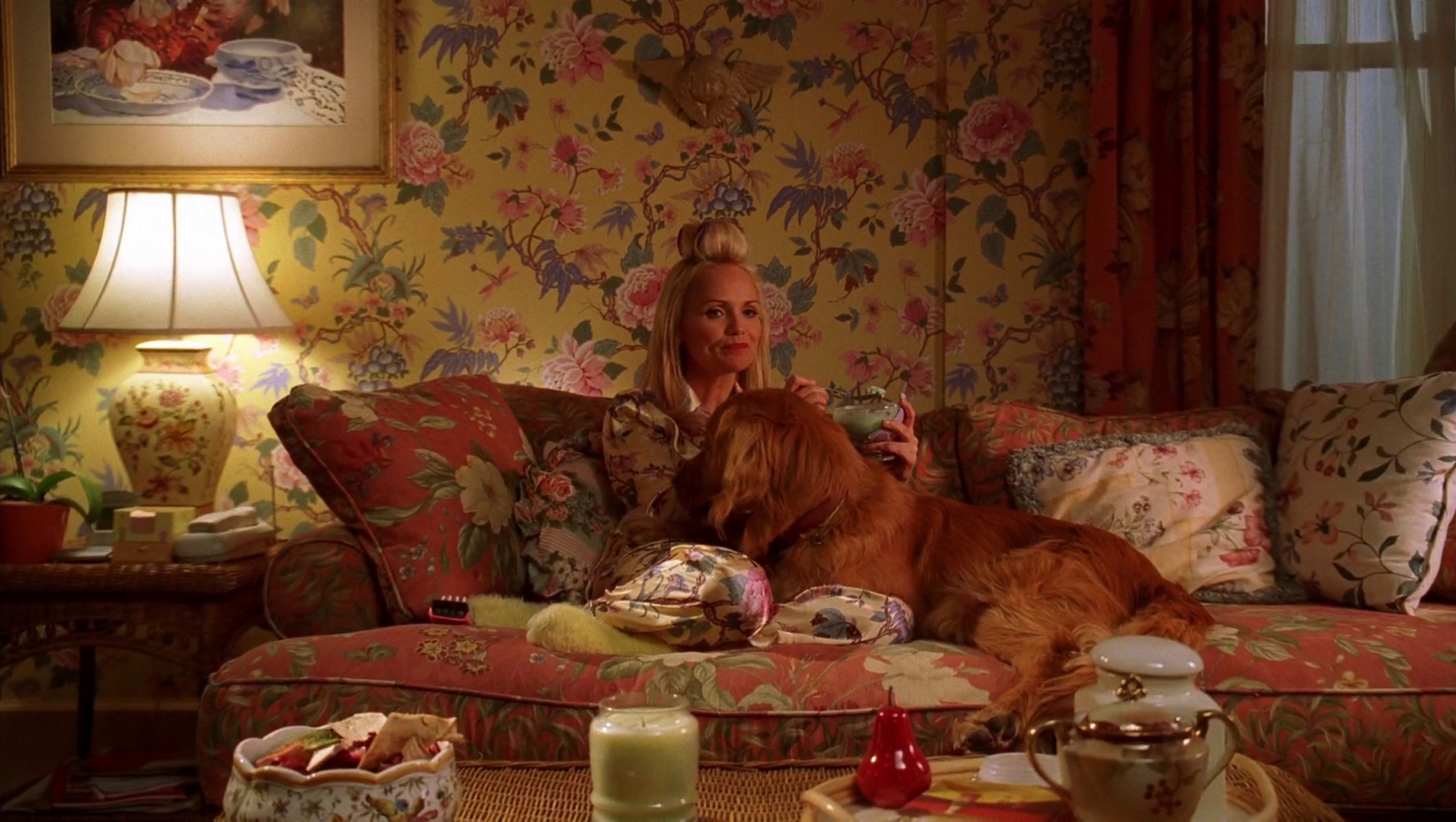
This style extended to all interior sets, never too vintage to mark any specific era, and yet never modern to break the charming spell of the deeply emotional connections between the different characters. Here’s Olive in her living room, surrounded by blooming flowers on the walls, sofa, pillows, lamp, her pajamas and even the tableware. Delicate, intricate, each with its own color palette, yet none screaming for attention, and all working together in a perfect unison.
Continue reading »
