Illustrators at work – interview with Andrew Lyons
Andrew Lyons is a prolific illustrator with an impressive portfolio that includes client work for GQ, Inc magazine, Penguine Books, BBC, Google and Mercedes-Benz. In this interview Andrew talks about his influences, bringing a human touch to the world of predominantly digital media, the importance of personal work and his recent packaging branding for “Strong” line of nutrient supplements.
 Kirill: Tell us about yourself and how you started in the field.
Andrew: Art was the only thing I was really good at in school, so I knew when I was younger that I wanted to be an artist of some kind. I choose to study painting at university in Cardiff, but when I came out of university I had really now idea what to do with myself, there was no career guidance at all, so I spent the next ten years in odd jobs mostly as a temp working in offices. After a move to France in 2005 I had lots of time on my hands while learning French. I took a graphic design course that taught me how to use Adobe creative suite, but designing logos and websites just felt to restrictive although I liked the aesthetics of clean design. This is when I decided I wanted to be an illustrator, to combine my interest in painting and clean graphics. So in 2010 I started to build a portfolio of personal work and had my first magazine commission 6 months later. From there I just learnt on the job.
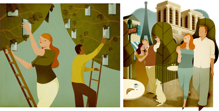
Left – illustration for Inc Magazine, right – illustration for Financial Times Weekend newspaper.
Kirill: What informs and shapes your taste and style?
Andrew: So many different things shape our tastes I think, the more the better. I’ve recently realised that the cartoons I watched when I was very small have been an influence, British children’s programmes from the early 80’s like Mr Ben, and Trumpton. I watch these again with my kids and I can see how the visuals were ingrained in my mind, and see similarities with my work which is weird really!
Another big factor is my love for abstract art, and the kind of paintings I used to do in Art school. I was a little obsessed with squares and geometric shapes in flat colours. I admire artists from the St Ives school; Ben Nicholson, Patrick Heron and Barbara Hepworth.
Lastly comic book artists are a big influence, Hergé’s Tintin, and other artists like Yves Chaland, Ted Benoit, Ever Meulen and Joost Swarte. Abstract art and comic books are my big loves. I like the idea of putting comic book style figures into an abstract and geometric background and seeing how they can interact with that space.
Kirill: Do you want to carve out a consistent and recognizable style, or are you willing to push and explore different directions as time goes by?
Andrew: I don’t really try too hard to be consistent. The way in which I draw certain things seems to evolve naturally with time and I can see differences in the work I did two years ago compared to my current work. I so like to try new things, but I take little steps I guess.
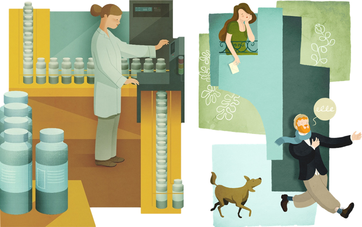
Left – illustration for Spirig AG, right – personal work.
Kirill: Your illustrations are alive with strong human figures, and yet the facial features are reduced to bare minimum. Are you more interested in the shape than in smaller details that might distract from the overall composition?
Andrew: Yes I think that’s probably true, I think it might distract a little, I like simplifying things where I can. But what I like most about having simple features is that it makes the faces more iconic, and possibly easier for people to identify with. Also I like the ambiguity of simple features as it makes emotions difficult pin down exactly, which can be useful when dealing with difficult subjects.
Kirill: As you move from pencil-and-paper sketches to digital outlines and colorizing on computer, do you aim to preserve the imperfection of a human touch? Or is that brought back by textures and lighting?
Andrew: Yes that’s right, I like to conserve some element of the hand drawn in the final art. I’ll either throw in some hand drawn line, or the textures will help to do that a little. More recently I have started to use pencil saying on my characters to rough up their shadows a little, whilst keeping their contours super clean. I like the duality of that. It’s like a push and pull between the right and left side of my brain. There’s a part of me that wants to be Mondrian with super clean lines and colours, and another part of me that just wants to make a mess and throw paint around like Pollock. I try to contain both impulses when I’m working.
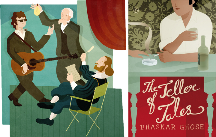
Left – illustration for Google’s Think Quarterly, right – cover illustration for “The Teller of Tales” book.
Kirill: How do you preserve colour fidelity when the final product is targeting print media, such as magazines, book covers or packaging labels?
Andrew: I think that it’s difficult to know exactly how the illustrations colours will look once printed as different paper stocks give different results. I work in photoshop in RGB and then covert to CMYK at the end because there are some layer effects that just don’t work in a CMYK file. So when I’m working I’ll click the little ‘proof colours’ option in photoshop to get a rough idea for how it’ll look once printed in CMYK, but apart from that there’s not much else to do.
Kirill: On a related note, you’ve done a lot of editorial illustrations for magazines. Do you see any changes that affect your work as that industry is exploring digital editions and a variety of smaller screens and different form factors?
Andrew: I’ll often supply a layered photoshop document to an editorial client so that it can be animated for the iPad, but I don’t do any animating myself. I know of some illustrators that do the animating themselves so perhaps it’s a useful skill for illustrators to learn these days. But apart from that I’m not sure how things have changed as I’ve not been illustrating long.
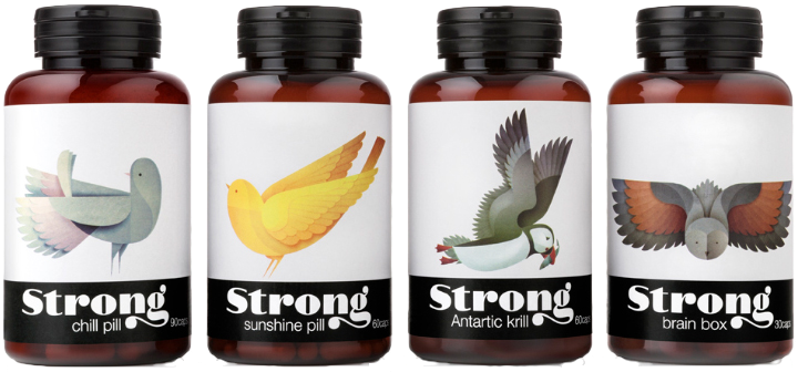
Packaging branding for “Strong” line of nutrient supplements.
Kirill: Walk us through the process of creating the packaging branding for “Strong”. How do you capture the essence of an individual product in a single animal, and yet maintain consistency and continuity for the entire line?
Andrew: Thanks, I’m pleased that you think I’ve captured some of the essence of the subject. I start by looking at dozens of photographs and video of the bird in question, and sketching a lot, just drawing the bird as it is to get a feel for it’s shape. Then I sketch again, but this time directly into photoshop where it’s easier to clean up the drawings, and edit them, flip them etc… It’s at this stage that I try to imagine the birds build from clean curves and geometric shapes. I send my drawings to the client for feedback. My Art Director for Strong very honest with her feedback. If something isn’t working she tells me frankly what needs to change, so I go back and redraw, sometimes from scratch until it’s looking right. Working in this way brings out my best work I think as. it doesn’t always look right at the first attempt.
As to consistency, it’s always at the back of my mind when I’m drawing so this comes through in the final work. I use the same textures in almost all the bird illustrations too which helps.
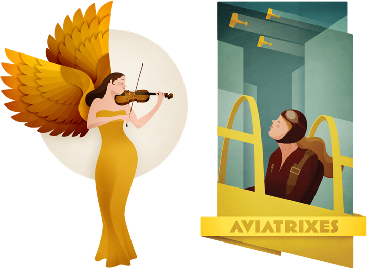
Left – personal illustration, right – personal illustration.
Kirill: What’s the weirdest client feedback that you’ve received so far, if you don’t mind sharing?
Andrew: That’s a difficult question as I’ve never really had any weird client feedback to be honest! The feedback I’ve had from clients is always quite useful. Sometimes the honesty of the feedback can be quite funny, but it’s usually spot on.
Kirill: How important is it to invest time in personal projects?
Andrew: It’s important for me, and my personal illustrations have brought me new work quite often. I sometimes think that personal work has a quality that some client work is missing, there’s a drive and passion behind a lot of personal work, and I can see it myself when looking in other illustrator’s portfolios. The only difficulty with personal work is getting feedback, and being your own critic. I have other illustrators I can speak to to ask their opinions because when you’ve your head in a piece of work, it can be hard to see things that aren’t working. So a fresh pair of eyes really helps.
Personal work is important too for moving my portfolio and style forward.
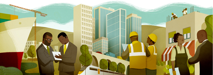
Illustration for Bspirit magazine.
Kirill: What do you do when you run out of ideas and get stuck?
Andrew: When I get stuck I’ll try and work through it for a time and I’ll keep at it until I just can’t get any further. Then I’ll do something totally different. I’ll take a walk or read a book. And it’s when my mind is elsewhere that the ideas often come. I’ll often use spider diagrams and write down words related to the subject first rather than drawing anything. Then when I’ve filled a page I try connecting words on opposite sides the page to find something unique, a new idea. Then with an idea in mind of what I want to draw, I try to figure out how I’m going to draw it.
If I’m working hard on finding a visual solution before bed, I sometimes wake up with a picture in my head in the morning, so I quickly sketch it down before I forget it. But it’s rarely that easy.
Kirill: What’s the best thing about being an illustrator?
Andrew: Well, my two favourite things about being an illustrator are being able to work from home and spend more time with my wife and kids. And learning about something new with each project, from Iron ore mining in Africa to William Morris.
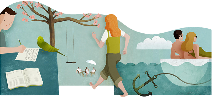
Illustration for educational textbook.
And here I’d like to thank Andrew Lyons for his wonderful work, and for taking the time to answer a few questions I had about his art and craft. You can find his work online at his main portfolio site and his personal Tumblr stream. Select illustrations are available for sale at the Society6 shop. He’s also active on Behance, Dribbble and Twitter.


