Substance comes with built-in support for animating state transitions for the core Swing components, as well as for all the Flamingo components.
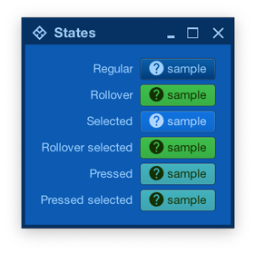
Let’s take a look at this screenshot from the component states documentation:
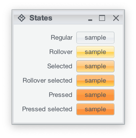
Here we see how one of the Substance skins (Office Silver 2007) provides different visuals for different component states – light yellow for rollover, light orange for selected, deeper orange for pressed, etc. As the component – such as JButton in this case – reacts to the user interaction and changes state, Substance smoothly animates the visuals of that component to reflect the new state. In the case of our JButton, that includes the inner fill, the border and the text.
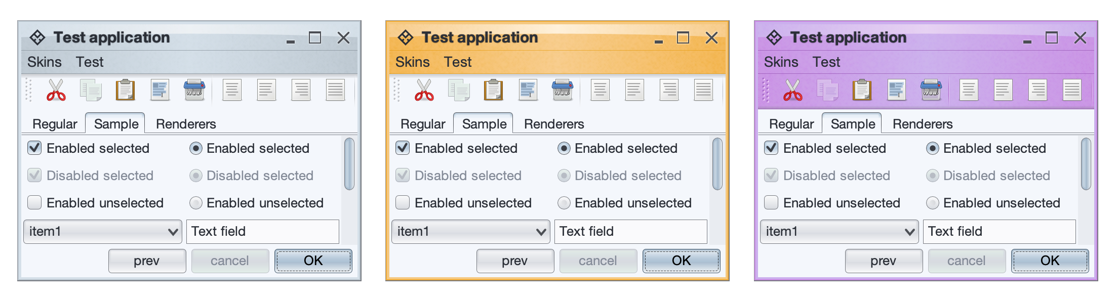
This comes particularly handy for skins that mix light and dark visuals for different states of the same component. Here is the same UI under the Magellan skin:
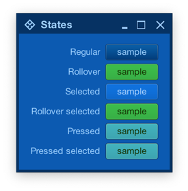
Note how the selected button uses light text on dark background, while the rollover selected button uses dark text on light background. If your UI uses the Magellan skin (or any other skin that uses a mix of light and dark color schemes), Substance will do the right thing to animate all relevant parts of your UI as the user interacts with it.
What about the icons?
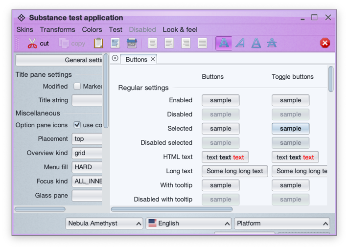
This is a screenshot of the main Substance demo app running under the Nebula Amethyst skin. As UIs with lots of icons can get pretty busy, Substance provides APIs to theme the icons based on the current skin visuals.
The APIs are in the SubstanceCortex class, one in the GlobalScope to apply on all icons in your app, and one in the ComponentScope to configure icon theming for the specific control:
SubstanceCortex.GlobalScope.setIconThemingType for global icon themingSubstanceCortex.ComponentScope.setIconThemingType for per-component icon theming
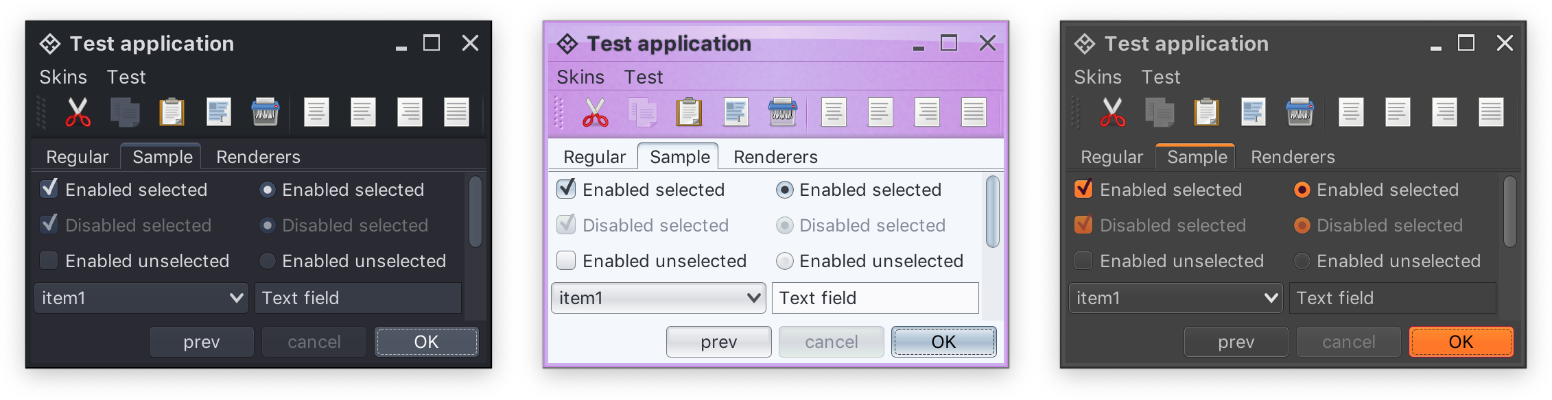
At the present moment, two icon theming types are supported. The first is SubstanceSlices.IconThemingType.USE_ENABLED_WHEN_INACTIVE which works best for multi-color / multi-tone icons and Substance skins with multi-color color schemes. Here is the same UI with this icon theming type:
Take a look at the icons in the toolbar. The icon for the active / selected button (bold A) is still in full original color, but the rest of the icons have been themed with the colors of the enabled color scheme configured for the toolbar area of the Nebula Amethyst skin. This work well in this particular case because:
- The original Tango icons have enough contrast to continue being easily recognizable when they are themed in what is essentially a mono-chrome purple color palette
- Nebula Amethyst skin uses color schemes with different background colors for the ultra light to ultra dark range, so that when these colors are used to theme the original icons, the icons remain crisp and legible.
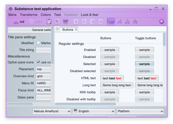
The second option is SubstanceSlices.IconThemingType.FOLLOW_FOREGROUND which works best for single-tone icons found in such popular icon packs as Material, Ionicons, Friconix, Flexicons, Font Awesome and many others:
In this screenshot of the same UI from earlier under the Magellan skin, all the buttons use the same help icon from the Material icon pack converted by Photon. At runtime, Substance themes the icon to follow the foreground / text color of the button for a consistent look across all component states.
It gives me great pleasure to announce the fifth major release of Radiance. Let’s get to what’s been fixed, and what’s been added. First, I’m going to use emojis to mark different parts of it like this:
💔 marks an incompatible API / binary change
😻 marks new features
🤷♀️ marks bug fixes and general improvements
Dependencies for core libraries
- Gradle from
6.4.1 to 6.6.1
- Kotlin from
1.3.72 to 1.4.10
- Kotlin coroutines from
1.3.7 to 1.3.9
Substance
- 💔 Remove support for watermarks
- 💔 Convert
SubstanceSkin.ColorSchemes into an interface
- 😻 Support for overlay colors with
SubstanceSkin.setOverlayColor
- 💔 Support for specifying derived colors in color scheme files
- 😻 New API to mark a label as title pane text
- 😻 Text highlights that respect decoration areas
- 💔 Moved the Green Magic skin from
substance-extras to the core substance module (see the screenshot of this skin above)
- 💔 Aligned signatures of
ComponentState.getActiveStates and ComponentState.getAllStates
- 🤷♀️ Improved menu search widget UX
- 🤷♀️ Correct layout for edit context menu under RTL
- 🤷♀️ Fix concurrent modification exception thrown when ghost icon animations are enabled
Flamingo
- 💔 Pass command projection instead of command in ribbon contextual menu listener
- 💔 Remove
AbstractCommandButton class. Everything is in the JCommandButton class now.
- 😻 New
CommandButtonPresentationModel.Builder.setPopupHorizontalGravity API to contol horizontal alignment of command button popups
- 🤷♀️ Fix crash in opening a command popup menu from taskbar
- 🤷♀️ Fix memory leaks caused by model listeners
- 🤷♀️ Fix for root key tip chain not showing popup key tips of anchored commands
- 🤷♀️ Fix for overlays on ribbon popup content in the title pane / taskbar
Trident
- 🤷♀️ Fix inconsistent usage of conversion from duration fraction to timeline position
This release has mostly been focused on stabilizing and improving the overall API surface of the various Radiance modules. There’s still a long road ahead to continue exploring the never-ending depths of what it takes to write elegant and high-performing desktop applications in Swing. If you’re in the business of writing just such apps, I’d love for you to take this Radiance release for a spin. Click here to get the instructions on how to add Radiance to your builds. And don’t forget that all of the modules require Java 9 to build and run.
It gives me great pleasure to announce the fourth major release of Radiance. Let’s get to what’s been fixed, and what’s been added. First, I’m going to use emojis to mark different parts of it like this:
💔 marks an incompatible API / binary change
😻 marks new features
🤷♀️ marks bug fixes and general improvements
Dependencies for core libraries
- Gradle from
5.6.1 to 6.4.1
- Kotlin from
1.3.50 to 1.3.72
- Kotlin coroutines from
1.3.0 to 1.3.7
- Batik from
1.11 to 1.13
Substance
- 😻 A more flexible skin accent system
- 😻 New skins – Graphite Sienna, Sentinel and Harvest
- 😻 Support color references in color scheme files
- 😻 New Caps Lock indication on focused password fields
- 😻 New association kind for checkbox and radio button “boxes”
- 💔 Revisit APIs for loading color scheme bundles
- 💔 Remove the title pane heap status widget
- 🤷♀️ Use Helvetica Neue on macOS Catalina
- 🤷♀️ Visual refresh of checkbox marks
- 🤷♀️ Support for fallback fonts (CJK, etc)
- 🤷♀️ Fix for incorrect usage of
HIGHLIGHT_TEXT association kind on renderers.
- 🤷♀️ Fix for background of popup menus opened from toolbar buttons.
- 🤷♀️ Fix improved contrast across core skins.
- 🤷♀️ Multiple fixes for table rollover hightlights and animations
- 🤷♀️ Fix for some components under very large font sizes
- 🤷♀️ Performance fix for column selection in large tables
- 🤷♀️ Fix for icons in file chooser drop downs
- 🤷♀️ Fix for incorrect bounds of maximized frames on secondary monitors
Flamingo
- 💔 General evolution of command button APIs
- 😻 Support for toggle split buttons
- 😻 Add API to wire notification on ribbon spinner changes
- 😻 Add API to wire notification on ribbon task selection
- 🤷♀️ Multiple focus traversal fixes for ribbon content
- 🤷♀️ Fixes for clipped wrapped ribbon components
- 🤷♀️ Fix to not use round corners on command buttons in menus
- 🤷♀️ Fix for crash in narrow command button panels
- 🤷♀️ Fix for crash in showing keytips on toggle anchored ribbon commands
- 🤷♀️ Fix for crash on showing keytips on undecorated windows
- 🤷♀️ Fix for dynamic changes to ribbon gallery content
- 🤷♀️ Fix for large icons on internal frames
- 🤷♀️ Use the public
Taskbar API to set the ribbon frame dock icon
Trident
- 💔 Move all public APIs to
org.pushingpixels.trident.api package
- 💔 Remove generic UI toolkit support and leave only Swing support
- 😻 Add support to provide dynamically computed
from / to values on timelines.
Neon
- 💔 Move all public APIs to
org.pushingpixels.neon.api package
Photon
Plasma
This release marks a special milestone for me. The very first Substance release happened exactly fifteen years ago, on May 30th 2005. I didn’t quite imagine that I’d be here today, still working on the same codebase.
There’s still a long road ahead to continue exploring the never-ending depths of what it takes to write elegant and high-performing desktop applications in Swing. If you’re in the business of writing just such apps, I’d love for you to take this Radiance release for a spin. Click here to get the instructions on how to add Radiance to your builds. And don’t forget that all of the modules require Java 9 to build and run.
Here’s to the next fifteen years!
It gives me great pleasure to announce the third major release of Radiance. Let’s get to what’s been fixed, and what’s been added. First, I’m going to use emojis to mark different parts of it like this:
💔 marks an incompatible API / binary change
😻 marks new features
🤷♀️ marks bug fixes and general improvements
Substance
- 😻 New skins – Nebula Amethyst, Night Shade and Graphite Sunset
- 🤷♀️ Fix for disappearing internal frame title pane buttons
- 🤷♀️ Fix for crash during initialization
- 🤷♀️ Fix for
OutOfMemoryError on sliders with large model ranges
- 🤷♀️ Fix for slider tracks under dark skins
- 💔 Fix for incorrect tracking of state-based alpha values in color scheme bundles
- 🤷♀️ Fix for drop shadows under some skins
- 🤷♀️ Fix for contrast ratio of highlighted content under Sahara skin
- 🤷♀️ Fix for antialiased rendering of pasted text content
Flamingo
Trident
Photon
The first Radiance release focused on bringing all the different Swing open-source projects that I’ve been working on since 2005 under one roof. The second Radiance release was about making them work much better together. And this one (code-named Coral) is about covering major functionality gaps that were missing up until now.
There’s still a long road ahead to continue exploring the never-ending depths of what it takes to write elegant and high-performing desktop applications in Swing. If you’re in the business of writing just such apps, I’d love for you to take this third Radiance release for a spin. Click here to get the instructions on how to add Radiance to your Gradle / Maven / Ivy / Leiningen / Bazel builds. And don’t forget that all of the modules require Java 9 to build and run.
