Theming in Substance, now with icons
Substance comes with built-in support for animating state transitions for the core Swing components, as well as for all the Flamingo components.
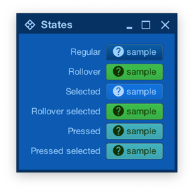
Let’s take a look at this screenshot from the component states documentation:
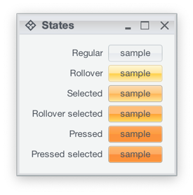
Here we see how one of the Substance skins (Office Silver 2007) provides different visuals for different component states – light yellow for rollover, light orange for selected, deeper orange for pressed, etc. As the component – such as JButton in this case – reacts to the user interaction and changes state, Substance smoothly animates the visuals of that component to reflect the new state. In the case of our JButton, that includes the inner fill, the border and the text.
This comes particularly handy for skins that mix light and dark visuals for different states of the same component. Here is the same UI under the Magellan skin:
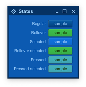
Note how the selected button uses light text on dark background, while the rollover selected button uses dark text on light background. If your UI uses the Magellan skin (or any other skin that uses a mix of light and dark color schemes), Substance will do the right thing to animate all relevant parts of your UI as the user interacts with it.
What about the icons?
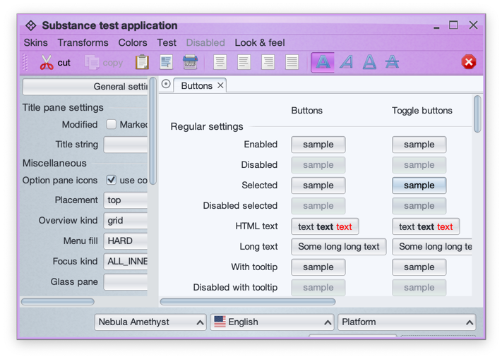
This is a screenshot of the main Substance demo app running under the Nebula Amethyst skin. As UIs with lots of icons can get pretty busy, Substance provides APIs to theme the icons based on the current skin visuals.
The APIs are in the SubstanceCortex class, one in the GlobalScope to apply on all icons in your app, and one in the ComponentScope to configure icon theming for the specific control:
SubstanceCortex.GlobalScope.setIconThemingTypefor global icon themingSubstanceCortex.ComponentScope.setIconThemingTypefor per-component icon theming
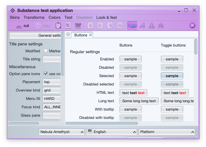
At the present moment, two icon theming types are supported. The first is SubstanceSlices.IconThemingType.USE_ENABLED_WHEN_INACTIVE which works best for multi-color / multi-tone icons and Substance skins with multi-color color schemes. Here is the same UI with this icon theming type:
Take a look at the icons in the toolbar. The icon for the active / selected button (bold A) is still in full original color, but the rest of the icons have been themed with the colors of the enabled color scheme configured for the toolbar area of the Nebula Amethyst skin. This work well in this particular case because:
- The original Tango icons have enough contrast to continue being easily recognizable when they are themed in what is essentially a mono-chrome purple color palette
- Nebula Amethyst skin uses color schemes with different background colors for the ultra light to ultra dark range, so that when these colors are used to theme the original icons, the icons remain crisp and legible.
The second option is SubstanceSlices.IconThemingType.FOLLOW_FOREGROUND which works best for single-tone icons found in such popular icon packs as Material, Ionicons, Friconix, Flexicons, Font Awesome and many others:
In this screenshot of the same UI from earlier under the Magellan skin, all the buttons use the same help icon from the Material icon pack converted by Photon. At runtime, Substance themes the icon to follow the foreground / text color of the button for a consistent look across all component states.
