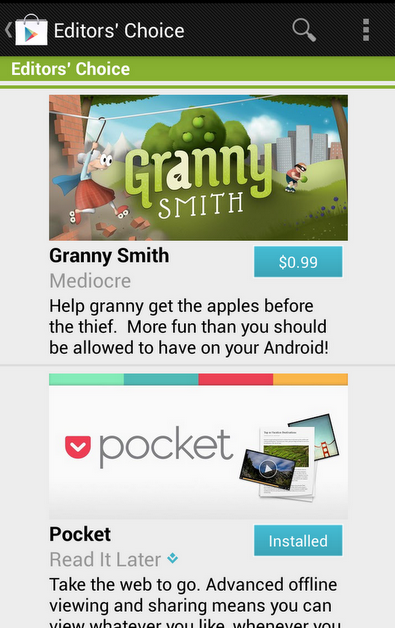
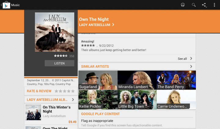
In an earlier post I talked how we restyled the “Similar artists” section in the latest release of Google Play Store app. Here is how the details page for an artist used to look like:
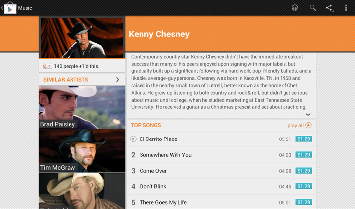
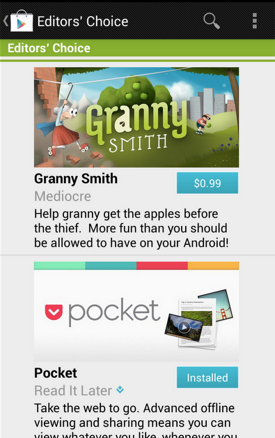
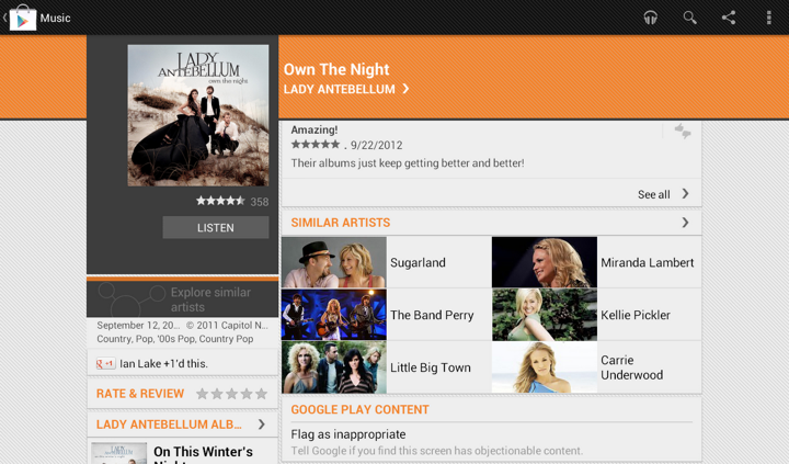
We display up to four similar artists (if we have that info), and using full-bleed artist images with overlayed names creates this gigantic block that completely overpowers the main artist image. It’s just too heavy, and it constantly draws your attention away from the rest of the content on this page. Here is the restyled version that provides the same information, but scales down the presentation to match its relative logical importance in the overall content hierarchy. The artist image takes half the cell, and the artist name is displayed to its right. And now we can also fit more of these cells above the fold.
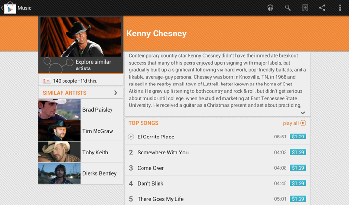
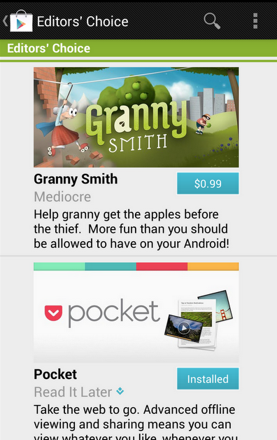
Tapping on the header of “Similar Artists” section opens the full list. Cells in that list are full-bleed to provide a richer listing, where each element has the same logical and visual importance. In the absence of a more “important” visual element (such as the main artist hero image on the details page) we can go back to the full-bleed presentation:

The implementation behind these two screens is quite straightforward. We define two XML layouts, let’s call them artist_reduced.xml and artist_full_bleed.xml. The first is used on the details page, and the second is used on the full listing. But what happens on smaller devices?
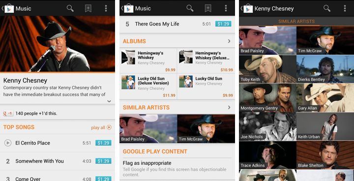
The first two screens show the details page of the specific artist, and the third screen is the full list of similar artists. As shown here, the target design is to use the full-bleed cell in both cases, preserving the existing presentation. The main reason not to switch to cells that display artist image side by side with artist title is that the current presentation is already following the logical importance of that content. The main artist image takes the full width of the screen, while similar artists section displays two cells side by side. Not only each such image is smaller, the vertical position of that section and full scrolling ensure that we won’t end up with both main and related images being visible on the screen at the same time. Finally, if we switch to the new presentation, we won’t have enough horizontal space to display two cells side by side (which is, by the way, why we switched from 3 columns to 2 columns in “Similar Artists” section on album details page on larger devices). So, to continue displaying two similar artists we’d need to add another row of content, which is not an immediate UX improvement.
Preserving the existing design poses an interesting problem. On smaller devices we want to use the same layout for both usages, while on larger devices we want to switch from “reduced” to “full bleed” layout. Suppose our switching point to differentiate between smaller and larger devices is -sw600dp. Then, the first approach would be to have:
- layout/artist_reduced.xml
- layout/artist_full_bleed.xml
- layout-sw600dp/artist_reduced.xml
In this approach, layout/artist_reduced.xml is a copy of layout/artist_full_bleed.xml which lays out the content as full-bleed image and overlapping title, while layout-sw600dp/artist_reduced.xml lays out the content as a smaller image in the left part of the container, and multi-line to its right. At runtime the system decides which layout bucket is used for the specific layout. For the full view that references R.layout.artist_full_bleed in its adapter it will return the instance inflated from layout/artist_full_bleed.xml. For the “Similar Artists” section on details page R.layout.artist_reduced will be resolved to either layout/artist_reduced.xml or layout-sw600dp/artist_reduced.xml based on the device.
The main disadvantage of this approach is maintaining two identical copies of the full-bleed layout in the layout/ folder. Even though we only have two child views in this cell, you still need to remember to sync any tweaks you make between the two copies. This can be addressed by extracting the content into yet another layout that has parent <merge> tag, and <include> that content in both XML files in the layout/ folder. That still doesn’t completely remove the sync problem as you still have identical parents defined in the two original files, and increases the amount of information you need to “parse” in understanding what is the right place to tweak the specific layout. Here is where we can use layout aliases.
What do we want in an ideal world? We want to define two basic layouts and, depending on which layout bucket we’re in, to map R.layout to one of them depending on which page / section we’re in. So this is what we’re going to do:
- Define the “full bleed” layout in layout/artist_full_bleed.xml
- Define the “reduced” layout in the bucket that is actually going to use it – layout-sw600dp/artist_reduced.xml
How do we make the code that uses R.layout.artist_reduced to be resolved to layout/artist_full_bleed.xml on smaller devices? By using this layout alias placed in values/layout.xml:
<resources>
<item type=”layout” name=”artist_reduced”>@layout/artist_full_bleed</item>
</resources>
This effectively maps R.layout.artist_reduced reference to layout/artist_full_bleed.xml on smaller devices, while layout-sw600dp/artist_full_bleed.xml is used on larger ones. Any change to layout/artist_full_bleed.xml will be reflected in all places that use it without need to remember syncing it across multiple XML files.
Some of your Android nine-patch assets may have transparent outer areas. For example, the buttons in Google Play Store have 4dip transparent outer area for the normal state. The assets for pressed and focused states then use that area for outer glows. What does this mean for aligning such controls with the rest of the UI?
If you place such a button in, say a vertical LinearLayout and set android:paddingRight on that container, you will get correct alignment for the physical content bounds, but not for the perceived content bounds. That transparent 4dip-space on the right side of the button will push it further inside the container, while the rest of the content (which does not have that extra space encoded in its asset) will be aligned on a different perceived vertical line.
Let’s take a look at the purchase dialog displayed on devices with larger form factor:
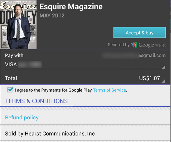
The “Accept & Buy” button is visually aligned with the “Secured by Google Wallet” text below it. But, the actual right edge of the button view is 4dips to the right of the right edge of that text view. Another option would be to set the right padding on that text view to 4dips as well. Sometimes, if you have such a button along the right edge of the container, you would need to set different paddings / margins on the content, depending on which side of the container it aligns to. And yes, the “Accept & buy” in pressed state shows the highlight halo that goes beyond the rest of the content that is aligned to the right edge of the screen. This, however, is a better compromise than having the button moved inwards when it’s in the normal state.

Sometimes you need to consider how view / background colors blend when you’re working on perceived alignment. Here’s how the app editorial cells looked like in the previous release of Google Play Store. It’s functional, and if you open hierarchy viewer to look at the physical bounds of promo image and the blue button below it, they are at the same right edge. But the outer transparent area encoded in the 9-patch asset (for outer glow of pressed / focused state) causes perceived misalignment.
The next screen accounts for that transparent area by moving the button to the right. So now you have the right edge of the image aligning with the right visible edge of the button. But there’s still misalignment, and now it’s even more pronounced (aka the uncanny valley). In most cases the blue action button is displayed on dark grey background, and its outer white edge is quite visible there. But in this context we have very light gray fill, and the button’s outer white edge is almost unnoticeable:
Our current solution is to nudge the button even further to the right, aligning the right edge of the promo image with the inner blue fill of the button, as shown here:
Here’s how an artist page used to look like in the Google Play Store app:

And this is its new look:
In addition to displaying the section that launches Music Explorer, we also scaled down the appearance of cells in the Similar Artists section in the left column. Why?
Take a look at the first image. We display up to four similar artists (if we have that info), and using full-bleed artist images with overlayed names creates this gigantic block that completely overpowers the main artist image. It’s just too heavy, and it constantly draws your attention away from the rest of the content on this page. The second image shows how we tweaked the visuals of that section to be more scaled down. The artist image takes half the cell, and the artist name is displayed to its right. And now we can also fit more of these cells above the fold.
This highlights how the visual styling of a content block follows its logical importance in the overall hierarchy of the screen content. Here’s the same principle applied to the album page. First, this is how the album page used to look like:
And this is how it looks like now:
Once again here, we are breaking this big heavy block into smaller pieces. As we’re displaying the artist image side by side with the artist name, we switched from 3 columns to 2. This provides enough space for reasonably short artist names, and we wrap them if necessary to multi-line mode.
Our daily job as programmers is to solve problems. Some view this as a just a job with a steady paycheck, rarely venturing outside the daily routine, not interested in learning new techniques or pushing their own boundaries. Some enjoy working on side projects, exploring new languages or just reading blogs to stay current. Hopefully, as the years pass, you grow and enrich your own personal arsenal of tips, tricks, techniques and ways to assess and solve problems. Finding the best solution to the specific problem at hand within the constraints of available time and specific programming environment.
Simple problems should have simple solutions. That’s kind of obvious. Except when people insist on creating artificial complexity while solving them, either out of lack of knowledge or out of fear that if simple solutions is all they have, they will fail to uphold their seniority status. And so you end up with people writing their own string replacement routines instead of using regular expressions, writing their own persistence layers with opaque binary blobs that serialize multi-field multi-level object hierarchies instead of using databases, or inventing WSDL and UML.
Complex problems can have simple solutions as well. At times, we tend to forget the underlying math complexity behind such elegant data structures as hash tables and balanced trees, the ingenuity behind bloom filters, Perlin noise generators and inverse square root approximation, or the sheer power of recursion that gives us such beauty as Quicksort. Once these are tucked safely behind library APIs – provided by either the runtime itself or written as a utility layer in your own project – they become just a few more entries in your toolbox, and you rarely spend time to appreciate their powerful elegance.
And then there are complex problems for which we don’t seem yet to have simple solutions. Sometimes you need to combine a few tools that you have, and sometimes you need to sit down and create a brand new complex solution. That’s what we’re paid for, after all. And then, sometimes, there is an existing solution. And it feels just the right fit for this problem we’re trying to solve.
Such is the case of using vector image formats for scalable graphics, which is most often boiled down to using – or at least trying to use – SVG for icons on platforms that run on a wide variety of screen pixel densities. On one hand, you have a problem of scaling your graphics on screens of various sizes and resolutions. On the other hand, you have a solution that claims to do just that. And it feels that these two are a perfect match.
And you can start by thinking that it’s a simple problem of scaling the entire icon up or down, and that it’s a simple solution of taking one of the existing SVG libraries and asking your designers to export all their assets in that format. And if your designers know what they’re doing, they’ll come back to say that they don’t want to just scale everything. They want to hide some visuals for smaller point sizes, tweak proportions as the target point size changes, or even switch to a different overall composition beyond a certain threshold. And while for you it’s all pixels, for them it’s points. And then you need to understand what’s the difference. And then you may realize that it’s no longer a simple problem, but you don’t want to throw away that nice simple solution. So you go read a bit more about the SVG format, and it’s this gigantic spec that supports embedded bitmaps, embedded fonts, animations and even interactivity layer that can run scripts on user interaction. And it’s no longer a simple solution. It’s this complex solution. And its complexity scope seems to match the new complexity scope of the problem.
And so now you have a complex problem and an existing complex solution. And it feels like they are a good match. If only you can just find the right subset of functionality and the right set of tools that will allow your designer to create those custom elements in the exported files. And with every objection your designer raises, you only are more determined to dig into the format spec and find a section that seems to be a good match. And as you dig deeper and deeper, the feeling that you have a good match becomes a firm conviction. And you never look back at the complexity you have built trying to match the “almost there, but not quite” solution to this problem. It was never “almost there”, mind you. But it takes time to actually realize that. And then SVG becomes another entry in your arsenal of tools. A tool that is not great – or even decent – at solving the problems that it claims to solve. Not yet. Not this year. Maybe the next one.
