I have first came upon the online presence of Niall McCormack a couple of years ago through his blog dedicated to vintage Irish book covers. Unlike many of the aggregator blogs that simply repackage and post image galleries, every entry on this blog is a breath of fresh air, providing a wealth of background information on the specific authors, genres and publishing houses, along with Niall’s own impressions of the works. And a few months ago I was particularly delighted to find Niall’s portfolio, a thriving and captivating collection of his illustration work with particular emphasis on music packaging and book covers. It gives me a great pleasure to welcome Niall to the ongoing series of interviews with illustrators, and to ask him a few questions about his art and craft.
 Kirill: Tell us about yourself and how you started in the field.
Niall: I’m a designer and illustrator from Dublin, Ireland. I specialise in designing music packaging and book covers. I studied Industrial Design at college in the early nineties but I spent my free time designing posters and playing music while I was there. After college I played with my brothers in a band called Jubilee Allstars. I designed all of our record releases – a few LPs and a bunch of singles and EPs. That gave me a good handle on the technical side of packaging design and I got more jobs on the back of that work.
Since 2007 I’ve been designing CD covers for Ace Records in the UK and I get to work on great music from the fifties and sixties – rhythm & blues, soul, rock ‘n’ roll, girl groups, rockabilly, garage etc.
In the last couple of years I’ve been exploring illustration much more and enjoying the freedom it brings to the design process. Originating the entire visuals for a project is very satisfying and allows a higher degree of control over the process. It also means that you can add you’re own voice to projects and use it as a selling point to new clients.

Left: Giselle, for Birmingham Royal Ballet exhibition organised by Point Blank. Right: Vatican Voodoo Brand for The Art of Superstition exhibition organised by Illustrators Ireland.
Kirill: What informs and shapes your taste and style?
Niall: Collecting records from a young age had a major impact on my visual taste. I’ve always loved the sleeve designs as much as the music and in many ways it was my first exposure to the visual arts. I love design that is simple and direct, I like it to be rough around the edges. I always associate slick design with corporate blandness. I like vernacular design and popular commercial design.
I’m also very interested in the mechanics of printing and how different processes affect the look of the finished piece. I’m fascinated by how ephemera from different eras has a look that is unique to that time, how trends in design as well as advances in print technologies affect the style of that time.
Kirill: Do you want to carve out a consistent and recognizable style? Is there a danger of being influenced too much and not finding your own unique voice?
Niall: My aesthetic preferences and tastes do give my work some semblance of a recognisable style. It is something that I’m conscious of, but I find it hard to actively aim for a consistent style without it becoming a creative strait jacket. I’m not too concerned about having a unique voice, I like my work to retain the feel of the material that I take inspiration from. Some of my work requires me to explore styles from the past in a believable way so there is less room to create a unique voice.

Book covers for Chartered Accountants Ireland.
Kirill: How do you approach designing a book cover? Is it about capturing the story in a single image, or a somewhat looser interpretation that gives you more freedom?
Niall: Most of the book covers I design are non-fiction and the Irish market is quite conservative in terms of cover design. Irish publishers are struggling to embrace the move towards illustration which has occurred in larger markets over the last few years.
With fiction, if you’re lucky, you’ll get to read the full book although sometimes it might only be a chapter or two. I think it’s important to capture the tone or mood of the book rather than a literal representation of a particular scene, character or object. Period style may also need to be evoked and that can be a good starting point.
Non-fiction covers can be a real challenge but it is very satisfying when it goes right. I design a lot of accountancy book covers with impenetrable titles and abstraction tends to work a lot better than stock clichés.

Downtown Soulville CD covers for WFMU Radio.
Kirill: What is your process of designing a record cover? Does it work better if you like the particular album?
Niall: Yes, it definitely helps to like the music and it’s essential that you have a good understanding of the cultural context the music was made in and the market it is aimed at. Luckily I have a fairly broad taste and I’m a fan of the labels I work with. I’m not interested in packaging music that I don’t like and so far it hasn’t been an issue.
The design process is different depending on whether I’m working on a reissue or on contemporary material. For reissues there are usually some photographs or other ephemera which will be used as the starting point. I always relish having a blank canvas to start with which happens more often with contemporary releases. I like to push illustrative solutions but sometimes an artist will feel safer with a photographic cover.
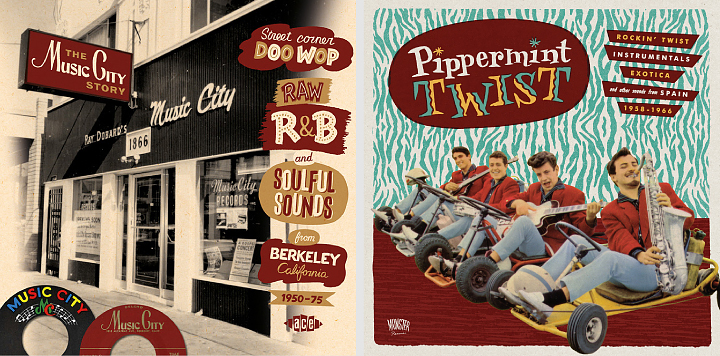
Left: The Music City Story, CD cover for Ace Records. Right: Pippermint Twist, LP & CD cover for Munster Records.
Kirill: Most of your record covers are for compilations of material from a few decades ago. Employing the mix of old photographs and vintage illustration elements, is your intent to stay faithful to the original style of that era?
Niall: The majority of my work is for labels who reissue music from the ‘fifties and ‘sixties and it’s an era I’m drawn to both musically and visually. I do try to stay faithful to the original style of the era and can be a bit obsessive about it. I try to use fonts which are true to the period and employ hand-lettering when necessary. I enjoy exploring the nuances of popular visual style. There’s a big difference between the graphic look of the early-sixties, mid-sixties and late-sixties but some of the differences are quite subtle. I collect books of LP cover art and I’m particularly fond of 45 label artwork, it’s always good to refer to examples from the period, rather than later reinterpretations which can be quite wide of the mark. With some projects I’m less fussy about period style and can employ a more general retro feel.
Kirill: Speaking more broadly about cover design, what are your thoughts on increasing prevalence of digital stores – for both music and books? Do you keep in mind that people are browsing and making impulse purchases on a variety of smaller screens?
Niall: To be honest I’m still focused on the physical product and don’t tailor the design to the digital marketplace unless that is a requirement from the outset. The buyers of reissues tend to be older and still want physical product, particularly releases with extensive sleeve notes and archival images. Most of the packages I work on have at least a 20 page booklet so a digital version would be lacking in comparison.
I’ve designed some digital only music and book releases but haven’t enjoyed the experience. It is essentially a thumbnail icon that you are producing and it is very different from what I’m used to. I’m not sure about the fate of CDs but I believe books aren’t in the imminent danger that some commentators would have us believe.
Kirill: What’s the technical process? Pen-and-paper first, and then transition to digital tools?
Niall: I mainly use brush or dip-pen and ink to create the original elements and then bring them into the computer to add colour, texture and assemble. I avoid clean vector lines if at all possible. With some pieces I’ll mimic the printing process and create separations for each colour, add texture to them individually and then recombine them as a single piece. I go into the process of creating Tomorrow Never Knows for Illustrators Ireland’s Illustrated Beatles exhibition here.

Left: Charlie Parr, gig poster for U:mack Productions. Right: Thee Oh Sees, gig poster for U:mack Productions.
Kirill: Once the cover is part of the final product, do you ever wish to go back and tweak that illustration? Has it ever happened that you had what seemed to be an even better idea after the process has been completed?
Niall: You can have very strong feeling about a piece when you are working on it but feel differently when you view it after some time has passed. This can go both ways, sometimes a job gets compromised and the client wants to use what you feel is a weaker idea. It can be quite dispiriting at the time but oddly, I’ve found that I’m often very happy with the finished cover after the dust has settled. At other times, you can be very happy with a piece as you work on it, but when you review it later on you might not be as enthusiastic. It’s hard to be objective in the middle of a job so you have to trust your instinct, it won’t always be right but it will be most of the time.
Kirill: How do you preserve color fidelity when the final product is targeting print media, such as album or book covers?
Niall: I have a well-calibrated colour printer which gives a good idea of colour in the CMYK range. Colour fidelity is less problematic now than it has been in the past, partly because the technology has improved but also because I’ve a better sense of what is possible within the limitations of commercial printing.

Left: Konono No 1, gig poster for U:mack Productions. Right: Flash Gordon, re-imagined film poster for Hollywood Babylon Dublin.
Kirill: What’s the weirdest client feedback that you’ve received so far, if you don’t mind sharing?
Niall: A client described some of my cover drafts as “old fashioned” and “out of date”. I didn’t have the heart to explain the whole retro phenomenon.
Kirill: They say that the Internet has a place for everybody, no matter how narrow their interest is. What’s the story behind the Vintage Irish book covers blog? How did it start?
Niall: I wanted to start a design blog that focused on an area of design which was generally overlooked. Originally I hoped to post examples of Irish ephemera from the 20th century but I found it very hard to find enough good material. While I was on the look out I noticed that there were lots of very interesting Irish book covers waiting to be discovered. The history of Irish graphic design and illustration has yet to be documented properly and many very talented Irish designers from the past are completely unknown even in their home country. The blog has a very narrow focus but I think that has been a strength rather than a weakness. Most of the covers I post aren’t on the internet already and I think people appreciate the unique content and my efforts to piece together some of the designer’s stories.
Kirill: How much time do you spend on preparing a typical entry on that blog, and how do you get the actual high-resolution images of the covers?
Niall: The blog entries take about 3-4 hours to put together. The majority of covers are from my own collection of books.
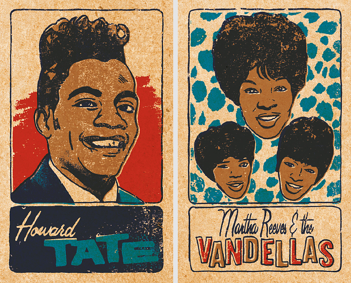
Two cards from a set of 48 Soul & Funk Trading Cards, personal work.
Kirill: How important is it to invest time in personal projects?
Niall: Personal projects are vital and I always enjoy working on them. There is more space to experiment and try new processes and the results usually make for good self promotion pieces.
Kirill: What do you do when you run out of ideas and get stuck?
Niall: Try not to stress out. It’s good to get away from work and get a clear head.
Kirill: What’s the best thing about being an illustrator?
Niall: Having started out as a designer, the best thing for me is the added freedom and control that illustration gives.

Left: WFMU interprets the music of Sun Ra, CD cover for WFMU Radio. Right: Tomorrow Never Knows for Illustrated Beatles exhibition organised by Illustrators Ireland.
And here I’d like to thank Niall McCormack for graciously agreeing to answer a few questions I had about his work, and to share his materials for the interview. You can find more of Niall’s work in his portfolio, and follow his blog dedicated to vintage Irish book covers.
Continuing the ongoing series of interviews with illustrators, it is my pleasure to welcome the talented John Holcroft. Over the last 15 years John has worked with clients such as BBC, Reader’s Digest, Financial Times, The Guardian, The Economist, Conde Nast and many others, capturing ideas and stories with a vigorous, vibrant and expressive visual style. Today I am thrilled to have an opportunity to ask him a few questions about the art and craft of illustration in the digital era.

Kirill: Tell us a little bit about yourself and how you got started in the field.
John: I left college at a time when the UK economy was in recession. I could only get temporary jobs doing anything I could. At the time of my graduation the technology in the design industry was going through lots of change.
As time went by my portfolio of hand rendered type and graphics seemed more and more obsolete and I started to worry about what my future would hold. Illustration was my one strong point and it seemed only natural to pursue this as a career seeing as I didn’t need any kind on technology. At the time I was painting in acrylic on board and it was time consuming and restrictive but it was a start.
Kirill: In your bio blurb over at Behance you say that you’ve reinvented your style about 5 or 6 times. Is this part of finding and refining your own voice, and pushing yourself to explore new directions?
John: Nothing stays still in this constant changing industry. It is fickle and one minute you can be hot next you are yesterdays news. As an illustrator you learn this the hard way which is why any artist worth their salt will adapt and evolve their style to suit the market. I changed my style from time to time either because it wasn’t right, it had run it’s course or because it was too bloody awful and didn’t work. They say an illustrator is only as good as their last job. In my case jobs were so far and few between, no one would remember me anyway. So in answer to your question it did encourage me to explore new avenues with different mediums.
Kirill: On a related note, what has shaped and influenced you over the years?
John: At first my work was more pictorial and figurative like it it now. This I suppose was influenced by Edward Hopper and David Cutter. I later tried to experiment with colour and technique and my style became very off the wall.
I loved the work on Ian Pollock, David Hughs and Rachel Gosling. This inspired me to reinvent my style to become something that in hindsight wasn’t really me. I had work for a while but I could never have really competed with what was already around. After yet another failed attempt at a style change, I threw in the proverbial towel. It was around 2008 that I admitted defeat and looked for work. This was short lived because not long after I had to have an operation on my back and I was out of action for months. It was this incapacity that gave me the change to develop my current winning style.
Kirill: How do you approach the process of creating an editorial illustration? Do you work off of an article pitch, or are you brought in after the article has been fully fleshed out?
John: It depends on the client. Most of the time I just get the copy to read and sometimes the art editor might make some suggestions. If I’m lucky I might have a very ingenious art editor who has already come up with the concepts and I just use that as a starting point. I do prefer to work on the creative process alone unless I know the art editor and have worked with them before. Occasionally my ideas are mutilated by clients and the’ve added pointless and daft elements to the image just to satisfy the editor.
Kirill: As you are expected to distill the idea behind the article – or the main area of the specific issue – into a single cover illustration, do you prefer tackling it from the solitude of your office, or do brainstorming with your art director or other client contact people?
John: Both, depends on the art editor.

Kirill: In the last few years the publishing industry is pushing their content onto a variety of digital mobile platforms. As people now browse and consume content on a variety of smaller screens, do you find yourself scaling down the complexity of your illustrations so that the finer details don’t get lost?
John: Not at all. My work is kept simple anyway and I don’t like to add too smaller detail.
Kirill: You’ve been doing digital illustrations since 2001. Do you still start with pen-and-paper doing quick sketches and then moving to the digital tools? Are you satisfied with the current crop of software and hardware tools? If not, what could use some improvement?
John: I do everything on my wacom tablet. I still use a sketch pad occasionally though. For years I have used Corel Painter do do my work until I bought version 12 which I had problems with. It kept crashing constantly and I would lose work. I just use Photoshop now.
Kirill: And on a related note, there’s so much being created, distributed and consumed in the digital domain. Is there anything being lost when neither the creator nor the consumer interact with the physical print media?
John: Print is still very much alive. Not including books and all aspects of design ( packaging, ads, corporate) Magazines have always been a springboard for many rookie illustrators. All my clients produce both print and digital media and if it were not for the print we would pay more for the online media.
Kirill: Once the illustration is out of your hands and becomes part of a published product, do you ever wish to go back and tweak it? Has it ever happened that you had what seemed to be an even better idea after the process has been completed?
John: All the time. Just got to make sure it’s right by double checking. The beauty of digital artwork is that you can tweak it. Sometime the client has requested tweaks which is no problem. Once I was doing a piece for Employer’s Benefit magazine. On my illustration was a man next to a powerpoint presentation whiteboard. On it were the words ‘Pensions’, ‘Investments’, ‘Savings’ and ‘Shares’ reading down the page. The client got back to me and asked me to configure it differently because the lead letters spelled PISS.
Kirill: What’s the weirdest client feedback that you’ve received so far, if you don’t mind sharing?
John: Most clients are great. Just like anyone else. Sometime you come across a prima donna. I was doing my usual ringing up for appointments that I used to do every couple of years. Sometimes you don’t get through to the people you need to straight away, either because they’re out or away or not at their desk. There was one particular client I really wanted an appointment with, if I was going to London for a week I wanted to make sure it was fruitful. After ringing this client 4 times, I rang again and asked the receptionist to be put through. I was told to hang on and after a minute the receptionist came back on and told me the art editor in question has asked me never to put you through to her and can you not call again. A simple ‘no’ would have been sufficient.
Kirill: What do you think looking back at your own work from a few years ago?
John: Some of it I like, some I want to die of embarrassment.
Kirill: How important is it to invest time in personal projects?
John: Very important. I still do. It’s the only way I can be sure to have the work I really want. Commissioned work is good, but it’s specific to that job and probably wont appeal to a wider audience.
Kirill: What do you do when you run out of ideas and get stuck?
John: Go away and do something else then come back later. I do try to research any topic I’m working on and sometimes just watching TV can trigger ideas.
Kirill: What’s the best thing about being an illustrator?
John: Freedom. I can manage my time more flexibly which is crucial having children. I have to be careful not to over expose my work and become a ‘has been’ too early. I love what I do and all I ever want to do is earn a living.
In the past it has been hard when work dries up as many illustrator out there know too well and if work is trickling in I’m happy.
And here I’d like to thank John Holcroft for this great opportunity to get a small glimpse into his world. You can see more of his work over at his Behance portfolio, and selected prints are available for sale at Society6.
As part of the “In Motion” series, I did a few interviews about screen graphics and the way they are portrayed in futuristic sci-fi movies, and one of the “usual” questions I ask the person is where they see the human-computer interaction going in the next few decades.
And then, as I was talking with Scott Chambliss, the production designer of “Star Trek”, about how he approached designing the computer environment of the Enterprise Bridge, especially given that it’s happening in a rather distant future (250 years from now, give or take), I realized that I’m not really being fair.
Asking such a question immediately puts the other person on the defense. Look at where we were 25 years ago, and look at where we are now. The pace of technological evolution is incredible, and there’s an amazing amount of research going into all these different directions, some proving to be niche experimentation, and some reaching and changing lives of hundreds of millions of people. Asking somebody (who is not an extrovert futurist) to predict what will happen in the next 25 years is unfair. There’s just no way to be able to do that, and there’s an extra layer of being indexed forever and having people point fingers at your old self and how completely wrong you were at the time you made that prediction.
So here’s my resolution. I’m not going to ask this question any more. No more “Where do you see human-computer interaction going in the next 25 years”. Instead, I’m going to ask about where they would like it to go. What is bothering them now, and how that can be eliminated? How this can make our lives better? How this can be enriched without isolating us even more from our fellow human beings?
My own personal take on this is that interacting with computers is too damn hard. Even given that I write software for a living. Computers are just too unforgiving. Too unforgiving when they are given “improperly” formatted input. And way too unforgiving when they are given properly formatted input which leads to an unintentionally destructive output. The way I’d like to see that change is to have it be more “human” on both sides. Understand both the imperfections of the way human beings form their thoughts and intent, and the potential consequences of that intent.
What about you? Where would you take the field of HCI in the next 25 years?
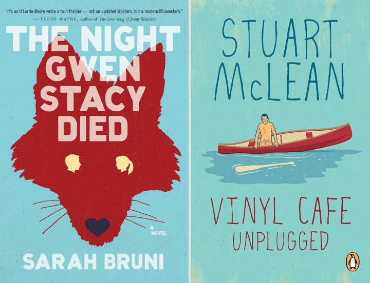
Continuing the ongoing series of interviews with illustrators, it is my pleasure to welcome the talented Dan Page. Dan’s editorial portfolio includes clients such as Time, The Washington Post, The Boston Globe, Forbes, Reader’s Digest and many others. Every illustration packs a powerful twist, with a unique, strong and expressive visual delivery. In addition to his extensive editorial work Dan has also illustrated a number of book covers, most prominently for the Vinyl Cafe series.
 Kirill: Tell us about yourself and how you started in the field.
Dan: I grew up in the suburbs of Toronto and went the regular route to be an illustrator. I had artistic talent growing up, went to art school (Ontario College of Art and Design), but never imagined an Illustration career at the time. Like many students, I simply gravitated towards Illustration from all the options art school had to offer. The course that hooked me was a third year Editorial Illustration class, taught by the late Jerzy Kolacz, an immigrant from Poland, and a respected conceptual Illustrator. Jerzy had a way about him, a master at crafting ideas, and inspiring students to think conceptually.
Kirill: What informs and shapes your taste and style?
Dan: My work is shaped by communicating ideas through images. I like to take a graphic approach. I love a good line drawing, playing with different textures or even now silhouetted shapes.
Distilling things down and not overloading a composition gives me the end result I’m striving for.
Kirill: Do you want to carve out a consistent and recognizable style, or are you willing to push and explore different directions as time goes by?
Dan: I love to explore and push things, it keeps things fresh and exciting for me. Exploring new techniques new possible ways to complete a final has become part of my process.
With technology you can make a few different finals up to the last minute of a deadline. This was not possible a decade ago, at least the way I would work back then. You needed to be sure of how you would approach a final with little wiggle room for changes. I’ve been Illustrating full time for over 20 years.
I know from personal experience that without pushing and exploring, surviving a long career is difficult. Creating new ways of approaching assignments is reenergizing. It makes work feel less like work.
Kirill: Your editorial illustrations seem to be about distilling the main subject into a single, powerful, thought-provoking idea. Is there any sort of organized process behind this, or more of a sudden bolt of inspiration?
Dan: Coming up with original ideas is the most challenging and difficult part of my process, but also the most rewarding. I wish it was easier since it’s always done under time constraints – the all powerful deadline.
It’s an unpredictable process. While I’ve experienced the gift of a sudden bolt of inspiration, I would never bank on it, but every day I hope for it! It’s usually old fashioned hard work and not organized at all. it could be a sketching process, researching subject matter, google searches, calling friends for insight, taking a break, taking a drive, grabbing another coffee, taking a shower, looking up past sketches… and then the a-ha moment! Immersing myself in the subject matter visually and intellectually, letting it soak in consciously and sub-consciously would best sum up this process.
Kirill: What’s the technical process? Pen-and-paper first, and then transition to digital tools?
Dan: Yes, pen and paper then scanning things into Photoshop, that’s the general rule. Along the way I may have an idea for something new to try. The technical end is the more predictable part of the process. I enjoy both the traditional and digital parts of this process equally, the combination of the two offer endless possibilities. I remember when my process was all traditional from start to finish. In retrospect creating art work then wasn’t as exciting compared to incorporating the digital element in my current work. This additional element eliminates the monotony of the process. Its like driving somewhere and taking the same route every time. I find that the digital process takes you on new interesting twists and turns all the time, yet arriving at the same destination.
Kirill: Once the magazine is published, do you ever wish to go back and tweak that illustration? Has it ever happened that you had what seemed to be an even better idea after the process has been completed?
Dan: Absolutely, I’m not satisfied with everything I’ve done. With all the different variables involved when an assignment is underway, the stars don’t always align. There is a collaborative element to illustration. My sketches have to be approved by Art Directors and Editors and my preferred idea may not be the one approved by the AD / Editor for whatever reason. You just proceed, and that’s part of the job. Getting a second and third set of eyes involved in the process can improve my ideas as well. I am flexible and have benefited from great art direction many times.
Kirill: How different is it for you working on book covers? How do you approach capturing a larger story in a single illustration?
Dan: It does feel different when working on a book cover, but I try to remind myself that it’s not. There is a throw away aspect to magazine illustration, if you do a bad illustration, it will be gone the next week or the next month.
Not with book covers, you put more pressure on yourself thinking they will be around for a real long time – you don’t want to screw it up. Plus, that feeling carries over to the book publishers, this is their baby you are working on, you can sense it in all your communications with the Art Directors. They want to make sure it’s just right. I try to just focus and keep doing my thing. I do find reading the whole book helps in the process, rather than working from a synopsis. On the other hand, I’ve done a number of covers for the author Stuart McLean and he’d rather I create an intriguing image that may compliment the title without reading the books or knowing anything about them. This has been very successful as well.
Kirill: How do you preserve color fidelity when the final product is targeting print media, such as magazines or book covers?
Dan: Amazingly what I see on my iMac usually is translated to print, whether they are RGB or CMYK files, it always seems to print without problems. I don’t have to do anything special to preserve it.
Kirill: You’ve done a lot of work for what used to be traditional print media. Do you see any changes that affect your work as the magazine and book publishers are exploring digital editions and a variety of smaller screens and different form factors?
Dan: I keep hearing there may be changes, I’m sure there will be but it hasn’t impacted my work at this point. I remember what I was doing when they announced on CNN that Newsweek is going all digital. It hit me that times were changing. I don’t foresee it affecting work flow, as media still will need graphics in some shape or form. I have done some assignments for digital use only, it seems like the transition is a slow process, giving graphic artists time to adapt along the way. But as for now, print is not dead.
Kirill: What’s the weirdest client feedback that you’ve received so far, if you don’t mind sharing?
Dan: It involves one of the most famous magazines on the planet and one of the most famous editors. It ended with a kill fee. I tried to push the boundaries a little and found out that there is an actual line that you can cross.
I thought I’d never work for them again, but I’ve worked for them recently. I guess I didn’t go too far over the line.
Kirill: What do you think looking back at your own work from a few years ago?
Dan: There’s an evolution that takes place. I always want to go forward and try new things and feel like my work is changing and growing, but deep down you want it to be better than before. That is difficult to do.
Kirill: How important is it to invest time in personal projects?
Dan: It’s good to break away from the regular routine and structure of making images. You can find a new technique or explore subject matter that you’ve always wanted to do but never get the chance.
Personal projects can elevate your work as you usually delve into subject matter that is close to your heart. This is probably when you can get the opportunity to do your best work, so it’s very important.
Kirill: What do you do when you run out of ideas and get stuck?
Dan: I may have already touched on this when I discussed my process. I get stuck all the time. Having a deadline surely helps, sometimes having a shorter amount of time in a deadline gets ideas flowing more.
There must be a psychological reason for this. I’ve been through experiences where I’d send in a set of sketches where I racked my brain, turning over every stone… only for all the sketches to get rejected.
You get asked for more ideas, and you think to yourself that there are no ideas left, I’ve thought of absolutely everything! Instead I say, OK I’ll see what I can do… and surprisingly I end up nailing it with something unexpected right at the last minute. PHEW.
Kirill: What’s the best thing about being an illustrator?
Dan: The best thing is that you are making art every day – it doesn’t feel like work.
And here I’d like to thank Dan Page for taking the time to answer a few questions I had about his craft. You can find more of Dan’s work on his main portfolio site and his agency page. All illustrations used with the author’s permission.
