Random musings as NFL gets into the last week of the regular season and both Saints and Cardinals are at 10-5, with only one of them going to the playoffs. Since they’re not playing each other, we may see an 11-5 team not going to the playoffs this year. And only three years ago Seahawks won their division and went to playoffs at 7-9.
There’s some math laid out in here [PDF] that looks at the schedule balance of an NFL season, and while on average it appears that in most cases we do see the best teams from each conference going to the playoffs, I always wondered what is the worst case scenario.
There are two extremes here. The first one is how bad can you be and still get to the playoffs. The second one is how good can you be and still watch the post season on the TV.
The first one is simple. Each conference has four divisions, and every division is guaranteed a spot in the playoffs (aka Seahawks ’10). If you’re not familiar with how the regular season schedule is determined, here’s how it works. For the purposes of this first extreme, it’s enough to know that each team plays the three teams in its division twice (home / road), and then 10 games elsewhere in the league. What’s the absolute worst? Well, you can get into the playoffs with zero wins. That’s right, zero. How? Imagine a division with four really bad teams, and every game in that division ending at 0:0 (or any tie). And then every team in that division loses the rest of their 10 non-division games. In that case you’d eventually get to a very awkward coin-toss to determine which one of these four teams gets the “first place” in the division. Unlikely? Extremely. Possible? Of course.
Now to the other extreme. How many games can you win and still miss the playoffs? The answer is 14 (out of 16 games you’re playing) – if my math is correct of course. Let’s look at the scheduling rules more closely.
When the league expanded to 32 teams, it brought a very nice balance to the divisions themselves and to the schedule. Two conferences, four divisions each, four teams each. All hail the powers of 2! By the way, there’s additional symmetry that you get to play / host / visit each other team every 3/4/6/8 years (depending on the division association).
Back to who gets to the playoffs. Every division sends its first place, with two more spots (wildcards) left to the two best teams in the conference after division leaders are “removed” from the equation. This means you can be a really good team and still not get into those six. The conditions are quite simple really (as one of Saints / Cardinals will see this Sunday). The first one is that you have an even better team in your division that takes first place. The second one is that you have two better teams elsewhere in the conference (such as 49ers that already secured the first wildcard spot for NFC).
Let’s look at the numbers now. How can we get to the 14-2 record and still miss the playoffs?
In the following scenario we have NFC East as NE, NFC West as NW, NFC North as NN, NFC South as NS, and their counterparts in AFC as AE, AW, AS and AN. Let’s choose three random divisions in NFC, say NE, NN and NS.
A team in NE is playing 6 games in NE, 4 in NN, 4 in AW and 2 in NS/NW. A team in NN is playing 6 games in NN, 4 in NE, 4 in AN and 2 in NS/NW. A team in NS is playing 6 games in NS, 4 games in NW, 4 games in AE and 2 games in NN/NE.
In general you meet all teams in your division twice, all teams in another division in your conference once, all teams in a division in the other conference once, and then two teams from the other two divisions in your conference that finished at the same place as you last year.
What we’re trying to do is to get as many wins as possible for the #2 team in each one of our divisions (NE, NN and NS). There are only two wildcards available in each conference, and we don’t care what happens in NW or the entire AFC.
For each pair of teams in NE, NN and NS we want to maximize the number of wins while still keeping in mind that they play each other. This year each team from NE plays each team in NN twice. And each team in NS plays one team in NN and one team in NE – based on its position in the division last year.
Let’s look at NS first. Team #1 and #2 get four wins each playing #3 and #4 in their division. Then they split the wins in their two games, getting at 5-1 record for each. They then win all 4 games against NW, getting at 9-1, and all 4 games against AE, getting at 13-1. Finally, assuming that our two teams finished last year at positions that get them scheduled against NE / NN teams that will not be finishing at #1 / #2 teams this year, both teams get at 15-1 – all without taking a single win away from the four teams in NE / NN that we’ll be looking at shortly.
Now to NE / NN. We’ll look at NE, while the same logic applies to NN. Once again, teams #1 / #2 win all four games against #3 / #4 and split their own two matches, getting at 5-1 both. Now they play four games against NN. They win both games against #3 / #4 teams, getting at 7-1 each, and split the wins against #1 / #2. We need to split the wins in order not to take away “too many” wins from those two teams in NN. So we end up with 8-2. Now they win all four games against AW, getting at 12-2. Then they get one win against NW getting to 13-2. Finally, they have one game to play against NS. Applying the same selection logic, the best scenario for us is to get them scheduled against a team that is not at #1 / #2 this year (but at the same position they were last year), which gets both teams to 14-2.
And now the same goes to the first two teams in NN, getting them to 14-2 both. Which is why we need to split the NE/NN games between #1/#2 teams.
Now we have #2 team in NS at 15-1 and #2 teams in both NE and NN at 14-2 each. One of them will have to stay out of playoffs. Unlikely? Extremely. Possible? Of course.
Waving hands in the air, it feels that the first scenario is much less likely to happen due to how few ties we usually see in the league. Even though it can happen in any one of the eight divisions, and the second scenario involves three divisions in the same conference, it’s still much less likely to happen. What if we remove the ties from the equation?
A 4-team division has every team playing every other team twice. All in all you have 12 inner-division games in every division. If no game ends in a tie, the most extreme case is that all teams end up winning and losing 3 games in their division, and losing all other 10 games, with 3-13 record for each. One of them will go to the playoffs. That would also answer the question of how many games can you lose and still go to the playoffs. In the previous scenario (no wins), you have every team in the division at 0-10-6 record, so it’s “only” 10 losses. With this scenario you have a 13-loss team going to the playoffs.
It would appear that this new extreme is more likely to happen, as it only involves teams in a single division, and the other one (14-2 not going to playoffs) involves teams in three divisions.
Now two questions remain. Can we get to a 15-1 record and stay out of playoffs? And, more importantly, is there a fatal flaw in the logic outlined above?
One of my recent resolutions (not for 2014, but for mobile software in general in the last few months) was to evaluate designs of new apps and redesigns of existing apps from the position of trust. Trust in the designers and developers of those apps that they have good reasons to do what they do, even if it’s only one or two steps on the longer road towards their intended interaction model. But Twitter’s recent redesign of their main stream keeps on baffling me.Putting apart the (somewhat business-driven from what I gather) decision of “hiding” the mentions and DMs behind the action bar icons and adding the rather useless discover / activity tabs, I’m looking at the interaction model in the main (home) stream.
Twitter never got to the point of syncing the stream position across multiple devices signed into the same account. There is at least one third-party solution to do that, which requires third-party apps to use their SDK and users to use those apps. The developer of that third-party solution has repeatedly stated that in his opinion Twitter is not interested in discouraging casual users that check their streams every so often. If you start following random (mostly PR-maintained) celebrity streams, it’s easy to get lost in the Twitter sea, and when you check in every once in a while and see hundreds – if not thousands – of unread tweets, you might start feeling that you’re not keeping up.
As I’ve reached the aforementioned decision a few months ago, I’ve uninstalled all third-party Twitter apps I had on my phone, and switched to the official app. It does a rather decent job of remembering the stream position, as long as – from what I could see – I check the stream at least once every 24 hours. When I skip a day, the stream jumps to the top. It also seems to do that if the app refreshes the stream after I rotate the device, so some of this skipping can be attributed to bugs. But in general if I’m checking in twice a day and am careful not to rotate the device, the app remembers the last position as it loads the tweets above it.
In the last release Twitter repositioned the chrome around the main stream, adding discover / activity tabs above it and the “what’s happening” box below. While they encourage you to explore things beyond your main stream, it also looks like they’re aware that these two elements take valuable vertical space during the scrolling. And the current solution is to hide these two bars when you scroll down the stream.
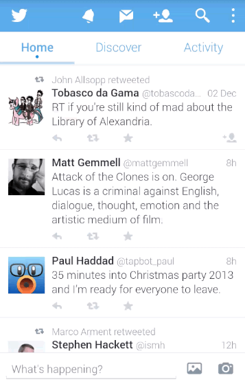
And here’s what baffles me the most. On one hand, the app remembers the stream position, which means that I need to move the content down to get to the newer tweets (as an aside, with “natural” scrolling I’m not even sure if this is scrolling up or scrolling down”). On the other hand, the app hides the top tabs / bottom row when I move the content up.
Is the main interaction mode with this stream is getting to the last unread tweet and then going up the stream to skim the unread tweets, as hinted by remembering the stream position? Or is it getting bumped to the top of the stream and scrolling a few tweets down just to sample the latest few entries in it, as hinted by hiding the two chrome rows and providing more space during the scrolling?
I don’t want to say what the app should or shouldn’t do in the stream (as pointed out by M.Saleh Esmaeili). It’s just that I can’t get what the designers intend the experience to be.
A few days ago The Verge has posted an article around metric-driven design in Twitter mobile apps, an for me personally the saddest part of this article is how much they focus on engagement metrics and how little the guy talks about informed design. Trying to squeeze every possible iota of “interaction” out of every single element on the screen – on its own – without talking about the bigger picture of what Twitter wants to be as a designed system. Experiments are fine, of course. But jacking up random numbers on your “engagement” spreadsheets and having those dictate your roadmap (if one can even exist in such a world) is kind of sad.
When every interaction is judged by how much it maximizes whatever particular internal metric your team is tracking, you may find yourself dead-set on locating the local maximum of an increasingly fractured experience, with no coherent high-level design, and no clear path that you’re taking to arrive to the next level. Or, as Billie Kent’s character in Boardwalk Empire says, “always on the move, going nowhere fast.”
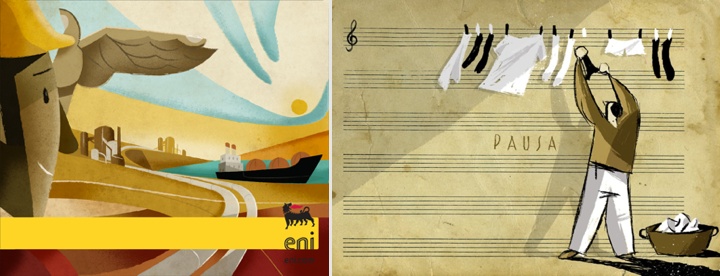
Riccardo Guasco is an illustrator and a painter working with a variety of styles and mediums – ink, watercolor, acrylic, Chinese brush – in addition to creating digital illustrations for clients such as Eni, Diesel, Rizzoli, Moleskine, Thames & Hudson and TBWA. In this interview Riccardo talks about what influenced his taste, not wanting to be tied to a single technique, and conveying motion in a static medium – particularly in his collection about cyclists.

Photography by Lorenzo De Simone
Kirill: Tell us about yourself and how you started in the field.
Riccardo: My name is Riccardo Guasco, I am an illustrator and a painter born in Alessandria, a small town in the northwestern part of Italy. I’ve always been drawing: since I was a little boy, I’ve always got the chance to attend art schools, till the School of Fine Arts in Turin. And this experience helped me to improve my hand and my style, up to turn my passion into a job.
Kirill: What informs and shapes your taste and style?
Riccardo: My style has evolved over time, matured with the passing of the years and with the settling down of my passions. During my studies, I got very interested into Picasso’s, Futurist painters’, Russian Suprematists’ and contemporary street art. Later, my passion has been enriched with comics – with the characters coming from Il Corriere dei Piccoli, the first Italian weekly comic magazine -, posters, or thanks to artists creating advertising placards since the Forties – such as Savignac, Cappiello, Seneca, Dudovich. It is a style taking inspiration from simple images, made up of few lines but full of expressive and emotional content.

Kirill: Your portfolio has work in multiple mediums – ink, watercolor, acrylic, Chinese brush. Is this a challenge to yourself to explore different directions and styles?
Riccardo: I love my art can become a language applicable to all media and through every technique. Technique is just a tool, a mean to communicate; the most important thing is having a message. I don’t want to tie myself down to a single technique or even worse to a single software, I want to try them all. My next collection I have in my mind, it will be a ceramic dinnerware set; this technique is really attractive to me, but I have never tried it up to now.
Kirill: What are your thoughts about digital illustration hardware and software tools?
Riccardo: I often use hardware and software tools in my job. Photoshop, Illustrator and Cintiq digital tablet are useful but not essential tools, luckily. As I told you before, I don’t want to tie myself down to a single software or a single hardware. Almost all my works arise from the paper first, and several times I prefer not to switch them into a digital format because I do not want to loose the freshness they have on the paper.

Kirill: How do you approach capturing and conveying movement in this static medium, particularly in your illustrations of cyclists?
Riccardo: My collection about cyclists was one of my earlier works. I wanted to convey the more introspective side of each cyclist, rather than to portray them just as racers; my attention was addressed to their thoughts and their soul, I wanted to tell something only through their profiles. So, I decided to eliminate the bicycle and everything that was redundant for me. And I was left with faces belonging to heroes, profiles speaking about struggle, noses stuck out in order to reach the finishing line they would have passed shortly.
Kirill: Do you ever find yourself so immersed during painting that you lose track of time?
Riccardo: If I could, I would draw nights and days, and if I am doing a job I like I don’t care about tiredness and time passing. I experience like a trance and my attention is completely enchanted by the work till the end. On the contrary, I never spend too much time on the same painting or illustration because I do not want to loose the freshness and spontaneity of the very first idea I’ve put on the paper.

Kirill: What goes through you head when you look at your own work from a few years ago?
Riccardo: It is a continuous metamorphosis, my works and my style change with the passing of the years (luckily). When I go back to my old works, I see naivety and defects that I would not make again now and I think the same painting or illustration would be different today.
Kirill: As you went back to the academic world, do you miss the more hectic side of client work? Any plans to go back to freelancing or agency?
Riccardo: I like to work with customers and/or agencies that ask me for unusual illustrations. I think that facing and dealing with brief and customer’s requirements is like a training. Usually, I try to explain to the customer that first of all we need to rely on each other and have a mutual consideration; only in this way it is possible to discuss and create an illustration satisfying both. I know I have a really peculiar and codified style, and this is a luck that helps me to meet customers who are exactly looking for my illustrations because they appreciate and consider them interesting from a quality point of view.
Kirill: What do you do when you run out of ideas and get stuck?
Riccardo: I think inspiration does not exist. Creativity and ideas are the result of a teamwork of eye, brain and hart. At the end of this process, the hand realizes what the other three players have imagined. This process cannot be stopped because it is like breathing or running: you need training and perseverance.
Kirill: What’s the best thing about being an illustrator?
Riccardo: The best thing about being an illustrator is the availability in your own hands of a universal communication medium: “drawing”. Having the opportunity to create an image able to reach and touch millions of people in a short time; if you try to think about an image, you realize it is more straightforward than a book, or a song, or rather a movie; but it has a strong tension inside that needs to be well and carefully handle.

And here I’d like to thank Riccardo Guasco for his outstanding work, and for taking the time to answer a few questions I had about his art and craft. You can find his work online at his main portfolio site and his Behance profile. Selected works are available for sale at his Society6 shop.
Continuing the ongoing series of interviews with illustrators, it is my pleasure to welcome the talented and prolific Morgan Schweitzer. He splits his time between editorial illustrations and motion work that includes character design, concept design, asset creation and storyboard art. His clients include Penguin, Businessweek, Maxim, Psyop, Buck, Stardust and many others. In this interview Morgan talks about his roots, his creative process and designing for various media.
 Kirill: Tell us about yourself and how you started in the field.
Morgan: I studied Visual Communications at Washington University in St Louis. When I first graduated I blindly emailed over 100 commercial animation studios all over the world to see if they had openings. It was only one studio, Nathan Love in New York, that started offering me some freelance work here and there. I did some odd-jobs as a freelancer starting out. I was hired by a talented graphic designer/developer and family friend, Gretchen May. She was working for Massachusetts General Hospital at the time, and hired me to build an illustration library for them. Selling the copyrights to all the images allowed me the financial freedom to move to New York City. Once in NYC I started working for Nathan Love more regularly. In fact, the day they called me in to start was the same day I was supposed to start work as a waiter.
I dropped off my portfolio, sent out mailers and started getting some editorial illustration jobs. For about a year I illustrated a weekly column for the Village Voice. Meanwhile, as other freelance coworkers migrated to other studios, my name got spread around and I started working for more animation studios.

Wraparound cover for PK Pinkerton and the Deadly Desperados book published by Penguin.
Kirill: What informs and shapes your taste and style?
Morgan: I have a real compulsion to discover new artists, designers, and illustrators online. It’s inspiring and eye-opening to see how different artists work, and how they work differently from me.
Kirill: Is there a danger of absorbing too much from what influences you and not finding your own unique voice?
Morgan: There is certainly that danger. My influences are so vast, that I’m never influenced by one artist in particular. I strive to become an amalgam of everything that I love in all that influences me.
However, I struggled for a while…or rather, I thought I was struggling for a while with finding a focus and a voice. As a concept artist I work to invent new styles and aesthetics for each project. Some, styles that I would never pursue within my own artistic exploration. So, for a while I felt like concept art muddled my focus and my own voice. I got confused and thought I needed to stick to a “style” or come up with a “style” that was unique to me.
Then, I stepped back and realized that when given an illustration assignment I would go back to my own default and illustrate the topic in the way that was most comfortable for me. And, while I never equated that with a “style,” what I realized was that the most genuine artistic voices are not determined from a lineup of styles, but rather, just a way of working which is most comfortable and engaging for the artist. That said, I still don’t feel like I have a “style,” and I don’t anticipate ever feeling that way.

Illustration for an article in American Cowboy Magazine about the old Clint Eastwood classic, Fist Full of Dollars
Kirill: There’s a lot of momentum and energy in your illustrations. How do you approach conveying motion in a static image, particularly for human subjects?
Morgan: I’m glad that comes across. My sketches are generally very loose and gestural at first. I try to incorporate some of those gestural qualities to help guide the finished illustration and to exaggerate aspects of the figure that help convey movement.
Kirill: What is the process of designing a book cover? Is it about capturing the story in a single image, or a somewhat looser interpretation that gives you more freedom?
Morgan: For book covers I’ve worked on, I would say it’s not about capturing an actual scene or events from the book, but rather a more general expression of the most iconic elements from the story into an image (without giving anything away). It’s also important for the image to be iconic and readable from afar.
Kirill: Speaking more broadly about cover design, what are your thoughts on increasing prevalence of digital stores – for both music and books? As you’re blocking out the cover elements, do you factor in that people will see the cover – possibly significantly scaled down – on a variety of screen sizes?
Morgan: I think a good cover will hold up. These factors make it even more important for the image to be readable at a small scale. I do tend to examine my illustrations at thumbnail size whether it’s for a cover or not. I find it helps me to see the image more broadly to make sure everything is working together.

Left – illustration for New York Times Magazine, right – illustration for Westchester Magazine.
Kirill: What’s the technical process? Pen-and-paper first, and then transition to digital tools?
Morgan: While I love working with traditional media, my process has become increasingly digital. It’s a time-saver with tight deadlines, and for working in animation with continuous revisions it’s a must. To avoid the sterile, lifeless qualities that digital art can often produce I have amassed a library of paint, ink, and charcoal textures that I use to give my images a bit more of a tactile quality.
Kirill: Once the specific illustration is out of your hands and becomes a part of the final product, do you ever wish to go back and tweak it? Has it ever happened that you had what seemed to be an even better idea after the process has been completed?
Morgan: I have a bad habit of staring at my illustrations for a couple days after I’ve already sent them in to the client. Even when they’re approved I’ll sometimes send in my own revisions after the fact if something starts bugging me later. That said, once I’m finished staring at an illustration, I tend to close the book on it mentally. Overtime, I develop a constructive hatred of all my earlier work. I think that’s an important sign of growth. I’ll never be content with a piece that I’ve improved beyond, so if I weren’t hating everything I’ve ever done, I’d be worried.

Self-initiated work for imagined comic book covers.
Kirill: How do you preserve color fidelity when the final product is targeting print media, such as album or book covers?
Morgan: I’m not as much of a stickler about color as maybe I ought to be. Every monitor is different. Every printer is different. So, it’s kind of an impossible pursuit. I think if the overall color palette is strong as a unit, then it will hold up if all the colors are uniformly shifted.
Kirill: What’s the weirdest client feedback that you’ve received so far, if you don’t mind sharing? Is there any difference between working for smaller publications as opposed to larger corporate clients?
Morgan: To be honest, nothing too weird comes immediately to mind. There are certainly client decisions that I consider to be strange within the context of certain projects, but I can’t think of anything too crazy. Things like the typographic design working against the illustration, or character designs that move away from what the characters are trying to convey.

Type Design for “Crime of Passion” album cover for “Hollywood Kill”.
Kirill: One of the sections on your site is about your lettering projects. Do you see yourself branching out in the future to do type design?
Morgan: I have a background in typography and design, so lettering is something I enjoy. Type is most exciting to me when it’s combined into an illustration. So, I try to incorporate illustrated lettering here and there in my illustrations when possible. However, I don’t have a dedication to type alone the way most type designers do. So, I don’t see that becoming a more prominent aspect of my career.
Kirill: How important is it to invest time in personal projects?
Morgan: I would say it’s very important. It helps to stretch your creativity farther than assignments may allow. Exploring your own creativity in that way is perhaps the most important tool in developing an identifiable voice. All that said, I rarely work on personal projects…something I would very much like to change in the near future.
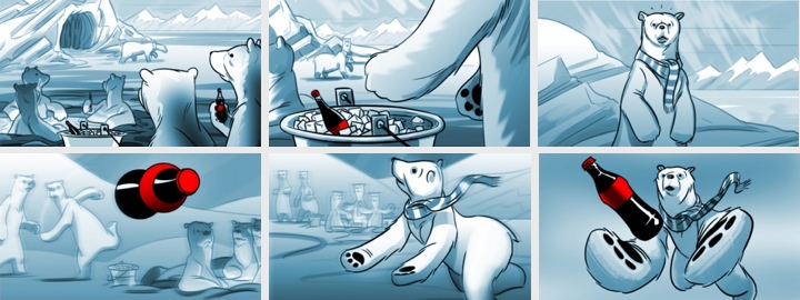
Storyboards for “The Catch” Coca-Cola pitch.
Kirill: What do you do when you run out of ideas and get stuck?
Morgan: I suppose my idea process is a little different for each field. If I ever get stuck coming up with a concept for an editorial illustration, it’s generally as simple as starting to sketch some thumbnails. Seeing different ideas on paper gives way to expanding on those ideas, changing and combining them in different ways. If I ever have trouble starting to sketch thumbnails, I find it helps to start writing down a list of words that correspond to topics in the article.
For character design, when I feel I’ve exhausted all the forms for a particular character exploration, I start to sketch almost without intention. Almost random scribbles. Then I’ll start to turn the scribbles into different forms and generally more exaggerated interesting characters will start to take shape.
Kirill: What’s the best thing about being an illustrator?
Morgan: Hard not to say something totally cliché here. I’d like to say something like…because I love the pursuit of illustration, I rarely feel like I’m working; exploring one’s own creativity is a valuable window oneself; it’s a fulfilling and exciting pursuit to work toward the impossible goal of artistic perfection; but really it’s the danger…and the power, fame, money, cars and women.

Illustration for melba.co.
And here I’d like to thank Morgan Schweitzer for his wonderful work, and for taking the time to answer a few questions I had about his art and craft. You can find his work online at his main portfolio site and his personal Tumblr stream. He’s also active on Facebook and Twitter.
